news + thoughts
Nasa to send our human genome discs to the Moon
We'd like to say a ‘cosmic hello’: mathematics, culture, palaeontology, art and science, and ... human genomes.


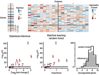
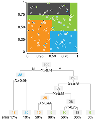
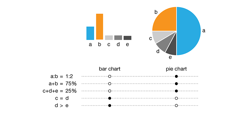
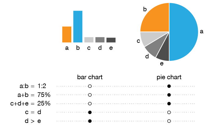
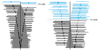
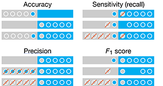
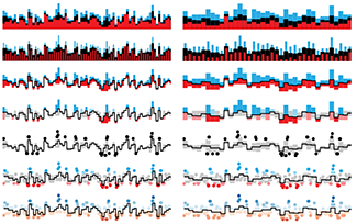
Comparing classifier performance with baselines
All animals are equal, but some animals are more equal than others. —George Orwell
This month, we will illustrate the importance of establishing a baseline performance level.
Baselines are typically generated independently for each dataset using very simple models. Their role is to set the minimum level of acceptable performance and help with comparing relative improvements in performance of other models.

Unfortunately, baselines are often overlooked and, in the presence of a class imbalance5, must be established with care.
Megahed, F.M, Chen, Y-J., Jones-Farmer, A., Rigdon, S.E., Krzywinski, M. & Altman, N. (2024) Points of significance: Comparing classifier performance with baselines. Nat. Methods 20.
Happy 2024 π Day—
sunflowers ho!
Celebrate π Day (March 14th) and dig into the digit garden. Let's grow something.

How Analyzing Cosmic Nothing Might Explain Everything
Huge empty areas of the universe called voids could help solve the greatest mysteries in the cosmos.
My graphic accompanying How Analyzing Cosmic Nothing Might Explain Everything in the January 2024 issue of Scientific American depicts the entire Universe in a two-page spread — full of nothing.

The graphic uses the latest data from SDSS 12 and is an update to my Superclusters and Voids poster.
Michael Lemonick (editor) explains on the graphic:
“Regions of relatively empty space called cosmic voids are everywhere in the universe, and scientists believe studying their size, shape and spread across the cosmos could help them understand dark matter, dark energy and other big mysteries.
To use voids in this way, astronomers must map these regions in detail—a project that is just beginning.
Shown here are voids discovered by the Sloan Digital Sky Survey (SDSS), along with a selection of 16 previously named voids. Scientists expect voids to be evenly distributed throughout space—the lack of voids in some regions on the globe simply reflects SDSS’s sky coverage.”
voids
Sofia Contarini, Alice Pisani, Nico Hamaus, Federico Marulli Lauro Moscardini & Marco Baldi (2023) Cosmological Constraints from the BOSS DR12 Void Size Function Astrophysical Journal 953:46.
Nico Hamaus, Alice Pisani, Jin-Ah Choi, Guilhem Lavaux, Benjamin D. Wandelt & Jochen Weller (2020) Journal of Cosmology and Astroparticle Physics 2020:023.
Sloan Digital Sky Survey Data Release 12
Alan MacRobert (Sky & Telescope), Paulina Rowicka/Martin Krzywinski (revisions & Microscopium)
Hoffleit & Warren Jr. (1991) The Bright Star Catalog, 5th Revised Edition (Preliminary Version).
H0 = 67.4 km/(Mpc·s), Ωm = 0.315, Ωv = 0.685. Planck collaboration Planck 2018 results. VI. Cosmological parameters (2018).
constellation figures
stars
cosmology
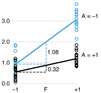
Error in predictor variables
It is the mark of an educated mind to rest satisfied with the degree of precision that the nature of the subject admits and not to seek exactness where only an approximation is possible. —Aristotle
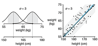
In regression, the predictors are (typically) assumed to have known values that are measured without error.
Practically, however, predictors are often measured with error. This has a profound (but predictable) effect on the estimates of relationships among variables – the so-called “error in variables” problem.

Error in measuring the predictors is often ignored. In this column, we discuss when ignoring this error is harmless and when it can lead to large bias that can leads us to miss important effects.
Altman, N. & Krzywinski, M. (2024) Points of significance: Error in predictor variables. Nat. Methods 20.
Background reading
Altman, N. & Krzywinski, M. (2015) Points of significance: Simple linear regression. Nat. Methods 12:999–1000.
Lever, J., Krzywinski, M. & Altman, N. (2016) Points of significance: Logistic regression. Nat. Methods 13:541–542 (2016).
Das, K., Krzywinski, M. & Altman, N. (2019) Points of significance: Quantile regression. Nat. Methods 16:451–452.
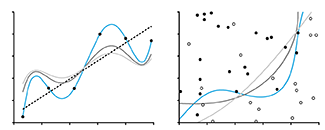
Convolutional neural networks
Nature uses only the longest threads to weave her patterns, so that each small piece of her fabric reveals the organization of the entire tapestry. – Richard Feynman
Following up on our Neural network primer column, this month we explore a different kind of network architecture: a convolutional network.
The convolutional network replaces the hidden layer of a fully connected network (FCN) with one or more filters (a kind of neuron that looks at the input within a narrow window).
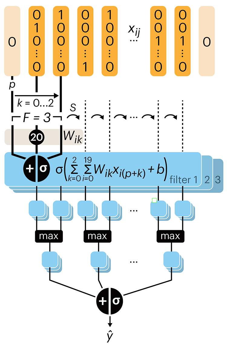
Even through convolutional networks have far fewer neurons that an FCN, they can perform substantially better for certain kinds of problems, such as sequence motif detection.
Derry, A., Krzywinski, M & Altman, N. (2023) Points of significance: Convolutional neural networks. Nature Methods 20:1269–1270.
Background reading
Derry, A., Krzywinski, M. & Altman, N. (2023) Points of significance: Neural network primer. Nature Methods 20:165–167.
Lever, J., Krzywinski, M. & Altman, N. (2016) Points of significance: Logistic regression. Nature Methods 13:541–542.
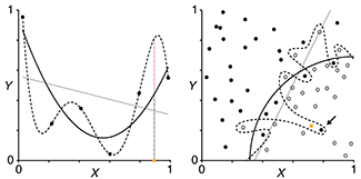
Neural network primer
Nature is often hidden, sometimes overcome, seldom extinguished. —Francis Bacon
In the first of a series of columns about neural networks, we introduce them with an intuitive approach that draws from our discussion about logistic regression.
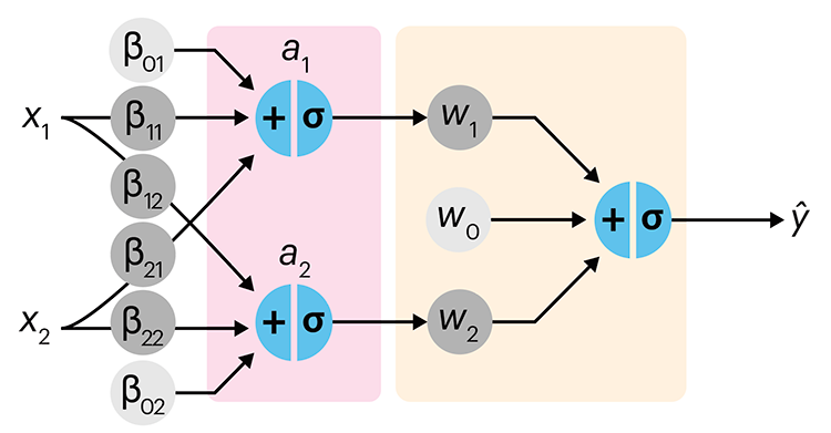
Simple neural networks are just a chain of linear regressions. And, although neural network models can get very complicated, their essence can be understood in terms of relatively basic principles.
We show how neural network components (neurons) can be arranged in the network and discuss the ideas of hidden layers. Using a simple data set we show how even a 3-neuron neural network can already model relatively complicated data patterns.
Derry, A., Krzywinski, M & Altman, N. (2023) Points of significance: Neural network primer. Nature Methods 20:165–167.
Background reading
Lever, J., Krzywinski, M. & Altman, N. (2016) Points of significance: Logistic regression. Nature Methods 13:541–542.
Cell Genomics cover
Our cover on the 11 January 2023 Cell Genomics issue depicts the process of determining the parent-of-origin using differential methylation of alleles at imprinted regions (iDMRs) is imagined as a circuit.
Designed in collaboration with with Carlos Urzua.

Akbari, V. et al. Parent-of-origin detection and chromosome-scale haplotyping using long-read DNA methylation sequencing and Strand-seq (2023) Cell Genomics 3(1).
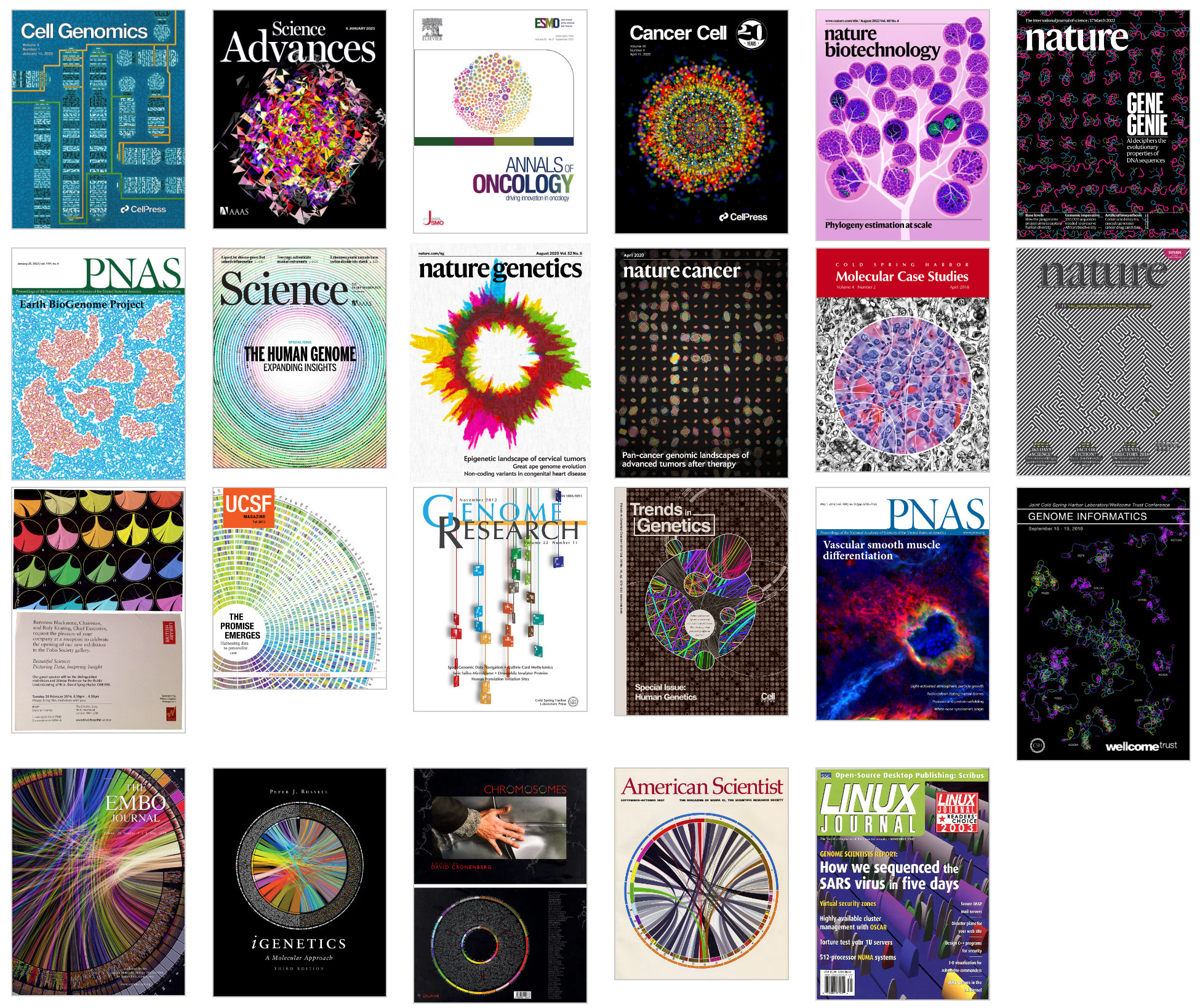
Browse my gallery of cover designs.

Science Advances cover
My cover design on the 6 January 2023 Science Advances issue depicts DNA sequencing read translation in high-dimensional space. The image showss 672 bases of sequencing barcodes generated by three different single-cell RNA sequencing platforms were encoded as oriented triangles on the faces of three 7-dimensional cubes.
More details about the design.

Kijima, Y. et al. A universal sequencing read interpreter (2023) Science Advances 9.
Browse my gallery of cover designs.
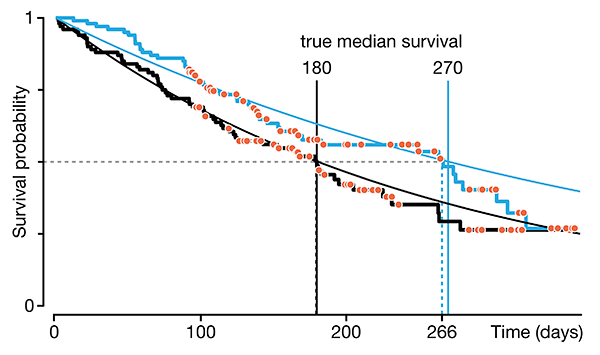
Regression modeling of time-to-event data with censoring
If you sit on the sofa for your entire life, you’re running a higher risk of getting heart disease and cancer. —Alex Honnold, American rock climber
In a follow-up to our Survival analysis — time-to-event data and censoring article, we look at how regression can be used to account for additional risk factors in survival analysis.
We explore accelerated failure time regression (AFTR) and the Cox Proportional Hazards model (Cox PH).
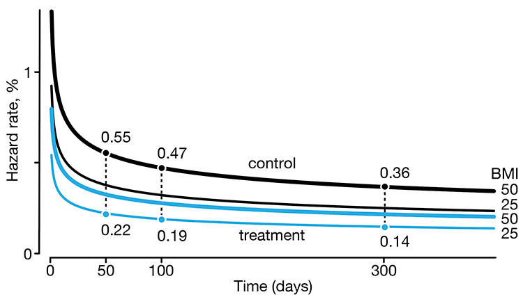
Dey, T., Lipsitz, S.R., Cooper, Z., Trinh, Q., Krzywinski, M & Altman, N. (2022) Points of significance: Regression modeling of time-to-event data with censoring. Nature Methods 19:1513–1515.
Music video for Max Cooper's Ascent
My 5-dimensional animation sets the visual stage for Max Cooper's Ascent from the album Unspoken Words. I have previously collaborated with Max on telling a story about infinity for his Yearning for the Infinite album.
I provide a walkthrough the video, describe the animation system I created to generate the frames, and show you all the keyframes
The video recently premiered on YouTube.
Renders of the full scene are available as NFTs.
Gene Cultures exhibit — art at the MIT Museum
I am more than my genome and my genome is more than me.
The MIT Museum reopened at its new location on 2nd October 2022. The new Gene Cultures exhibit featured my visualization of the human genome, which walks through the size and organization of the genome and some of the important structures.

Annals of Oncology cover
My cover design on the 1 September 2022 Annals of Oncology issue shows 570 individual cases of difficult-to-treat cancers. Each case shows the number and type of actionable genomic alterations that were detected and the length of therapies that resulted from the analysis.

Pleasance E et al. Whole-genome and transcriptome analysis enhances precision cancer treatment options (2022) Annals of Oncology 33:939–949.

Browse my gallery of cover designs.
Survival analysis—time-to-event data and censoring
Love's the only engine of survival. —L. Cohen
We begin a series on survival analysis in the context of its two key complications: skew (which calls for the use of probability distributions, such as the Weibull, that can accomodate skew) and censoring (required because we almost always fail to observe the event in question for all subjects).
We discuss right, left and interval censoring and how mishandling censoring can lead to bias and loss of sensitivity in tests that probe for differences in survival times.
Dey, T., Lipsitz, S.R., Cooper, Z., Trinh, Q., Krzywinski, M & Altman, N. (2022) Points of significance: Survival analysis—time-to-event data and censoring. Nature Methods 19:906–908.
3,117,275,501 Bases, 0 Gaps
See How Scientists Put Together the Complete Human Genome.
My graphic in Scientific American's Graphic Science section in the August 2022 issue shows the full history of the human genome assembly — from its humble shotgun beginnings to the gapless telomere-to-telomere assembly.
Read about the process and methods behind the creation of the graphic.
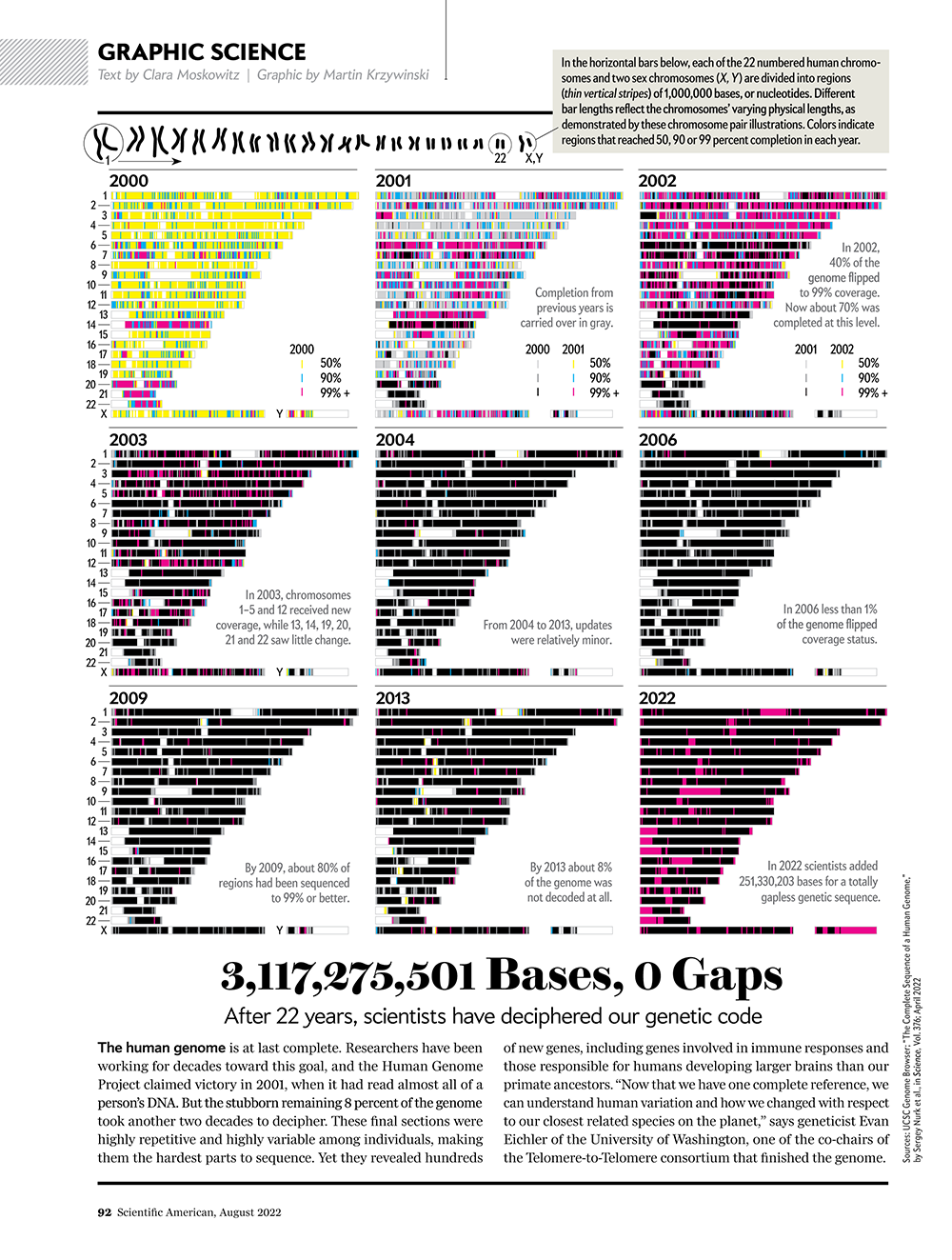
See all my Scientific American Graphic Science visualizations.
Anatomy of SARS-Cov-2
My poster showing the genome structure and position of mutations on all SARS-CoV-2 variants appears in the March/April 2022 issue of American Scientist.
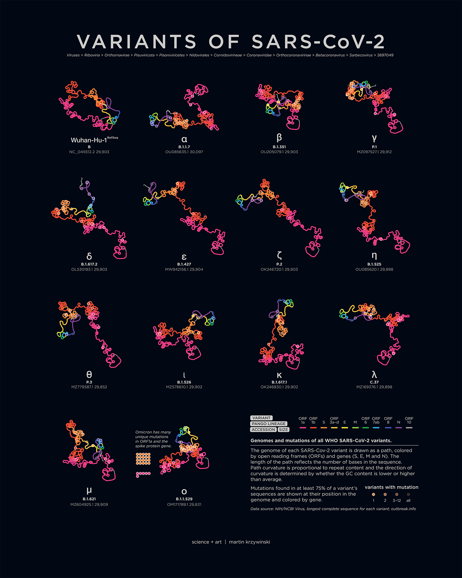
An accompanying piece breaks down the anatomy of each genome — by gene and ORF, oriented to emphasize relative differences that are caused by mutations.

Cancer Cell cover
My cover design on the 11 April 2022 Cancer Cell issue depicts cellular heterogeneity as a kaleidoscope generated from immunofluorescence staining of the glial and neuronal markers MBP and NeuN (respectively) in a GBM patient-derived explant.
LeBlanc VG et al. Single-cell landscapes of primary glioblastomas and matched explants and cell lines show variable retention of inter- and intratumor heterogeneity (2022) Cancer Cell 40:379–392.E9.

Browse my gallery of cover designs.
Nature Biotechnology cover
My cover design on the 4 April 2022 Nature Biotechnology issue is an impression of a phylogenetic tree of over 200 million sequences.
Konno N et al. Deep distributed computing to reconstruct extremely large lineage trees (2022) Nature Biotechnology 40:566–575.

Browse my gallery of cover designs.
Nature cover — Gene Genie
My cover design on the 17 March 2022 Nature issue depicts the evolutionary properties of sequences at the extremes of the evolvability spectrum.
Vaishnav ED et al. The evolution, evolvability and engineering of gene regulatory DNA (2022) Nature 603:455–463.

Browse my gallery of cover designs.
Happy 2022 `\pi` Day—
three one four: a number of notes
Celebrate `\pi` Day (March 14th) and finally hear what you've been missing.
“three one four: a number of notes” is a musical exploration of how we think about mathematics and how we feel about mathematics. It tells stories from the very beginning (314…) to the very (known) end of π (...264) as well as math (Wallis Product) and math jokes (Feynman Point), repetition (nn) and zeroes (null).

The album is scored for solo piano in the style of 20th century classical music – each piece has a distinct personality, drawn from styles of Boulez, Feldman, Glass, Ligeti, Monk, and Satie.
Each piece is accompanied by a piku (or πku), a poem whose syllable count is determined by a specific sequence of digits from π.
Check out art from previous years: 2013 `\pi` Day and 2014 `\pi` Day, 2015 `\pi` Day, 2016 `\pi` Day, 2017 `\pi` Day, 2018 `\pi` Day, 2019 `\pi` Day, 2020 `\pi` Day and 2021 `\pi` Day.
PNAS Cover — Earth BioGenome Project
My design appears on the 25 January 2022 PNAS issue.

The cover shows a view of Earth that captures the vision of the Earth BioGenome Project — understanding and conserving genetic diversity on a global scale. Continents from the Authagraph projection, which preserves areas and shapes, are represented as a double helix of 32,111 bases. Short sequences of 806 unique species, sequenced as part of EBP-affiliated projects, are mapped onto the double helix of the continent (or ocean) where the species is commonly found. The length of the sequence is the same for each species on a continent (or ocean) and the sequences are separated by short gaps. Individual bases of the sequence are colored by dots. Species appear along the path in alphabetical order (by Latin name) and the first base of the first species is identified by a small black triangle.
Lewin HA et al. The Earth BioGenome Project 2020: Starting the clock. (2022) PNAS 119(4) e2115635118.
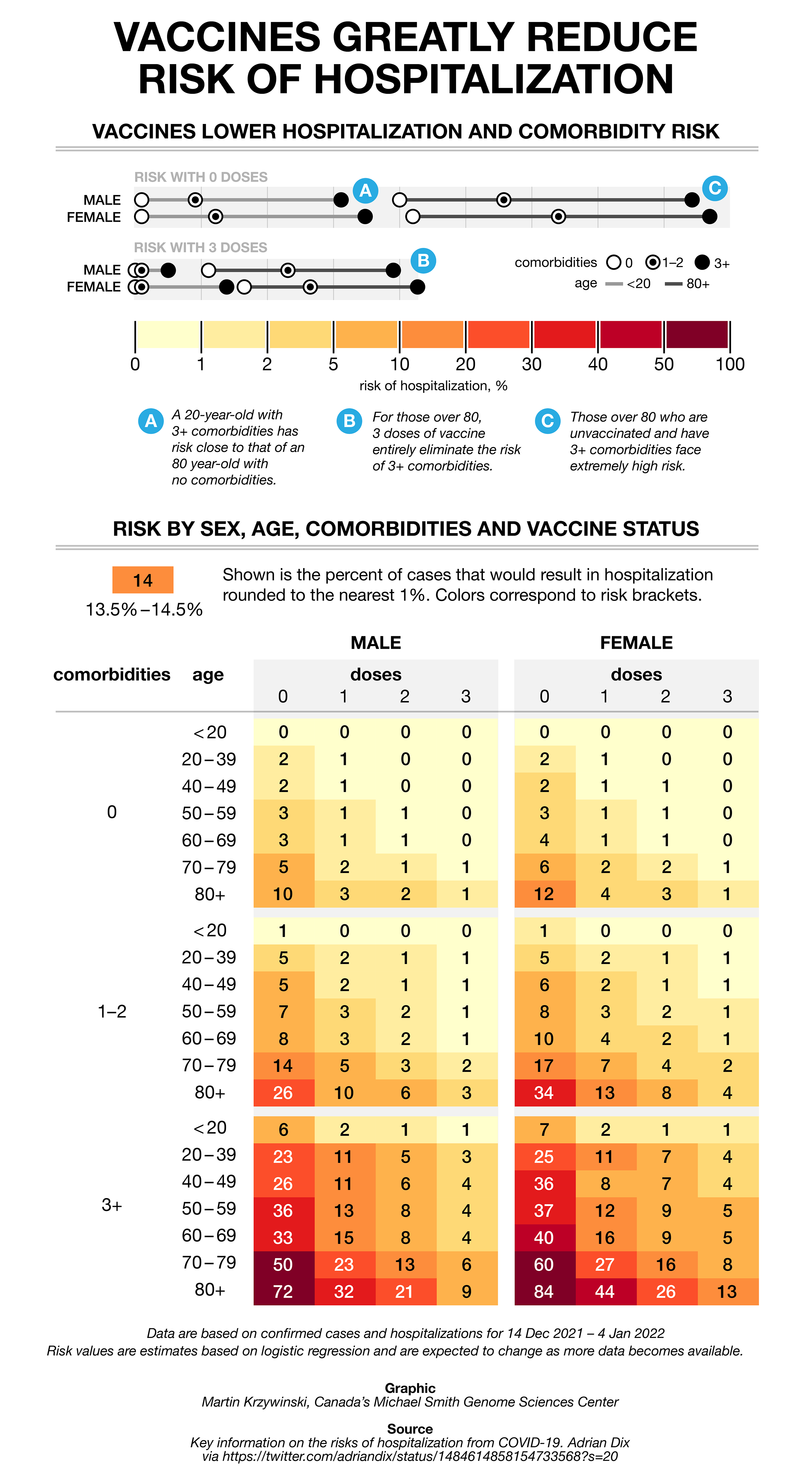
The COVID charts — hospitalization rates
As part of the COVID Charts series, I fix a muddled and storyless graphic tweeted by Adrian Dix, Canada's Health Minister.
I show you how to fix color schemes to make them colorblind-accessible and effective in revealing patters, how to reduce redundancy in labels (a key but overlooked part of many visualizations) and how to extract a story out of a table to frame the narrative.
The class imbalance problem
The exception proves the rule.
But when one class is rare, evaluating a classifier using accuracy can be misleading — because it can vary across classes. This is the class imbalance problem.
We discuss at how a data set can be rebalanced by removing data (undersampling) or adding (oversampling) synthetic data. This must be done with care — undersampling can result in the loss of information and oversampling can lead to overfitting.
We look at various resampling methods (e.g. SMOTE) and explore how they influence performance of a classifier as the imbalance ratio increases.
Megahed, F.M, Chen, Y-J., Megahed, A., Ong, Y., Altman, N. & Krzywinski, M. (2021) Points of significance: The class imbalance problem. Nature Methods 18:1270–1272.
Science cover — The Human Genome
My cover design on the 24 Sep 2021 Science issue depicts the human genome as a spiral (scale: 1 million bases per centimeter), with colored segments representing different chromosomes. Circle size denotes the number of genes associated with Mendelian disorders and hollow circles indicate the number of mutation clusters from a pan-cancer analysis.

Browse my gallery of cover designs.
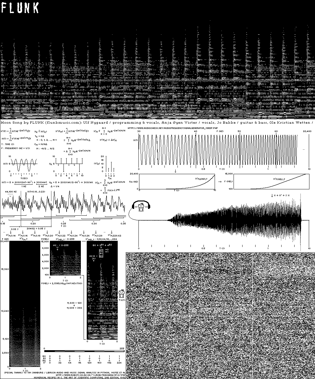
Music for the Moon: Flunk's 'Down Here / Moon Above'
The Sanctuary Project is a Lunar vault of science and art. It includes two fully sequenced human genomes, sequenced and assembled by us at Canada's Michael Smith Genome Sciences Centre.
The first disc includes a song composed by Flunk for the (eventual) trip to the Moon.
But how do you send sound to space? I describe the inspiration, process and art behind the work.
Happy 2021 `\pi` Day—
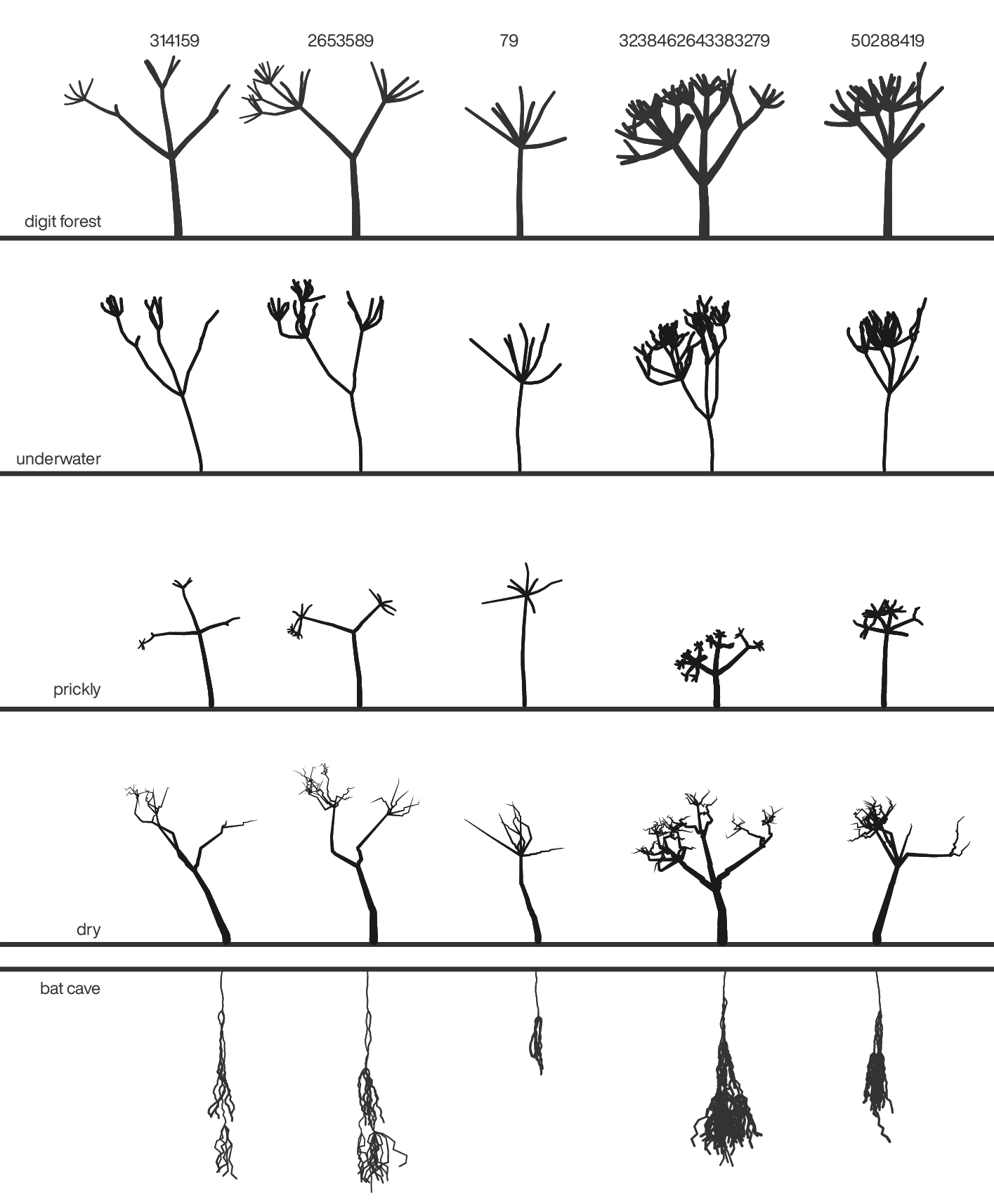
A forest of digits
Celebrate `\pi` Day (March 14th) and finally see the digits through the forest.

This year is full of botanical whimsy. A Lindenmayer system forest – deterministic but always changing. Feel free to stop and pick the flowers from the ground.

And things can get crazy in the forest.
Check out art from previous years: 2013 `\pi` Day and 2014 `\pi` Day, 2015 `\pi` Day, 2016 `\pi` Day, 2017 `\pi` Day, 2018 `\pi` Day and 2019 `\pi` Day.
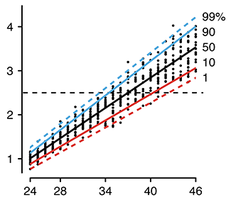
Testing for rare conditions
All that glitters is not gold. —W. Shakespeare
The sensitivity and specificity of a test do not necessarily correspond to its error rate. This becomes critically important when testing for a rare condition — a test with 99% sensitivity and specificity has an even chance of being wrong when the condition prevalence is 1%.
We discuss the positive predictive value (PPV) and how practices such as screen can increase it.
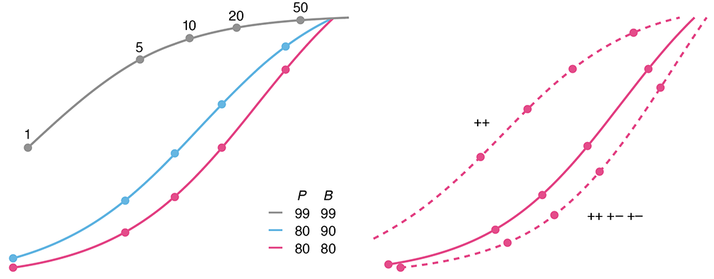
Altman, N. & Krzywinski, M. (2021) Points of significance: Testing for rare conditions. Nature Methods 18:224–225.
Standardization fallacy
We demand rigidly defined areas of doubt and uncertainty! —D. Adams
A popular notion about experiments is that it's good to keep variability in subjects low to limit the influence of confounding factors. This is called standardization.
Unfortunately, although standardization increases power, it can induce unrealistically low variability and lead to results that do not generalize to the population of interest. And, in fact, may be irreproducible.
Not paying attention to these details and thinking (or hoping) that standardization is always good is the "standardization fallacy". In this column, we look at how standardization can be balanced with heterogenization to avoid this thorny issue.
Voelkl, B., Würbel, H., Krzywinski, M. & Altman, N. (2021) Points of significance: Standardization fallacy. Nature Methods 18:5–6.
Graphical Abstract Design Guidelines
Clear, concise, legible and compelling.
Making a scientific graphical abstract? Refer to my practical design guidelines and redesign examples to improve organization, design and clarity of your graphical abstracts.
"This data might give you a migrane"
An in-depth look at my process of reacting to a bad figure — how I design a poster and tell data stories.
He said, he said — a word analysis of the 2020 Presidential Debates
Building on the method I used to analyze the 2008, 2012 and 2016 U.S. Presidential and Vice Presidential debates, I explore word usagein the 2020 Debates between Donald Trump and Joe Biden.
Points of Significance celebrates 50th column
We are celebrating the publication of our 50th column!
To all our coauthors — thank you and see you in the next column!
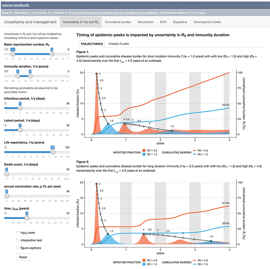
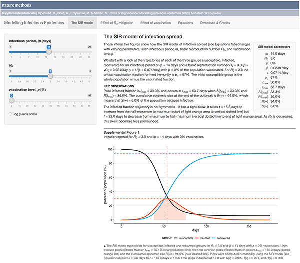
Uncertainty and the management of epidemics
When modelling epidemics, some uncertainties matter more than others.
Public health policy is always hampered by uncertainty. During a novel outbreak, nearly everything will be uncertain: the mode of transmission, the duration and population variability of latency, infection and protective immunity and, critically, whether the outbreak will fade out or turn into a major epidemic.
The uncertainty may be structural (which model?), parametric (what is `R_0`?), and/or operational (how well do masks work?).
This month, we continue our exploration of epidemiological models and look at how uncertainty affects forecasts of disease dynamics and optimization of intervention strategies.
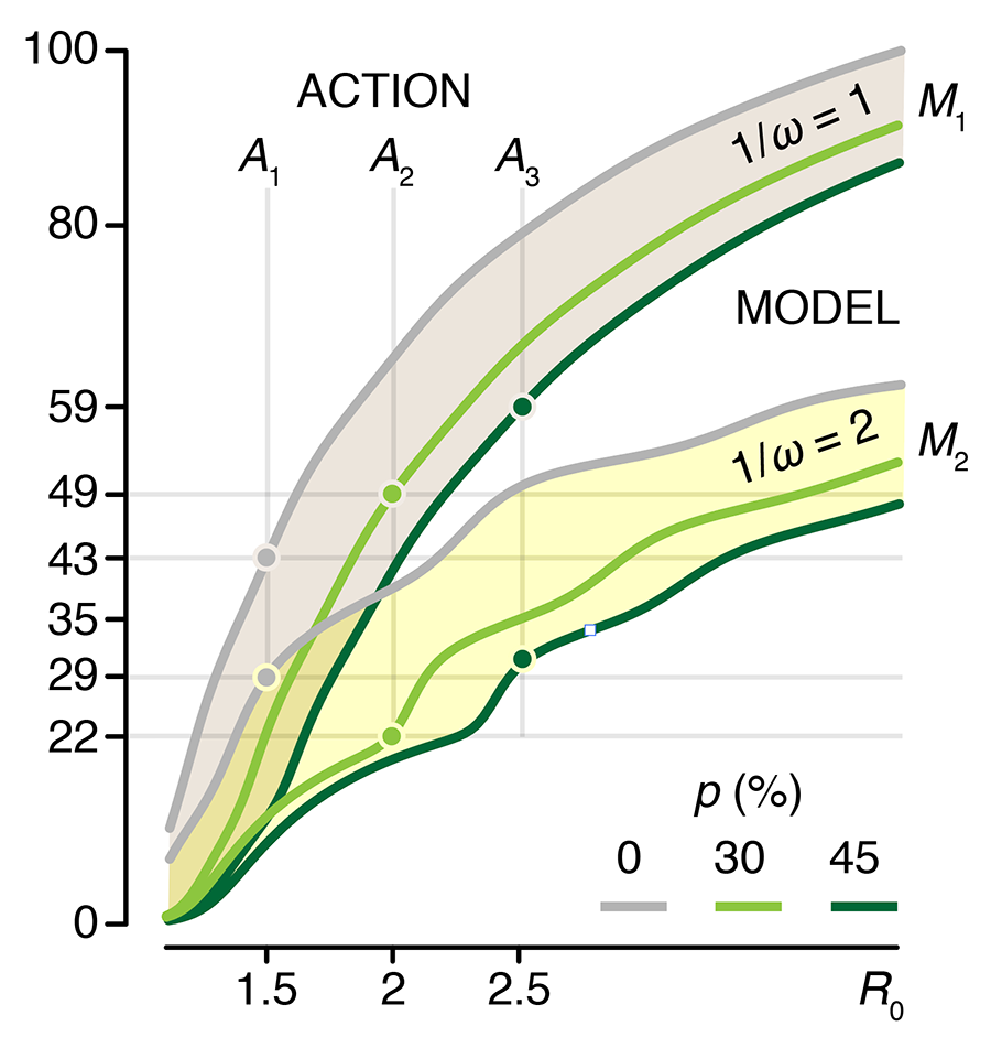
We show how the impact of the uncertainty on any choice in strategy can be expressed using the Expected Value of Perfect Information (EVPI), which is the potential improvement in outcomes that could be obtained if the uncertainty is resolved before making a decision on the intervention strategy. In other words, by how much could we potentially increase effectiveness of our choice (e.g. lowering total disease burden) if we knew which model best reflects reality?
This column has an interactive supplemental component (download code) that allows you to explore the impact of uncertainty in `R_0` and immunity duration on timing and size of epidemic waves and the total burden of the outbreak and calculate EVPI for various outbreak models and scenarios.
Bjørnstad, O.N., Shea, K., Krzywinski, M. & Altman, N. (2020) Points of significance: Uncertainty and the management of epidemics. Nature Methods 17.
Background reading
Bjørnstad, O.N., Shea, K., Krzywinski, M. & Altman, N. (2020) Points of significance: Modeling infectious epidemics. Nature Methods 17:455–456.
Bjørnstad, O.N., Shea, K., Krzywinski, M. & Altman, N. (2020) Points of significance: The SEIRS model for infectious disease dynamics. Nature Methods 17:557–558.
Cover of Nature Genetics August 2020
Our design on the cover of Nature Genetics's August 2020 issue is “Dichotomy of Chromatin in Color”. Thanks to Dr. Andy Mungall for suggesting this terrific title.

The cover design accompanies our report in the issue Gagliardi, A., Porter, V.L., Zong, Z. et al. (2020) Analysis of Ugandan cervical carcinomas identifies human papillomavirus clade–specific epigenome and transcriptome landscapes. Nature Genetics 52:800–810.
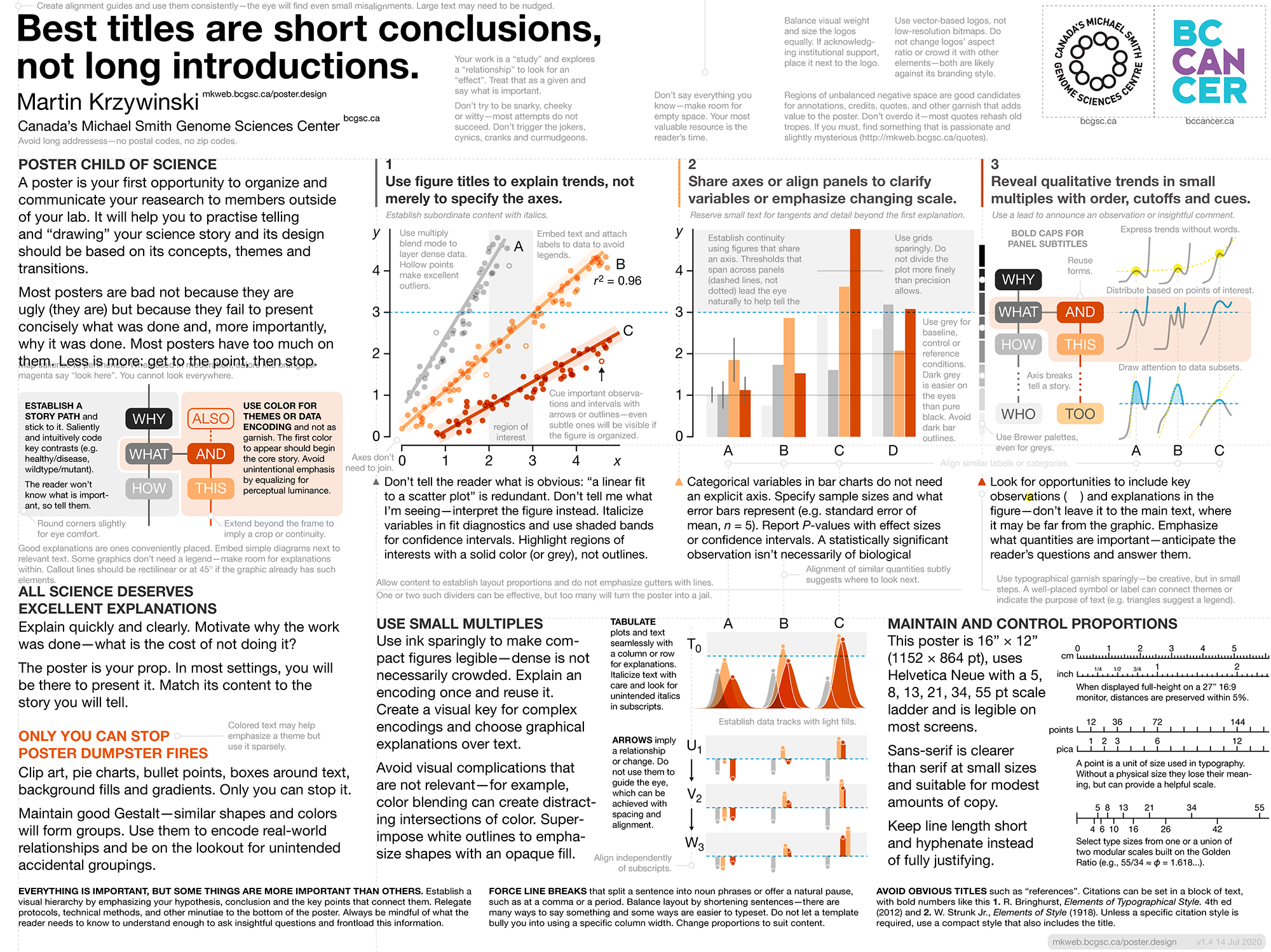
Poster Design Guidelines
Clear, concise, legible and compelling.
The PDF template is a poster about making posters. It provides design, typography and data visualiation tips with minimum fuss. Follow its advice until you have developed enough design sobriety and experience to know when to go your own way.
The SEIRS model for infectious disease dynamics
Realistic models of epidemics account for latency, loss of immunity, births and deaths.
We continue with our discussion about epidemic models and show how births, deaths and loss of immunity can create epidemic waves—a periodic fluctuation in the fraction of population that is infected.
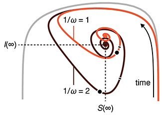
This column has an interactive supplemental component (download code) that allows you to explore epidemic waves and introduces the idea of the phase plane, a compact way to understand the evolution of an epidemic over its entire course.
Bjørnstad, O.N., Shea, K., Krzywinski, M. & Altman, N. (2020) Points of significance: The SEIRS model for infectious disease dynamics. Nature Methods 17:557–558.
Background reading
Bjørnstad, O.N., Shea, K., Krzywinski, M. & Altman, N. (2020) Points of significance: Modeling infectious epidemics. Nature Methods 17:455–456.
Gene Machines
Shifting soundscapes, textures and rhythmic loops produced by laboratory machines.
In commemoration of the 20th anniversary of Canada's Michael Smith Genome Sciences Centre, Segue was commissioned to create an original composition based on audio recordings from the GSC's laboratory equipment, robots and computers—to make “music” from the noise they produce.

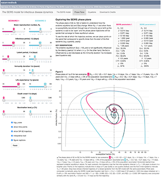
Virus Mutations Reveal How COVID-19 Really Spread
Genetic sequences of the coronavirus tell story of when the virus arrived in each country and where it came from.
Our graphic in Scientific American's Graphic Science section in the June 2020 issue shows a phylogenetic tree based on a snapshot of the data model from Nextstrain as of 31 March 2020.
Cover of Nature Cancer April 2020
Our design on the cover of Nature Cancer's April 2020 issue shows mutation spectra of patients from the POG570 cohort of 570 individuals with advanced metastatic cancer.

The cover design accompanies our report in the issue Pleasance, E., Titmuss, E., Williamson, L. et al. (2020) Pan-cancer analysis of advanced patient tumors reveals interactions between therapy and genomic landscapes. Nat Cancer 1:452–468.
Modeling infectious epidemics
Every day sadder and sadder news of its increase. In the City died this week 7496; and of them, 6102 of the plague. But it is feared that the true number of the dead this week is near 10,000 ....
—Samuel Pepys, 1665
This month, we begin a series of columns on epidemiological models. We start with the basic SIR model, which models the spread of an infection between three groups in a population: susceptible, infected and recovered.
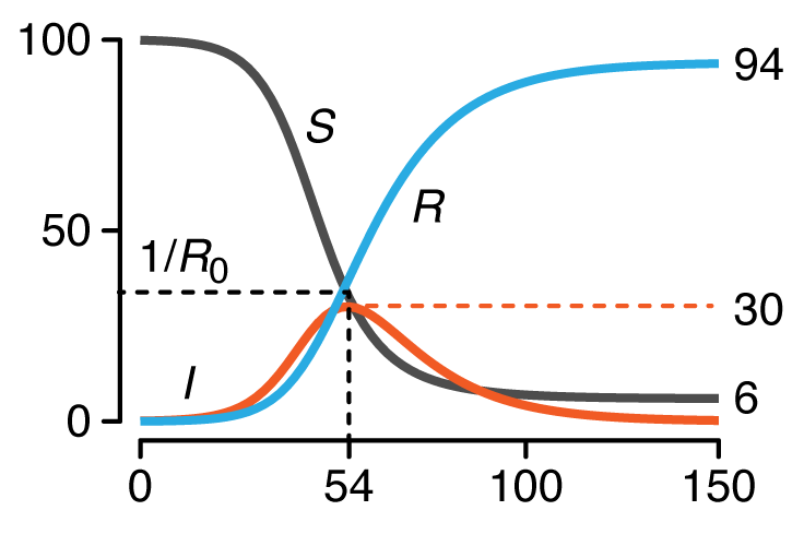
We discuss conditions under which an outbreak occurs, estimates of spread characteristics and the effects that mitigation can play on disease trajectories. We show the trends that arise when "flattenting the curve" by decreasing `R_0`.
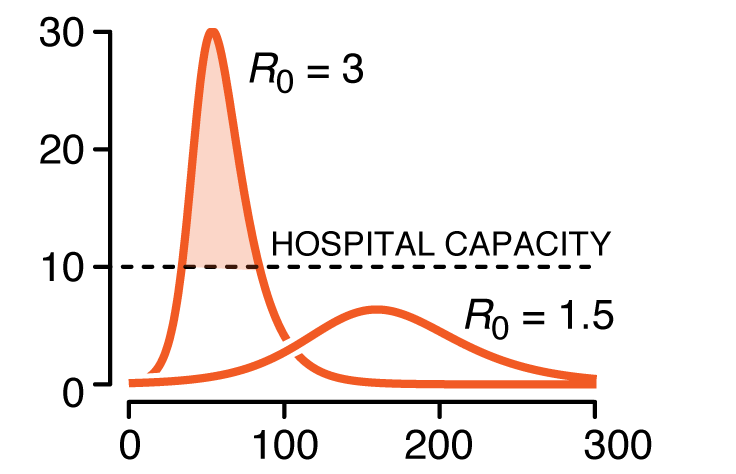
This column has an interactive supplemental component (download code) that allows you to explore how the model curves change with parameters such as infectious period, basic reproduction number and vaccination level.
Bjørnstad, O.N., Shea, K., Krzywinski, M. & Altman, N. (2020) Points of significance: Modeling infectious epidemics. Nature Methods 17:455–456.
The Outbreak Poems
I'm writing poetry daily to put my feelings into words more often during the COVID-19 outbreak.
Your hours
will
last me my years.
Hole in heart
is
bigger than you
were.
From hand to
heart
in a flutter.
Come fly in
my
heart for a while.
Can't feel you
in
my hand, dying.
Need new words,
please,
for these feelings.
Mini dee
you
put you in me.
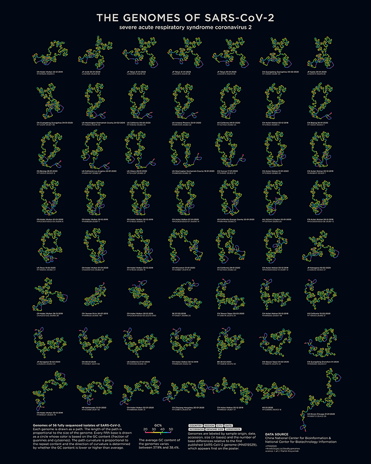
Deadly Genomes: Genome Structure and Size of Harmful Bacteria and Viruses
A poster full of epidemiological worry and statistics. Now updated with the genome of SARS-CoV-2 and COVID-19 case statistics as of 3 March 2020.
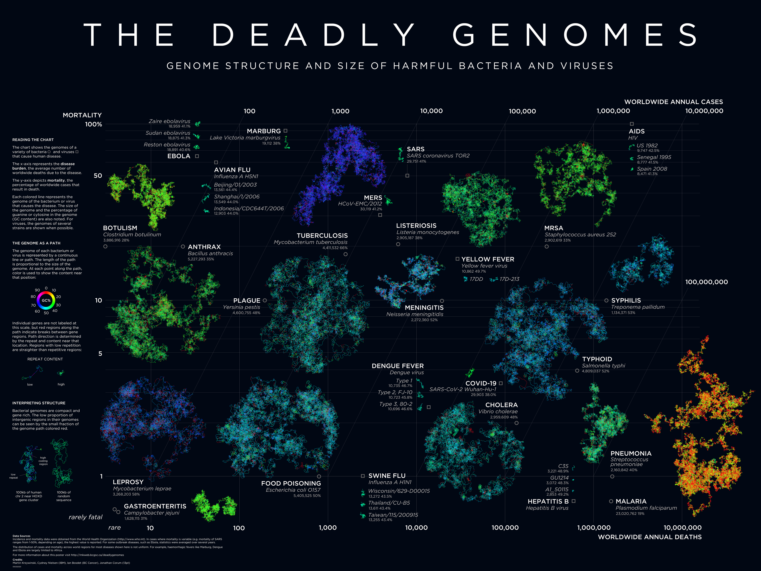
Bacterial and viral genomes of various diseases are drawn as paths with color encoding local GC content and curvature encoding local repeat content. Position of the genome encodes prevalence and mortality rate.
The deadly genomes collection has been updated with a posters of the genomes of SARS-CoV-2, the novel coronavirus that causes COVID-19.


Using Circos in Galaxy Australia Workshop
A workshop in using the Circos Galaxy wrapper by Hiltemann and Rasche. Event organized by Australian Biocommons.

Galaxy wrapper training materials, Saskia Hiltemann, Helena Rasche, 2020 Visualisation with Circos (Galaxy Training Materials).
Essence of Data Visualization in Bioinformatics Webinar
My webinar on fundamental concepts in data visualization and visual communication of scientific data and concepts. Event organized by Australian Biocommons.
Markov models — training and evaluation of hidden Markov models
With one eye you are looking at the outside world, while with the other you are looking within yourself.
—Amedeo Modigliani
Following up with our Markov Chain column and Hidden Markov model column, this month we look at how Markov models are trained using the example of biased coin.
We introduce the concepts of forward and backward probabilities and explicitly show how they are calculated in the training process using the Baum-Welch algorithm. We also discuss the value of ensemble models and the use of pseudocounts for cases where rare observations are expected but not necessarily seen.
Grewal, J., Krzywinski, M. & Altman, N. (2019) Points of significance: Markov models — training and evaluation of hidden Markov models. Nature Methods 17:121–122.
Background reading
Altman, N. & Krzywinski, M. (2019) Points of significance: Hidden Markov models. Nature Methods 16:795–796.
Altman, N. & Krzywinski, M. (2019) Points of significance: Markov Chains. Nature Methods 16:663–664.
Genome Sciences Center 20th Anniversary Clothing, Music, Drinks and Art
Science. Timeliness. Respect.
Read about the design of the clothing, music, drinks and art for the Genome Sciences Center 20th Anniversary Celebration, held on 15 November 2019.

As part of the celebration and with the help of our engineering team, we framed 48 flow cells from the lab.

Each flow cell was accompanied by an interpretive plaque explaining the technology behind the flow cell and the sample information and sequence content.

Scientific data visualization: Aesthetic for diagrammatic clarity
The scientific process works because all its output is empirically constrained.
My chapter from The Aesthetics of Scientific Data Representation, More than Pretty Pictures, in which I discuss the principles of data visualization and connect them to the concept of "quality" introduced by Robert Pirsig in Zen and the Art of Motorcycle Maintenance.
Yearning for the Infinite — Aleph 2
Discover Cantor's transfinite numbers through my music video for the Aleph 2 track of Max Cooper's Yearning for the Infinite (album page, event page).

I discuss the math behind the video and the system I built to create the video.
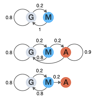
Hidden Markov Models
Everything we see hides another thing, we always want to see what is hidden by what we see.
—Rene Magritte
A Hidden Markov Model extends a Markov chain to have hidden states. Hidden states are used to model aspects of the system that cannot be directly observed and themselves form a Markov chain and each state may emit one or more observed values.
Hidden states in HMMs do not have to have meaning—they can be used to account for measurement errors, compress multi-modal observational data, or to detect unobservable events.
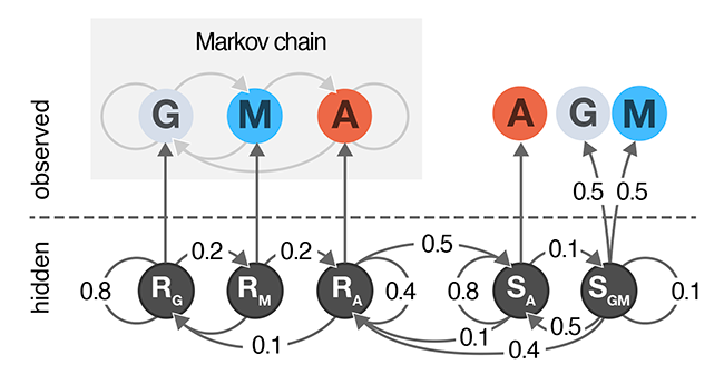
In this column, we extend the cell growth model from our Markov Chain column to include two hidden states: normal and sedentary.
We show how to calculate forward probabilities that can predict the most likely path through the HMM given an observed sequence.
Grewal, J., Krzywinski, M. & Altman, N. (2019) Points of significance: Hidden Markov Models. Nature Methods 16:795–796.
Background reading
Altman, N. & Krzywinski, M. (2019) Points of significance: Markov Chains. Nature Methods 16:663–664.
Hola Mundo Cover
My cover design for Hola Mundo by Hannah Fry. Published by Blackie Books.
Curious how the design was created? Read the full details.
Markov Chains
You can look back there to explain things,
but the explanation disappears.
You'll never find it there.
Things are not explained by the past.
They're explained by what happens now.
—Alan Watts
A Markov chain is a probabilistic model that is used to model how a system changes over time as a series of transitions between states. Each transition is assigned a probability that defines the chance of the system changing from one state to another.
Together with the states, these transitions probabilities define a stochastic model with the Markov property: transition probabilities only depend on the current state—the future is independent of the past if the present is known.
Once the transition probabilities are defined in matrix form, it is easy to predict the distribution of future states of the system. We cover concepts of aperiodicity, irreducibility, limiting and stationary distributions and absorption.
This column is the first part of a series and pairs particularly well with Alan Watts and Blond:ish.
Grewal, J., Krzywinski, M. & Altman, N. (2019) Points of significance: Markov Chains. Nature Methods 16:663–664.
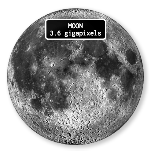
1-bit zoomable gigapixel maps of Moon, Solar System and Sky
Places to go and nobody to see.
Exquisitely detailed maps of places on the Moon, comets and asteroids in the Solar System and stars, deep-sky objects and exoplanets in the northern and southern sky. All maps are zoomable.


Quantile regression
Quantile regression robustly estimates the typical and extreme values of a response.Quantile regression explores the effect of one or more predictors on quantiles of the response. It can answer questions such as "What is the weight of 90% of individuals of a given height?"
Unlike in traditional mean regression methods, no assumptions about the distribution of the response are required, which makes it practical, robust and amenable to skewed distributions.
Quantile regression is also very useful when extremes are interesting or when the response variance varies with the predictors.
Das, K., Krzywinski, M. & Altman, N. (2019) Points of significance: Quantile regression. Nature Methods 16:451–452.
Background reading
Altman, N. & Krzywinski, M. (2015) Points of significance: Simple linear regression. Nature Methods 12:999–1000.
Analyzing outliers: Robust methods to the rescue
Robust regression generates more reliable estimates by detecting and downweighting outliers.Outliers can degrade the fit of linear regression models when the estimation is performed using the ordinary least squares. The impact of outliers can be mitigated with methods that provide robust inference and greater reliability in the presence of anomalous values.
We discuss MM-estimation and show how it can be used to keep your fitting sane and reliable.
Greco, L., Luta, G., Krzywinski, M. & Altman, N. (2019) Points of significance: Analyzing outliers: Robust methods to the rescue. Nature Methods 16:275–276.
Background reading
Altman, N. & Krzywinski, M. (2016) Points of significance: Analyzing outliers: Influential or nuisance. Nature Methods 13:281–282.
Two-level factorial experiments
To find which experimental factors have an effect, simultaneously examine the difference between the high and low levels of each.Two-level factorial experiments, in which all combinations of multiple factor levels are used, efficiently estimate factor effects and detect interactions—desirable statistical qualities that can provide deep insight into a system.
They offer two benefits over the widely used one-factor-at-a-time (OFAT) experiments: efficiency and ability to detect interactions.
Since the number of factor combinations can quickly increase, one approach is to model only some of the factorial effects using empirically-validated assumptions of effect sparsity and effect hierarchy. Effect sparsity tells us that in factorial experiments most of the factorial terms are likely to be unimportant. Effect hierarchy tells us that low-order terms (e.g. main effects) tend to be larger than higher-order terms (e.g. two-factor or three-factor interactions).
Smucker, B., Krzywinski, M. & Altman, N. (2019) Points of significance: Two-level factorial experiments Nature Methods 16:211–212.
Background reading
Krzywinski, M. & Altman, N. (2014) Points of significance: Designing comparative experiments.. Nature Methods 11:597–598.
Happy 2019 `\pi` Day—
Digits, internationally
Celebrate `\pi` Day (March 14th) and set out on an exploration explore accents unknown (to you)!
This year is purely typographical, with something for everyone. Hundreds of digits and hundreds of languages.
A special kids' edition merges math with color and fat fonts.


Check out art from previous years: 2013 `\pi` Day and 2014 `\pi` Day, 2015 `\pi` Day, 2016 `\pi` Day, 2017 `\pi` Day and 2018 `\pi` Day.
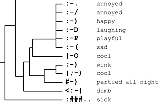
Tree of Emotional Life
One moment you're :) and the next you're :-.
Make sense of it all with my Tree of Emotional life—a hierarchical account of how we feel.
Find and snap to colors in an image
One of my color tools, the colorsnap application snaps colors in an image to a set of reference colors and reports their proportion.
Below is Times Square rendered using the colors of the MTA subway lines.
Colors used by the New York MTA subway lines.


Take your medicine ... now
Drugs could be more effective if taken when the genetic proteins they target are most active.
Design tip: rediscover CMYK primaries.
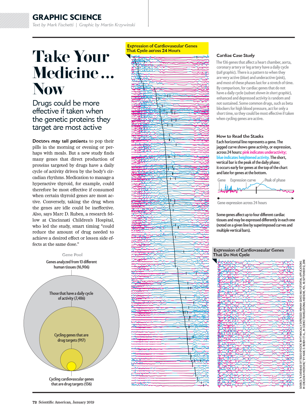
More of my American Scientific Graphic Science designs
Ruben et al. A database of tissue-specific rhythmically expressed human genes has potential applications in circadian medicine Science Translational Medicine 10 Issue 458, eaat8806.
Predicting with confidence and tolerance
I abhor averages. I like the individual case. —J.D. Brandeis.We focus on the important distinction between confidence intervals, typically used to express uncertainty of a sampling statistic such as the mean and, prediction and tolerance intervals, used to make statements about the next value to be drawn from the population.
Confidence intervals provide coverage of a single point—the population mean—with the assurance that the probability of non-coverage is some acceptable value (e.g. 0.05). On the other hand, prediction and tolerance intervals both give information about typical values from the population and the percentage of the population expected to be in the interval. For example, a tolerance interval can be configured to tell us what fraction of sampled values (e.g. 95%) will fall into an interval some fraction of the time (e.g. 95%).
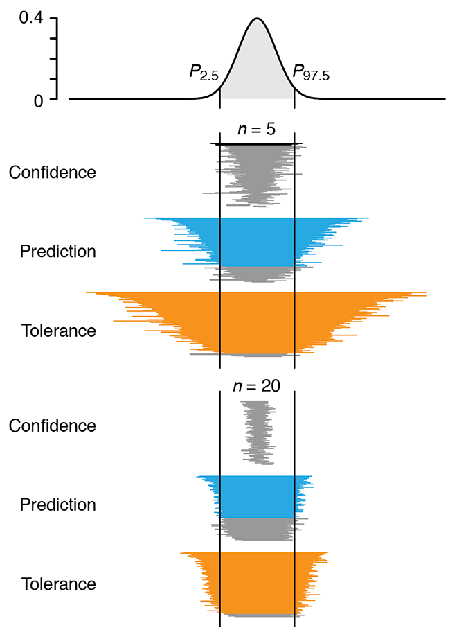
Altman, N. & Krzywinski, M. (2018) Points of significance: Predicting with confidence and tolerance Nature Methods 15:843–844.
Background reading
Krzywinski, M. & Altman, N. (2013) Points of significance: Importance of being uncertain. Nature Methods 10:809–810.
4-day Circos course
A 4-day introductory course on genome data parsing and visualization using Circos. Prepared for the Bioinformatics and Genome Analysis course in Institut Pasteur Tunis, Tunis, Tunisia.
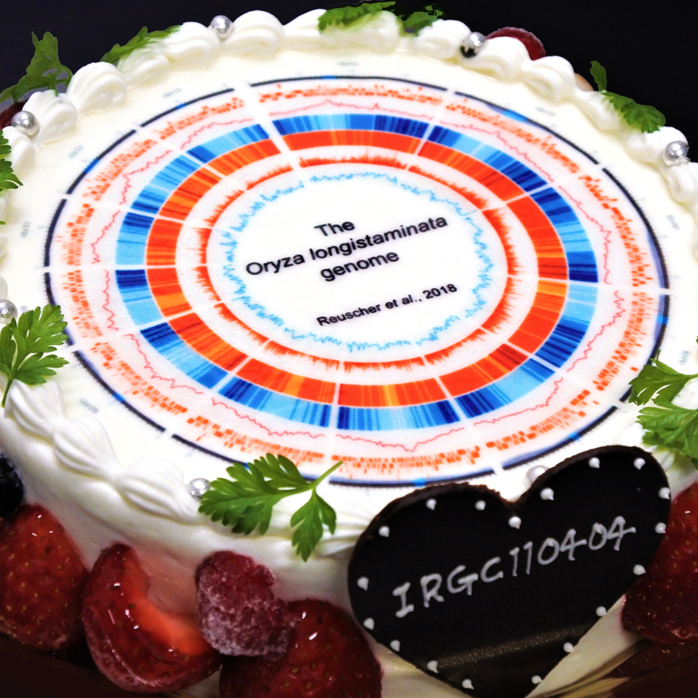
Oryza longistaminata genome cake
Data visualization should be informative and, where possible, tasty.
Stefan Reuscher from Bioscience and Biotechnology Center at Nagoya University celebrates a publication with a Circos cake.
The cake shows an overview of a de-novo assembled genome of a wild rice species Oryza longistaminata.
Optimal experimental design
Customize the experiment for the setting instead of adjusting the setting to fit a classical design.The presence of constraints in experiments, such as sample size restrictions, awkward blocking or disallowed treatment combinations may make using classical designs very difficult or impossible.
Optimal design is a powerful, general purpose alternative for high quality, statistically grounded designs under nonstandard conditions.
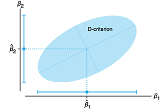
We discuss two types of optimal designs (D-optimal and I-optimal) and show how it can be applied to a scenario with sample size and blocking constraints.
Smucker, B., Krzywinski, M. & Altman, N. (2018) Points of significance: Optimal experimental design Nature Methods 15:599–600.
Background reading
Krzywinski, M., Altman, N. (2014) Points of significance: Two factor designs. Nature Methods 11:1187–1188.
Krzywinski, M. & Altman, N. (2014) Points of significance: Analysis of variance (ANOVA) and blocking. Nature Methods 11:699–700.
Krzywinski, M. & Altman, N. (2014) Points of significance: Designing comparative experiments. Nature Methods 11:597–598.
The Whole Earth Cataloguer
All the living things.An illustration of the Tree of Life, showing some of the key branches.
The tree is drawn as a DNA double helix, with bases colored to encode ribosomal RNA genes from various organisms on the tree.
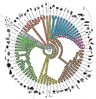
All living things on earth descended from a single organism called LUCA (last universal common ancestor) and inherited LUCA’s genetic code for basic biological functions, such as translating DNA and creating proteins. Constant genetic mutations shuffled and altered this inheritance and added new genetic material—a process that created the diversity of life we see today. The “tree of life” organizes all organisms based on the extent of shuffling and alteration between them. The full tree has millions of branches and every living organism has its own place at one of the leaves in the tree. The simplified tree shown here depicts all three kingdoms of life: bacteria, archaebacteria and eukaryota. For some organisms a grey bar shows when they first appeared in the tree in millions of years (Ma). The double helix winding around the tree encodes highly conserved ribosomal RNA genes from various organisms.
Johnson, H.L. (2018) The Whole Earth Cataloguer, Sactown, Jun/Jul, p. 89
Why we can't give up this odd way of typing
All fingers report to home row.An article about keyboard layouts and the history and persistence of QWERTY.
My Carpalx keyboard optimization software is mentioned along with my World's Most Difficult Layout: TNWMLC. True typing hell.

McDonald, T. (2018) Why we can't give up this odd way of typing, BBC, 25 May 2018.
Molecular Case Studies Cover
The theme of the April issue of Molecular Case Studies is precision oncogenomics. We have three papers in the issue based on work done in our Personalized Oncogenomics Program (POG).
The covers of Molecular Case Studies typically show microscopy images, with some shown in a more abstract fashion. There's also the occasional Circos plot.
I've previously taken a more fine-art approach to cover design, such for those of Nature, Genome Research and Trends in Genetics. I've used microscopy images to create a cover for PNAS—the one that made biology look like astrophysics—and thought that this is kind of material I'd start with for the MCS cover.

Happy 2018 `\tau` Day—Art for everyone

Universe Superclusters and Voids
A map of the nearby superclusters and voids in the Unvierse.
By "nearby" I mean within 6,000 million light-years.

Datavis for your feet—the 178.75 lb socks
In the past, I've been tangentially involved in fashion design. I've also been more directly involved in fashion photography.
It was now time to design my first ... pair of socks.

In collaboration with Flux Socks, the design features the colors and relative thicknesses of Rogue olympic weightlifting plates. The first four plates in the stack are the 55, 45, 35, and 25 competition plates. The top 4 plates are the 10, 5, 2.5 and 1.25 lb change plates.
The perceived weight of each sock is 178.75 lb and 357.5 lb for the pair.
The actual weight is much less.
Genes Behind Psychiatric Disorders
Find patterns behind gene expression and disease.
Expression, correlation and network module membership of 11,000+ genes and 5 psychiatric disorders in about 6" x 7" on a single page.
Design tip: Stay calm.

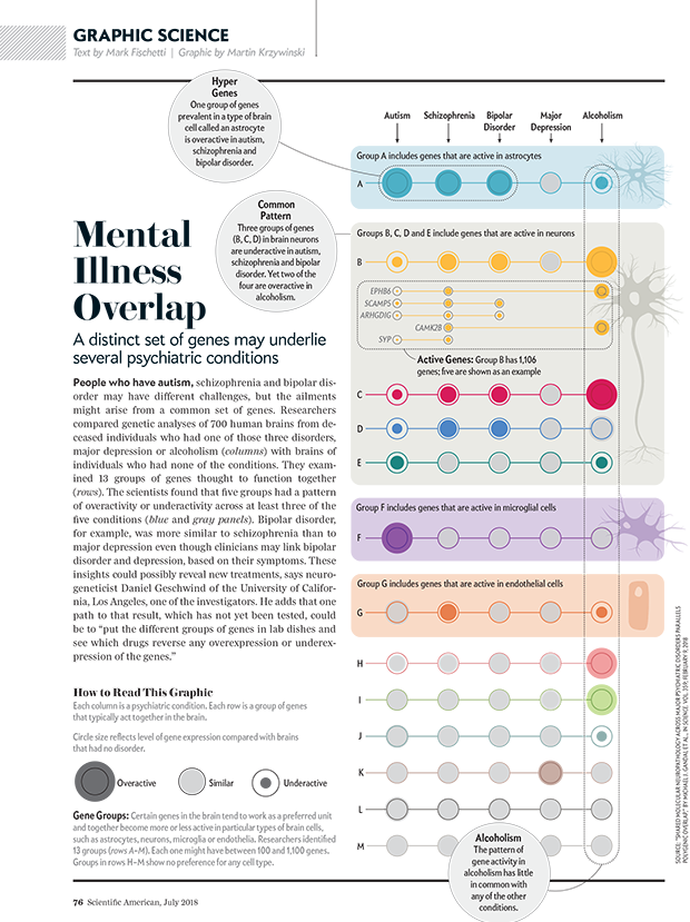
More of my American Scientific Graphic Science designs
Gandal M.J. et al. Shared Molecular Neuropathology Across Major Psychiatric Disorders Parallels Polygenic Overlap Science 359 693–697 (2018)
Curse(s) of dimensionality
There is such a thing as too much of a good thing.We discuss the many ways in which analysis can be confounded when data has a large number of dimensions (variables). Collectively, these are called the "curses of dimensionality".
Some of these are unintuitive, such as the fact that the volume of the hypersphere increases and then shrinks beyond about 7 dimensions, while the volume of the hypercube always increases. This means that high-dimensional space is "mostly corners" and the distance between points increases greatly with dimension. This has consequences on correlation and classification.
Statistics vs Machine Learning
We conclude our series on Machine Learning with a comparison of two approaches: classical statistical inference and machine learning. The boundary between them is subject to debate, but important generalizations can be made.Inference creates a mathematical model of the datageneration process to formalize understanding or test a hypothesis about how the system behaves. Prediction aims at forecasting unobserved outcomes or future behavior. Typically we want to do both and know how biological processes work and what will happen next. Inference and ML are complementary in pointing us to biologically meaningful conclusions.
Statistics asks us to choose a model that incorporates our knowledge of the system, and ML requires us to choose a predictive algorithm by relying on its empirical capabilities. Justification for an inference model typically rests on whether we feel it adequately captures the essence of the system. The choice of pattern-learning algorithms often depends on measures of past performance in similar scenarios.
Bzdok, D., Krzywinski, M. & Altman, N. (2018) Points of Significance: Statistics vs machine learning. Nature Methods 15:233–234.
Background reading
Bzdok, D., Krzywinski, M. & Altman, N. (2017) Points of Significance: Machine learning: a primer. Nature Methods 14:1119–1120.
Bzdok, D., Krzywinski, M. & Altman, N. (2017) Points of Significance: Machine learning: supervised methods. Nature Methods 15:5–6.
Happy 2018 `\pi` Day—Boonies, burbs and boutiques of `\pi`
Celebrate `\pi` Day (March 14th) and go to brand new places. Together with Jake Lever, this year we shrink the world and play with road maps.
Streets are seamlessly streets from across the world. Finally, a halva shop on the same block!
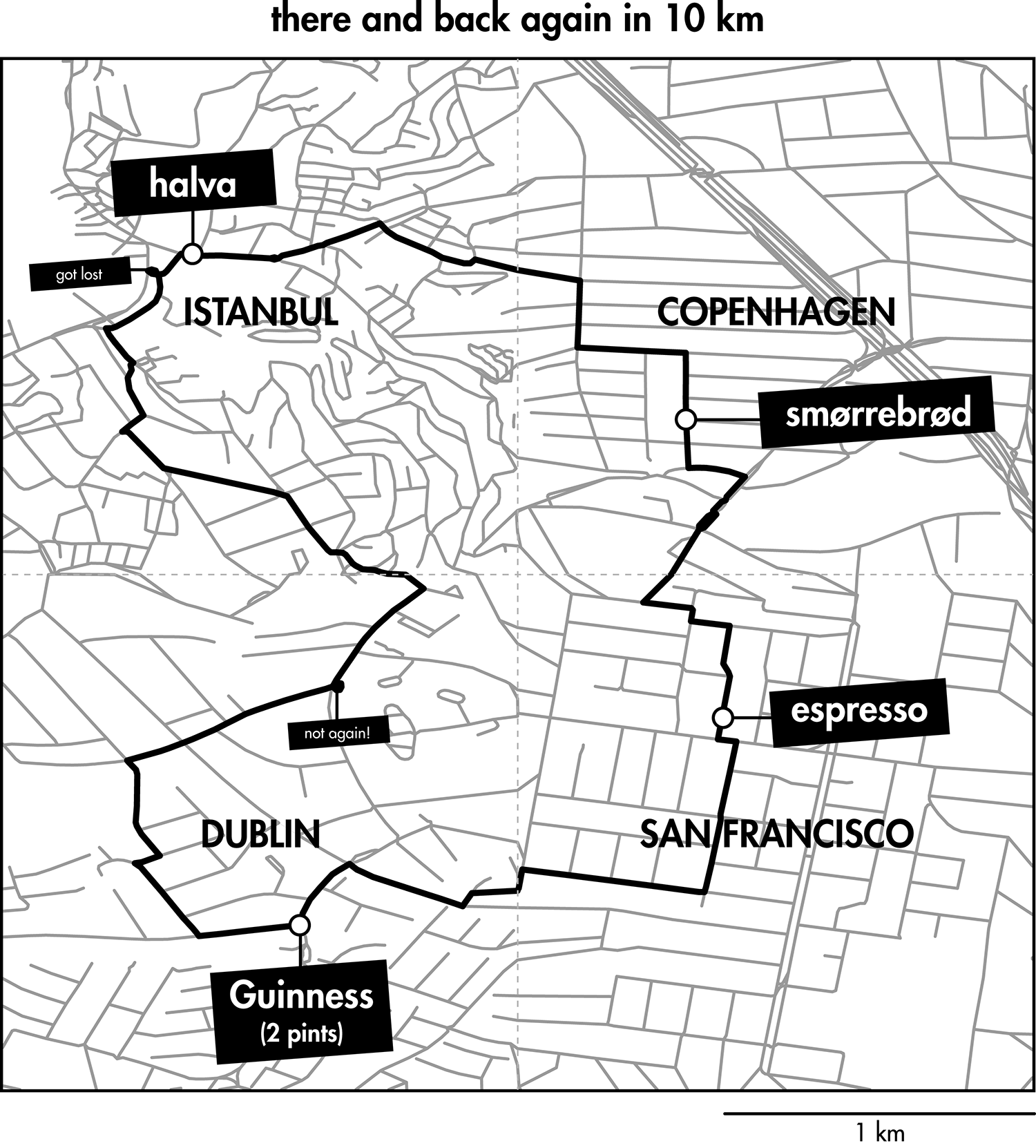
Intriguing and personal patterns of urban development for each city appear in the Boonies, Burbs and Boutiques series.
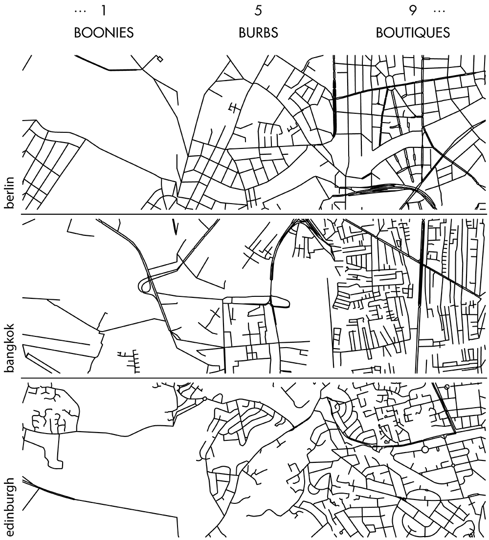
No color—just lines. Lines from Marrakesh, Prague, Istanbul, Nice and other destinations for the mind and the heart.

The art is featured in the Pi City on the Scientific American SA Visual blog.
Check out art from previous years: 2013 `\pi` Day and 2014 `\pi` Day, 2015 `\pi` Day, 2016 `\pi` Day and 2017 `\pi` Day.
Machine learning: supervised methods (SVM & kNN)
Supervised learning algorithms extract general principles from observed examples guided by a specific prediction objective.We examine two very common supervised machine learning methods: linear support vector machines (SVM) and k-nearest neighbors (kNN).
SVM is often less computationally demanding than kNN and is easier to interpret, but it can identify only a limited set of patterns. On the other hand, kNN can find very complex patterns, but its output is more challenging to interpret.
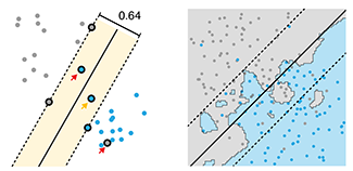
We illustrate SVM using a data set in which points fall into two categories, which are separated in SVM by a straight line "margin". SVM can be tuned using a parameter that influences the width and location of the margin, permitting points to fall within the margin or on the wrong side of the margin. We then show how kNN relaxes explicit boundary definitions, such as the straight line in SVM, and how kNN too can be tuned to create more robust classification.
Bzdok, D., Krzywinski, M. & Altman, N. (2018) Points of Significance: Machine learning: a primer. Nature Methods 15:5–6.
Background reading
Bzdok, D., Krzywinski, M. & Altman, N. (2017) Points of Significance: Machine learning: a primer. Nature Methods 14:1119–1120.
Human Versus Machine
Balancing subjective design with objective optimization.In a Nature graphics blog article, I present my process behind designing the stark black-and-white Nature 10 cover.

Nature 10, 18 December 2017
Machine learning: a primer
Machine learning extracts patterns from data without explicit instructions.In this primer, we focus on essential ML principles— a modeling strategy to let the data speak for themselves, to the extent possible.
The benefits of ML arise from its use of a large number of tuning parameters or weights, which control the algorithm’s complexity and are estimated from the data using numerical optimization. Often ML algorithms are motivated by heuristics such as models of interacting neurons or natural evolution—even if the underlying mechanism of the biological system being studied is substantially different. The utility of ML algorithms is typically assessed empirically by how well extracted patterns generalize to new observations.

We present a data scenario in which we fit to a model with 5 predictors using polynomials and show what to expect from ML when noise and sample size vary. We also demonstrate the consequences of excluding an important predictor or including a spurious one.
Bzdok, D., Krzywinski, M. & Altman, N. (2017) Points of Significance: Machine learning: a primer. Nature Methods 14:1119–1120.
Snowflake simulation
Symmetric, beautiful and unique.Just in time for the season, I've simulated a snow-pile of snowflakes based on the Gravner-Griffeath model.

The work is described as a wintertime tale in In Silico Flurries: Computing a world of snow and co-authored with Jake Lever in the Scientific American SA Blog.
Gravner, J. & Griffeath, D. (2007) Modeling Snow Crystal Growth II: A mesoscopic lattice map with plausible dynamics.
Genes that make us sick
Where disease hides in the genome.My illustration of the location of genes in the human genome that are implicated in disease appears in The Objects that Power the Global Economy, a book by Quartz.

Ensemble methods: Bagging and random forests
Many heads are better than one.We introduce two common ensemble methods: bagging and random forests. Both of these methods repeat a statistical analysis on a bootstrap sample to improve the accuracy of the predictor. Our column shows these methods as applied to Classification and Regression Trees.

For example, we can sample the space of values more finely when using bagging with regression trees because each sample has potentially different boundaries at which the tree splits.
Random forests generate a large number of trees by not only generating bootstrap samples but also randomly choosing which predictor variables are considered at each split in the tree.
Krzywinski, M. & Altman, N. (2017) Points of Significance: Ensemble methods: bagging and random forests. Nature Methods 14:933–934.
Background reading
Krzywinski, M. & Altman, N. (2017) Points of Significance: Classification and regression trees. Nature Methods 14:757–758.
Classification and regression trees
Decision trees are a powerful but simple prediction method.Decision trees classify data by splitting it along the predictor axes into partitions with homogeneous values of the dependent variable. Unlike logistic or linear regression, CART does not develop a prediction equation. Instead, data are predicted by a series of binary decisions based on the boundaries of the splits. Decision trees are very effective and the resulting rules are readily interpreted.
Trees can be built using different metrics that measure how well the splits divide up the data classes: Gini index, entropy or misclassification error.
When the predictor variable is quantitative and not categorical, regression trees are used. Here, the data are still split but now the predictor variable is estimated by the average within the split boundaries. Tree growth can be controlled using the complexity parameter, a measure of the relative improvement of each new split.
Individual trees can be very sensitive to minor changes in the data and even better prediction can be achieved by exploiting this variability. Using ensemble methods, we can grow multiple trees from the same data.
Krzywinski, M. & Altman, N. (2017) Points of Significance: Classification and regression trees. Nature Methods 14:757–758.
Background reading
Lever, J., Krzywinski, M. & Altman, N. (2016) Points of Significance: Logistic regression. Nature Methods 13:541-542.
Altman, N. & Krzywinski, M. (2015) Points of Significance: Multiple Linear Regression Nature Methods 12:1103-1104.
Lever, J., Krzywinski, M. & Altman, N. (2016) Points of Significance: Classifier evaluation. Nature Methods 13:603-604.
Lever, J., Krzywinski, M. & Altman, N. (2016) Points of Significance: Model Selection and Overfitting. Nature Methods 13:703-704.
Lever, J., Krzywinski, M. & Altman, N. (2016) Points of Significance: Regularization. Nature Methods 13:803-804.
Personal Oncogenomics Program 5 Year Anniversary Art
The artwork was created in collaboration with my colleagues at the Genome Sciences Center to celebrate the 5 year anniversary of the Personalized Oncogenomics Program (POG).
The Personal Oncogenomics Program (POG) is a collaborative research study including many BC Cancer Agency oncologists, pathologists and other clinicians along with Canada's Michael Smith Genome Sciences Centre with support from BC Cancer Foundation.
The aim of the program is to sequence, analyze and compare the genome of each patient's cancer—the entire DNA and RNA inside tumor cells— in order to understand what is enabling it to identify less toxic and more effective treatment options.
Principal component analysis
PCA helps you interpret your data, but it will not always find the important patterns.Principal component analysis (PCA) simplifies the complexity in high-dimensional data by reducing its number of dimensions.
To retain trend and patterns in the reduced representation, PCA finds linear combinations of canonical dimensions that maximize the variance of the projection of the data.
PCA is helpful in visualizing high-dimensional data and scatter plots based on 2-dimensional PCA can reveal clusters.
Altman, N. & Krzywinski, M. (2017) Points of Significance: Principal component analysis. Nature Methods 14:641–642.
Background reading
Altman, N. & Krzywinski, M. (2017) Points of Significance: Clustering. Nature Methods 14:545–546.
`k` index: a weightlighting and Crossfit performance measure
Similar to the `h` index in publishing, the `k` index is a measure of fitness performance.
To achieve a `k` index for a movement you must perform `k` unbroken reps at `k`% 1RM.
The expected value for the `k` index is probably somewhere in the range of `k = 26` to `k=35`, with higher values progressively more difficult to achieve.
In my `k` index introduction article I provide detailed explanation, rep scheme table and WOD example.
Dark Matter of the English Language—the unwords
I've applied the char-rnn recurrent neural network to generate new words, names of drugs and countries.
The effect is intriguing and facetious—yes, those are real words.
But these are not: necronology, abobionalism, gabdologist, and nonerify.
These places only exist in the mind: Conchar and Pobacia, Hzuuland, New Kain, Rabibus and Megee Islands, Sentip and Sitina, Sinistan and Urzenia.
And these are the imaginary afflictions of the imagination: ictophobia, myconomascophobia, and talmatomania.
And these, of the body: ophalosis, icabulosis, mediatopathy and bellotalgia.
Want to name your baby? Or someone else's baby? Try Ginavietta Xilly Anganelel or Ferandulde Hommanloco Kictortick.
When taking new therapeutics, never mix salivac and labromine. And don't forget that abadarone is best taken on an empty stomach.
And nothing increases the chance of getting that grant funded than proposing the study of a new –ome! We really need someone to looking into the femome and manome.
Dark Matter of the Genome—the nullomers
An exploration of things that are missing in the human genome. The nullomers.
Julia Herold, Stefan Kurtz and Robert Giegerich. Efficient computation of absent words in genomic sequences. BMC Bioinformatics (2008) 9:167
Clustering
Clustering finds patterns in data—whether they are there or not.We've already seen how data can be grouped into classes in our series on classifiers. In this column, we look at how data can be grouped by similarity in an unsupervised way.
We look at two common clustering approaches: `k`-means and hierarchical clustering. All clustering methods share the same approach: they first calculate similarity and then use it to group objects into clusters. The details of the methods, and outputs, vary widely.
Altman, N. & Krzywinski, M. (2017) Points of Significance: Clustering. Nature Methods 14:545–546.
Background reading
Lever, J., Krzywinski, M. & Altman, N. (2016) Points of Significance: Logistic regression. Nature Methods 13:541-542.
Lever, J., Krzywinski, M. & Altman, N. (2016) Points of Significance: Classifier evaluation. Nature Methods 13:603-604.
What's wrong with pie charts?
In this redesign of a pie chart figure from a Nature Medicine article [1], I look at how to organize and present a large number of categories.
I first discuss some of the benefits of a pie chart—there are few and specific—and its shortcomings—there are few but fundamental.
I then walk through the redesign process by showing how the tumor categories can be shown more clearly if they are first aggregated into a small number groups.
(bottom left) Figure 2b from Zehir et al. Mutational landscape of metastatic cancer revealed from prospective clinical sequencing of 10,000 patients. (2017) Nature Medicine doi:10.1038/nm.4333
Tabular Data
Tabulating the number of objects in categories of interest dates back to the earliest records of commerce and population censuses.After 30 columns, this is our first one without a single figure. Sometimes a table is all you need.
In this column, we discuss nominal categorical data, in which data points are assigned to categories in which there is no implied order. We introduce one-way and two-way tables and the `\chi^2` and Fisher's exact tests.
Altman, N. & Krzywinski, M. (2017) Points of Significance: Tabular data. Nature Methods 14:329–330.
Happy 2017 `\pi` Day—Star Charts, Creatures Once Living and a Poem
on a brim of echo,
capsized chamber
drawn into our constellation, and cooling.
—Paolo Marcazzan
Celebrate `\pi` Day (March 14th) with star chart of the digits. The charts draw 40,000 stars generated from the first 12 million digits.

The 80 constellations are extinct animals and plants. Here you'll find old friends and new stories. Read about how Desmodus is always trying to escape or how Megalodon terrorizes the poor Tecopa! Most constellations have a story.

This year I collaborate with Paolo Marcazzan, a Canadian poet, who contributes a poem, Of Black Body, about space and things we might find and lose there.
Check out art from previous years: 2013 `\pi` Day and 2014 `\pi` Day, 2015 `\pi` Day and and 2016 `\pi` Day.
Data in New Dimensions: convergence of art, genomics and bioinformatics
Art is science in love.
— E.F. Weisslitz
A behind-the-scenes look at the making of our stereoscopic images which were at display at the AGBT 2017 Conference in February. The art is a creative collaboration with Becton Dickinson and The Linus Group.
Its creation began with the concept of differences and my writeup of the creative and design process focuses on storytelling and how concept of differences is incorporated into the art.
Oh, and this might be a good time to pick up some red-blue 3D glasses.

Interpreting P values
A P value measures a sample’s compatibility with a hypothesis, not the truth of the hypothesis.This month we continue our discussion about `P` values and focus on the fact that `P` value is a probability statement about the observed sample in the context of a hypothesis, not about the hypothesis being tested.
Given that we are always interested in making inferences about hypotheses, we discuss how `P` values can be used to do this by way of the Benjamin-Berger bound, `\bar{B}` on the Bayes factor, `B`.
Heuristics such as these are valuable in helping to interpret `P` values, though we stress that `P` values vary from sample to sample and hence many sources of evidence need to be examined before drawing scientific conclusions.
Altman, N. & Krzywinski, M. (2017) Points of Significance: Interpreting P values. Nature Methods 14:213–214.
Background reading
Krzywinski, M. & Altman, N. (2017) Points of significance: P values and the search for significance. Nature Methods 14:3–4.
Krzywinski, M. & Altman, N. (2013) Points of significance: Significance, P values and t–tests. Nature Methods 10:1041–1042.
Snellen Charts—Typography to Really Look at
Another collection of typographical posters. These ones really ask you to look.

The charts show a variety of interesting symbols and operators found in science and math. The design is in the style of a Snellen chart and typset with the Rockwell font.
Essentials of Data Visualization—8-part video series

In collaboration with the Phil Poronnik and Kim Bell-Anderson at the University of Sydney, I'm delighted to share with you our 8-part video series project about thinking about drawing data and communicating science.

We've created 8 videos, each focusing on a different essential idea in data visualization: encoding, shapes, color, uncertainty, design, drawing missing or unobserved data, labels and process.
The videos were designed as teaching materials. Each video comes with a slide deck and exercises.
P values and the search for significance
Little P valueWhat are you trying to say
Of significance?
—Steve Ziliak
We've written about P values before and warned readers about common misconceptions about them, which are so rife that the American Statistical Association itself has a long statement about them.
This month is our first of a two-part article about P values. Here we look at 'P value hacking' and 'data dredging', which are questionable practices that invalidate the correct interpretation of P values.
We also illustrate how P values can lead us astray by asking "What is the smallest P value we can expect if the null hypothesis is true but we have done many tests, either explicitly or implicitly?"
Incidentally, this is our first column in which the standfirst is a haiku.
Altman, N. & Krzywinski, M. (2017) Points of Significance: P values and the search for significance. Nature Methods 14:3–4.
Background reading
Krzywinski, M. & Altman, N. (2013) Points of significance: Significance, P values and t–tests. Nature Methods 10:1041–1042.
Intuitive Design
Appeal to intuition when designing with value judgments in mind.
Figure clarity and concision are improved when the selection of shapes and colors is grounded in the Gestalt principles, which describe how we visually perceive and organize information.

The Gestalt principles are value free. For example, they tell us how we group objects but do not speak to any meaning that we might intuitively infer from visual characteristics.
This month, we discuss how appealing to such intuitions—related to shapes, colors and spatial orientation— can help us add information to a figure as well as anticipate and encourage useful interpretations.
Krzywinski, M. (2016) Points of View: Intuitive Design. Nature Methods 13:895.
Regularization
Constraining the magnitude of parameters of a model can control its complexity.
This month we continue our discussion about model selection and evaluation and address how to choose a model that avoids both overfitting and underfitting.
Ideally, we want to avoid having either an underfitted model, which is usually a poor fit to the training data, or an overfitted model, which is a good fit to the training data but not to new data.
Regularization is a process that penalizes the magnitude of model parameters. This is done by not only minimizing the SSE, `\mathrm{SSE} = \sum_i (y_i - \hat{y}_i)^2 `, as is done normally in a fit, but adding to this minimized quantity the sum of the mode's squared parameters, `\mathrm{SSE} + \lambda \sum_i \hat{\beta}^2_i`.
Lever, J., Krzywinski, M. & Altman, N. (2016) Points of Significance: Regularization. Nature Methods 13:803-804.
Background reading
Lever, J., Krzywinski, M. & Altman, N. (2016) Points of Significance: Model Selection and Overfitting. Nature Methods 13:703-704.
Lever, J., Krzywinski, M. & Altman, N. (2016) Points of Significance: Classifier evaluation. Nature Methods 13:603-604.
Lever, J., Krzywinski, M. & Altman, N. (2016) Points of Significance: Logistic regression. Nature Methods 13:541-542.
Model Selection and Overfitting
With four parameters I can fit an elephant and with five I can make him wiggle his trunk. —John von Neumann.
By increasing the complexity of a model, it is easy to make it fit to data perfectly. Does this mean that the model is perfectly suitable? No.
When a model has a relatively large number of parameters, it is likely to be influenced by the noise in the data, which varies across observations, as much as any underlying trend, which remains the same. Such a model is overfitted—it matches training data well but does not generalize to new observations.
We discuss the use of training, validation and testing data sets and how they can be used, with methods such as cross-validation, to avoid overfitting.
Lever, J., Krzywinski, M. & Altman, N. (2016) Points of Significance: Model Selection and Overfitting. Nature Methods 13:703-704.
Background reading
Lever, J., Krzywinski, M. & Altman, N. (2016) Points of Significance: Classifier evaluation. Nature Methods 13:603-604.
Lever, J., Krzywinski, M. & Altman, N. (2016) Points of Significance: Logistic regression. Nature Methods 13:541-542.
Classifier Evaluation
It is important to understand both what a classification metric expresses and what it hides.
We examine various metrics use to assess the performance of a classifier. We show that a single metric is insufficient to capture performance—for any metric, a variety of scenarios yield the same value.
We also discuss ROC and AUC curves and how their interpretation changes based on class balance.
Lever, J., Krzywinski, M. & Altman, N. (2016) Points of Significance: Classifier evaluation. Nature Methods 13:603-604.
Background reading
Lever, J., Krzywinski, M. & Altman, N. (2016) Points of Significance: Logistic regression. Nature Methods 13:541-542.
Happy 2016 `\pi` Approximation, roughly speaking
Today is the day and it's hardly an approximation. In fact, `22/7` is 20% more accurate of a representation of `\pi` than `3.14`!
Time to celebrate, graphically. This year I do so with perfect packing of circles that embody the approximation.
By warping the circle by 8% along one axis, we can create a shape whose ratio of circumference to diameter, taken as twice the average radius, is 22/7.
If you prefer something more accurate, check out art from previous `\pi` days: 2013 `\pi` Day and 2014 `\pi` Day, 2015 `\pi` Day, and 2016 `\pi` Day.
Logistic Regression
Regression can be used on categorical responses to estimate probabilities and to classify.
The next column in our series on regression deals with how to classify categorical data.
We show how linear regression can be used for classification and demonstrate that it can be unreliable in the presence of outliers. Using a logistic regression, which fits a linear model to the log odds ratio, improves robustness.
Logistic regression is solved numerically and in most cases, the maximum-likelihood estimates are unique and optimal. However, when the classes are perfectly separable, the numerical approach fails because there is an infinite number of solutions.
Lever, J., Krzywinski, M. & Altman, N. (2016) Points of Significance: Logistic regression. Nature Methods 13:541-542.
Background reading
Altman, N. & Krzywinski, M. (2016) Points of Significance: Regression diagnostics? Nature Methods 13:385-386.
Altman, N. & Krzywinski, M. (2015) Points of Significance: Multiple Linear Regression Nature Methods 12:1103-1104.
Altman, N. & Krzywinski, M. (2015) Points of significance: Simple Linear Regression Nature Methods 12:999-1000.
Visualizing Clonal Evolution in Cancer
Genomic instability is one of the defining characteristics of cancer and within a tumor, which is an ever-evolving population of cells, there are many genomes. Mutations accumulate and propagate to create subpopulations and these groups of cells, called clones, may respond differently to treatment.
It is now possible to sequence individual cells within a tumor to create a profile of genomes. This profile changes with time, both in the kinds of mutation that are found and in their proportion in the overall population.
Clone evolution diagrams visualize these data. These diagrams can be qualitative, showing only trends, or quantitative, showing temporal and population changes to scale. In this Molecular Cell forum article I provide guidelines for drawing these diagrams, focusing with how to use color and navigational elements, such as grids, to clarify the relationships between clones.

I'd like to thank Maia Smith and Cydney Nielsen for assistance in preparing some of the figures in the paper.
Krzywinski, M. (2016) Visualizing Clonal Evolution in Cancer. Mol Cell 62:652-656.
Binning High-Resolution Data
Limitations in print resolution and visual acuity impose limits on data density and detail.
Your printer can print at 1,200 or 2,400 dots per inch. At reading distance, your reader can resolve about 200–300 lines per inch. This large gap—how finely we can print and how well we can see—can create problems when we don't take visual acuity into account.
The column provides some guidelines—particularly relevant when showing whole-genome data, where the scale of elements of interest such as genes is below the visual acuity limit—for binning data so that they are represented by elements that can be comfortably discerned.
Krzywinski, M. (2016) Points of view: Binning high-resolution data. Nature Methods 13:463.
Regression diagnostics
Residual plots can be used to validate assumptions about the regression model.
Continuing with our series on regression, we look at how you can identify issues in your regression model.
The difference between the observed value and the model's predicted value is the residual, `r = y_i - \hat{y}_i`, a very useful quantity to identify the effects of outliers and trends in the data that might suggest your model is inadequate.
We also discuss normal probability plots (or Q-Q plots) and show how these can be used to check that the residuals are normally distributed, which is one of the assumptions of regression (constant variance being another).
Background reading
Altman, N. & Krzywinski, M. (2016) Points of Significance: Analyzing outliers: Influential or nuisance? Nature Methods 13:281-282.
Altman, N. & Krzywinski, M. (2015) Points of Significance: Multiple Linear Regression Nature Methods 12:1103-1104.
Altman, N. & Krzywinski, M. (2015) Points of significance: Simple Linear Regression Nature Methods 12:999-1000.
Analyzing Outliers: Influential or Nuisance?
Some outliers influence the regression fit more than others.
This month our column addresses the effect that outliers have on linear regression.
You may be surprised, but not all outliers have the same influence on the fit (e.g. regression slope) or inference (e.g. confidence or prediction intervals). Outliers with large leverage—points that are far from the sample average—can have a very large effect. On the other hand, if the outlier is close to the sample average, it may not influence the regression slope at all.

Quantities such as Cook's distance and the so-called hat matrix, which defines leverage, are useful in assessing the effect of outliers.
Background reading
Altman, N. & Krzywinski, M. (2015) Points of Significance: Multiple Linear Regression Nature Methods 12:1103-1104.
Altman, N. & Krzywinski, M. (2015) Points of significance: Simple Linear Regression Nature Methods 12:999-1000.
Typographical posters of bird songs
Chirp, chirp, chirp but much better looking.
If you like these, check out my other typographical art posters.
Happy 2016 Pi Day—gravity of `\pi`
Celebrate `\\pi` Day (March 14th) with colliding digits in space. This year, I celebrate the detection of gravitational waves at the LIGO lab and simulate the effect of gravity on masses created from the digits of `\\pi`.
Some strange things can happen.

The art is featured in the Gravity of Pi article on the Scientific American SA Visual blog.
Check out art from previous years: 2013 `\\pi` Day and 2014 `\\pi` Day and 2015 `\\pi` Day.
Neural Circuit Diagrams
Use alignment and consistency to untangle complex circuit diagrams.
This month we apply the ideas presented in our column about drawing pathways to neural circuit diagrams. Neural circuits are networks of cells or regions, typically with a large number of variables, such as cell and neurotransmitter type.
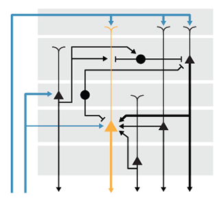
We discuss how to effectively route arrows, how to avoid pitfalls of redundant encoding and suggest ways to encorporate emphasis in the layout.
Hunnicutt, B.J. & Krzywinski, M. (2016) Points of View: Neural circuit diagrams. Nature Methods 13:189.
background reading
Hunnicutt, B.J. & Krzywinski, M. (2016) Points of Viev: Pathways. Nature Methods 13:5.
Wong, B. (2010) Points of Viev: Gestalt principles (part 1). Nature Methods 7:863.
Wong, B. (2010) Points of Viev: Gestalt principles (part 2). Nature Methods 7:941.
Pathways
Apply visual grouping principles to add clarity to information flow in pathway diagrams.
We draw on the Gestalt principles of connection, grouping and enclosure to construct practical guidelines for drawing pathways with a clear layout that maintains hierarchy.
We include tips about how to use negative space and align nodes to emphasizxe groups and how to effectively draw curved arrows to clearly show paths.
Hunnicutt, B.J. & Krzywinski, M. (2016) Points of Viev: Pathways. Nature Methods 13:5.
background reading
Wong, B. (2010) Points of Viev: Gestalt principles (part 1). Nature Methods 7:863.
Wong, B. (2010) Points of Viev: Gestalt principles (part 2). Nature Methods 7:941.
Multiple Linear Regression
When multiple variables are associated with a response, the interpretation of a prediction equation is seldom simple.
This month we continue with the topic of regression and expand the discussion of simple linear regression to include more than one variable. As it turns out, although the analysis and presentation of results builds naturally on the case with a single variable, the interpretation of the results is confounded by the presence of correlation between the variables.
By extending the example of the relationship of weight and height—we now include jump height as a second variable that influences weight—we show that the regression coefficient estimates can be very inaccurate and even have the wrong sign when the predictors are correlated and only one is considered in the model.
Care must be taken! Accurate prediction of the response is not an indication that regression slopes reflect the true relationship between the predictors and the response.
Altman, N. & Krzywinski, M. (2015) Points of Significance: Multiple Linear Regression Nature Methods 12:1103-1104.
Background reading
Altman, N. & Krzywinski, M. (2015) Points of significance: Simple Linear Regression Nature Methods 12:999-1000.
Circos and Hive Workshop Workshop—Poznan, Poland
Taught how Circos and hive plots can be used to show sequence relationships at Biotalent Functional Annotation of Genome Sequences Workshop at the Institute for Plant Genetics in Poznan, Poland.
Students generated images published in Fast Diploidization in Close Mesopolyploid Relatives of Arabidopsis.
Workshop materials: slides, handout, Circos and hive plot files.
Students also learned how to use hive plots to show synteny.
Mandakova, T. et al. Fast Diploidization in Close Mesopolyploid Relatives of Arabidopsis The Plant Cell, Vol. 22: 2277-2290, July 2010
Play the Bacteria Game
Choose your own dust adventure!
Nobody likes dusting but everyone should find dust interesting.
Working with Jeannie Hunnicutt and with Jen Christiansen's art direction, I created this month's Scientific American Graphic Science visualization based on a recent paper The Ecology of microscopic life in household dust.
We have also written about the making of the graphic, for those interested in how these things come together.
This was my third information graphic for the Graphic Science page. Unlike the previous ones, it's visually simple and ... interactive. Or, at least, as interactive as a printed page can be.
More of my American Scientific Graphic Science designs
Barberan A et al. (2015) The ecology of microscopic life in household dust. Proc. R. Soc. B 282: 20151139.
Names for 5,092 colors
A very large list of named colors generated from combining some of the many lists that already exist (X11, Crayola, Raveling, Resene, wikipedia, xkcd, etc).

For each color, coordinates in RGB, HSV, XYZ, Lab and LCH space are given along with the 5 nearest, as measured with ΔE, named neighbours.
I also provide a web service. Simply call this URL with an RGB string.
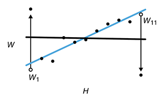
Simple Linear Regression
It is possible to predict the values of unsampled data by using linear regression on correlated sample data.
This month, we begin our column with a quote, shown here in its full context from Box's paper Science and Statistics.
In applying mathematics to subjects such as physics or statistics we make tentative assumptions about the real world which we know are false but which we believe may be useful nonetheless. The physicist knows that particles have mass and yet certain results, approximating what really happens, may be derived from the assumption that they do not. Equally, the statistician knows, for example, that in nature there never was a normal distribution, there never was a straight line, yet with normal and linear assumptions, known to be false, he can often derive results which match, to a useful approximation, those found in the real world.
—Box, G. J. Am. Stat. Assoc. 71, 791–799 (1976).
This column is our first in the series about regression. We show that regression and correlation are related concepts—they both quantify trends—and that the calculations for simple linear regression are essentially the same as for one-way ANOVA.
While correlation provides a measure of a specific kind of association between variables, regression allows us to fit correlated sample data to a model, which can be used to predict the values of unsampled data.
Altman, N. & Krzywinski, M. (2015) Points of Significance: Simple Linear Regression Nature Methods 12:999-1000.
Background reading
Altman, N. & Krzywinski, M. (2015) Points of significance: Association, correlation and causation Nature Methods 12:899-900.
Krzywinski, M. & Altman, N. (2014) Points of significance: Analysis of variance (ANOVA) and blocking. Nature Methods 11:699-700.
Association, correlation and causation
Correlation implies association, but not causation. Conversely, causation implies association, but not correlation.
This month, we distinguish between association, correlation and causation.
Association, also called dependence, is a very general relationship: one variable provides information about the other. Correlation, on the other hand, is a specific kind of association: an increasing or decreasing trend. Not all associations are correlations. Moreover, causality can be connected only to association.
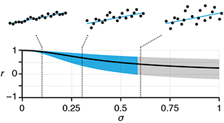
We discuss how correlation can be quantified using correlation coefficients (Pearson, Spearman) and show how spurious corrlations can arise in random data as well as very large independent data sets. For example, per capita cheese consumption is correlated with the number of people who died by becoming tangled in bedsheets.
Altman, N. & Krzywinski, M. (2015) Points of Significance: Association, correlation and causation Nature Methods 12:899-900.
Bayesian networks
For making probabilistic inferences, a graph is worth a thousand words.
This month we continue with the theme of Bayesian statistics and look at Bayesian networks, which combine network analysis with Bayesian statistics.
In a Bayesian network, nodes represent entities, such as genes, and the influence that one gene has over another is represented by a edge and probability table (or function). Bayes' Theorem is used to calculate the probability of a state for any entity.
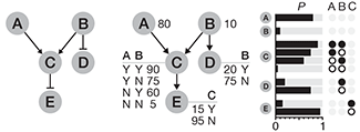
In our previous columns about Bayesian statistics, we saw how new information (likelihood) can be incorporated into the probability model (prior) to update our belief of the state of the system (posterior). In the context of a Bayesian network, relationships called conditional dependencies can arise between nodes when information is added to the network. Using a small gene regulation network we show how these dependencies may connect nodes along different paths.
Background reading
Puga, J.L, Krzywinski, M. & Altman, N. (2015) Points of Significance: Bayesian Statistics Nature Methods 12:277-278.
Puga, J.L, Krzywinski, M. & Altman, N. (2015) Points of Significance: Bayes' Theorem Nature Methods 12:277-278.
Unentangling complex plots
The Points of Significance column is on vacation this month.
Meanwhile, we're showing you how to manage small multiple plots in the Points of View column Unentangling Complex Plots.
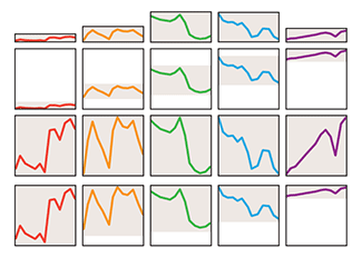
Data in small multiples can vary in range, noise level and trend. Gregor McInerny and myself show you how you can deal with this by cropped and scaling the multiples to a different range to emphasize relative changes while preserving the context of the full data range to show absolute changes.
McInerny, G. & Krzywinski, M. (2015) Points of View: Unentangling complex plots. Nature Methods 12:591.
Fixing Jurassic World science visualizations
The Jurassic World Creation Lab webpage shows you how one might create a dinosaur from a sample of DNA. First extract, sequence, assemble and fill in the gaps in the DNA and then incubate in an egg and wait.

With enough time, you'll grow your own brand new dinosaur. Or a stalk of corn ... with more teeth.
What went wrong? Let me explain.

Printing Genomes
You've seen bound volumes of printouts of the human reference genome. But what if at the Genome Sciences Center we wanted to print everything we sequence today?

Gene Volume Control
I was commissioned by Scientific American to create an information graphic based on Figure 9 in the landmark Nature Integrative analysis of 111 reference human epigenomes paper.
The original figure details the relationships between more than 100 sequenced epigenomes and genetic traits, including disease like Crohn's and Alzheimer's. These relationships were shown as a heatmap in which the epigenome-trait cell depicted the P value associated with tissue-specific H3K4me1 epigenetic modification in regions of the genome associated with the trait.
As much as I distrust network diagrams, in this case this was the right way to show the data. The network was meticulously laid out by hand to draw attention to the layered groups of diseases of traits.
This was my second information graphic for the Graphic Science page. Last year, I illustrated the extent of differences in the gene sequence of humans, Denisovans, chimps and gorillas.
Sampling distributions and the bootstrap
The bootstrap is a computational method that simulates new sample from observed data. These simulated samples can be used to determine how estimates from replicate experiments might be distributed and answer questions about precision and bias.
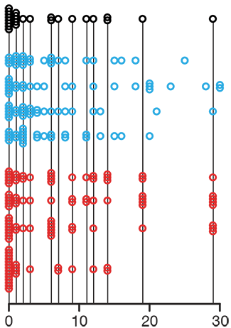
We discuss both parametric and non-parametric bootstrap. In the former, observed data are fit to a model and then new samples are drawn using the model. In the latter, no model assumption is made and simulated samples are drawn with replacement from the observed data.
Kulesa, A., Krzywinski, M., Blainey, P. & Altman, N (2015) Points of Significance: Sampling distributions and the bootstrap Nature Methods 12:477-478.
Background reading
Krzywinski, M. & Altman, N. (2013) Points of Significance: Importance of being uncertain. Nature Methods 10:809-810.
Bayesian statistics
Building on last month's column about Bayes' Theorem, we introduce Bayesian inference and contrast it to frequentist inference.
Given a hypothesis and a model, the frequentist calculates the probability of different data generated by the model, P(data|model). When this probability to obtain the observed data from the model is small (e.g. `alpha` = 0.05), the frequentist rejects the hypothesis.

In contrast, the Bayesian makes direct probability statements about the model by calculating P(model|data). In other words, given the observed data, the probability that the model is correct. With this approach it is possible to relate the probability of different models to identify one that is most compatible with the data.
The Bayesian approach is actually more intuitive. From the frequentist point of view, the probability used to assess the veracity of a hypothesis, P(data|model), commonly referred to as the P value, does not help us determine the probability that the model is correct. In fact, the P value is commonly misinterpreted as the probability that the hypothesis is right. This is the so-called "prosecutor's fallacy", which confuses the two conditional probabilities P(data|model) for P(model|data). It is the latter quantity that is more directly useful and calculated by the Bayesian.
Puga, J.L, Krzywinski, M. & Altman, N. (2015) Points of Significance: Bayes' Theorem Nature Methods 12:277-278.
Background reading
Puga, J.L, Krzywinski, M. & Altman, N. (2015) Points of Significance: Bayes' Theorem Nature Methods 12:277-278.
Bayes' Theorem
In our first column on Bayesian statistics, we introduce conditional probabilities and Bayes' theorem
P(B|A) = P(A|B) × P(B) / P(A)
This relationship between conditional probabilities P(B|A) and P(A|B) is central in Bayesian statistics. We illustrate how Bayes' theorem can be used to quickly calculate useful probabilities that are more difficult to conceptualize within a frequentist framework.
Using Bayes' theorem, we can incorporate our beliefs and prior experience about a system and update it when data are collected.
Puga, J.L, Krzywinski, M. & Altman, N. (2015) Points of Significance: Bayes' Theorem Nature Methods 12:277-278.
Background reading
Oldford, R.W. & Cherry, W.H. Picturing probability: the poverty of Venn diagrams, the richness of eikosograms. (University of Waterloo, 2006)
Happy 2015 Pi Day—can you see `pi` through the treemap?
Celebrate `pi` Day (March 14th) with splitting its digit endlessly. This year I use a treemap approach to encode the digits in the style of Piet Mondrian.
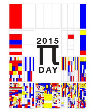
The art has been featured in Ana Swanson's Wonkblog article at the Washington Post—10 Stunning Images Show The Beauty Hidden in `pi`.
I also have art from 2013 `pi` Day and 2014 `pi` Day.
Split Plot Design
The split plot design originated in agriculture, where applying some factors on a small scale is more difficult than others. For example, it's harder to cost-effectively irrigate a small piece of land than a large one. These differences are also present in biological experiments. For example, temperature and housing conditions are easier to vary for groups of animals than for individuals.
The split plot design is an expansion on the concept of blocking—all split plot designs include at least one randomized complete block design. The split plot design is also useful for cases where one wants to increase the sensitivity in one factor (sub-plot) more than another (whole plot).
Altman, N. & Krzywinski, M. (2015) Points of Significance: Split Plot Design Nature Methods 12:165-166.
Background reading
1. Krzywinski, M. & Altman, N. (2014) Points of Significance: Designing Comparative Experiments Nature Methods 11:597-598.
2. Krzywinski, M. & Altman, N. (2014) Points of Significance: Analysis of variance (ANOVA) and blocking Nature Methods 11:699-700.
3. Blainey, P., Krzywinski, M. & Altman, N. (2014) Points of Significance: Replication Nature Methods 11:879-880.
Color palettes for color blindness
In an audience of 8 men and 8 women, chances are 50% that at least one has some degree of color blindness1. When encoding information or designing content, use colors that is color-blind safe.

Points of Significance Column Now Open Access
Nature Methods has announced the launch of a new statistics collection for biologists.
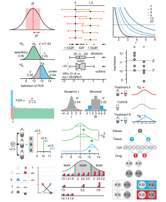
As part of that collection, announced that the entire Points of Significance collection is now open access.
This is great news for educators—the column can now be freely distributed in classrooms.
Before and After—Designing Tiny Figures for Nature Methods
I've posted a writeup about the design and redesign process behind the figures in our Nature Methods Points of Significance column.
I have selected several figures from our past columns and show how they evolved from their draft to published versions.
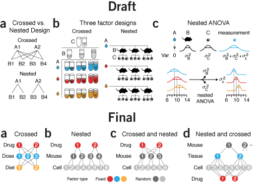
Clarity, concision and space constraints—we have only 3.4" of horizontal space— all have to be balanced for a figure to be effective.
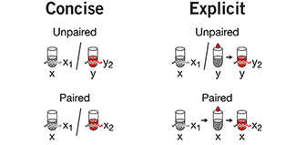
It's nearly impossible to find case studies of scientific articles (or figures) through the editing and review process. Nobody wants to show their drafts. With this writeup I hope to add to this space and encourage others to reveal their process. Students love this. See whether you agree with my decisions!
Sources of Variation
Past columns have described experimental designs that mitigate the effect of variation: random assignment, blocking and replication.
The goal of these designs is to observe a reproducible effect that can be due only to the treatment, avoiding confounding and bias. Simultaneously, to sample enough variability to estimate how much we expect the effect to differ if the measurements are repeated with similar but not identical samples (replicates).
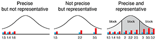
We need to distinguish between sources of variation that are nuisance factors in our goal to measure mean biological effects from those that are required to assess how much effects vary in the population.
Altman, N. & Krzywinski, M. (2014) Points of Significance: Two Factor Designs Nature Methods 11:5-6.
Background reading
1. Krzywinski, M. & Altman, N. (2014) Points of Significance: Designing Comparative Experiments Nature Methods 11:597-598.
2. Krzywinski, M. & Altman, N. (2014) Points of Significance: Analysis of variance (ANOVA) and blocking Nature Methods 11:699-700.
3. Blainey, P., Krzywinski, M. & Altman, N. (2014) Points of Significance: Replication Nature Methods 11:879-880.
Two Factor Designs
We've previously written about how to analyze the impact of one variable in our ANOVA column. Complex biological systems are rarely so obliging—multiple experimental factors interact and producing effects.
ANOVA is a natural way to analyze multiple factors. It can incorporate the possibility that the factors interact—the effect of one factor depends on the level of another factor. For example, the potency of a drug may depend on the subject's diet.

We can increase the power of the analysis by allowing for interaction, as well as by blocking.
Krzywinski, M., Altman, (2014) Points of Significance: Two Factor Designs Nature Methods 11:1187-1188.
Background reading
Blainey, P., Krzywinski, M. & Altman, N. (2014) Points of Significance: Replication Nature Methods 11:879-880.
Krzywinski, M. & Altman, N. (2014) Points of Significance: Analysis of variance (ANOVA) and blocking Nature Methods 11:699-700.
Krzywinski, M. & Altman, N. (2014) Points of Significance: Designing Comparative Experiments Nature Methods 11:597-598.
Nested Designs—Assessing Sources of Noise
Sources of noise in experiments can be mitigated and assessed by nested designs. This kind of experimental design naturally models replication, which was the topic of last month's column.
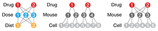
Nested designs are appropriate when we want to use the data derived from experimental subjects to make general statements about populations. In this case, the subjects are random factors in the experiment, in contrast to fixed factors, such as we've seen previously.
In ANOVA analysis, random factors provide information about the amount of noise contributed by each factor. This is different from inferences made about fixed factors, which typically deal with a change in mean. Using the F-test, we can determine whether each layer of replication (e.g. animal, tissue, cell) contributes additional variation to the overall measurement.
Krzywinski, M., Altman, N. & Blainey, P. (2014) Points of Significance: Nested designs Nature Methods 11:977-978.
Background reading
Blainey, P., Krzywinski, M. & Altman, N. (2014) Points of Significance: Replication Nature Methods 11:879-880.
Krzywinski, M. & Altman, N. (2014) Points of Significance: Analysis of variance (ANOVA) and blocking Nature Methods 11:699-700.
Krzywinski, M. & Altman, N. (2014) Points of Significance: Designing Comparative Experiments Nature Methods 11:597-598.
Replication—Quality over Quantity
It's fitting that the column published just before Labor day weekend is all about how to best allocate labor.
Replication is used to decrease the impact of variability from parts of the experiment that contribute noise. For example, we might measure data from more than one mouse to attempt to generalize over all mice.
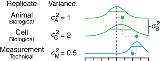
It's important to distinguish technical replicates, which attempt to capture the noise in our measuring apparatus, from biological replicates, which capture biological variation. The former give us no information about biological variation and cannot be used to directly make biological inferences. To do so is to commit pseudoreplication. Technical replicates are useful to reduce the noise so that we have a better chance to detect a biologically meaningful signal.
Blainey, P., Krzywinski, M. & Altman, N. (2014) Points of Significance: Replication Nature Methods 11:879-880.
Background reading
Krzywinski, M. & Altman, N. (2014) Points of Significance: Analysis of variance (ANOVA) and blocking Nature Methods 11:699-700.
Krzywinski, M. & Altman, N. (2014) Points of Significance: Designing Comparative Experiments Nature Methods 11:597-598.
Monkeys on a Hilbert Curve—Scientific American Graphic
I was commissioned by Scientific American to create an information graphic that showed how our genomes are more similar to those of the chimp and bonobo than to the gorilla.
I had about 5 x 5 inches of print space to work with. For 4 genomes? No problem. Bring out the Hilbert curve!
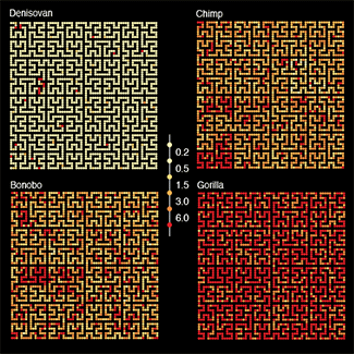
To accompany the piece, I will be posting to the Scientific American blog about the process of creating the figure. And to emphasize that the genome is not a blueprint!
As part of this project, I created some Hilbert curve art pieces. And while exploring, found thousands of Hilbertonians!
Happy Pi Approximation Day— π, roughly speaking 10,000 times
Celebrate Pi Approximation Day (July 22nd) with the art of arm waving. This year I take the first 10,000 most accurate approximations (m/n, m=1..10,000) and look at their accuracy.
I turned to the spiral again after applying it to stack stacked ring plots of frequency distributions in Pi for the 2014 Pi Day.

Analysis of Variance (ANOVA) and Blocking—Accounting for Variability in Multi-factor Experiments
Our 10th Points of Significance column! Continuing with our previous discussion about comparative experiments, we introduce ANOVA and blocking. Although this column appears to introduce two new concepts (ANOVA and blocking), you've seen both before, though under a different guise.
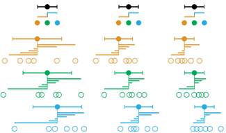
If you know the t-test you've already applied analysis of variance (ANOVA), though you probably didn't realize it. In ANOVA we ask whether the variation within our samples is compatible with the variation between our samples (sample means). If the samples don't all have the same mean then we expect the latter to be larger. The ANOVA test statistic (F) assigns significance to the ratio of these two quantities. When we only have two-samples and apply the t-test, t2 = F.
ANOVA naturally incorporates and partitions sources of variation—the effects of variables on the system are determined based on the amount of variation they contribute to the total variation in the data. If this contribution is large, we say that the variation can be "explained" by the variable and infer an effect.
We discuss how data collection can be organized using a randomized complete block design to account for sources of uncertainty in the experiment. This process is called blocking because we are blocking the variation from a known source of uncertainty from interfering with our measurements. You've already seen blocking in the paired t-test example, in which the subject (or experimental unit) was the block.
We've worked hard to bring you 20 pages of statistics primers (though it feels more like 200!). The column is taking a month off in August, as we shrink our error bars.
Krzywinski, M. & Altman, N. (2014) Points of Significance: Analysis of Variance (ANOVA) and Blocking Nature Methods 11:699-700.
Background reading
Krzywinski, M. & Altman, N. (2014) Points of Significance: Designing Comparative Experiments Nature Methods 11:597-598.
Krzywinski, M. & Altman, N. (2014) Points of Significance: Comparing Samples — Part I — t-tests Nature Methods 11:215-216.
Krzywinski, M. & Altman, N. (2013) Points of Significance: Significance, P values and t-tests Nature Methods 10:1041-1042.
Designing Experiments—Coping with Biological and Experimental Variation
This month, Points of Significance begins a series of articles about experimental design. We start by returning to the two-sample and paired t-tests for a discussion of biological and experimental variability.
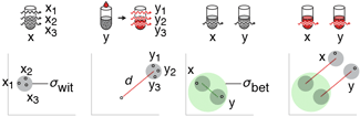
We introduce the concept of blocking using the paired t-test as an example and show how biological and experimental variability can be related using the correlation coefficient, ρ, and how its value imapacts the relative performance of the paired and two-sample t-tests.
We also emphasize that when reporting data analyzed with the paired t-test, differences in sample means (and their associated 95% CI error bars) should be shown—not the original samples—because the correlation in the samples (and its benefits) cannot be gleaned directly from the sample data.
Krzywinski, M. & Altman, N. (2014) Points of Significance: Designing Comparative Experiments Nature Methods 11:597-598.
Background reading
Krzywinski, M. & Altman, N. (2014) Points of Significance: Comparing Samples — Part I — t-tests Nature Methods 11:215-216.
Krzywinski, M. & Altman, N. (2013) Points of Significance: Significance, P values and t-tests Nature Methods 10:1041-1042.
Have skew, will test
Our May Points of Significance Nature Methods column jumps straight into dealing with skewed data with Non Parametric Tests.
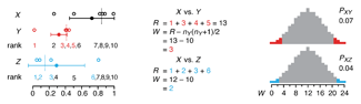
We introduce non-parametric tests and simulate data scenarios to compare their performance to the t-test. You might be surprised—the t-test is extraordinarily robust to distribution shape, as we've discussed before. When data is highly skewed, non-parametric tests perform better and with higher power. However, if sample sizes are small they are limited to a small number of possible P values, of which none may be less than 0.05!
Krzywinski, M. & Altman, N. (2014) Points of Significance: Non Parametric Testing Nature Methods 11:467-468.
Background reading
Krzywinski, M. & Altman, N. (2014) Points of Significance: Comparing Samples — Part I — t-tests Nature Methods 11:215-216.
Krzywinski, M. & Altman, N. (2013) Points of Significance: Significance, P values and t-tests Nature Methods 10:1041-1042.
Mind your p's and q's
In the April Points of Significance Nature Methods column, we continue our and consider what happens when we run a large number of tests.
Observing statistically rare test outcomes is expected if we run enough tests. These are statistically, not biologically, significant. For example, if we run N tests, the smallest P value that we have a 50% chance of observing is 1–exp(–ln2/N). For N = 10k this P value is Pk=10–kln2 (e.g. for 104=10,000 tests, P4=6.9×10⁻⁵).
We discuss common correction schemes such as Bonferroni, Holm, Benjamini & Hochberg and Storey's q and show how they impact the false positive rate (FPR), false discovery rate (FDR) and power of a batch of tests.
Krzywinski, M. & Altman, N. (2014) Points of Significance: Comparing Samples — Part II — Multiple Testing Nature Methods 11:215-216. Krzywinski, M. & Altman, N. (2014) Points of Significance: Comparing Samples — Part I — t-tests Nature Methods 11:215-216. Krzywinski, M. & Altman, N. (2013) Points of Significance: Significance, P values and t-tests Nature Methods 10:1041-1042.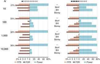
Happy Pi Day— go to planet π
Celebrate Pi Day (March 14th) with the art of folding numbers. This year I take the number up to the Feynman Point and apply a protein folding algorithm to render it as a path.

For those of you who liked the minimalist and colorful digit grid, I've expanded on the concept to show stacked ring plots of frequency distributions.
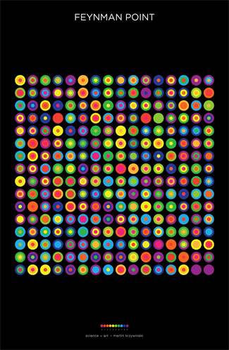
And if spirals are your thing...
Have data, will compare
In the March Points of Significance Nature Methods column, we continue our discussion of t-tests from November (Significance, P values and t-tests).
We look at what happens how uncertainty of two variables combines and how this impacts the increased uncertainty when two samples are compared and highlight the differences between the two-sample and paired t-tests.
When performing any statistical test, it's important to understand and satisfy its requirements. The t-test is very robust with respect to some of its assumptions, but not others. We explore which.
Krzywinski, M. & Altman, N. (2014) Points of Significance: Comparing Samples — Part I Nature Methods 11:215-216.
Krzywinski, M. & Altman, N. (2013) Points of Significance: Significance, P values and t-tests Nature Methods 10:1041-1042.
Circos at British Library Beautiful Science Exhibit
Beautiful Science explores how our understanding of ourselves and our planet has evolved alongside our ability to represent, graph and map the mass data of the time. The exhibit runs 20 February — 26 May 2014 and is free to the public. There is a good Nature blog writeup about it, a piece in The Guardian, and a great video that explains the the exhibit narrated by Johanna Kieniewicz, the curator.
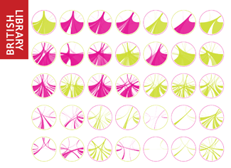

I am privileged to contribute an information graphic to the exhibit in the Tree of Life section. The piece shows how sequence similarity varies across species as a function of evolutionary distance. The installation is a set of 6 30x30 cm backlit panels. They look terrific.
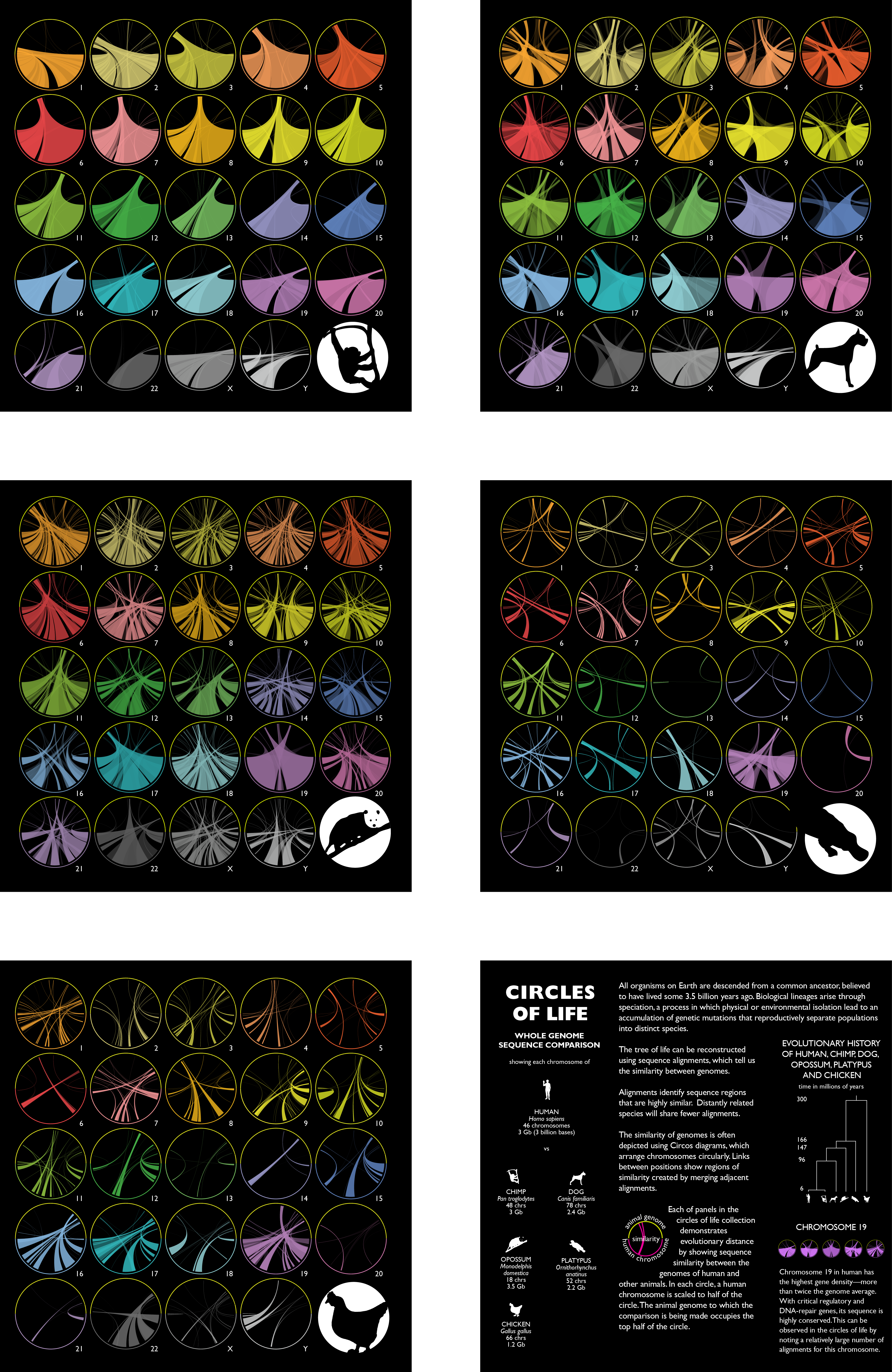
Think outside the bar—box plots
Quick, name three chart types. Line, bar and scatter come to mind. Perhaps you said pie too—tsk tsk. Nobody ever thinks of the box plot.
Box plots reveal details about data without overloading a figure with a full frequency distribution histogram. They're easy to compare and now easy to make with BoxPlotR (try it). In our fifth Points of Significance column, we take a break from the theory to explain this plot type and—I hope— convince you that they're worth thinking about.

The February issue of Nature Methods kicks the bar chart two more times: Dan Evanko's Kick the Bar Chart Habit editorial and a Points of View: Bar charts and box plots column by Mark Streit and Nils Gehlenborg.
Krzywinski, M. & Altman, N. (2014) Points of Significance: Visualizing samples with box plots Nature Methods 11:119-120.
Wired Data|Life 2013 talk
I recently presented at the Wired Data|Life 2013 conference, sharing my thoughts on The Art and Science of Data Visualization.
For specialists, visualizations should expose detail to allow for exploration and inspiration. For enthusiasts, they should provide context, integrate facts and inform. For the layperson, they should capture the essence of the topic, narrate a story and deligt.
Wired's Brandon Keim wrote up a short article about me and some of my work—Circle of Life: The Beautiful New Way to Visualize Biological Data.
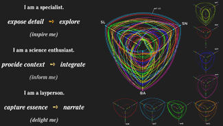
Power and Sample Size
Experimental designs that lack power cannot reliably detect real effects. Power of statistical tests is largely unappreciated and many underpowered studies continue to be published.
This month, Naomi and I explain what power is, how it relates to Type I and Type II errors and sample size. By understanding the relationship between these quantities you can design a study that has both low false positive rate and high power.
Krzywinski, M. & Altman, N. (2013) Points of Significance: Power and Sample Size Nature Methods 10:1139-1140.
20 imperatives of science—limits of evidence
20 Tips for Interpreting Scientific Claims is a wonderful comment in Nature warning us about the limits of evidence.
I've made a poster (download hires PDF, PNG) of this list, grouping them into categories that are my own. Thrust this into everyone's hands, including your own.
Sutherland WJ, Spiegelhalter D & Burgman M (2013) Policy: Twenty tips for interpreting scientific claims. Nature 503:335–337.
Significance, P values and t-tests
Have you wondered how statistical tests work? Why does everyone want such a small P value?
This month, Naomi and I explain how significance is measured in statistics and remind you that it does not imply biological significance. You'll also learn why the t-distribution is so important and why its shape is similar to that of a normal distribution, but not quite.
Krzywinski, M. & Altman, N. (2013) Points of Significance: Significance, P values and t-tests Nature Methods 10:1041-1042.
Drinks & Science Workshop: Effective Presentations and Slides
Your slides are not your presentation. They are a representation of your presentation.
Effective presentations require that you have a clear narrative—control detail and emphasis to deliver your message. Engage the audience early. Don't dump on them.
Effective slides are visual cues. Show only what you can't easily say. Text should acts as emphasis. Don't read.
A workshop I gave on Oct 8th at Science Online Vancouver at Science World.
Error Bars
Error bar overlap does not imply significance. Error bar gap does not imply lack of significance. Chances are you find these statements surprising.
You've seen and used error bars. But do you understand how to interpret them in the context of statistical signifiance? This month we address the most common (and commonly misunderstood) method of visualizing uncertainty.
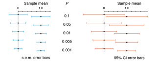
We discuss error bars based on standard deviation, standard error of the mean and confidence intervals. It turns out that none of these behave as our intuition would wish.
Krzywinski, M. & Altman, N. (2013) Points of Significance: Error Bars Nature Methods 10:921-922.
Launch of Nature Methods Statistics Column
This month, Nature Method is launching Points of Significance a new column to educate, enlighten and, if possible, entertaining bench scientists about statistics.
I will be working closely with with Naomi Altman from The Pennsylvania State University and Dan Evanko, the Chief Editor at Nature Methods, to make the column engaging and useful.
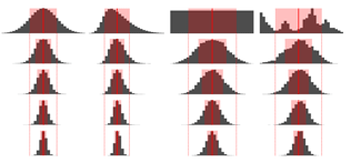
Our first publication — The Importance of Being Uncertain — acknowledges not only the imperative of being right about how we're wrong, but also our appreciation for Oscar Wilde.
Krzywinski, M. & Altman, N. (2013) Points of Significance: Importance of Being Uncertain Nature Methods 10:809-810.
Points of View — The Collection
Interested in data visualization? The Points of View columns are an excellent way to learn practical tips and design principles that help you communicate clearly. All the columns are now available as a collection, and open access during August 2013.

The columns were written by Bang Wong, Martin Krzywinski, Nils Gehlenborg, Cydney Nielsen, Noam Shoresh, Rikke Schmidt Kjærgaard, Erica Savig and Alberto Cairo.
Storytelling with Graphics
This month, Alberto Cairo and I examine the importance of storytelling in presenting data. A strong narrative captures the reader's attention, informs and inspires.
Instead of "explain, not merely show," seek to "narrate, not merely explain."
Analyze as a specialist, present as a communicator
The distinction between the specialist and the communicator was made by Albert Cairo at 2013 Bloomberg Design Conference. I have used this principle to structure my talk to the UBC Tableau Users Group.
Design is algorithmics for the page. Use its principles to inform how to choose from among the options offered by your software. Recognize the limitations of your tool, as well as those features that are ineffective.
Don't practise visual intuitics—use shapes whose size and proportion can be well judged.

Real Human Genome Art
A collaboration of science and art with Joanna Rudnick and Aaron De La Cruz.
The science of cancer genomics will be interpreted by individuals whose lives are affected by genomic mutations using the art style of Aaron De La Cruz.
Beautiful, meaningful and personal.
Multidimensional data
This month, Erica Savig and I look at the design process for a figure from her paper Multiplexed mass cytometry profiling of cellular states perturbed by small-molecule regulators. The underlying data set has 1.2 billion individual observations, categorized by drug, cell line, protein and stimulation condition.
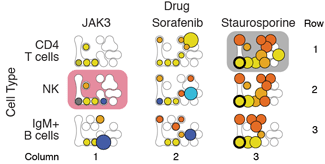
2012 Multiplexed mass cytometry profiling of cellular states perturbed by small-molecule regulators Nature Biotechnology 30:858-867.
Although spatial encoding is the most perceptually accurate, in this case it's not the best channel to display quantitative information. Instead, the x/y position on the page is used to organize small multiples of the network of affected proteins.

Choosing Plotting Symbols
In this months column, Bang and I consider how to choose effective plotting symbols in the Points of View column Plotting Symbols.

Choose symbols that overlap without ambiguity and communicate relationships in data.
Figure Design and Writing — Two Goals, One Process
This month I look at how creating effective figures is similar to the process of writing well in the Points of View column Elements of Visual Style.
Using Strunk's Elements of Style as an example of writing guidelines, I look how these can be translated to creating figures.
VIZBI 2013 Keynote—Visual Design Principles
When we create figures, we must communicate and design. In my talk I discuss some of the rules that turn graphical improvisation into a structured and reproducible process.
The fractal tree was created with OneZoom, which received the best poster award at the conference.
Happy Pi Day— 3.14
Celebrate Pi Day (March 14th) with a funky modern posters. Transcend, don't repeat, yourself and watch the dots shimmer.

The posters were inspired by the beautiful AIDS posters by Elena Miska.
For the Love of Type
I am always drawn to type and periodically I must do something about it.
If you were a type, what type would you be? Me, Gill Sans on weekdays and Perpetua on the weekend.

Return of Nature Methods Points of View
I take over from Bang Wong as primary contributor to the Points of View column, a monthly advice and opinion piece about data visualization and information and figure design in molecular biology.
Nature Encode Explorer

Nature's special issue dedicated to the Encode Project uses the Circos motif on its cover as well as the interactive Encode Explorer, which is available as an app at iTunes.
Bloomberg Businessweek Design Conference
Together with Alberto Cairo, and then in conversation with Sam Grobart, I presented about science and design at Bloomberg's Businessweek Design Conference in San Francisco.
ICDM2012 Keynote — Needles in Stacks of Needles
My ICDM2012 keynote on genomics and data mining: Needles in Stacks of Needles.
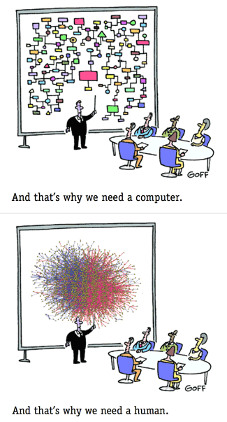
Genome Research cover
Creating strings of genome jewelery. Read about how it was done.

The design accompanies Cydney Nielsen's Spark manuscript, which appeared in Genome Research.
Biovis 2012 — Getting into Visualization of Large Biological Data Sets
Guidelines for data encoding and visualization in biology, presented presented at Biovis 2012 (Visweek 2012).
2012 Presidential Debates — a Lexical Analysis
Building on the method I used to analyze the 2008 debates, I look at the 2012 Debates between Obama and Romney, lexically speaking. Obama speaks to "folks", while Romney fearmongers with "kill" and "hurt".
Trends in Genetics cover
Making things round, not square. Read about how it was done.
A Circos-based design for the cover of the human genetics special issue of Trends in Genetics (Trends in Genetics October 2012, 28 (10)).
Schloss Dagstuhl - Visualization: communicating, clearly
My talk — Visualization: communicating, clearly from the Biological Data Visualization seminar at Schloss Dagstuhl.
Science needs words
And usually, really long and funny ones.
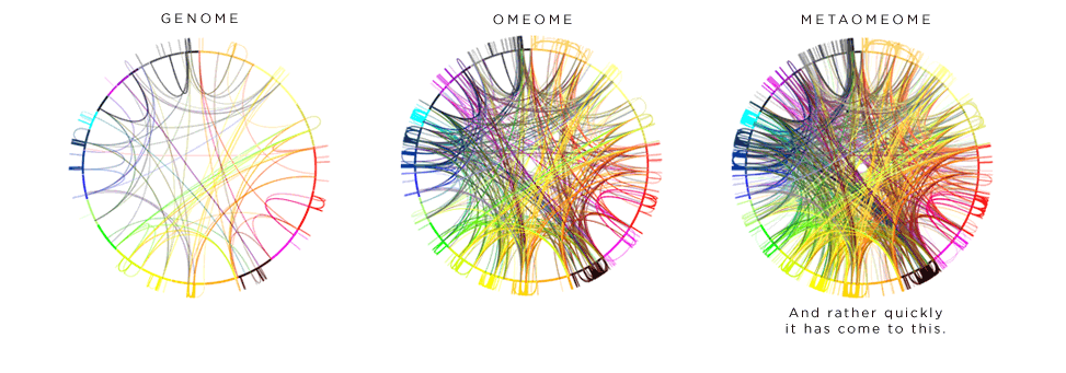
My neologisms were picked up by James Gorman of the New York Times in an article Ome, the sound of the scientific universe expanding.
PNAS cover
Biology or astrophysics? Read about how it was done.

The image was published on the cover of PNAS (PNAS 1 May 2012; 109 (18))
the art of numbers
Numerology is bogus but art based on numbers has a beautiful random quality. Oh, and none of the metaphysical baggage.


accidental similarity number
The quantity formed by the overlap of two or more numbers.
the 4ness of pi
How much 4ness does π have?
Compare the iness of π to that of the other famous transcendental number, e, and the mysterious but attractive Golden Ratio, φ.
ASCII Illustration—Outer Space, Sequence and Typography
I have found a way to combine my curiosity about space, fear of large sequence assemblies and love of typography in a single illustration. Inspired by typographical portraits, I wanted to automate representing an image with multiple font weights, while sampling characters from a quote or debate transcripts.

Tangering Tango—Color of 2012
If you made widgets, you could be justified in campaigning a widget of the year. Business acumen suggests it should be one of your widgets. Pantone has done exactly that, naming their 17-1463 color (tangerine tango), as color of the year 2012.

I prefer green—green jive.

World's Most Expensive Photograph
I really like the world's most expensive photograph, Rhein II by Andreas Gursky. Cautious use of the word "expensive" should be practised — in this case, merely meaning that only one person saw the $4.3 million price tag. Others saw lower prices, or no price tag at all.

Here's my own attempt at such compositions.

Adobe Swatches for Brewer Palettes
I could not find Illustrator swatch files for this awesome color resource, so I created them myself.

If you're interested in color and design and don't know about Brewer palettes, see my presentation.
Global Visualization of Google Searches by Language
World-wide Google searches, categorized by one of 21 languages, are visualized with WebGL, available from Chrome Experiments. The data offers some fascinating insights such as (a) in what two places in the US are Google searches in Chinese are performed? (b) what are the most remote locations are from which Google searches were detected? (c) Why is Istanbul the 3rd top location for searches? Why is Miami in the top 10?
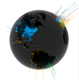
PSA Genomics Workshop Slides
Designing effective visualizations in the biological sciences.
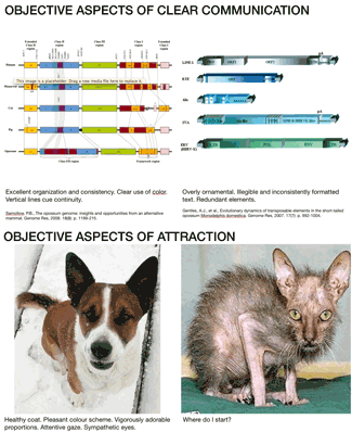
Circos and Hive Plots: Challenging visualization paradigms in genomics and network analysis.
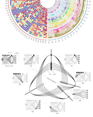
Tor tor & Loa Loa — 546 Organisms with Same Genus and Species
In a recent conversation, I was challenged to name as many organisms with the same genus and species as I could. Neither a biologist, and especially not a taxonomist, my responses were limited to organisms with sequenced genomes I had come across in the literature. Immediately to mind sprung Gallus gallus (chicken) and ... nothing else. Well, that was embarrassing.
I was suddently taken up by the urge to find all instances of this occurrence. Using resources at the NCBI Taxonomy Browser I downloaded the NCBI taxonomy table which contains 1,097,405 entries in the names.dmp file (not all of these are unique genus/species combinations).
To my suprise I discovered that my performance in this challenge was beyond dysmal. In fact, there are 380 genuses which contain organisms that have the same genus and species name. Most of them (317) include a single organism, but some have many. For example the genus Salamandra has 14 organisms with the species salamandra, including Salamandra salamandra, Salamandra salamandra crespoi and Salamandra salamandra morenica. The genus Regulus has 13 organisms, including Regulus regulus azoricus, Regulus regulus japonensis and Regulus regulus regulus (these are all Goldcrests).
In total, there are 546 unique entries, when organisms with a unique subspecies name are considered distinct. If subspecies is not considered, the number of organisms with the same genus as species (i.e., regardless of subspecies) is 383. Here are organisms whose genus/species name is shorter than 6 letters (82 entries).
Shortest Species/Genus Duplicates (82, 5 letters or less)
Agama agama, Alces alces, Alle alle, Alosa alosa, Anser anser, Appia appia, Apus apus, Arita arita, Arius arius, Aroma aroma, Axis axis, Badis badis, Bagre bagre, Bison bison, Boops boops, Brama brama, Bubo bubo, Bufo bufo, Bulla bulla, Buteo buteo, Butis butis, Catla catla, Chaca chaca, Conta conta, Crex crex, Cynea cynea, Dama dama, Dario dario, Diuca diuca, Dives dives, Ensis ensis, Equus equus, Ficus ficus, Gemma gemma, Gesta gesta, Glis glis, Gobio gobio, Grus grus, Guira guira, Gulo gulo, Hara hara, Hucho hucho, Huso huso, Indri indri, Irus irus, Juga juga, Labeo labeo, Lima lima, Loa loa, Lota lota, Lutra lutra, Lynx lynx, Meles meles, Melo melo, Meza meza, Mitu mitu, Mola mola, Molva molva, Mops mops, Myaka myaka, Naja naja, Nasua nasua, Papio papio, Pauxi pauxi, Perna perna, Pica pica, Pipa pipa, Pipra pipra, Plica plica, Rapa rapa, Rita rita, Sarda sarda, Sisko sisko, Solea solea, Sula sula, Suta suta, Tinca tinca, Todus todus, Tor tor, Uncia uncia, Vimba vimba, Volva volva.Longest Species/Genus Duplicates (5, 14 letters or more)
Coccothraustes coccothraustes
Labiostrongylus labiostrongylus
Macrobilharzia macrobilharzia
Macropostrongylus macropostrongylus
Xanthocephalus xanthocephalus
The nematode worm Macropostrongylus macropostrongylus has the honour of being the longest genus/species duplicate organism. Given this distinction, it is surprising that Pubmed returns only 2 papers that refer to it.
Dataset
Download the full list. The number next to each ENTRY field is the NCBI Taxonomy ID for the organism. In a small number of cases there are ambiguities in parsing the data file (e.g. Troglodytes cf. troglodytes PS-2, Troglodytes sp. troglodytes PS-1). I left these in.
Visual Acuity and Sequence Visualization
Visual acuity limits of the human eye restrict the resolution at which we can comfortably visualize data.
In this short guide, I explain why dividing a scale into no more than 500 divisions is a good idea.
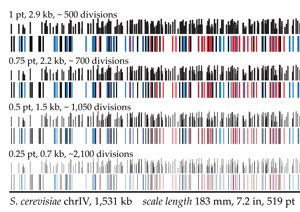
2011 EMBO Journal Cover Contest
For the EMBO Journal 2011 Cover Contest, I prepared two entries, one for the scientific category and one for the non-scientific category.

The 2011 winners have been announced. My non-scientific entry (photo of fiber optics) received honourable mention and was included in the Favourites of the Jury gallery.
New Circos Domains
Until now, Circos did not have its own domain name, having been served from the lengthy and boring http://mkweb.bcgsc.ca/circos.

Recently, I was surprised to find out that the following domains were available
All these now point to the Circos site.
ee spammings - beautiful language of spam poetry
ee spammings are spam edited into a format reminiscent of the poetry of ee cummings. Unwanted solicitations for questionable endeavours and products suddenly turn into heady words of the new literature. Art suddenly freed from the husk of spam.
Literature 2.0 — from unlikely origins.

Here's one example that emphasizes that today is ok.
i got
to touch you

i like us
and know the more.

believe
       recontact
me

today ok!
but matters

waiting for
           happy
I now have over 20 ee spammings — enjoy them all.
Neologisms - New Words, Much Needed
What do inconversible, mystific, postpetizer, prenopsis and suscitate have in common?
They are words that don't exist, but should. Learn new words.


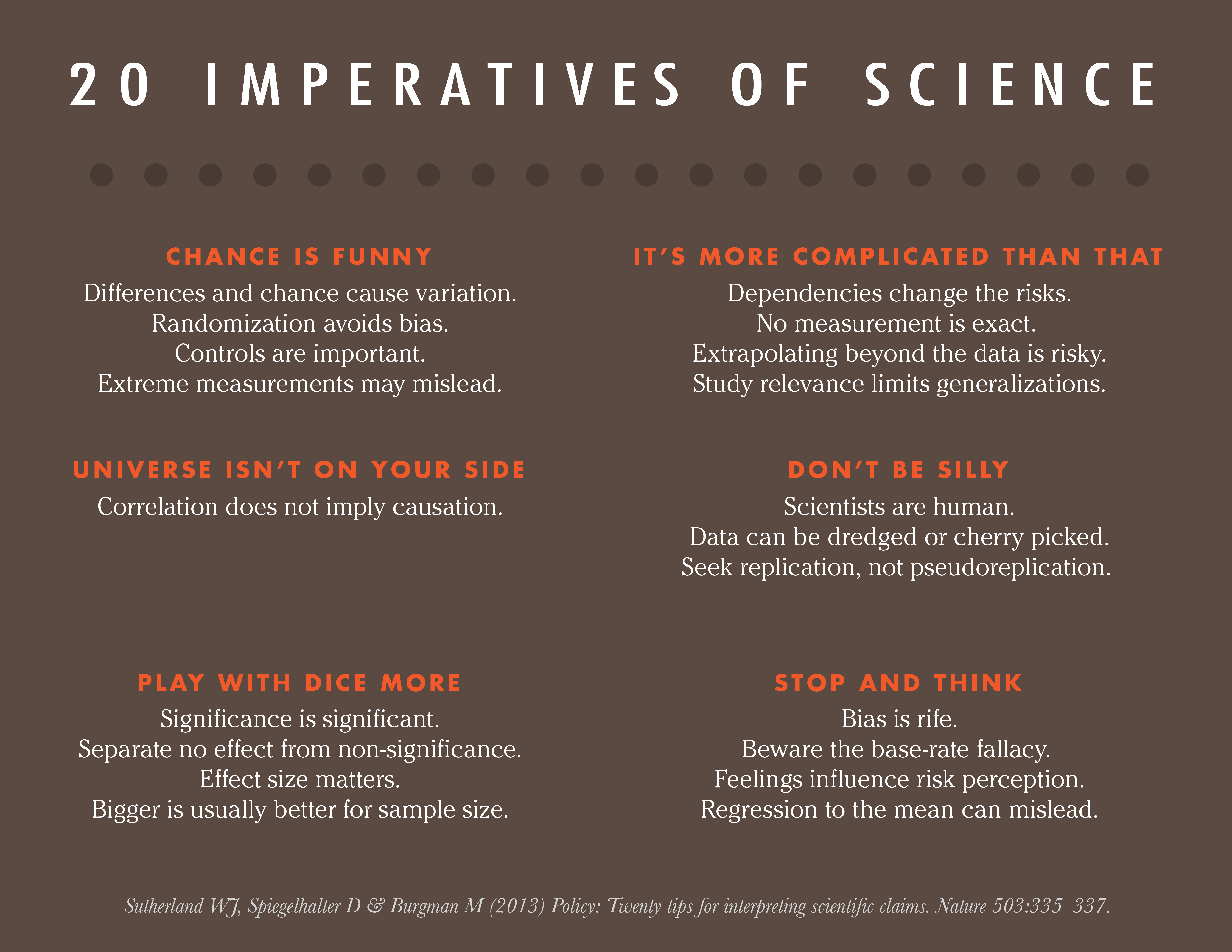
World's Most Popular Questions
Today's Zeitgeist

What are the world's top questions?
Using Google's autocomplete feature, I have tabulated the world's most popular questions. By combining a interrogative term, such as what, who or why, with a term from a related set, such as do I, can I, and can't I, it is possible to sample the space of questions and obtain the most popular for a given start word combination.
I have tabulated the most popular questions by category.
| general | limits & desires |
| love | money |
| career & education | health |
| sizes & extremes | religion & faith |
Science
What kind of questions about science are people asking? From the Career & Education section,
- Can biology lead to new theorems?
- Can physics explain miracles?
- Can math be fun?
- Can science and religion coexist?
- Can history repeat itself?
- Can psychology be morally neutral?
Curios
What are the strangest questions? I'll let you explore, but these have me wondering:
- Has the world gone mad or is it me?
- Why can't I hold all these limes?
- What happens if I make a formal commitment to Satan?
- Why can't I sell my kidney?
- Who is the most powerful Jedi?
- Can Jesus microwave a burrito?
- Where is the hardest part of your head?
Circos Table Browser
Circos can be used to visualize tabular data, such as spreadsheets.

1,000s of tables have already been visualized. Has yours?
648 Ratios
Hive plots are excellent at visualizing ratios. They're not just an anti-hairball network visualization agent.
Below are visualized 3 x 8 x 27 = 648 (axes, ribbons, plots) ratios visualized.

The image above compares the relative ratios of region annotations in human, mouse and dog genomes.
Cáceres Creativa - Model and Strategy for Urban Innovation

Cáceres is a small city of 100,000 inhabitants in western Spain, where the city government is promoting Cáceres Creativa, a project to build citizens collaboratively sustainable future for the city based on activating the creative capacity of the population.
The project has been published as a book (excerpt), which provides a basis for working with city residents and businesses in this collaborative design.
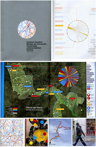
Circos proved useful in showing the complex relationships that are established in such an environment is a city which combines flows of energy and resources, physical items and intellectual concepts. The online Circos tableviewer was used to generate the images.
Storage Cluster
Taking photos of inanimate objects is rewarding. Your subject doesn't complain, nor move, and a coffee break fits naturally into the workflow at any time. In this case, the inanimate object is over 3 Pb (3,000 Tb) of storage composed of a variety of Netapp appliances.

Using three gelled Hensel Integras (500 Ws monoheads — here I'm using only the modelling light for illumination along with red, blue and green filters) (lighting details), I spent some time getting to know the components up close.


See more photos.
All photos by Martin Krzywinski (Lumondo Photography).
Genesis 1.0
Our new compute cluster has been released to the user community.

This cluster consists of 420 compute nodes each with 12 cores and 48GB RAM, totaling 5,040 cores and 20TB RAM. Each node has 160GB local /tmp space and all nodes are tied together over an Inifiniband 40Gbs network.

The nodes all have access to a dedicated storage system over the Infiniband Network running GPFS with a total 700TB of usable scratch space. The filesystem is served by 8 IBM x3850 servers. All nodes are running CentOS5.4 and are using open source Grid Engine 6.2u5 as their scheduler.


Lighting details and more photos.
All photos by Martin Krzywinski (Lumondo Photography).
1 First the server room was expanded 2 It was empty and without racks, and the lights were dim. Sysadmins scurried about and unpacked equipment 3 The circuit was closed and there were electrons 4 IT staff were pleased and accounts were handed out to users 5 Who had work they called "important" 6 But which the IT staff merely called "jobs".
Photo
Periodically, I take my camera, point it at things. Here, I'll share a favourite from my creations.

This image — I will keep the subject a mystery — gives me the same feeling as some of the Hubble images. For this shot, I didn't need to reach orbit.

Other images in this series are available on flickr.
I also like geometry and lines. This shot is a tense composition of the Hancock Building at Copley Square in Boston.

and an assortment of baggage carts at St Pancreas station (London) which catches the eye.

I like to collect time in a photo, be it uniformly as in this diptych of street and traffic lights from a moving car

or blended, as in this skyline of Vancouver showing the flow of time from 5.30pm to 9.30pm.

WIZARD — Longest English Reverse Complement
DNA is composed of two strands, which are complementary. Given a sequence, its reverse complement is created by swapping A/T and G/C and writing the remapped sequence backwards (e.g. ATGC is first remapped to TACG and then reversed to GCAT).
Consider the corresponding concept applied to English words (or any language, for that matter). First, construct the complementarity map, which assigns to the nth letter of the alphabet the N-n letter, given an alphabet of N letters.
abcdefghijklmnopqrstuvwxyz
||||||||||||||||||||||||||
zyxwvutsrqponmlkjihgfedcba
For example, a becomes z, b becomes y, and so on. To create a reverse complement of a word, apply this mapping and then reverse the new word (e.g. 'dog' is remapped to 'wlt' and then reversed to obtain 'tlw').
So far, that's not very exciting.
But consider the question: What is the longest English word that is a palindrome under this set of rules (reverse complementarity). In other words, it's the same forward and backward after complementing the letters. Clearly "dog" is not such a palindrome since its reverse complement is "tlw".
The answer? wizard and hovels.
wizard
||||||
draziw -> 'wizard' backwards
It's an amazingly fitting answer, since a wizard is someone with special powers.
A few interesting 4-letter words that are their own reverse complement palindromes are bevy, grit, trig and wold. Common surnames that match are Ghrist, Elizarov and Prawdzik. Female first name Zola and male first name Iver are also reverse complement palindromes, as are trolig (Norwegian for 'likely', as well as an IKEA curtain product) and aviverez (2nd person plural future of 'aviver', French for 'brighten').
I've scanend a very large word list (4,138,000 unique English and foreign words) and identified 108 reverse complement palindromes. If you find a new entry longer than 6 letters, let me know.
Typefaces that are worth it
Finding just the right font is hard work. There are so many to choose from. Or are there?
If the type face is not on this list, don't use it (except Bodoni &mdash I hate Bodoni &mdash don't use it). If you need a shorter list, consult the quintissential 15 serif and 15 sans-serif fonts.
You'll notice a rotating image of type faces at the top of this page. Here's the full list.


I love Gotham and have used it in visualization projects. It's more rational than Helvetica and still enjoys a freshness that has evapourated from Helvetica after near-ubiquitous use. Don't get me wrong, there is still not enough Helvetica in the world, but more Gotham would be nice.
Paper
Anyone who has met me, quickly learns that I have a personal and antagonistic relationship with Comic Sans, the type face that shouldn't have been.
In a recent article in the journal Cognition, Fortune favours the bold (and the italicized): Effects of disfluence on educational outcomes, Diemand-Yauman et al. suggest that rendering educational materials in a hard-to-read font, and thereby recruiting the effects of the disfluency ("the subjective experience of difficulty associated with cognitive operations"), improves retention of material.
Regardless whether the effect is real, there must be better ways to improve education than through bad design.
Kittens
Surely you like kittens. So don't hurt your audience.

Side Interest Spawns Brazilian Fashion Line
In a cosmically improbable confluence of multidisciplinary pursuits, my work on keyboard layouts, which as one of its fruits has produced the TNWMLC keyboard layout — the most difficult for English typing — has been incorporated into the eponymously named Brazilian fashion line by Julia Valle.

Spatter of Network Communities
Looking into network data sets for the linear layout project, I found pretty hairballs which make a juicy spatter pattern.