


Nature Methods: Points of Significance
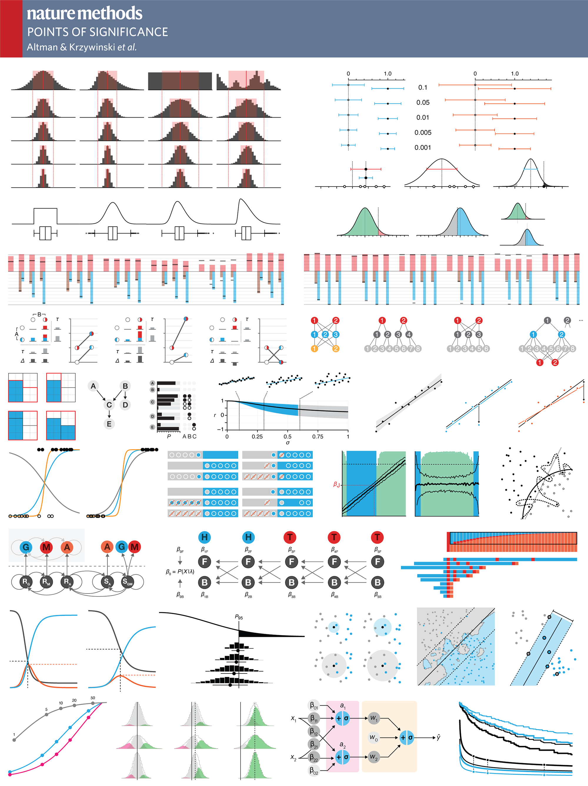
evolution of column figures
I spend a lot of my time talking to people about figures and in my presentations I show how figures can be improved by showing redesign examples. Here, I thought I'd take my own advice and show you how some of the figures for the column evolved over the lifetime of the draft.
Each example compares the figure from the first draft with the one that was eventually published. I include some thoughts about the figure's purpose and evolution. If you think of ways to improve our approach or specific design choices, send me your suggestions and I'll post them here.
figure preparation
All the figures are generated in Illustrator. Scatter plots and curves are created in R using ggplot2, imported into Illustrator via PDF and then modified to fit the figure style.
Elements that are commonly reused, like the normal distribution, are created as vector art and then pasted into figures as required.
The type face is Helvetica Neue. Figure titles are 6 pt with all other text, such as axis and tick labels, 5 pt. Once in a while 4 pt—skirting the limits of legibility—text is used, if we're running out of space or for ancillary elements.
In May 2018 the Nature Method layout changed from a two columns to three. The Curses of Dimensionality column in the May 2018 issue was the first column that used the new layout. Now, figures are either 1 column (166 pt), 2 column (340 pt) or 3 column (522 pt). The figures described below were all designed as 1 column (342 pt) for the two column layout. Transition to the new layout brings benefits (smaller figures are possible) and challenges (smaller figures are possible).
emphasis on concepts, patterns, clarity
It seems that for any topic, thousands of figures are already available. It's very difficult to offer a fresh perspective on concepts like statistical significance, p values and t-tests. It may well be that no fresh perspective is actually possible.
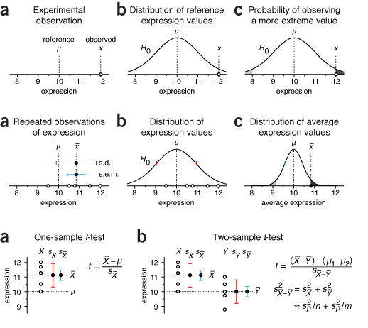
Our goal is to provide the figures in a biological context and use only essential technical terminology. In many cases the journal style guide resolves ambiguity in notation (p value, P value, p-value, P-value). In some cases we need to respect technical issues even though some will be glossed over by some readers; for example, the distinction between sample statistics and population parameters (s vs σ). In other cases we need to carefully choose the notation to provide continuity. In the figure on the right the first time standard error is mentioned we use s.e.m. but in the third figure, which comes from a later column, we use sX̄ instead. We do this so that the s.e.m. can be related to sX, which is the sample standard deviation, and therefore more easily understood as the standard deviation of sample means, as estimated from the sample values.
It took a few columns to converge on a consistent notation. For example, the middle above uses lower-case `\bar{x}` as the sample mean. This was later changed to capitalized `\bar{X}`, reserving the lower-case `x` to represent a single value.
size and style constraints
Nature Method's style guides limit a single-column figure to 3.4" width. Since we have only two pages for the column, we prefer single-column figures to reserve more room for text. Striking a balance between space used by the figures and text can be a vexing process. In an effort to be concise and clear, we often spend more time on the figures than the text itself.
Many of the design decisions reflect the space constraints. Many of the figures are packed quite tightly. Given more space, I would use more negative space to let them breathe.
from draft to print
The process of creating a figure can be likened to writing. It's well put in Towards a Theory of Writing (Inspirational Writing for Academic Publication, Ch. 2, Gillie Bolton and Stephen Rowland).
- Write for yourself to find out what you know, think, feel and want to say.
- Redraft to communicate with your reader.
- Edit for posterity to offer clarity, clear language, structure, grammar, correct references.
The Nature Methods Points of View column Visual Style approaches the process similarly, relating it to Strunk's Elements of Style.
If you find the narration here overly lengthy—good. It's meant to be. Design is thinking about every element and drawing it with purpose. This doesn't preclude you from creating ineffective figures, but at least lowers the chance. Depending on the application, you can find yourself second-guessing your decisions quite a bit. In our case, as the text evolved, so did the figures.
Note that the draft versions of the figures may have drafty errors!
less is more | I harp on the importance of conciseness but often catch myself not taking this advice. After all, there is so much to say. Right?
Right. But not at first pass. There is always more that can be said, much of which should be defered. The goal of the figures in the column is to communicate the essentials of a statistical concept—we leave out detail for the sake of clarity.
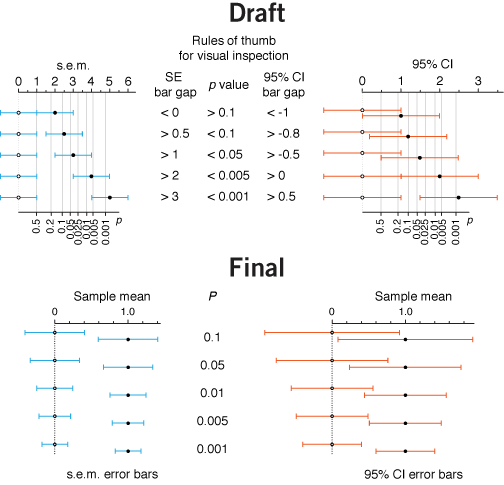
In this figure about error bars, I was pleased with the fact that I managed to pull off a dual-axis plot, which showed the distance between sample means in s.e.m. (or 95% CI) as well as the associated P value.
I chose to remove the second P value axis after hearing my answer to the question "Does this additional level of complexity help to communicate the core idea?".
On further reflection, the horizontal axes might work better at the bottom and the error bar type headings at the top.
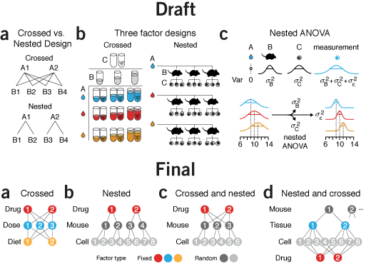
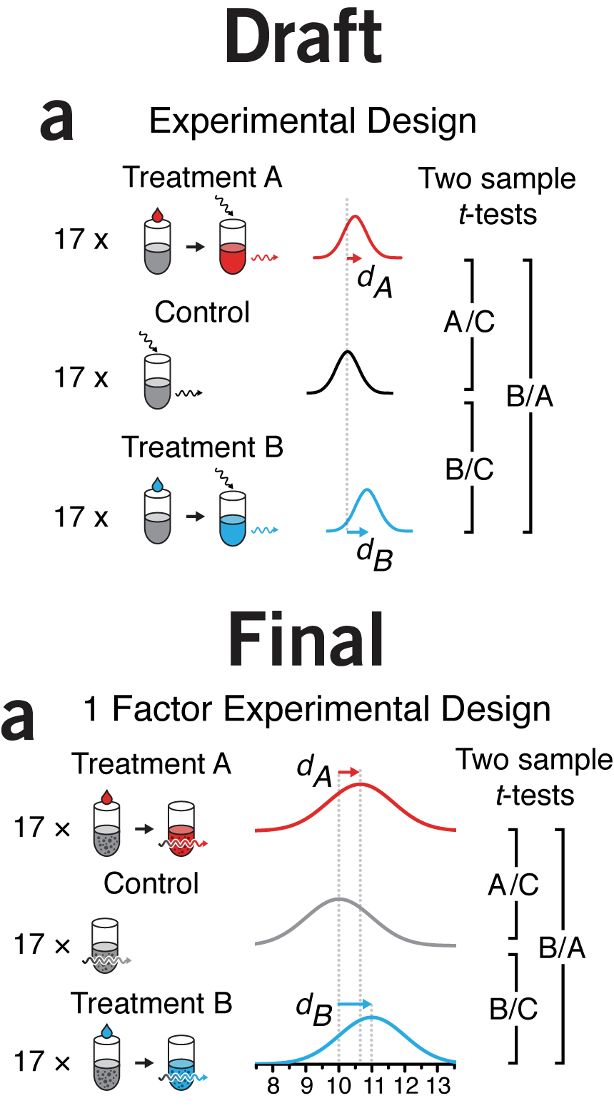
why instead of what | By the time I got to panel c in this figure, my chart junk sense started to tingle painfully. I had tubes, mice, cells, distributions, equations, and arrows in 3.4" of horizontal space. Ugh.
What was the purpose of the figure? To demonstrate sampling methods in different designs. I managed to do this in panel a but by the time I got to panel b, for some reason I thought that the simple schematic wasn't enough. Instead, I showed the actual experimental units in a matrix or a hierarchical tree of mice and cells. To emphasize that all the mice and cells were actually different I varied the size of each mouse and the rotation and position of nucleus of each cell. Hint—if you find yourself doing this, stop and try another approach!
The draft is a dense, thick and weighty mess. Experimental designs are explained in two different ways: procedurally in a and with enumeration in b. As the figure evolved, I forced myself to use the same visual vocabulary and explain all the designs using the same symbols.
Now, instead of showing all the combinations—differences are difficult to glean—I show the method of how the combinations are created—differences are easy to spot. I was free to use color to distinguish between random and fixed factors. In the split plot design they appear obviously layered, something that is harder to spot if you show the design by enumerating all the factor combinations.
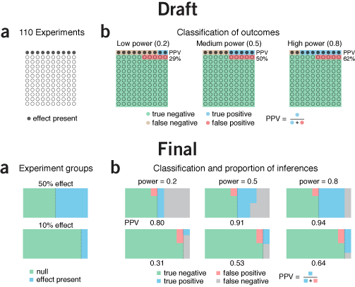
icons, color & alignment | I sometimes use this paper about icon plots as an example to demonstrate the value in graphically enumerating and classifying cases rather than showing aggregate statistics. The draft of this figure is unduly influenced by this.
I was also anchored to the design choice by a similar graphic I saw at the time in the Economist's Trouble at the Lab article (see Consistency & Hierarchy below).
Since we have only 3.4" of horizontal space, I could not enumerate enough experiments to make the numbers in each category to be integers—for our scenario example, this would require 1,000 experiments. Instead, I was forced to use an awkward number of experiments: 110.
Ultimately, it dawned on me that it's not actually necessary to show each experiment as a symbol—removing them in the original figure changes nothing. The effect rate can be better shown by a line dividing the rectangle.
Within the effect and no effect experiments, areas are top-aligned to facilitate comparisons. False negatives seem much better as grey than brown, since brown is too close to red. Using grey has the benefit of reducing the number of colors.
In the legend I grouped the categories by "true" and "false" rather than "positive" and "negative", which seemed a better way to do it given that the topic of the column was about the fraction of "false" inferences. The reason why T- and F+ are in the same row is because these inferences apply to experiments in which there is no effect. Similarly, the row with T+ and F- apply to experiments in which there is an effect.
I discuss the legend more in the example below.
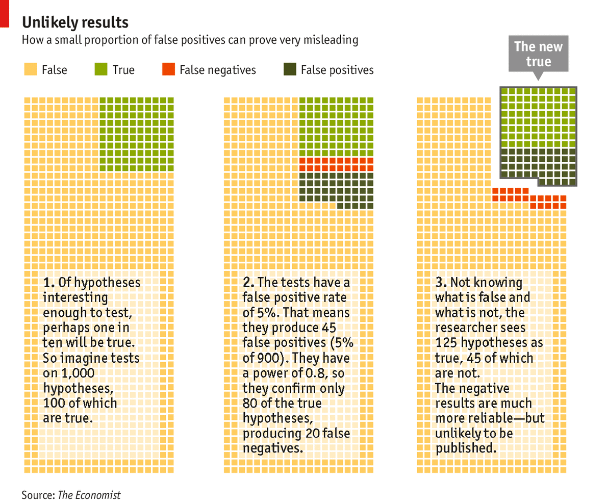
consistency & hierarchy | I struggled for a good color scheme for the above figure, as well as for a good legend layout. In this section, I compare my approach with that taken by the Economist's Trouble at the Lab article (original Economist figure). Here I reproduce the legend from the Economist figure, as well as my own legend and color-blind friendly version.
When data can be divided into categories that fall into a hierarchy (true/false, positive/negative), always try to format the legend as a table. Alternatively, at least align the legend text to make the numberand relationship between categories explicit.

The Economist, which incorporates the legend into the figure, has a couple of inconsistencies. Even though the concept behind the figure is straightforward, I'd like to bring these issues up to demonstrate that even simple things require attention to detail.
I should emphasize that the point of the Economist figure is to focus on the fraction of experiments in which an effect was inferred. These are the true positives and false positives, which the figure knocks out in its third panel.
The Economist's use of the word "true" and "false" in the legend is ambiguous. The same word simultaneously refers to the effect and inference. By "true" the figure means both "experiments with an effect" and "true positive inferences". Conversely, "false" means "experiments in which there is no effect" and "false negatives". The overall effect is that "false" appears three times but "true" only once, which is unintuitive.
The choice of colors in the Economist is similarly unintuitive. A red/yellow/green color scheme is reminiscent of a traffic light and naturally hints at categories that reflect bad/caution/good. But in this case both yellow (true negatives) and light green (true positives) are both appropriate inferences. The use of yellow for the former inadvertantly demotes its status.
In fact, if you look at the legend in isolation, the progression of colors is not compatible with category names. And it's only once you see the figure that the legend makes (some kind of) sense. The legend should help make sense of the figure, not the other way around.
If we accept the choice of yellow (true negatives) and green (true positives), and concede red to stand for false negatives then dark green for false positives is not ideal. By using the same hue for all positive inferences (both true and false), the inference type (positive vs negative) becomes the primary classification, because hue is a more salient encoding than tone. However, all positive inferences are already being distinguished from negative inferences by being knocked out of the figure. Since physically separating them makes a bigger impression than the grouping based on hue, we are free to use hue within the knocked out group to distinguish between true and false positive inferences.
red is the color of the apocalypse | There's a more insiduous issue with choice of colors. Red is generally the color reserved for the worst outcome. In my presentations I joke that it is the color of extremes, disease, and the apocalypse. And that if you're finding yourself having to emphasize something that is red, you need to rethink your color scheme.
In the Economist figure, red is used to encode false negatives. But false negatives aren't actually the worst outcome—false positives are! In the lab we're always under the assumption that we'll miss things. We can't act on things we don't detect—the false negatives—though we might later come to regret not detecting them. It's the positive inferences are generally queued for validation, a more expensive and time-consuming process than the original high-throughput scan. False positives cause us to waste time and resources—the kind that we can measure here and now, not uncertain opportunity costs of false negatives. This is why it is these inferences that should be red.
Both figures neglect red/green color-blind readers. In hindsight, we should have avoided the use of red and green. By using red for both types of erroneous inferences, reserving the more salient dark red for false positives, we can emphasize the fraction of mistakes.
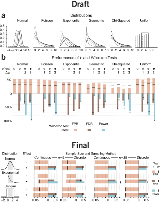
essential patterns | Wouldn't be interesting to compare parameteric and non-parametric tests for all sorts of distributions and show things like false positive rate, power and so on? All sorts, eh? Yup, trouble ahead.
The draft of the figure is actually pretty good, but for a different application. It's a type of stare-at-me-for-5-minutes encyclopedic figure that belongs in a supplement or text book. It shows more than what is necessary for the purpose of the column—it compares t- and Wilcoxon tests for four parameters for each of six distributions. A useful set of comparisons to draw from, but not to show in their entirety.
The difference between results for normal, Poisson and exponential distributions follows the same trend, so there's little reason to try to pack in all three in the figure. Additionally, the variance of the Poisson distribution isn't constant—it increases with mean, so it's not only the shape of the distribution that's changing. Also, the geometric distribution doesn't fit well here because, unlike the others, it only exists in discrete form.
What I do like about the original figure is the horizontal layout. It makes comparing the quantities encoded by the bars easier. In hindsight, I should have tried to force the horizontal layout on the final figure. However, space limitations made this impossible—I even had to pack in the legend beside the figure, rather than below. The vertical layout makes comparing the same scenario between distributions easier and emphasizes that the three distributions have the same variance. However, comparing between scenarios (e.g. n=5 vs n=25) is awkward.
I chose to keep only three distributions. The Gaussian, for reference, and two extremes: the very skewed exponential and uniform. Instead of different effect sizes, I chose to show the effect of sample size and continuous/discrete sampling.
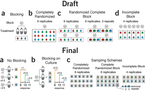
flow and orientation | The first draft isn't bad. The block outlines are a little kludgy but the point gets across.
However, the orientation of the panels is a little awkward. They are arranged horizontally but some have a distinct vertical organization within them, such as panel a. Also, the cell culture icon is repeated so many times it seems hamfisted.
Given that blocking was a central theme in the column, showing the difference between a designs with and without blocking in a consistent way is important. The draft does not do this, however. Panel a explains blocking, then panel b shows a design without blocking but uses a different approach. Panels c and d shows blocked designs. I didn't like this order. It made more sense to first show what no blocking looks like, then explain blocking using the same visual formula, and only then show examples of different designs. This way, there's a distinct progression in the themes of each panel.
The final version also demonstrates the effect of variation between cultures on the response variable, helping to motivate the need and mechanism behind blocking.
Notice the difference between the two parts of the original panel c was relatively minor—the entire diagram was repeated just to show the concept of replication. In the final version, this was more subtly incorporated as a callout from a single measurement, making the concept of replication less central to the figure's theme, in keeping with the emphasis on blocking in the text.
This time, I made a point to avoid using red and green.
arrows | Try to never use arrows for navigation—to indicate to the viewer what they should be looking at next. An arrow should indicate a transition, flow, or any process that can be interpreted to have a sense of direction. In my talks I joke that you should only make one arrow and reuse it for the rest of your life. Except that I'm not joking.
Arrows, by being gruesomely mutilated, add confusion to figures. This happens frequently enough that the topic has its own Points of View: Arrows column, where Bang Wong writes "Used most effectively, arrows are the 'verbs' of visual communication, describing processes and functional relationships."
We've used arrows rarely in our figures—both by design and nature of the topic. In the few cases where arrows appeared, I tried to take great care in following Bang's advice. In the first figure arrows are used to indicate three things: the application of treatment to the experimental unit (test tube), incident and transmitted light (act of measurement by absorption) and a horizontal shift in the mean of the response.
The squiggly arrow intuitively represents a photon (or radiation in general), at least to me (though I often wonder how representative my intuition is in a biological context given that it's been heavily influenced by a physics background). The arrows that represent shifts in the mean are colored to visually group them with their distributions.
For all arrows line weights are the same in the print version (0.5 pt) and the arrow head size is adjusted to be in pleasant proportion to line weight (35% in Illustrator's stroke panel arrowhead scale). You'll see in the final version I have represented the act of measurement by a single arrow passing through the tube. This removes arrows (a good thing) and avoids the arbitrary degree of freedom of the angle of the incident arrow. After all, why is the light coming from the top left?
Space constraints reduced the horizontal separation between the treatments and control to the point where association between the tube and its label (e.g. "Control") becomes a little lost. Once the journal layout has been applied to the copy, we sometimes find ourselves over-length. Tightening the figures vertically is one way in which we can reclaim a little space—truly, every milimeter counts. In this case, I think we squeezed it too tight.
You'll also see in the final version that I've added some flat texture to the liquit in the tube. My thought on this now is that it's extraneous. Tube junk.
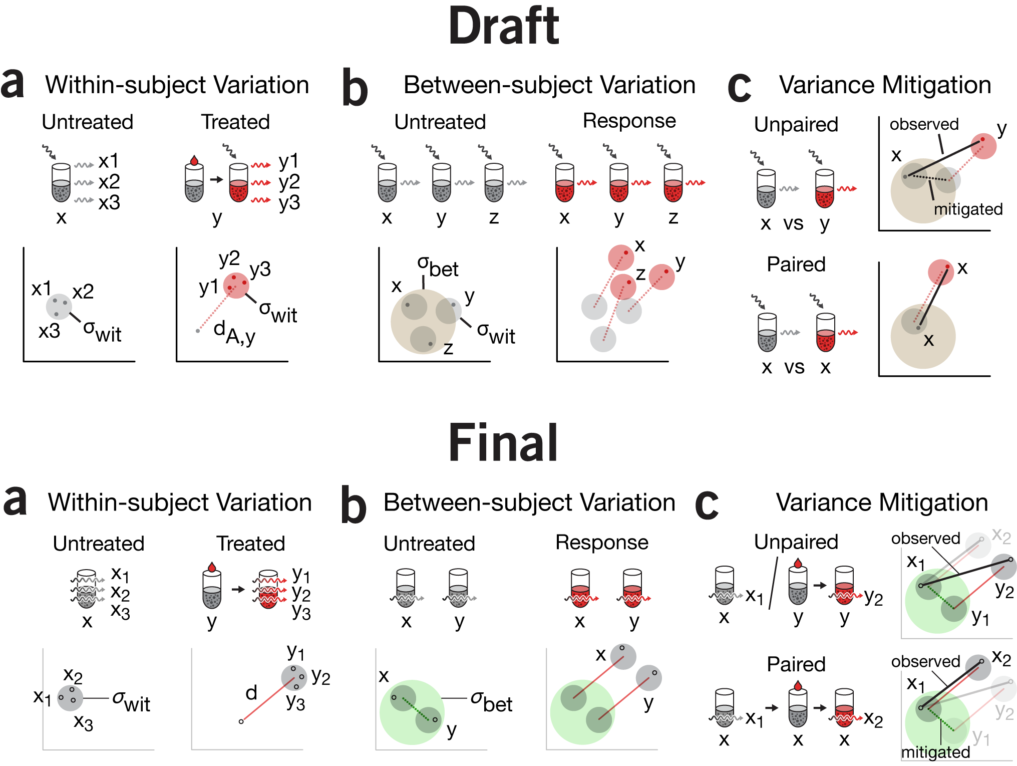
emphasis & repetition | The visual motif of tube + reagent + light is being reused in the next figure in this column. This is one of the conceptually more complex figures we've made to-date. At the time, I was quite satisfied with all that we managed to pack into it and thought that the concept of within- and between-group variance was cogently depicted. Importantly, I was happy with how we depicted how between-group variance is mitigated in a paired design.
There are some subtle differences between the first and final versions which are worth mentioning,in addition to the removal of the dedicated incident light arrow. First, notice the tube labels `x` and `y` in panel a. Originally `x` is aligned with the tube but `y` is under the arrow. This is not consistent—`y` belongs with the tube not the pair of tubes (which are really the same tube, just temporally displaced). In the final version, all the labels are aligned with the first appearance of that tube.
I struggled with the labels in panel c. Originally the vs in the label was superfluous—we're obviously making a comparison. However, if I labeled a tube only once (e.g. the way `y` is labeled in panel a), I felt there wasn't enough emphasis on the fact that we're using different tubes (unpaired) or the same tube (paired) design. By repeating `x` three times for the paired design, it's blatently obvious. The desire for consistency necessitated labelling `y` twice in the unpaired design.
There is often a balance between being concise and being clear. This is particularly true when you're uncertain about the background of the audience—sometimes to make a concept easier to understand you need to emphasize aspects of the figure. The need for emphasis is removed once the figure is understood, and the reader may be left with the sense that the emphasis was unnecessary, not having realized that it assisted comprehension. Given that there are quite a lot of tubes in the figure, we thought there was room for uncertainty. So, each time a tube was drawn, it was labeled (or relabeled).
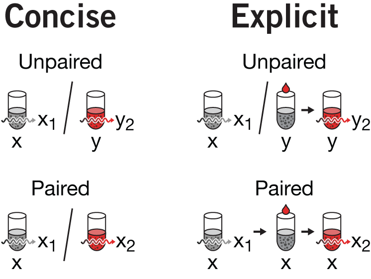
You can also argue that the `y` tube in the unpaired design does not need to have its precursor (grey tube + treatment) drawn. Here, I would agree. But removing it causes a cascade of (I believe) necessary reductions for consistency which results in a concise but somewhat opaque version of the figure. If we remove the precusor, we wind up with the concise version of the figure as shown on the right. We can't use an arrow instead of the in the paired design because this would contradict how the arrow between tubes was being used before (to connect untreated+treatment tube to the treated tube). Since our goal was to unambiguously distinguish the unpaired from paired design, the concise version of the figure seemed too subtle.
I decided to forego maximum concision and unpack all the details and show the full set of precursor (first measurement), precursor + treatment, and treated tubes. One of the benefits of this is that the way in which unpaired and paired designs are shown continues to be nearly symmetrical, with the / in the unpaired being replaced by → in the paired design—exactly what we wanted to emphasize.
We did have to carefully navigate the notation for the measurements. The baseline measurement for a tube was indexed with 1 and the treated response with 2. This is why in the unpaired design we see `x_1` but `y_2`—the point is that `y_1` is actually not measured. This works well in panel c in isolation, but is inconsistent with how the numerical index is used in a, where it indicates replication. More complex schemes could have been used, like `x'` for treated or perhaps `x_{t,i}` for the `i`th measurement of a treated tube, or even capitalize the tube name to indicate treated (e.g. `X_1` is the first measurement of the treated `x`). The trouble with all these is that they add complexity and it's not clear whether it reduces or adds to the potential for confusion.
My hope was that the plot in c next to the tubes would make the meaning of `x_1`, `x_2`, `y_1`, and `y_2` obvious.
Space limitations forced us to orient panel c horizontally and reduce the details in panel b. The treated tubes do not have their precursor + treatment shown, nor are the individual measurements labeled. I'm left unsatisfied with the change in orientation.
You'll also see that the colors of the circles that represent the collection of measurements have been changed. Red is reserved for the effect size. Within-group variation for the treated tubes is no longer red—the same grey is used to indicate within-group. This is somewhat inconsistent since the untreated tubes and their within-group variation was both grey, suggesting an association between color and treatment.
Ultimately, I think this figure would work better on a series of three slides, where each panel was shown independently. This way, decisions made about the levels of detail and numerical indexing in one panel would have less of an affect on the interpretation of the next. When all three panels are shown next to each other, these effect of these differences are impossible to contain within a panel—readers will naturally scan between panels and try to interpret the reason for any differences.
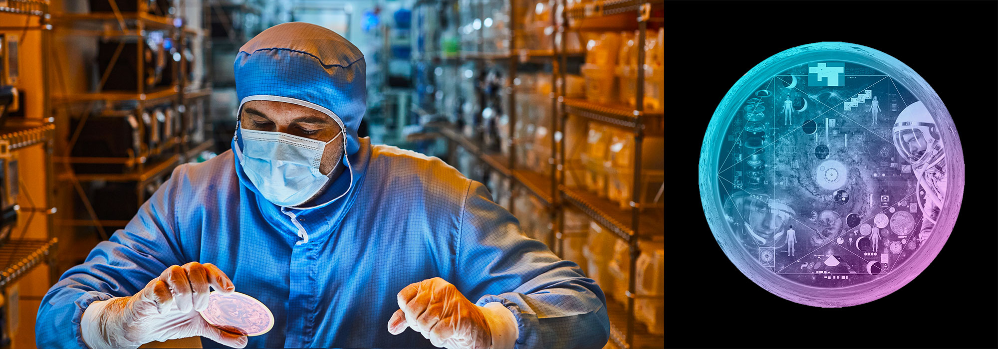
Nasa to send our human genome discs to the Moon
We'd like to say a ‘cosmic hello’: mathematics, culture, palaeontology, art and science, and ... human genomes.


Comparing classifier performance with baselines
All animals are equal, but some animals are more equal than others. —George Orwell
This month, we will illustrate the importance of establishing a baseline performance level.
Baselines are typically generated independently for each dataset using very simple models. Their role is to set the minimum level of acceptable performance and help with comparing relative improvements in performance of other models.

Unfortunately, baselines are often overlooked and, in the presence of a class imbalance5, must be established with care.
Megahed, F.M, Chen, Y-J., Jones-Farmer, A., Rigdon, S.E., Krzywinski, M. & Altman, N. (2024) Points of significance: Comparing classifier performance with baselines. Nat. Methods 20.
Happy 2024 π Day—
sunflowers ho!
Celebrate π Day (March 14th) and dig into the digit garden. Let's grow something.

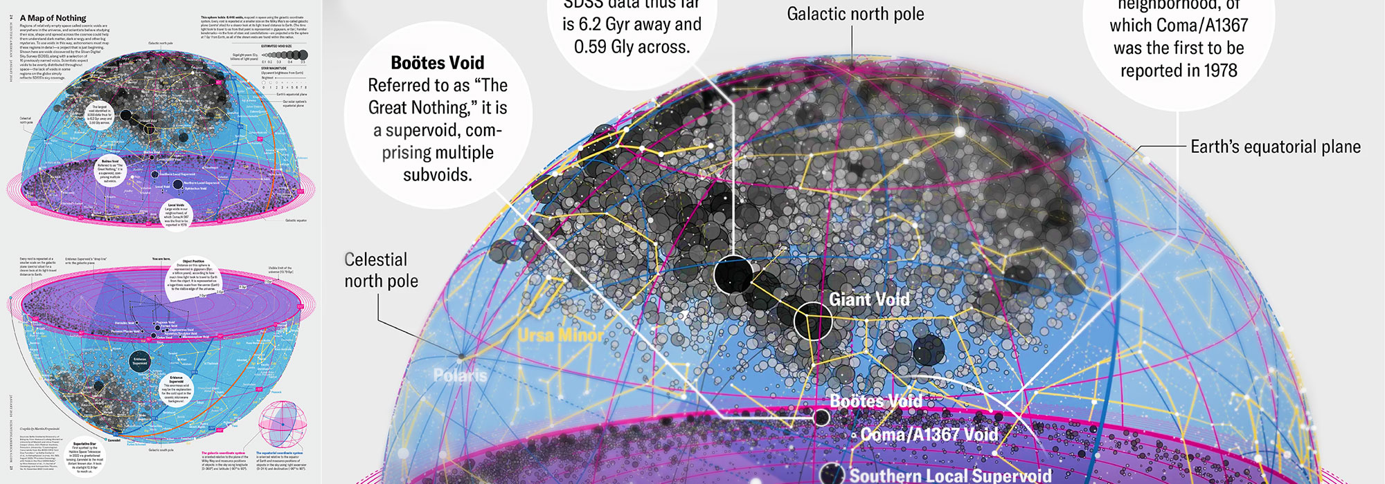
How Analyzing Cosmic Nothing Might Explain Everything
Huge empty areas of the universe called voids could help solve the greatest mysteries in the cosmos.
My graphic accompanying How Analyzing Cosmic Nothing Might Explain Everything in the January 2024 issue of Scientific American depicts the entire Universe in a two-page spread — full of nothing.

The graphic uses the latest data from SDSS 12 and is an update to my Superclusters and Voids poster.
Michael Lemonick (editor) explains on the graphic:
“Regions of relatively empty space called cosmic voids are everywhere in the universe, and scientists believe studying their size, shape and spread across the cosmos could help them understand dark matter, dark energy and other big mysteries.
To use voids in this way, astronomers must map these regions in detail—a project that is just beginning.
Shown here are voids discovered by the Sloan Digital Sky Survey (SDSS), along with a selection of 16 previously named voids. Scientists expect voids to be evenly distributed throughout space—the lack of voids in some regions on the globe simply reflects SDSS’s sky coverage.”
voids
Sofia Contarini, Alice Pisani, Nico Hamaus, Federico Marulli Lauro Moscardini & Marco Baldi (2023) Cosmological Constraints from the BOSS DR12 Void Size Function Astrophysical Journal 953:46.
Nico Hamaus, Alice Pisani, Jin-Ah Choi, Guilhem Lavaux, Benjamin D. Wandelt & Jochen Weller (2020) Journal of Cosmology and Astroparticle Physics 2020:023.
Sloan Digital Sky Survey Data Release 12
Alan MacRobert (Sky & Telescope), Paulina Rowicka/Martin Krzywinski (revisions & Microscopium)
Hoffleit & Warren Jr. (1991) The Bright Star Catalog, 5th Revised Edition (Preliminary Version).
H0 = 67.4 km/(Mpc·s), Ωm = 0.315, Ωv = 0.685. Planck collaboration Planck 2018 results. VI. Cosmological parameters (2018).
constellation figures
stars
cosmology