

data visualization + art
Beautiful science deserves effective visuals
When you asphyxiate new knowledge with airless figures, you leave everyone breathless—in a bad way.
Let's look at a simple figure recently published in Nature Medicine, redesign it and take this opportunity to talk about fundamentals of organizing and communicating information.
The trouble isn't that we cannot find good ways to show complex data—it's that we fail at showing simple data.
pie chart is the ugliest data poem
Consider the pie chart. Given the quote below, it can be considered a data poem—it attempts to hide even the most simple patterns.
In science one tries to tell people, in such a way as to be understood by everyone, something that no one ever knew before. But in poetry, it’s the exact opposite.
—Paul Dirac, Mathematical Circles Adieu by H. Eves [quoted]
But the pie chart is a bad data poem. It never overcomes your initial disappointment and only rarely provides precise answers.
figures that are victims of their own success
This case study uses Figure 2b, shown below, from the recent report [1] of the sequencing of tumor and matched normal of over 10,000 patients.

The reason why I chose to focus on this figure is not because it is a pie chart—there are countless pie charts out there that trigger only a mild reaction in me.
The problem with this figure is that it makes everything difficult—judging proportions, reading labels and, generally, supporting the scope of information it has been asked to present.
This figure can't be allowed to fail. It is the first of many in the paper and therefore acts as both introduction to the diversity in the data and offers an early opportunity to identify broad patterns.
The science behind the figure is complex and broad in scope—if the experiment involved 3 patients and only two kinds of cancer, a pie chart wouldn't be awesome but it wouldn't be the worst thing. But with 10,000 patients and 62 types of cancer, the figure struggles.
As more effort is spent on better science, proportionately more effort needs to be spent on the figures. But you probably knew that already.
what went wrong?
The limitation of the approach taken in the figure is exemplified by the fact that more than half of the categories had to be broken out as a different encoding—the stacked bar plot to the right. Because of space limitations imposed by the pie chart encoding, more than half of the categories were pushed out of the pie chart and, arbitrarily, encoded as a stacked bar plot. I don't even want to talk about the fact that the callout bracket that connects the stacked bar plot isn't aligned with its corresponding "Other (n = 1,627)" label.
The problem isn't just one of mixed encodings or messily organized category labels. The forced creation of an "Other" group partitions the categories in a way that is not related to the information itself but forced by the limitations of the encoding.
The smallest slice in the chart is "Cancer of unknown primary (`n = 160`) and the largest contributor to the "Other" category is "Non-Hodgkin lymphoma (`n = 159`). This is extremely unintuitive—why should the more specific Non-Hodgkin lymphoma diagnosis be relegated to "Other" while a catch-all "unknown primary" category remain in the pie chart and thus likely capture more attention? The answer is a difference of `n = 1`.
Notice also that the stacked bar plot the breaks out the "Other" slice itself has an "Other (`n=60`)" bar—created presumably because the authors ran out of space also in this part of the figure. This "other other" grouping makes me a little anxious—how important is the information that it contains?
Let's redesign this figure—I think the science deserves a better visual.
[1] Zehir et al. Mutational landscape of metastatic cancer revealed from prospective clinical sequencing of 10,000 patients. (2017) Nature Medicine doi:10.1038/nm.4333
when pie charts work, sort of
Let's briefly talk about why pie charts are problematic.
But first, let's look at the small number of very specific cases where pie charts are better than bar charts.

Because horizontal and vertical lines are easily distinguished from oblique ones, there are exactly four pie chart slice boundaries that can be precisely judged. In other words, there are four value positions in the pie chart (0, 25, 50 and 75%) that can be instantly identified without any labels or grids.

This allows the pie chart to communicate 1:3 proportions more precisely and more quickly than a bar chart, if we do not employ any kind of grid and depend on judgment by eye. While this is an attractive property, it is very rare that data sets in the wild can take advantage of it. If I have only two values, `x=1` and `y=3` then I don't need a visualization.

The bad news is that precisely judging whether two arbitrary slices are the same is not possible. This is shown in the figure above, where the fact that `c=d` is obvious in a bar chart but not obvious in the pie chart. Minor differences in values is also something that is obvious in a bar chart, `d > e`, but not in the pie chart. This is a stunning blow to the pie chart—because of our lack of precision in assessing slice size, the pie chart cannot unambiguously communicate that two values are the same or that they are different by only a small amount.
And it gets worse.
the problem with pie charts
My views here are hardly new. Much has been written about the shortcomings of pie charts and it may be that we do not even read pie charts by angle. However, in the context of the Nature Medicine figure, I want to focus on not merely data encoding and perception of patterns but also how pie charts fail at organizing information.
The figure below illustrates some (but not all) of the issues of pie charts: perception of proportions and label layout. It builds on the example above which demonstrated that a pie chart cannot tell us with precision that two values are the same.

The pie chart is a kind of stacked bar plot, except now instead of length, angle is used to encode quantity. In the figure above, you can see that already by stacking the bars in the bar plot it becomes more difficult to compare lengths. This is because we are better at judging length differences of shapes that are aligned. This issue is not resolved in the pie chart.
pie charts hate labels
Part of the challenge in communicating the diversity of sample counts across 62 tumor type categories in the Nature Medicine figure comes from the fact that the labels are variably sized. Some are short "glioma" and some very long "gastrointestinal neuroendorine tumor". Whatever issues a stacked bar plot may have in terms of judgment of proportions, at least it is still effective at keeping categories and their labels organized—the plot can be rotated to have the labels aligned as would a column of text in a table.
The pie chart, on the other hand, is an untamed encoding because it cannot be designed around a placement of labels that makes them easy to read—it forces the positions of labels and severely restricts the room that they can occupy without overlap.
The inability to accommodate long (and often many) labels has led to many a figure's demise. Encodings that fail to accommodate aspects of data (e.g. number of counts) or metadata (e.g. category labels), scale poorly and leave the reader frustrated—the ability of the encoding to present proportions is irrelevant if you can't relate the shapes back to their categories. A good example of this is the stacked bar plot that respresents the "Other" group of tumor types in the Nature Medicine figure—the majority of the labels are not near their bars and the connector lines that join them are impossible to follow.
pie charts love color
Many pie charts beg the use of color—without it, their role is reduced to a frustrating puzzle.

The reason pie charts typically use color (or at least different tones of grey for each, or adjacent, slice) is to try to recoup some of the judgment accuracy lost due to the encoding. This attempt has the effect of breaking the pie chart further—the redundancy of the double encoding of categories (by label and color) is compounded by the often poor choice of colors. While for a small number of categories, the choice of colors can be both intuitive and justified, it's impossible to practically achieve when we have more than 60 categories. As such, in the Nature Medicine figure, only some of the categories get a color.
I very much get the feeling that by the time the authors got to the stacked bar plot for the "Other" group, somebody said "Screw it, I'm not doing this." and made all the bars blue. Even then, if you look carefully, you realize that it's not even the same hue of blue—the first bar has hue 240 and the last one has hue 195.
Below are a couple of monotone takes of the figure. While both are better than the original, we can do better.

pie charts refuse curve fits
You cannot draw a trend line on a pie chart. In other words, the pie chart is bad at explaining.
If you're standing in front of a pie chart you cannot wave your hand in the direction of an increasing or decreasing trend—there is no such direction. So, it's not only bad at explaining but is also doesn't help you explain.

The corollary to this is that the movement of the eye in a pie chart is not in the direction of the trend—it can never be in this encoding. Other data encodings that align eye movement to trends are wonderful because they encourage (or make possible) the movement of a body part along a relevant direction in the data. In a pie chart, there is no such direction and the eye is forced to go in the same circular direction regardless of what the data show.
In a pie chart you don't see patterns, you cognitively reconstruct them, which is more expensive.
redesign
Let's now look at how the information in the original pie chart figure can be redesigned. I show the figure again below, in case you've wiped it from memory.
By now, you will correctly guess that I don't think the figure should be a pie chart. But the issue with the figure isn't just the encoding—it's also the organization.
aggregate ruthlessly but sensibly
From the figure caption, you'll see that there are "62 principal tumor types" that "encapsulate 361 detailed tumor types". I think having 62 top-level categories is too many and the data could benefit from being grouped first.
To do so, I have asked my colleague Martin Jones to classify each of the 62 principal tumor types into one of the 11 categories that we use to broadly classify tumors, based on a combination of tissue and location.
These 11 categories are: breast, central nervous system, endocrine, gastrointestinal, gynecologic, head and neck, hematologic, skin, soft tissue, thoracic, urologic. We'll use "other" as the 12th category to classify cases from the figure that don't clearly fit into any of our categories (e.g. germ cell tumor) or are explicitly unstated (e.g. other).
For example, we've assigned renal cell carcinoma, bladder cancer and prostate cancer to the "urological" category.
I'd need to point out again that this categorization is not part of the original study and was done by us as part of the figure redesign. Going only by the name of the tumor type and, as with any human-assigned categorization, there is likely to be some ambiguity around the boundaries. That's fine and for the purpose of the redesign. What I hope you won't have issue with is the fact that the data benefit from this kind of grouping.
overview and detail
This figure is an introduction to 62 data categories, which correspond to the principal tumor types.
Whenever we visually tabulate (I say this as foreshadowing) so many categories, we should be asking
- what are the relevant statistical questions we want the figure to answer?
- how should the categories be grouped, if at all?
- how should the groups and categories within them be ordered?
in addition to questions that speak to the standards of legibility and clarity of text in the figure.
The first point about statistical questions is relevant to every figure and the next two questions relate to it. As an overview figure it's important that we don't get too much into the details and, instead, provide a solid footing for the reader in understanding data classification and proportions within each classification.
The overview figure also presents us with an opportunity to establish an encoding that we wish to use in subsequent figures, such as colors for each of the cancer categories.
use of color
I don't think this figure needs color, largely because choosing 12 colors for the top-level categories is always going to be a challenge and not all the categories are equally interesting. For example, general readership might be interested in categories with the highest and lowest prevalence, but not those with median prevalence.
In my redesigns, I use a playful and bright spectral palette but also provide black and white and limited color versions.
redesign, sort by top-level grouping
I think this the most informative way to present the data. First, a panel shows the prevalence of the top-level categories. The membership in each category is broken down by principal tumor type in the panel below. Thus, the introductory figure which was originally only an overview figure keeps the overview, but now at a more manageable level, and provides detail, in a reasonable order that can address questions.


In both cases, I've added subtle horizontal dividers to keep the categories distinct. These dividers are more prominent in the black and white version because, now that color is no longer used, they play a larger role in dividing the categories.
I've kept the number of cases for each category and principal type both in absolute and relative terms. For the relative value, I've shown the number as a fraction of cases in a category, as opposed to the total number of cases. I think this communicates the proportions better because we can present the values as nested: "24% of all cases were gastrointestinal, of which 40% were colorectal" sounds better to me than "24% of all cases were gastrointestinal and 9% of all cases were colorectal".
The redesigned figure can answer far more questions than the original pie chart.
- what is the distribution of top-level categories?
- for each top-level category, what is the most common principal cancer type?
- what is the distribution of principal cancer types within a category?
- what are the common categories that comprise 50% of the samples? 90%?
The redesign looks very much like a table, which I think is exactly what is needed in this case.
redesign, sort by prevalence
The figures below have the same overview panel but in the detail panel the principal cancer types are sorted by their prevalence rather than first grouped by their top-level category.


The only benefit to this is being able to quickly read off the most common principal types, which are the first bars in the detail panel. However, since there are only a few large bars, these are also very easy to spot when bars are grouped by top-level category.
Whereas the color encoding works pretty well when the bars are grouped by top-level category, I think it's less useful when this grouping is not included. The bar colors mix together and it's tricky to find all the bars of a given color (though possible, unlike in the black and white version). On the other hand, in the black and white version the connection between top-level categories and principal tumor types disappears and is very hard to put back in without using additional labels.
One way to maintain focus on important categories without having 11 colors is to apply color to only the top 4 categories, as I've done below. Then, the corresponding bars are similarly colored in the detail view. This approach distinguishes itself because it can contrast quickly the difference in prevalence of top-level cateogory and of the principal type, as reflected by the difference in the order of colors the overview and detail panels. For example, gastrointestinal is the most common category of tumor but non-small-cell lung cancer is the most common principal type, which is in a different category.

chicken pie chart pie
I'm known in the Australian poultry science circles for helping create better graphics to improve the quality of life of chickens. My Enhancing Research Communication Through Information Design and Visual Storytelling: Reflections on 10 Years of APSS Proceedings Figures presented at the 28th Australian Poultry Science Symposium caused quite a cluck.
So I was not at all surprising to be recruited again. Thanks Cath. No, really. Thank YOU.

These US Poultry and Egg Association pie charts on the economic outlook of consumption and exports need help. Let's get to work.

What are the trends? Where's the actionable information? If you can quickly answer this, then pie charts are for you, you're a savant and we need to talk.
If you couldn't answer these two simple questions then read on.

Show the data in a way that reflects how they should be compared. When units and absolute quantities vary, anchor the viewer on a relative scale with a reasonable baseline.
A secondary y-axis anchors each plot on the first data point. The vertical scale for the per capita consumption is adjusted to make relative scale consistent in size. Thus, just as chicken consumption increased by 10% from 2000 to 2019, turkey consumption fell by about the same amount and this is represented by the same distance on the plot. Turkeys rejoiced but we're the ones stuck with the charts.
Broiler exports plot is scaled so that the relative axis spans twice the range (100–150% vs. 100–125%).

Start and end with a summary—most of the stuff in the middle can be skipped during the first explanation.
For a good summary of the data, place all four pie charts in a single panel and keep the units relative. This quickly shows that turkey consumption is the only quantity that shows a decrease, which possibly correlates with the increased broiler exports. Absolute units are often overrated in overview graphics. The reader will want to know how quantities are changing and what the tolerances are. Did you notice that in the original pie plots chicken consumption was shown in pounds whereas turkey is shown in kilograms?
a note about colors
Don't forget, default software settings can and will harm your graphic. I've previously made statements about use of colors and provide many resources.
The global color palette in the pie charts is bad but not the absolute worst. Colors are reasonably distinguishable. But take a marginally acceptable set of colors and offset them based on the starting year: that’s insanity.

Pie charts don’t have the monopoly on outrageously unhelpful color palettes, but they lead the charge.
In the figure above, I show another example from a different figure—not a pie chart but equally vexing—in which colors encode genes. The color scheme is entirely inappropriate for this kind of categorical data—the smooth gradient makes identifying categories unnecessarily difficult. In fact, some of the colors are essentially identical.
What’s more, JPEG artefacts in the original image make it impossible to assess what the actual color is.
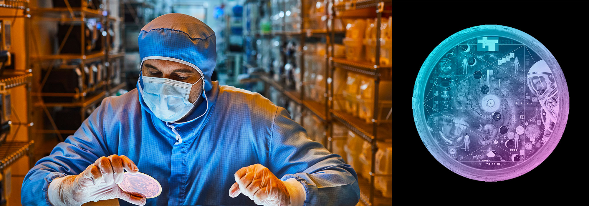
Nasa to send our human genome discs to the Moon
We'd like to say a ‘cosmic hello’: mathematics, culture, palaeontology, art and science, and ... human genomes.


Comparing classifier performance with baselines
All animals are equal, but some animals are more equal than others. —George Orwell
This month, we will illustrate the importance of establishing a baseline performance level.
Baselines are typically generated independently for each dataset using very simple models. Their role is to set the minimum level of acceptable performance and help with comparing relative improvements in performance of other models.

Unfortunately, baselines are often overlooked and, in the presence of a class imbalance5, must be established with care.
Megahed, F.M, Chen, Y-J., Jones-Farmer, A., Rigdon, S.E., Krzywinski, M. & Altman, N. (2024) Points of significance: Comparing classifier performance with baselines. Nat. Methods 20.
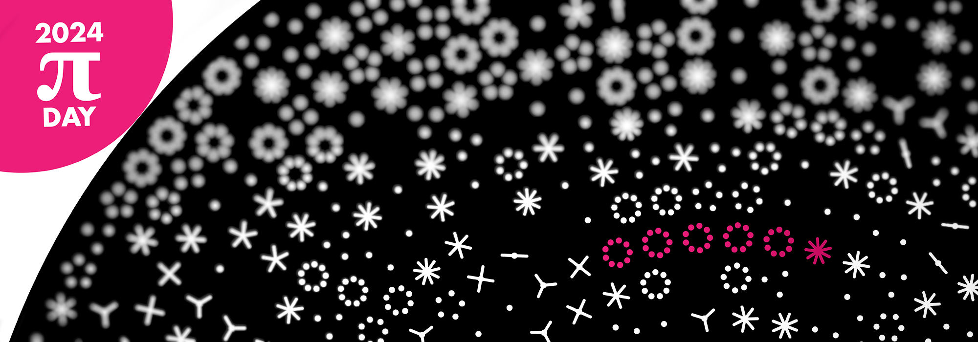
Happy 2024 π Day—
sunflowers ho!
Celebrate π Day (March 14th) and dig into the digit garden. Let's grow something.

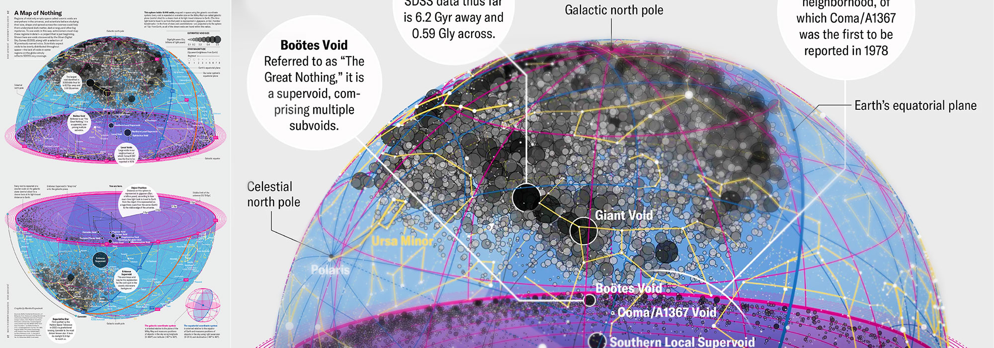
How Analyzing Cosmic Nothing Might Explain Everything
Huge empty areas of the universe called voids could help solve the greatest mysteries in the cosmos.
My graphic accompanying How Analyzing Cosmic Nothing Might Explain Everything in the January 2024 issue of Scientific American depicts the entire Universe in a two-page spread — full of nothing.

The graphic uses the latest data from SDSS 12 and is an update to my Superclusters and Voids poster.
Michael Lemonick (editor) explains on the graphic:
“Regions of relatively empty space called cosmic voids are everywhere in the universe, and scientists believe studying their size, shape and spread across the cosmos could help them understand dark matter, dark energy and other big mysteries.
To use voids in this way, astronomers must map these regions in detail—a project that is just beginning.
Shown here are voids discovered by the Sloan Digital Sky Survey (SDSS), along with a selection of 16 previously named voids. Scientists expect voids to be evenly distributed throughout space—the lack of voids in some regions on the globe simply reflects SDSS’s sky coverage.”
voids
Sofia Contarini, Alice Pisani, Nico Hamaus, Federico Marulli Lauro Moscardini & Marco Baldi (2023) Cosmological Constraints from the BOSS DR12 Void Size Function Astrophysical Journal 953:46.
Nico Hamaus, Alice Pisani, Jin-Ah Choi, Guilhem Lavaux, Benjamin D. Wandelt & Jochen Weller (2020) Journal of Cosmology and Astroparticle Physics 2020:023.
Sloan Digital Sky Survey Data Release 12
Alan MacRobert (Sky & Telescope), Paulina Rowicka/Martin Krzywinski (revisions & Microscopium)
Hoffleit & Warren Jr. (1991) The Bright Star Catalog, 5th Revised Edition (Preliminary Version).
H0 = 67.4 km/(Mpc·s), Ωm = 0.315, Ωv = 0.685. Planck collaboration Planck 2018 results. VI. Cosmological parameters (2018).
constellation figures
stars
cosmology
Error in predictor variables
It is the mark of an educated mind to rest satisfied with the degree of precision that the nature of the subject admits and not to seek exactness where only an approximation is possible. —Aristotle
In regression, the predictors are (typically) assumed to have known values that are measured without error.
Practically, however, predictors are often measured with error. This has a profound (but predictable) effect on the estimates of relationships among variables – the so-called “error in variables” problem.

Error in measuring the predictors is often ignored. In this column, we discuss when ignoring this error is harmless and when it can lead to large bias that can leads us to miss important effects.
Altman, N. & Krzywinski, M. (2024) Points of significance: Error in predictor variables. Nat. Methods 20.
Background reading
Altman, N. & Krzywinski, M. (2015) Points of significance: Simple linear regression. Nat. Methods 12:999–1000.
Lever, J., Krzywinski, M. & Altman, N. (2016) Points of significance: Logistic regression. Nat. Methods 13:541–542 (2016).
Das, K., Krzywinski, M. & Altman, N. (2019) Points of significance: Quantile regression. Nat. Methods 16:451–452.
Convolutional neural networks
Nature uses only the longest threads to weave her patterns, so that each small piece of her fabric reveals the organization of the entire tapestry. – Richard Feynman
Following up on our Neural network primer column, this month we explore a different kind of network architecture: a convolutional network.
The convolutional network replaces the hidden layer of a fully connected network (FCN) with one or more filters (a kind of neuron that looks at the input within a narrow window).
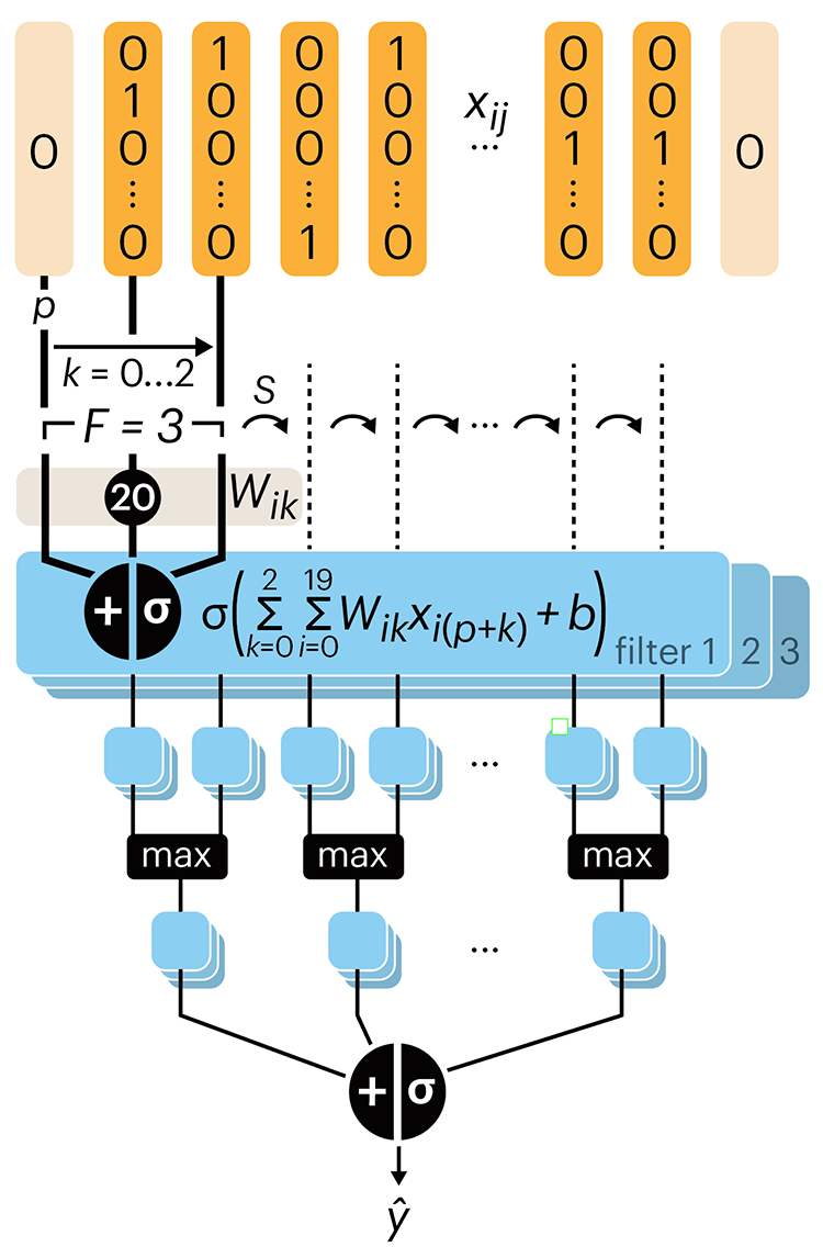
Even through convolutional networks have far fewer neurons that an FCN, they can perform substantially better for certain kinds of problems, such as sequence motif detection.
Derry, A., Krzywinski, M & Altman, N. (2023) Points of significance: Convolutional neural networks. Nature Methods 20:1269–1270.
Background reading
Derry, A., Krzywinski, M. & Altman, N. (2023) Points of significance: Neural network primer. Nature Methods 20:165–167.
Lever, J., Krzywinski, M. & Altman, N. (2016) Points of significance: Logistic regression. Nature Methods 13:541–542.