
Creating the Genome Research November 2012 Cover
contents
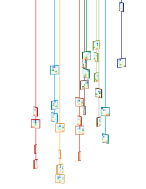
My November 2012 Genome Research cover design takes a fun and illustrative approach to visualization. It's a mix of art and science.
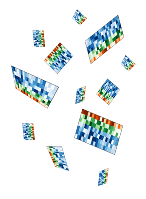
The cover image accompanies the article by Cydney Nielsen from our visualization group, describing her Spark tool for visualization epigenetics data.
Nielsen CB, Younesy H, O'Geen H, Xu X, Jackson AR, et al. (2012) Spark: A navigational paradigm for genomic data exploration. Genome Res 22: 2262-2269.

Instead of a literal depiction of output from Spark, the final design presents what appears to be necklaces of the kind of tiles that Spark uses for its visual presentation. I took a chance that Genome Research had a sense of humor. Luckily, they did and accepted the design for the cover.
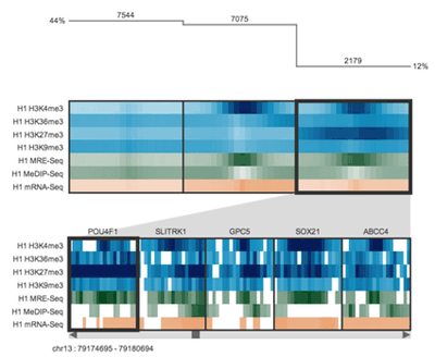
Colored tiles are playfully suspended on vertical strings to illustrate how Spark, presented in this issue, uses clustering to group genomic regions (tiles) with similar data patterns (colored heatmaps) and facilitates genome-wide data exploration. — Genome Research 22 (11)
Browse my gallery of cover designs.
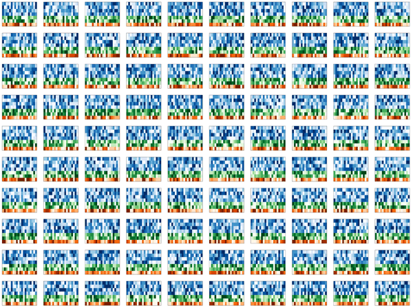
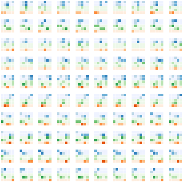
Thinking about design ideas for the cover, I looked to the kind of visual motifs that Spark used for inspiration. Immediately the colorful tiles, which represent clustered data tracks, stood out.
Spark's output is very stylized, colorful and high contrast. It was important to preserve this aesthetic in the design. I also wanted to incorporate the idea of clustering in the design, as well as the concept that the clusters represented data from different parts of the genome.
While it was not important to illustrate how Spark organizes and analyzed data explicitly — in fact, I wanted these aspects to be subtle — it was important that the cover illustration had connections to Spark at several levels.
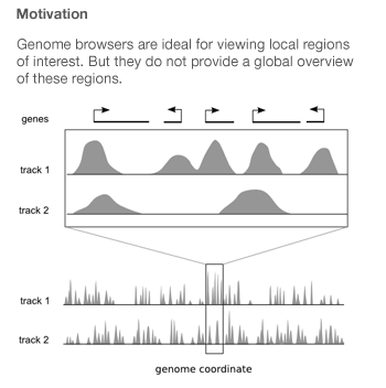
Spark was created by Cydney Nielsen, who works with me at the Genome Sciences Center. It is designed to mitigate the difficulties arising from the fact that genome-wide data is typically scattered across thousands of points of interest.
Genome browsers integrate diverse data sets by plotting them as vertically stacked tracks across a common genomic x-axis. Genome browsers are designed for viewing local regions of interest (e.g. an individual gene) and are frequently used during the initial data inspection and exploration phases.
Most genome browsers support zooming along the genome coordinate. This type of overview is not always useful because it produces a summary across a continuous genomic range (e.g. chromosome 1) and not across the subset of regions that are of interest (e.g. genes on chromosome 1). Spark addresses this shortcoming and provides a way to help answer questions like: What are the common data patterns across genes start sites in my data set?
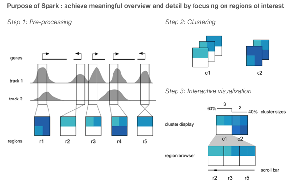
Spark's visualization is driven by clustering data tracks (e.g. ChIP-seq coverage) from across equivalent regions (e.g. gene start sites). The clustered tracks are displayed as heatmaps, with each row being a data track and each column a windowed region of the genome.
With fond memories of Monte Carlo simulations from my physics days, I set out to simulate some realistic-looking, but entirely synthetic, Spark cluster tiles.
My first idea was a design which would show these tiles falling, perhaps accumulating on a pile on the ground. Quick prototypes of this idea were disappointing. The tiles appeared flimsy and too complex, while the image was largely empty. I spent several hours messing around with the rotation and pseudo-3D layout, but could not find anything that was satisfying.

I thought to do this right would require a proper simulation within a 3D system.
To address the fact that the tiles felt flimsy and overly complicated and the design lacked depth, I simplified the tile simulation to generate 5x5 tiles. These simpler representations still embodied how Spark displayed data, but did so minimally.
To keep with the idea that the clusters come from different regions of the genome, I thought of arranging them along line segments. Unlike the design in which the tiles were falling, this constrained the layout significantly and allowed me to play with the design to make it look like the clusters were draped over it. By casting a light shadow behind each string of tiles, a subtle 3D effect could be achieved while still keeping the design within a plane.
There are 11 orientations of tiles created by rotating a thin square around the vertical axis with a slight forward tilt. There are 5 rotations to the left and right at angles 10, 26, 46, 66 and 80 degrees. The rotation was achieved using Illustrator's Extrude and Bevel 3D filter.
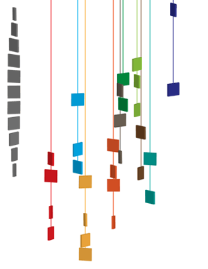
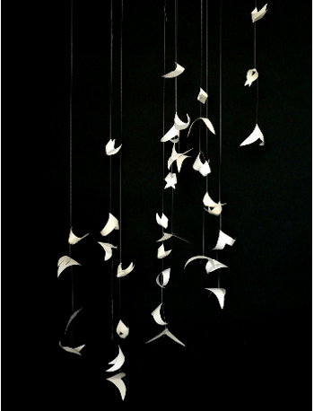
The layout and rotation of the tiles was inspired by Flight and Fall by Rachel Nottingham, a mobile of paper birds.
I wanted to keep the layout of the spark tiles pleasant, without being too organized. I find this to be a difficult balance to achieve — natural randomness is deceptively difficult to create by hand.
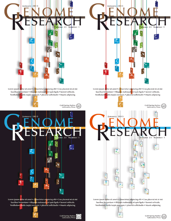
Four different versions of the design were submitted to Genome Research. I was happiest with the treatment in which the tiles maintained their color and the Spark clusters were projected as tones of white. This designed felt more solid and punchy — I feel like you can reach out and touch one of those strings.
Nasa to send our human genome discs to the Moon
We'd like to say a ‘cosmic hello’: mathematics, culture, palaeontology, art and science, and ... human genomes.


Comparing classifier performance with baselines
All animals are equal, but some animals are more equal than others. —George Orwell
This month, we will illustrate the importance of establishing a baseline performance level.
Baselines are typically generated independently for each dataset using very simple models. Their role is to set the minimum level of acceptable performance and help with comparing relative improvements in performance of other models.

Unfortunately, baselines are often overlooked and, in the presence of a class imbalance5, must be established with care.
Megahed, F.M, Chen, Y-J., Jones-Farmer, A., Rigdon, S.E., Krzywinski, M. & Altman, N. (2024) Points of significance: Comparing classifier performance with baselines. Nat. Methods 20.
Happy 2024 π Day—
sunflowers ho!
Celebrate π Day (March 14th) and dig into the digit garden. Let's grow something.

How Analyzing Cosmic Nothing Might Explain Everything
Huge empty areas of the universe called voids could help solve the greatest mysteries in the cosmos.
My graphic accompanying How Analyzing Cosmic Nothing Might Explain Everything in the January 2024 issue of Scientific American depicts the entire Universe in a two-page spread — full of nothing.

The graphic uses the latest data from SDSS 12 and is an update to my Superclusters and Voids poster.
Michael Lemonick (editor) explains on the graphic:
“Regions of relatively empty space called cosmic voids are everywhere in the universe, and scientists believe studying their size, shape and spread across the cosmos could help them understand dark matter, dark energy and other big mysteries.
To use voids in this way, astronomers must map these regions in detail—a project that is just beginning.
Shown here are voids discovered by the Sloan Digital Sky Survey (SDSS), along with a selection of 16 previously named voids. Scientists expect voids to be evenly distributed throughout space—the lack of voids in some regions on the globe simply reflects SDSS’s sky coverage.”
voids
Sofia Contarini, Alice Pisani, Nico Hamaus, Federico Marulli Lauro Moscardini & Marco Baldi (2023) Cosmological Constraints from the BOSS DR12 Void Size Function Astrophysical Journal 953:46.
Nico Hamaus, Alice Pisani, Jin-Ah Choi, Guilhem Lavaux, Benjamin D. Wandelt & Jochen Weller (2020) Journal of Cosmology and Astroparticle Physics 2020:023.
Sloan Digital Sky Survey Data Release 12
Alan MacRobert (Sky & Telescope), Paulina Rowicka/Martin Krzywinski (revisions & Microscopium)
Hoffleit & Warren Jr. (1991) The Bright Star Catalog, 5th Revised Edition (Preliminary Version).
H0 = 67.4 km/(Mpc·s), Ωm = 0.315, Ωv = 0.685. Planck collaboration Planck 2018 results. VI. Cosmological parameters (2018).
constellation figures
stars
cosmology
Error in predictor variables
It is the mark of an educated mind to rest satisfied with the degree of precision that the nature of the subject admits and not to seek exactness where only an approximation is possible. —Aristotle
In regression, the predictors are (typically) assumed to have known values that are measured without error.
Practically, however, predictors are often measured with error. This has a profound (but predictable) effect on the estimates of relationships among variables – the so-called “error in variables” problem.

Error in measuring the predictors is often ignored. In this column, we discuss when ignoring this error is harmless and when it can lead to large bias that can leads us to miss important effects.
Altman, N. & Krzywinski, M. (2024) Points of significance: Error in predictor variables. Nat. Methods 20.
Background reading
Altman, N. & Krzywinski, M. (2015) Points of significance: Simple linear regression. Nat. Methods 12:999–1000.
Lever, J., Krzywinski, M. & Altman, N. (2016) Points of significance: Logistic regression. Nat. Methods 13:541–542 (2016).
Das, K., Krzywinski, M. & Altman, N. (2019) Points of significance: Quantile regression. Nat. Methods 16:451–452.
Convolutional neural networks
Nature uses only the longest threads to weave her patterns, so that each small piece of her fabric reveals the organization of the entire tapestry. – Richard Feynman
Following up on our Neural network primer column, this month we explore a different kind of network architecture: a convolutional network.
The convolutional network replaces the hidden layer of a fully connected network (FCN) with one or more filters (a kind of neuron that looks at the input within a narrow window).
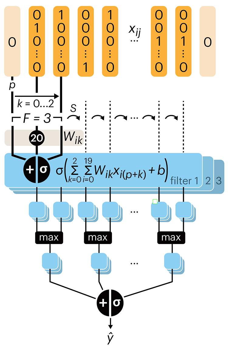
Even through convolutional networks have far fewer neurons that an FCN, they can perform substantially better for certain kinds of problems, such as sequence motif detection.
Derry, A., Krzywinski, M & Altman, N. (2023) Points of significance: Convolutional neural networks. Nature Methods 20:1269–1270.
Background reading
Derry, A., Krzywinski, M. & Altman, N. (2023) Points of significance: Neural network primer. Nature Methods 20:165–167.
Lever, J., Krzywinski, M. & Altman, N. (2016) Points of significance: Logistic regression. Nature Methods 13:541–542.