

Visions of Type
contents
- 1 · A font to test your eyes
- 2 · Optotypes
- 3 · Snellen chart design
- 4 · Snellen optotype font
- 5 · Classic and modern eyechart posters
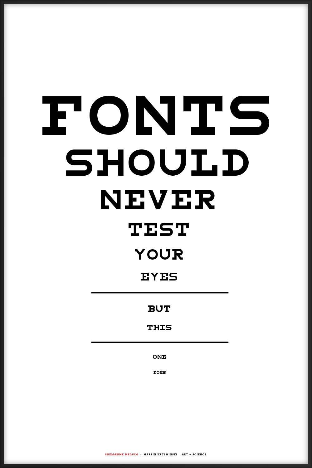
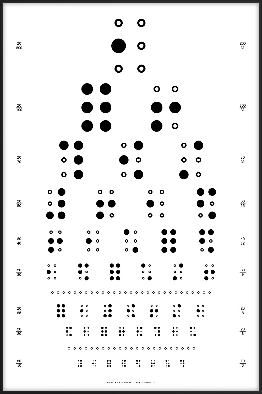
These typographical posters are designed after the style of the Snellen Chart, which is one of the kinds of eye charts used to measure visual acuity.
If you love looking, seeing and the universe, these posters are for you. They are available for purchase.
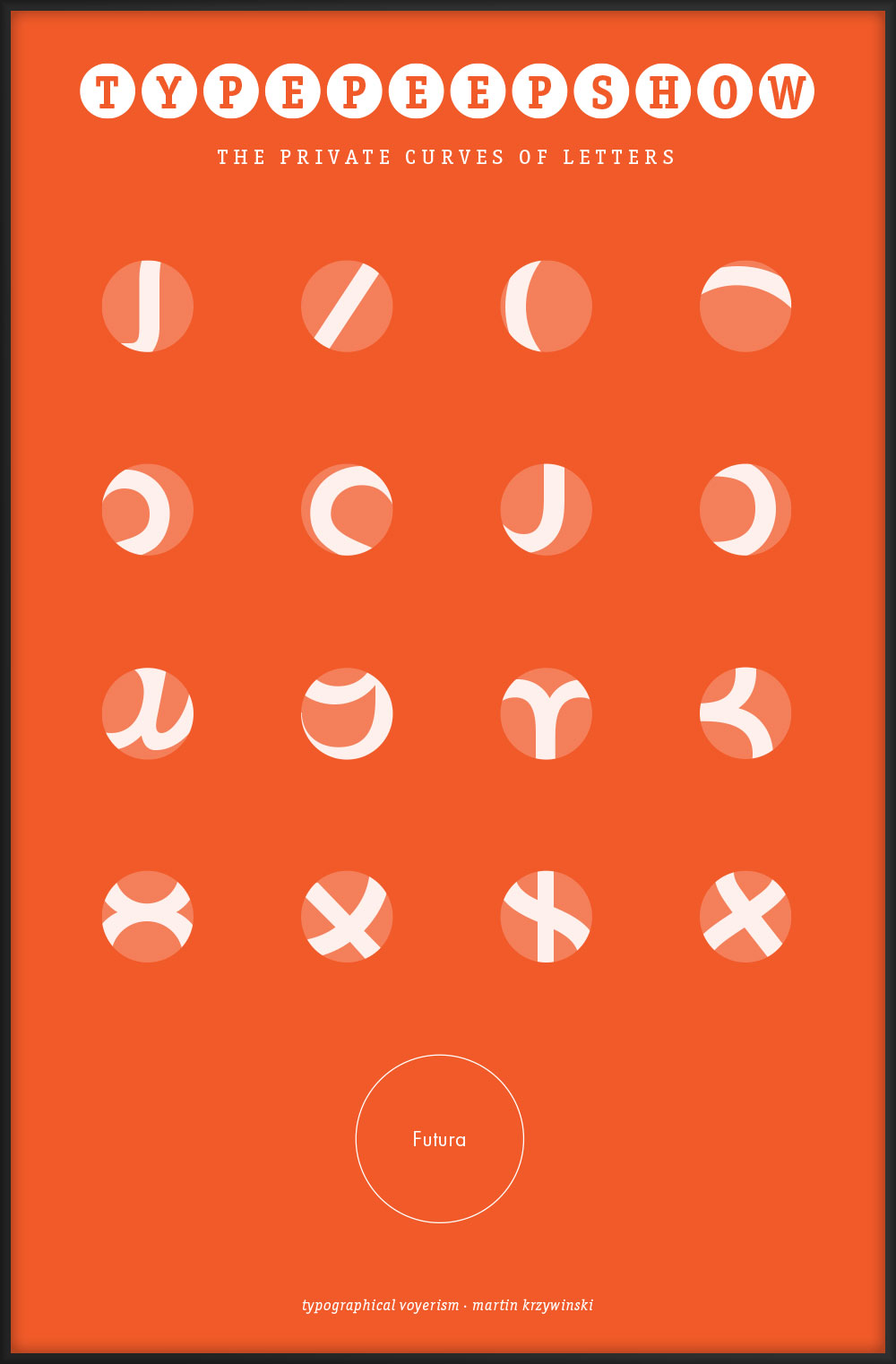
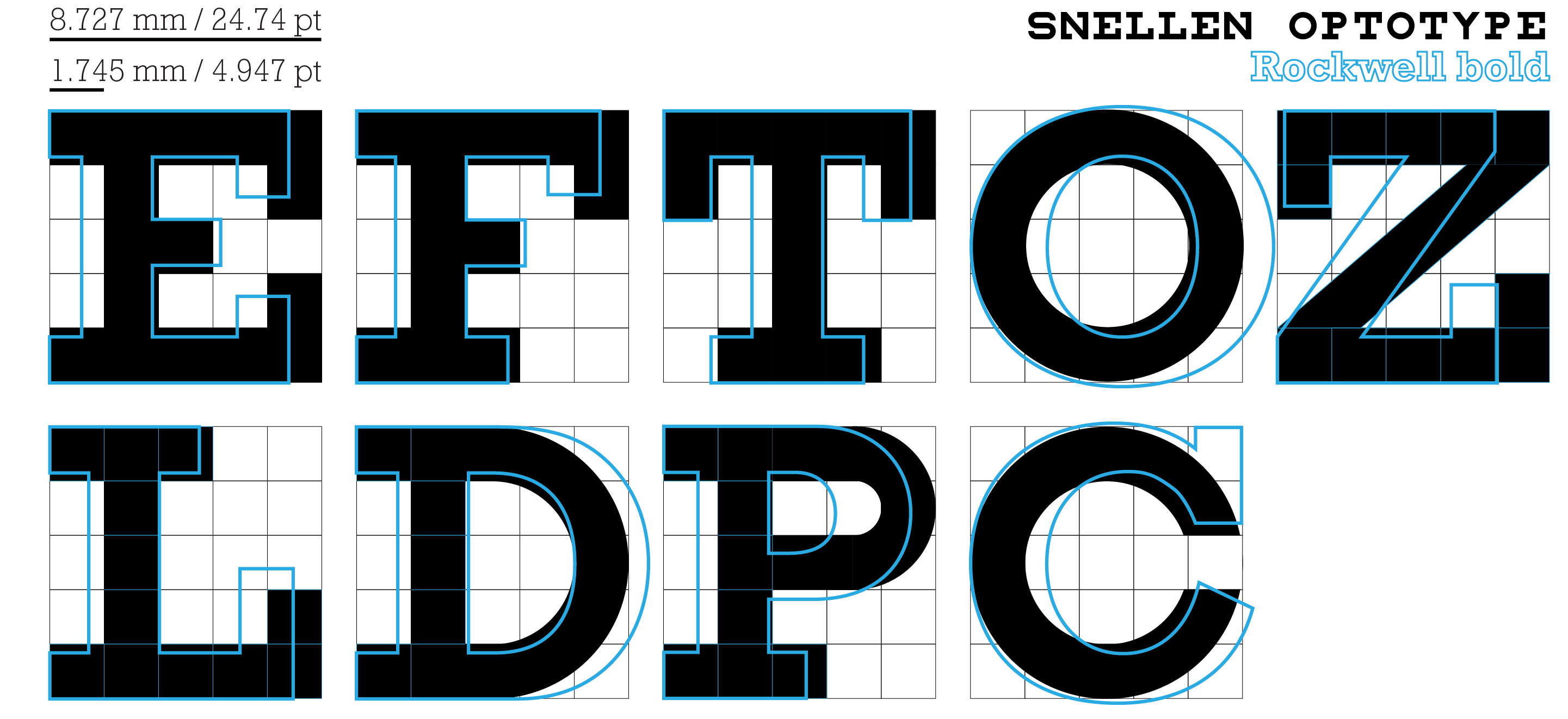
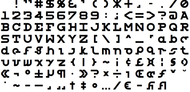
Symbols on such charts are known as optotypes. Fonts by Andrew Howlett exist whose glyphs conform to the properties of optotypes: Snellen font and Sloan font. However, some of the characters in the Snellen font file are a little oddly shaped—I provide my redesign of the Snellen font in which the glyphs are more consistent (see below). Lowercase characters are not available.
For the posters here, I've used either my redesigned Snellen font or Monotype's Rockwell, with minor stroke and kerning adjustments in places. Some symbols, such as on the math chart, were designed by hand.
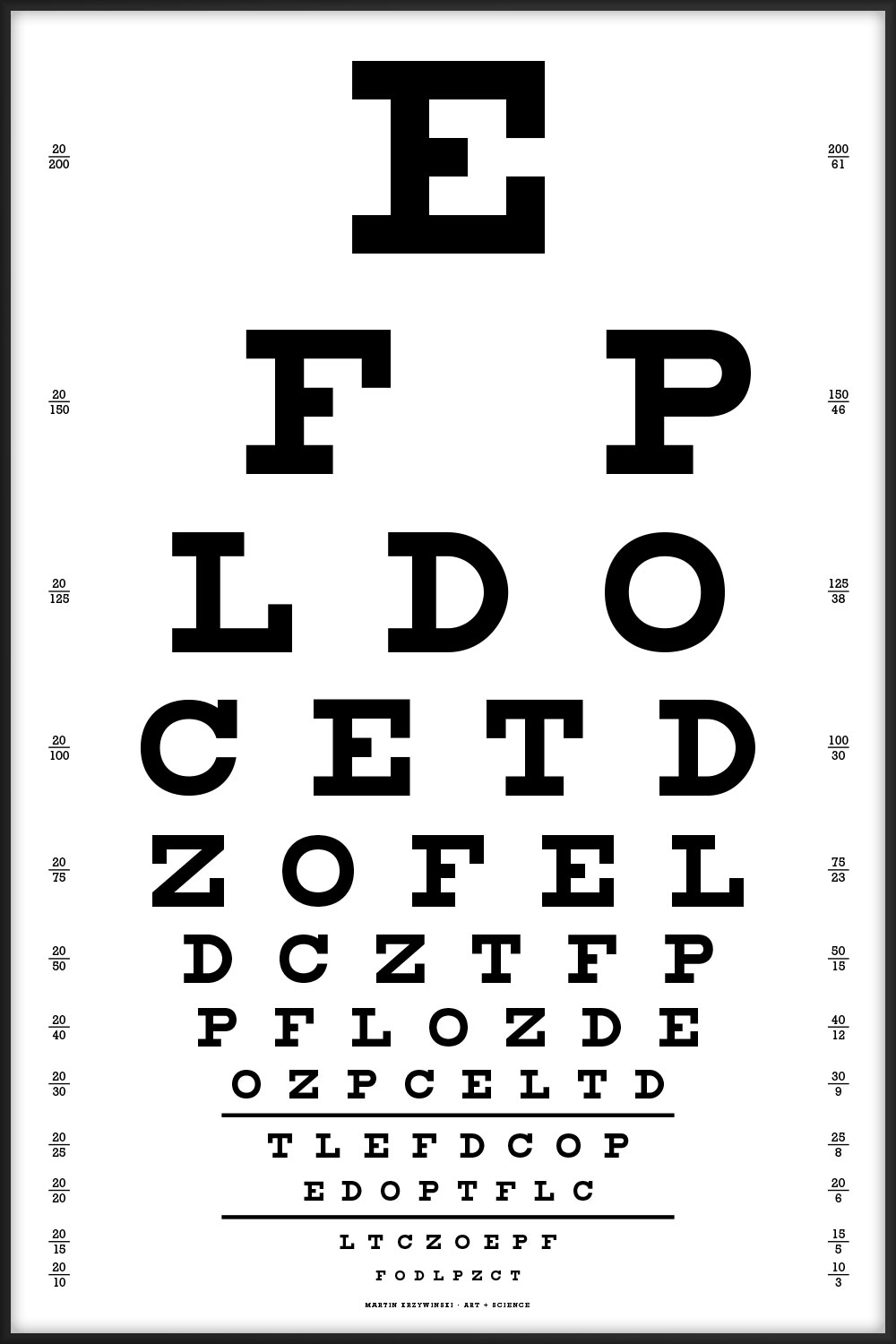
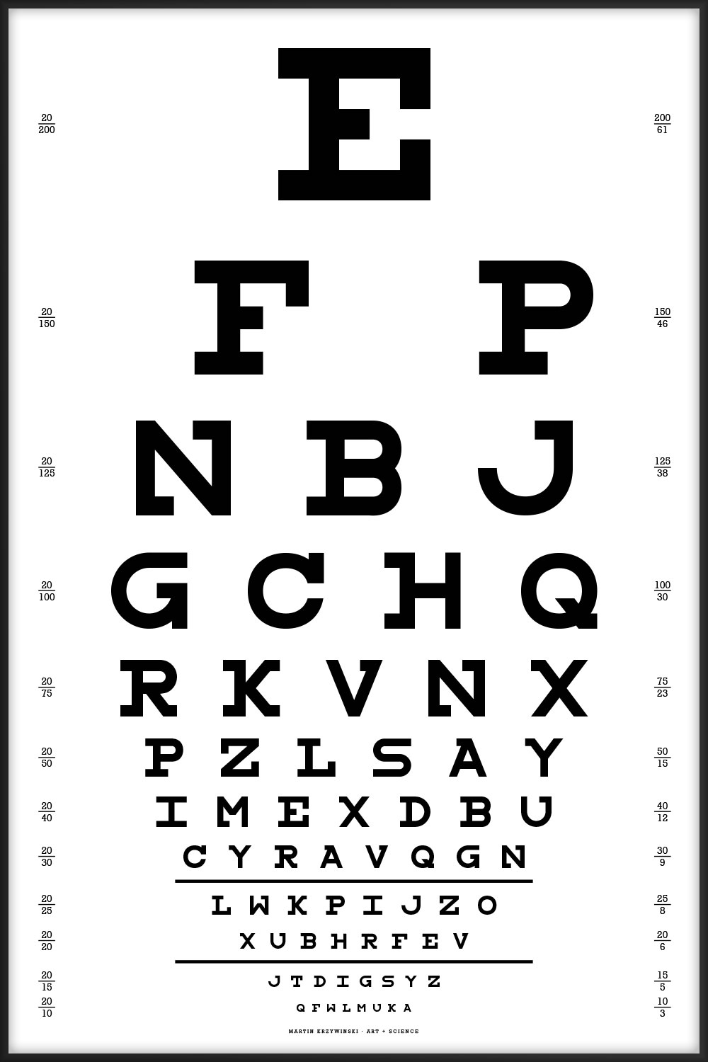
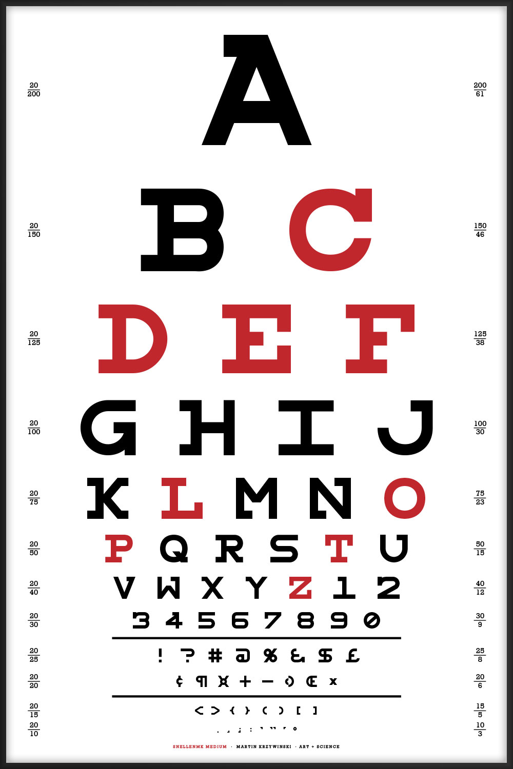
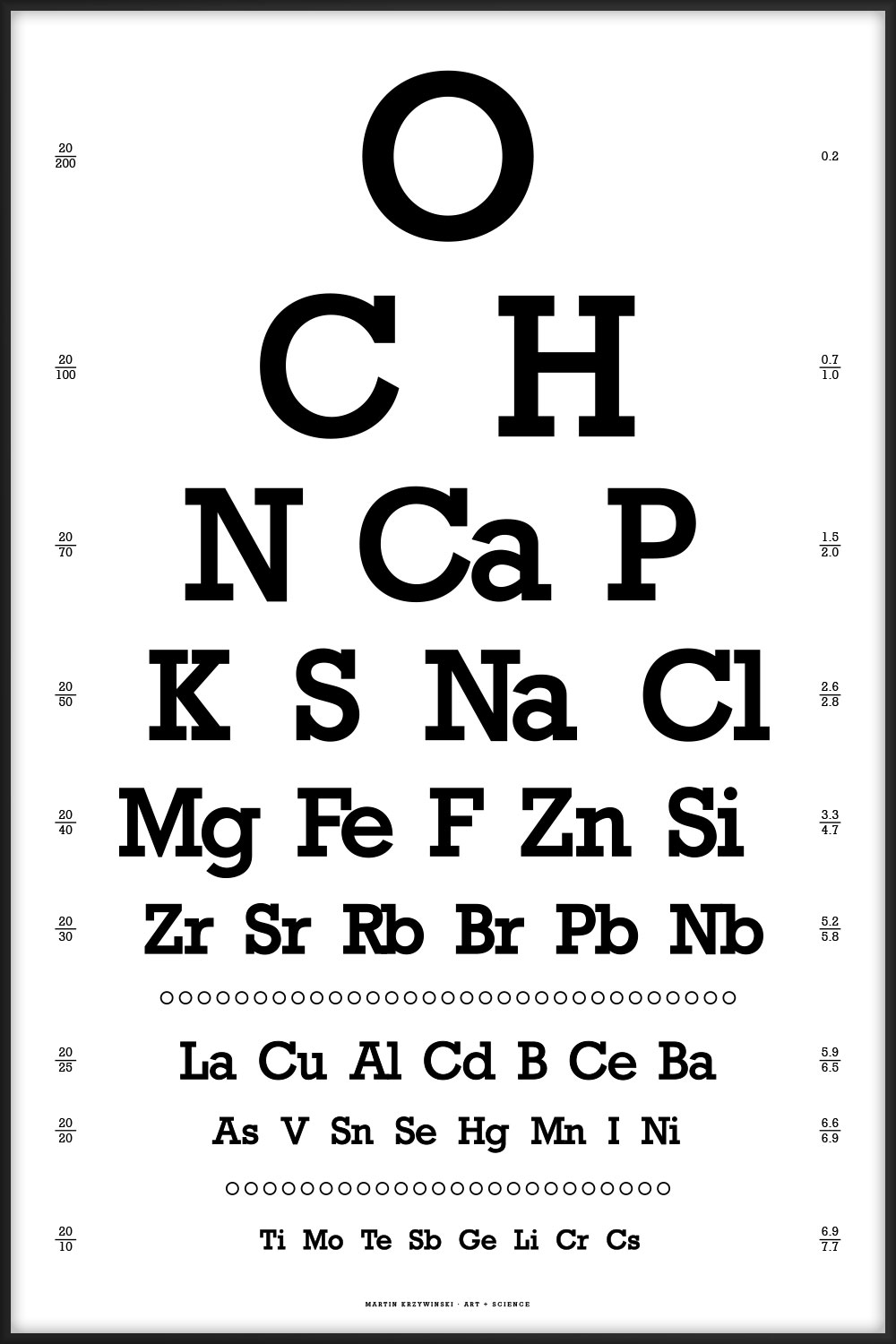
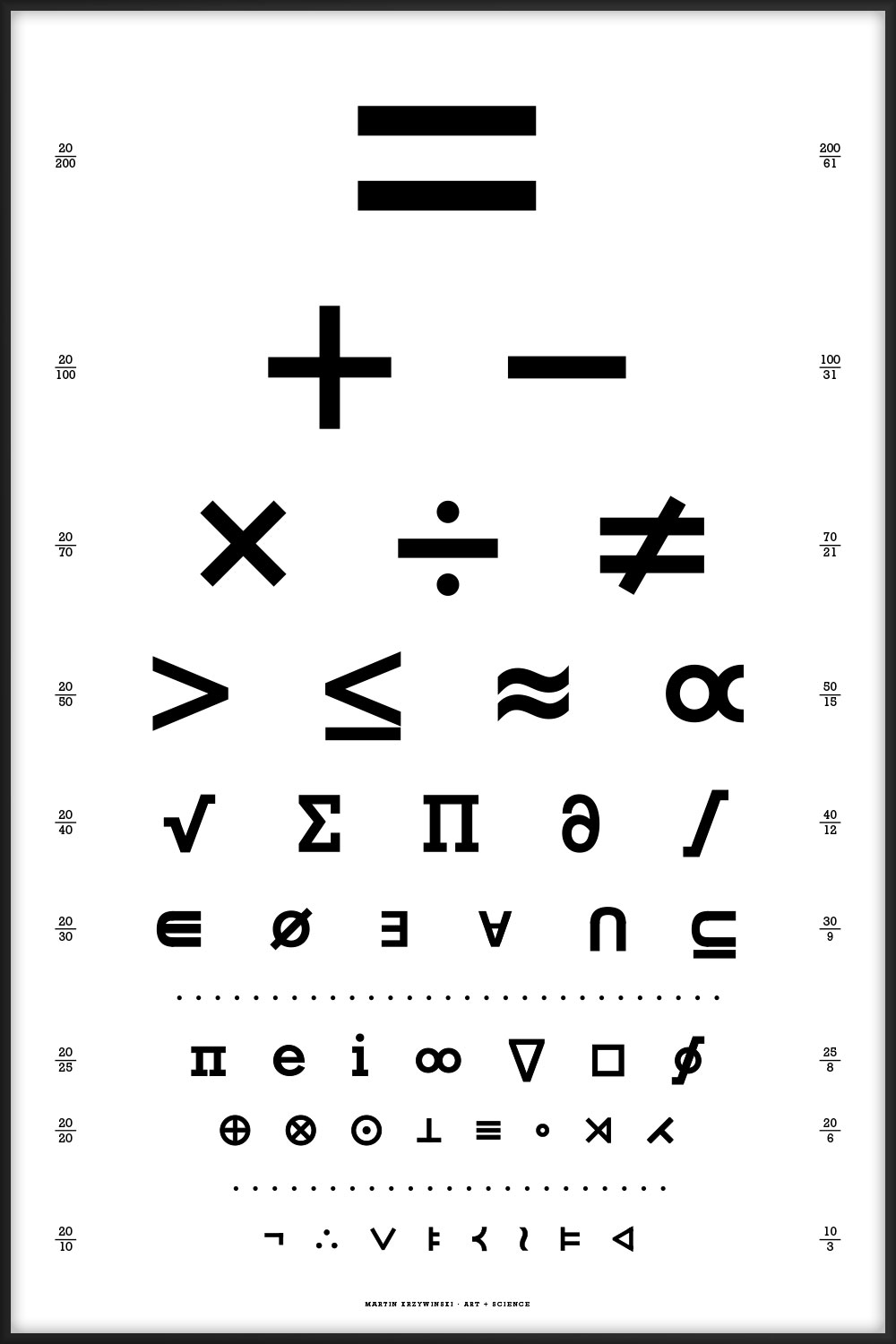
The numbers on the left side of the posters (e.g. 20/30) are a measure of visual acuity. The numbers on the right provide information about what is shown on the line (e.g. abundance of elements).
The charts are designed to be viewed at a distance of 6 meters (20 feet). At this distance, ability to resolve a letter tha subtends 5 minute of arc corersponds to 6/6 (or 20/20) visual acuity. This corresponds to a letter size of $$\frac{2\pi}{360} \times \frac{5}{60} \times 6 = 8.727 \, \text{mm} = 24.74 \, \text{pt}$$
The Snellen optotypes are designed on a 5 × 5 grid and have a fascinating history. For design, Rockwell and Lubalin Graph can be used to approximate Snellen, though these fonts lack the grid structure of the optotypes.
 buy artwork
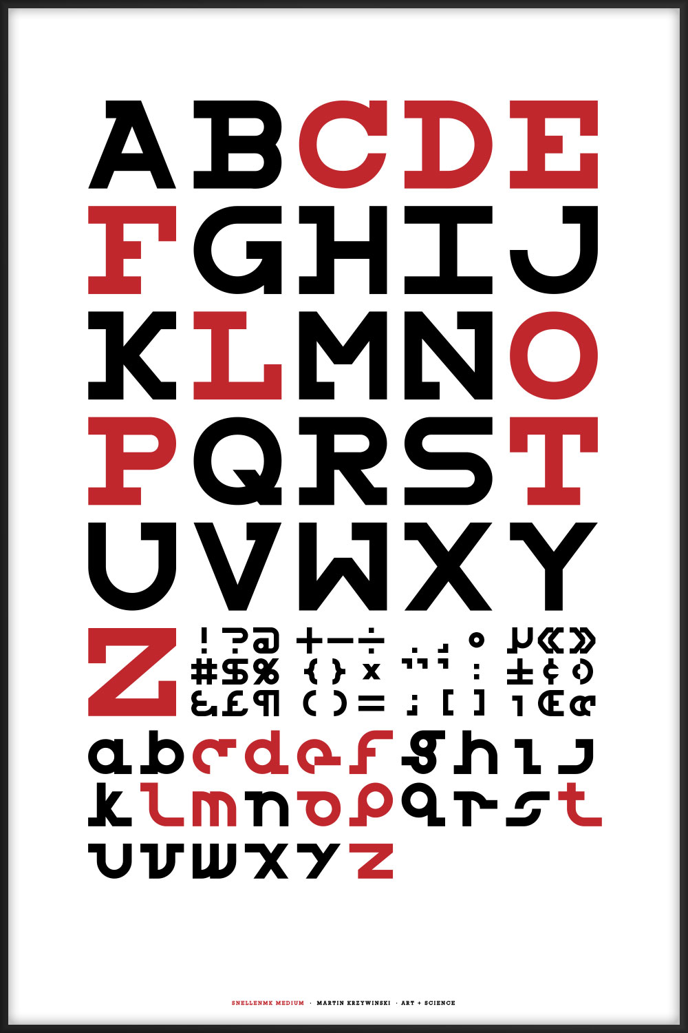
My redesign of Andrew Howlett's Snellen optotype font. Read about redesign process—which reinterprets some of the characters and adds lowercase.
You can download both versions of the font.
 buy artwork

These Snellen charts include acuity lines from 20/200 to 20/10.
The charts should be printed at a physical size of 16" × 24" (1150 pt × 1725 pt. At this size, the characters on the 20/20 line subtend 5 minutes of arc when viewed at 6 meters (20 feet), which is the technical specification of the Snellen chart.
When the charts are printed at this size, the two horizontal lines below the 20/30 and 20/20 lines are exactly 8" (576 pt) long. These length markers are my own addition.
If the chart is printed at any other size, the viewing distance changes. To compute the correct viewing distance, `d`, measure the length of these lines, `L` (in inches) and use $$ d = 6 \times L / 8 $$
For example, if I print this chart to fit onto an 8.5" × 11" page, these lines are 3.47". Thus, my smaller chart should be viewed from `6 \times 3.47 / 8 = 2.60 \, \text{m}` (8.53 ft).
Numbers on the left provide visual acuity in feet. Numbers on the right show the denominator of the acuity in feet and its equivalent in meters, rounded to the nearest integer.
The order of the 61 characters on the charts has been limit uniformity and avoid easily perceived patterns—especially in the case of the genetic sequence Snellen. These restrictions (e.g. limit in the number of repeated n-grams) apply across linebreaks.
This is the canonical Snellen chart, using the 9 original characters.
E FP LDO CETD ZOFEL DCZTFP PFLOZDE OZPCELTD TLEFDCOP EDOPTFLC LTCZOEPF FODLPZCT
- no more than 8 instances of any character and no fewer than 6
- no double characters (e.g. PP does not occur)
- no more than 2 repeats of any 2-gram (e.g. LT ... LT ... LT does not occur)
- all 3-grams are unique (e.g. LDO does not repeat)
- no identical adjacent characters across lines within a distance of one positions.
- for a given line, the characters at the same position in the previous 6 lines are all different.
 buy artwork
 buy artwork

This chart uses all the letters of the alphabet and is typset using my Snellen font redesign.
- all letters of the alphabet are used
- no more than 3 instances of any character
- no double characters (e.g. PP does not occur)
- all n-grams (n = 2, 3, ...) are unique
- on a given line, all characters are unique
- no identical adjacent characters across lines within a distance of 8 positions.
- for a given line, the characters at the same position in all other lines are all different.
E FP NBJ GCHQ RKVNX PZLSAY IMEXDBU CYRAVQGH LWKPIJZO XUBHRFEV JTDIGSYZ QFWLMUKA
 buy artwork
buy artwork
buy artwork
This chart uses all the letters of the alphabet and is typset using my Snellen font redesign.
 buy artwork
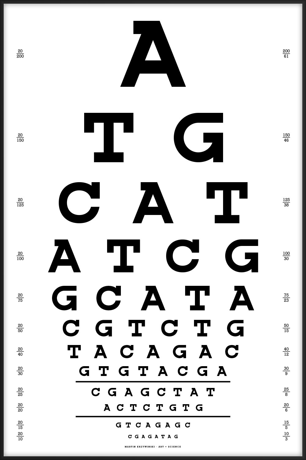
Since I work in a genome center, the one below is the one we'd use. Thanks to Dr. Nüket Bilgen for suggesting that the chart start with ATG (start codon) and end with one of the stop codons (TAG, TGA, but not TAA since no two adjoining characters can be the same).
- no more than 19 instances of any character and no fewer than 15
- no double characters (e.g. AA does not occur)
- no more than 7 repeats of any 2-gram
- no more than 4 repeats of any 3-gram
- no more than 2 repeats of any 4-gram or 5-gram
- for a given line, the characters at the same position in the previous 2 lines are different
- chart starts with start codon ATG
- chart ends with stop codon TAG, which appears only once; the other two stop codons (TGA, TAA) do not appear on the chart
A TG CAT ATCG GCATA CGTCTG TACAGAC GTGTACGA CGAGCTAT ACTCTGTG GTCAGAGC CGAGATAG
 buy artwork
The best alignments of this chart's sequence are to fungus (Leptosphaeria maculans lepidii, 35/42, 83%) and a tapeworm (Diphyllobothrium latum, 24/26, 92%). Thanks to Lorraine May for this observation!
Charts ahoy!
Z KE CHG XVRM YTWUS JQFINB EZAOXLD NHKVCUGF SWRMIAZP DBTOJYXE FZHLNUKA IVGMYCWR
 buy artwork
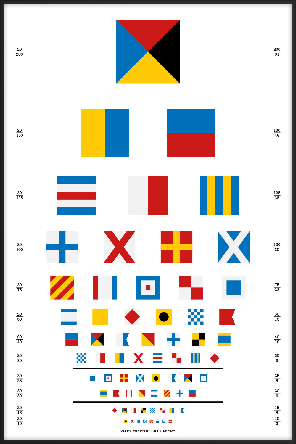
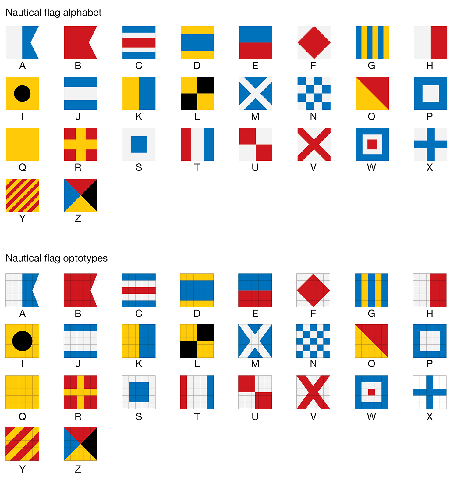
The flag alphabet has been designed to match, as closely as possible, to the style of the Snellen optotypes. In some cases this required that the geometry of the flag had to be adjusted—this may upset the purists and cause havoc on the waterways.
Proportions of colors has been adjusted in some flags to fit symmetrically into the 5 × 5 optotype grid. The checker of N is now a 5 × 5 grid. The number of stripes in Y has been reduced—the width of each stripe is now 20% of the width of the flag. Proportions in C, D, J, R, S, T, W and X have been adjusted so that color strips are a multiple of 20% of the width of the flag. The cross in M and V matches the X used in the Snellen font.
 buy artwork
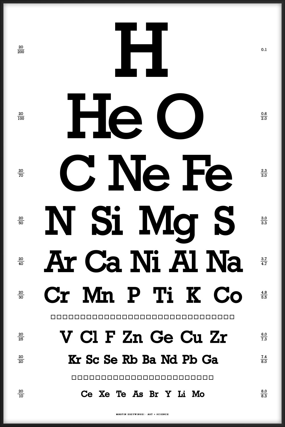
Elements are sorted in order of abundance. The numbers on the left show the max and min `-log_{10}` abundance of the elements listed on a given line. For example, 3.0/3.3 for the "N Si Mg S" line in the abundance of elements in the universe indicates that abundance of N is 0.001 and of S is 0.0005.
You can download my tidy plain-text table of abundance of elements in the universe (original source, 83 elements) and table of abundance of elements in the body (original source, 60 elements). These have been parsed from the original sources and give the `-log_{10}` abundance for various elements.

 buy artwork
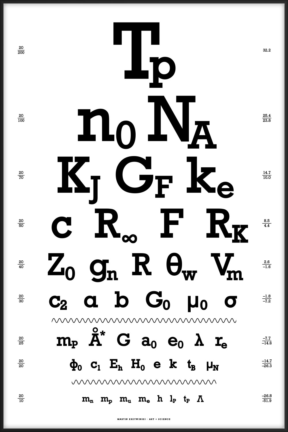
44 of the most interesting physical constants ranging from the very large (Planck temperature `T_p = 1.4 \times 10^{32} \mathrm{K}`) to the very small (cosmological constant `\Lambda = 1.19 \times 10^{-52} \mathrm{m}^{-2}`). You can download the table of constants and their values.


44 intriguing and perhaps mysterious mathematical symbols ranging from common equality `=` to the esoteric normal subgroup `\triangleleft`.
The chart is the visual form of a rhetorical question. The letter layout here is the same as in the canonical Snellen chart, which is limited to the 10 Sloan letters C, D, E, F, L, N, O, P, T, Z.

Nasa to send our human genome discs to the Moon
We'd like to say a ‘cosmic hello’: mathematics, culture, palaeontology, art and science, and ... human genomes.


Comparing classifier performance with baselines
All animals are equal, but some animals are more equal than others. —George Orwell
This month, we will illustrate the importance of establishing a baseline performance level.
Baselines are typically generated independently for each dataset using very simple models. Their role is to set the minimum level of acceptable performance and help with comparing relative improvements in performance of other models.

Unfortunately, baselines are often overlooked and, in the presence of a class imbalance5, must be established with care.
Megahed, F.M, Chen, Y-J., Jones-Farmer, A., Rigdon, S.E., Krzywinski, M. & Altman, N. (2024) Points of significance: Comparing classifier performance with baselines. Nat. Methods 20.
Happy 2024 π Day—
sunflowers ho!
Celebrate π Day (March 14th) and dig into the digit garden. Let's grow something.

How Analyzing Cosmic Nothing Might Explain Everything
Huge empty areas of the universe called voids could help solve the greatest mysteries in the cosmos.
My graphic accompanying How Analyzing Cosmic Nothing Might Explain Everything in the January 2024 issue of Scientific American depicts the entire Universe in a two-page spread — full of nothing.

The graphic uses the latest data from SDSS 12 and is an update to my Superclusters and Voids poster.
Michael Lemonick (editor) explains on the graphic:
“Regions of relatively empty space called cosmic voids are everywhere in the universe, and scientists believe studying their size, shape and spread across the cosmos could help them understand dark matter, dark energy and other big mysteries.
To use voids in this way, astronomers must map these regions in detail—a project that is just beginning.
Shown here are voids discovered by the Sloan Digital Sky Survey (SDSS), along with a selection of 16 previously named voids. Scientists expect voids to be evenly distributed throughout space—the lack of voids in some regions on the globe simply reflects SDSS’s sky coverage.”
voids
Sofia Contarini, Alice Pisani, Nico Hamaus, Federico Marulli Lauro Moscardini & Marco Baldi (2023) Cosmological Constraints from the BOSS DR12 Void Size Function Astrophysical Journal 953:46.
Nico Hamaus, Alice Pisani, Jin-Ah Choi, Guilhem Lavaux, Benjamin D. Wandelt & Jochen Weller (2020) Journal of Cosmology and Astroparticle Physics 2020:023.
Sloan Digital Sky Survey Data Release 12
Alan MacRobert (Sky & Telescope), Paulina Rowicka/Martin Krzywinski (revisions & Microscopium)
Hoffleit & Warren Jr. (1991) The Bright Star Catalog, 5th Revised Edition (Preliminary Version).
H0 = 67.4 km/(Mpc·s), Ωm = 0.315, Ωv = 0.685. Planck collaboration Planck 2018 results. VI. Cosmological parameters (2018).
constellation figures
stars
cosmology
Error in predictor variables
It is the mark of an educated mind to rest satisfied with the degree of precision that the nature of the subject admits and not to seek exactness where only an approximation is possible. —Aristotle
In regression, the predictors are (typically) assumed to have known values that are measured without error.
Practically, however, predictors are often measured with error. This has a profound (but predictable) effect on the estimates of relationships among variables – the so-called “error in variables” problem.

Error in measuring the predictors is often ignored. In this column, we discuss when ignoring this error is harmless and when it can lead to large bias that can leads us to miss important effects.
Altman, N. & Krzywinski, M. (2024) Points of significance: Error in predictor variables. Nat. Methods 20.
Background reading
Altman, N. & Krzywinski, M. (2015) Points of significance: Simple linear regression. Nat. Methods 12:999–1000.
Lever, J., Krzywinski, M. & Altman, N. (2016) Points of significance: Logistic regression. Nat. Methods 13:541–542 (2016).
Das, K., Krzywinski, M. & Altman, N. (2019) Points of significance: Quantile regression. Nat. Methods 16:451–452.