


data visualization + communication
Scientific data visualization: Aesthetic for diagrammatic clarity
“The great tragedy of science–the slaying of a beautiful hypothesis by an ugly fact.” wrote the English biologist Thomas Henry Huxley, also known as ‘Darwin’s Bulldog’ , in a statement that is as much about how science works as about the irrepressible optimism required to practice it. Equally great is the tragedy of obfuscating beautiful facts with ugly and florid visuals in impenetrable figures. It is not only a question of style—systemic lack of clarity, precision and conciseness in science communication impedes understanding and progress.
Well-designed figures can illustrate complex concepts and patterns that may be difficult to express concisely in words. Figures that are clear, concise and attractive are effective—they form a strong connection with the reader and communicate with immediacy. These qualities can be achieved by combining data encoding methods, to quantify, with principles of graphic design, to organize and reveal. Best practices in both aspects of visual communication are underpinned by conclusions from studies in visual perception and awareness and respect how we perceive, interpret and organize visual information [1, 2].
Scientific figures are often judged by how well it functions as a diagram. As accounted for in Chapter 2 in this volume, diagrams should present data neutrally, responsibly include uncertainty and sources of potential bias, achieve contrast between patterns that are meaningful and those that are spurious, encapsulate and present derived knowledge and suggest new hypotheses.
Equally important, though more elusive, is a figure’s aesthetic, visual engagement and emotional impact. What is the relationship between this visual form and underlying function and how can any such connection be used to formulate best practices? Is the form of a scientific figure entirely dictated by its function or can form be decoupled and independently altered? This chapter addresses these points specifically with regard to diagrams.
Visual Grammar
We all use words to communicate information—our ability to do so is quite sophisticated. We have large vocabularies, understand a variety of verbal and written styles and effortlessly parse errors in real time. But when we need to present complex information visually, we may find ourselves at a “loss for words” , graphically speaking.
Do images and graphics possess the same qualities as the spoken or written word? Can they be concise and articulate? Are there rules and guidelines for visual vocabulary and grammar? How can we focus the viewer’s attention to emphasize a point? Can we modulate the tone and volume of visual communication? These and other questions are broadly addressed through design, which is the conscious application of visual and organizational principles to communication. Their practice can be thought of as a kind of visual rhetoric whose aim is to clearly transmit ideas and experimental outcomes without bias while maintaining intellectual integrity and transparency.
All of us have already been schooled in ‘written design’ (grammar) and most of us have had some experience with ‘verbal design’ (public speaking) but relatively few have had training in ‘visual design’ (information design and visualization). However, before we learn how to visually communicate, we must figure out what we wish to say.
Constraints and Clarity
The scientific process works because all its output is empirically constrained. As such, the reporting of scientific knowledge can be dry and unemotional. R.M. Pirsig writes in Zen and the Art of Motorcycle Maintenance [3], his briliant classic 1974 novel, that the purpose of science is “not to inspire emotionally, but to bring order out of chaos and make the unknown known” , underscoring the fact that clear communication is paramount [3]. This is because “order out of chaos” rarely arises from a single observation or theory but from many small incremental steps and, as such, it is important to clearly communicate the minutiae, not only the grand discoveries, to improve the chances of scientists to successfully connect ideas.
This deep requirement for clarity and specificity means that both written and visual style must be “straightforward, unadorned, unemotional, economical and carefully proportioned” [3] because “rich, ornate prose is hard to digest, generally unwholesome, and sometimes nauseating” [4]. It is “not an esthetically free and natural style. It is esthetically restrained. Everything is under control.” and the quality of communication “is measured in terms of the skill with which this control is maintained” [3]. When information is hastily arranged or tinted with arbitrary personal taste its impact and fidelity can easily be diluted.
The primary payload of scientific communication is its information content. The form of the communication must therefore always be subordinate to it. Form must not only respect content, but elevate it, clarify it and untangle its complexity. Anytime it overwhelms content we are likely to find signs of bad design choices and possibly lack of respect for information. The footprint of design should therefore be subtle, despite the fact that the product may hastily be perceived as possessing “surface ugliness” [3] because it lacks the loud and tawdry design tropes used to please the eye and disengage critical thinking made familiar by marketing and advertising.
That being said, unfamiliar forms condemned as “overwhelming content” may actually be the products of genuine and inventive explorers who create new ways of respecting content and connecting us to it. Such hasty perceptions should be avoided and judgment deferred until the motivation and intention of the creator are well understood. For example, although the form of the pneumococcal transformation in the watercolor painting (Figure 1.4 in Chapter 1) is radically different than what would normally appear in the primary scientific literature (Figure 1.3 in Chapter 1), it should never be regarded as having less utility. In addition to stimulating a wider audience to participate in the conversation about the importance of pneumococcus, it demonstrates a key aspect of the biochemistry that is missing from traditional depictions. Namely, that cells are packed with biologically active molecules to a much greater extent than would normally be inferred from traditional figures. This dense packing may be surprising and is a convenient springboard to discussion about critical concepts such as entropy, entropic trapping, kinetics and thermodynamics.
Design is choreography for the page
When visualizing a complex process, concept or data set it is irresponsible to dump the information on the page and leave the reader to sort it out. We understand enough of how visual information is organized and processed to realize that often our readers’ visual system can sabotage our attempts at communication.
The human visual system, from retina to cortex, is extraordinarily complex. But even basic knowledge of its working can be leveraged to avoid surprises – “you saw what in my figure?” For example, knowing how we perceive color allows us to create data-to-color mappings in which relative changes in data can be visually perceived with accuracy. This mitigates the optical illusion of the luminance effect, in which the perception of a color is influenced by nearby colors [5]. We also know that there are some things that grab our visual attention first (and don’t let go) [6-8], that the distribution patterns in collections of similar shapes elude us [9] and that we cannot accurately judge relationships between areas [1]. These disparate observations about our visual system are brought together into a phenomenological model known as the Gestalt principles [10, 11], which can guide how we organize elements on a page to achieve flow and salience that is compatible with what we’re trying to communicate.
It is more productive to think about visual communication from the top down rather than bottom up. The main motivating factor informing design decisions should be the core message (what are we trying to say?) and aspects of its quality such as accuracy, clarity, conciseness, and consistency. With these in mind, we can approach design as a balance of focus, emphasis, detail and salience. It is only once these points are addressed that we can begin to reflect on the task of communicating from the bottom up and make practical selections about data encoding, color, symbols, typeface, arrows, line weight and alignment.
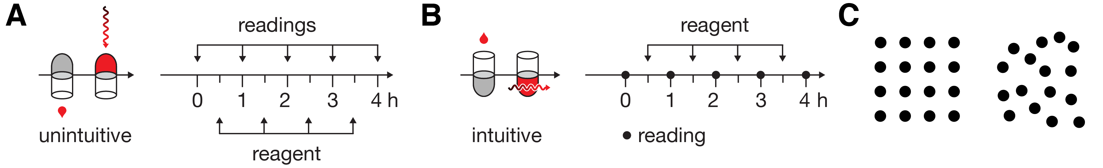
Where possible, design should depict familiar physical processes as intuitively as possible. It would be irrational to graphically represent the addition of a reagent to a test tube from the bottom with the tube pointing down (Figure 1A). And yet, this is exactly what we’re expected to accept by the quantitative timeline depiction in [12]. Once the tube and reagent are drawn right-side-up, a more appropriate encoding of the timeline readily presents itself (Figure 1B). This simple flip is part of the subtlety of the aesthetic.
We should always aim to lower the cognitive load of parsing a figure. To achieve this, we can make use of our ability to subitize—a process in which we can determine the number of shapes in a group without explicitly counting them [13]. Our ability to perform this kind of pre-attentive counting is limited to about 3–5 elements and there is diverse evidence in how it relates to explicit counting [14]. Spatial variation (Figure 1C) disrupts this process.
Just as this kind of arbitrary spatial variability should be limited, aspects of color, shape and texture should also be controlled—when unnecessarily varied they compete for visual attention. At all times, visual salience must be informed by relevance—the figure should not be a visual distraction theme park [6, 8]. For example, excessive visual flourish makes it more difficult to present a narrative with ordered elements because we cannot reliably predict the path of the reader’s eye—everything looks important and it is not clear where to look (Figure 2A). By adopting a minimal and unencumbered elements of style [15], formatting aspects such as space, color, and shape gain specificity (Figure 2B). It is difficult to use spot color to emphasize similarity in a figure replete with color. For example, it would be difficult to make element B in Figure 2A stand out because there is already too much competition for our attention. If other elements could be made more subtle, such as in Figure 2B, it is enough to spot color with red. Saliance can be achieved with even subtle markings. The white dot inside the rectangles of elements C and D in Figure 2B are very quickly seen—the bounding rectangle acts as negative space to focus our attention on the dot—and allow us to indicate a relationship between C and D.
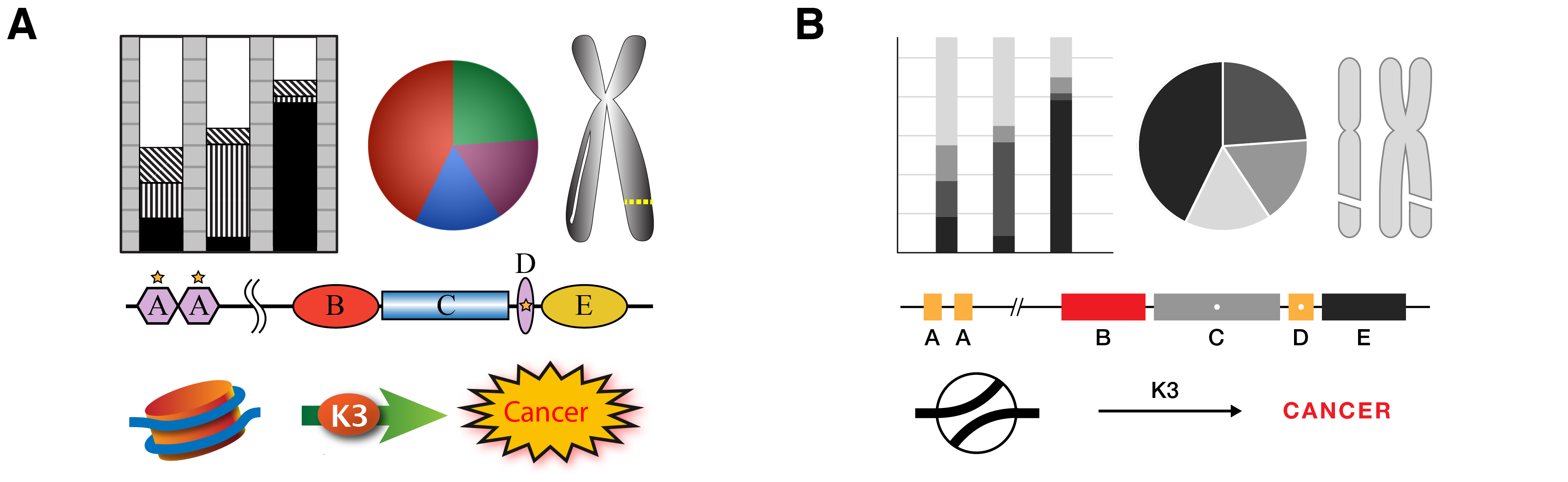
An even more important contributor to a clarity in design is the requirement that elements vary in proportion to the variation in the data or concepts they represent. This relatively strict requirement comes from the fact that quantitative aspects of shapes, such as position, size, shape and color (hue, richness, luminosity), are all data encodings. When these aspects are decoupled from data and allowed to change based on arbitrarily design choices it becomes difficult to assess which differences are due to data and which are due to formatting. For example, each of the elements A, B, C, D and E in Figure 2A have not only horizontal but, because of their shapes, vertical extent. What should we infer from the fact that D is taller than A? Elements A and D share color and a star, but have different shapes. How is the star different from the color? Should we infer similarity between B, D and E because they are ovals?
Limiting variation is equally important in quantitative figures. Practically, because the core message in quantitative information is often difficult to pin down—there may be several equally important points to raise or the data set may not yet be fully understood—there is a tendency for authors to rush straight into the choice of data encoding and hope that the relevant data will be fortuitously arranged and informative patterns will somehow present themselves. Hoping that the data will speak for themselves is a dangerous gamble, even in small data sets (Figure 3A–E). When raw data are shown, there remain many possible interpretations, which may be motivated by formatting and layout. Grouped numbers into pairs (Figure 3A) motivates within-pair comparisons leading to the observation that the second number in the pair is always larger and that the first number begins with the same digit that the second one ends. Grouping numbers into rows (Figure 3B) makes it easier to observe that first row is composed of odd numbers and the second row of even numbers, something that was harder to spot in the pair grouping. Without guidance from the figure designer, the reader cannot know whether these observations are relevant. By discretizing the numbers into one of three ranges, the importance of specific values is played down (Figure 3C). Showing the histogram of the counts of numbers (Figure 3D) emphasizes that counts within ranges are important and makes it obvious that the odd/even distinction is not important—the reader has been subtly steered away from unproductive thoughts about the data. Finally, by removing the values altogether (Figure 3E) the core message is distilled further: there are significantly fewer mid-sized values than expected.
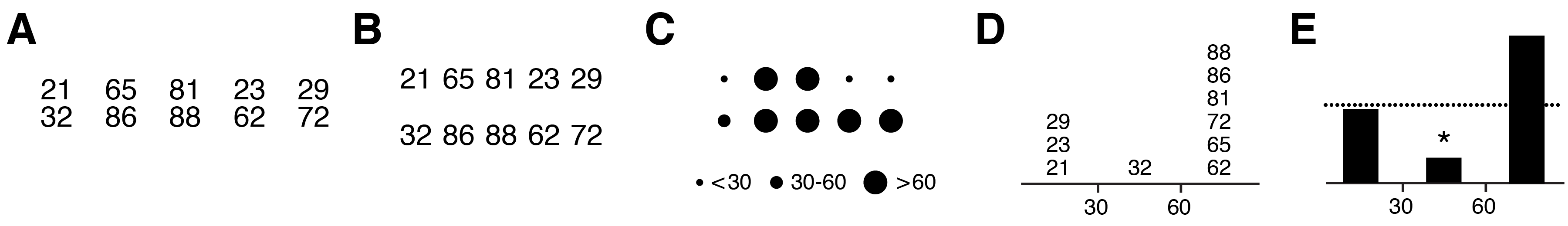
Every element in Figure 3E is necessary to convey the message (removing the dashed line deprives the reader of information needed to fully formulate the conclusion). Clarity is achieved because detail in the data has been encapsulated to expose only the relevant differences, much like the detail in fanciful shapes in Figure 2A has been suppressed in Figure 2B, which avoids visual clutter. Note also that the use of the * to mean “statistically significant” is a visual convention in data statistics that requires no explanation in the figure itself (the legend should describe the statistical test, sample size, P value and effect size). Such conventions are powerful—the figure becomes self-contained.
It is not enough to merely maximize the data-to-ink ratio [16], which is the proportion of ink (or pixels) that encode the data, but have in mind which patterns can be discerned and what conclusions offered by the figure are actionable. Thus, actionable-data-to-ink ratio is also important—it is not enough to show what we have, we need to have some sense of what can be done with it.
As important as these concepts are, without a means to practically and consistently implement them in figures, they remain mere hopes and effective communication becomes a happy accident. Below, examples from the literature will be used to show how design choices affect these concepts and to demonstrate that minor changes in formatting can greatly improve comprehension in the ‘concept figure’ and the ‘data figure’.
The Concept Figure
The concept figure is one of the most challenging to design. Concepts can be based on progression, change, transformation, relationships, and differences all of which could be spatial, temporal, qualitative or both. Matching visual properties, such as shapes, color and position, of elements in the figure to unambiguously and specifically match these relationships requires attention.
To think about visual design of concepts, we must fall back to the fundamental concepts of top-down design discussed in the context of Figures 1–3. Is the core of the concept clear? Are key points found along the figure’s central vertical and horizontal axes? Is the eye encouraged to flow along an intuitive path of explanation? Is there sufficient encapsulation to shelter the reader from extraneous details? Is relevant similarity between objects made clear? Have things that are dissimilar been accidentally grouped by shape, color or proximity? If there is a temporal flow or spatial compartmentalization, is the progression clear? If the same phenomenon is shown at different scales, is the organization of the magnified vignettes compatible with the rest of the figure.

Part of Figure 4A was used in Chapter 1 of this volume as the starting point to generate a watercolor representation of the molecular biology of Streptococcus pneumonia [17]. The final painting beautifully depicts the complexity, density and diversity of the molecular agents both in the process and background. Design decisions were balanced by knowledge about the system and personal aesthetic and, critically, the latter was never allowed to override the former. The image encourages and rewards exploration and, when accompanied by an interpretive legend, has pedagogical value.
If we look back to the original concept figure from literature [17], we find that it similarly contains both knowledge and personal aesthetic. However, the sophistication of the aesthetic lags behind the information content in the figure—ad hoc and inconsistent design interfere with clear presentation. The cluttered design introduces ambiguities, which make understanding the concepts difficult: Why is the host chromosome arranged in three loops? What does the brick pattern in the membrane represent? What is the square under the right EC molecule? Why are some arrows dashed? What is the significance of different shapes of proteins (pentagon, oval, circle)? These ambiguities compound to make the entire process difficult to grasp without resorting to the legend.
The multiplicity of colors and shapes creates a mismatch between salience (what stands out to the eye) and relevance (what is important). Background entities and navigational components should complement and not compete with the core message. For example, yellow is a very salient color and is used to highlight the EndA protein, which degrades the double-stranded DNA, a critical step. Unfortunately, RecA is similarly colored. This not only takes focus away from EndA it also motivates similarity grouping and suggests proteins are somehow related, but there is no evidence in the paper that they are.
The presence of green, used to color the host DNA, the host cell and proteins reduces the salience of red. More importantly, the green/red combination is not color-blind safe—these colors will appear similar to readers with deuteranopia and all focus on DNA will be lost [18].
A redesign of Figure 4A is presented in Figure 4B. Variation in shape and color is minimized. The green host color has been replaced by grey—removing color from background elements increases the salience of the red used for the DNA strands and makes it easier to perceiving changes along the pathway. Blue has been retained speculatively for DpnA because the protein appears in steps 3 and 4—any such emphasis should be justified in the legend. All the strands have uniform thickness (0.75 pt) and are drawn as simply as possible—it is unnecessary to mimic the double helix motif, or any kind of bending.
Topologically complex processes like strand joining should be shown as simply as possible. The choice of equal lengths, consistent spacing and alignment helps identify similarity between elements, such as sequence similarity that makes step 5 possible. In the original figure, it is not clear where the start and end of the labeled sequence regions (A, B, R1, R2) are. Moreover, it’s not clear whether R1 and R2, identified as repeat sequence, are actually identical or different instances of the same repeat family. Only A, R1 and R2 need to be identified in the process—both B and Z are superfluous. The redesign presents the two double strands as identically as possible, with simplified labels for the repeat sequence, R and R’, instead of the cumbersome subscripts. By keeping all labeled segments the same length and placing the red ssDNA in the center of the figure, the focus is kept on the bridging process.
One of the ways in which the cohesion of a figure can be assessed is to independently picture its functional and navigational components. For example, if we draw only the arrows and labels of Figure 4A, we find a jumble (Figure 4C). The environmental signal comes in right-to-left, which contradicts the more intuitive left-to-right direction for a beginning step. The spacing between the arrows between steps 1, 2 and 3 is inconsistent, as is the alignment between the green horizontal arrows that point to the molecular mechanisms of steps 2 and 3. Why is the first arrow angled and why is the second green arrow shorter? Had elements been placed with more foresight, all the arrows could be made horizontal or vertical, of the same size, and consistently spaced. The arrows in the cycle of transformation in the bottom right have various amount of curvature and their orientation does not help in establishing smooth flow. In particular, the arrow above the two RecA molecules is very disruptive.
Labels are both inconsistent and poorly aligned. For example, what is ‘Out’ and ‘In’ ? The words suggest motion but really they really mean ‘extracellular’ and ‘intracellular’ and are redundant if the membrane is indicated clearly. Labels of protein names vary in size, which breaks grouping by similarity, making it more difficult to perceive the protein name labels as objects of the same category. Curiously, the ‘In’ and ‘Out’ labels are larger than the protein names in the initial processing loop, which are much more relevant. The first instance of the blue protein that we are likely to see (bottom middle), because of the large amount of negative space around it which functions to emphasize the shape, is unlabeled. The DprA label is found at the edge of the figure, quite far from where it is most needed. Note that the SsbB is labeled in its first salient instance, unlike all the other proteins.
When the arrows and labels in the redesigned figure are shown in isolation (Figure 4D), we see a consistently spaced backbone of navigational elements that act as a grid and assist in impose order on information. Protein labels are bolded for emphasis and separation from other labels and PG and PM labels have been added to indicate peptidoglycan and plasma membrane components of the cell wall.
Figure 4 is a good example of how simplification and clarification of complex visual presentation affects its aesthetic.
The Data Figure
The data figure is different from the concept figure in that it is based on quantitative information that can be numerically transformed, can be accompanied by measures of uncertainty and whose proportions can be mathematically compared. The data figure, in addition to the kinds of relationships and hierarchy of information found in the concept figure, may also need to capture statistical trends and show clearly uncertainty in the observation or departures from mathematical models. Ideally, a data figure should present data in a way that makes any relevant patterns clear and, just as importantly, not obscure such patterns. Depending on the figure, both concept and data components may exist. For example, a figure that explains the serial steps in an algorithm may include the kind of flow and steps in Figure 4, along with graphs of the output of numerical simulation.
No matter how complex the data or concept is, the corresponding figure must give access to this complexity. The reader should have the sense that, given enough time (a few minutes), they will gain familiarity with the way information is presented and have confidence that they have not missed any important trends. It is up to the figure to draw attention to any trends that are unusual or potentially subtle. For example, differences in lengths of elements can be more accurately assessed if the elements are aligned [1]. This access to complexity is even more important in a data figure than a concept figure because the latter tends to be read serially, much like text, whereas the former can have its elements parsed in various order. In a data figure the reader seeks to find spatial patterns between elements, which are determined by data and not strictly design.
The choice of data encoding should not be made based on the data type. For example, if we have a data set of pair-wise relationships we should not think that this should necessarily be shown as a network diagram. In fact, network diagrams, for example, are notoriously difficult to assess because of their unpredictability and inaccessible complexity [19]. Such data could be shown as an adjacency matrix or even a list [20]. The choice of encoding should be motivated by the questions that are being asked and the types of trends that we expect to parse from the figure.

Even very simple data sets can present challenges. Although we are extremely competent in navigating the world visually, we cannot count on our visual system to assess proportions and find patterns. For example, Figure 5A compares two Venn diagrams that show the fraction of cells in brain regions active in different actions (Iso: isometric force production, Obs: visual observation, Sac: saccadic eye movements). Each Venn diagram encodes 7 numbers, so we are asked to compare 14 numbers, all the while keeping the categories in mind as well as their totals.
A subtle property of the figures is that the percentages in neither diagram add to 100%. The difference is classified as “none” and accounts for 22% in the left diagram and 61% (nearly three times as much!) in the right—a fact that is easily missed because the Venn diagram areas are not truly proportional. We might be led to believe that the Venn diagram circles consistently show proportion because some circles are scaled in the right direction (e.g. Sac on the left is larger than Sac on the right). But this is quickly contradicted by the fact that this scaling is inconsistent (22% on the left seems to cover a smaller area than the 19% on the right while 8% on the left is larger than 2% on the right). It might appear that circle size was based on the absolute amounts, but the original figure legend description (“Percentages of cells modulated and directionally tuned.”) does not suggest this to be the case.
Even though they are much simpler than network diagrams, Venn diagrams are very difficult to compare (one could argue that network diagrams are actually impossible to compare). Given that the purpose of the figure is to quantitatively communicate the differences between the fractions of activated cells in different actions and units, the Venn encoding is inadequate. In fact, it is likely that the Venn form was chosen entirely because it is the most suitable for the data structure, without consideration of the fact that any questions that arise are very poorly addressed by it.
The reader is left to assess differences between the data sets in the figure by explicitly comparing the numbers in each intersection. This could be facilitated by aligning the numbers to minimize eye travel and removing the redundant “%”. Labeling lacks consistency—the format of “Iso (62%)” is not compatible with “(none: 22%)”. Again, design choice is in direct conflict with the meaning of the information. Why is the “none” label closer to the Venn circles than the “Obs” label, given that it is not a category represented in the diagram (it corresponds to the fraction of cells that were not activated in the task)? The authors attempt to deal with this by enclosing “none” in parentheses—a bad decision made to deal with a problem due to an initial bad decision. Now, the labels are inconsistent while “none” is still close to the diagram. When faced with a situation in which compromise must be reached (how do I fit this label in this circle?) one must be on the lookout for a choice made upstream that has forced the compromise (could the circles that contain text be made to be rounded rectangles?).
One of the fundamental problems with the Venn encoding is that it does not allow alternative views of the data. The categories (Iso, Obs, Sac) and their intersections cannot be arbitrarily reordered to communicate trends in how the values increase, decrease or accumulate. For example, it’s impossible to quickly assess which of the intersection represents the middle-sized fraction in the left (Iso+Sac) and right (Iso+Sac and Iso+Obs+Sac) Venn diagrams.
Whenever comparison of multiple quantities is important a scatter or bar plot should be considered. The bar plot more emphatically communicates values—in a bar plot the amount of ink is proportional to the value whereas in a scatter plot this is encoded by the lack of ink (distance between point and axis). By encoding the information using the UpSet encoding—like Figure 5B [21], we can decouple the values from the categories. In this encoding, the values for each intersection are shown as a bar plot and the intersection is identified by a matrix of symbols below. This approach allows us to reorder intersection values—we can sort by either unit type (task modulated or directionally tuned), which allows us to immediately spot trends that were previously obscured. For example, if we sort by descending value of task modulated units (left bar plot in Figure 5B), we see from the matrix below the bar plot that the ‘Iso’ action is associated with the four largest values. The trends between task modulated and directionally tuned units also become apparent. In the former, the fraction of cells drops much more slowly across categories than in the latter—where the difference between the largest value (Iso, 19%) and next largest (Obs, 5%) is very large.
Differences of Differences
Many data sets are too large to show all of the information that is collected in an experiment. In biology, to explore biological variation we typically need a large number of samples. The differences between these samples may be minor and, if the data is presented in its entirety, may be lost among the similarities. For example, a healthy and a diseased cell are more similar than they are different, but it is the differences that are of interest.
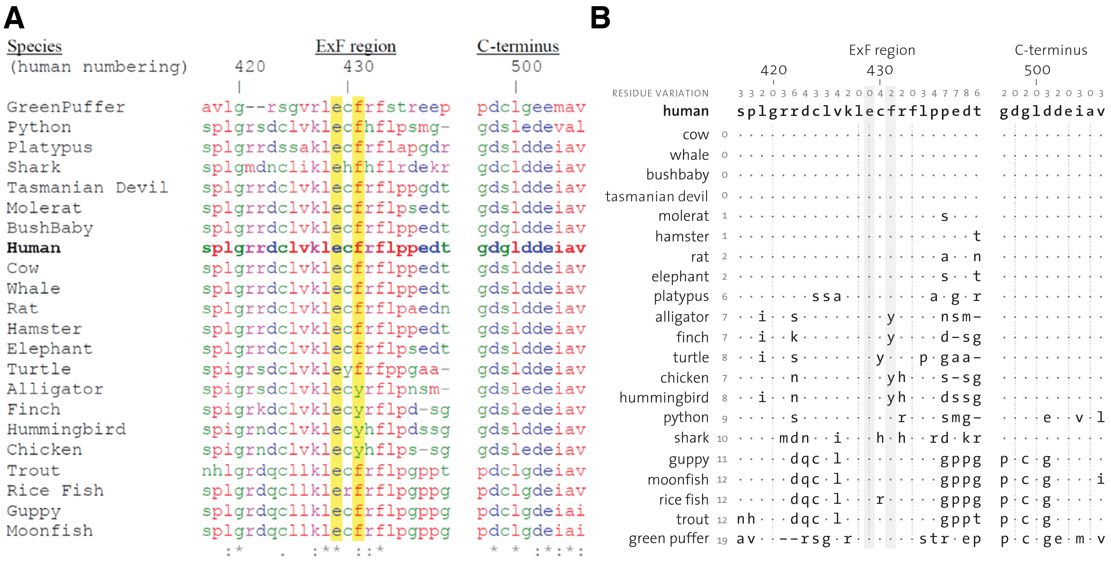
For data encodings that are not quantitative, such as the sequence alignments in Figure 6A, emphasizing differences requires that we suppress the display of areas of the figure where the data do not change and make the consensus (or reference) data the central focus (Figure 6B). By doing this, we are saving the reader from having to find all the sequence positions across species that vary with respect to the human sequence, a process fraught with error. Given that the comparison is made to the human sequence, it should be placed first. The order of other species should be based on phylogeny or, as in Figure 6B, a measure of the difference of their sequence compared to human. For example, we might place the species which have perfect conservation first (cow, whale, bushbaby and Tasmanian devil) and others others in order of the total number of positions in which their sequence varies, possibly limited to only those changes in which fundamental properties of the residue change (e.g. hydrophilicity).
By focusing on the differences of the sequences with respect to human, we can quickly group species based on common (or different) differences. For example, the guppy, moonfish, rice fish and trout at the bottom of the figure clearly show similar differences in the alignment (dqc-l, gpp, p-c-g), something that would have been very difficult to detect as quickly in the original.
Just like in the example of the Venn diagram in Figure 5A, where we wanted to bring related labels close to the diagram (e.g. Iso task) and distance others (e.g. ‘none’ ), here too the distance between labels and data benefits from adjustment. When the species names are left aligned, their distance to their sequence is unnecessarily increased, especially in cases of short labels like ‘cow’ . The size of this effect depends on the length of the longest species label (Tasmanian Devil). The figure design is thus brittle—a single label has influence over all other labels. This issue is entirely avoided by right aligning. The only time that left alignment would be helpful is if it was important that parts of the labels were vertically aligned for easy comparison, such as would be the case for alphanumeric sample names.
It is also not important for the species labels to be capitalized. In general, capitalization should be entirely avoided unless required by convention such as gene names or sequence structures (ExF, NOS1AP). Note the inconsistent use of spacing: GreenPuffer vs Rice Fish. The Gestalt principle [10, 11] of grouping—either by similarity or distance—is very useful and, when disregarded, can cause confusion and excess eye movement. In this figure, the labels for the species column, ‘Species’ , and sequence position row, ‘(human numbering)’ , should be moved so that both labels are closest to the part of the table they are labeling. As it is in Figure 6A, the column numbering header appears immediately below the species header, which makes it look like the header is one of the species. The unfortunate choice of adding parentheses to the row header also makes the text look like it is modifying the ‘Species’ header (e.g. that human numbering applies to the species column). These problems can be mitigated by removing both of these headers—they are actually not necessary. The row labels are obviously species and the column numbers are obviously sequence positions. The fact that the positions are relative to the human sequence does not need to be part of the figure because it is not part of the central message (it belongs in the legend).
The use of color in Figure 6A classifies the amino acid residues by their chemical property (hydrophobic, hydrophilic, neutral, etc.) and different schemes exist for specific elements [22], though many of the conventions are not color-blind safe nor normalize luminance. Here, color interferes with finding regions where sequence is different because hue is a much stronger discriminator and has more of a grouping effect than shape. Thus, areas where letters change but color does not are hard to spot (e.g. p, m, a and l all have the same color). Because the colors relate to chemical property, it is conceivable that changes of sequence within a color group, has a different interpretation in the context of conservation than changes of sequence and color. Even if this is the case, it should be kept in mind that assessing difference boundaries in shapes and colors, many of which appear similar (e.g. g and q, red and purple), is a challenging task. Neither the figure nor the legend, motivates the need for using color.
Beauty is the perceptual experience of pleasure or satisfaction. It may arrive through the eye or the mind and it is the privilege of good scientific communication to do both. Mere form is pretty but form with function are beautiful.
References
1. Heer, J. and M. Bostock, Crowdsourcing graphical perception: using mechanical turk to assess visualization design, in Proceedings of the 28th international conference on Human factors in computing systems. 2010, ACM: Atlanta, Georgia, USA. p. 203–212.
2. Cleveland, W.S. and R. McGill, Graphical Perception and Graphical Methods for Analyzing Scientific Data. Science, 1985. 229(4716): p. 828–833.
3. Pirsig, R.M., Zen and the Art of Motorcycle Maintenance. 1974, New York, USA: Harpertorch.
4. Strunk Jr., W., The Elements of Style. 1920, Ithaca, NY.: Priv. print.
5. Wong, B., Color coding. Nat Methods, 2010. 7(8): p. 573.
6. Wong, B., Salience to relevance. Nat Methods, 2011. 8(11): p. 889.
7. Yantis, S., How visual salience wins the battle for awareness. Nat Neurosci, 2005. 8(8): p. 975–977.
8. Wong, B., Salience. Nat Methods, 2010. 7(10): p. 773.
9. Krzywinski, M. and B. Wong, Plotting symbols. Nat Methods, 2013. 10(6): p. 451.
10. Wong, B., Gestalt principles (part 1). Nat Methods, 2010. 7(11): p. 863.
11. Wong, B., Gestalt principles (Part 2). Nat Methods, 2010. 7(12): p. 941.
12. Araldi, D., L.F. Ferrari, and J.D. Levine, Repeated Mu-Opioid Exposure Induces a Novel Form of the Hyperalgesic Priming Model for Transition to Chronic Pain. Journal of Neuroscience, 2015. 35(36): p. 12502–12517.
13. Wender, K.F. and R. Rothkegel, Subitizing and its subprocesses. Psychological Research-Psychologische Forschung, 2000. 64(2): p. 81–92.
14. Vetter, P., B. Butterworth, and B. Bahrami, Modulating Attentional Load Affects Numerosity Estimation: Evidence against a Pre-Attentive Subitizing Mechanism. Plos One, 2008. 3(9).
15. Krzywinski, M., Elements of visual style. Nat Methods, 2013. 10(5): p. 371.
16. Tufte, E., Visual Display of Quantitative Information. 2nd ed. 1992: Graphics Press.
17. Johnston, C., et al., Streptococcus pneumoniae, le transformiste. Trends in Microbiology, 2014. 22(3): p. 113–119.
18. Wong, B., Color blindness. Nat Methods, 2011. 8(6): p. 441.
19. Krzywinski, M., et al., Hive plots—rational approach to visualizing networks. Brief Bioinform, 2011.
20. Gehlenborg, N. and B. Wong, Networks. Nat Methods, 2012. 9(2): p. 115.
21. Lex, A., et al., UpSet: Visualization of Intersecting Sets. IEEE Transactions on Visualization and Computer Graphics, 2014. 20(12): p. 1983–1992.
22. Procter, J.B., et al., Visualization of multiple alignments, phylogenies and gene family evolution. Nature Methods, 2010. 7(3): p. S16–S25.
23. Ferrari-Toniolo, S., et al., Posterior Parietal Cortex Encoding of Dynamic Hand Force Underlying Hand-Object Interaction. Journal of Neuroscience, 2015. 35(31): p. 10899–10910.
24. Li, L.L., et al., Unexpected Heterodivalent Recruitment of NOS1AP to nNOS Reveals Multiple Sites for Pharmacological Intervention in Neuronal Disease Models. Journal of Neuroscience, 2015. 35(19): p. 7349–7364.
Nasa to send our human genome discs to the Moon
We'd like to say a ‘cosmic hello’: mathematics, culture, palaeontology, art and science, and ... human genomes.


Comparing classifier performance with baselines
All animals are equal, but some animals are more equal than others. —George Orwell
This month, we will illustrate the importance of establishing a baseline performance level.
Baselines are typically generated independently for each dataset using very simple models. Their role is to set the minimum level of acceptable performance and help with comparing relative improvements in performance of other models.

Unfortunately, baselines are often overlooked and, in the presence of a class imbalance5, must be established with care.
Megahed, F.M, Chen, Y-J., Jones-Farmer, A., Rigdon, S.E., Krzywinski, M. & Altman, N. (2024) Points of significance: Comparing classifier performance with baselines. Nat. Methods 20.
Happy 2024 π Day—
sunflowers ho!
Celebrate π Day (March 14th) and dig into the digit garden. Let's grow something.

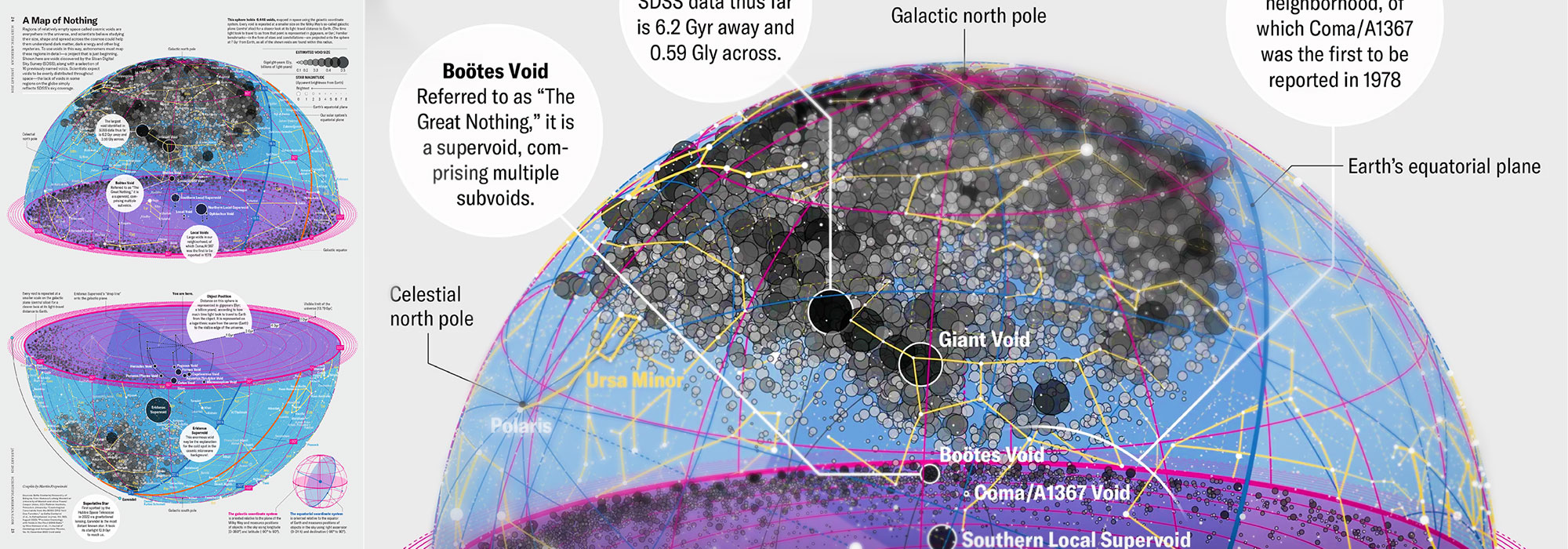
How Analyzing Cosmic Nothing Might Explain Everything
Huge empty areas of the universe called voids could help solve the greatest mysteries in the cosmos.
My graphic accompanying How Analyzing Cosmic Nothing Might Explain Everything in the January 2024 issue of Scientific American depicts the entire Universe in a two-page spread — full of nothing.

The graphic uses the latest data from SDSS 12 and is an update to my Superclusters and Voids poster.
Michael Lemonick (editor) explains on the graphic:
“Regions of relatively empty space called cosmic voids are everywhere in the universe, and scientists believe studying their size, shape and spread across the cosmos could help them understand dark matter, dark energy and other big mysteries.
To use voids in this way, astronomers must map these regions in detail—a project that is just beginning.
Shown here are voids discovered by the Sloan Digital Sky Survey (SDSS), along with a selection of 16 previously named voids. Scientists expect voids to be evenly distributed throughout space—the lack of voids in some regions on the globe simply reflects SDSS’s sky coverage.”
voids
Sofia Contarini, Alice Pisani, Nico Hamaus, Federico Marulli Lauro Moscardini & Marco Baldi (2023) Cosmological Constraints from the BOSS DR12 Void Size Function Astrophysical Journal 953:46.
Nico Hamaus, Alice Pisani, Jin-Ah Choi, Guilhem Lavaux, Benjamin D. Wandelt & Jochen Weller (2020) Journal of Cosmology and Astroparticle Physics 2020:023.
Sloan Digital Sky Survey Data Release 12
Alan MacRobert (Sky & Telescope), Paulina Rowicka/Martin Krzywinski (revisions & Microscopium)
Hoffleit & Warren Jr. (1991) The Bright Star Catalog, 5th Revised Edition (Preliminary Version).
H0 = 67.4 km/(Mpc·s), Ωm = 0.315, Ωv = 0.685. Planck collaboration Planck 2018 results. VI. Cosmological parameters (2018).
constellation figures
stars
cosmology
Error in predictor variables
It is the mark of an educated mind to rest satisfied with the degree of precision that the nature of the subject admits and not to seek exactness where only an approximation is possible. —Aristotle
In regression, the predictors are (typically) assumed to have known values that are measured without error.
Practically, however, predictors are often measured with error. This has a profound (but predictable) effect on the estimates of relationships among variables – the so-called “error in variables” problem.

Error in measuring the predictors is often ignored. In this column, we discuss when ignoring this error is harmless and when it can lead to large bias that can leads us to miss important effects.
Altman, N. & Krzywinski, M. (2024) Points of significance: Error in predictor variables. Nat. Methods 20.
Background reading
Altman, N. & Krzywinski, M. (2015) Points of significance: Simple linear regression. Nat. Methods 12:999–1000.
Lever, J., Krzywinski, M. & Altman, N. (2016) Points of significance: Logistic regression. Nat. Methods 13:541–542 (2016).
Das, K., Krzywinski, M. & Altman, N. (2019) Points of significance: Quantile regression. Nat. Methods 16:451–452.
Convolutional neural networks
Nature uses only the longest threads to weave her patterns, so that each small piece of her fabric reveals the organization of the entire tapestry. – Richard Feynman
Following up on our Neural network primer column, this month we explore a different kind of network architecture: a convolutional network.
The convolutional network replaces the hidden layer of a fully connected network (FCN) with one or more filters (a kind of neuron that looks at the input within a narrow window).
Even through convolutional networks have far fewer neurons that an FCN, they can perform substantially better for certain kinds of problems, such as sequence motif detection.
Derry, A., Krzywinski, M & Altman, N. (2023) Points of significance: Convolutional neural networks. Nature Methods 20:1269–1270.
Background reading
Derry, A., Krzywinski, M. & Altman, N. (2023) Points of significance: Neural network primer. Nature Methods 20:165–167.
Lever, J., Krzywinski, M. & Altman, N. (2016) Points of significance: Logistic regression. Nature Methods 13:541–542.