

Browse my gallery of cover designs.
Creating the PNAS Cover
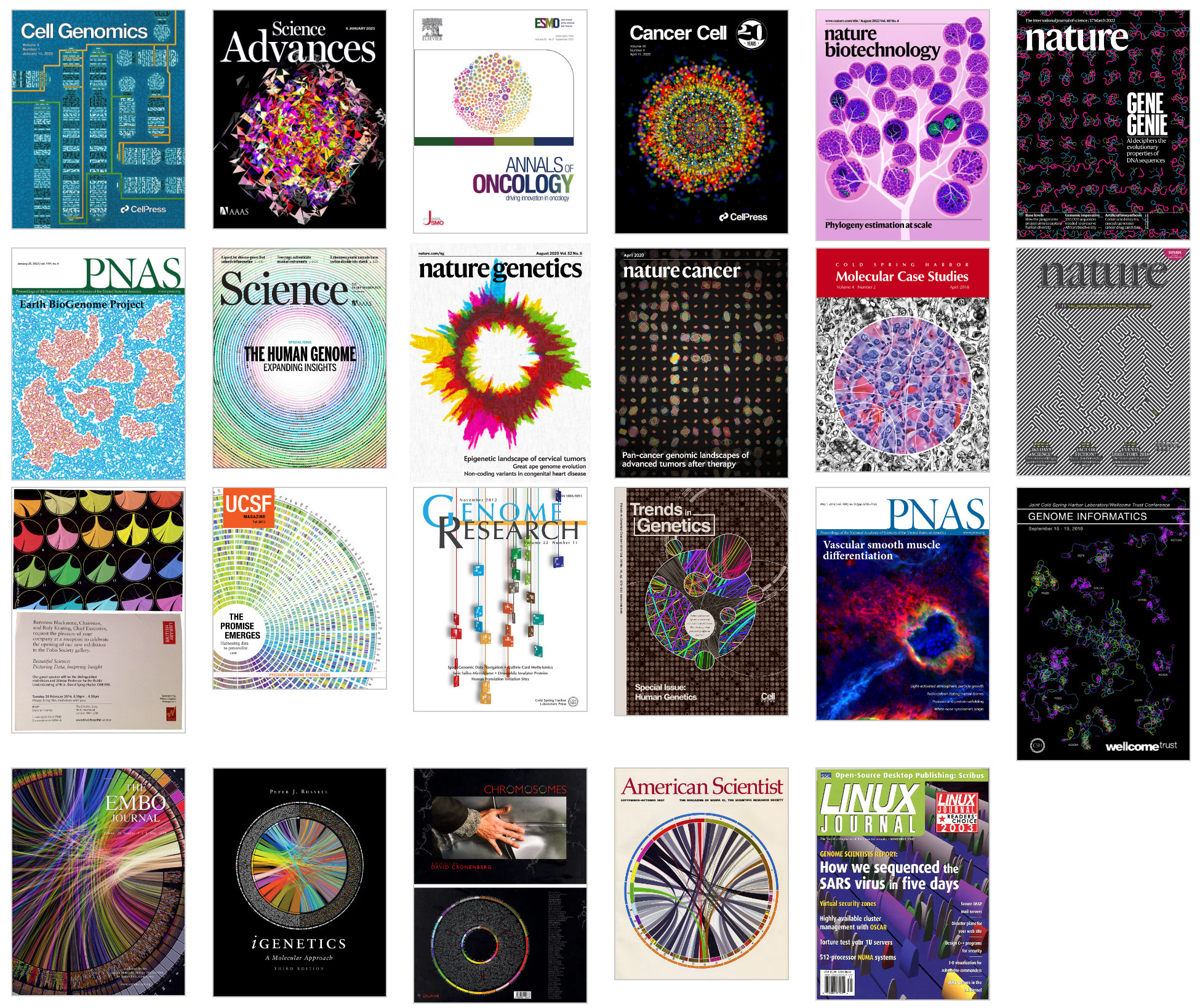
contents
One of my goals in life, which I can now say has been accomplished, is to make biology look like astrophysics. Call it my love for the Torino Impact Hazard Scale.
I was given an opportunity to achieve this goal when Linda Chang from Aly Karsan's group approached me with some microscopy photos of mouse veins. I was asked to do "something" with these images for a cover submission to accompany the manuscript.
When people see my covers, sometimes they ask "How did you do that?" Ok, actually they never ask this. But being a scientist, I'm trained me to produce answers in anticipation of such questions. So, below, I show you how the image was constructed.
The image was published on the cover of PNAS (PNAS 1 May 2012; 109 (18))
Photoshop CS5, Nik Color Efex Pro 4, Alien Skin Bokeh 2 and a cup of coffee from a Rancilio Silvia.Below are a few of the images I had the option to work with. These are mouse embryonic blood vessels, with a carotid artery shown in the foreground with endothelial cells in green, vascular smooth muscle cells in red and the nuclei in blue.
Of course, as soon as I saw the images, I realized that there was very little that I needed to do to trigger the viewer's imagination. These photos were great!


Immediately I thought of two episodes of Star Trek (original series): Doomsday Machine and the Immunity Syndrome, as well as of images from the Hubble Telescope.


I though it would be pretty easy to make the artery images look all-outer-spacey. They already looked it.
And then I saw the image below.

The background was created from the two images shown here. The second image was sampled three times, at different rotations.


The channel mixer was used to remove the green channel and leave only red and blue.

The next layer was composed of what looked like ribbons of blue gas. This was created by sampling the oval shapes from the source images. Here the red channel was a great source for cloud shapes, and this was the only channel that was kept. The hue was shifted to blue and a curve adjustment was applied to increase the contrast.


When the foreground and middle ground elements were combined, the result was already 40 parsecs away.

The foreground was created from the spectacular comet-like image of a mouse artery. Very little had to be done to make this element look good. It already looked good.
I applied a little blur using Alien Skin's Bokeh 2 to narrow the apparent depth of field, masked out elements at the bottom of the image and removed some of the green channel. The entire blue channel was removed altogether (this gave the tail of the comet a mottled, flame-like appearance).


And here we have the final image.
Nasa to send our human genome discs to the Moon
We'd like to say a ‘cosmic hello’: mathematics, culture, palaeontology, art and science, and ... human genomes.


Comparing classifier performance with baselines
All animals are equal, but some animals are more equal than others. —George Orwell
This month, we will illustrate the importance of establishing a baseline performance level.
Baselines are typically generated independently for each dataset using very simple models. Their role is to set the minimum level of acceptable performance and help with comparing relative improvements in performance of other models.

Unfortunately, baselines are often overlooked and, in the presence of a class imbalance5, must be established with care.
Megahed, F.M, Chen, Y-J., Jones-Farmer, A., Rigdon, S.E., Krzywinski, M. & Altman, N. (2024) Points of significance: Comparing classifier performance with baselines. Nat. Methods 20.
Happy 2024 π Day—
sunflowers ho!
Celebrate π Day (March 14th) and dig into the digit garden. Let's grow something.

How Analyzing Cosmic Nothing Might Explain Everything
Huge empty areas of the universe called voids could help solve the greatest mysteries in the cosmos.
My graphic accompanying How Analyzing Cosmic Nothing Might Explain Everything in the January 2024 issue of Scientific American depicts the entire Universe in a two-page spread — full of nothing.

The graphic uses the latest data from SDSS 12 and is an update to my Superclusters and Voids poster.
Michael Lemonick (editor) explains on the graphic:
“Regions of relatively empty space called cosmic voids are everywhere in the universe, and scientists believe studying their size, shape and spread across the cosmos could help them understand dark matter, dark energy and other big mysteries.
To use voids in this way, astronomers must map these regions in detail—a project that is just beginning.
Shown here are voids discovered by the Sloan Digital Sky Survey (SDSS), along with a selection of 16 previously named voids. Scientists expect voids to be evenly distributed throughout space—the lack of voids in some regions on the globe simply reflects SDSS’s sky coverage.”
voids
Sofia Contarini, Alice Pisani, Nico Hamaus, Federico Marulli Lauro Moscardini & Marco Baldi (2023) Cosmological Constraints from the BOSS DR12 Void Size Function Astrophysical Journal 953:46.
Nico Hamaus, Alice Pisani, Jin-Ah Choi, Guilhem Lavaux, Benjamin D. Wandelt & Jochen Weller (2020) Journal of Cosmology and Astroparticle Physics 2020:023.
Sloan Digital Sky Survey Data Release 12
Alan MacRobert (Sky & Telescope), Paulina Rowicka/Martin Krzywinski (revisions & Microscopium)
Hoffleit & Warren Jr. (1991) The Bright Star Catalog, 5th Revised Edition (Preliminary Version).
H0 = 67.4 km/(Mpc·s), Ωm = 0.315, Ωv = 0.685. Planck collaboration Planck 2018 results. VI. Cosmological parameters (2018).
constellation figures
stars
cosmology
Error in predictor variables
It is the mark of an educated mind to rest satisfied with the degree of precision that the nature of the subject admits and not to seek exactness where only an approximation is possible. —Aristotle
In regression, the predictors are (typically) assumed to have known values that are measured without error.
Practically, however, predictors are often measured with error. This has a profound (but predictable) effect on the estimates of relationships among variables – the so-called “error in variables” problem.

Error in measuring the predictors is often ignored. In this column, we discuss when ignoring this error is harmless and when it can lead to large bias that can leads us to miss important effects.
Altman, N. & Krzywinski, M. (2024) Points of significance: Error in predictor variables. Nat. Methods 20.
Background reading
Altman, N. & Krzywinski, M. (2015) Points of significance: Simple linear regression. Nat. Methods 12:999–1000.
Lever, J., Krzywinski, M. & Altman, N. (2016) Points of significance: Logistic regression. Nat. Methods 13:541–542 (2016).
Das, K., Krzywinski, M. & Altman, N. (2019) Points of significance: Quantile regression. Nat. Methods 16:451–452.