
BD Genomics stereoscopic art exhibit — AGBT 2017
Art is science in love.
— E.F. Weisslitz
contents
The final art pieces are the outcome of a long process of exploration, experimentation and more than a few dead-ends. Here I'll take you through the process of parsing, exploring and drawing the data and finding a story.

The first step was to identify how to present the theme of "differences" in the exhibit. We wanted to draw attention to the fact that the extent to which we can answer questions about biological states depends on how accurate and precise the measurements are. Initially, I thought that this might be a useful theme—highlighting both biological and technical variation.
In parallel, I thought about different functional sources of variation and the kinds of questions that the data might be used to answer. I narrowed them down to differences that cause disease, differences that cause disease progression and differences that allow for a variety of normal function.
We also considered the idea of showing differences due to purely experimental error, which are fluctuations due to the technology not necessarily the biology.
For each of the difference scenarios, the input data set were single-cell gene expression counts.
cell1 sample cell_type gene1 count
cell1 sample cell_type gene2 count
...
cell2 sample cell_type gene1 count
cell2 sample cell_type gene2 count
...
Each cell was identified by its sample (e.g. blood normal vs tumor) and type (e.g. B cell, T cell, etc). Typically, we had counts for about 500 genes of 100's or 1000's of cells of a given type and sample.
The transcriptome of each cell is a point in high-dimensional space—one dimension for each gene for which we have a count. To find a projection of the data onto the page, we dimensionally reduced the data using tSNE (t-distributed stochastic neighbour embedding) into either 2 or 4 dimensions.
# 2 dimensions (x,y)
cell1 sample cell_type tsne_x tsne_y
cell2 sample cell_type tsne_x tsne_y
...

# 4 dimensions (x,y,u,v)
cell1 sample cell_type tsne_x tsne_y tsne_u tsne_v
cell2 sample cell_type tsne_x tsne_y tsne_u tsne_v
...
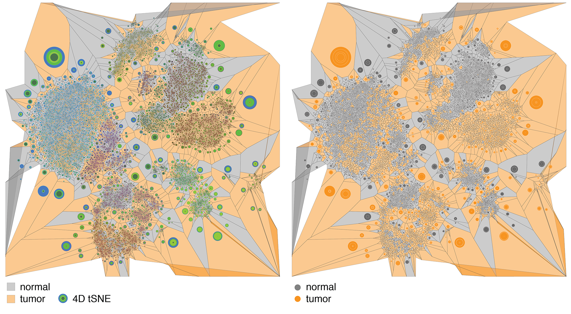
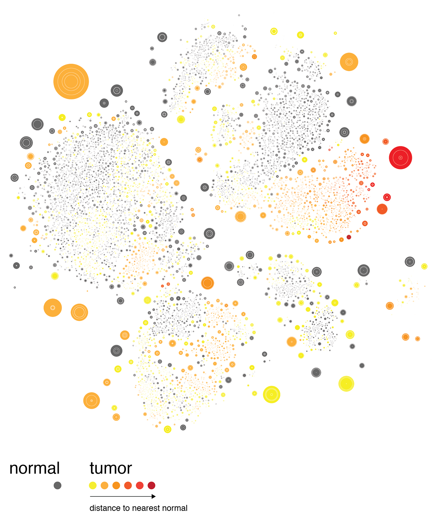
When the cells are drawn as points based on their tSNE coordinates, typically they will cluster both by type and disease status. They cluster by type because the gene expression profile for each cell type is different—this is what causes cells to have different function.
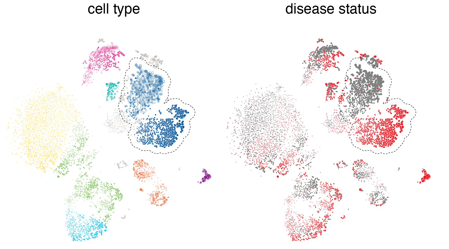
What we're looking for here is cells that cluster by disease state within a given cell type cluster, like the classical monocytes highlighted in the figure above. What this happens, we can say that there's something fundamentally different for this cell type between the normal and diseased states. For cell types that don't have a differential expression in disease, we see more of a random mixing of the normal and disease cell populations within their clusters.
I like to start by exploring ways to map the data onto the page. Typically, at this stage I try a lot of different approaches and many take the shortest route to the trash.
The focus of our story is "differences". So, I'll be looking for visuals that capture the Gestalt of a difference. Because we're aiming for an equal mix of art and data visualization, it's not critical that we can judge the differences quantitatively—ability to make qualitative assessments will suffice—but it is important that something obviously appears to be different, both within one panel and across panels.
In the search for an encoding, two basic questions have to be addressed: how cells are to be (a) placed and (b) represented on the page. For example, placement could be systematic, such as on a grid, with order based on some property such as total gene count. With this approach, we can achieve a tiling that covers the full canavs.
Or, placement could be based on properties such as tSNE coordinates. In this case, we settle in not populating the canvas evenly and hope that the cells fall into groups in a meaningful way.
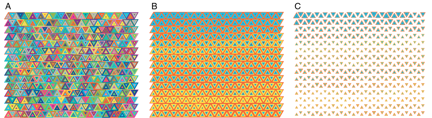
Below is one attempt at a tiling encoding. The cells are represented by a grid of squares and each square shows a comparison of gene counts in disease vs normal for four genes. This layout can be adapted into triangles (3 genes) or hexagons (6 genes).
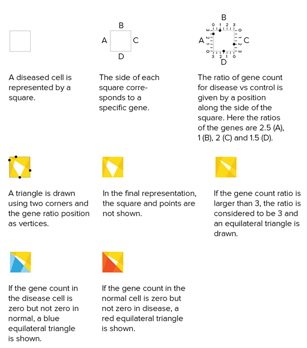
The genes can be chosen based on ones that are known to be of clinical significance or, as below, identified from the data set as ones that have the largest change in expression between normal and disease. Cells can be ordered based on similarity in counts between normal and disease.
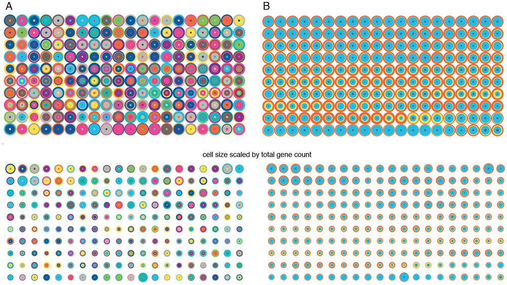
I then tried using the 4-dimensional `(x,y,u,v)` tSNE coordinates to represent each cell, still sticking to a tiling of cells. Cells are drawn in a row-dominant order and those with more similar tSNE coordinates are drawn closer together. For example, for the circular encoding, each concentric circle radius is `(x,x+y,x+y+u,x+y+u+v)`.
Playing with colors and shapes makes for interesting tilings.
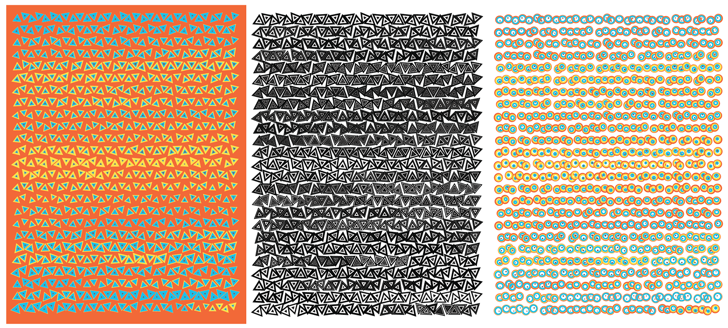
As much as all these attempts have pretty shapes and colors, it's hard to point your finger at any part of these encodings and say, "Here's a difference worth investigating."
As well, by placing cells on a grid makes for a rigid represntation. We agreed that we needed something that looked a little more organic. Could the way the cells were drawn look like actual cells?
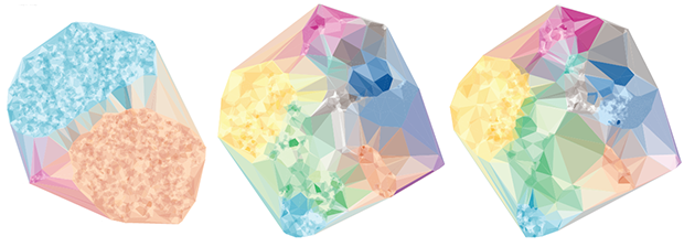
We started looking at drawing the cells based on their 2-dimensional tSNE coordinates. In this representation, cells that are closer together on the plane have more similar transcription profiles.
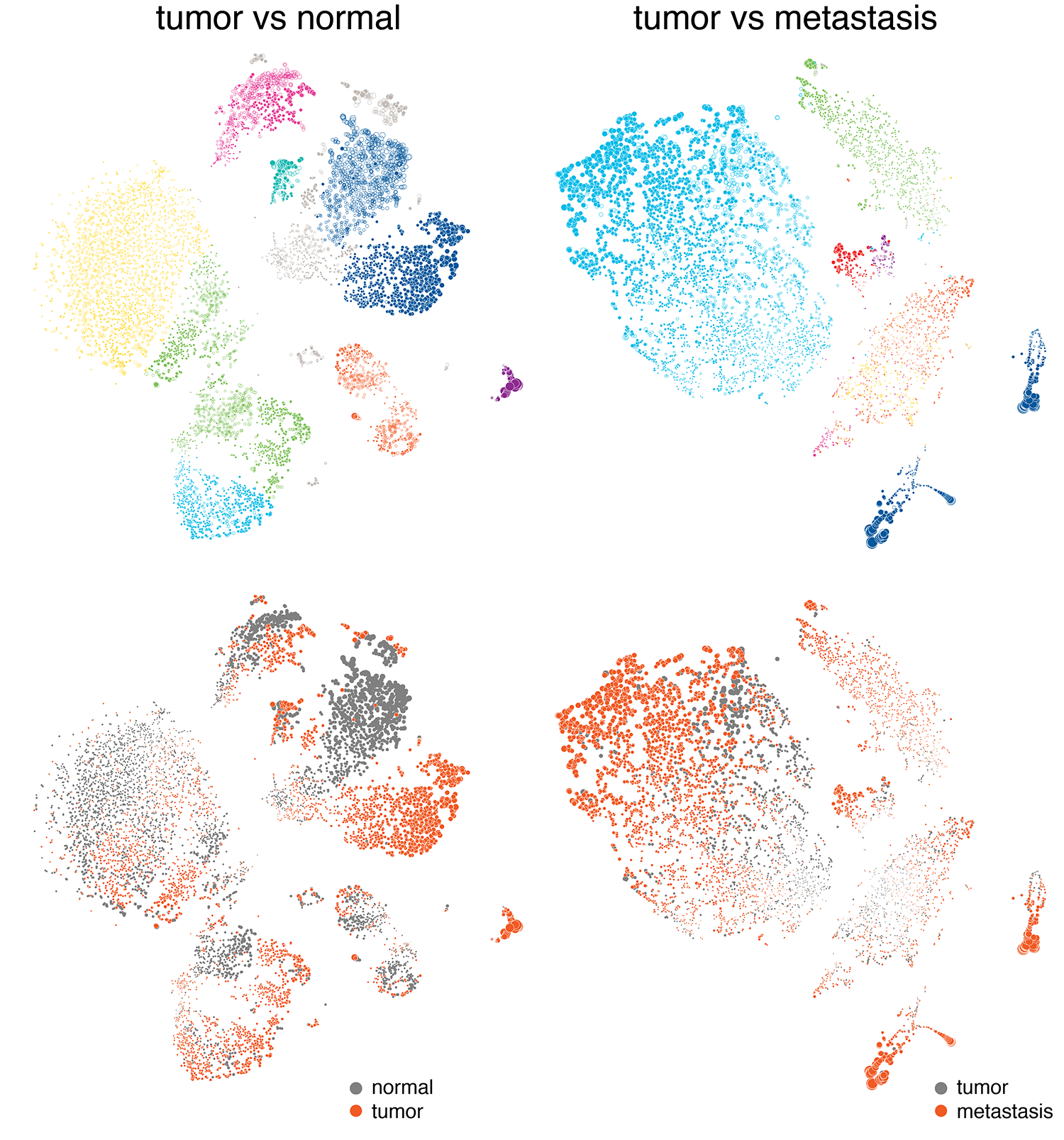
With this approach, it was really easy to draw attention to differences—either by cell type (which we wanted to do in the normal function case) or disease status. We also felt that this would be a familiar approach and one that showed populations of cells at the resolution of single cells.
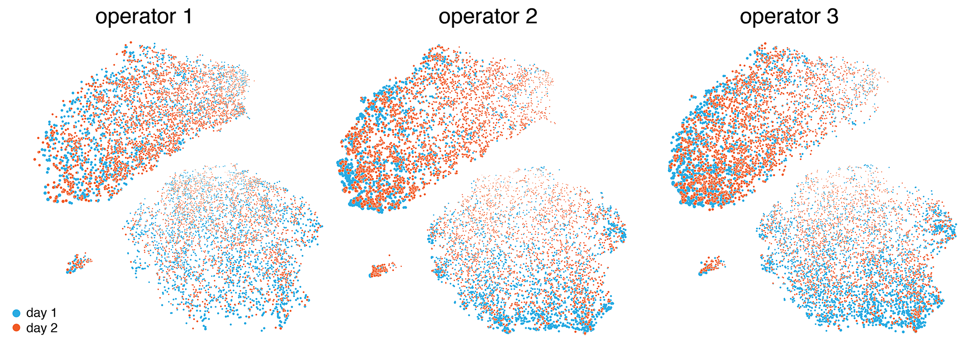
One of the data sets that we identified early was the internal validation set, which captured the variability between operators and technical replication. Below are the results of six experiments, each done by a different operator on two different days. Here, we don't expect (and we don't see) any clustering based on days or operators. In the end, we chose not make use of this data set in the final exhibit and focus instead on clinically relevant differences.
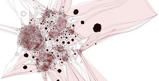
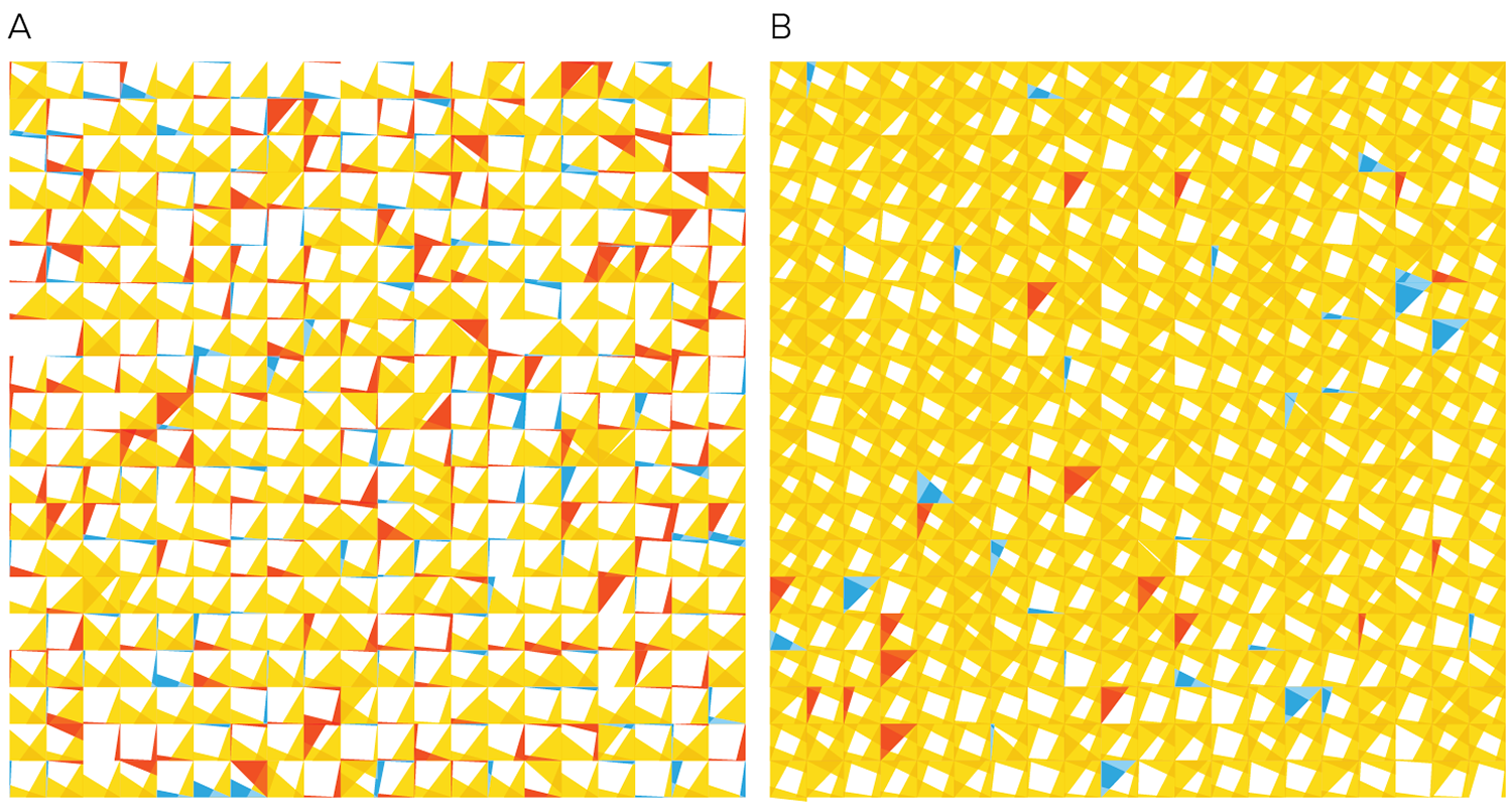
We then explored ways in which the tSNE coordinates could be used to derive different representations, such as a network or tesselation.
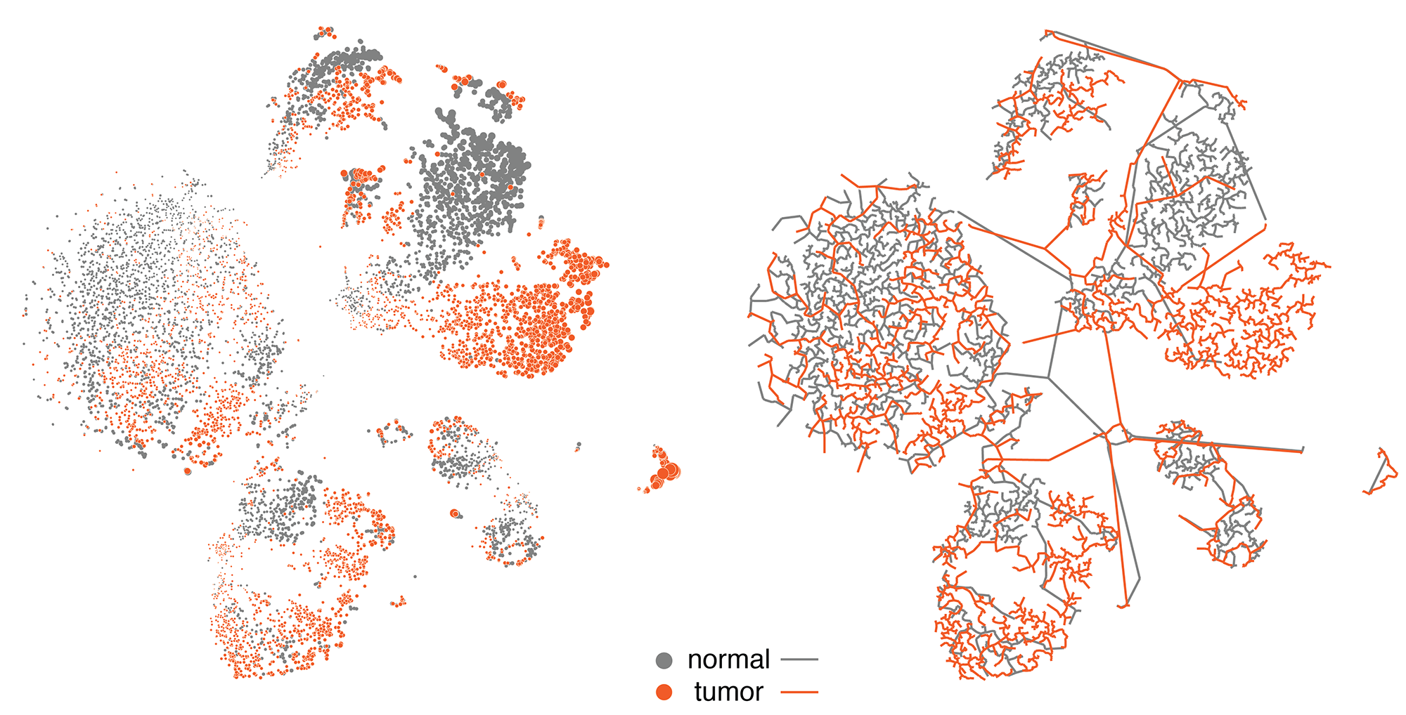
By hiding the cells and filling the polygons based on cell type and mixing the neighbouring polygon colors, we get a
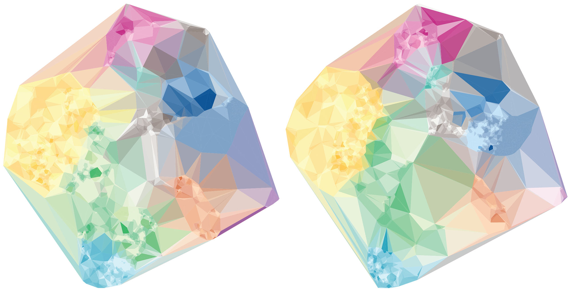
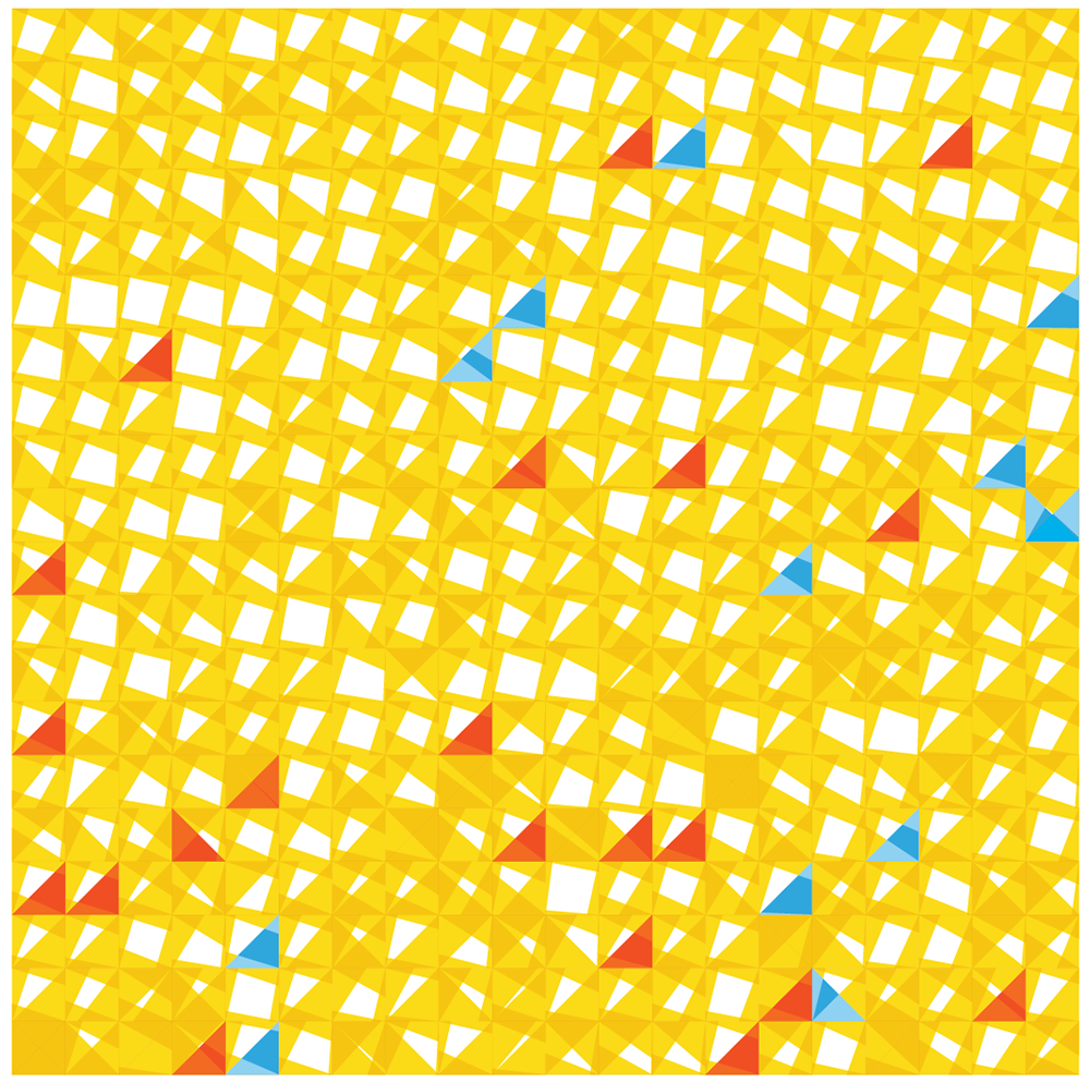
A more organic feel can be achieved by perturbing the edges of both the cells and polygons. We were happy enough with this representation to use it on the introductory panel in the exhibit.
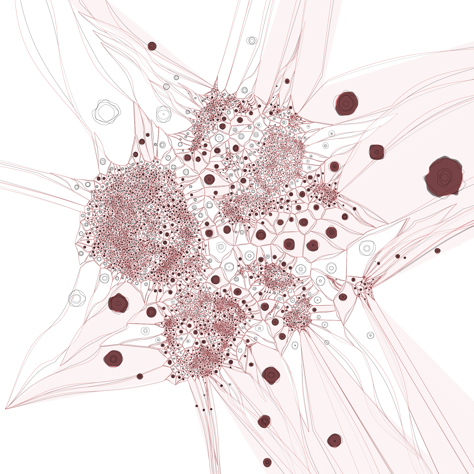
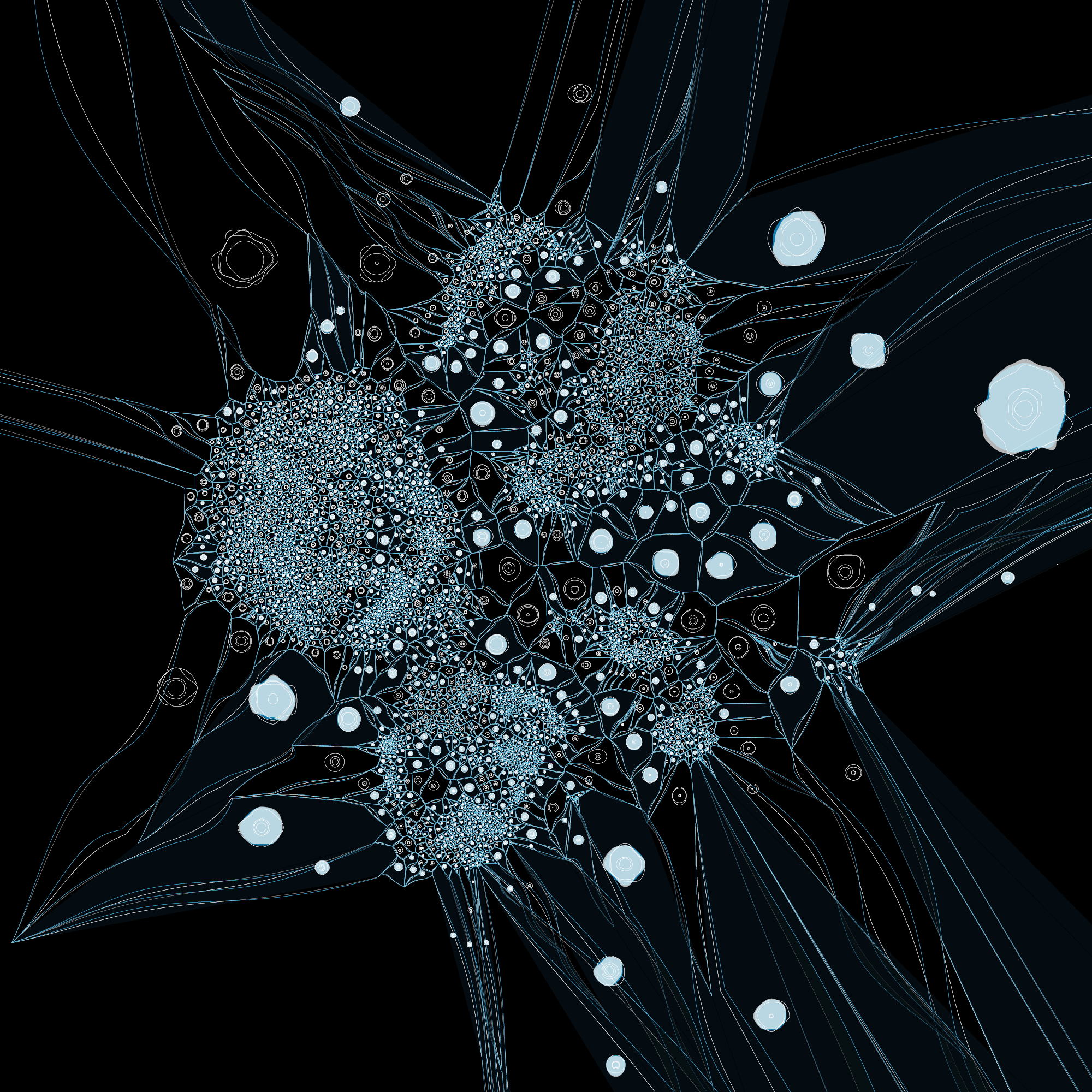
The distance between a given tumor cell and its nearest normal cell of the same type can be emphasized by encoding the distance with color, such as below.
At this point we decided to explore mapping this difference by the 3rd dimension, literally.
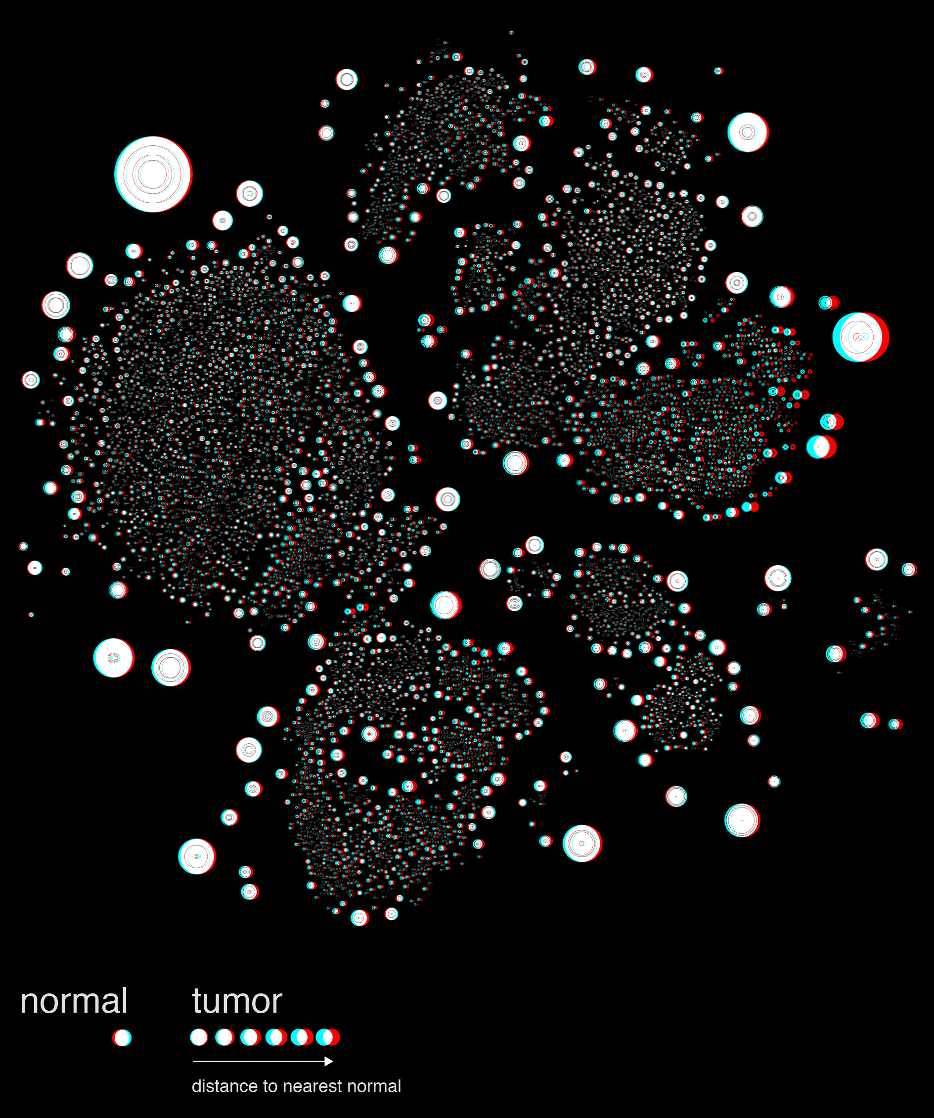
The stereoscopic image shown above is a quick prototype generated in Illustrator. The final images were rendered in a full 3D environment using Cinema4D.
Nasa to send our human genome discs to the Moon
We'd like to say a ‘cosmic hello’: mathematics, culture, palaeontology, art and science, and ... human genomes.


Comparing classifier performance with baselines
All animals are equal, but some animals are more equal than others. —George Orwell
This month, we will illustrate the importance of establishing a baseline performance level.
Baselines are typically generated independently for each dataset using very simple models. Their role is to set the minimum level of acceptable performance and help with comparing relative improvements in performance of other models.

Unfortunately, baselines are often overlooked and, in the presence of a class imbalance5, must be established with care.
Megahed, F.M, Chen, Y-J., Jones-Farmer, A., Rigdon, S.E., Krzywinski, M. & Altman, N. (2024) Points of significance: Comparing classifier performance with baselines. Nat. Methods 20.
Happy 2024 π Day—
sunflowers ho!
Celebrate π Day (March 14th) and dig into the digit garden. Let's grow something.

How Analyzing Cosmic Nothing Might Explain Everything
Huge empty areas of the universe called voids could help solve the greatest mysteries in the cosmos.
My graphic accompanying How Analyzing Cosmic Nothing Might Explain Everything in the January 2024 issue of Scientific American depicts the entire Universe in a two-page spread — full of nothing.

The graphic uses the latest data from SDSS 12 and is an update to my Superclusters and Voids poster.
Michael Lemonick (editor) explains on the graphic:
“Regions of relatively empty space called cosmic voids are everywhere in the universe, and scientists believe studying their size, shape and spread across the cosmos could help them understand dark matter, dark energy and other big mysteries.
To use voids in this way, astronomers must map these regions in detail—a project that is just beginning.
Shown here are voids discovered by the Sloan Digital Sky Survey (SDSS), along with a selection of 16 previously named voids. Scientists expect voids to be evenly distributed throughout space—the lack of voids in some regions on the globe simply reflects SDSS’s sky coverage.”
voids
Sofia Contarini, Alice Pisani, Nico Hamaus, Federico Marulli Lauro Moscardini & Marco Baldi (2023) Cosmological Constraints from the BOSS DR12 Void Size Function Astrophysical Journal 953:46.
Nico Hamaus, Alice Pisani, Jin-Ah Choi, Guilhem Lavaux, Benjamin D. Wandelt & Jochen Weller (2020) Journal of Cosmology and Astroparticle Physics 2020:023.
Sloan Digital Sky Survey Data Release 12
Alan MacRobert (Sky & Telescope), Paulina Rowicka/Martin Krzywinski (revisions & Microscopium)
Hoffleit & Warren Jr. (1991) The Bright Star Catalog, 5th Revised Edition (Preliminary Version).
H0 = 67.4 km/(Mpc·s), Ωm = 0.315, Ωv = 0.685. Planck collaboration Planck 2018 results. VI. Cosmological parameters (2018).
constellation figures
stars
cosmology
Error in predictor variables
It is the mark of an educated mind to rest satisfied with the degree of precision that the nature of the subject admits and not to seek exactness where only an approximation is possible. —Aristotle
In regression, the predictors are (typically) assumed to have known values that are measured without error.
Practically, however, predictors are often measured with error. This has a profound (but predictable) effect on the estimates of relationships among variables – the so-called “error in variables” problem.

Error in measuring the predictors is often ignored. In this column, we discuss when ignoring this error is harmless and when it can lead to large bias that can leads us to miss important effects.
Altman, N. & Krzywinski, M. (2024) Points of significance: Error in predictor variables. Nat. Methods 20.
Background reading
Altman, N. & Krzywinski, M. (2015) Points of significance: Simple linear regression. Nat. Methods 12:999–1000.
Lever, J., Krzywinski, M. & Altman, N. (2016) Points of significance: Logistic regression. Nat. Methods 13:541–542 (2016).
Das, K., Krzywinski, M. & Altman, N. (2019) Points of significance: Quantile regression. Nat. Methods 16:451–452.
Convolutional neural networks
Nature uses only the longest threads to weave her patterns, so that each small piece of her fabric reveals the organization of the entire tapestry. – Richard Feynman
Following up on our Neural network primer column, this month we explore a different kind of network architecture: a convolutional network.
The convolutional network replaces the hidden layer of a fully connected network (FCN) with one or more filters (a kind of neuron that looks at the input within a narrow window).
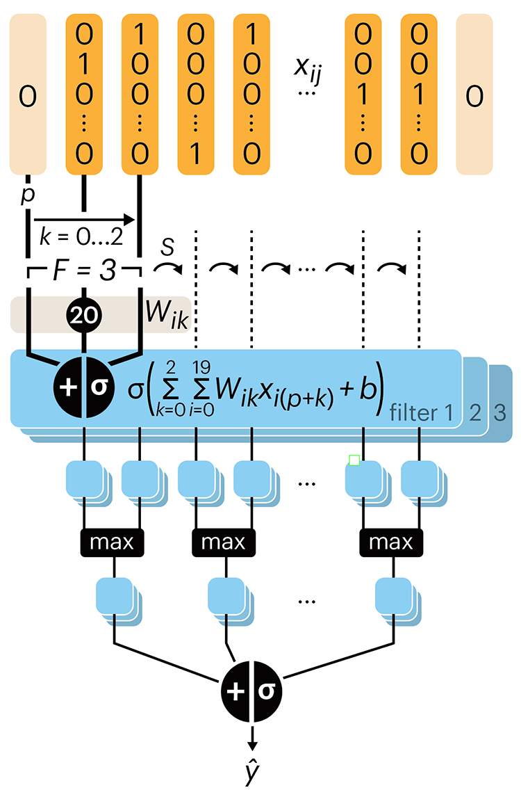
Even through convolutional networks have far fewer neurons that an FCN, they can perform substantially better for certain kinds of problems, such as sequence motif detection.
Derry, A., Krzywinski, M & Altman, N. (2023) Points of significance: Convolutional neural networks. Nature Methods 20:1269–1270.
Background reading
Derry, A., Krzywinski, M. & Altman, N. (2023) Points of significance: Neural network primer. Nature Methods 20:165–167.
Lever, J., Krzywinski, M. & Altman, N. (2016) Points of significance: Logistic regression. Nature Methods 13:541–542.