Love itself became the object of her love.
•
• count sadnesses
• more quotes
data visualization
+ public health
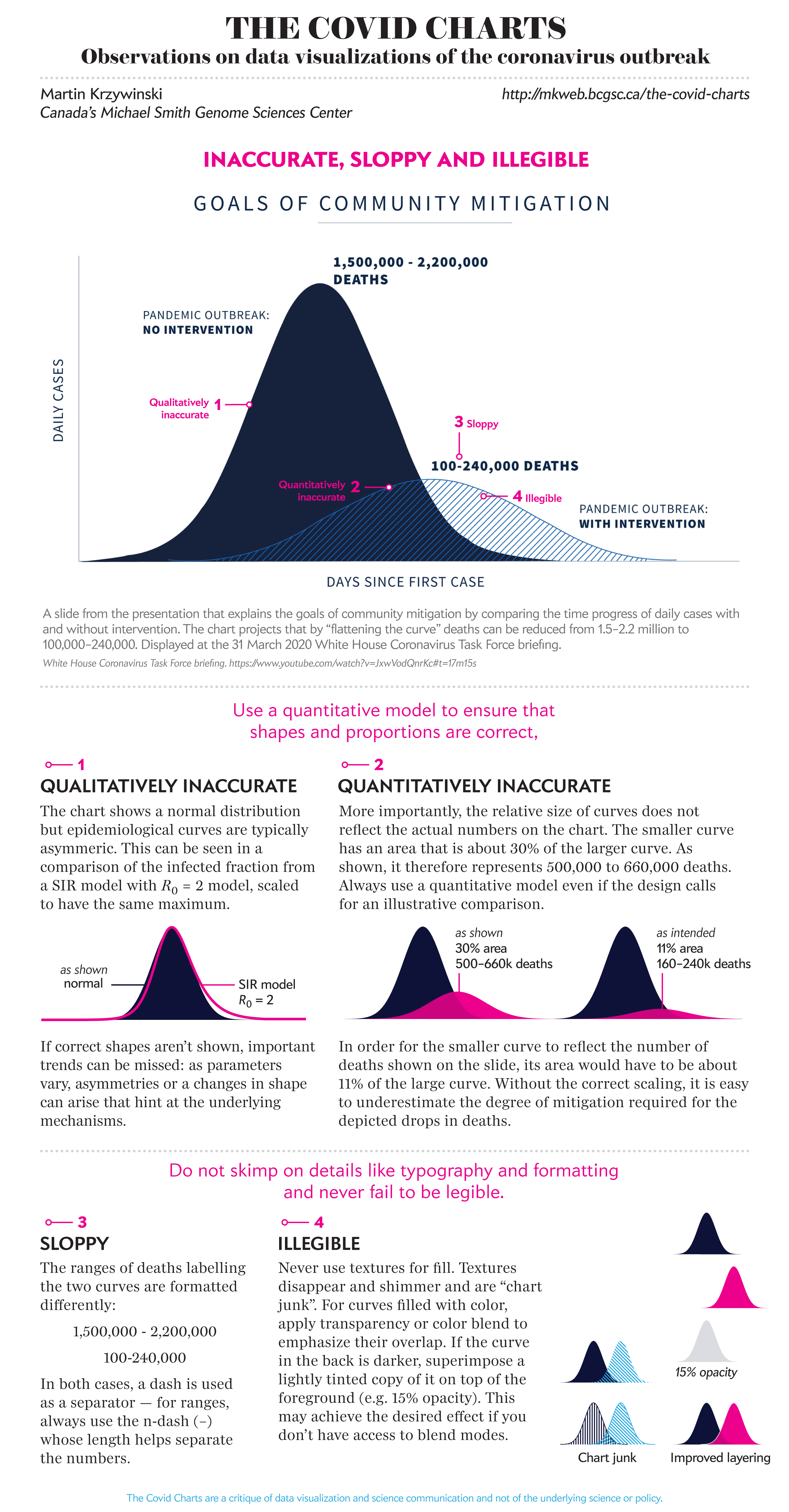
The COVID Charts
Observations on data visualizations of the coronavirus outbreak
The COVID Charts are brief critiques of data visualization and science communication of the coronavirus outbreak. They are not statements about the underlying science or public health policy.
If you would like me to critique a specific chart, get in touch.
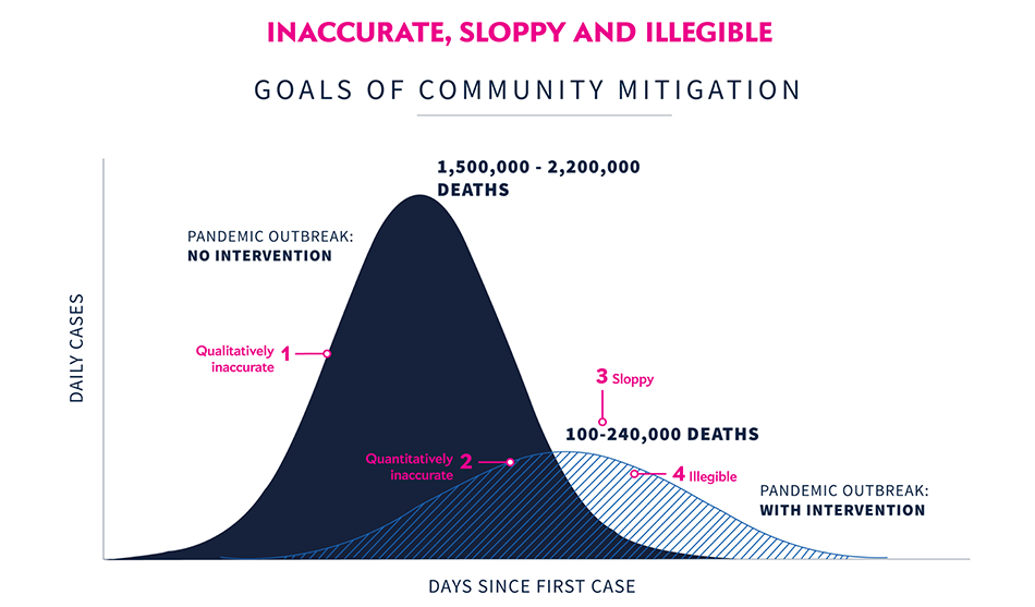
▲ Inaccurate, sloppy and illegible . A slide from the presentation that explains the goals of community mitigation by comparing the time progress of daily cases with and without intervention. The chart projects that by “flattening the curve” deaths can be reduced from 1.5–2.2 million to 100,000–240,000. (White House Coronavirus Task Force, 31 March 2020).
Martin Krzywinski | contact | Canada's Michael Smith Genome Sciences Centre ⊂ BC Cancer Research Center ⊂ BC Cancer ⊂ PHSA
{ 10.9.234.151 }