data visualization
+ public health
The COVID Charts
Observations on data visualizations of the coronavirus outbreak
The COVID Charts are brief critiques of data visualization and science communication of the coronavirus outbreak. They are not statements about the underlying science or public health policy.
If you would like me to critique a specific chart, get in touch.
▲ Inaccessible, sloppy and rambling — a poor message
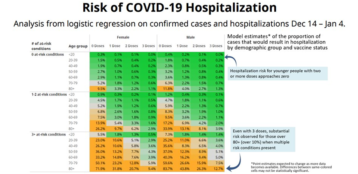
. COVID-19 hospitalization risk as function of age, sex, comorbidities and vaccination status
(Adrian Dix, 21 January 2022).
21 January 2022
background
A data table showing risk of COVID-19 hospitalization by age, sex, comorbidities and vaccination status.
core message
The graphic makes poor use of color and suffers from repetition, torturous copy and jargon that is both opaque to the public and insufficient for the experts.
key guidelines
1. Use colorblind-friendly Brewer color palettes and avoid diverging color palettes unless you seek to bifurcate the data.
2. Find a story that isn't obvious from the table, such as by making comparisons across categories.
3. Don't give the impression that you haven't read your own writing. Edit and refine repeatedly.
▲ It's not a comparison until you make it a comparison.
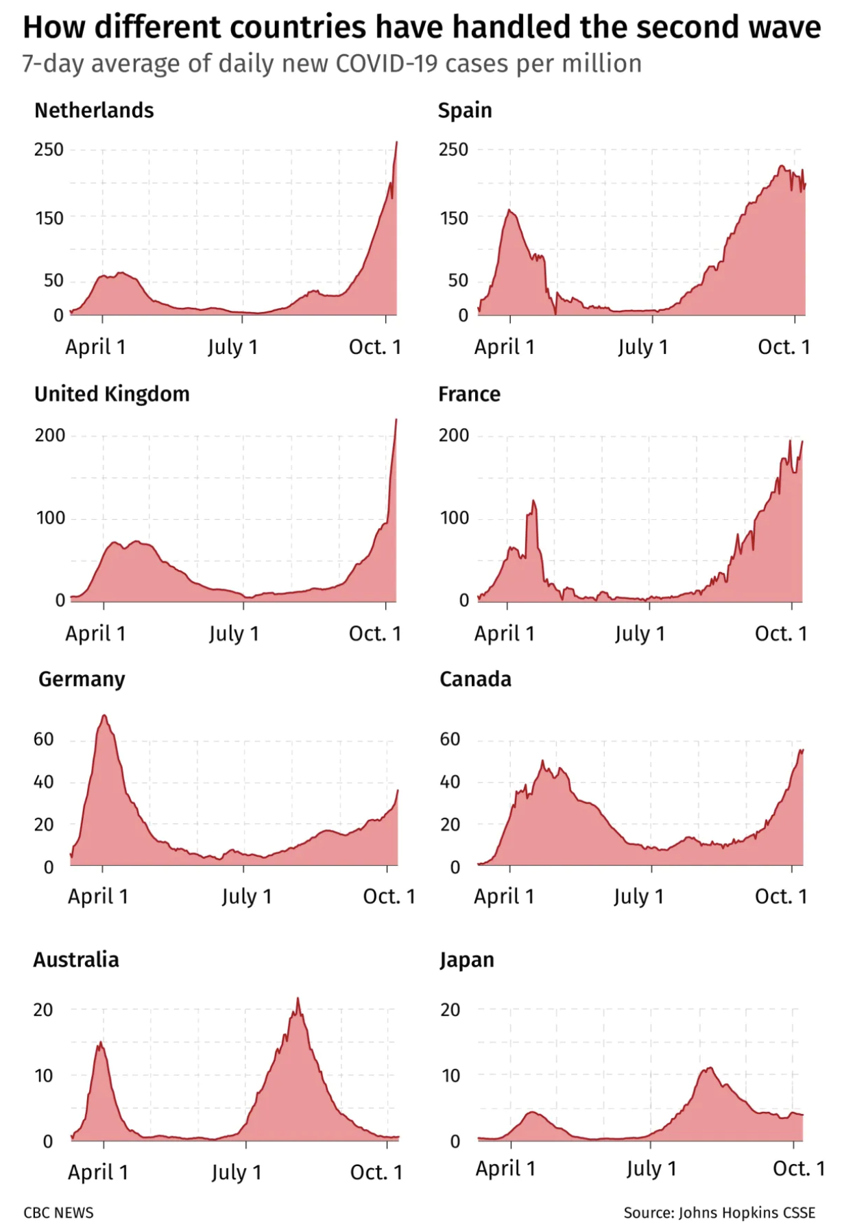
. Profiles of 7-day average daily cases in eight countries during the second wave of COVID-19.
(CBC News, 24 October 2020).
24 October 2020
background
A chart taken from an article that compares Canada's COVID-19 case numbers during the second wave with those of other countries.
core message
While it is clear that case profiles during the second wave are different, the details of these differences are difficult to perceive. The graphic does nothing to help compare the time of the peak and duration of the second wave, nor hint the extent to which these parameters might be influenced by the peak height.
key guidelines
1. Explicitly call out relevant similarities and differences to make an effective omparison..
2. Raw data or aggregate statistics like peak height and width? Know what is likely to be more important (or interesting).
3. Add a visual cue to draw attention that axis scale is varying.
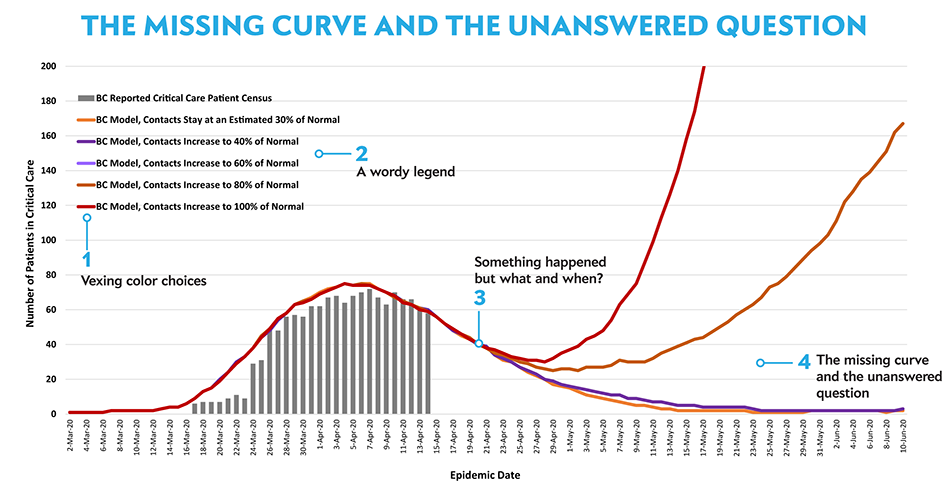
▲ The missing curve and the unanswered question
. A model released by the B.C. government of how critical care cases for COVID-19 could develop over the coming months based on the level of restrictions in place.
(BC Centre for Disease Control, 17 April 2020).
17 April 2020
background
British Columbia is praised for their COVID-19 strategies and
Dr. Bonnie Henry, the Provincial Health Officer, regularly shares data and charts during her daily briefings.
core message
The charts are valuable but some are more important than others. This particular one is critical in the discussion around loosening restrictions and I show how to make it even better.
key guidelines
1. The design of a chart must incorporate its purpose.
2. Intuitively map color to groups and trends.
3. Make the legend a table and order items in order of appearance on the plot.
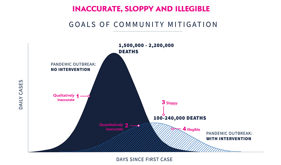
▲ Inaccurate, sloppy and illegible
. A slide from the presentation that explains the goals of community mitigation by comparing the time progress of daily cases with and without intervention. The chart projects that by “flattening the curve” deaths can be reduced from 1.5–2.2 million to 100,000–240,000.
(White House Coronavirus Task Force, 31 March 2020).
31 March 2020
background
[https://en.wikipedia.org/wiki/White_House_Coronavirus_Task_Force](The Coronavirus Taskforce) uses press briefings to communicate updates, guidelines, and policy changes to the public during the 2020 COVID-19 pandemic in the US.
core message
On charts that are illustrative, shapes, trends and proportions should be reflected as accurately as possible. This is easy to get wrong when not using curves from the source models but rather attempting to depict the data qualitatively.
key guidelines
1. Use an appropriate data generation model even for illustrative graphics.
2. Never deceive the reader by drawing proportions that don't accurately reflect your message.
3. Avoid textures and other chart junk.