The COVID Charts
Observations on data visualizations of the coronavirus outbreak
The COVID Charts are brief critiques of data visualization and science communication of the coronavirus outbreak. They are not statements about the underlying science or public health policy.
If you would like me to critique a specific chart, get in touch.
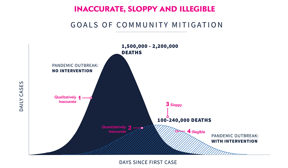
▲ Inaccurate, sloppy and illegible . A slide from the presentation that explains the goals of community mitigation by comparing the time progress of daily cases with and without intervention. The chart projects that by “flattening the curve” deaths can be reduced from 1.5–2.2 million to 100,000–240,000. (White House Coronavirus Task Force, 31 March 2020).
qualitatively inaccurate
The chart shows a normal distribution but epidemiological curves are typically asymmeric. This can be seen in a comparison of the infected fraction from a SIR model with R_0 = 2 model, scaled to have the same maximum.

Do not use a normal distribution to illustrate a data generation process that isn't normal. In this case, a simple SIR model curve is easy to generate and has the benefits authentically reflecting the change in shape as R__0 changes.
If correct shapes aren’t shown, important trends can be missed: as parameters vary, asymmetries or a changes in shape can arise that hint at the underlying mechanisms.
quantitatively inaccurate
More importantly, the relative size of curves does not reflect the actual numbers on the chart. The smaller curve has an area that is about 30% of the larger curve. As shown, it therefore represents 500,000 to 660,000 deaths. Always use a quantitative model even if the design calls for an illustrative comparison.

Accurately demonstrate proportions — failing to do so will give the reader an incorrect impression of how the data change. The curves on the plot imply a scenario in which cases are reduced to 11% but their actual shape corresponds to a reduction to 30%. This is akin to drawing two lines, one half the length of the other, and saying that it is actually one-sixth the length.
In order for the smaller curve to reflect the number of deaths shown on the slide, its area would have to be about 11% of the large curve. Without the correct scaling, it is easy to underestimate the degree of mitigation required for the depicted drops in deaths.
sloppy
The ranges of deaths labelling the two curves are formatted differently:
1,500,000 - 2,200,000
100-240,000
In both cases, a dash is used as a separator — for ranges, always use the n-dash (–) whose length helps separate the numbers.
illegible
Never use textures for fill. Textures disappear and shimmer and are “chart junk”.
For curves filled with color, apply transparency or color blend to emphasize their overlap. If the curve in the back is darker, superimpose a lightly tinted copy of it on top of the foreground (e.g. 15% opacity). This may achieve the desired effect if you don’t have access to blend modes.

Avoid textures at all cost. They are chart junk. Use color blends or a light tint overlay to mix the curve colors where they overlap. A subtle way to emphasize overlapping curves is to apply a thin white stroke to the top-most curve.