Tango is a sad thought that is danced.
•
• think & dance
• more quotes
data visualization
+ public health
The COVID Charts
Observations on data visualizations of the coronavirus outbreak
The COVID Charts are brief critiques of data visualization and science communication of the coronavirus outbreak. They are not statements about the underlying science or public health policy.
If you would like me to critique a specific chart, get in touch.
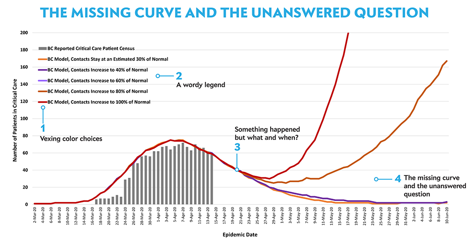
▲ The missing curve and the unanswered question . A model released by the B.C. government of how critical care cases for COVID-19 could develop over the coming months based on the level of restrictions in place. (BC Centre for Disease Control, 17 April 2020).
vexing color choices
Color choices do not support what is being shown because they do not reflect inputs (contact level) or whether an outbreak will occur. A good choice would be a two-hue palette for a natural grouping based on outcomes: red is undesirable/dangerous and blue is desirable/safe.
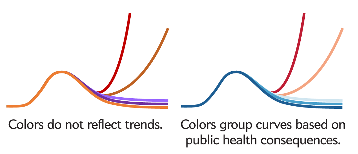
Figure 1
Choose colors that reflect trends. The original colors do not indicate an increasing progression of contact level. By selecting hues based on outcome and tinting within each group, we can communicate the outcomes qualitatively (blue: desirable, red: undesirable) as well as qualitatively (e.g., light blue: less desirable, dark blue: more desirable).
a wordy legend
The legend is an opportunity to present the story: baselines, thresholds, critical behaviour and trends can be subtly implied. This can be done by leveraging good color choices with key words and tabular formatting. Think of the legend as the graphic’s “elevator pitch”. Manage redundancy at every turn — no word should be repeated.
The small vertical space after 60% hints at a critical value of contact level that should not be exceeded.
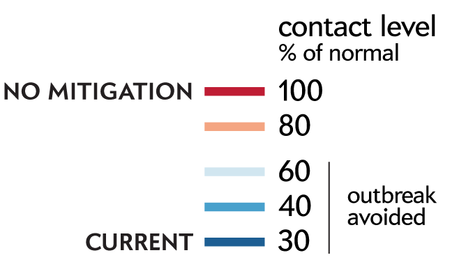
Figure 2
By formatting the legend as table you can naturally organize factors and levels into columns and rows. Order items in the legend as they appear in the plot.
something happened, but when?
The model shows the result of an increase in contact level above the current 30%. The date at which this increase takes place is a critical part of the analysis and showing it effectively splits the time axis into past and future. Note that it cannot be assumed that contact level increases after the last data point in the patient census barchart.
If there is a great deal of overlap between curves, take care to draw the appropriate curve on top–don't assume that this order will be optimal unless you specifically designate it in your software. In this case, drawing the current level of contact on top is the clear choice because only this plot technically goes back into the past.
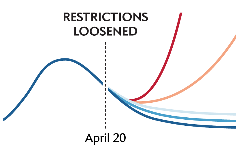
Figure 3
Grid lines that indicate key events along an axis can be outlined to appear to sit on top of the traces. As long as this does not obscure any important data, the effect will be to strongly divide the plot into parts.
the missing curve and the unanswered question
The plot misses the opportunity to answer the key question: what is the highest level of contact at which an outbreak is avoided (R_0 = 1). This threshold should be presented along with a confidence interval. This is the entire point of the graphic and represents the key to informing the mitigation process.
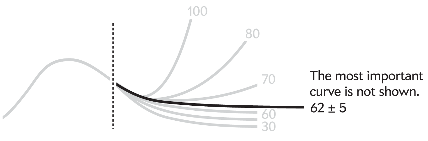
Figure 4
Anticipate the readers' questions and incorporate the answers in the design of the chart. In this case, the trends pivot on the contact level curve that corresponds to R0 = 1.
This critical contact level value is emphasized by coloring the area under the curve. There’s little value in having both 40% and 60% levels, which can replaced by 50%. The redesign of the chart is minimal but with a strong focus on the story.
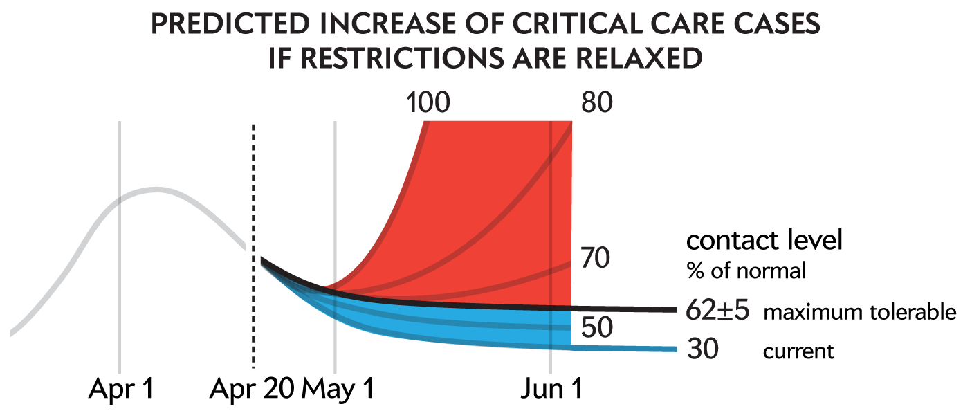
Figure 5
A redesign of the original graphic.
alternative broadcast version
The chart critiqued here came from the digital version of the COVID-19: Where we are. Considerations for next steps report. There is an alternate broadcast version in which the chart's design is substantially different. This alternative version fixes one of the issues but incurs others.
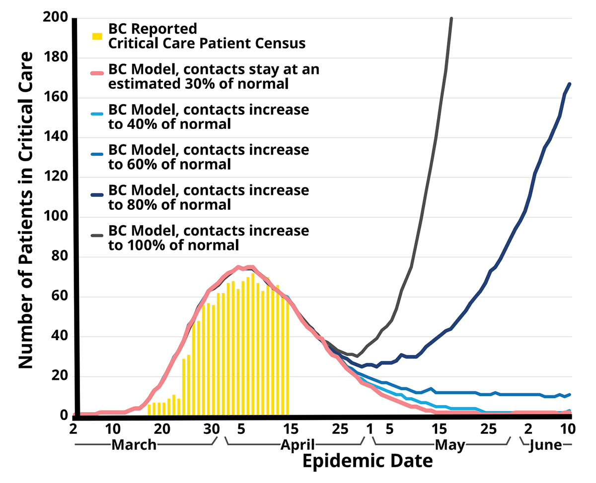
Figure 6
An alternate broadcast version of the original figure created by the BC Centre for Disease Control.
The choice of colors is arguably worse than in the original version. Red, which should normally be reserved for the worst outcome, is being used to encode the current level of mitigation, which is the most stringent of all scenarios.
The use of grey for 100% is reasonable, since it can be considered a reference value. However, if this is done then we're still left to choose the colors for the 30–80% levels. If we go with a single hue this time then we have the choice of either using blue (progressively improved outcomes as we approach 30%) or red (progressively worse outcomes as we approach 100%). Since avoiding a bad outcome is the theme of the story, I selected colors from the red sequential Brewer palette.
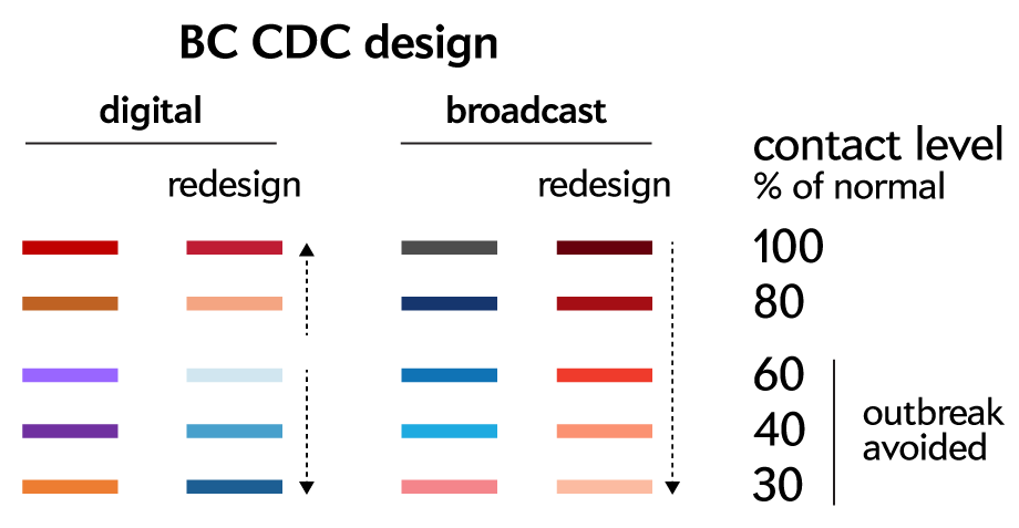
Figure 7
Color palettes of the original and alternative broadcast versions of the chart, along with my suggested redesign. The arrows indicate the progression of the redesigned color palettes: diverging for the digital version and sequential for the broadcast version.
Where the broadcast version improves on the original is the handling of the labels on the time axis. The original vertically oriented dates were hard to read and made even knowing which month you were looking at difficult.
If you're in a scenario in which the x-axis labels don't fit you can do one of two things: make them sparser (chances are you have too many anyway) or arrange the figure horizontally. The latter option is particularly useful for bar charts where the axis contains categories whose legibility is particularly important.
In the short redesign below I show one way of handling dates. The broadcast version wasn't that bad but the braces that capture the parts of the time axis into months were too bold.
To partition an axis into disjoint regions all you need is a tiny break. In this case, each month is a tiny axis from 1–30 with only days 10 and 20 labeled. The first and last days are not labeled because they would overlap with the next/previous month but also because they are in obvious positions. Note the distance between the months is 1 day or 2 days, depending on whether the month has 30 or 31 days.
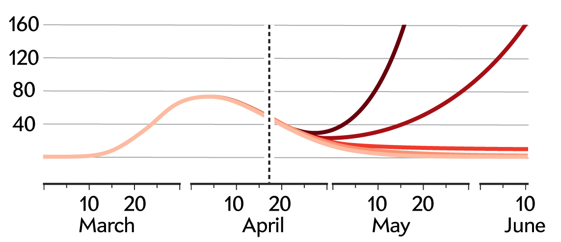
Figure 8
A compact redesign of the original graphic. Notice how the data traces are cropped by the last y-axis grid.
In general, overly granular axis labels are unproductive. The reader needs to know where they are in the plot but only at the level of detail reflected in the trends and variation in data. In this case, the first peak of cases is at 80 and the models diverge at around 40, so having a spacing of 40 is reasonable—both of these levels are close to a grid line.
Martin Krzywinski | contact | Canada's Michael Smith Genome Sciences Centre ⊂ BC Cancer Research Center ⊂ BC Cancer ⊂ PHSA
{ 10.9.234.151 }