I'm not real and I deny I won't heal unless I cry.
•
• let it go
• more quotes
data visualization
+ public health
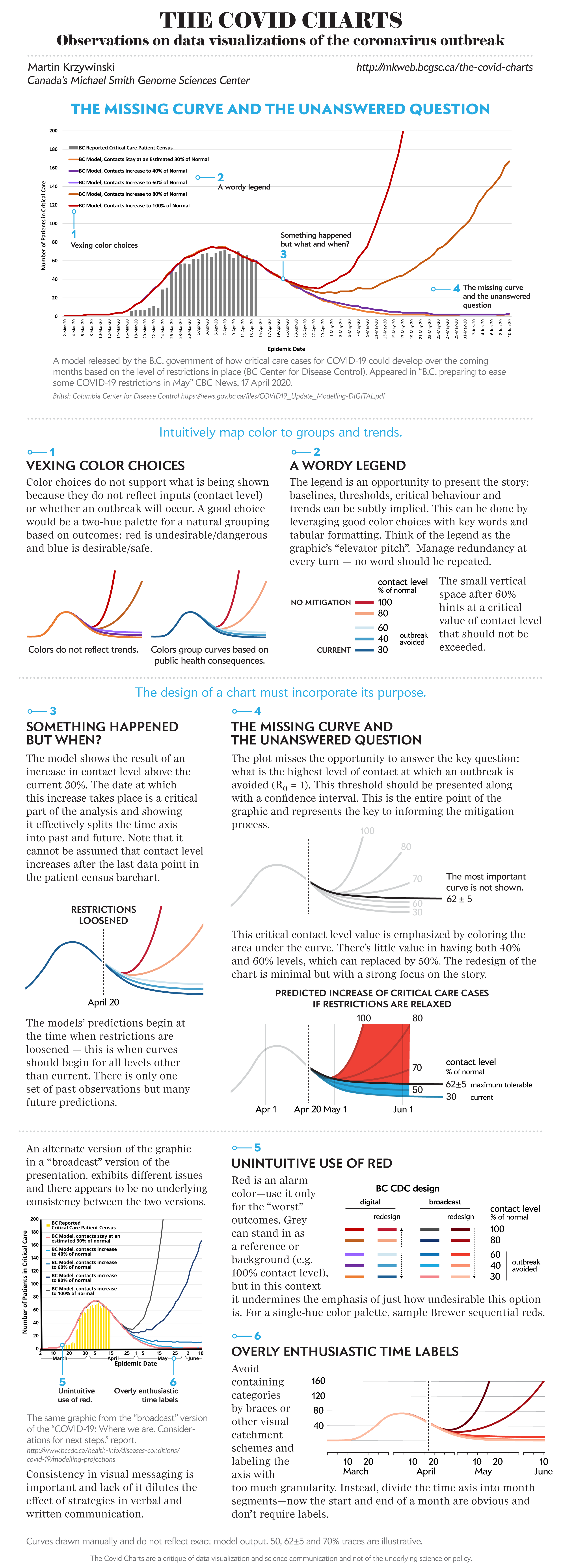
The COVID Charts
Observations on data visualizations of the coronavirus outbreak
The COVID Charts are brief critiques of data visualization and science communication of the coronavirus outbreak. They are not statements about the underlying science or public health policy.
If you would like me to critique a specific chart, get in touch.
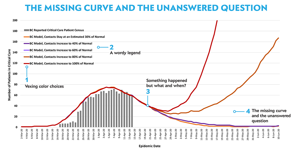
▲ The missing curve and the unanswered question . A model released by the B.C. government of how critical care cases for COVID-19 could develop over the coming months based on the level of restrictions in place. (BC Centre for Disease Control, 17 April 2020).
Martin Krzywinski | contact | Canada's Michael Smith Genome Sciences Centre ⊂ BC Cancer Research Center ⊂ BC Cancer ⊂ PHSA
{ 10.9.234.151 }