

#hitchens
Christopher Hitchens—Out of Letters
contents
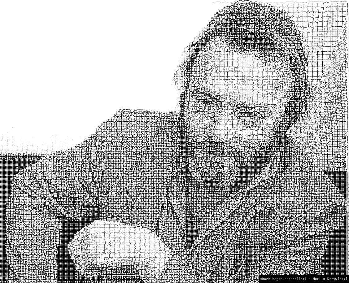
The images shown here were created as part of my ASCII Art project, which extends ASCII art to include
- proportionally spaced fonts
- a variety of font weights in a single image
- both tone and structure of the image to select characters
- fixed strings to render an image in legible text
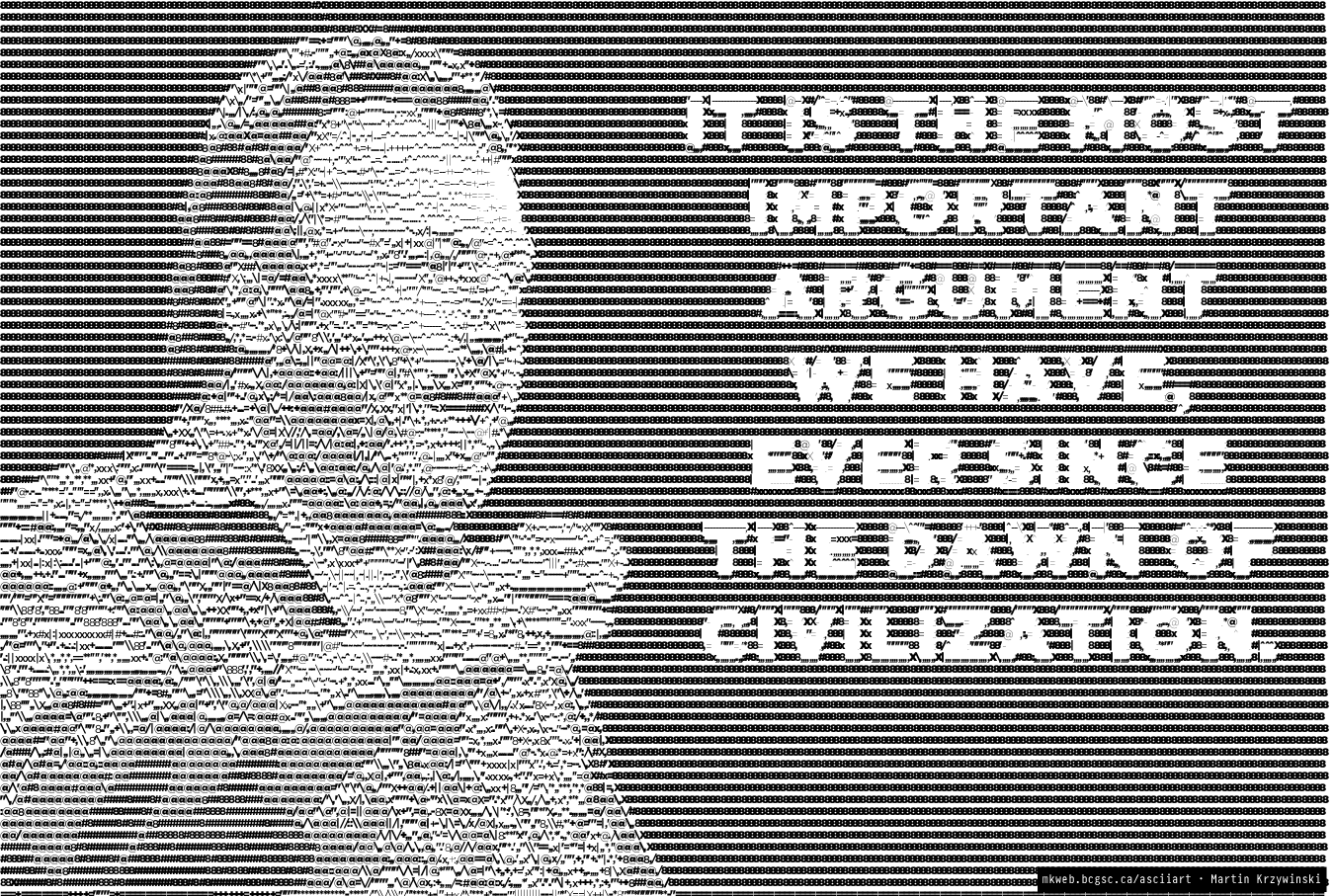
Applying the code to images of Hitchens was motivated by my own deep love of Hitchens and a typographic portrait of Christopher Hitchens, created out of Gill Sans letters by Miles Chic at Capilano University.
Also, what's the reason for reason this season? Why, Hitchmas, of course.

All images are generated using Gotham, with up to 8 weights (Extra Light to Ultra). Each image includes size and characters used for the image. I give the absolute type size, though only useful to know in relative terms to the size of the image and other images drawn with the same method. The color of text in each layer is the same—black— but font weight may vary.
Some images are generated using more than one layer of ASCII. In some cases the characters used in each layer are different.
As the font size is reduced, greater detail and contrast can be achieved.
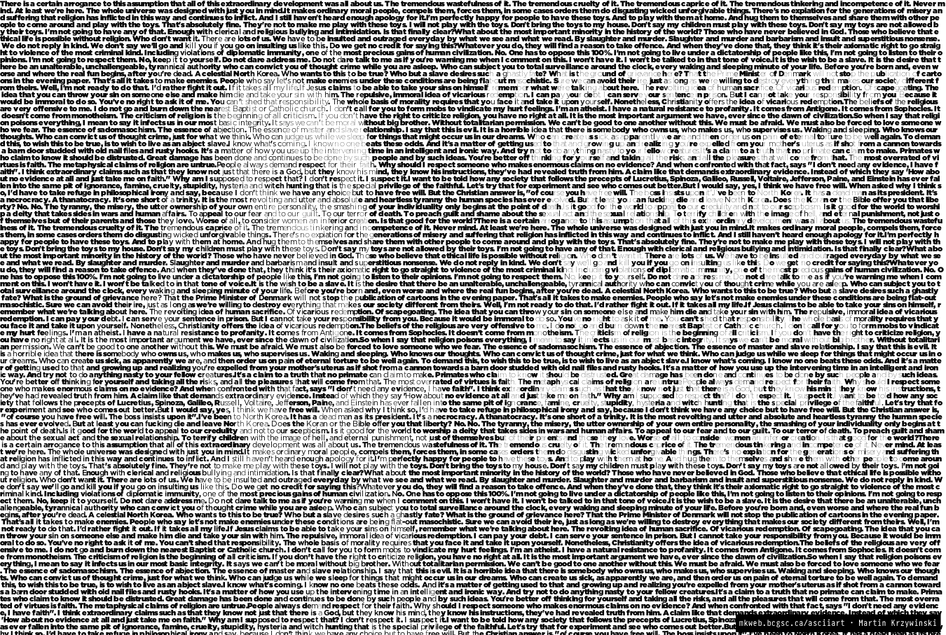
By setting the image with a fixed string, such as a short quote or longer body of text, detail is lost but the ASCII representation takes on more meaning.
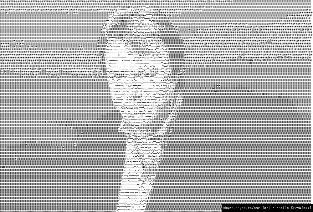
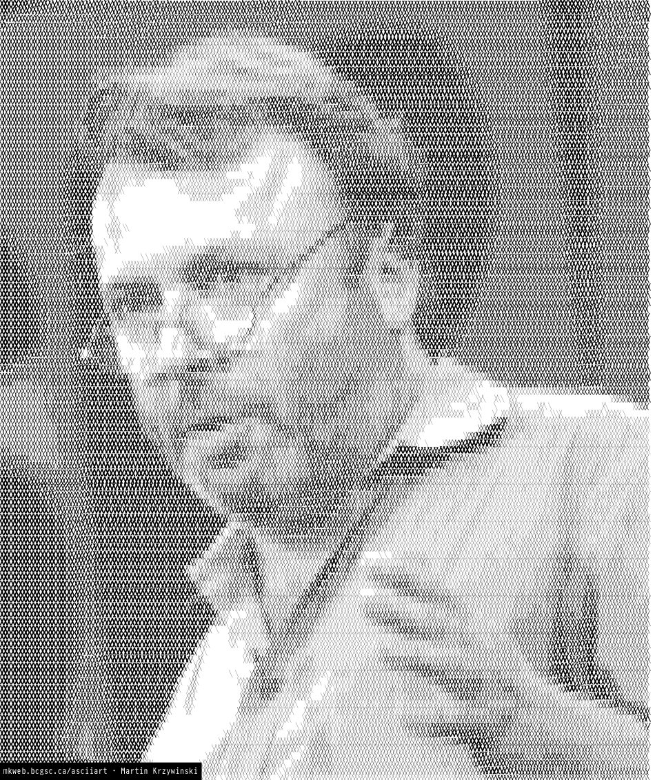
Images take on detail when several rotated layers of text is used. Each of the images below is composed of more than one layer, starting with a 2-layer image which uses the uppercase alphabet at 0 and 90 degrees.
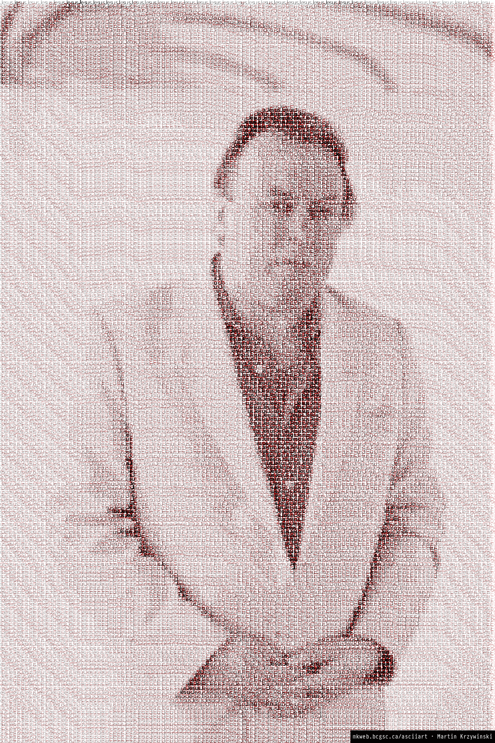
Meaning can be added to the image by using different text in each layer. In the examples below, I set the same image using the pair "Godisnotgreat" (at 0 degrees) and "religionpoisonseverything" (at 90 degrees). In the second example, I use the unlikely combination of "Jesus" and "Mohammad"—inspired by Jesus and Mo.
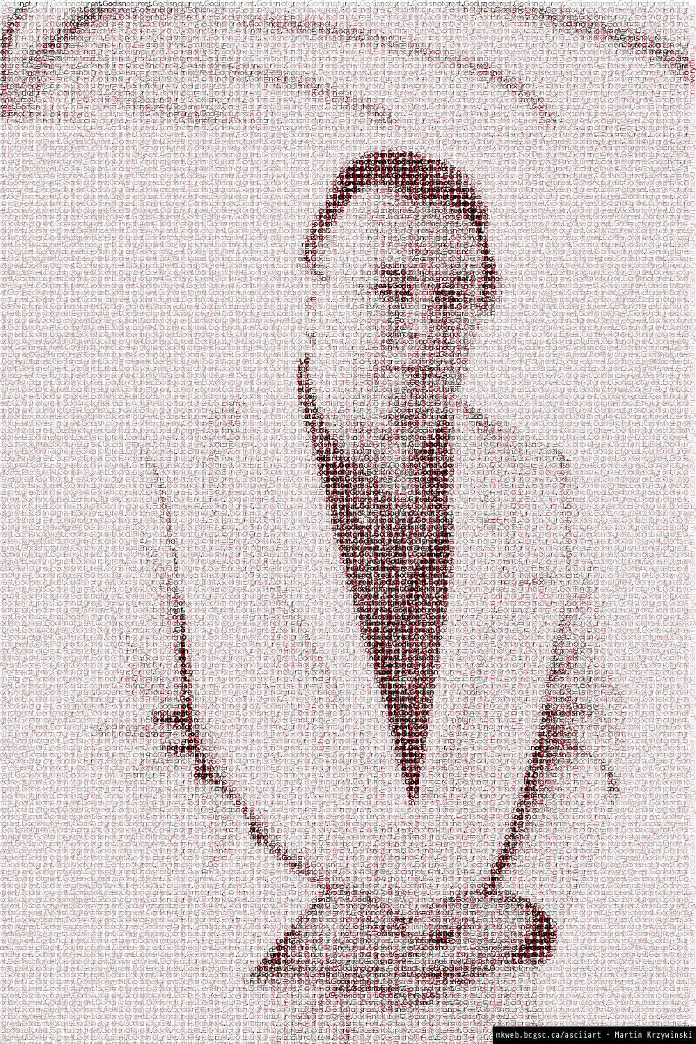
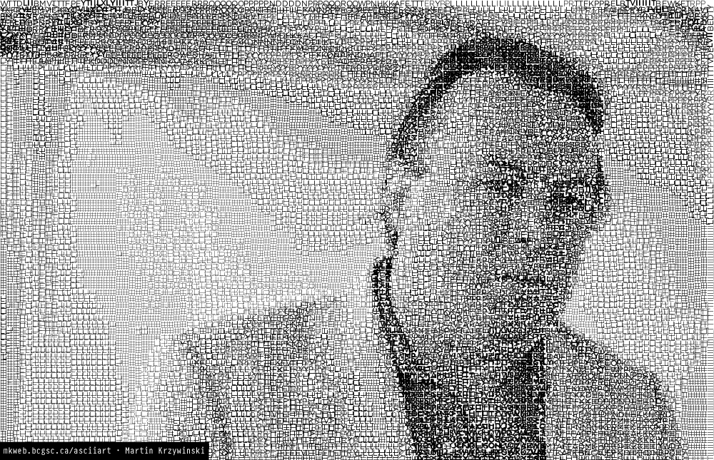
When rotated layers contain punctuation, very high level of detail can be achieved.
The image below is made out of layers that contain only forward (/) and back (\) slashes.
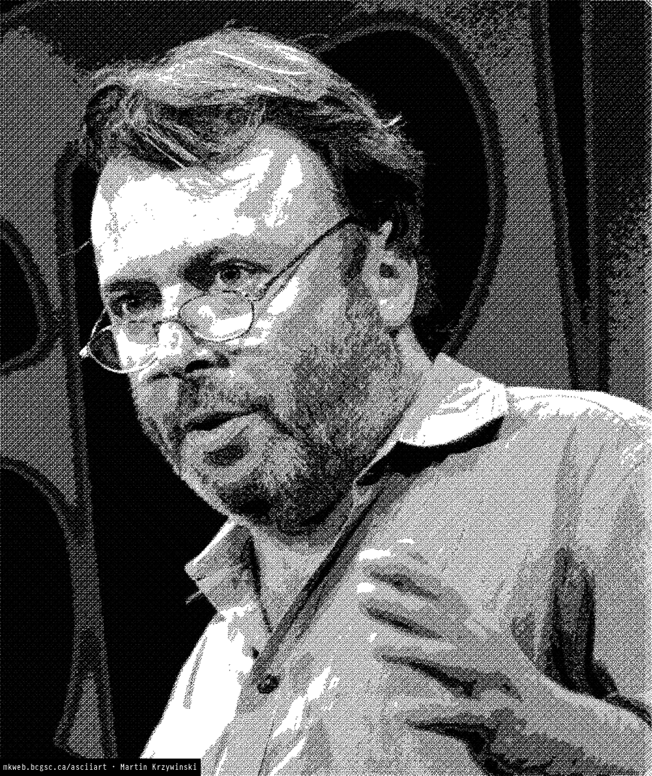
The image below is made using only the period character in three layers rotated at –45, 0 and 45 degrees. Although the image looks like a pixelated version of the original—it is more than that. It is a typeset representation that uses 8 weights of Gotham. Character spacing between periods is informed by font metrics.
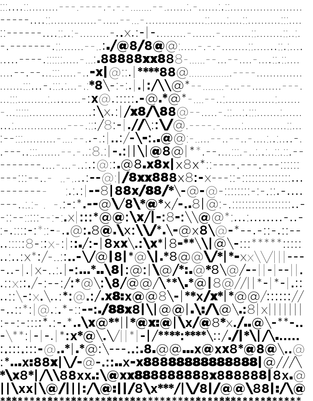
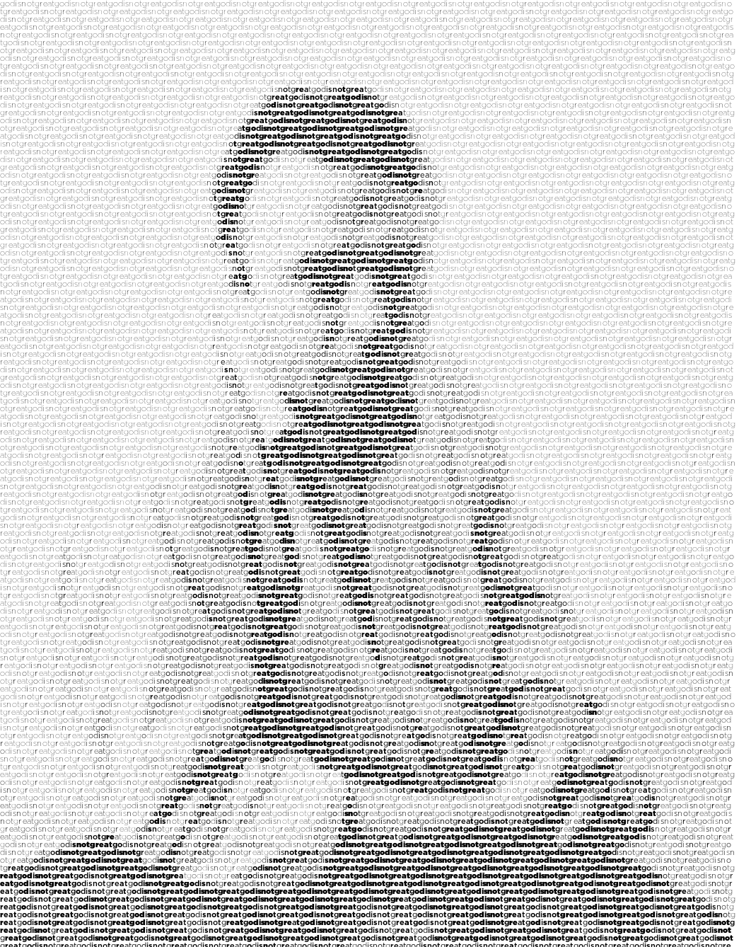
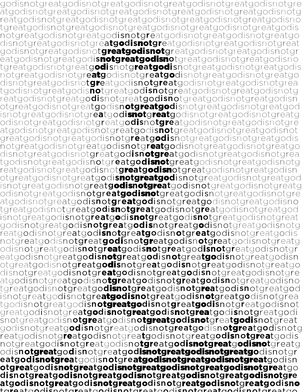
The three images below show the difference between using a variety of punctuation characters and setting an image using a block of text. The first image uses "8 X x" and common punctuation.
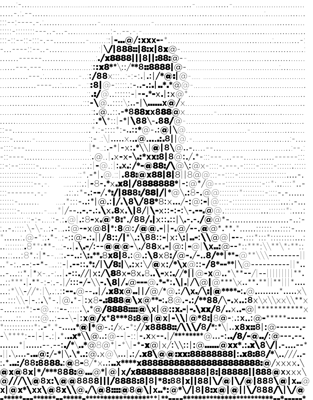
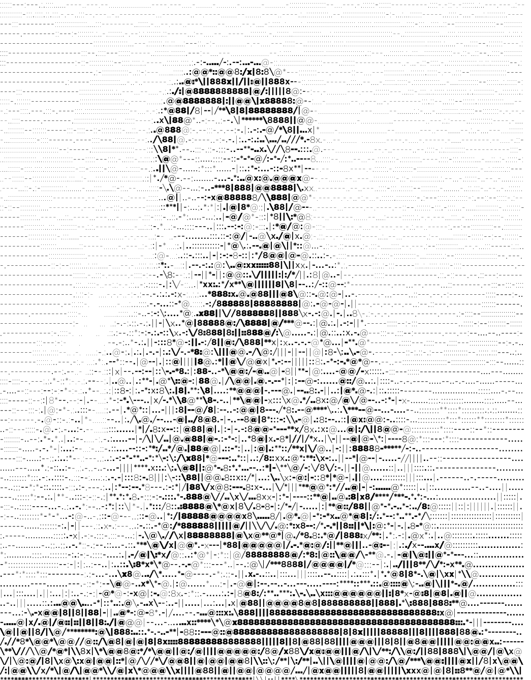
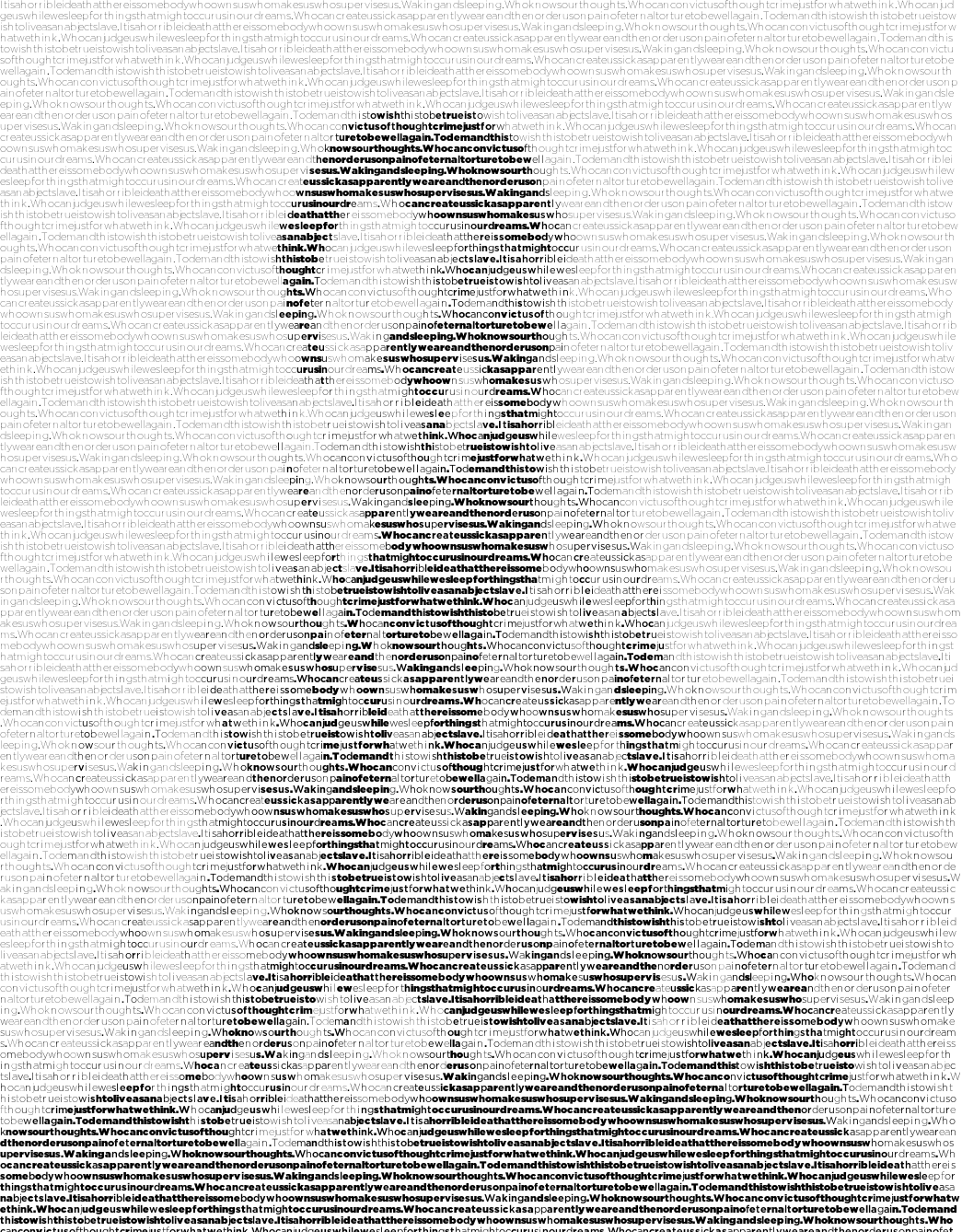
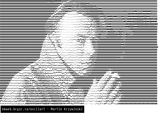
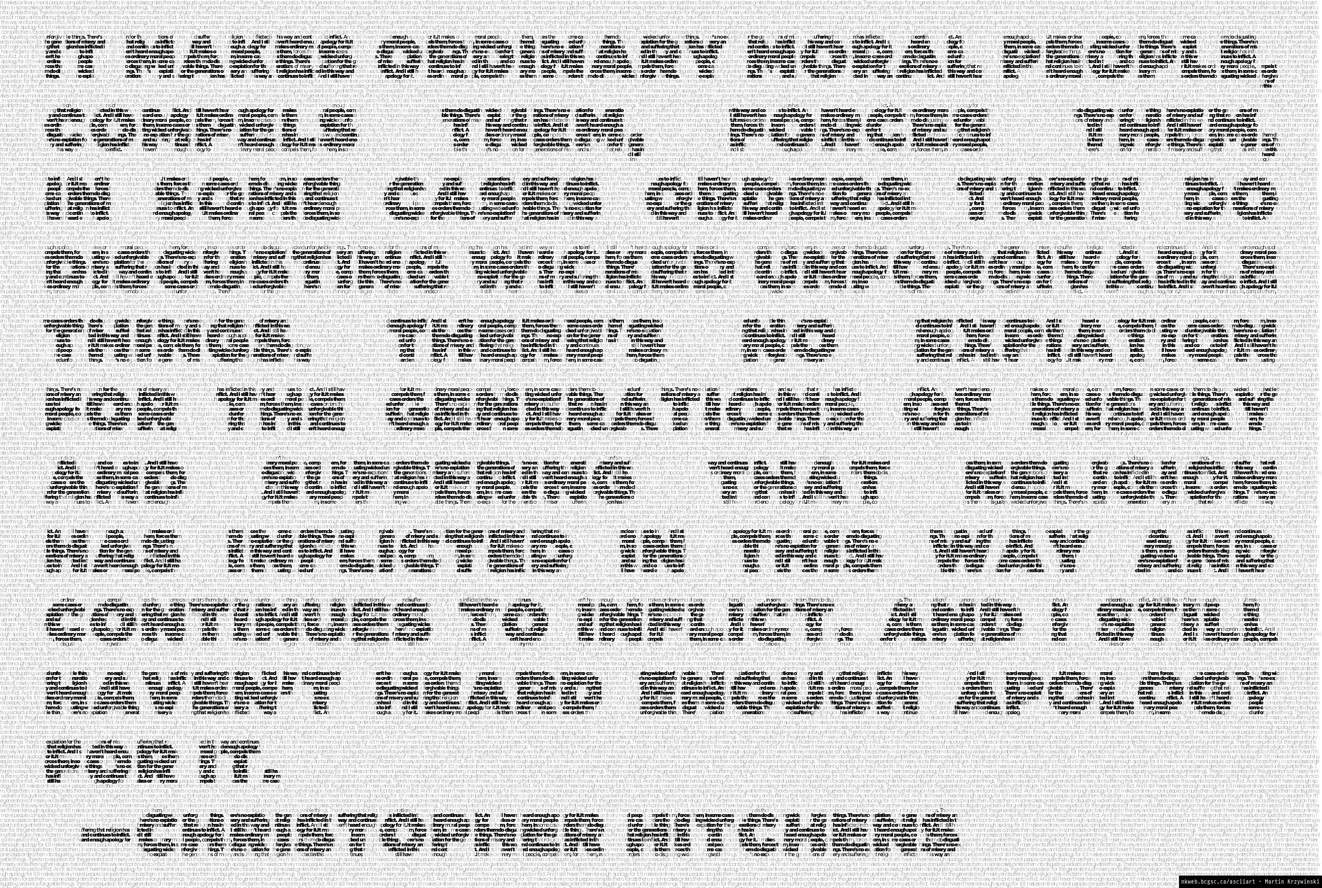
I use Hitchslap 9 for the first image below, and all the Hitchslaps for the second image. When setting an image in using a block of text, the choice of character at any position is fixed and only the font weight is allowed to vary. When the text is relatively short (e.g. Hitchslap 9 is 544 characters and is repeated 50 times in the image), rivers of space appear in the image.

In both cases, the image is very recognizable.
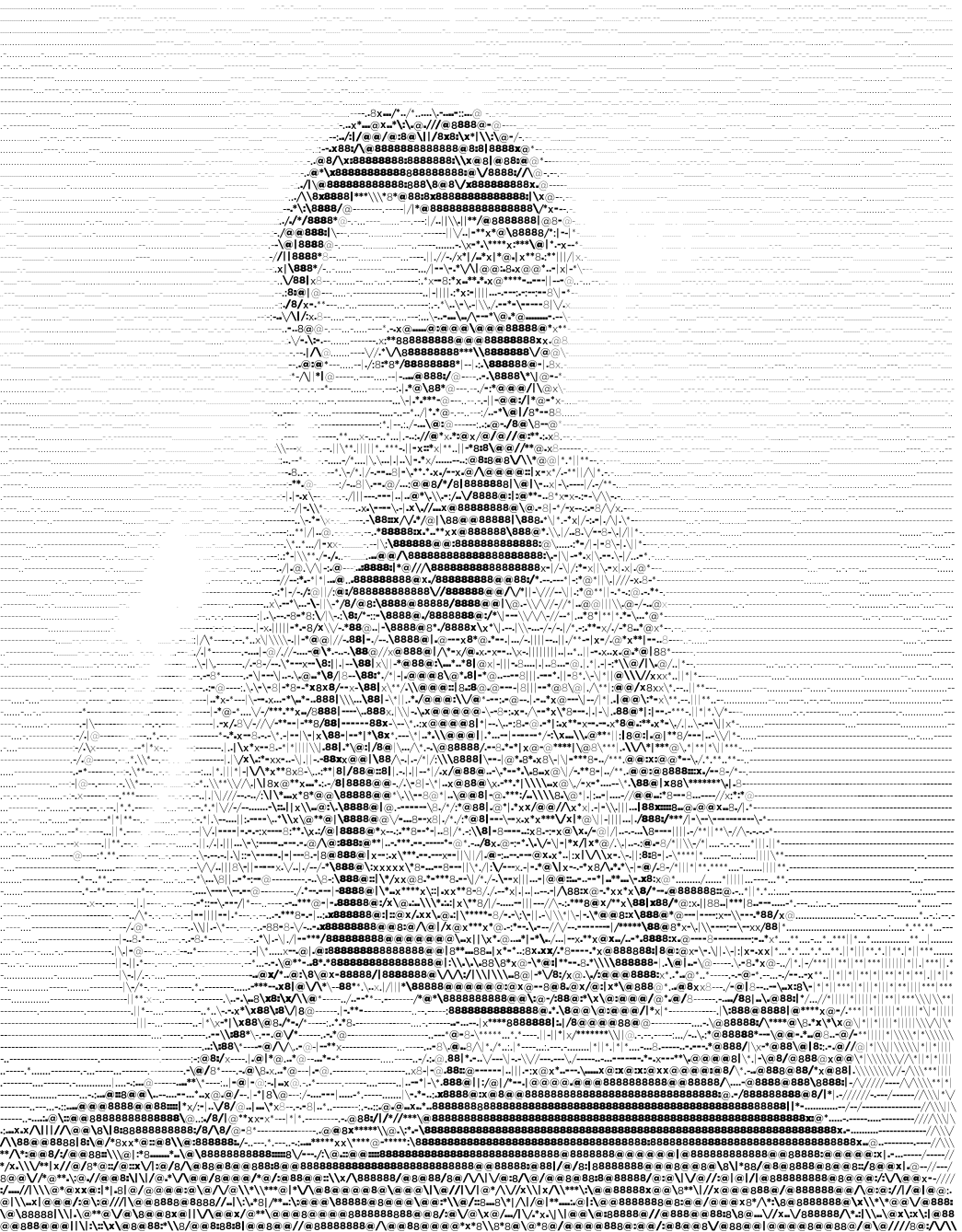
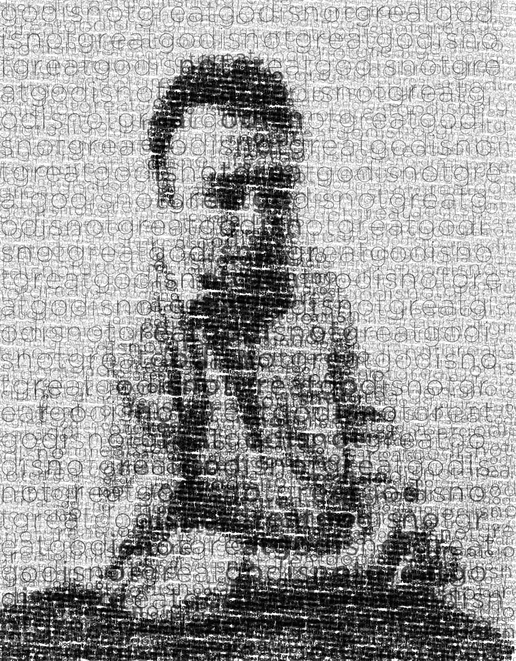
When an image of text is set with the text itself, you have recursive ASCII art. Below is Hitchslap 2, set with itself. In the image, the font is Gotham and the text used to asciify the image is also Gotham.
It makes ordinary moral people, compels them, forces them, in some cases orders them do disgusting wicked unforgivable things. There's no expiation for the generations of misery and suffering that religion has inflicted in this way and continues to inflict. And I still haven't heard enough apology for it. — Christopher Hitchens
The quote is 307 characters long and is repeated 391 times in the image.
In principle, the process of asciifying text with text can be repeated, by using the asciified image as input for asciification with progressively smaller text.
Nasa to send our human genome discs to the Moon
We'd like to say a ‘cosmic hello’: mathematics, culture, palaeontology, art and science, and ... human genomes.


Comparing classifier performance with baselines
All animals are equal, but some animals are more equal than others. —George Orwell
This month, we will illustrate the importance of establishing a baseline performance level.
Baselines are typically generated independently for each dataset using very simple models. Their role is to set the minimum level of acceptable performance and help with comparing relative improvements in performance of other models.

Unfortunately, baselines are often overlooked and, in the presence of a class imbalance5, must be established with care.
Megahed, F.M, Chen, Y-J., Jones-Farmer, A., Rigdon, S.E., Krzywinski, M. & Altman, N. (2024) Points of significance: Comparing classifier performance with baselines. Nat. Methods 20.
Happy 2024 π Day—
sunflowers ho!
Celebrate π Day (March 14th) and dig into the digit garden. Let's grow something.

How Analyzing Cosmic Nothing Might Explain Everything
Huge empty areas of the universe called voids could help solve the greatest mysteries in the cosmos.
My graphic accompanying How Analyzing Cosmic Nothing Might Explain Everything in the January 2024 issue of Scientific American depicts the entire Universe in a two-page spread — full of nothing.

The graphic uses the latest data from SDSS 12 and is an update to my Superclusters and Voids poster.
Michael Lemonick (editor) explains on the graphic:
“Regions of relatively empty space called cosmic voids are everywhere in the universe, and scientists believe studying their size, shape and spread across the cosmos could help them understand dark matter, dark energy and other big mysteries.
To use voids in this way, astronomers must map these regions in detail—a project that is just beginning.
Shown here are voids discovered by the Sloan Digital Sky Survey (SDSS), along with a selection of 16 previously named voids. Scientists expect voids to be evenly distributed throughout space—the lack of voids in some regions on the globe simply reflects SDSS’s sky coverage.”
voids
Sofia Contarini, Alice Pisani, Nico Hamaus, Federico Marulli Lauro Moscardini & Marco Baldi (2023) Cosmological Constraints from the BOSS DR12 Void Size Function Astrophysical Journal 953:46.
Nico Hamaus, Alice Pisani, Jin-Ah Choi, Guilhem Lavaux, Benjamin D. Wandelt & Jochen Weller (2020) Journal of Cosmology and Astroparticle Physics 2020:023.
Sloan Digital Sky Survey Data Release 12
Alan MacRobert (Sky & Telescope), Paulina Rowicka/Martin Krzywinski (revisions & Microscopium)
Hoffleit & Warren Jr. (1991) The Bright Star Catalog, 5th Revised Edition (Preliminary Version).
H0 = 67.4 km/(Mpc·s), Ωm = 0.315, Ωv = 0.685. Planck collaboration Planck 2018 results. VI. Cosmological parameters (2018).
constellation figures
stars
cosmology
Error in predictor variables
It is the mark of an educated mind to rest satisfied with the degree of precision that the nature of the subject admits and not to seek exactness where only an approximation is possible. —Aristotle
In regression, the predictors are (typically) assumed to have known values that are measured without error.
Practically, however, predictors are often measured with error. This has a profound (but predictable) effect on the estimates of relationships among variables – the so-called “error in variables” problem.

Error in measuring the predictors is often ignored. In this column, we discuss when ignoring this error is harmless and when it can lead to large bias that can leads us to miss important effects.
Altman, N. & Krzywinski, M. (2024) Points of significance: Error in predictor variables. Nat. Methods 20.
Background reading
Altman, N. & Krzywinski, M. (2015) Points of significance: Simple linear regression. Nat. Methods 12:999–1000.
Lever, J., Krzywinski, M. & Altman, N. (2016) Points of significance: Logistic regression. Nat. Methods 13:541–542 (2016).
Das, K., Krzywinski, M. & Altman, N. (2019) Points of significance: Quantile regression. Nat. Methods 16:451–452.
Convolutional neural networks
Nature uses only the longest threads to weave her patterns, so that each small piece of her fabric reveals the organization of the entire tapestry. – Richard Feynman
Following up on our Neural network primer column, this month we explore a different kind of network architecture: a convolutional network.
The convolutional network replaces the hidden layer of a fully connected network (FCN) with one or more filters (a kind of neuron that looks at the input within a narrow window).
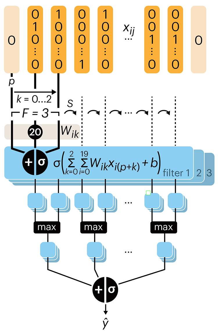
Even through convolutional networks have far fewer neurons that an FCN, they can perform substantially better for certain kinds of problems, such as sequence motif detection.
Derry, A., Krzywinski, M & Altman, N. (2023) Points of significance: Convolutional neural networks. Nature Methods 20:1269–1270.
Background reading
Derry, A., Krzywinski, M. & Altman, N. (2023) Points of significance: Neural network primer. Nature Methods 20:165–167.
Lever, J., Krzywinski, M. & Altman, N. (2016) Points of significance: Logistic regression. Nature Methods 13:541–542.