
#asciiart
ASCII Art—Proportional Spacing, Tone/Structure Mapping and Fixed Strings
contents
After finding a typographic portrait of Christopher Hitchens, created out of Gill Sans letters by Miles Chic at Capilano University, I thought to resurrect software I wrote a long time ago that converts images into letters and expanding traditional ASCII art by using
- proportionally spaced fonts
- a variety of font weights in a single image
- both tone and structure of the image to select characters
- fixed strings to render an image in legible text
This is a Perl script and requires Imager. See README in the archive for instructions. I cannot provide installation support, but welcome questions and ideas about the method.
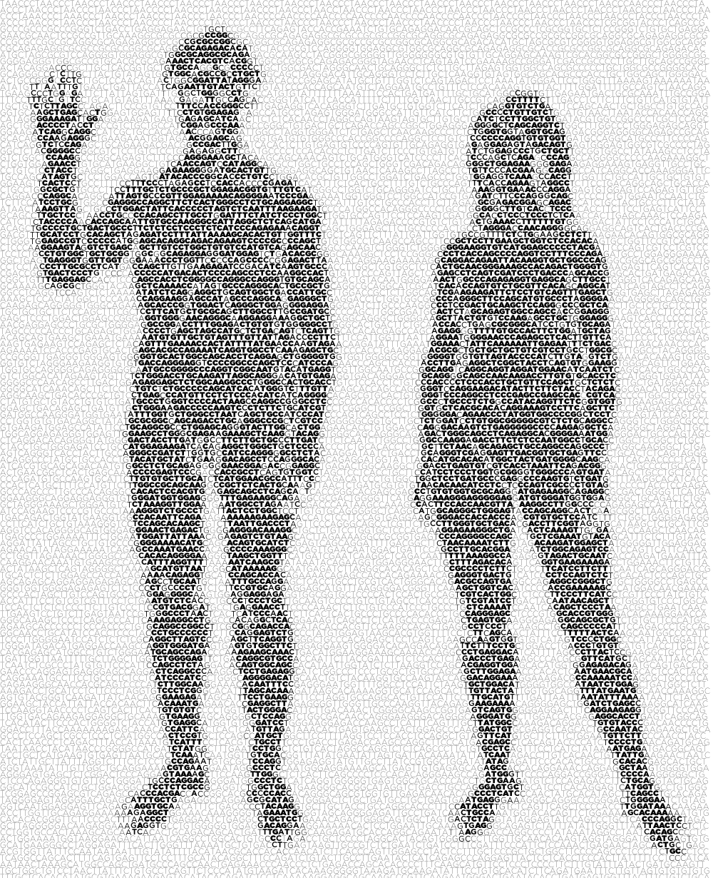

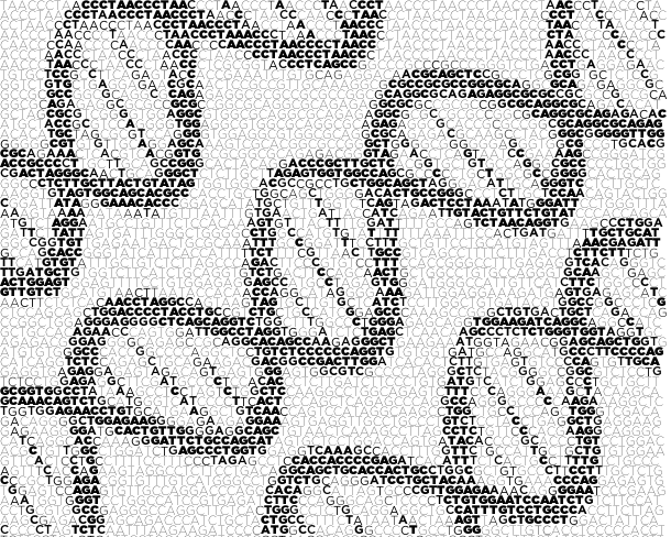
The representation of images by characters—ASCII art—has a long history. ASCII art extends the emoticon (or smiley) to represent a larger piece of work. Typically, the works use a fixed-space font (e.g. Courier), originally designed for display on a terminal. Despite the sophistication of computer graphics today, ASCII art continues to have a strong following with new work continually added to public online galleries.
Photos and paintings can be ASCIIfied using a tone-based approach and automated methods exist to do this (Paul D. O’Grady and Scott T. Rickard (2008) Automatic ASCII Art Conversion of Binary Images Using Non-Negative Constraints).
Many artists generate new creations, exclusive to the medium. Typically this kind of ASCII art is based on the interpretation of structure rather than tone—this method has also been automated (Xuemiao Xu, Linling Zhang, Tien-Tsin Wong (2010) Structure-based ASCII Art).
I have written code to generate ASCII art from images by using proportional spaced fonts.
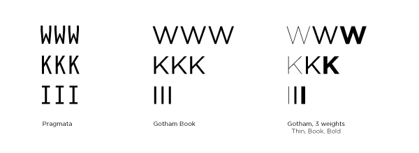
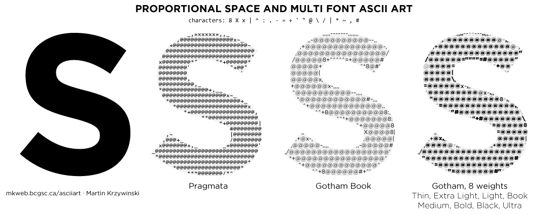
Below is an example of how Pragmata and Gotham can be used to different effect to render an image. When a proportional spaced font is used, the ASCII shape can more fully fill the image.
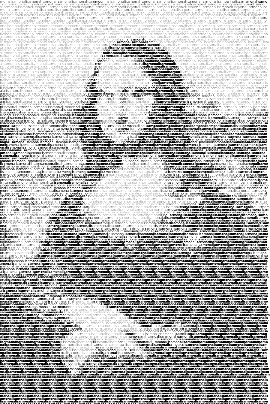
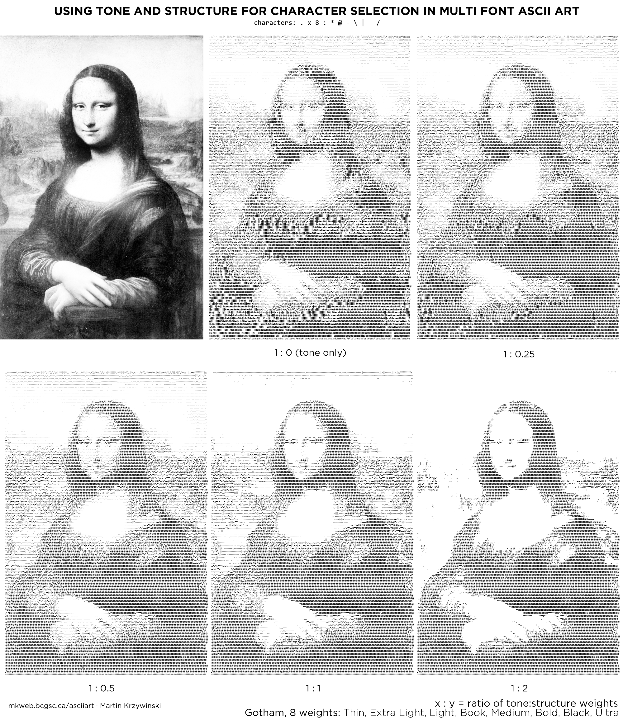
Let's see how these methods work on a real image. Many ASCII art Mona Lisa versions exist. Below, I render the Mona Lisa with Pragmata, Gotham Book and 8 weights of Gotham.
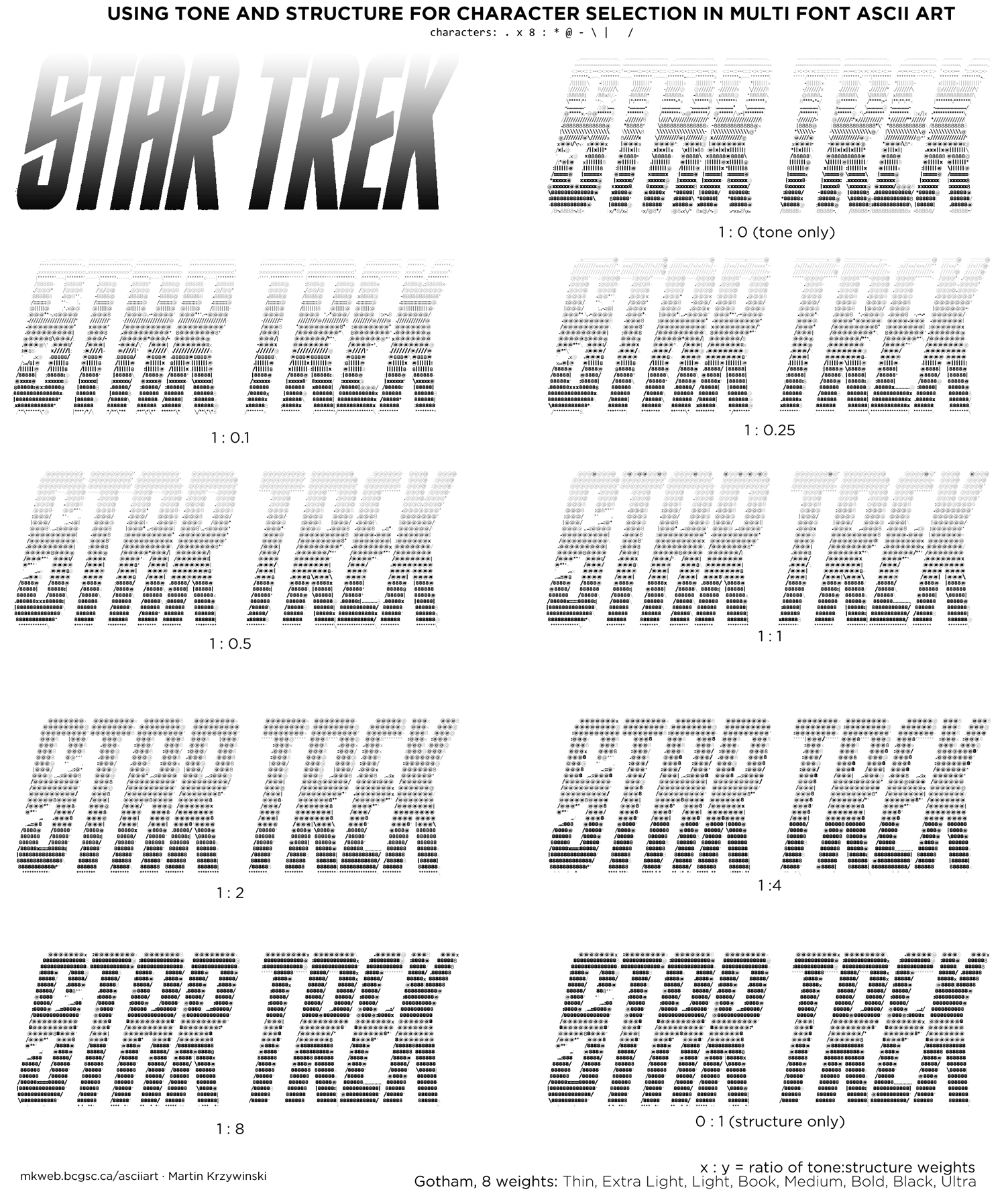
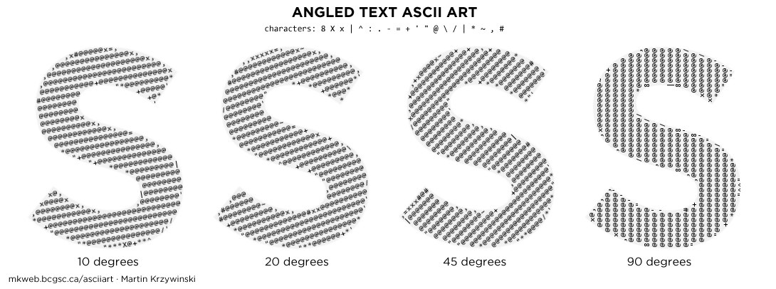
Two-tone shapes like the S in the figure above require selecting characters that match the structure of the image. (e.g. "|" matches vertical lines). For a given character and image position there are four distinct match possibilities—a combination of whether the character and image have a signal at a position. I show this in the figure below.
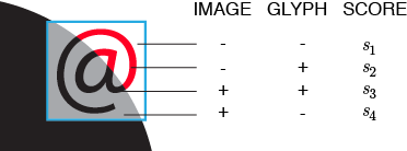
By maximizing scores derived from matches (s1, s3) and minimizing any penalties (s2, s4), a character is identified based on maximal coverage of the image region and minimum coverage of areas that are blank.
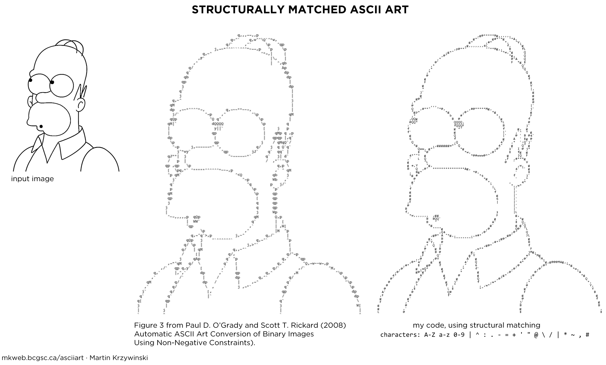
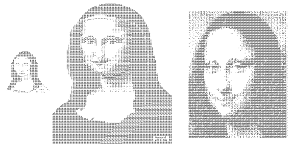
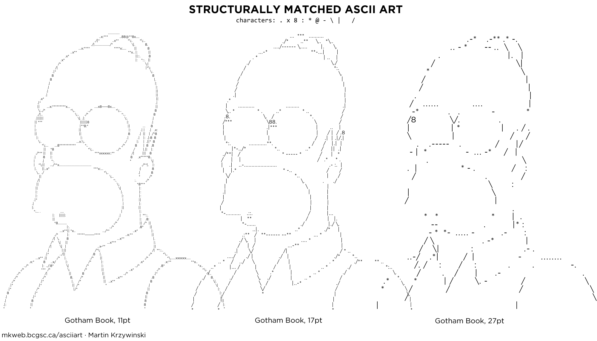
When proportional text is used, edges are better approximated, such as in the Homer Simpson example below which uses Gotham Book.
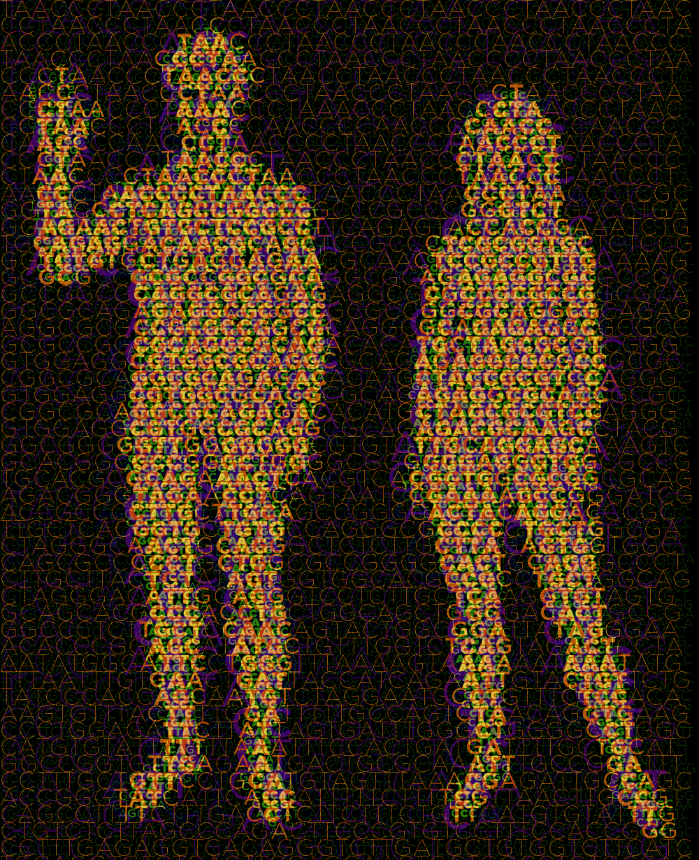
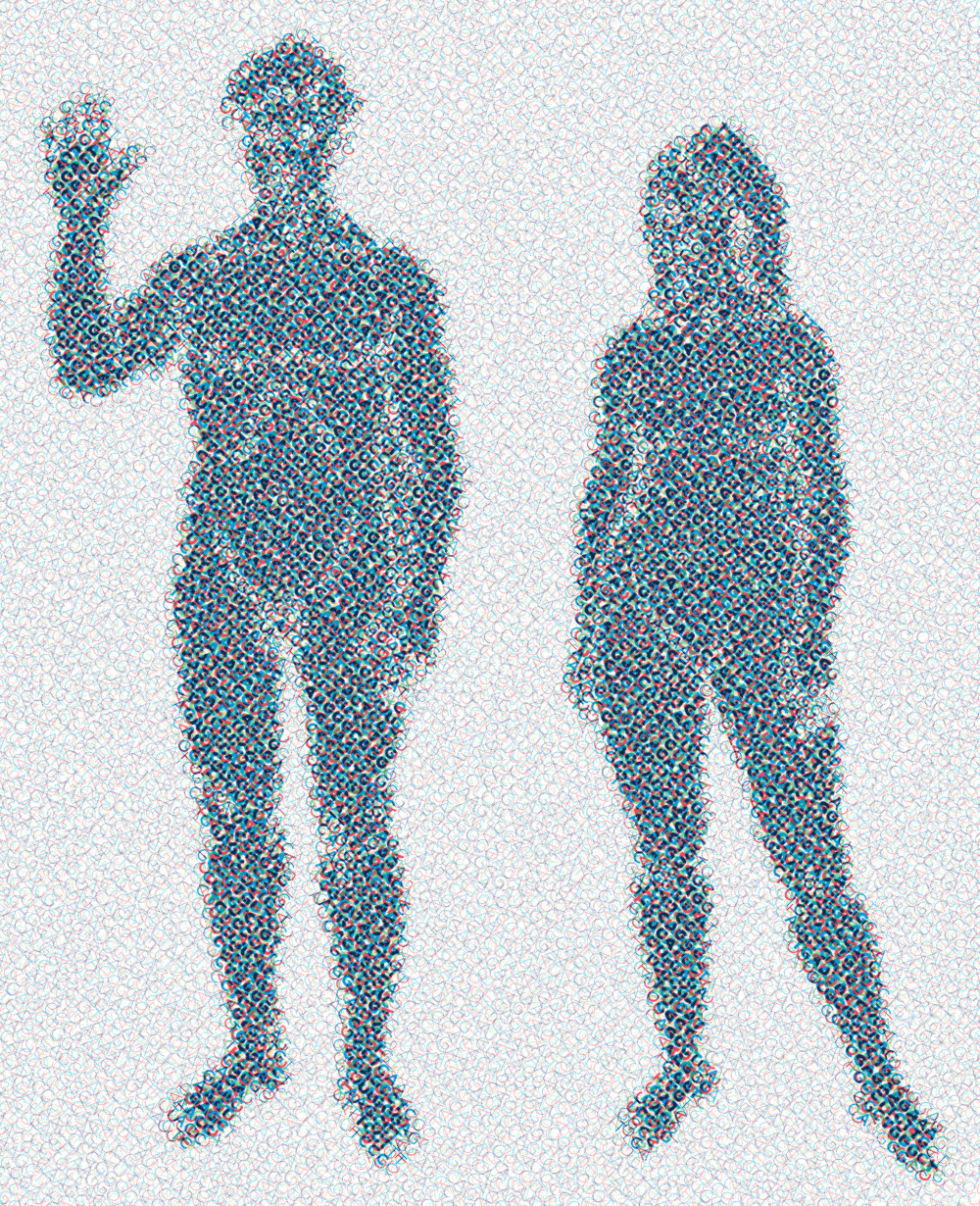
Images that are not two-tone require that we match both structure and tone. Structure is approximated by the choice of character, while tone by choice of font weight. To select the best character based on tone, the character's average tone is compared to the average tone of the section of the image to which it is being compared.
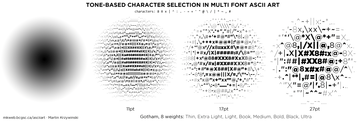
It is possible to combine both structure and tone metrics in character selection. Below is an example of how an image with both tone and structure is interpreted as the tone and structure score weights are varied. The balance between these two metrics can be very hard to find—it greatly depends on the image. Tone-based mapping works well when font size is small and the image is viewed from larger distance—in this case, characters play the role of individual pixels with varying brightness. Structure-based mapping works with larger type and closer viewing distance.
Continuous tone bitmaps are an idea application of multi-font ASCII art—images no longer need to be thresholded or dithered.
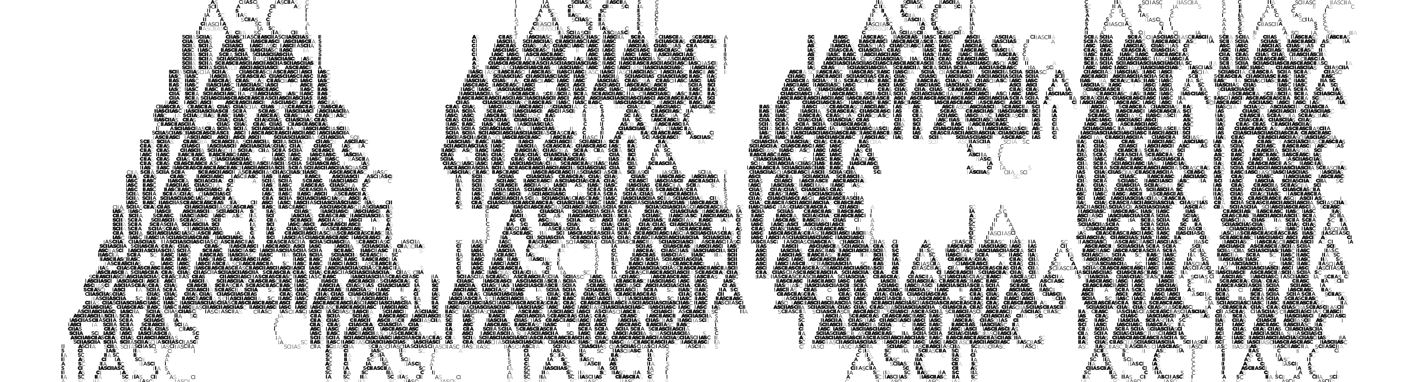
ASCII art is generated by dividing the image into a grid and finding the letter (the choice of characters is often expanded to include punctuation) that best matches the grid section. Typically, for each grid the entire set of allowable characters is sampled. Instead, we can limit the choice of character by successively sampling from a fixed string.
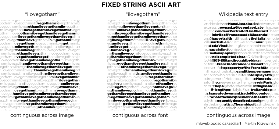
Here is the Mona Lisa rendered with the fixed string "monalisa" using 8 weights of Gotham.
Things get even more interesting when the text is angled.
The image can be textured with multiple layers of ASCII art. In the example below, four layers of text are used, each with a different font size.
Instead of varying size, the angle of the text can be changed among layers. This results in a pattern reminiscent of a halftone.
An image can be asciified several times, with each iteration the asciified output of the previous step used as input for the next. At each step, the font size should be reduced to s → √s.


Nasa to send our human genome discs to the Moon
We'd like to say a ‘cosmic hello’: mathematics, culture, palaeontology, art and science, and ... human genomes.


Comparing classifier performance with baselines
All animals are equal, but some animals are more equal than others. —George Orwell
This month, we will illustrate the importance of establishing a baseline performance level.
Baselines are typically generated independently for each dataset using very simple models. Their role is to set the minimum level of acceptable performance and help with comparing relative improvements in performance of other models.

Unfortunately, baselines are often overlooked and, in the presence of a class imbalance5, must be established with care.
Megahed, F.M, Chen, Y-J., Jones-Farmer, A., Rigdon, S.E., Krzywinski, M. & Altman, N. (2024) Points of significance: Comparing classifier performance with baselines. Nat. Methods 20.
Happy 2024 π Day—
sunflowers ho!
Celebrate π Day (March 14th) and dig into the digit garden. Let's grow something.

How Analyzing Cosmic Nothing Might Explain Everything
Huge empty areas of the universe called voids could help solve the greatest mysteries in the cosmos.
My graphic accompanying How Analyzing Cosmic Nothing Might Explain Everything in the January 2024 issue of Scientific American depicts the entire Universe in a two-page spread — full of nothing.

The graphic uses the latest data from SDSS 12 and is an update to my Superclusters and Voids poster.
Michael Lemonick (editor) explains on the graphic:
“Regions of relatively empty space called cosmic voids are everywhere in the universe, and scientists believe studying their size, shape and spread across the cosmos could help them understand dark matter, dark energy and other big mysteries.
To use voids in this way, astronomers must map these regions in detail—a project that is just beginning.
Shown here are voids discovered by the Sloan Digital Sky Survey (SDSS), along with a selection of 16 previously named voids. Scientists expect voids to be evenly distributed throughout space—the lack of voids in some regions on the globe simply reflects SDSS’s sky coverage.”
voids
Sofia Contarini, Alice Pisani, Nico Hamaus, Federico Marulli Lauro Moscardini & Marco Baldi (2023) Cosmological Constraints from the BOSS DR12 Void Size Function Astrophysical Journal 953:46.
Nico Hamaus, Alice Pisani, Jin-Ah Choi, Guilhem Lavaux, Benjamin D. Wandelt & Jochen Weller (2020) Journal of Cosmology and Astroparticle Physics 2020:023.
Sloan Digital Sky Survey Data Release 12
Alan MacRobert (Sky & Telescope), Paulina Rowicka/Martin Krzywinski (revisions & Microscopium)
Hoffleit & Warren Jr. (1991) The Bright Star Catalog, 5th Revised Edition (Preliminary Version).
H0 = 67.4 km/(Mpc·s), Ωm = 0.315, Ωv = 0.685. Planck collaboration Planck 2018 results. VI. Cosmological parameters (2018).
constellation figures
stars
cosmology