Dinosaurs of the Corn—Fixing Jurassic World Science Visualization
TL;DR Get science visualization less wrong. And, if you make movies and want genome visualizations, call me.
contents
When your science art can be enjoyed only by someone who doesn't know better, you're doing it wrong.
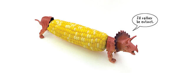
Do you know the difference between corn and a dinosaur? It might appear that the makers of Jurassic World don't care whether you do. Or don't know whether you care.
Which one is it? I don't know but I do care.
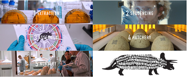
The Jurassic World Creation Lab is one of the web accoutrements of the Jurassic World brand and shows you how one might create a dinosaur from a sample of DNA. First extract, sequence, assemble and fill in the gaps in the DNA and then incubate in an egg and wait.
With enough time, you'll grow your own brand new dinosaur. Or a stalk of corn ... with more teeth.
What went wrong?
With the exception of this note, I have practiced restraint and nowhere on this page do I describe the design practices of Jurassic World as corny.
Dinosaur genomics isn't pure fiction. Although we can't yet grow a full dinosaur, we can create chickens with dinosaur-like snouts. Don't worry, you're unlikely to be pecked to death by one of these creations. This is a great example of the fact that characteristics of extinct animals can be found today in their evolutionary descendants.
In fact, the characteristics of evolutionary ancestors may be latent in their descendants. Jack Horner certaintly hopes so—his goal is to turn a chicken into a dinosaur by reactivating its ancient DNA. Watch his TED talk.
We have a pretty good sense of size and aspects of the structure of dinosaur genomes. For example, Origin of avian genome size and structure in non-avian dinosaurs, estimates the size of the triceratops genome to be about 3.2 gigabases.
The list of steps to grow your own dinosaur in the Creation Lab is quite reasonable. For additional authenticity, a synthesis step should be added. The assembly step determines the contiguous (if you're lucky, gapped otherwise). It does not actually synthesize the DNA, a step that would be required for us to be able to package and implant the designer genome into the egg.
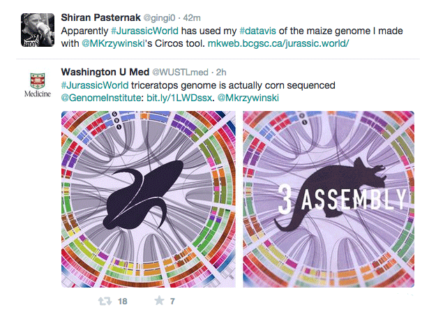
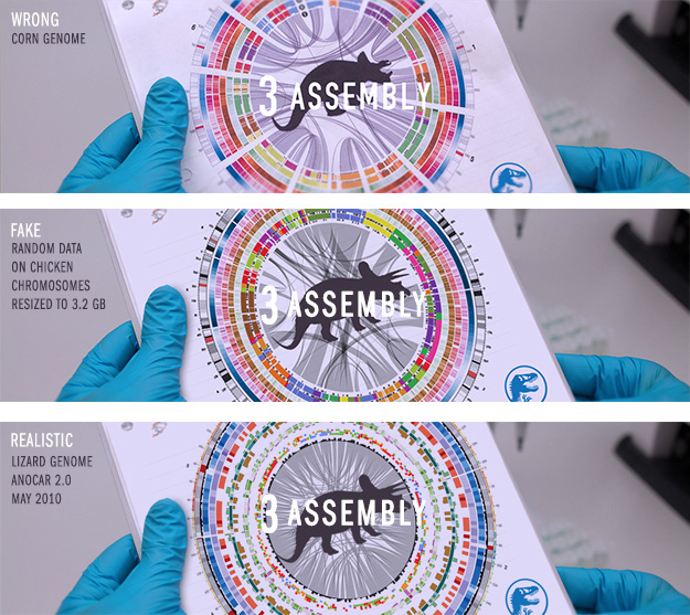
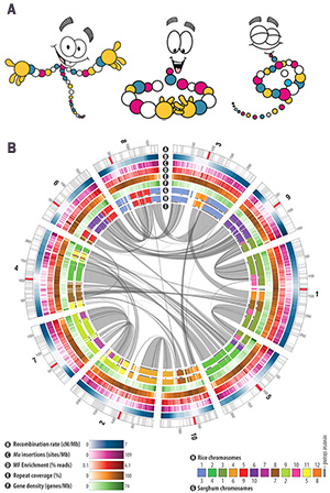
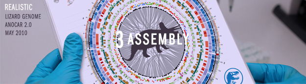
In step #3 (assembly) in the Creation Lab, the photo is of a corn genome visualization. The image was taken from the The B73 Maize Genome: Complexity, Diversity, and Dynamics Science publication that described the state of the reference corn genome sequenced at the McDonnell Genome Institute at Washington University. The figure was generated by the authors of the paper using my Circos software.
I should mention that the Creation Lab website does not include any attribution (e.g., Schnable et al., Science 2009) for the corn visualization image. Bad image reasearcher, bad.
Not only has the genome in the image crossed the hilarity boundary, its perspective skew in the composite doesn't seem to be compatible with the plane of the paper, at least to my eye. Warped humor.
The image might be an actual photo of the image printed on a piece of paper, but it feels more like a composite in which the image was superimposed on a photo of blank paper. In the random and lizard genome images I show below, I use a proper perspective projection of the image onto the paper, and do the same for the blue dino icon in the bottom right.
Tangentially, there's little reason for the researcher to be holding up what looks like a computer CPU in the photo for step #2. A flow cell would have been a good choice here and plenty such images exist.
Let's see how a more authentic image could be generated.
$150m, the budget of Jurassic World, is not enough to buy you a correct genome visualization. Genomics is expensive—but not that expensive. In fact, it's 44× less expensive than printing with a laser jet printer, but I digress.
Should we care that an image derived from corn genome data is being used to represent a visualization of a Triceratops horridus genome assembly? Yes, we should—unconditionally—and not just because of the inadvertant disappointment of having one's spiky dinosaur secretly replaced with a harmless plant. Cue Folger's crystals commercial (yuck).
When your science art can be enjoyed only by someone who doesn't know better, you're doing it wrong. No meaningful conversation about the subject can continue once your audience has the answer to "What does this image show?" I can't take the corn image into a grade 5 classroom and talk about dinosaur genomics. We know so much about the world that it's trivial to get the obvious things less wrong in science fiction.
We know so much about the world that it's trivial to get the obvious things less wrong in science fiction.
The science must always be respected. A lot of people worked very hard for us to know what most of us don't realize—let's honor that effort. Science-based art, at every opportunity, should get as many things right as possible. At least, it should get as few things wrong.
The dinosaurs must be turning in their sendimentary beds. First, they suffer a high-throughput extinction. Now, they've been asked to trade their alpha predator status for a starchy, though extant, vegetable. Can you say extinct clade action suit?
It's true that people respond to strong visuals. But they'll respond even better to strong visuals based on relevant science. It's not just about eye-marvel. Let's see some thought-marvel—beauty that connects us to the world, informs us about it and reveals its intricacies.
There are three options for the image: wrong, fake and realistic.
Let's look at each in turn.
The Jurassic World Creation Lab picks the worst of the three options. Its image (above) shows a visualization of corn genome data (figure on right, B) taken from the Science paper The B73 Maize Genome: Complexity, Diversity, and Dynamics and presents it as having something to do with dinosaurs.
Even though both have been known to stalk and neither of them are a mineral, corn and dinosaurs don't have a lot in common.
The corn image is one of the more visually striking published Circos images. It's colorful and fits with the cartoon DNA (figure on right, A) used in the Jurassic World Creation Lab website.
The corn genome is about 2.3 Gb in size and composed of 10 pairs of chromosomes. The image focuses on the similarity between corn and rice and sorghum (a kind of grass) and the corn chromosomes are shown out of order to make this similarity more clear.
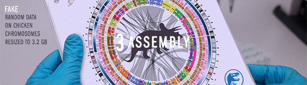
The look and feel of the corn genome image (colors, ink density, proportions) can be reproduced in an image that uses randomly generated data. Random data is less interesting than real genome data, which I'll talk about below, but arguably more appropriate than data from a completely unrelated genome.
Since chickens are a kind of modern dinosaur, we could start with the chicken genome. My colleague Cath Ennis pointed out that a Komodo dragon genome might be more suitable to represent a triceratops. Unfortunately, we don't have a Komodo assembly yet so that's not possible but Cath's suggestion did lead me to generate an image based on the lizard assembly (see below).
I took the first 8 chromosomes of chicken, which is the number of large chromosomes in the Varanus subgenus of lizards to which the Komodo dragon belongs and resized them so that their length totaled 3.2 Gb, which is the estimated size of the triceratops genome. The actual size doesn't matter on first glance but it does add the extra touch because the tick labels on the chromosomes reflect the correct total genome size.
I mimicked each track in the corn genome with random data, keeping the same colors.
The white, grey and black bars within the chromosome ideograms were uniformly randomly sized, up to 20 Mb. The red bar represents the centromere which was placed somewhere within 20% of the center of the chromosome and sized between 2.5% and 5% of the chromosome length, or 5 Mb, whichever was longer.
The smooth blue heatmap, which corresponds to the recombination rate in the corn image, was generated using the function `x(1-x)^(0.75k)` where `x` is the relative position along the chromosome and `k` is the relative position of the centromere.
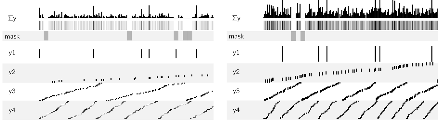
The tracks C-F (mu insertions, MF enrichment, repeats, genes) were faked using a random coverage process as shown below.
The original corn genome image showed the synteny between corn and rice and sorghum (a kind of grass). Synteny is the mapping between positions on one genome and those with the same sequence in another genome—it can tell us how much a genome was "mixed up" during evolution.
To generate the synteny tracks, I started with the 12 chromosomes of corn, using the color coding from the original image. First, I cut each chromosome at a random position once and shuffled the cut pieces. This assured me of a good chance that each chromosome was split at least once. Then I progressively added more cross-overs by selecting two pieces from the list, cutting them in a random position and swapping the position of the second from each cut pair. The process is illustrated below for two independent simulations up to 35 cross-overs.
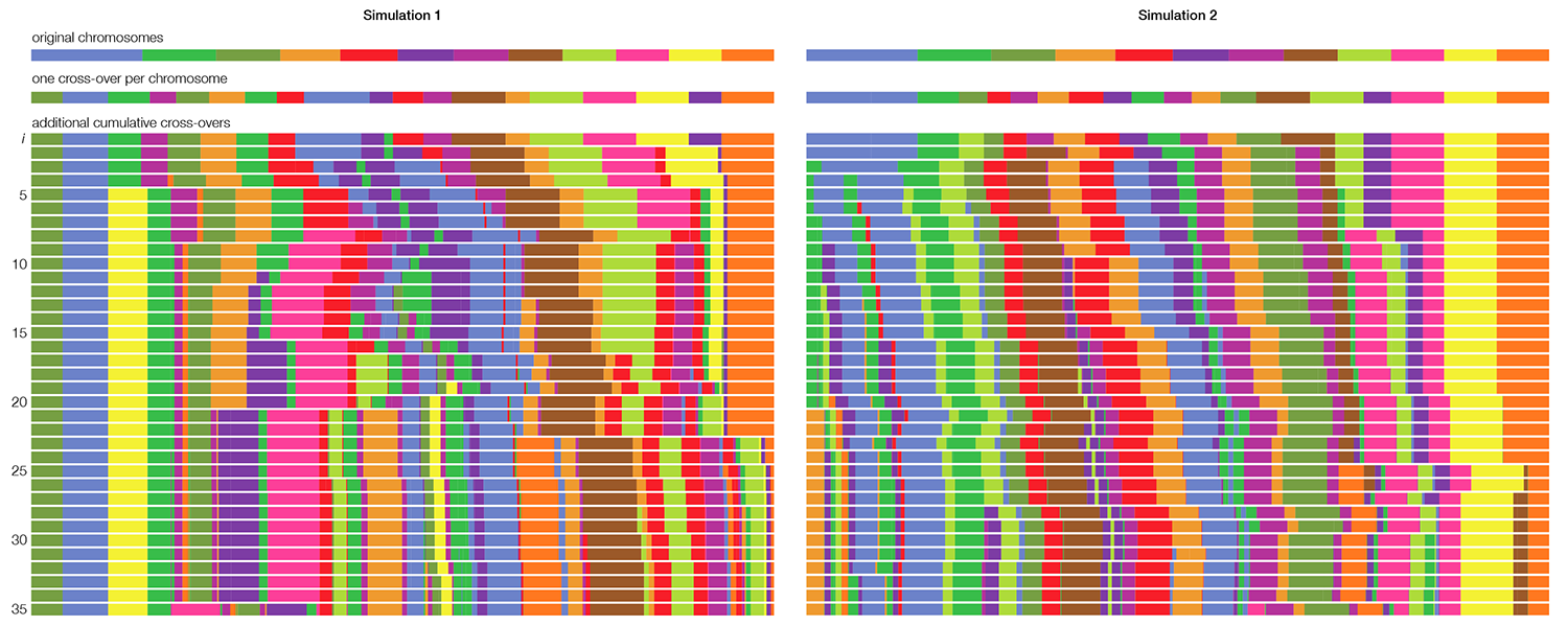
The outer synteny track in the image is the result of 30 cross-overs and the inner of 35 cross-overs.
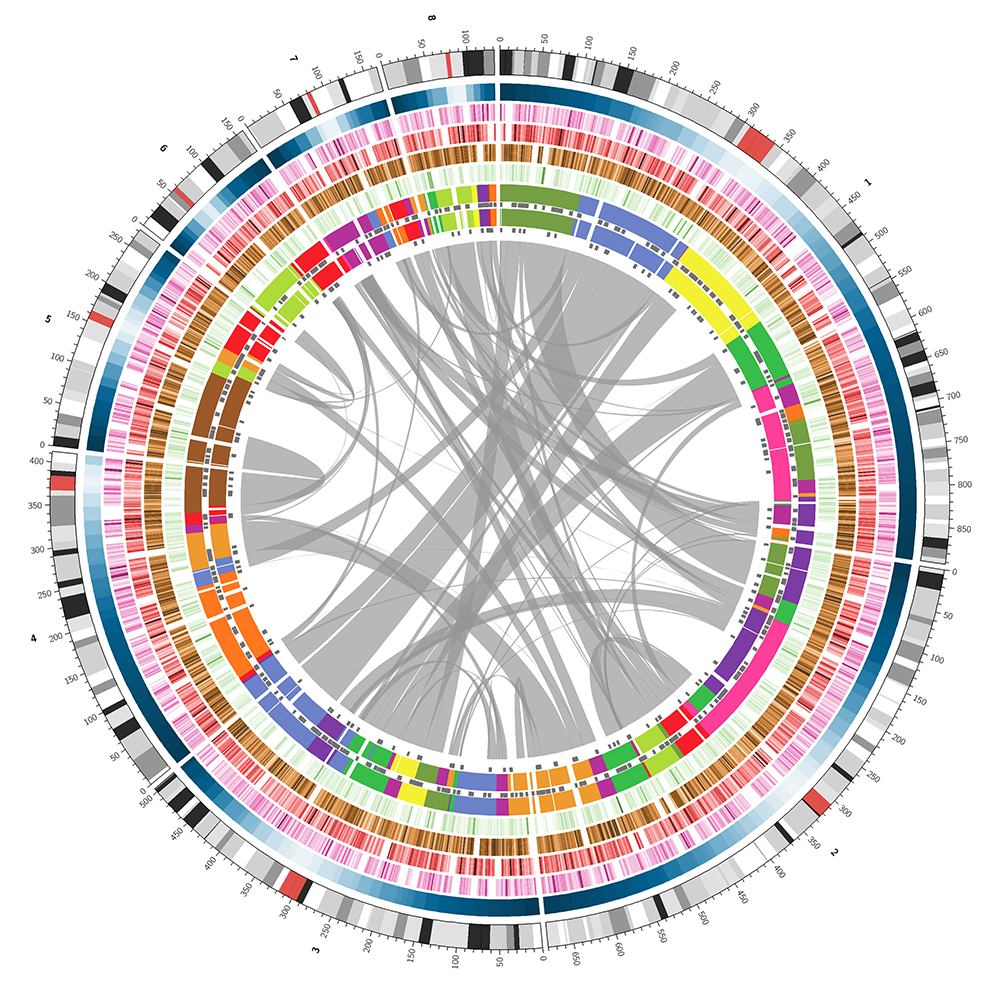
The third option is to base the image on the real assembly of a reasonably closely related genome. This would mean picking one of the vertebrates for which genome annotations are available. I chose the lizard.
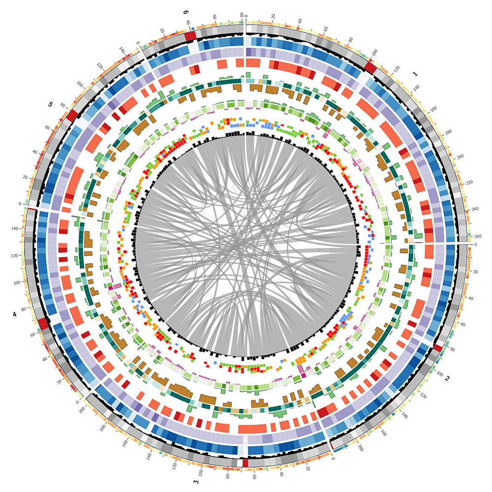
The lizard genome assembly has 14 chromosomes (chr1..chr6, chrLGa..chrLGh and chrM) which total 1.08 Gb and 6,443 unanchored pieces which total 717 Mb. I decided to create the image based only on chromosomes 1–6. The LG chromosomes were much smaller (LGa, the largest, is more than 10 times smaller than the next larger, chr6).
I used the UCSC Genome Browser table viewer to download a variety of annotations for the lizard genome (assembly, gaps, quality, GC content, CpG islands, gene models, and alignments to human genome and genes).
I parsed each annotation file and calculated statistics for each segment in the genome of size `w`, which was either `g/250` or `g/500` depending on the annotation. Here, `g` is the total size of the chromosomes shown in the image (1.06 Gb). The two outer-most tracks, the GC content and gene models, used `g/500` to provide two resolution scales in the image for visual interest.
I've used colors vaguely similar to those used in the corn image. The actual colors for the lizard genome image are drawn from the Brewer palettes as well as from luminance-normalized UCSC human chromosome color palette.
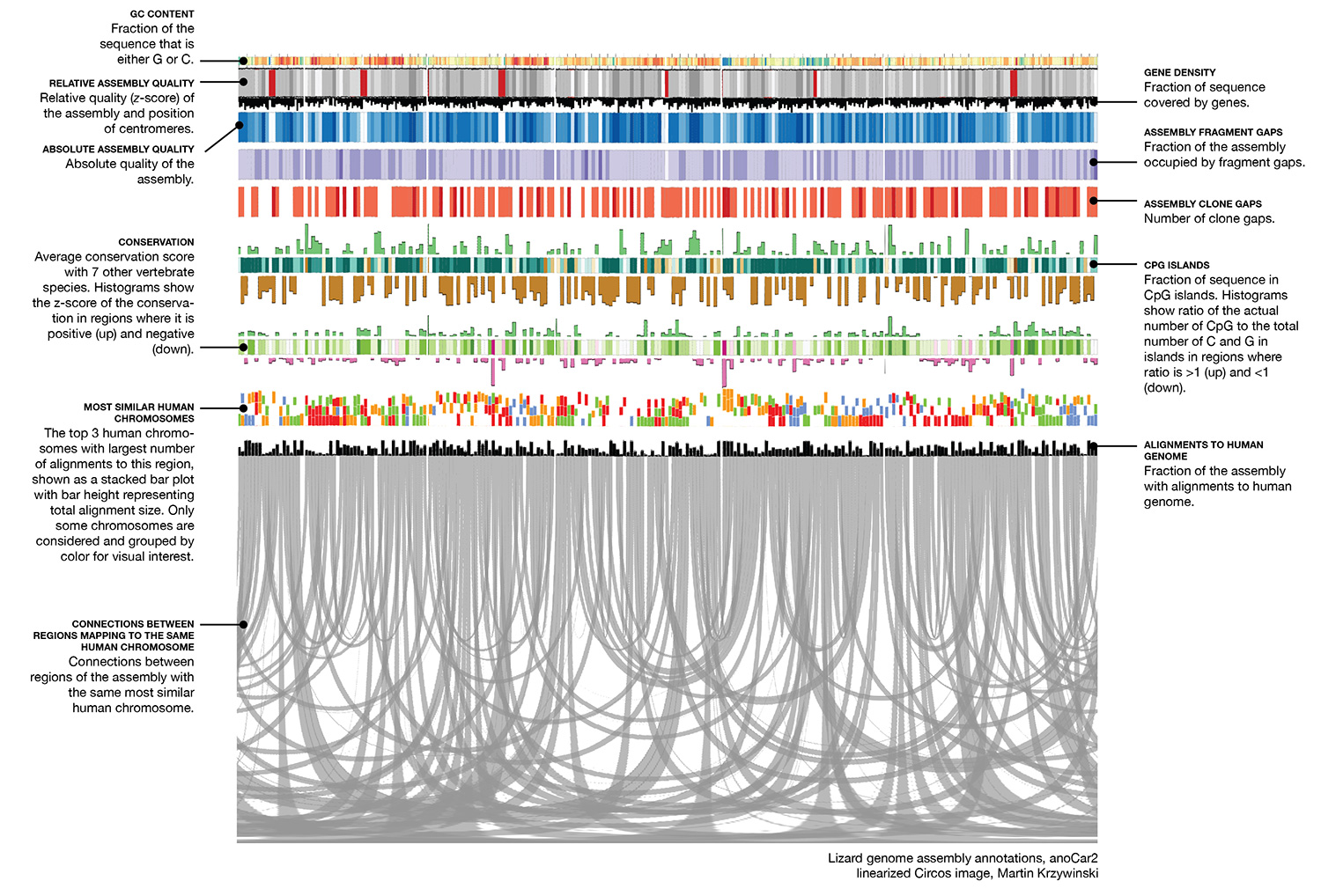
The image below is a linearized version of the Circos image and describes what each track shows.
With more work, you could perturb the lizard data so that the data weren't exactly that of the lizard. Or use phylogenetic information to to model the entire triceratops genome!
So that's it. Jurassic World science visualization fixed, or at least improved.
Nasa to send our human genome discs to the Moon
We'd like to say a ‘cosmic hello’: mathematics, culture, palaeontology, art and science, and ... human genomes.


Comparing classifier performance with baselines
All animals are equal, but some animals are more equal than others. —George Orwell
This month, we will illustrate the importance of establishing a baseline performance level.
Baselines are typically generated independently for each dataset using very simple models. Their role is to set the minimum level of acceptable performance and help with comparing relative improvements in performance of other models.

Unfortunately, baselines are often overlooked and, in the presence of a class imbalance5, must be established with care.
Megahed, F.M, Chen, Y-J., Jones-Farmer, A., Rigdon, S.E., Krzywinski, M. & Altman, N. (2024) Points of significance: Comparing classifier performance with baselines. Nat. Methods 20.
Happy 2024 π Day—
sunflowers ho!
Celebrate π Day (March 14th) and dig into the digit garden. Let's grow something.

How Analyzing Cosmic Nothing Might Explain Everything
Huge empty areas of the universe called voids could help solve the greatest mysteries in the cosmos.
My graphic accompanying How Analyzing Cosmic Nothing Might Explain Everything in the January 2024 issue of Scientific American depicts the entire Universe in a two-page spread — full of nothing.

The graphic uses the latest data from SDSS 12 and is an update to my Superclusters and Voids poster.
Michael Lemonick (editor) explains on the graphic:
“Regions of relatively empty space called cosmic voids are everywhere in the universe, and scientists believe studying their size, shape and spread across the cosmos could help them understand dark matter, dark energy and other big mysteries.
To use voids in this way, astronomers must map these regions in detail—a project that is just beginning.
Shown here are voids discovered by the Sloan Digital Sky Survey (SDSS), along with a selection of 16 previously named voids. Scientists expect voids to be evenly distributed throughout space—the lack of voids in some regions on the globe simply reflects SDSS’s sky coverage.”
voids
Sofia Contarini, Alice Pisani, Nico Hamaus, Federico Marulli Lauro Moscardini & Marco Baldi (2023) Cosmological Constraints from the BOSS DR12 Void Size Function Astrophysical Journal 953:46.
Nico Hamaus, Alice Pisani, Jin-Ah Choi, Guilhem Lavaux, Benjamin D. Wandelt & Jochen Weller (2020) Journal of Cosmology and Astroparticle Physics 2020:023.
Sloan Digital Sky Survey Data Release 12
Alan MacRobert (Sky & Telescope), Paulina Rowicka/Martin Krzywinski (revisions & Microscopium)
Hoffleit & Warren Jr. (1991) The Bright Star Catalog, 5th Revised Edition (Preliminary Version).
H0 = 67.4 km/(Mpc·s), Ωm = 0.315, Ωv = 0.685. Planck collaboration Planck 2018 results. VI. Cosmological parameters (2018).
constellation figures
stars
cosmology
Error in predictor variables
It is the mark of an educated mind to rest satisfied with the degree of precision that the nature of the subject admits and not to seek exactness where only an approximation is possible. —Aristotle
In regression, the predictors are (typically) assumed to have known values that are measured without error.
Practically, however, predictors are often measured with error. This has a profound (but predictable) effect on the estimates of relationships among variables – the so-called “error in variables” problem.

Error in measuring the predictors is often ignored. In this column, we discuss when ignoring this error is harmless and when it can lead to large bias that can leads us to miss important effects.
Altman, N. & Krzywinski, M. (2024) Points of significance: Error in predictor variables. Nat. Methods 20.
Background reading
Altman, N. & Krzywinski, M. (2015) Points of significance: Simple linear regression. Nat. Methods 12:999–1000.
Lever, J., Krzywinski, M. & Altman, N. (2016) Points of significance: Logistic regression. Nat. Methods 13:541–542 (2016).
Das, K., Krzywinski, M. & Altman, N. (2019) Points of significance: Quantile regression. Nat. Methods 16:451–452.