dynamics of mitigating disease spread
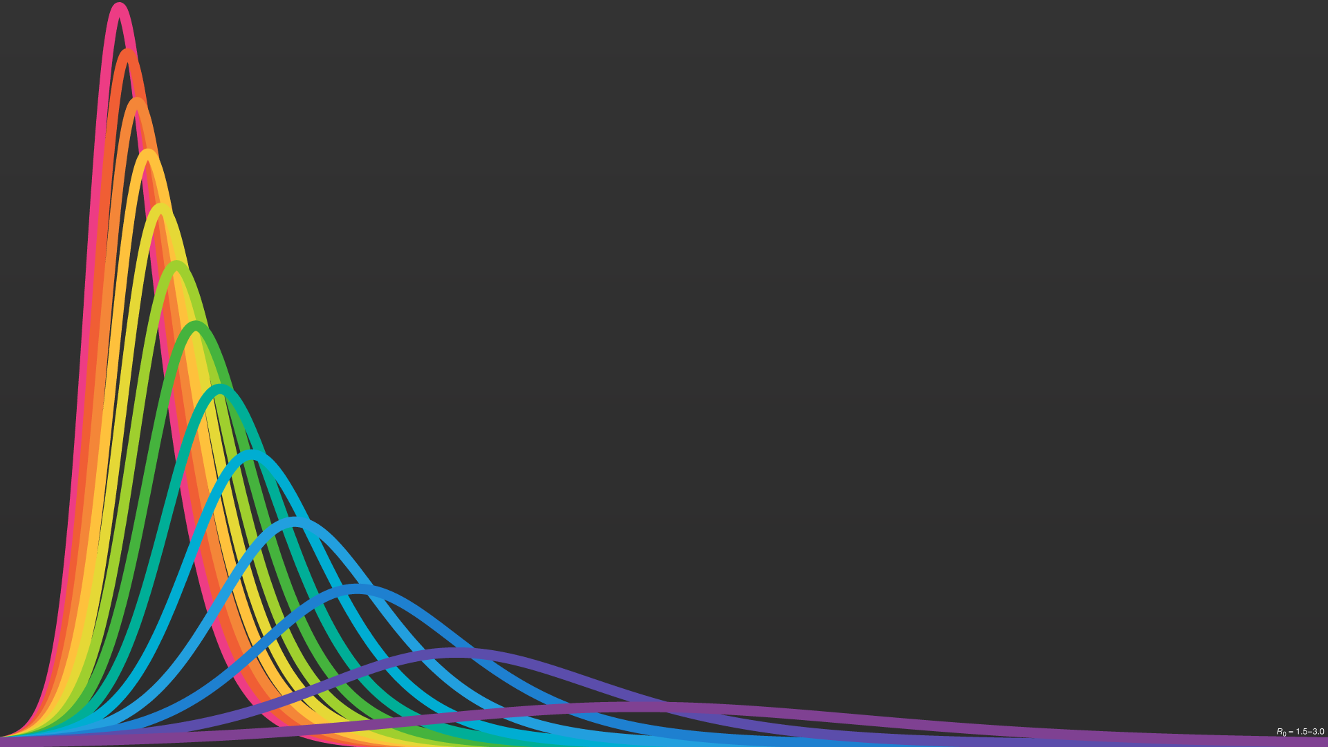
Do your part! Even small efforts in preventing the spread of disease have big payoffs. This graphic follows how the fraction of the population infected with a disease changes as we mitigate its spread.
Trajectories were modeled with R0 = 1.5 – 3.0 using a S-I-R model without vital dynamics under the assumption of free and random mixing among the population. Realistic physical and social barriers are not modeled. Value of β was selected to have peak infection at t = 1.
These trajectories are for instructional purposes—they are not predictions of COVID-19 spread.
Report errors or suggest improvements.

Same as above but on a dark background.
Infected fraction curves for R0 = 3 (magenta) and R0 = 1.5 (cyan) illustrating the contept of flattening the curve (PNG, PDF). Image license is CC BY 4.0.

A pandemic desktop.