upcoming
19–24 April 2024
Cold Spring Harbour, USA
15—16 May 2024
Essence of data visualization and design in science: what makes a good figure?
Dana Farber Cancer Institute, Boston, USA
17 May 2024
Essence of data visualization and design in science: what makes a good figure?
University of Massachusetts, Boston, USA
30 May 2024
Essence of data visualization and design in science: what makes a good figure?
Germans Trias i Pujol Research Institute (IGTP), Badalona, Spain
13 June 2024
Essence of data visualization and design in science: what makes a good figure?
CEEHRC, Vancouver
17–18 June 2024
Eye for design, mind for data
Luxembourg Centre for Systems Biomedicine, Belvaux, Luxembourg
24–27 July 2024
Annual meeting of the Association of Medical Illustrators, Rochester, NY, USA
26–30 August 2024
Complexity Science Hub, Vienna, Austria
14 April 2024
International Congress on Academic Medicine (ICAM), Vancouver
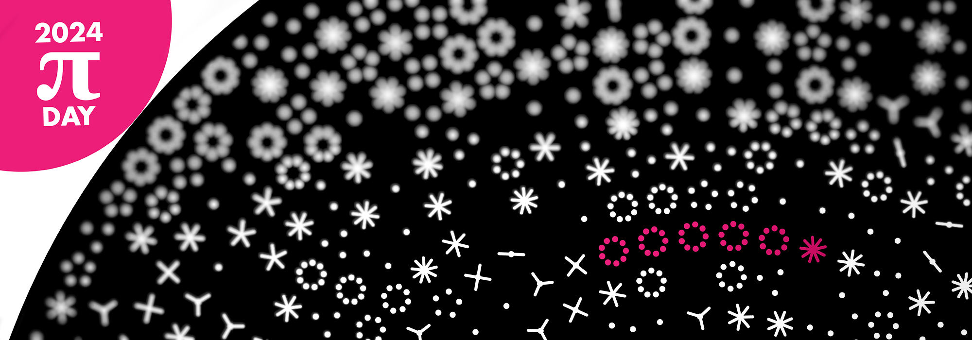
21 March 2024
Northeastern University, Vancouver, Canada
14 March 2023
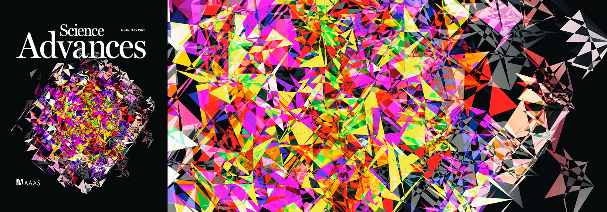
art
math
pi
piday
visualization
Digit Garden: Sunflowers ho!
12 March 2024
masterclass
visualization
VIZBI 2024, Los Angeles, USA
5 March 2024
art
science
visualization
CS617 guest lecture, UMass Boston
28–29 February 2024
TRIANGLE (TRaIning a New generation of researchers in Gastroenterology and livEr) summit, Toronto, Canada
26 February 2024
MEDS3001
lecture
visualization
15 February 2024
art
science
visualization
Eye for design, mind for data — in search of balance
In conversation with Martina Richeldi and Stephen Potvin
Francis Crick Institute, London, UK
14 February 2024
BMEG518
lecture
visualization
Graphical abstract — designing for small spaces
Practical tips and redesign examples for creating scientific graphical abstracts.
5 February 2024
Scientific Illustration — Graphical Abstracts
MICB506, SBME/MICB, UBC
21 January 2024
1996–2001, 22 issues
2 January 2024
nature methods
points of significance
statistics
19 December 2022
graphic science
scientific american
visualization
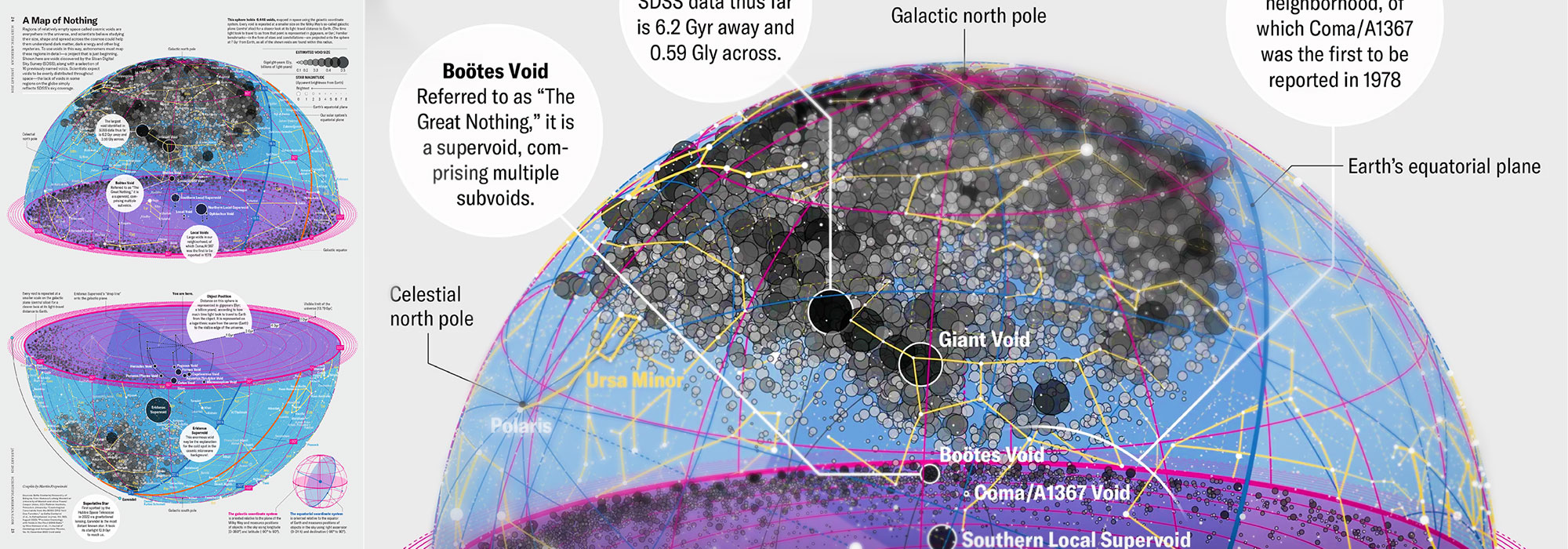
How Analyzing Cosmic Nothing Might Explain Everything
Huge empty areas of the universe called voids could help solve the greatest mysteries in the cosmos
15 December 2022
Official Hitchmas party at the Watson in Vancouver.
12 Nov 2023
art
constellation
map
space
stars
visualization
Draw constellations (now with boundaries) and stars (with name and designation labels)
12—13 October 2023
Showing data and explaining science visually: the rules, the guidelines and the warnings.
2023 Precision Oncology and Experimental Therapeutics (POET) Congress, Calgary, Canada
24 Octobert 2023
training
visualization
workshop
Essence of data visualization and design in science: what makes a good figure?
Bioinformatics & Molecular Epidemiology Training, Biotechnology Institute, Ankara University, Ankara, Turkey
14 August 2023
nature methods
points of significance
statistics
5 July 2023
training
visualization
workshop
Effective poster design: legible, clear, concise and compelling
BCCHRI, Vancouver
15 June 2023
Essence of data visualization and design in science: what makes a good figure?
Pathology Department, Boston Children's Hospital, Boston
5–10 May 2023
Schloss Lautrach, Germany
4 May 2023
Essence of data visualization and design in science: what makes a good figure?
Max Planck Institute, Munich
28 April 2023
Engage my brain, not my eye – the non-negotiables in visual communication of data and concepts
UBC Pharmaceutical Sciences
13 April 2023
International Congress on Academic Medicine (ICAM), Québec City
31 March 2023
KT Connects Webinars, Michael Smith Health Research BC
16 & 23 March 2023
Essence of data visualization and design in science: what makes a good figure?
CHEM/CHBE, UBC
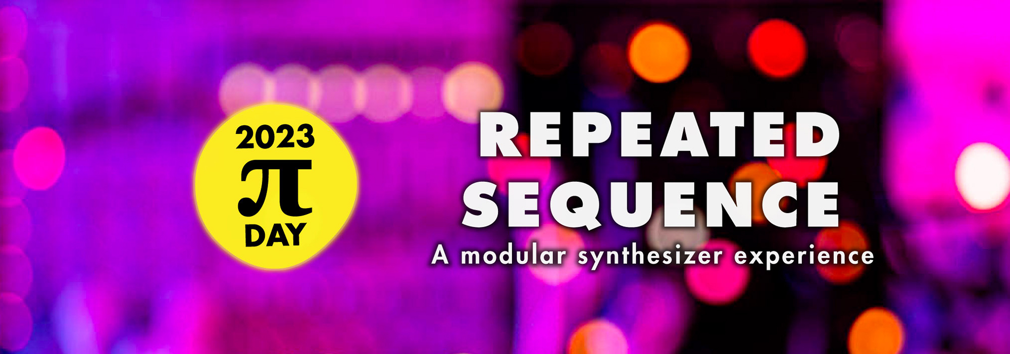
14 March 2023
art
math
pi
piday
visualization
Repeated Sequence: A Modular Synthesizer Experience
27 February 2023
BMEG518
lecture
visualization
Graphical abstract — designing for small spaces
Practical tips and redesign examples for creating scientific graphical abstracts.
27 February 2023
MEDS3001
lecture
visualization
31 January 2023
Design of effective scientific figures
Human Proteome Organization Webinar
11 January 2023
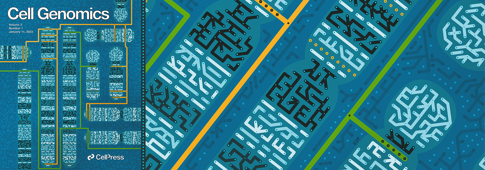
cover
design
visualization
With Carlos Urzua, our cover design images the process of determining the parent-of-origin using differential methylation of alleles at imprinted regions (iDMRs) as a circuit.
10 January 2023
nature methods
points of significance
statistics
4 January 2023
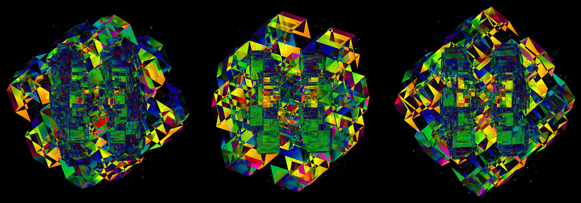
cover
design
visualization
My cover design shows 672 barcode bases from three sequencing platforms encoded on the faces of 7-dimensional cubes.
19 December 2022
Art is Science in Love
Vrije Universiteit, Amsterdam, Netherlands
15 December 2022
Official Hitchmas party at Layla Bar in Berlin.
8 December 2022
Explain visually, explain well: what makes a good figure?
Genetics Department, UMCG, Groningen, Netherlands
2–5 December 2022
Schloss Lautrach, Germany
16 November 2022
nature methods
points of significance
statistics
Dey, T., Lipsitz, S.R., Cooper, Z., Trinh, Q., Krzywinski, M & Altman, N. (2022) Points of significance: Regression modeling of time-to-event data with censoring Nature Methods 19
13–18 November 2022
Schloss Dagstuhl - Leibniz-Zentrum fur Informatik GmbH
13 November 2022
conference
talk
visualization
Schloss Dagstuhl - Leibniz-Zentrum fur Informatik GmbH
10 November 2022
Effectively Communicating Research Through Visuals
Science Communication, UBC Pharmaceutical Studies, BC Children's Hospital
30 October – 2 November 2022
Cold Spring Harbour, USA
22 October 2022
The animation shows cubes in 5-dimensional space — math, dyads and distortion.
2 October 2022
design
museum
visualization
Today the MIT museum reopened. My art is part of the Gene Cultures exhibit about the present and future of the genome.
14 September 2022
cover
design
visualization
My Annals of Oncology cover is a representation of 570 cases of difficult-to-treat cancers, each individually encoding the actionable genomic alterations found in the sample and the type and length of therapy that resulted from the analysis.
31 August 2022
Communicating with data
Canadian National Proteomics Network
25 August 2022
Webpage style refresh. Same clickables but now with more room.
4 August 2022
nature methods
points of significance
statistics
Dey, T., Lipsitz, S.R., Cooper, Z., Trinh, Q., Krzywinski, M & Altman, N. (2022) Points of significance: Survival analysis — time-to-event data and censoring. Nature Methods 19:906–908.
20 July 2022
graphic science
scientific american
visualization
Our graphic shows the evolution of the human genome assembly over the last 22 years — from humble shotgun beginnings to a complete telomere-to-telomere assembly.
25 May 2022
BioVis Meetup
14 April 2022
cover
design
visualization
My Nature Biotechnology cover is a take on a phylogenetic tree constructed from over 200 million sequences.
14 April 2022
MEDS3001
masterclass
visualization
MEDS3001 Masterclass — Visualizing Data, University of Sydney, Australia
14 April 2022
Network Institute, Vrije Universiteit Amsterdam – Nieuw Universiteitsgebouw, Amsterdam, Netherlands
11 April 2022
cover
design
visualization
My Cancer Cell cover depicts cellular heterogeneity as a kaleidoscope generated from immunofluorescence staining of the glial and neuronal markers in GBM
1 April 2022
covid-19
design
visualization
My information graphic in the March/April 2022 issue of American Scientist shows the position of genes and ORFs on each WHO COVID variant, along with their commonly seen mutations
27–28 March 2022
Schloss Lautrach, Germany
17 March 2022
cover
design
visualization
My Nature cover the cover offers a visual representation of the evolutionary properties of sequences at the extremes of the evolvability spectrum.
14 March 2022
art
math
pi
piday
visualization
three one four: a number of notes
14 March 2022
masterclass
visualization
VIZBI 2022
10 March 2022
MEDS1001
masterclass
visualization
MEDS1001 Masterclass — Visualizing Data, University of Sydney, Australia
9 March 2022
MICB425
lecture
visualization
Turning Tables into Graphics
What's the story and where are the outliers?
1 March 2022
BMEG518
lecture
visualization
Graphical abstract — designing for small spaces
Practical tips and redesign examples for creating scientific graphical abstracts.
25 February 2022
lecture
visualization
workshop
Science communication workshop, East of Scotland Doctoral Training Partnership (EASTBIo), Rules of Life
24 February 2022
lecture
visualization
workshop
Data visualisation principles and resources
SOMS4101 Honours Module on Data Analysis and Visualization, School of Medical Sciences, Faculty of Medicine and Health, University of Sydney, Australia
9 February 2022
Reisle, C., Williamson, L.M., Pleasance, E., Davies, A., Pellegrini, B., Bleile, D.W., Mungall, K.L, Chuah, E., Jones, M.R., Ma, Y., Lewis, E., Beckie, I., Pham, D., Matiello Pletz, R., Muhammadzadeh, A., Pierce, B.M., Li, J., Stevenson, R., Wong, H., Bailey, L., Reisle, A., Douglas, M., Bonakdar, M., Nelson, J.M.T., Grisdale, C.J., Krzywinski, M., Fisic, A., Mitchell, T., Renouf, D.J., Yip, S., Laskin, J., Marra, M.A., Jones, S.J.M. A platform for oncogenomic reporting and interpretation. Nature Communications 13:756 (2022).
3 February 2022
Adobe Illustrator for scientist and practical data visualization workshop
Rock lab, Rockefeller University, NY
28 January 2022
cover
design
visualization
28 January 2022
cover
design
visualization
My PNAS cover design captures the vision of the Earth BioGenome Project — to sequence everything.
24 January 2022
COVID-19
design
visualization
I fix a graphic by Canada's Health Minister Adrian Dix Brief and show how a story can be lifted from something that is inaccessible and muddled.
14 January 2022
BMEG518
lecture
visualization
SeRC course on Visual Storytelling, Linköping University, Sweden
15 November 2021
CSCI-CITAC General Meeting, University of Toronto
22 October 2021
communications biology
oceanography
paper
15 October 2021
nature methods
points of significance
statistics
Megahed, F.M, Chen, Y-J., Megahed, A., Ong, Y., Altman, N. & Krzywinski, M. (2021) Points of significance: The class imbalance problem. Nature Methods 18:1270–1272.
3–8 October 2021
Schloss Dagstuhl - Leibniz-Zentrum fur Informatik GmbH
23 September 2021
cover
design
visualization
Chromosomes spiral at 1 Mb/cm on the cover, annotated with genes associated with Mendelian disorders and mutations clusters found in advanced cancers.
20 September 2021
Medical Science Interdisciplinary Project, MEDS3888, University of Sydney
16 September 2021
Science Polish Perspectives Meetup USA 2021
Panel discussion: where art meets science
3 + 17 August 2021
Scientific Communication Workshop, Stewart Blusson Quantum Matter Institute, UBC
27 July 2021
nature methods
points of significance
statistics
6 July 2021
Ascent uses my animation of 5-dimension things doing things for its backdrop. Math, dyads and distortion.
6 July 2021
training
visualization
workshop
Effective poster design: legible, clear, concise and compelling
BCCHRI, Vancouver
28 May 2021
art
music
space
visualization
The 'Down Here / Moon Above' song was written for the Sanctuary project genome discs. For the Moon.
17–21 May 2021
design
visualization
workshop
Mentoring PhDs — Bring your image
1 May 2021
paper
public health
visualization
Capturing the data moment: Effective public health communication in a pandemic
19 April 2021
Dimensions and digits projected onto the canopy of St Michael’s Church in Leuven with music by Max Cooper transmitted directly to your body by a haptic audio delivery system.
15 April 2021
Visual design principles for scientific data, graphical abstracts and posters
2021 dermatology skin research trainee workshop, UBC
9 April 2021
Design and delivery of effective virtual conference presentations
2021 ARCC pre-conference workshop, Canadian Center for Applied Research in Cancer Control
23 March 2021
Design guidelines for posters and graphical abstracts
BCCHRI Seminar Series
14 March 2021
art
math
pi
piday
visualization
A forest of digits
10 March 2021
art
covid
genome
visualization
My COVID genome poster from the deadly genome series appears in a Science news article about issues with open access to SARS-CoV-2 genome data
9 March 2021
MICB425
lecture
visualization
Turning Tables into Graphics
What's the story and where are the outliers?
5 March 2021
nature methods
points of significance
statistics
2 March 2021
BMEG518
lecture
visualization
Graphical abstract — designing for small spaces
Practical tips and redesign examples for creating scientific graphical abstracts.
3 February 2021
art
covid
genome
visualization
My COVID genome poster from the deadly genome series appears in a Nature news article news article about issues with open access to SARS-CoV-2 genome data.
7 January 2021
nature methods
points of significance
statistics
15 December 2019
Official Hitchmas parties in a pandemic.
Europe party: 9pm GMT
North American party: 9pm EST
13 Nov 2019
Practical tips and redesign examples for creating scientific graphical abstracts.
10 November 2020
Rats tasting tea: some statistical issues in preclinical studies
with Naomi Altman
Preclinical Imaging and Testing facility, MIT
6 October 2020
A detailed look at the process of designing a poster and creating data stories.
5–6 October 2020
Epigene2Sys CNRS GDRi
Oct 6 4:05–4:45pm CEST
30 September 2020
Who said and didn't say what.
18 September 2020
conversation
music
visualization
10:30–11:30am CEST
1 Sep 2020
Albert Einstein College of Medicine, New York
24 August 2020
nature methods
points of significance
statistics
7 years, 50 columns, 100 pages, 150+ figures. Whew!
24 August 2020
nature methods
points of significance
statistics
3 August 2020
cover
design
visualization
Histone modifications across HPV-integration events on the cover of Nature Genetics August 2020 issue.
6 July 2020
training
visualization
workshop
BCCHRI, Vancouver
16 June 2020
nature methods
points of significance
statistics
5 June 2020
Shifting soundscapes, textures and rhythmic loops produced by laboratory machines. Available on vinyl.
12 May 2020
Updated pages on color blindness. Now with math calculations!
5 May 2020
My interview about keyboards on Bloomberg Quint
by Arianne Cohen
4 May 2020
covid-19
graphic science
scientific american
visualization
Our graphic depics genetic sequences of the coronavirus reported by laboratories and shows when the virus arrived in each place and where it came from.
21 April 2020
cover
design
visualization
Mutation spectra of 570 genomes on the cover of Nature Cancer April 2020 issue.
20 April 2020
COVID-19
design
visualization
Brief critiques of data visualization and science communication of the coronavirus outbreak.
20 April 2020
nature methods
points of significance
statistics
9 April 2020
blindness
color
visualization
Updated resources, added Adobe library links and refreshed figures.
4 April 2020
You can now browse the poems by theme.
20 March 2020
See what people want to know.
16 March 2020
Poems in piku form written during the coronavirus outbreak.
14 March 2020
art
math
pi
piday
visualization
Digits, poetically.
10 March 2020
Updated with SARS-CoV-2, including a special poster of 56 coronavirus genomes.
8 March 2020
Updated with SARS-CoV-2, including a special poster of 56 coronavirus genomes.
6 March 2020
MICB425
lecture
visualization
Turning Tables into Graphics
What's the story and where are the outliers?
4 March 2020
art
math
pi
piday
visualization
Digits, poetically.
25 February 2020
Putting the form in formalizing
Shonan Meeting 167, Tokyo, Japan
23–27 February 2020
Shonan Meeting 167, Tokyo, Japan
20 February 2020
My favourite passages, excerpts and quotes from this classic by Robert M. Pirsig
11 February 2020
talk
visualization
workshop
The Essence of Data Visualization in Bioinformatics
Charles Perkins Centre, University of Sydney, Australia
12 February 2020
Cancer, Pi, Infinity
Charles Perkins Center, University of Sydney, Australia
8 February 2020
Lorne Proteomics Symposium, Lorne, Australia
5 February 2020
International House, University of Melbourne, Melbourne, Australia
4 February 2020
nature methods
points of significance
statistics
4 February 2020
The Essence of Data Visualization in Bioinformatics
The Peter Doherty Institute for Infection and Immunity, University of Melbourne, Melbourne, Australia
3 February 2020
Australian BioCommons, University of Melbourne, Australia
3 February 2020
Australian BioCommons, University of Melbourne, Australia
22 January 2020
anniversary
art
clothing
music
BC Cancer Genome Sciences Center 20th Anniversary Celebration
22 January 2020
Chapter 3, The Aesthetics of Scientific Data Representation, More than Pretty Pictures, 1st Edition.
15 December 2019
Official Hitchmas party at Moretender's Cocktail Bar in Istanbul, 8pm till late
13 December 2019
Genomes, cancer, infinity.
Department of Molecular Biology and Genetics, Bogazici University, Istanbul, Turkey
8-9 November 2019
Art is Science in Love
Science: Polish Perspectives (SPP), Cambridge, UK
20 October 2019
Set visualization in genomics
SetVA at IEEE VIS 2019, Vancouver, BC, Canada
24 October 2019
Little table, what do you have to say of visualization?
BioVis at IEEE VIS 2019, Vancouver, BC, Canada
10 October 2019
Effective visual scientific communication
Exposome Cluster, Michael Smith Laboratories, UBC
2 October 2019
Effective visual scientific communication
Hirst Lab, Michael Smith Laboratories, UBC
28 September 2019
Read about the math and making of my Aleph 2 music video for Max's show.
10 September 2019
Effective visual scientific communication
GrasPods welcome week workshop, BCCRC, 12-1pm
31 August 2019
nature methods
points of significance
statistics
30 July 2019
nature methods
points of significance
statistics
20 July 2019
apollo
maps
space
visualization
Celebrating the 50th anniversary of the Apollo 11 Moon landing.
19 July 2019
Data Visualization and Scientific Communication Workshop, Kobor Lab, BC Children's Hospital Research Institute, Vancouver
16–30 June 2019
San Michele all'Adige, Italy
7 June 2019
Scientific Communication Workshop, Part 2/2, Stewart Blusson Quantum Matter Institute, UBC
30 May 2019
nature methods
points of significance
statistics
10 May 2019
Scientific Communication Workshop, Part 1/2, Stewart Blusson Quantum Matter Institute, UBC
Part 2/2 scheduled for July 7, 2019
9 April 2019
The Art of Data
MBB Graduate Colloquium 2019 (20th anniversary), SFU, Vancouver, Canada.
16–18 April 2019
Bio-IT World Conference & Expo, Boston, USA
30 March 2019
art
visualization
wayfinding
Science this way! Wayfinding signs on Vancouver's Health Care Corridor (10th Avenue, at Oak Street) (1 June 2019: signs are now lit!)
28 March 2019
nature methods
points of significance
statistics
14 March 2019
art
math
pi
piday
visualization
Digits, internationally.
14-15 March 2019
14th Annual New Mexico BioInformatics, Science and Technology (NMBIST) Symposium, Santa Fe
27 February 2019
nature methods
points of significance
statistics
26 February 2019
Essentials of Data Visualization: Thinking about drawing data and communicating science.
MBB462, Simon Fraser University
17 February 2019
Find your inner ASCII
15 February 2019
MICB425
lecture
visualization
Turning Tables into Graphics
What's the story and where are the outliers?
31 January 2019
UBC
visualization
workshop
Scientific Storytelling and Data Visualization
Faculty of Land and Food Systems, UBC
28 December 2018
My colorsnap application (Linux/Windows) makes quick work of finding colors in an image.
18 December 2018
graphic science
scientific american
visualization
Visualization of the temporal patterns in the expression of 136 cardiac genes.
15 December 2018
Official Hitchmas party at Oslo's Fuglen, 8pm till late
10–11 December 2018
Pasteur Institute, Tunis, Tunesia
30 November 2018
Hemaware, Fall 2018
30 October 2018
nature methods
points of significance
statistics
20–21 September 2018
conference
visualization
workshop
University of Helsinki, Finland
1 August 2018
Art is Science in Love
MSFT YVR DataViz Symposium, Microsoft Research, Vancouver
31 July 2018
nature methods
points of significance
statistics
27 July 2018
Data Visualization in Epigenetics Reporting Pipelines
Zymo Research, Irvine, CA
20 July 2018
Article by Nick Enfield in the Guardian references our Storytelling Points of View column
9 July 2018
conference
keynote
talk
visualization
Keynote at BioVis2018, ISMB, Chicago, USA.
1 July 2018
illustration
magazine
visualization
Tree of life illustration accompanying the article. Sactown June/July 2018, p.89
28 June 2018
Art for everyone.
28 June 2018
art
constellation
map
space
stars
visualization
Draw constellations and download high-resolution star charts.
23 June 2018
graphic science
scientific american
visualization
Analysis of 700 human brains and 11,000 genes.
23 June 2018
Galaxy clusters, superclusters and voids within 12,000 million light-years. And one quasar.
20 June 2018
Trainee Symposium, BC Children¹s Hospital Research Institute, Van Dusen Gardens, Vancouver
5 June 2018
nature methods
points of significance
statistics
1 June 2018
Sydney Vivid Festival, Museum of Contemporary Art, Sydney, Australia
31 May 2018
Sydney Vivid Festival, University of Technology Sydney, Sydney, Australia
25 May 2018
A BBC article by Tim McDonald about keyboard layouts, referencing my layouts generated with my Carpalx keyboard optimization software
15–20 April 2018
Schloss Dagstuhl - Leibniz-Zentrum fur Informatik GmbH
3 April 2018
I describe the design path.
3 April 2018
nature methods
points of significance
statistics
16 March 2018
SFU Omics Visualization Workshop
1–4 pm, Library Committee Room 7200, WAC Bennet Library, SFU
14 March 2018
art
math
pi
piday
visualization
Jake Lever and I shrink the world and use the digits of `\pi` to shuffle road maps.
14 February 2018
art
love
science
valentine
Charles Perkins Center, University of Sydney, Australia
13 February 2018
Information design is data choreography for the page
University of Sydney, Australia
9 February 2018
Information design is data choreography for the page
Westmead Institute for Medical Research, Sydney, Australia
8 February 2018
part of the Australian Poultry Science Symposium (APSS), Sydney, Australia, 4–7 February 2018
4–7 February 2018
Enhancing research communication through information design and visual storytelling: Reflections on 10 years of APSS proceedings figures
31 January 2018
Curiosity Collider
3 January 2018
nature methods
points of significance
statistics
15 December 2017
graphic science
scientific american
visualization
With Jake Lever.
18 December 2017
Making of the 2017 Nature 10 cover: balancing subjective design with objective optimization.
1 December 2017
nature methods
points of significance
statistics
26–29 November 2017
Mechanisms of disease
14 Nov 2017
Each simulated snowflake is beautiful and, of course, unique.
2 Nov 2017
art
illustration
visualization
Illustration in 'The Objects that Power the Global Economy' by Quartz.
11 October 2017
hive plot
network
visualization
Martin Krzywinski, Ka Ming Nip, Inanc Birol, Marco Marra (2017) Leonardo, 50:5, p.504
6–8 October 2017
Himmerland Golf & Spa Resort, Denmark
29 September 2017
nature methods
points of significance
statistics
24 September–1 October 2017
Spetses, Greece
13–18 August 2017
Schloss Dagstuhl - Leibniz-Zentrum für Informatik GmbH
6–11 August 2017
Visualization in Science and Education
3 Aug 2017
Intertypes are the spaces between letters
29 July 2017
nature methods
points of significance
statistics
29 June 2017
book
chapter
visualization
Chapter 3 in Scientific Data Visualization: Aesthetic for Diagrammatic Clarity. More Than Pretty Pictures (2017) Edited by Rikke Schmidt Kjærgaard & Lotte Philipsen. Routledge, NY.
29 June 2017
nature methods
points of significance
statistics
13 June 2017
Added 3-point route challenge.
7 June 2017
benchmark
crossfit
fitness
Perform `k` reps at `k`% 1RM. Expected value is `k=26` and higher values are progressively more difficult to achieve.
5–17 June 2017
Centre for Research & Technology – Hellas. Tessalonica, Greece
3 June 2017
Brand new words for the language generated from a neural network. New places, drugs, names and diseases.
31 May 2017
Nullomers are the unwords of the genome, sequences that are not there.
31 May 2017
nature methods
points of significance
statistics
30 March 2017
nature methods
points of significance
statistics
21 March 2017
Country flags rendered as concentric rings in proportion to their color composition and sorted by similarity.
16 March 2017
Practical Data Visualization: Thinking about drawing data and communicating science.
14 March 2017
art
math
pi
piday
visualization
This year, I imagine the digits of `\pi` as a star catalogue and populate the sky with constellations based on extinct species.
8 March 2017
An article about the visualization and design process behind the art.
28 Feb 2017
nature methods
points of significance
statistics
25 February – March 1 2017
21 February 2017
art
chemistry
math
physics
typography
The font gets its dedicated page.
20 February 2017
Updated and named the clock, with contributions from Rodrigo Goya.
18 February 2017
art
chemistry
math
physics
typography
Insist that you look at physics, math and chemistry
8 February 2017
A Westgrid workshop
7 February 2017
Is Trump a Manchurian candidate?
24 January 2017
Essentials of Data Visualization: Thinking about drawing data and communicating science.
MBB462, Simon Fraser University
16 January 2017
8-part video series.
4 January 2017
nature methods
points of significance
statistics
17 November 2016
epigenetics
resource
visualization
10 November 2016
Remember, the genome is not a blueprint.
7 November 2016
Interview with The Ubbyssey by Nivretta Thatra. Photos by Joshua Medicoff.
4 November 2016
color
resource
visualization
3 November 2016
nature methods
points of view
visualization
25 October 2016
Neverending speeches, haikus and promises by Trump and Clinton.
4 October 2016
Central European Institute of Technology, Brno, Chech Republic
29 September 2016
nature methods
points of signficance
statistics
26 September 2016
Who said and didn't say what.
22 September 2016
communication
education
science
A talk about thinking: scientifically and artistically
19 September 2016
Interview with Biotechniques' Sarah Webb about the processes, challenges, and skills involved in visualizing large biological data sets. Including Nils Gehlenborg, Jan Aerts and Lennart Martens. Biotechniques 61:107-112 (2016).
2 September 2016
nature methods
points of signficance
statistics
30 August 2016
University of Sydney
26 August 2016
Communicating Your Science
University of Sydney
12 August 2016
Biotechnology Institute, Ankara University, Turkey
28 July 2016
nature methods
points of signficance
statistics
22 July 2016
art
math
pi
piday
visualization
Perfect packing of warped circles that embody the approximation.
29 June 2016
nature methods
points of signficance
statistics
22 June 2016
CANHEIT-HPCS2016 Conference: Shaping the Digital Landscape, Edmonton
21 June 2016
CANHEIT-HPCS2016 Conference: Shaping the Digital Landscape, Edmonton
1 June 2016
nature methods
points of view
visualization
4 May 2016
Izmir Biomedicine and Genome Center, Dokuz Eylul University, Izmir, Turkey
1 May 2016
nature methods
points of signficance
statistics
27 April 2016
hive plot
network
visualization
21 April 2016
design
science
visualization
Design + Science mixer
10–noon, Art Building, Room 247, University of Washington, Seattle
20 April 2016
7pm, Kane Hall, Room 110, University of Washington, Seattle
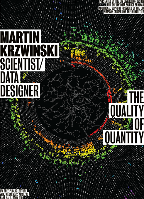
20 April 2016
University of Washington, Seattle
7 April 2016
9–11am, AW210, Western Washington University, Bellingham, WA
6 April 2016
Mt Baker Theater, Western Washington University, Bellingham
30 March 2016
nature methods
points of signficance
statistics
22 March 2016
art
birds
song
typography
Against a background of the bird's plumage color, its song.
14 March 2016
art
math
pi
piday
visualization
This year, I imagine the digits of Pi as physical masses and collapse them under gravity. The work is featured in Scientific American.
11 March 2016
seminar
ubc
visualization
1:15pm AMS Student NEST, UBC
7 March 2016
seminar
ubc
visualization
12:30-1:30pm, LSC 3, Life Science Institute, 2350 Health Sciences Mall, UBC
1 March 2016
nature methods
points of view
visualization
1 February 2016
party
petabase
sequencing
When you sequence a petabase (1015 bases), you have a party. And it looks like this.
21 January 2016
Our Sanctuary project site goes beta.
21 January 2016
communication
education
science
A talk about thinking: scientifically and artistically
4 January 2016
nature methods
points of view
visualization
15 December 2015
Official Hitchmas party at Copenhagen's Library Bar. Today at 8pm.
7 December 2015
graphic science
making of
scientific american
visualization
Dust, bacteria and genomes.
3 December 2015
It was published in Jul 2003 Sys Admin Journal.
3 December 2015
nature methods
points of signficance
statistics
19 November 2015
graphic science
scientific american
visualization
Dust, bacteria and genomes.
18 November 2015
bacteria
dust
graphic science
scientific american
visualization
Men and Women Alter a Home's Bacteria Differently—an analysis of dust reveals how the presence of men, women, dogs and cats affects the variety of bacteria in a household.
11 November 2015
center for inquiry
hitchmas
party
11 November 2015
cocteau twins
music
quotes
1 November 2015
Sit down. Object the objectionable
28 October 2015
nature methods
points of signficance
statistics