2024 π Daylatest newsbuy art
Trance opera—Spente le Stellebe dramaticmore quotes
data visualization + public health

The COVID Charts

Observations on data visualizations of the coronavirus outbreak

The COVID Charts are brief critiques of data visualization and science communication of the coronavirus outbreak. They are not statements about the underlying science or public health policy.

If you would like me to critique a specific chart, get in touch.
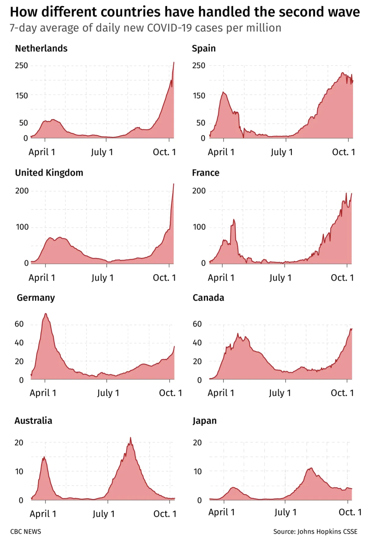
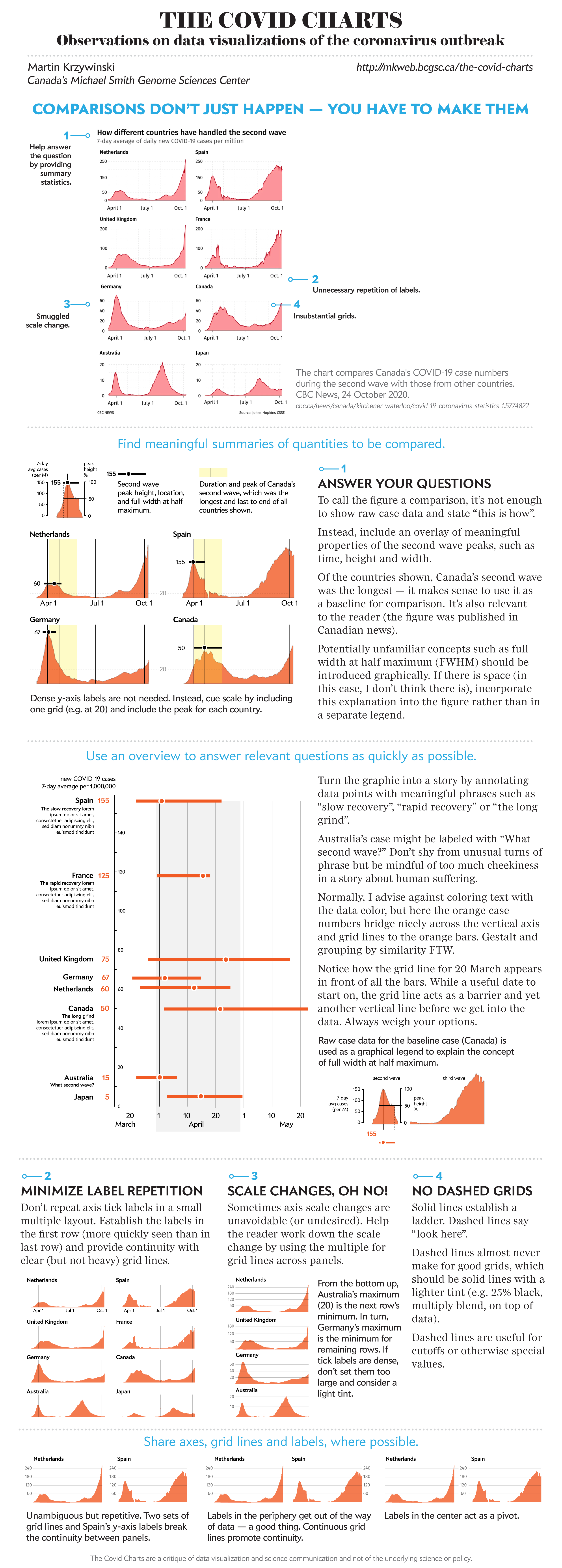
The COVID Charts -- Observations on data visualizations of the coronavirus outbreak -- Martin Krzywinski

It's not a comparison until you make it a comparison. . Profiles of 7-day average daily cases in eight countries during the second wave of COVID-19. (CBC News, 24 October 2020).

24 October 2020
background
A chart taken from an article that compares Canada's COVID-19 case numbers during the second wave with those of other countries.
core message
While it is clear that case profiles during the second wave are different, the details of these differences are difficult to perceive. The graphic does nothing to help compare the time of the peak and duration of the second wave, nor hint the extent to which these parameters might be influenced by the peak height.
key guidelines
1. Explicitly call out relevant similarities and differences to make an effective omparison..
2. Raw data or aggregate statistics like peak height and width? Know what is likely to be more important (or interesting).
3. Add a visual cue to draw attention that axis scale is varying.
Martin Krzywinski | contact | Canada's Michael Smith Genome Sciences CentreBC Cancer Research CenterBC CancerPHSA
Google whack “vicissitudinal corporealization”
{ 10.9.234.151 }