The COVID Charts
Observations on data visualizations of the coronavirus outbreak
The COVID Charts are brief critiques of data visualization and science communication of the coronavirus outbreak. They are not statements about the underlying science or public health policy.
If you would like me to critique a specific chart, get in touch.
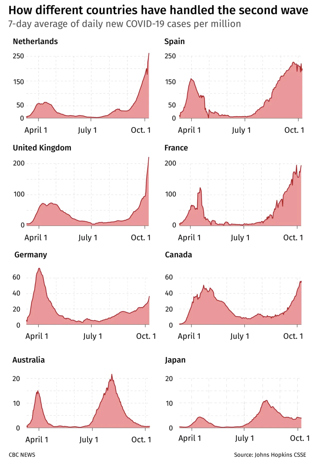
▲ It's not a comparison until you make it a comparison. . Profiles of 7-day average daily cases in eight countries during the second wave of COVID-19. (CBC News, 24 October 2020).
cue scale changes
Sometimes axis scale changes are unavoidable (or undesired). Help the reader work down the scale change by using the multiple for grid lines across panels.
In Figure 1, from the bottom up, Australia’s maximum (20) is the next row’s minimum. In turn, Germany’s maximum is the minimum for remaining rows. If tick labels are dense, don’t make them too large and consider a light tint.
The density of grid lines subtly implies the resolution at which trends are to be interpreted — be aware of this and act accordingly. If grid density is too high — needed only rarely for data that spans a large dynamic range and is rapidly varying — switch spacing to the maximum of a previous panel. For example, Germany's maximum (60) becomes United Kingdom's minimum.

When changing scale across panels, one strategy to cue the change is to use the maximum division of one panel (e.g. 20 Australia) as the minimum for another (Germany).
share axes
One of the benefits of small multiples is that because all data is presented in the same format, a lot of navigation elements like labels can be omitted from most of the panels. Likewise, grids and axes can often be shared. Wile this isn't possibly (or desired) in all cases, be on the lookout for opportunities to eliminate repeated elements. The more focus on the data, the better.
Figure 2 shows a variety of ways in which sharing axes (and/or grid lines) can be accomplished. Figure 2a is unambiguous but repetitive. Here, two sets of grid lines and Spain’s y-axis labels break the continuity between panels. In Figure 2b, labels in the periphery get out of the way of data — a good thing. This permits columns of plots to be closer together. Continuous grid lines promote continuity. Figure 3c has one set of labels per row, acting as a pivot in the center.

(A) Each panel has its own y-axis and labels and the grid lines of the panels don't connect. (B) y-axis gridlines stretch across a row and axis labels of plots in the second column are placed on the right. (C) Plots in the same row share a y-axis, with labels placed in the center.

Closeup of the axis sharing strategies shown above.
no dashed grid lines
Solid lines establish a ladder. Dashed lines say “look here”.
Dashed lines are useful for cutoffs or otherwise special values — they almost never make for good grids, which should be solid lines with a lighter tint (e.g. 25% black, multiply blend, on top of data).
establish a baseline
To call the figure a comparison, it’s not enough to show raw case data and state “this is how”.
Instead, include an overlay of meaningful properties of the second wave peaks, such as time, height and width.
Of the countries shown, Canada’s second wave was the longest — it makes sense to use it as a baseline for comparison. It’s also relevant to the reader (the figure was published in Canadian news).
Potentially unfamiliar concepts such as full width at half maximum (FWHM) should be introduced graphically. If there is space (in this case, I don’t think there is), incorporate this explanation into the figure rather than in a separate legend.

Canada is used as a baseline — the time and duration of the second wave (but not height) is copied to each panel as a yellow highlight. This cues the reader to make a specific (and meaningful) comparison.
summarize to understand
Turn the graphic into a story by annotating data points with meaningful phrases such as “slow recovery”, “rapid recovery” or “the long grind”.
Australia’s case might be labeled with “What second wave?” Don’t shy from unusual turns of phrase but be mindful of too much cheekiness in a story about human suffering.
Normally, I advise against coloring text with the data color, but here the orange case numbers bridge nicely across the vertical axis and grid lines to the orange bars. Gestalt and grouping by similarity FTW.
Notice how the grid line for 20 March appears in front of all the bars. While a useful date to start on, the grid line acts as a barrier and yet another vertical line before we get into the data. Always weigh your options.

The raw case profiles are replaced by peak time, width and height. The second wave in each country is plotted as an interval and we can now use the vertical position (peak height) to judge whether time and length of the second wave is correlated with case number.