2024 π Daylatest newsbuy art
Without an after or a when.Papercut feat. Maiken Sundbycan you hear the rain?more quotes
data visualization + public health

The COVID Charts

Observations on data visualizations of the coronavirus outbreak

The COVID Charts are brief critiques of data visualization and science communication of the coronavirus outbreak. They are not statements about the underlying science or public health policy.

If you would like me to critique a specific chart, get in touch.
The COVID Charts -- Observations on data visualizations of the coronavirus outbreak -- Martin Krzywinski

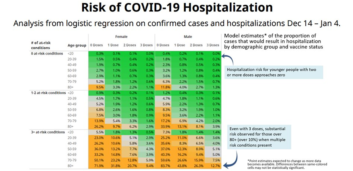
Inaccessible, sloppy and rambling — a poor message . COVID-19 hospitalization risk as function of age, sex, comorbidities and vaccination status (Adrian Dix, 21 January 2022).

21 January 2022
background
A data table showing risk of COVID-19 hospitalization by age, sex, comorbidities and vaccination status.
core message
The graphic makes poor use of color and suffers from repetition, torturous copy and jargon that is both opaque to the public and insufficient for the experts.
key guidelines
1. Use colorblind-friendly Brewer color palettes and avoid diverging color palettes unless you seek to bifurcate the data.
2. Find a story that isn't obvious from the table, such as by making comparisons across categories.
3. Don't give the impression that you haven't read your own writing. Edit and refine repeatedly.
Martin Krzywinski | contact | Canada's Michael Smith Genome Sciences CentreBC Cancer Research CenterBC CancerPHSA
Google whack “vicissitudinal corporealization”
{ 10.9.234.151 }