The COVID Charts
Observations on data visualizations of the coronavirus outbreak
The COVID Charts are brief critiques of data visualization and science communication of the coronavirus outbreak. They are not statements about the underlying science or public health policy.
If you would like me to critique a specific chart, get in touch.
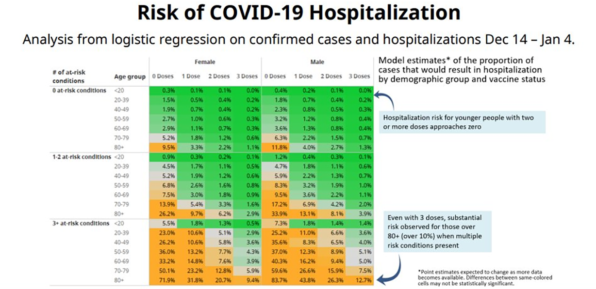
▲ Inaccessible, sloppy and rambling — a poor message . COVID-19 hospitalization risk as function of age, sex, comorbidities and vaccination status (Adrian Dix, 21 January 2022).
The redesigned graphic
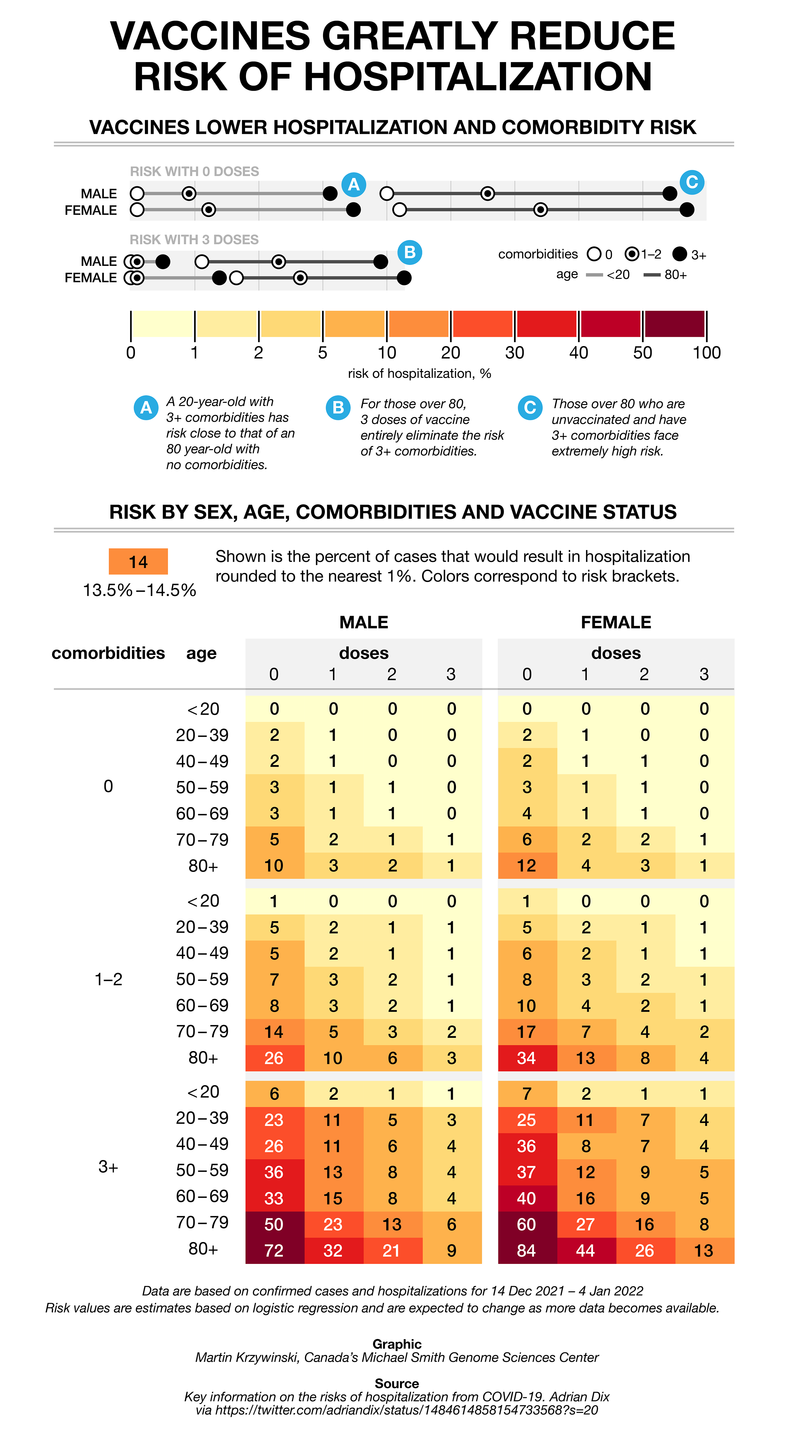
The redesigned graphic, explored in detail below.
Use words efficiently
Needless repetition is tiring. Avoid it, especially in labels and captions. The risk is that the reader will reach their word limit before they even get to your story.
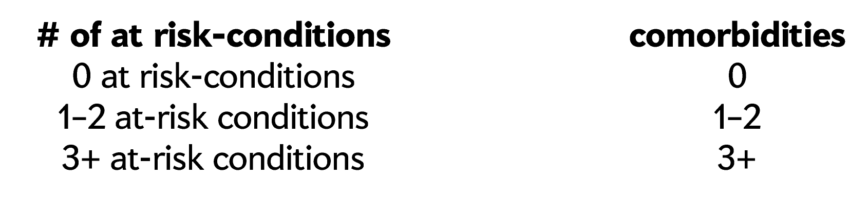
The term “at-risk” should be avoided because the word “risk” is used throughout to mean something else. It’s almost never necessary to include “#” or “number of” in the label.
Jargon makes your message opaque to the public and misuse of it makes it frustrating for the experts
Graphics for the public should not lead with a technical explanation of the model. Relegate this to a footer. Terms such as “logistic regression” and “point estimates” mean nothing to most readers.
Statements such as “same-colored cells may not be statistically significant” are pointless. First, the expert reader will immediately ask what the P-value cutoff was (or equivalent), without which the term “significance” is meaningless. Second, the layman reader will not understand this statement but think it well-phrased, thereby simultaneously uninformed and misinformed.
Match the granularity of how data is reported to key patterns
It is very likely that the precision in 83.7% (to three significant figures) is unwarranted. And it’s almost certain that there is no statistical significance (say, at α = 0.05) between 83.7% and 83.6%. The third significant figure is worthless. It’s also unlikely that the reader will care about the difference between, for example, 10.8 and 11.2, even if it is statistically significant.
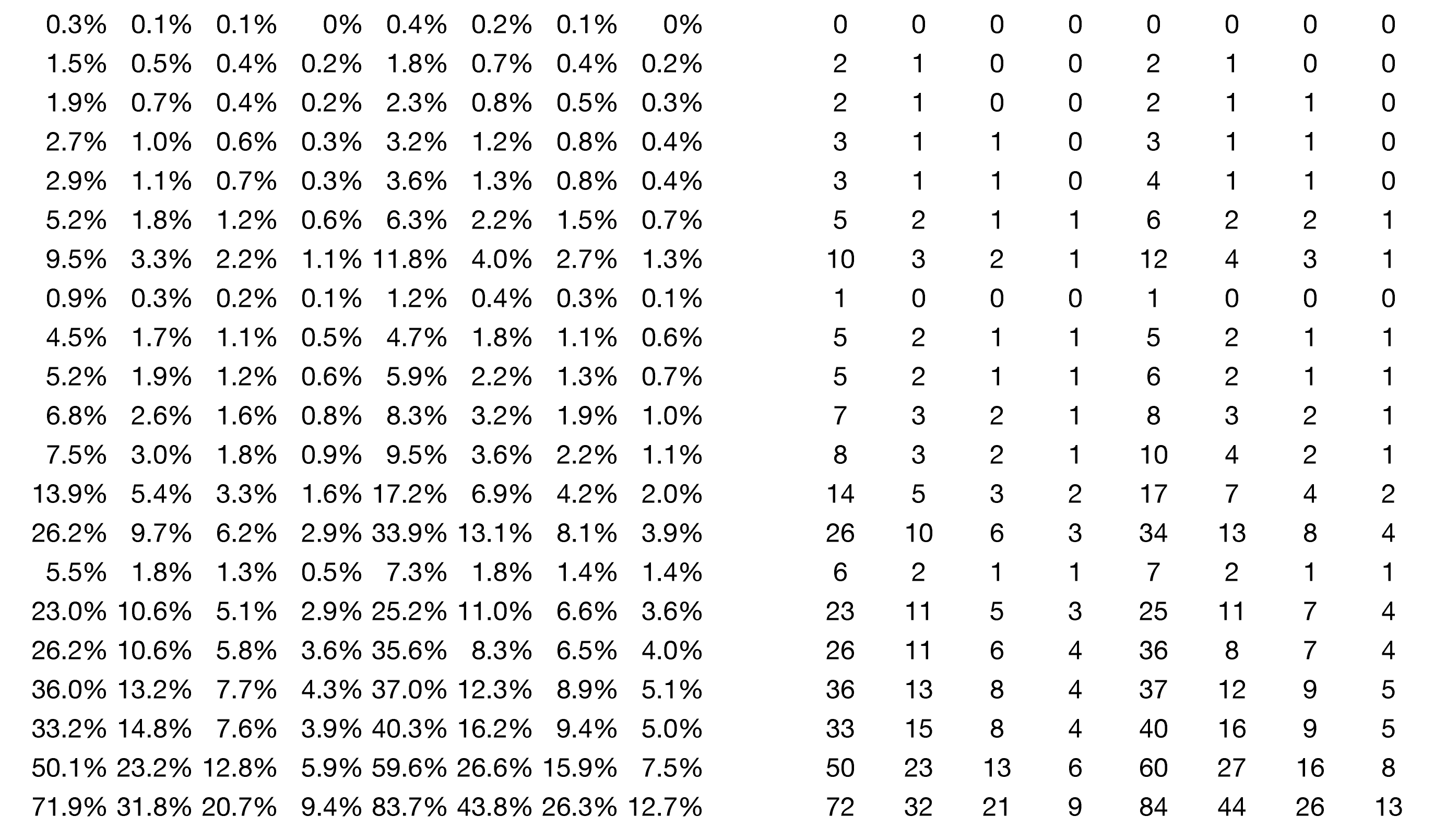
Round to the nearest %, lose the %, and center align if dealing with single or double digits.Any attempt at spotting patterns (such as finding all the large numbers) is hindered by the sea of %.
The repetition of % in each cell pollutes the table, which has 536 digits but 216 “%” signs. So, roughly a third of characters (not counting the decimal points) are useless.
Stay colorblind-safe
About 1 in 12 males are affected by color blindness. The green-purple-orange diverging color scheme is possibly the worst (after green-red) in terms of accessibility.
Brewer palettes are ideal for continuous data and many options are colorblind-safe. Red is an intuitive color for communicating risk (or other variables associated with negative outcomes).
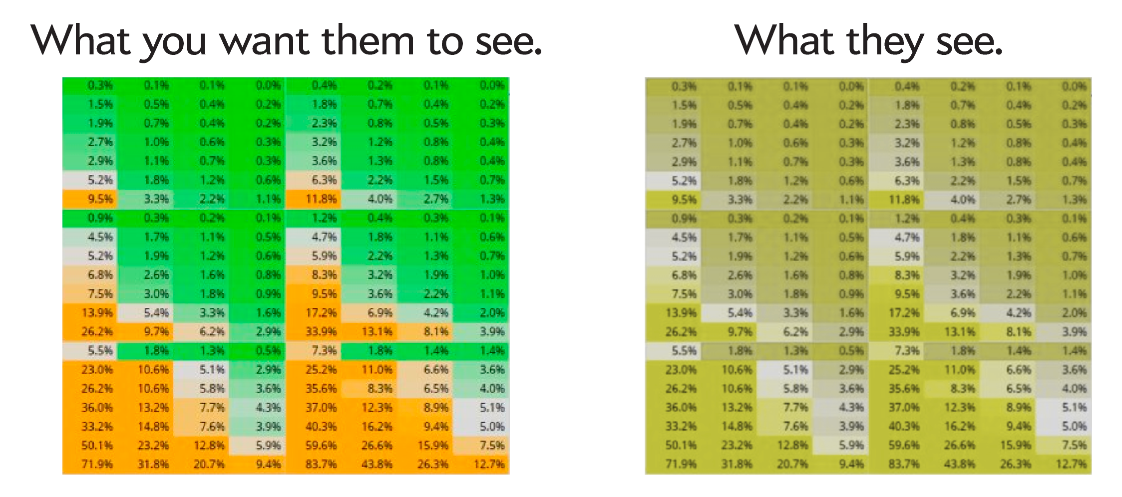
Don't just pick any colors. Colors matter. Learn about colorblindness and the perceptual property of colors.
Continuous palettes that do not diverge into very different hues do not give the reader an impression of an artificial boundary between ranges of values.
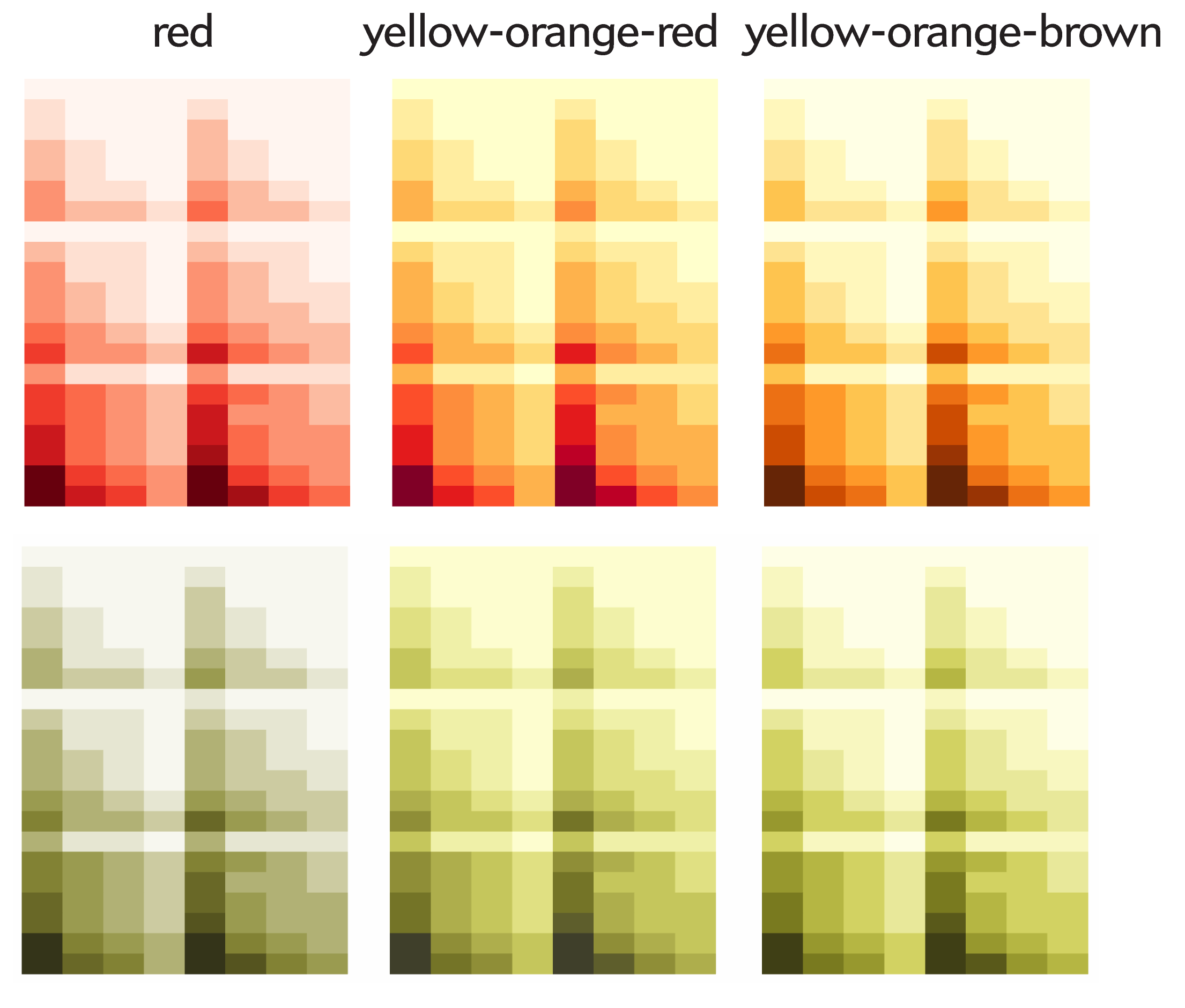
The green-purple-orange palette on the left strongly groups values into green and orange, which may not be appropriate, since this establishes an arbitrary bright-line division of risk brackets (8% orange). Instead, use continuous palettes with one hue (e.g. red) or those that use similar hues.
Don’t be sloppy — even in a public health crisis
I’ve never seen a good graphic with distorted arrows. They do not do what you think they do.

These arrows do not dynamically say “look here”. What they say is “I don’t care about consistency and probably couldn’t figure out (or cared) how to lay out the text.
Don’t give people the impression that nobody has actually read what you wrote, including yourself. Phrases like “for those over 80+ (over 10%)” and “substantial risk observed ... when multiple risk conditions present” are torturous and smack of a cut and paste job.
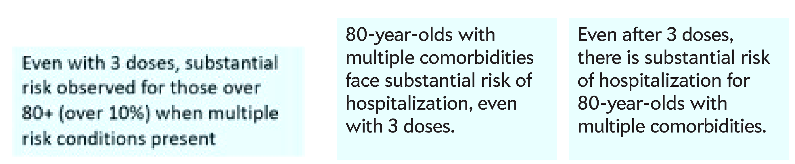
Be attentive to where you break your lines. Do so along phrases and natural points of pause. Do not split concepts across lines, such as “substantial risk”. This is particularly important for lines that are short.
Tell a story and support it with data
If you’re showing a table, find as many useful stories as you can fit and you think the audience has the attention span for. Use active titles that explain what is shown and not simply announce the variables.
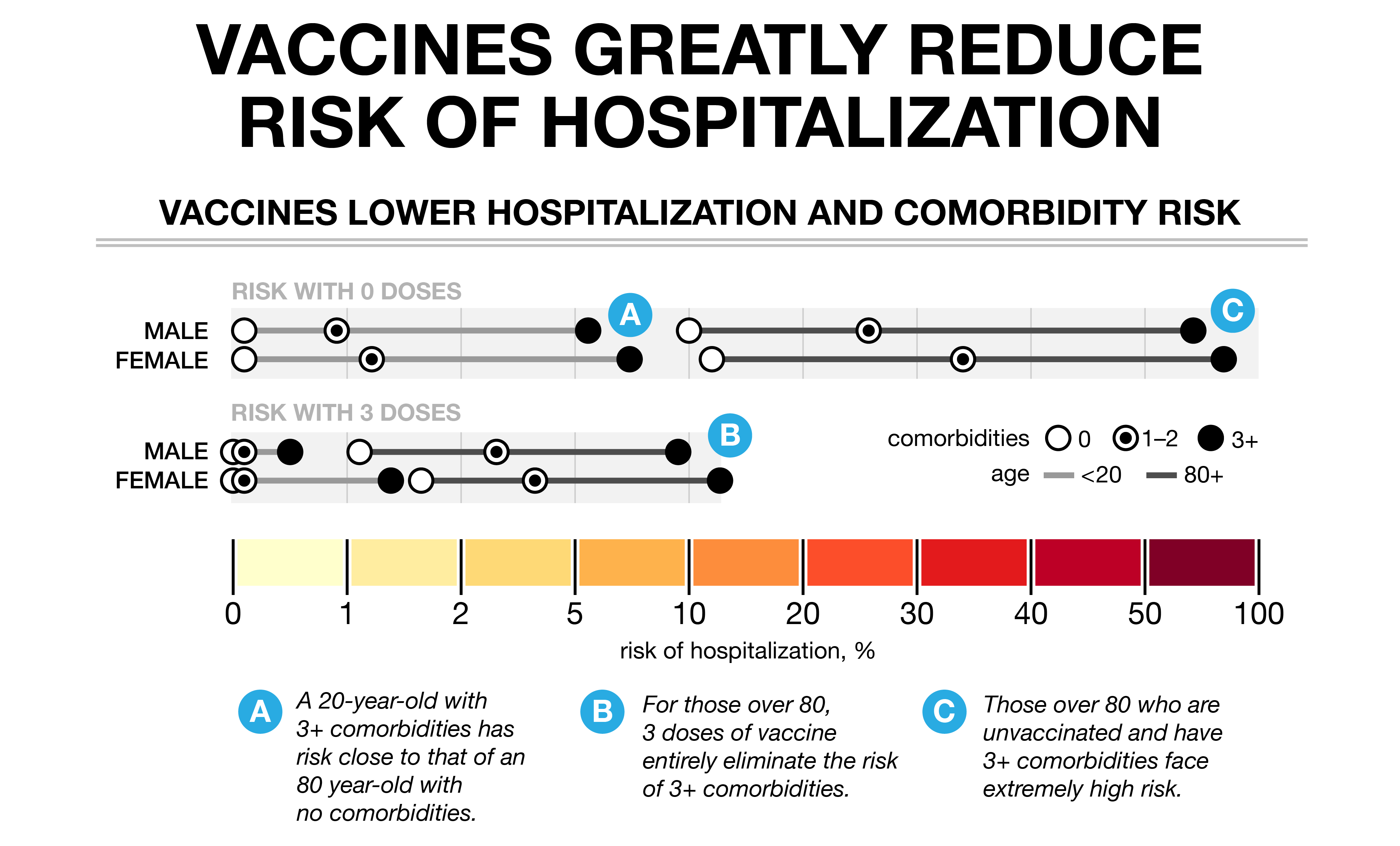
Observations (A) and (B) aren’t clear from the table but are worth making. They perform two vital comparisons: between age groups with different comorbidities (unhealthy 20-year-olds and healthy 80-year-olds) and within age group with different comorbidities (unealthy vs healthy 80-year-olds). Observation (C) is trivial and easily gleaned from the table — especially when attention is paid to how risk brackets are encoded by color.
Use spacing between columns and rows to establish a hierarchy of groups. Here the column spacing between sex groups is slightly larger than spacing between age groups.
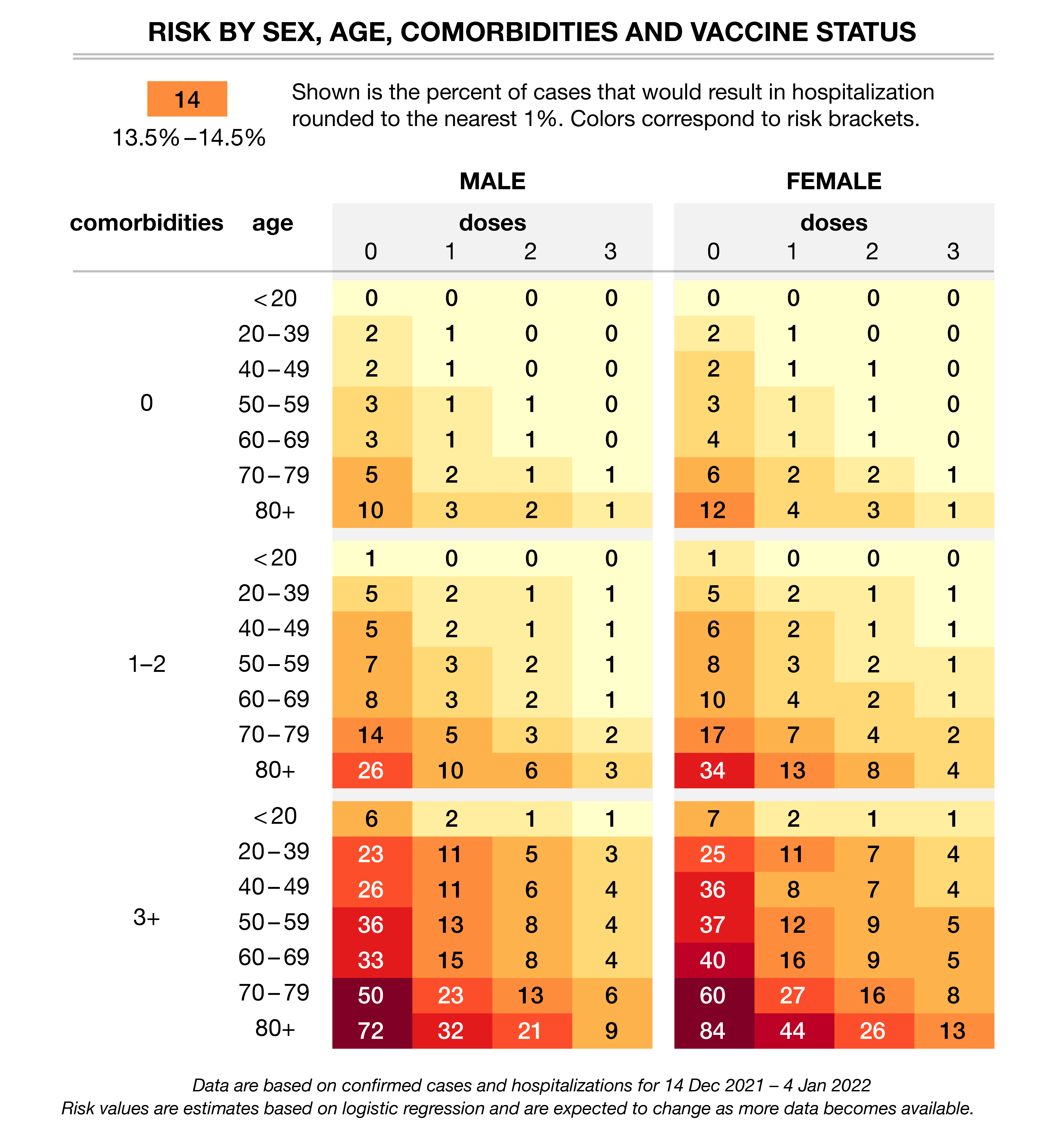
Varying text color across cells in a table isn’t generally a good idea. But sometimes guidelines can be broken to good effect. Notice how the white text emphasizes where the values are large. It’s up to you which risk bracket to use as the pivot from black to white text — but understand that you will strongly bifurcate the data into “low” and “high” risk groups.