preamble
To learn more about this approach, read the Visualizing Tabular Data - Introduction. If you feel this approach is useful for you, proceed to Visualizing Tabular Data - How to Use Circos to Visualize Tables.
The table visualizations shown here are created by the tableviewer utility script, which is included in Circos. This web page provides a limited interface to the tableviewer. To make use of the full functionality of the tableviewer, download it and run it locally.
updates
As I make minor changes to the interface and the backend code, the images you generate from your data may look slightly different from those shown in this section. These minor differences shouldn't cause confusion.
Any new and significant adjustments will be reflected in this document.
visualizing tabular data
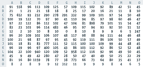
The purpose of the Circos table viewer is to turn a table such as this
into an informative and attractive visualization, with minimal effort on your part. Although at first these visualizations may seem more complicated than the tables themselves, they become intuitive once you learn how to interpret them.
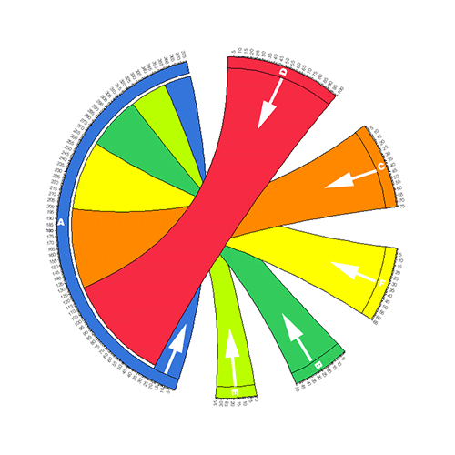
Four different visualizations of the preceeding table are shown below.
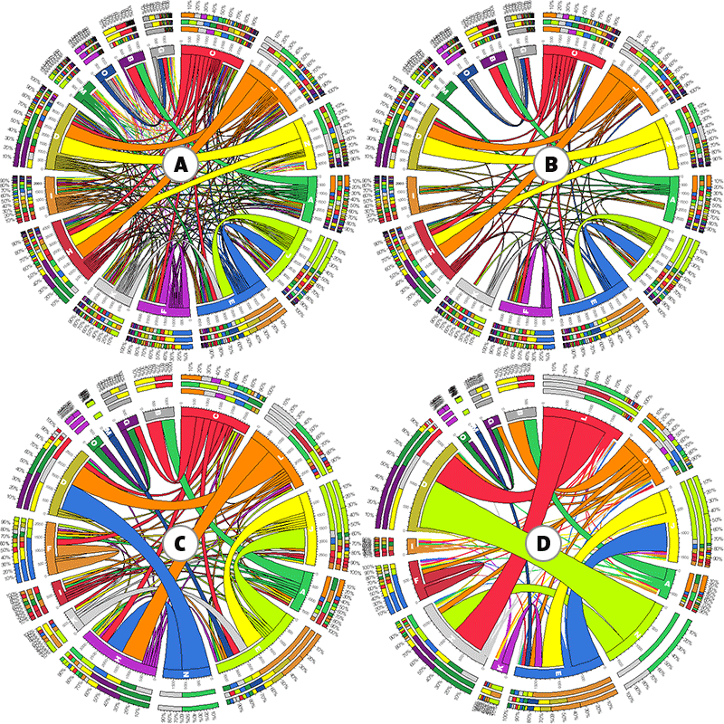
Look at panel D. Does the thick lime ribbon between N-D jump out at you? What about those two thick red ribbons L-D and L-H.
You've just learned something important. Namely, that large values in the table (which can be quite a chore to find visually) are represented by thick ribbons between segments that are labeled by the row/column name. The rest is details.
using the viewer
You upload your table as a plain-text file, and get your image in PNG format. Once the image has been created, you can download an archive of all files used to create the image, as well as the image in PNG and SVG format. The archive contains
- your input, random or sample table file, depending on your choice (uploads/)
- parsed version of the table file and individual data files for image elements (data/)
- Circos configuration files used to create the image (etc/)
- PNG and SVG images (results/)
To make sense of the output, this short guide attempts to explain the components of the table visualizations.
Once you've read through this section, see sample input files.
cell nomenclature
I will refer to cell values by their (row,column) labels. For example, in the 15x15 table at the start of this document cell (A,B)=558 (row A column B), but cell (B,A)=21 (row B column A). The nomenclature I use is row-dominant and one where the row is indicated first, followed by the column. I include this clarification here to eliminate any confusion that might arise when a cell (e.g. A,B) is mistaken for its transpose (e.g. B,A).
cell nomenclature is row,column
	A	B
C      C,A     C,B
D      D,A     D,B
label nomenclature
By label, I mean the name of the row or column. By requirement, no two rows can have the same label. Similarly, no two columns can have the same label. This condition is necessary to eliminate ambiguity in row and column segments in the image (read below).
However, a row and column can have the same label.
example 1. every label is different
	A	B
C	10	15
D	20	25

example 2. second row/column have the same label
	A	B
C	10	15
B	20	25

example 3. each row label has a corresponding column with same label
	A	B
A	10	15
B	20	25

example 4. NOT ALLOWED! - same label used for both rows
	A	B
C	10	15
C	20	25
anatomy of a Circos image
image components
There are three basic parts to the tabular visualization as shown in the figure below. These three components encode the information in the table and summary statistics about row and column totals.
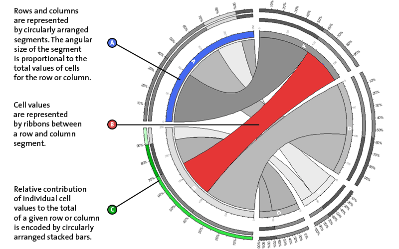
cell and row segments
Consider the following 4x2 (row x column) table
	A	B
C	25	50
D	75	100
E	50	25
F	100	75
The image for this table has six segments (4 row and 2 column segments). By default, segments are ordered by cell totals. Each segment is assigned a distinct color. The figure below shows a portion of the image for this table.
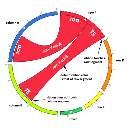
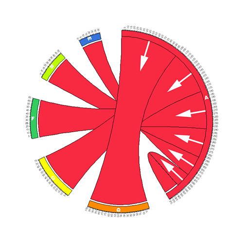
direction of cell ribbon
Each ribbon has a direction - it starts at the row segment, which it touches, and ends at the column segment, which it does not touch. Since any given label could be a row, column (or both), this difference in how ribbon ends are drawn distinguishes rows from columns. This is illustrated in the above figure, where the ribbon for the cell row F column B is seen touching the F row segment but terminating just before the B column segment.
Consider this table and the associate visualization.
        A       B
C       25      50
D       75      100
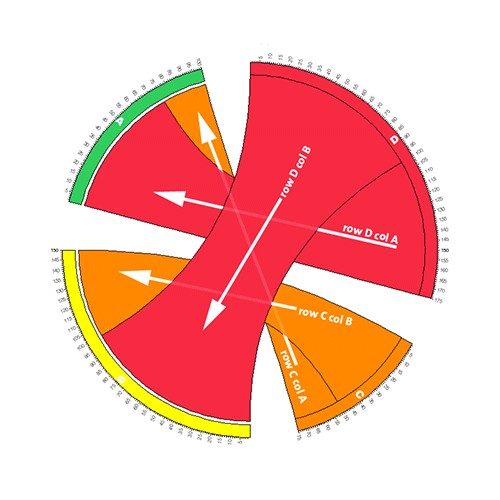
Each row and column in the above table has a distinct label and ribbons flow between distinct segments (a row segment and a column segment). Depending on whether the ribbon touches the segment, you can tell whether it is a row or column segment.
shared labels
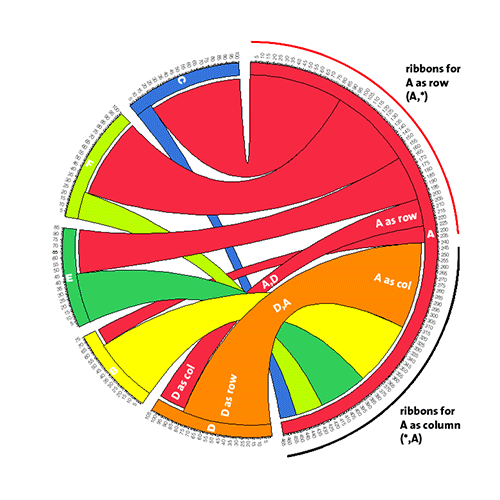
When a row and column have the same label, the corresponding segment encodes both the row and column data associated with that label. Consider the table and image below,
        A       B
A       25      50
C       75      100
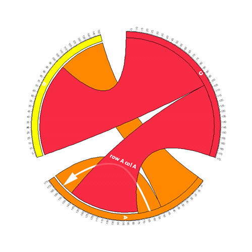
In this case, there are three distinct labels in the table (A, B, C) and label A has an associated row and column. Therefore, the A segment will have ribbons starting at the segment (when A is a row) and terminating at the segment (when A is a column). The total size of the A segment is the total size of the A row and A column. Note that the cell A,A needs to be counted twice because the ribbon associated with this cell starts and terminates on the same segment.
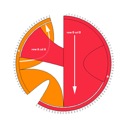
You may have some tables in which each label will have a corresponding row and column. Below is such an example, where each segment has an intra-segment ribbon (corrsponding to the cell that starts and terminates at the row and column with the same label) and an inter-segment ribbon (uniquely labeled row and column).
        A       B
A       25      50
B       75      100
transposes
Consider the two tables below, which are transposes.
	A
A	25
B 	50
C 	75
D 	100
E 	35
F 	65
	A	B	C	D	E	F
A	25 	50	75	100	35	65
Images of a Nx1 and a 1xM table look very different.
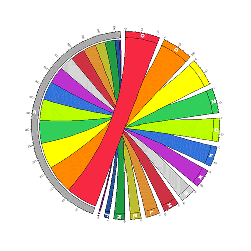
segment order
Segments are positioned in descending order according to their row, then column, total size. If all segments are uniquely row or column segments, then the row segments will appear first, from largest to smallest, followed by all column segments, from largest to smallest. For cases when a segment represents both a row and column, the row contribution is used to order the segments, followed by any remaining column-only segments.
For example, in the image of the table below, the segments for rows B-P are placed first, in order of descending size, followed by the segment for column A. Note that since the data value for A,A is missing (denoted by "-"), there is no ribbon for row A.
data	A
A	-
B	50
C	75
D	100
E	35
F	65
G	5
H	50
I	90
J	15
K	60
L	45
M	80
N	35
O	110
P	75
Within each segment, ribbons are ordered by descending size. Ribbons associated with the segment as row are placed first (in a clockwise sense) followed by ribbons associated with the segment as a column.
Within each segment, ribbons are ordered by descending size. Ribbons associated with the segment as row are placed first (in a clockwise sense) followed by ribbons associated with the segment as a column. This is best seen in the image below.
data	A	B	C	D	E	F
A	-	15	85	25	40	75
B	60	-	-	-	-	-
C	15	-	-	-	-	-
D	80	-	-	-	-	-
E	45	-	-	-	-	-
F	25	-	-	-	-	-
relative contribution bars
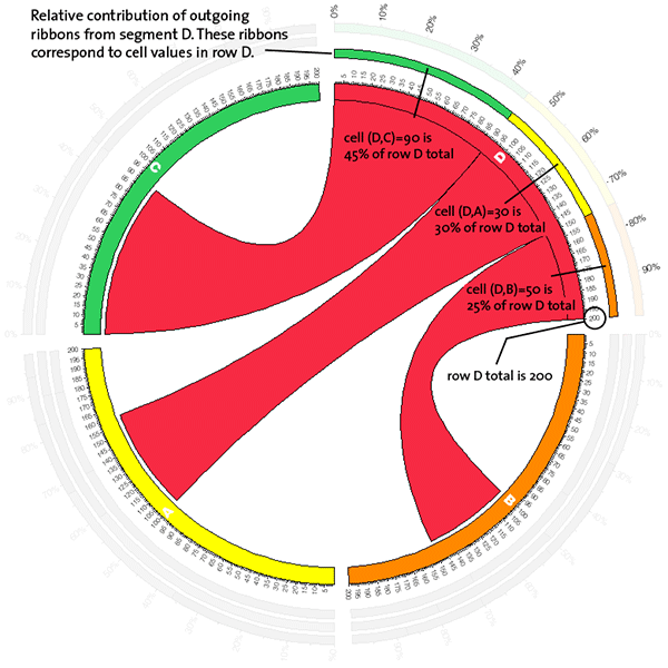
Consider the table
	A	B	C
A	10	20	70
B 	30	30	40
D	60	50	90
Cell (B,C)=40 contributes 40% to row B (40/100) and 20% to column C (40/200).
Considering row B only, contributions of cells (B,A), (B,B) and (B,C) are 30%, 30% and 40%, respectively.
Considering column B only, contributions of cells (A,B), (B,B) and (D,B) are 20%, 30% and 50%, respectively.
These contributes are visually represented in the figure as illustrated below. Concentric stacked bars outside the row and column segments encode these relative contribution of each ribbon to a segment. There are three stacked bars (I,J,K) which show ribbon contribution for a segment as row, column and row+column, as shown in the figure below.
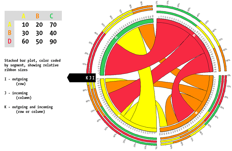
Bar in ring I encodes ribbons starting at the segment (i.e., ribbons for which the segment is a row). If the segment is column-only, no bar in ring I is drawn (e.g., see segment C).
Bar in ring J encodes ribbons terminating at the segment (i.e., ribbons for which the segment is a column). If the segment is row-only, no bar in ring J is drawn (e.g., see segment D).
Bar in ring K encodes all ribbons at the segment (i.e., all ribbons for the segment). Bar in ring K is always drawn. If only two bars are drawn (e.g. I,J or I,K), they are always the same.
Let's focus on label D, which labels only a row. The inner-most stacked bar plot shows the contributions from columns (A,B,C) in row D.
Label B, on the other hand, labels both a row and a column. Therefore, there is a stacked plot for both contribution of cells to row B and one for contribution of cells to column B. The inner-most plot encodes row B contributions from columns (A,B,C).
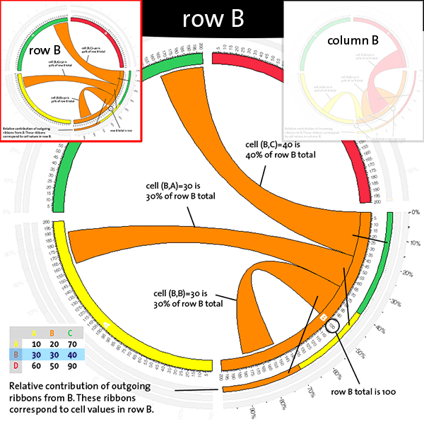
The second inner stacked plot shows column B contributions from rows (A,B,D).
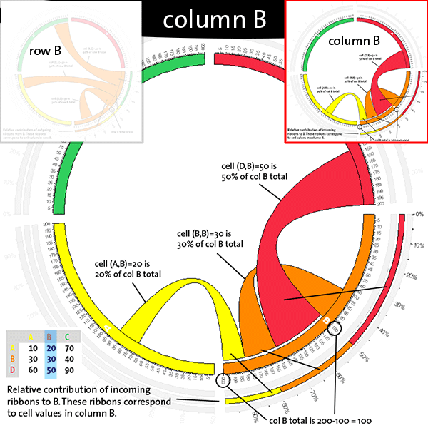
Note that cell (B,B) is belongs to row B and column B and since the label is the same, it starts and terminates on the same segment. And, consequently, this cell contributes to both row- and column-contribution stacked plots.
filtering, encoding and formatting
You can control how your table is parsed, how the information is encoded and how various elements in the image are formatted through the settings panel.
Changes in the panel are persistent — they will apply to all images you generate until you change settings again. Each of the setting sections is described in detail below.
data filter settings
Data filter settings control how the data in your table is parsed.
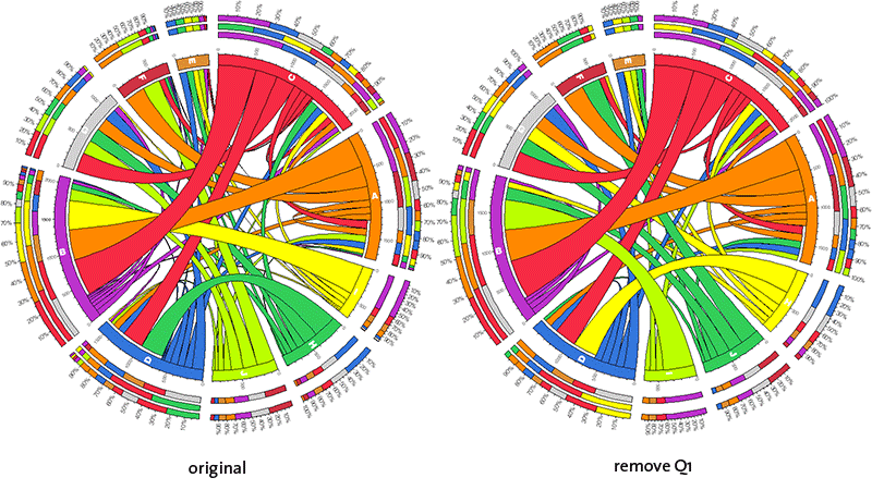
remove Q1 (first quartile)
Cells with values in the first quartile (0-25% percentile) will be ignored. No ribbons will be displayed for these cells.
This setting is useful if you are not interested in the small values in your table.
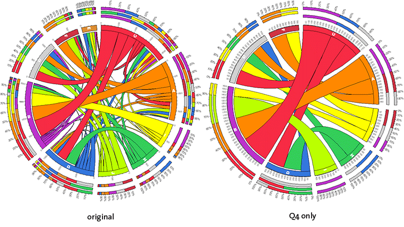
Q4 only (fourth quartile)
Cells with values in the fourth quartiles (75-100% percentile) will be parsed and all other cells will be ignored.
This setting is useful if you are interested in only the largest values in your table.
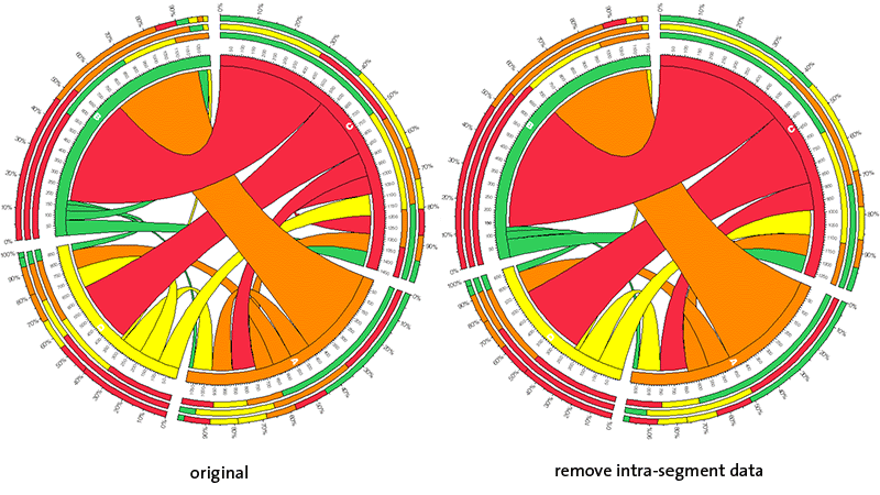
remove intra-segment data
Any cells associated with a row and column that share the same label will be ignored.
# intra-segment cells
	A	B	C
A      A,A
B              B,B
D
Use this setting if you don't want to see ribbons that start and end on the same segment. This is a useful feature if your row and column labels have special significance that makes, for example, the cell A,A much less interesting than A,B.
data encoding settings
Once data from your table is parsed, it can be scaled to help bring out significant patterns.
Currently, there is only one option.
attenuate small values
In addition to suppressing the display of data from cells with small values, you can scale visible ribbons to accentuate the size difference between small and large values.
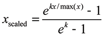
The scaling is exponential and done using the equation given below. If you are interested in preserving the quantitative relationship between the ribbons, then you should not use this feature. However, if a qualitative summary is required, then scaling is useful.
Once values are scaled, the tick mark labels reflect scaled values. You may wish to hide the tick labels (see tick mark option belows) to avoid implying that the scale divisions reflect original data values.
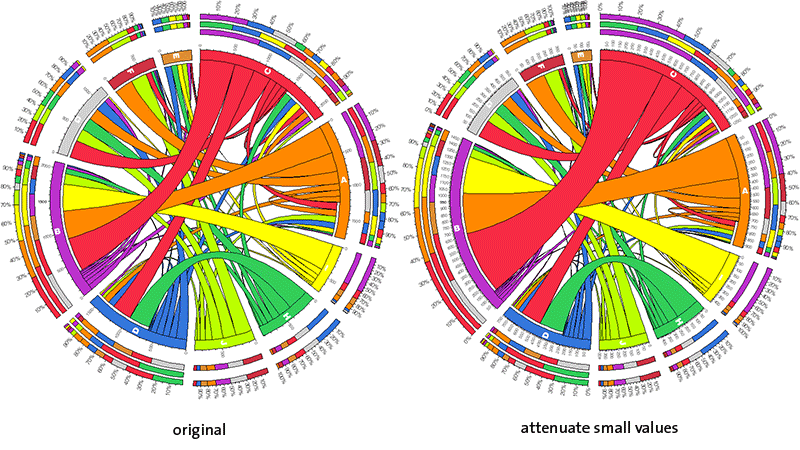
image format settings
Settings in this section control visibility and formatting of image components.
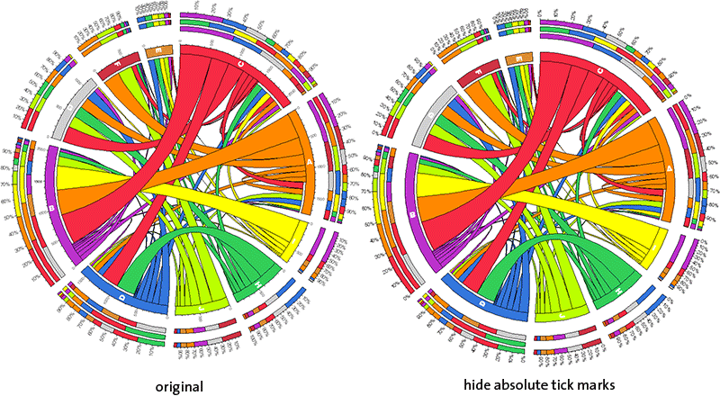
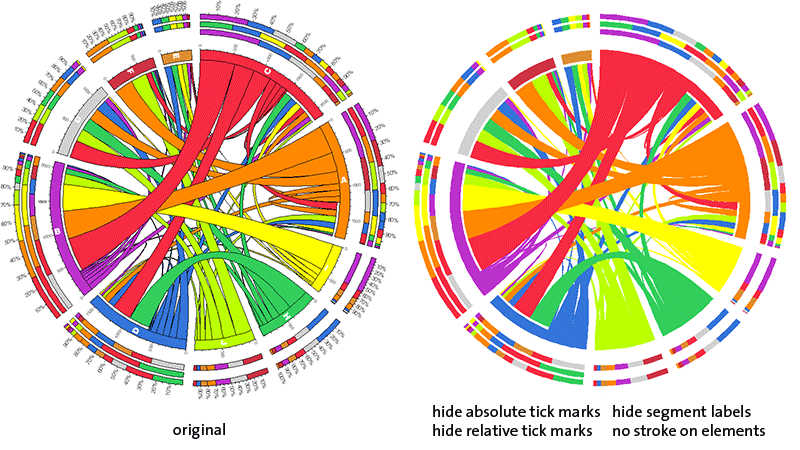
hide absolute tick marks
Absolute scale ticks and associated labels are not shown. This setting is useful if you want to draw focus away from the fact that the segment scale is quantitative.
Hiding ticks is highly recommended if you have scaled your data — because ribbons of scaled data no longer reflect original values.
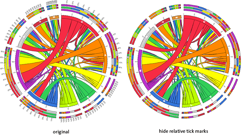
hide relative tick marks
Relative scale ticks and associated labels are not shown. Combine this with the hide absolute tick marks setting above to create a more illustrative image.
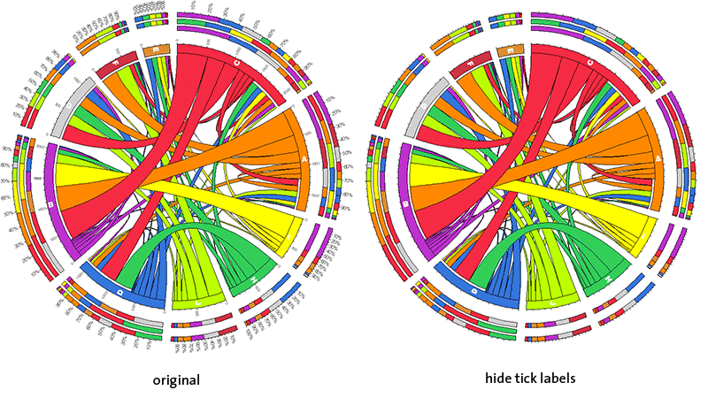
hide tick labels
This option hides labels on absolute and relative ticks. The tick marks themselves remain.
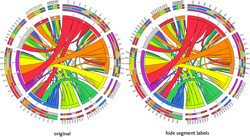
hide segment labels
This option hides segment labels.
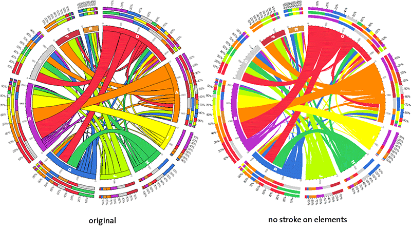
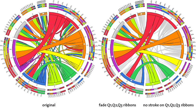
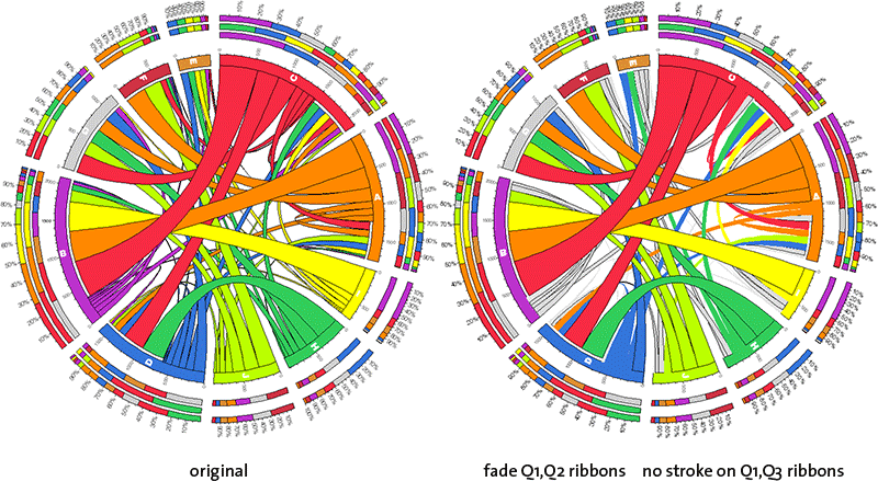
no stroke on elements
Segments, ribbons and stacked bars do not have an outline. Use this to create a more illustrative image.
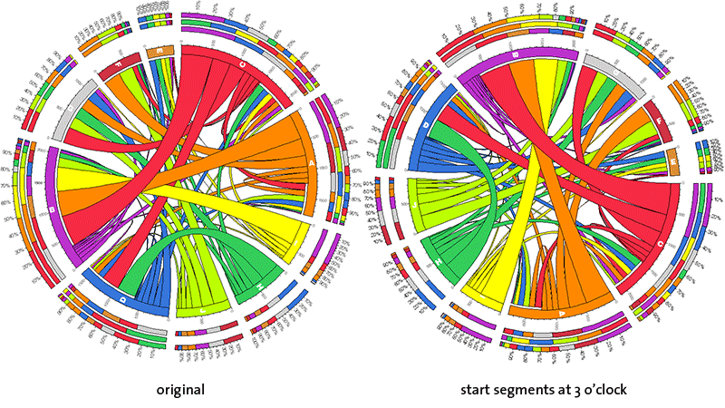
start segments at 3 o'clock
By default, segments are ordered clockwise starting at 12 o'clock (north). To have them start at 3 o'clock (east), use this setting.
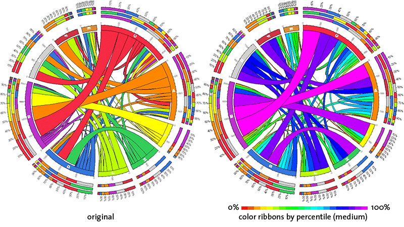
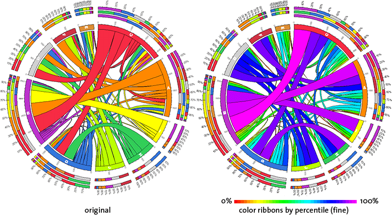
color ribbons by percentile
There are three levels of this setting: rough, medium and fine. In each case, cell values are partitioned into percentile groups and ribbon color is assigned based on the percentile group of the corresponding value.
At the rough setting, percentile groups are 10% in size. Here, there will be 10 different colors of ribbons.
At the medium setting, percentile groups are 5% in size. Here, there will be 20 different colors of ribbons.
At the fine setting, percentile groups are 2.5% in size. Here, there will be 40 different colors of ribbons.
A false-color scheme is used, with red corresponding to the lowest value and purple to the highest.

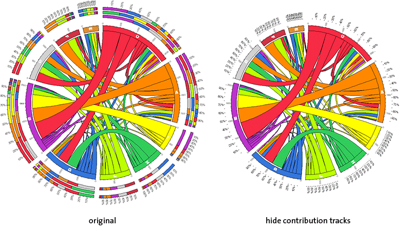
hide contribution tracks
If you're not interested in the outer contribution bars, use this option. When these tracks are hidden, the relative tick marks are moved inward.
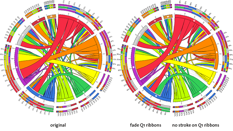
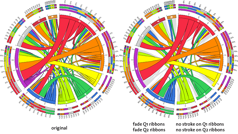
fade Qn ribbons, no stroke on Qn ribbons
Ribbons of the first three quartiles can, as groups, have their color and outline modified. The color and outline adjustments are independent.
First/second/third quartile ribbons are faded to very light grey, light grey and grey color, respectively.
Cookie version [NO_VERSION]. Wrong cookie version [NO_VERSION] but needed [0.63-10]. Making new cookie. access_code color_ribbons_by_value 0 contribution_tracks encoding fade_transparency 0 format intra_segment label_segment_color vvvdgrey label_segment_font normal label_segment_font_size 24 label_segment_on_segment label_segment_parallel 1 label_tick_color vvvdgrey label_tick_font light label_tick_font_size 16 label_tick_parallel 0 min_percentile 0 normalize 0 placement_order row,col q1ribbonc inherit q1ribbons 1 q1ribbont inherit q1ribbonuse q2ribbonc inherit q2ribbons 1 q2ribbont inherit q2ribbonuse q3ribbonc inherit q3ribbons 1 q3ribbont inherit q3ribbonuse q4ribbonc inherit q4ribbons 1 q4ribbont inherit q4ribbonuse ratio_layout reverse_ribbons ribbon_bundle_order native ribbon_caps ribbon_color_source row ribbon_layer_order size_asc segment_color_interpolation count segment_color_order ascii segment_order ascii segment_order_progression size_desc segment_radius 0.75 segment_spacing 0.0075r segment_thickness 35p transparency 1 version 0.63-10 Baking new cookie. connection localparams
$VAR1 = {};cookie
$VAR1 = { 'access_code' => [ '' ], 'color_ribbons_by_value' => [ 0 ], 'contribution_tracks' => [ '', '', '' ], 'encoding' => [ '' ], 'fade_transparency' => [ 0 ], 'format' => [ '', '', '', '', '', '', '', '' ], 'intra_segment' => [ '' ], 'label_segment_color' => [ 'vvvdgrey' ], 'label_segment_font' => [ 'normal' ], 'label_segment_font_size' => [ 24 ], 'label_segment_on_segment' => [ '' ], 'label_segment_parallel' => [ 1 ], 'label_tick_color' => [ 'vvvdgrey' ], 'label_tick_font' => [ 'light' ], 'label_tick_font_size' => [ 16 ], 'label_tick_parallel' => [ 0 ], 'min_percentile' => [ 0 ], 'normalize' => [ 0 ], 'placement_order' => [ 'row,col' ], 'q1ribbonc' => [ 'inherit' ], 'q1ribbons' => [ 1 ], 'q1ribbont' => [ 'inherit' ], 'q1ribbonuse' => [ '' ], 'q2ribbonc' => [ 'inherit' ], 'q2ribbons' => [ 1 ], 'q2ribbont' => [ 'inherit' ], 'q2ribbonuse' => [ '' ], 'q3ribbonc' => [ 'inherit' ], 'q3ribbons' => [ 1 ], 'q3ribbont' => [ 'inherit' ], 'q3ribbonuse' => [ '' ], 'q4ribbonc' => [ 'inherit' ], 'q4ribbons' => [ 1 ], 'q4ribbont' => [ 'inherit' ], 'q4ribbonuse' => [ '' ], 'ratio_layout' => [ '' ], 'reverse_ribbons' => [ '' ], 'ribbon_bundle_order' => [ 'native' ], 'ribbon_caps' => [ '', '', '' ], 'ribbon_color_source' => [ 'row' ], 'ribbon_layer_order' => [ 'size_asc' ], 'segment_color_interpolation' => [ 'count' ], 'segment_color_order' => [ 'ascii' ], 'segment_order' => [ 'ascii' ], 'segment_order_progression' => [ 'size_desc' ], 'segment_radius' => [ '0.75' ], 'segment_spacing' => [ '0.0075r' ], 'segment_thickness' => [ '35p' ], 'transparency' => [ 1 ], 'version' => [ '0.63-10' ] };
| CGI Param |
| ENV | |
| CONTEXT_DOCUMENT_ROOT | /home/martink/www/htdocs |
| CONTEXT_PREFIX | |
| DOCUMENT_ROOT | /home/martink/www/htdocs |
| GATEWAY_INTERFACE | CGI/1.1 |
| HTTPS | on |
| HTTP_ACCEPT | */* |
| HTTP_CACHE_CONTROL | max-age=259200 |
| HTTP_CONNECTION | keep-alive |
| HTTP_HOST | mk.bcgsc.ca |
| HTTP_REFERER | https://mkweb.bcgsc.ca/tableviewer/docs |
| HTTP_SURROGATE_CAPABILITY | mkweb03.bcgsc.ca="Surrogate/1.0 ESI/1.0" |
| HTTP_USER_AGENT | Mozilla/5.0 AppleWebKit/537.36 (KHTML, like Gecko; compatible; ClaudeBot/1.0; +claudebot@anthropic.com) |
| HTTP_VIA | 1.1 mkweb03.bcgsc.ca (squid/5.5) |
| MOD_PERL | mod_perl/2.0.12 |
| MOD_PERL_API_VERSION | 2 |
| PATH | /usr/local/sbin:/usr/local/bin:/usr/sbin:/usr/bin |
| PATH_INFO | / |
| PATH_TRANSLATED | /home/martink/www/htdocs/index.mhtml |
| QUERY_STRING | |
| REMOTE_ADDR | 18.220.66.151 |
| REMOTE_PORT | 55594 |
| REQUEST_METHOD | GET |
| REQUEST_SCHEME | https |
| REQUEST_URI | /tableviewer/docs/ |
| SCRIPT_FILENAME | /home/martink/www/htdocs/tableviewer/docs |
| SCRIPT_NAME | /tableviewer/docs |
| SCRIPT_URI | https://mk.bcgsc.ca/tableviewer/docs/ |
| SCRIPT_URL | /tableviewer/docs/ |
| SERVER_ADDR | 10.9.208.135 |
| SERVER_ADMIN | martink@bcgsc.ca |
| SERVER_NAME | mk.bcgsc.ca |
| SERVER_PORT | 443 |
| SERVER_PROTOCOL | HTTP/1.1 |
| SERVER_SIGNATURE | |
| SERVER_SOFTWARE | Apache/2.4.53 (Rocky Linux) OpenSSL/3.0.7 mod_apreq2-20101207/2.8.1 mod_perl/2.0.12 Perl/v5.32.1 |
| UNIQUE_ID | ZiqtnR6u1QAP2GMQyEdbJgAAAMo |
cookie
| cookie not defined |