
Effective poster design for science communication
Guidelines to get you started and keep you going
contents
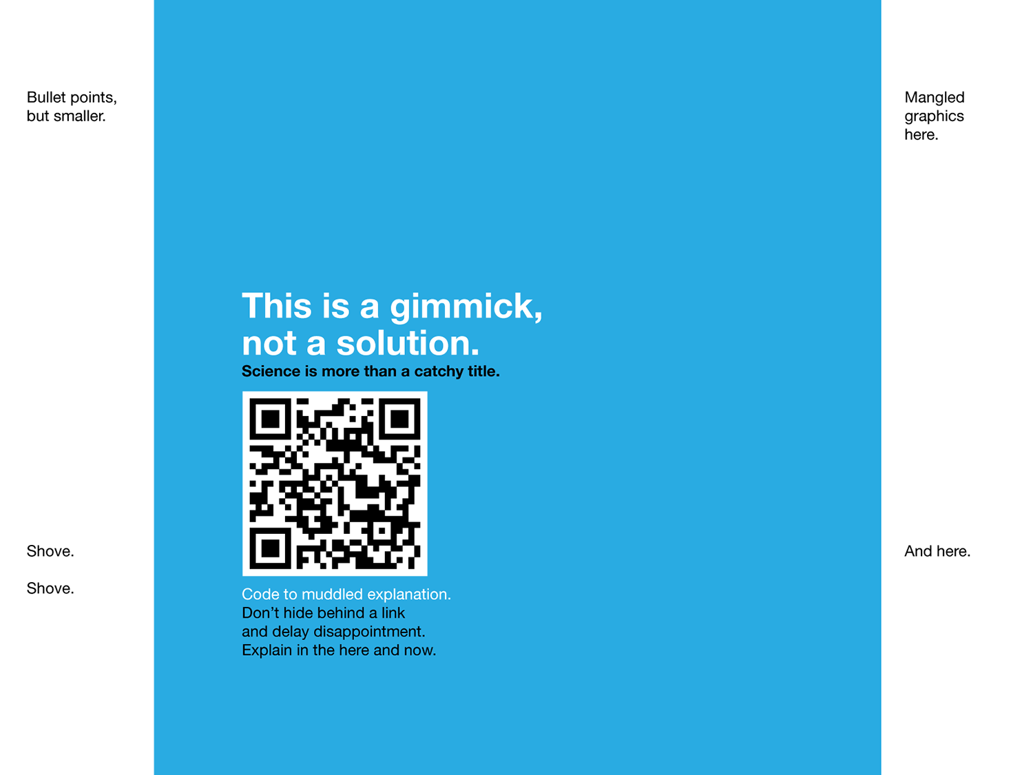
There are no shortcuts—good explanations take effort. There are plenty of gimmicks and cheap tricks that masquerade as solutions—reject them.
Instead, seek out strategies that adopt the categorical imperative. If everyone used this strategy, would the (poster) world be a better place? A conference hall full of 300 QR-code posters? No thank you.
The poster design guidelines are flexible. They are built on the concept that less is more. However, sometimes a little bit more is actually more. Think before you draw and adjust the design to the themes of your story.
See how the guidelines can be applied to posters in the wild by visiting the poster hospital.
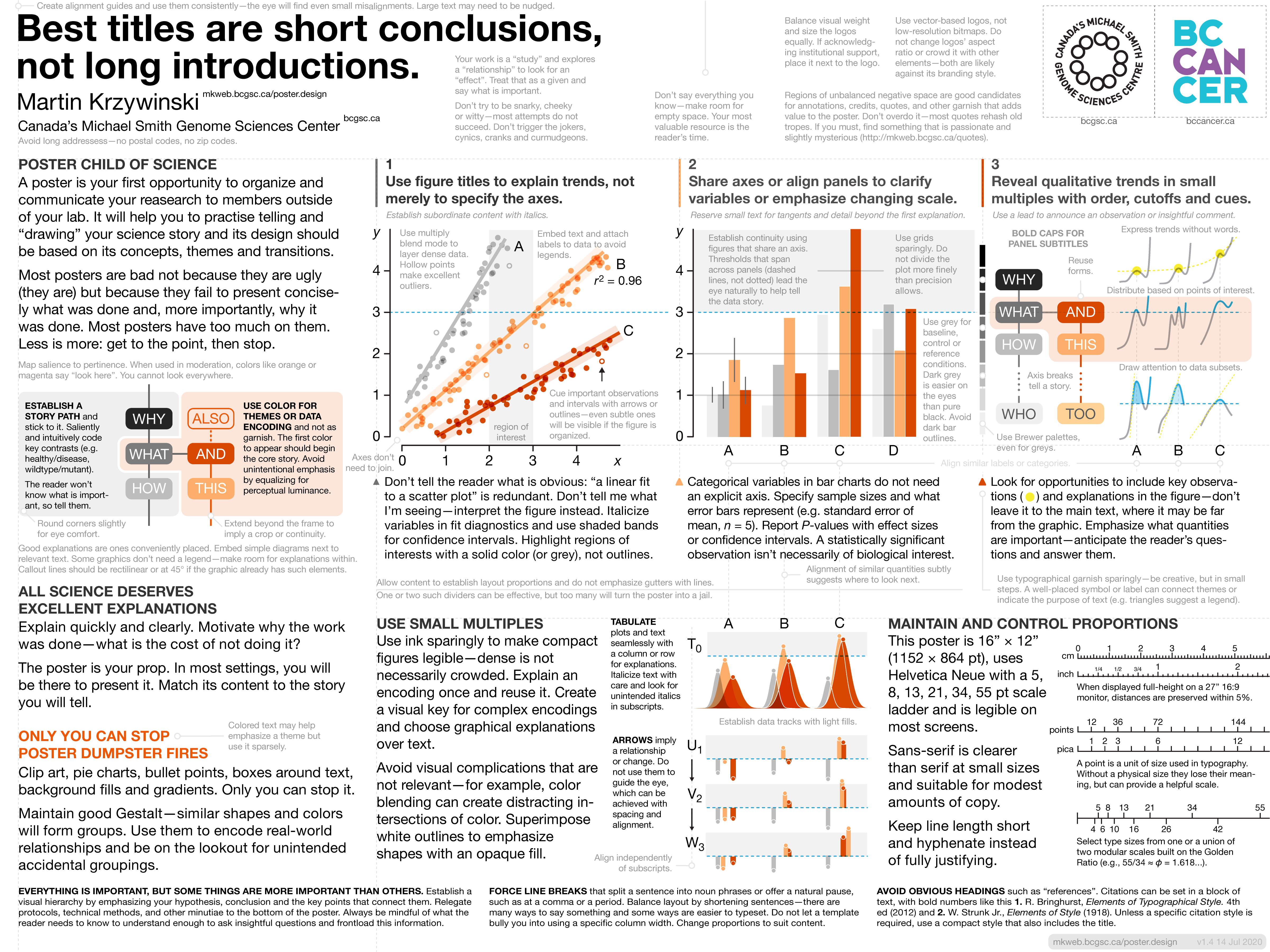
A poster is your first opportunity to organize and communicate your reasearch to members outside of your lab. It will help you to practise telling and “drawing” your science story and its design should be based on its concepts, themes and transitions.
The poster is a prop—not a paper. In most settings, you will be there to present it. Match its content to the story you will tell.
Most posters are bad not because they are ugly (they are) but because they fail to present concisely what was done and, more importantly, why it was done.
Most posters have too much content, presented too flatly. Less is more: get to the point, then stop.
Detail on demand, not by default.
Curate your content, narrate and explain—don't dump.
Control your volume of speech and restrain exuberance, folly and whimsy.
Motivate why the work was done. What is the cost of not doing it?
State your hypothesis and conclusions clearly and early. Connect them with the fewest steps required for a first explanation.
The reader won’t know what is important, so tell them.
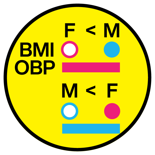
Saliently and intuitively code key contrasts (e.g. healthy/disease, wildtype/mutant).
Good explanations are ones conveniently placed. Embed simple diagrams next to relevant text.
Clean and consistent design allows for subtle cues to call out important observations and other points of interest.
Clip art, pie charts, bullet points, boxes around text, background fills, textures and gradients. Only you can stop it.
Create groups to encode real-world relationships and be on the lookout for unintended accidental groupings.
Similar shapes and colors will form groups.
Objects and shapes that are close to one another will form groups.
Alignment of similar quantities subtly suggests where to look next.
Create alignment guides and use them consistently—the eye will find even small misalignments.
Do not let a template bully you into using a specific column width. Change proportions to suit content.
Be prepared to rewrite. There are many ways to say something and some ways are easier to typeset.
Space makes groups.
Dividing lines can be effective but more can make the poster look congested.
Hollow boxes are jails and do not distinguish foreground from background.
Don’t say everything you know. Your most valuable resource is the reader’s time.
Regions of unbalanced negative space are good candidates for annotations, credits, quotes, and other garnish that adds value to the poster. Don’t overdo it—most quotes rehash old tropes. If you must, find something that is passionate and slightly mysterious.
Sans-serif is clearer than serif at small sizes and suitable for modest amounts of copy.
Match Helvetica/Minion, Frutiger/Apollo, Gill Sans/Perpetua, Gotham/Mercury, Legancy/Jensen, Syntax/Sabon, Univers/Meridien.
Italicize text with care and look for unintended italics in subscripts.
This poster is 16” × 12” (1152 × 864 pt), uses Helvetica Neue with a 5, 8, 13, 21, 34, 55 pt scale ladder, and is legible on most screens.
A point is a unit of size used in typography. Without a physical size they lose their meaning, but can provide a helpful scale.
Select type sizes from one or a union of two modular scales built on the Golden Ratio (e.g., 55/34 ≈ φ = 1.618...).
Keep line length short and hyphenate instead of fully justifying.
Establish subordinate content with italics.
Reserve small text for tangents and detail beyond the first explanation.
Bold caps for panel subtitles
Use typographical garnish sparingly—be creative, but in small steps. A well-placed symbol or label can connect themes or indicate the purpose of text (e.g. triangles suggest a legend).
Align symbols independently of subscripts and superscripts.
Split a sentence into noun phrases or offer a natural pause, such as at a comma or a period.
Balance layout by shortening sentences—there are many ways to say something and some ways are easier to typeset.
Establish a visual hierarchy by emphasizing your hypothesis, conclusion and the key points that connect them.
Relegate protocols, technical methods, and other minutiae to the bottom of the poster.
Always be mindful of what the reader needs to know to understand enough to ask insightful questions and frontload this information.
Avoid long addressess—no postal codes, no zip codes.
Your work is a “study” and explores a “relationship” to look for an “effect”. Treat that as a given and say what is important.
Citations can be set in a block of text, with bold numbers like this 1. R. Bringhurst, Elements of Typographical Style. 4th ed (2012) and 2. W. Strunk Jr., Elements of Style (1918). Unless a specific citation style is required, use a compact style that also includes the title.
Don’t try to be snarky, cheeky or witty—most attempts do not succeed. Don’t trigger the jokers, cynics, cranks and curmudgeons.
Heed Strunk's Elements of Style:
“Make definite assertions. Avoid tame, colorless, hesitating, non-committal language. Use the word not as a means of denial or in antithesis, never as a means of evasion.”
“Use definite, specific, concrete language.”
“Do not overwrite. Rich, ornate prose is hard to digest, generally unwholesome, and sometimes nauseating.”
Be “compact, informative, unpretentious.” and avoid “a breezy style is often the work of an egocentric, the person who imagines that everything that comes to mind is of general interest.”
“Avoid a succession of loose sentences.”
Color powerfully classifies content. It is impossible to achieve this if everything is in color or if the poster is agrresively colourfully branded.
A ramp of colors of the same hue (e.g. green, blue) is useful to communicate continuous quantity. Use a single salient color (e.g. orange, magenta) to underscore a key theme, observation or conclusion.
Design for accessibility by colorblind readers.
Do not reuse the same color for a different meaning.
Work in CMYK space and avoid 100% saturated colors.
The first color to appear should begin the core story.
Map salience to pertinence. When used in moderation, colors like orange or magenta say “look here”. You cannot look everywhere.
Avoid unintentional emphasis by equalizing for perceptual luminance.
Colored text may help emphasize a theme but use it sparsely.
Round corners slightly for eye comfort.
Extend beyond the frame to imply a crop or continuity.
Dense is not necessarily crowded.
Explain an encoding once and reuse it.
Create a visual key for complex encodings and choose graphical explanations over text.
Use Brewer palettes, even for greys.
Color blending can create distracting intersections of color.
Superimpose white outlines to emphasize shapes with an opaque fill.
Use multiply blend mode to layer dense data. Hollow points make excellent outliers.
Tabulate plots and text seamlessly with a column or row for explanations.
Do not use them to guide the eye, which can be achieved with spacing and alignment.
Don’t tell the reader what they're seeing: “a linear fit to a scatter plot” is redundant. Explain and interpret the figure instead.
Trends and their explanations should be the most salient.
Do not use excess ink on axes and navigation elements.
Use 0.5pt lines for axis lines and ticks.
Avoid dense ticks and tick labels.
Place grids on top with a multiply blend.
Highlight regions of interests with a solid color (or grey), not outlines.
Cue important observations and intervals with arrows or outlines.
Embed text and attach labels to data to avoid legends.
Italicize variables in fit diagnostics and use shaded bands for confidence intervals.
Callout lines should be rectilinear or at 45° if the graphic already has such elements.
Categorical variables in bar charts do not need an explicit axis. Specify sample sizes and what error bars represent (e.g. standard error of mean, `n = 5`). Report `P`-values with effect sizes or confidence intervals. A statistically significant observation isn’t necessarily of biological interest.
Establish continuity using figures that share an axis. Thresholds that span across panels (dashed lines, not dotted) lead the eye naturally to help tell the data story.
Use grids sparingly. Do not divide the plot more finely than precision allows.
Use grey for baseline, control or reference conditions. Dark grey is easier on the eyes than pure black. Avoid dark bar outlines.
Look for opportunities to include key observations and explanations in the figure—don’t leave it to the main text, where it may be far from the graphic. Emphasize what quantities are important—anticipate the reader’s questions and answer them.
Express trends without words and draw attention to important data subsets.
Distribute based on points of interest.
Axis breaks tell a story.
If acknowledging institutional support, place it next to the logo.
Use vector-based logos, not low-resolution bitmaps. Do not change logos’ aspect ratio or crowd it with other elements—both are likely against its branding style.
Nasa to send our human genome discs to the Moon
We'd like to say a ‘cosmic hello’: mathematics, culture, palaeontology, art and science, and ... human genomes.


Comparing classifier performance with baselines
All animals are equal, but some animals are more equal than others. —George Orwell
This month, we will illustrate the importance of establishing a baseline performance level.
Baselines are typically generated independently for each dataset using very simple models. Their role is to set the minimum level of acceptable performance and help with comparing relative improvements in performance of other models.

Unfortunately, baselines are often overlooked and, in the presence of a class imbalance5, must be established with care.
Megahed, F.M, Chen, Y-J., Jones-Farmer, A., Rigdon, S.E., Krzywinski, M. & Altman, N. (2024) Points of significance: Comparing classifier performance with baselines. Nat. Methods 20.
Happy 2024 π Day—
sunflowers ho!
Celebrate π Day (March 14th) and dig into the digit garden. Let's grow something.

How Analyzing Cosmic Nothing Might Explain Everything
Huge empty areas of the universe called voids could help solve the greatest mysteries in the cosmos.
My graphic accompanying How Analyzing Cosmic Nothing Might Explain Everything in the January 2024 issue of Scientific American depicts the entire Universe in a two-page spread — full of nothing.

The graphic uses the latest data from SDSS 12 and is an update to my Superclusters and Voids poster.
Michael Lemonick (editor) explains on the graphic:
“Regions of relatively empty space called cosmic voids are everywhere in the universe, and scientists believe studying their size, shape and spread across the cosmos could help them understand dark matter, dark energy and other big mysteries.
To use voids in this way, astronomers must map these regions in detail—a project that is just beginning.
Shown here are voids discovered by the Sloan Digital Sky Survey (SDSS), along with a selection of 16 previously named voids. Scientists expect voids to be evenly distributed throughout space—the lack of voids in some regions on the globe simply reflects SDSS’s sky coverage.”
voids
Sofia Contarini, Alice Pisani, Nico Hamaus, Federico Marulli Lauro Moscardini & Marco Baldi (2023) Cosmological Constraints from the BOSS DR12 Void Size Function Astrophysical Journal 953:46.
Nico Hamaus, Alice Pisani, Jin-Ah Choi, Guilhem Lavaux, Benjamin D. Wandelt & Jochen Weller (2020) Journal of Cosmology and Astroparticle Physics 2020:023.
Sloan Digital Sky Survey Data Release 12
Alan MacRobert (Sky & Telescope), Paulina Rowicka/Martin Krzywinski (revisions & Microscopium)
Hoffleit & Warren Jr. (1991) The Bright Star Catalog, 5th Revised Edition (Preliminary Version).
H0 = 67.4 km/(Mpc·s), Ωm = 0.315, Ωv = 0.685. Planck collaboration Planck 2018 results. VI. Cosmological parameters (2018).
constellation figures
stars
cosmology
Error in predictor variables
It is the mark of an educated mind to rest satisfied with the degree of precision that the nature of the subject admits and not to seek exactness where only an approximation is possible. —Aristotle
In regression, the predictors are (typically) assumed to have known values that are measured without error.
Practically, however, predictors are often measured with error. This has a profound (but predictable) effect on the estimates of relationships among variables – the so-called “error in variables” problem.

Error in measuring the predictors is often ignored. In this column, we discuss when ignoring this error is harmless and when it can lead to large bias that can leads us to miss important effects.
Altman, N. & Krzywinski, M. (2024) Points of significance: Error in predictor variables. Nat. Methods 20.
Background reading
Altman, N. & Krzywinski, M. (2015) Points of significance: Simple linear regression. Nat. Methods 12:999–1000.
Lever, J., Krzywinski, M. & Altman, N. (2016) Points of significance: Logistic regression. Nat. Methods 13:541–542 (2016).
Das, K., Krzywinski, M. & Altman, N. (2019) Points of significance: Quantile regression. Nat. Methods 16:451–452.