

Nature Methods: Points of View
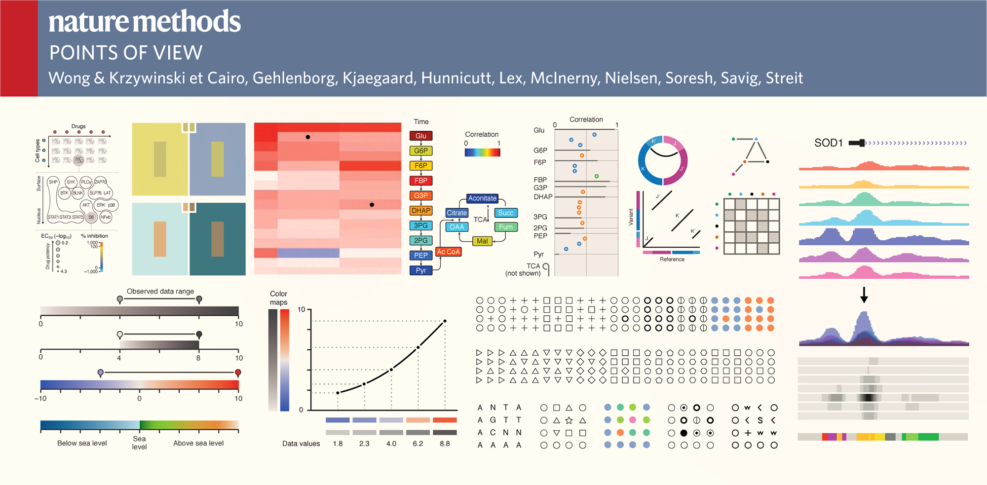
Guidelines for Effective Figures
Practical and concise advise on the visual presentation of data for researchers. One topic and one page at a time.
Common Challenges in Figure Design
Andreas Dahlin runs a figure making course at Uppsala University. He was kind to share with me common questions and concerns that his students have when creating figures (emphasis is mine).
I face problems for using the tools in power point to make nice illustration figures, and in addition how one can enhance the resolution of the figures to print it in a high quality mode.
In my opinion, the most difficult thing is how to draw the good-looking pictures and design the structure of slide to make it simple and substantial in content.
I find it difficult to find the right software to draw pictures.
The most difficult thing for me, when I make a figure, is to arrange the parts of the figure in a way they look nice and understandable.
I think the most difficult part is creating the concept, how to make a figure easy and fast to understand but not lacking all essential parts.
Stepping outside of my own knowledge of what the picture presents and viewing it as someone who sees it for the first time. It's easy to assume that some things are self evident and not making them clear enough in the pictures.
Figures that not are plots can also be tricky to get to look nice.
Anytime you have to draw something in paint, gimp, or other image program it requires a lot of work to make it look even slightly better than crap.
The most difficult thing (in general) is to include as much information as possible and display it in a way that is easy to understand. Figures should be intuitive for the reader, which is sometimes difficult to achieve. There might also be technical difficulties in achieving what you've visualized.
I think the most difficult part for me is to highlight the main idea I would like to express.
For me the most difficult part is making 3-D figures. Also while making figures its hard to decide on the good colors to choose for the figure.
In my opinion, the most difficult part when making a figure is don't know which software we can use and how to use.
The most difficult part for me is to start it! Because I am so meticulous and I am a painter, then it is not so easy to make decision about my figures and which one is better and so on, then finally I give up and put just one figure which of course I don't like...
I think it is difficult to put together my ideas to something that is connected and makes it easier for the viewer to understand.
It is so easy to just get an image from internet. I don’t know what is ok to do. There seems to be different rules in different communities.
To come up with a figure that does not simplify the concept too much at the same time as it does not overwhelm the viewer. To get some ideas for this is the reason why I take the course. ;-)
To me, how to make it easy to understand is the difficult part.
I think it is to save it in the correct format: Raster or vector, png or jpg or pdf... especially if I want to make some changes in the future to the figure.
I think is to choose the most appropriate figure that really help to transmit the information we want. Then, how many words can be good enough for been part of the message. At the beginning I used to use too many.
Apart from the difficulty of making the figure clear and easy to understand, the biggest problem I'm having is the captions. How long and detailed description is appropriate, so it neither steals attention from the figure nor leaves out too much important information.
I think the most difficult part is to have high resolution image once we want to save it. My experience is when finish with drawing, the file size sometimes to large for high quality image and if we downgrade it, the image becomes bad.
The most difficult part when i making a figure is the software using part, I'm not good at computer so that part is annoying for me all the time.
I think the most difficult is to find out how to condensate many ideas in one picture without making it difficult to understand.
The most difficult part is the get the image to not look too amateurish that people focus on that instead of the message.
The most difficult part when doing a figure is to let it speak for itself, i.e. to not have long caption text.
To be able to depict all the desirable results on a single figure is sometimes not that easy. It becomes more critical when a figure is to be fitted within a certain size frame. An exact placing of a figure in some text editors often comes along with difficulties.
The most difficult part when making a figure is to make it simple and still be informative.
Depends a lot on the kind of figure, but generally it is to get clarity in the design, such that the idea is conceived easily. This requires some good outline (usually an iterative process).
The most difficult part to make a figure is the need to express abstract concepts into drawings.
The compromise between include detailed information and at the same time be readable (figures in articles)
To compress all information and ideas you have in your head into short and clear message.
I feel the difficulty in choosing a right resolution of the picture and the angle that could visualize all the details. And also choosing right test/label colour, size, font. Another difficulty for me is continuation from one slide to another.
I believe that my biggest problem would be making nice flux charts. Generally the ones I draw look too crude, it does not look beautiful. I have no concern about making an image that can represent an idea, but making a beautiful image makes it more pleasing to the eyes of the people who will read my work.
It is very difficult to make the figure delicate. I am still not get used to put all the small components together to integrate the figure by the vector software, instead of drawing it out directly.
I think the most difficult part is to make the image simple but yet informative.
I find it very difficult to make an original clarity picture in a particular format after dimensioning it according to the requirement.
Some times it is difficult to limit the size (Bytes) of the picture when going for high clarity remake.
Making the figure as informative as you want while keeping it simple enough to grasp quickly.
For me, the more difficult part is to create a figure that contains or tells all the information that I want to transmit, but keeping the figure simple, clean and not overloaded.
The most difficult for me is make it easily to be understood meanwhile containing the essential information.
The most difficult thing when developing a figure is ... to remove the bloat but keep the message. (Besides the very most difficult: finding out what I want to tell.)
For me the most difficult part is to choose colors with right contrast and to make it more attractive and catchy.
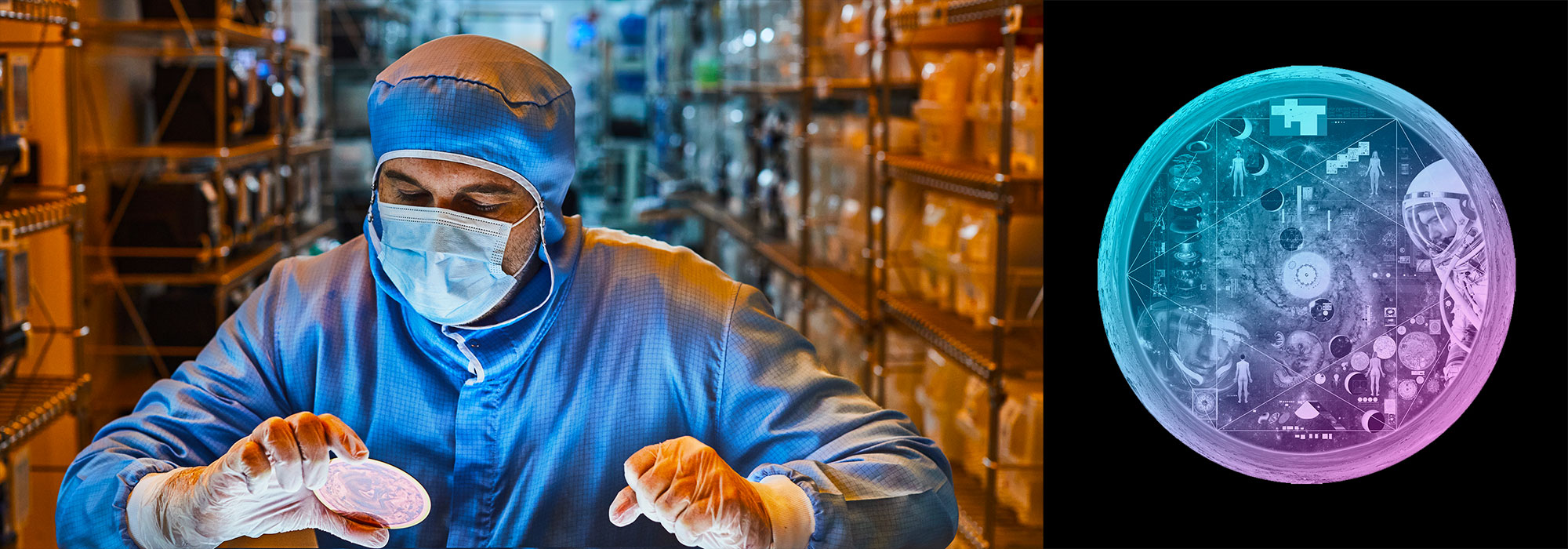
Nasa to send our human genome discs to the Moon
We'd like to say a ‘cosmic hello’: mathematics, culture, palaeontology, art and science, and ... human genomes.


Comparing classifier performance with baselines
All animals are equal, but some animals are more equal than others. —George Orwell
This month, we will illustrate the importance of establishing a baseline performance level.
Baselines are typically generated independently for each dataset using very simple models. Their role is to set the minimum level of acceptable performance and help with comparing relative improvements in performance of other models.

Unfortunately, baselines are often overlooked and, in the presence of a class imbalance5, must be established with care.
Megahed, F.M, Chen, Y-J., Jones-Farmer, A., Rigdon, S.E., Krzywinski, M. & Altman, N. (2024) Points of significance: Comparing classifier performance with baselines. Nat. Methods 20.
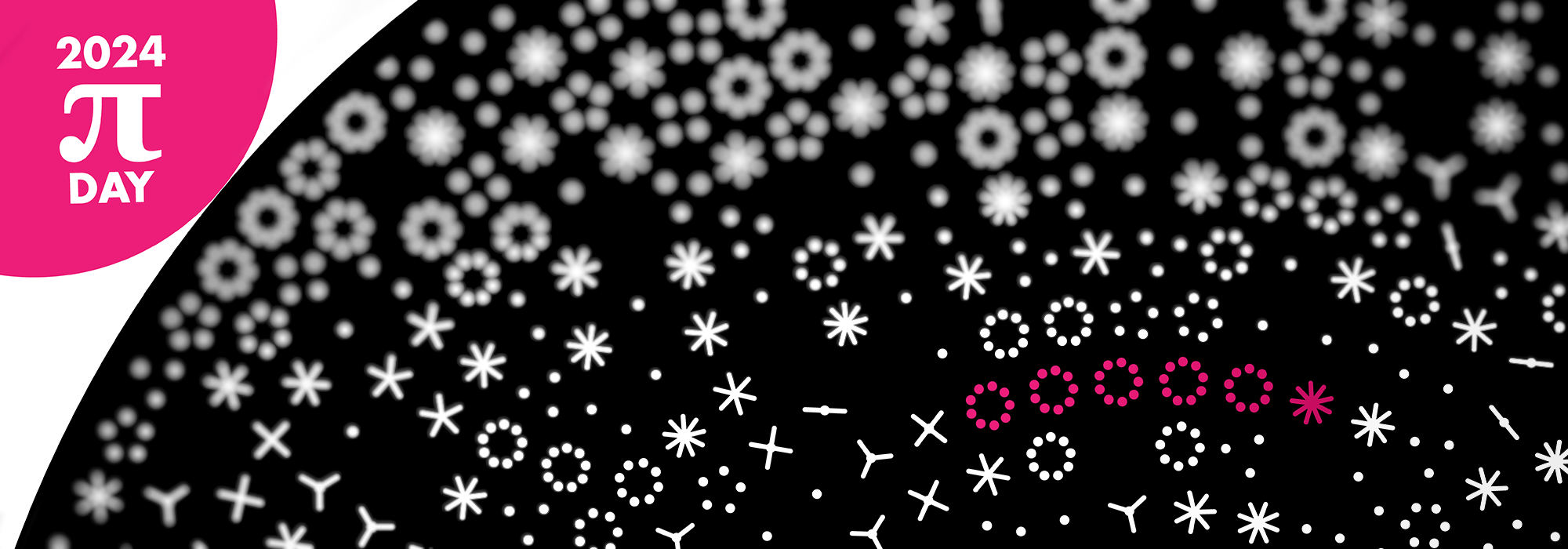
Happy 2024 π Day—
sunflowers ho!
Celebrate π Day (March 14th) and dig into the digit garden. Let's grow something.

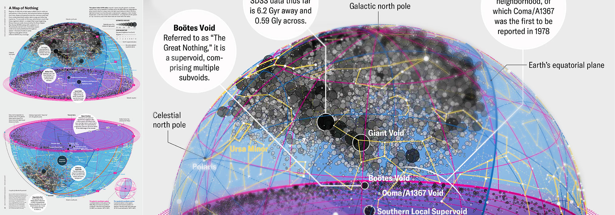
How Analyzing Cosmic Nothing Might Explain Everything
Huge empty areas of the universe called voids could help solve the greatest mysteries in the cosmos.
My graphic accompanying How Analyzing Cosmic Nothing Might Explain Everything in the January 2024 issue of Scientific American depicts the entire Universe in a two-page spread — full of nothing.

The graphic uses the latest data from SDSS 12 and is an update to my Superclusters and Voids poster.
Michael Lemonick (editor) explains on the graphic:
“Regions of relatively empty space called cosmic voids are everywhere in the universe, and scientists believe studying their size, shape and spread across the cosmos could help them understand dark matter, dark energy and other big mysteries.
To use voids in this way, astronomers must map these regions in detail—a project that is just beginning.
Shown here are voids discovered by the Sloan Digital Sky Survey (SDSS), along with a selection of 16 previously named voids. Scientists expect voids to be evenly distributed throughout space—the lack of voids in some regions on the globe simply reflects SDSS’s sky coverage.”
voids
Sofia Contarini, Alice Pisani, Nico Hamaus, Federico Marulli Lauro Moscardini & Marco Baldi (2023) Cosmological Constraints from the BOSS DR12 Void Size Function Astrophysical Journal 953:46.
Nico Hamaus, Alice Pisani, Jin-Ah Choi, Guilhem Lavaux, Benjamin D. Wandelt & Jochen Weller (2020) Journal of Cosmology and Astroparticle Physics 2020:023.
Sloan Digital Sky Survey Data Release 12
Alan MacRobert (Sky & Telescope), Paulina Rowicka/Martin Krzywinski (revisions & Microscopium)
Hoffleit & Warren Jr. (1991) The Bright Star Catalog, 5th Revised Edition (Preliminary Version).
H0 = 67.4 km/(Mpc·s), Ωm = 0.315, Ωv = 0.685. Planck collaboration Planck 2018 results. VI. Cosmological parameters (2018).
constellation figures
stars
cosmology