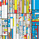
`\pi` Day 2018 Art Posters - Stitched city road maps from around the world


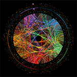
On March 14th celebrate `\pi` Day. Hug `\pi`—find a way to do it.
For those who favour `\tau=2\pi` will have to postpone celebrations until July 26th. That's what you get for thinking that `\pi` is wrong. I sympathize with this position and have `\tau` day art too!
If you're not into details, you may opt to party on July 22nd, which is `\pi` approximation day (`\pi` ≈ 22/7). It's 20% more accurate that the official `\pi` day!
Finally, if you believe that `\pi = 3`, you should read why `\pi` is not equal to 3.

And if you've got to sleep a moment on the road
I will steer for you
And if you want to work the street alone
I'll disappear for you
—Leonard Cohen (I'm Your Man)
This year's is the 30th anniversary of `\pi` day. The theme of the art is bridging the world and making friends. So myself I again team up with my long-time friend and collaborator Jake Lever. I worled with Jake on the snowflake catalogue, where we build a world of flakes.
And so, this year we also build a world. We start with all the roads in the world and stitch them together in brand new ways. And if you walk more than 1 km in this world, you'll likely to be transported somewhere completely different.
This year's `\pi` day song is Trance Groove: Paris. Why? Because it's worth to go to new places—real or imagined.
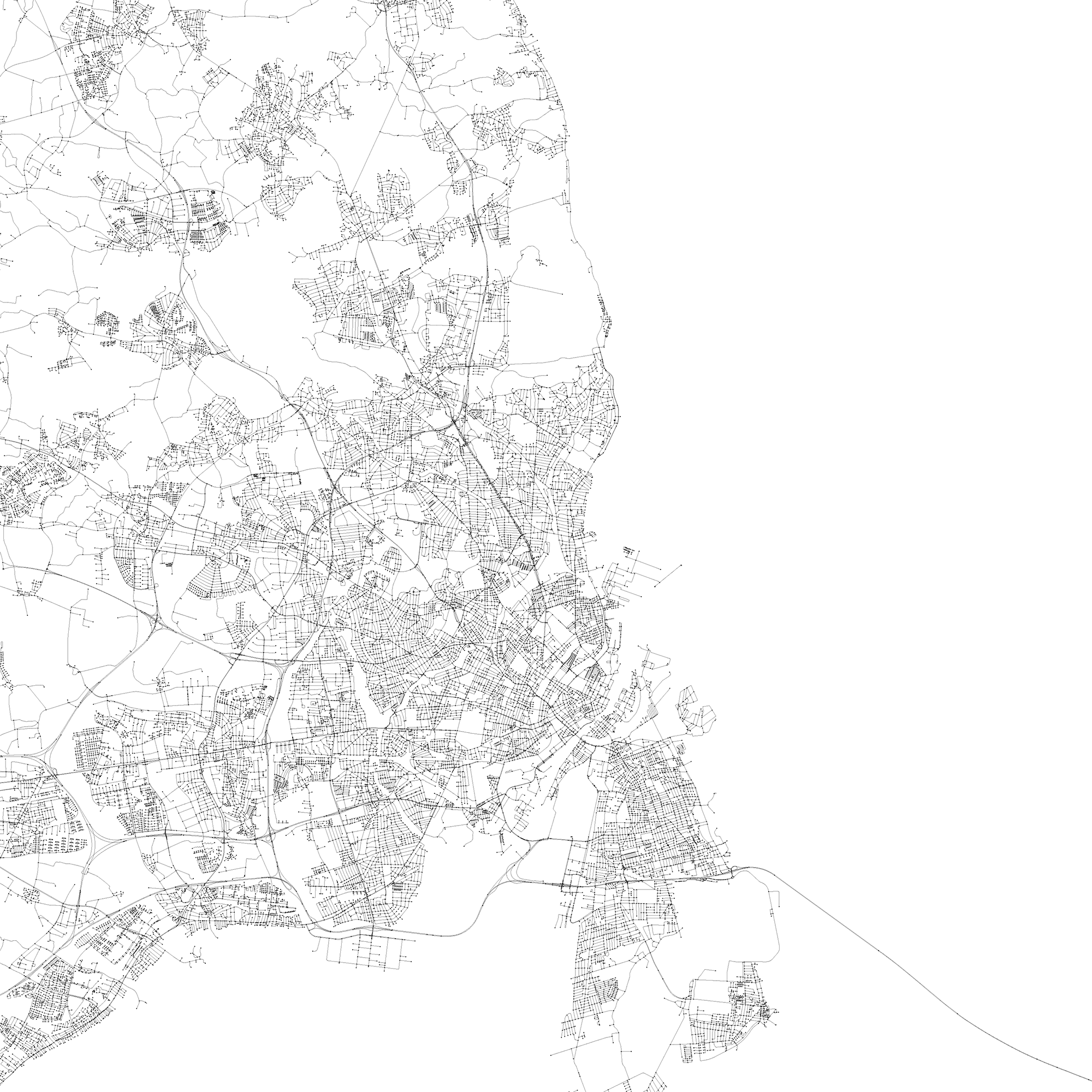
The input data set to the art are all the roads in the world, as obtained from Open Street Map.
Road segments between intersections are represented by polylines and ends at intersections are snapped together to coincide with a resolution of 5–10 meters.
There are 108,366,429 polylines and together they span about 39,930,000 km.
extracting cities
We took 44 cities and sampled a square patch of 0.6 × 0.6 degrees of roads from the data set centered on the longitude and latitude coordinates below. This roughly corresponds to a square of 65 km × 65 km.
These center coordinates might be slightly different from the canonical ones associated with a city—I used Google Maps to center the coordinates on what I felt was a useful center for sampling streets. Below are these coordinates along with the number of polylines extracted.
           CITY    LATITUDE      LONGITUDE  POLYLINES
--------------- ------------ -------------  ---------
      amsterdam  52.38179720    4.90840330   98,965
        bangkok  13.72635950  100.53609560  154,348
      barcelona  41.38759720    2.17333560   86,575
        beijing  39.90487690  116.39331750   49,867
         berlin  52.51864170   13.40732310   64,336
   buenos_aires -34.61566250  -58.50333750  267,432
          cairo  30.05371250   31.23528970  108,524
     copenhagen  55.67346250   12.58781160   45,025
           doha  25.28233490   51.53479620   50,458
         dublin  53.34316360   -6.24433520   44,109
      edinburgh  55.94884870   -3.18828100   34,211
      hong_kong  22.31338230  114.16994610   36,329
       istanbul  41.03592820   28.98158110  190,938
        jakarta  -6.21858830  106.85252890  253,211
   johannesburg -26.20653880   28.05113830  128,840
         lisbon  38.73064000   -9.13667460   98,118
         london  51.50838960   -0.08585320  169,164
    los_angeles  34.04362360 -118.24505510  193,899
         madrid  40.41671290   -3.70329570  112,495
      marrakesh  31.63192610   -7.98895890   17,442
      melbourne -37.88286720  145.11800540  140,817
    mexico_city  19.39741470  -99.15827060  273,477
         moscow  55.75202630   37.61531070   40,043
         mumbai  19.18775070   72.97777590   65,316
        nairobi  -1.28718700   36.83157870   31,317
      new_delhi  28.61245350   77.21369970  262,503
       new_york  40.72187290  -73.92426750  199,652
           nice  43.70006260    7.26974590   25,564
          osaka  34.66944300  135.49965600  376,652
          paris  48.85837360    2.29229260  175,028
         prague  50.08022370   14.43002100   58,659
           rome  41.89659480   12.49983650   81,370
  san_francisco  37.77526950 -122.40966350   82,462
      sao_paulo -23.57343700  -46.63341590  267,742
          seoul  37.54869140  126.99479350  169,593
       shanghai  31.22590500  121.47386710   50,036
  st_petersburg  59.93029690   30.33955910   31,186
      stockholm  59.32318770   18.07408060   48,321
         sydney -33.86772020  151.20734660   76,820
          tokyo  35.69220740  139.75613010  694,893
        toronto  43.66328030  -79.38932030   73,173
      vancouver  49.25782630 -123.19394300   34,081
         vienna  48.20740250   16.37336040   53,669
         warsaw  52.23101840   21.01639680   54,870
Each city's road coordinates were then transformed using the equirectangular projection to make the distance between longitude meridians constant with latitude. This was done by $$ \phi' \leftarrow \phi - \text{avg}(\phi) $$ $$ \lambda' \leftarrow (\lambda - avg(\lambda)) \text{cos} (avg(\phi)) $$
where `\phi` is the latitude and `\lambda` is the longitude. The average is taken over the patch of roads extracted for the city. For all steps below these transformed coordinates were used.
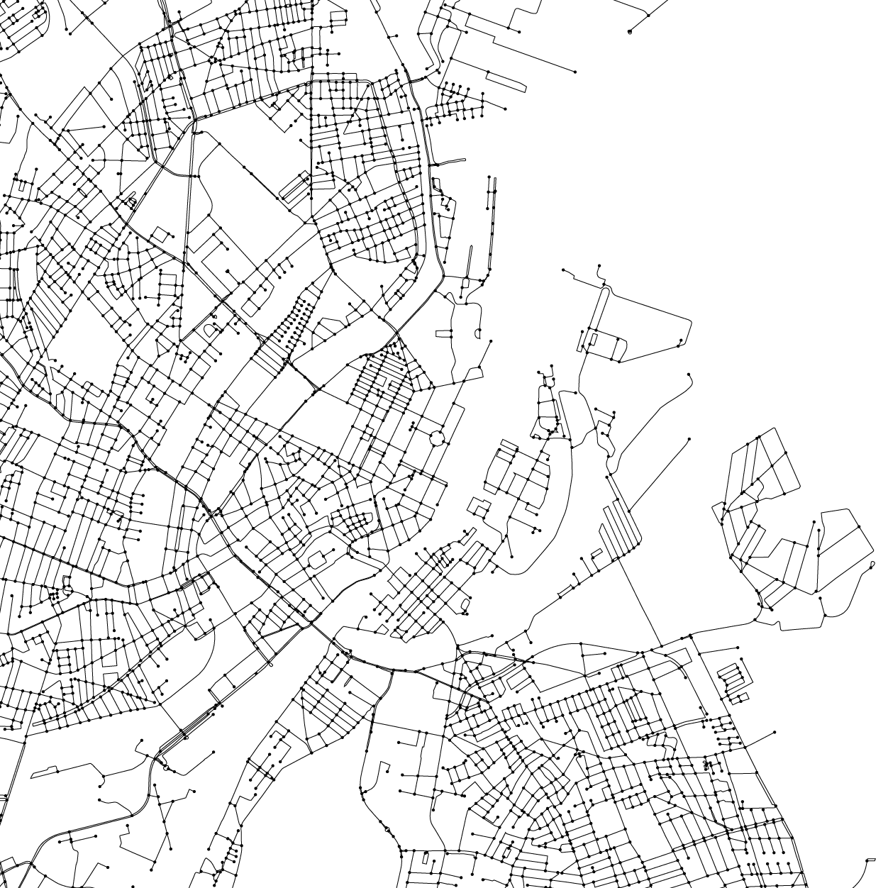
copenhagen
Let's look at one city—Copenhagen—to get a feel for the data set.
In the zoom crop below, you can see the intersections (dots) and the individual polylines that connect the intersections.
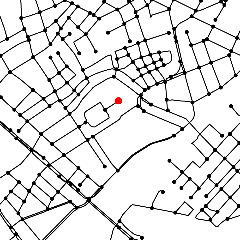
Zooming in even more you can see the Christiansborg Slot, one of the Danish Palaces and the seat of the Danish Parliament (corresponding Google Map view).
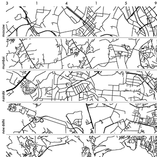
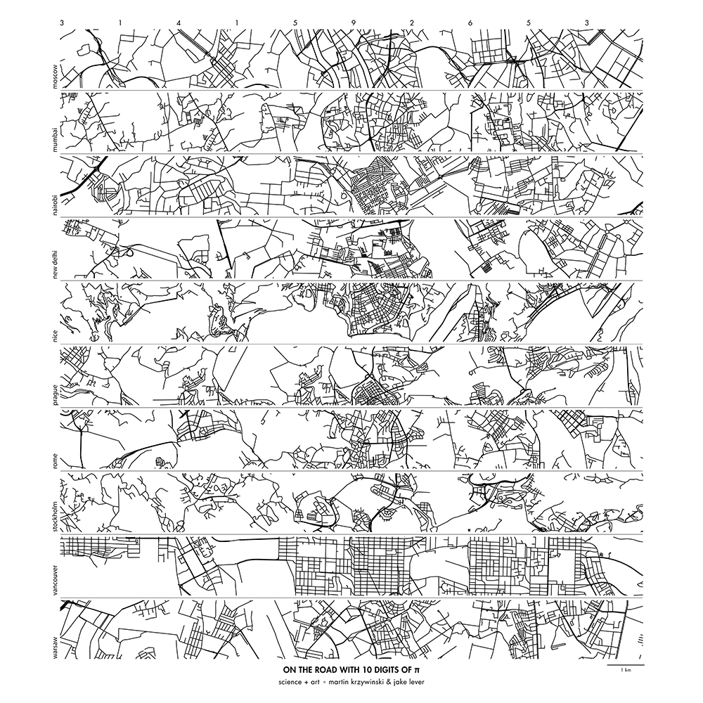
creating city strips
City strips were created by sampling patches of 0.015 × 0.015 degrees (after transformation). This corresponds roughly to 1.7 km.
For each position in the strip, patches were sampled in order of the digits of `\pi` only if the number of polylines in the was `40d \le N < 40(d+1)-1` where `d` is the digit of `\pi`. Patches for `d=9` only need to have `360 \le N` polylines.
For example, the first patch is assigned to `d=3` and it must have `120 \le N < 159` polylines. The second patch is sampled so that its density is `40 \le N < 79` because it is associated with the next digit, `d=1`.
Further selection on acceptable patches is performed so that the streets line up with the previous patch. Minor local adjustments and stitching are performed to make the join appear seamless.
Below is an example of a set of city strips for Amsterdam, Bangkok, Beijing, Berlin, Copenhagen, Edinburgh, Hong Kong, Johannesburg, Marrakesh and Melbourne.
 buy artwork
Below I zoom in on a portion of the city strips above to show the result of the stitching—individual street patches are outlined in blue squares.
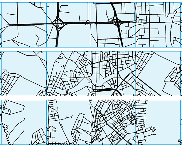
It's interesting to see that some patches (e.g. 4th one on the bottom strip, which is Copenhagen) don't necessarily have roads that across the patch horizontally.
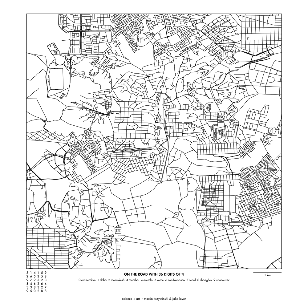
creating world patches
World patches are a two-dimension version of city strips but they use more than one city.
Patches are sampled from cities based on the order of the digits of `\pi`, as arranged on a 6 × 6 grid. For example, the first row of patches corresponds to 314159 and the second 265358. Each digit is assigned to a city from which the corresponding patch is sampled.
As for city strips, patches are selected only if they align with previous patches. This is now trickier to do in two-dimensions because we must match a selected patch with up to two other patches already placed.
Unlike for city strips, there is no selection made for street density.
Below is a world patch using the following digit-to-city assignment: 0:Amsterdam, 1:Doha, 2:Marrakesh, 3:Mumbai, 4:Nairobi, 5:Rome, 6:San Francisco, 7:Seoul, 8:Shanghai and 9:Vancouver.
 buy artwork
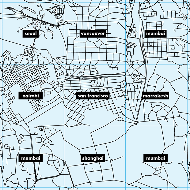
Below I zoom in on patches in the center of the image and show the cities from which the patches were sampled.
Nasa to send our human genome discs to the Moon
We'd like to say a ‘cosmic hello’: mathematics, culture, palaeontology, art and science, and ... human genomes.


Comparing classifier performance with baselines
All animals are equal, but some animals are more equal than others. —George Orwell
This month, we will illustrate the importance of establishing a baseline performance level.
Baselines are typically generated independently for each dataset using very simple models. Their role is to set the minimum level of acceptable performance and help with comparing relative improvements in performance of other models.

Unfortunately, baselines are often overlooked and, in the presence of a class imbalance5, must be established with care.
Megahed, F.M, Chen, Y-J., Jones-Farmer, A., Rigdon, S.E., Krzywinski, M. & Altman, N. (2024) Points of significance: Comparing classifier performance with baselines. Nat. Methods 20.
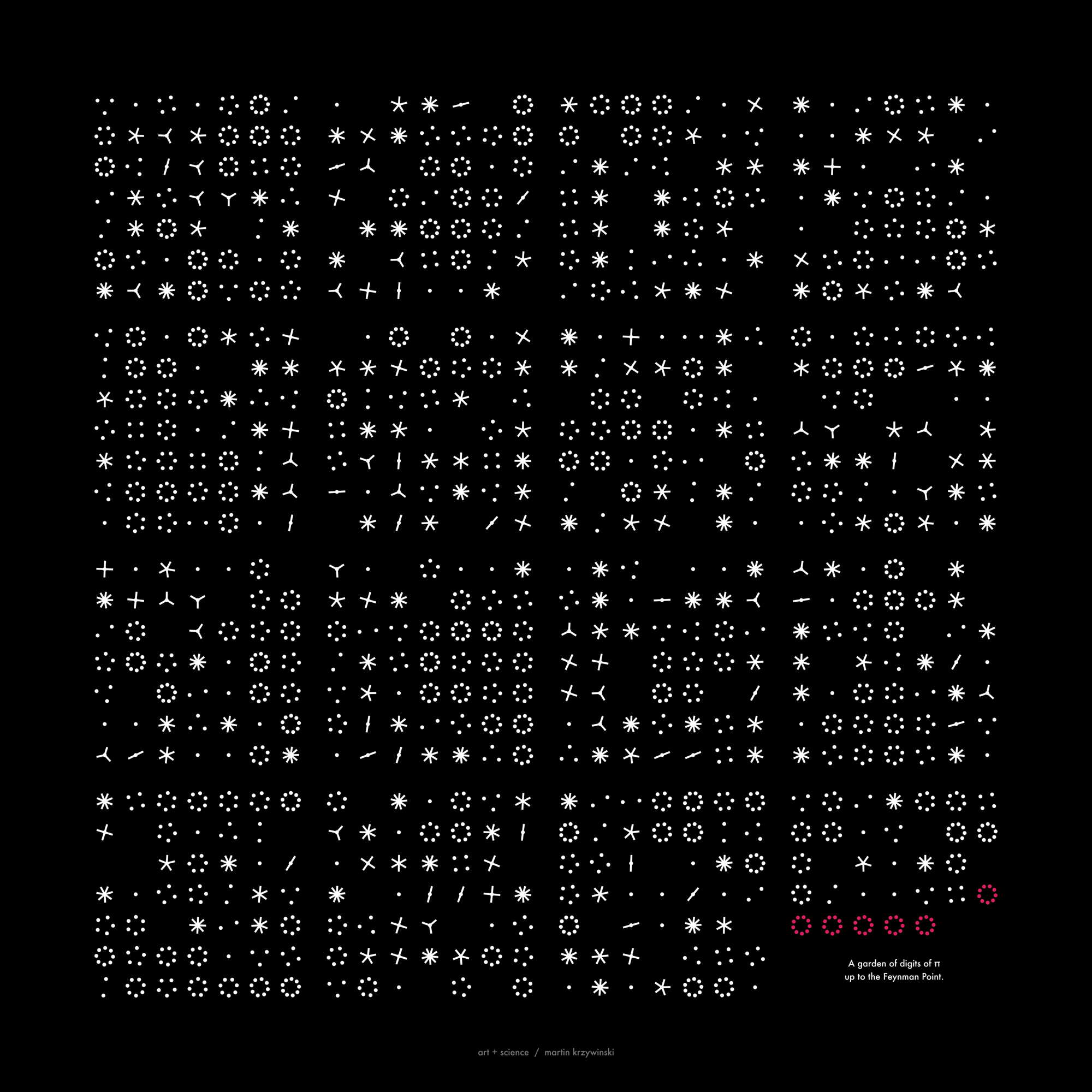
Happy 2024 π Day—
sunflowers ho!
Celebrate π Day (March 14th) and dig into the digit garden. Let's grow something.

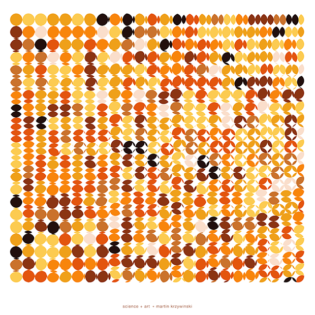
How Analyzing Cosmic Nothing Might Explain Everything
Huge empty areas of the universe called voids could help solve the greatest mysteries in the cosmos.
My graphic accompanying How Analyzing Cosmic Nothing Might Explain Everything in the January 2024 issue of Scientific American depicts the entire Universe in a two-page spread — full of nothing.

The graphic uses the latest data from SDSS 12 and is an update to my Superclusters and Voids poster.
Michael Lemonick (editor) explains on the graphic:
“Regions of relatively empty space called cosmic voids are everywhere in the universe, and scientists believe studying their size, shape and spread across the cosmos could help them understand dark matter, dark energy and other big mysteries.
To use voids in this way, astronomers must map these regions in detail—a project that is just beginning.
Shown here are voids discovered by the Sloan Digital Sky Survey (SDSS), along with a selection of 16 previously named voids. Scientists expect voids to be evenly distributed throughout space—the lack of voids in some regions on the globe simply reflects SDSS’s sky coverage.”
voids
Sofia Contarini, Alice Pisani, Nico Hamaus, Federico Marulli Lauro Moscardini & Marco Baldi (2023) Cosmological Constraints from the BOSS DR12 Void Size Function Astrophysical Journal 953:46.
Nico Hamaus, Alice Pisani, Jin-Ah Choi, Guilhem Lavaux, Benjamin D. Wandelt & Jochen Weller (2020) Journal of Cosmology and Astroparticle Physics 2020:023.
Sloan Digital Sky Survey Data Release 12
Alan MacRobert (Sky & Telescope), Paulina Rowicka/Martin Krzywinski (revisions & Microscopium)
Hoffleit & Warren Jr. (1991) The Bright Star Catalog, 5th Revised Edition (Preliminary Version).
H0 = 67.4 km/(Mpc·s), Ωm = 0.315, Ωv = 0.685. Planck collaboration Planck 2018 results. VI. Cosmological parameters (2018).
constellation figures
stars
cosmology
Error in predictor variables
It is the mark of an educated mind to rest satisfied with the degree of precision that the nature of the subject admits and not to seek exactness where only an approximation is possible. —Aristotle
In regression, the predictors are (typically) assumed to have known values that are measured without error.
Practically, however, predictors are often measured with error. This has a profound (but predictable) effect on the estimates of relationships among variables – the so-called “error in variables” problem.

Error in measuring the predictors is often ignored. In this column, we discuss when ignoring this error is harmless and when it can lead to large bias that can leads us to miss important effects.
Altman, N. & Krzywinski, M. (2024) Points of significance: Error in predictor variables. Nat. Methods 20.
Background reading
Altman, N. & Krzywinski, M. (2015) Points of significance: Simple linear regression. Nat. Methods 12:999–1000.
Lever, J., Krzywinski, M. & Altman, N. (2016) Points of significance: Logistic regression. Nat. Methods 13:541–542 (2016).
Das, K., Krzywinski, M. & Altman, N. (2019) Points of significance: Quantile regression. Nat. Methods 16:451–452.
Convolutional neural networks
Nature uses only the longest threads to weave her patterns, so that each small piece of her fabric reveals the organization of the entire tapestry. – Richard Feynman
Following up on our Neural network primer column, this month we explore a different kind of network architecture: a convolutional network.
The convolutional network replaces the hidden layer of a fully connected network (FCN) with one or more filters (a kind of neuron that looks at the input within a narrow window).
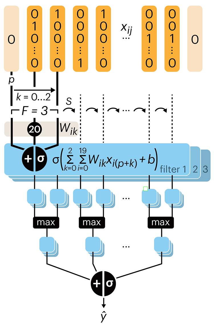
Even through convolutional networks have far fewer neurons that an FCN, they can perform substantially better for certain kinds of problems, such as sequence motif detection.
Derry, A., Krzywinski, M & Altman, N. (2023) Points of significance: Convolutional neural networks. Nature Methods 20:1269–1270.
Background reading
Derry, A., Krzywinski, M. & Altman, N. (2023) Points of significance: Neural network primer. Nature Methods 20:165–167.
Lever, J., Krzywinski, M. & Altman, N. (2016) Points of significance: Logistic regression. Nature Methods 13:541–542.