`\pi` Day 2015 Art Posters


On March 14th celebrate `\pi` Day. Hug `\pi`—find a way to do it.
For those who favour `\tau=2\pi` will have to postpone celebrations until July 26th. That's what you get for thinking that `\pi` is wrong. I sympathize with this position and have `\tau` day art too!
If you're not into details, you may opt to party on July 22nd, which is `\pi` approximation day (`\pi` ≈ 22/7). It's 20% more accurate that the official `\pi` day!
Finally, if you believe that `\pi = 3`, you should read why `\pi` is not equal to 3.

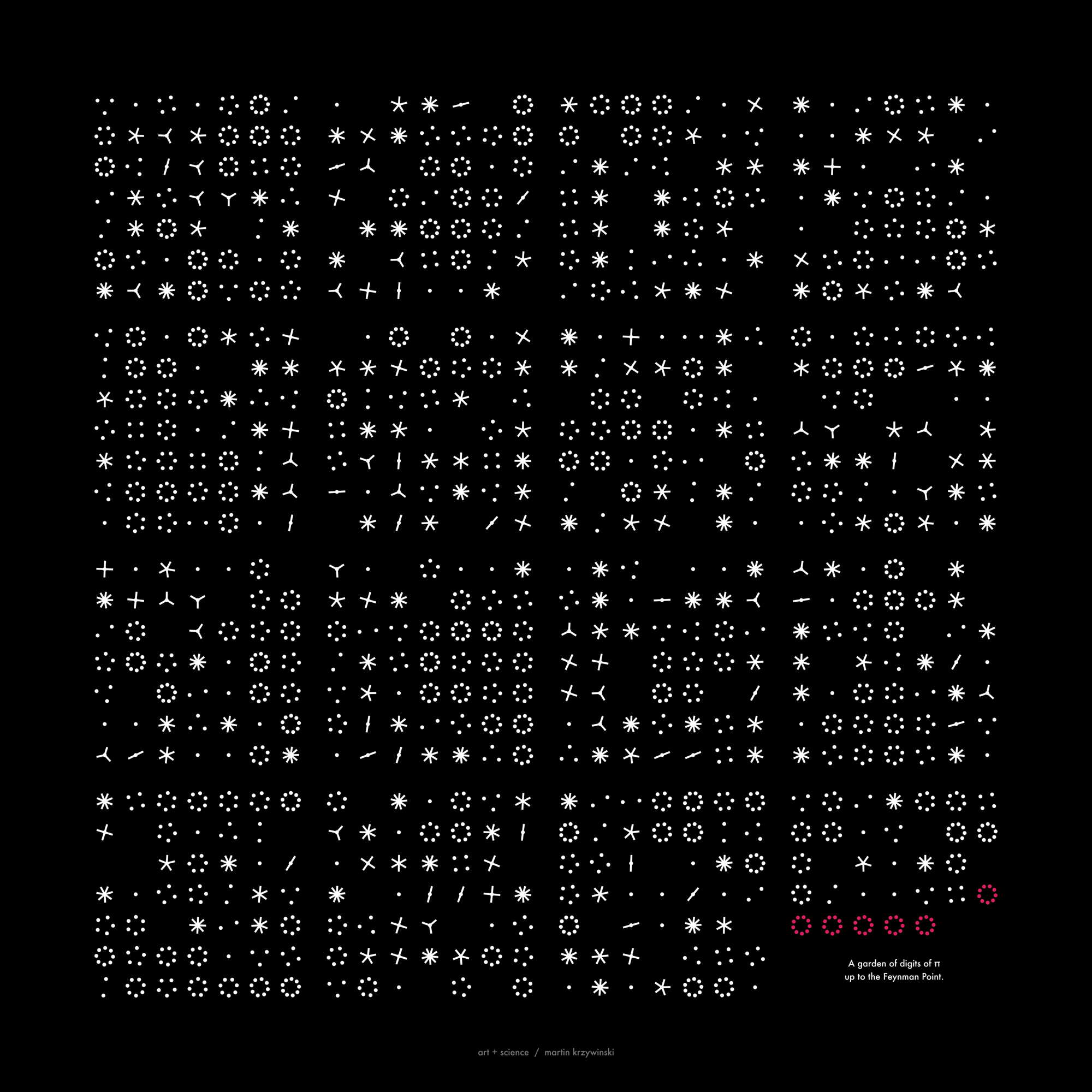
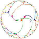
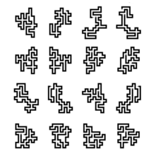
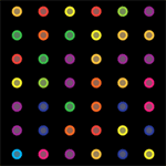
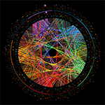
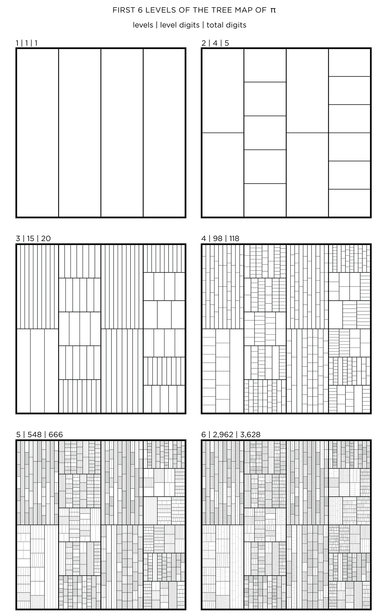
Not a circle in sight in the 2015 `\pi` day art. Try to figure out how up to 612,330 digits are encoded before reading about the method. `\pi`'s transcendental friends `\phi` and `e` are there too—golden and natural. Get it?
This year's `\pi` day is particularly special. The digits of time specify a precise time if the date is encoded in North American day-month-year convention: 3-14-15 9:26:53.
The art has been featured in Ana Swanson's Wonkblog article at the Washington Post—10 Stunning Images Show The Beauty Hidden in `\pi`.
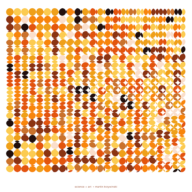
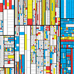
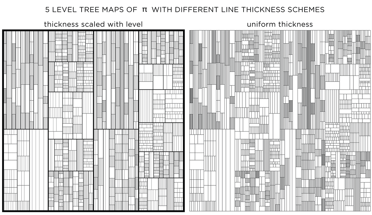
We begin with a square and progressively divide it. At each stage, the digit in `pi` is used to determine how many lines are used in the division. The thickness of the lines used for the divisions can be attenuated for higher levels to give the treemap some texture.
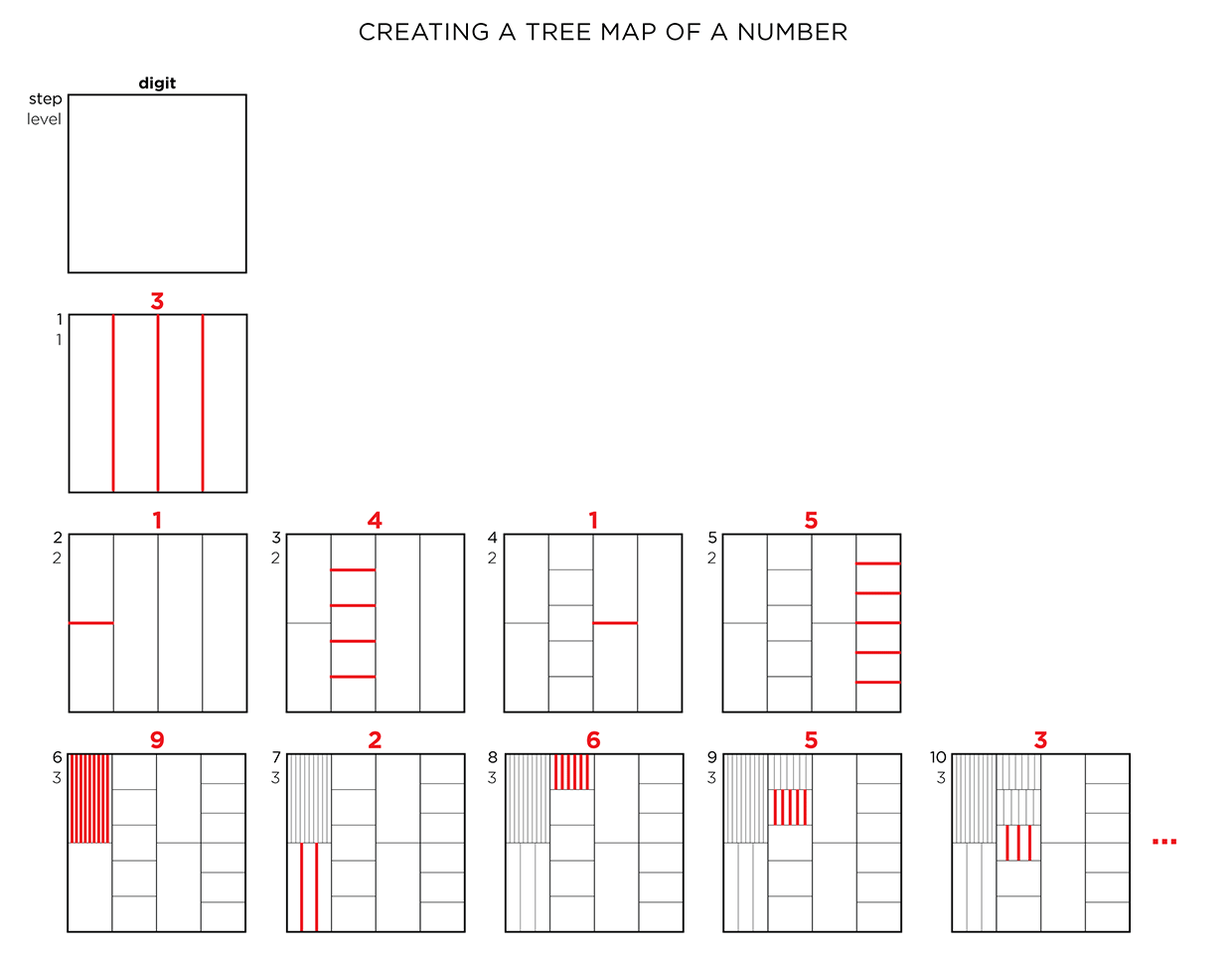
This method of encoding data is known as treemapping. Typically, it is used to encode hierarchical information, such as hard disk spac usage, where the divisions correspond to the total size of files within directories.
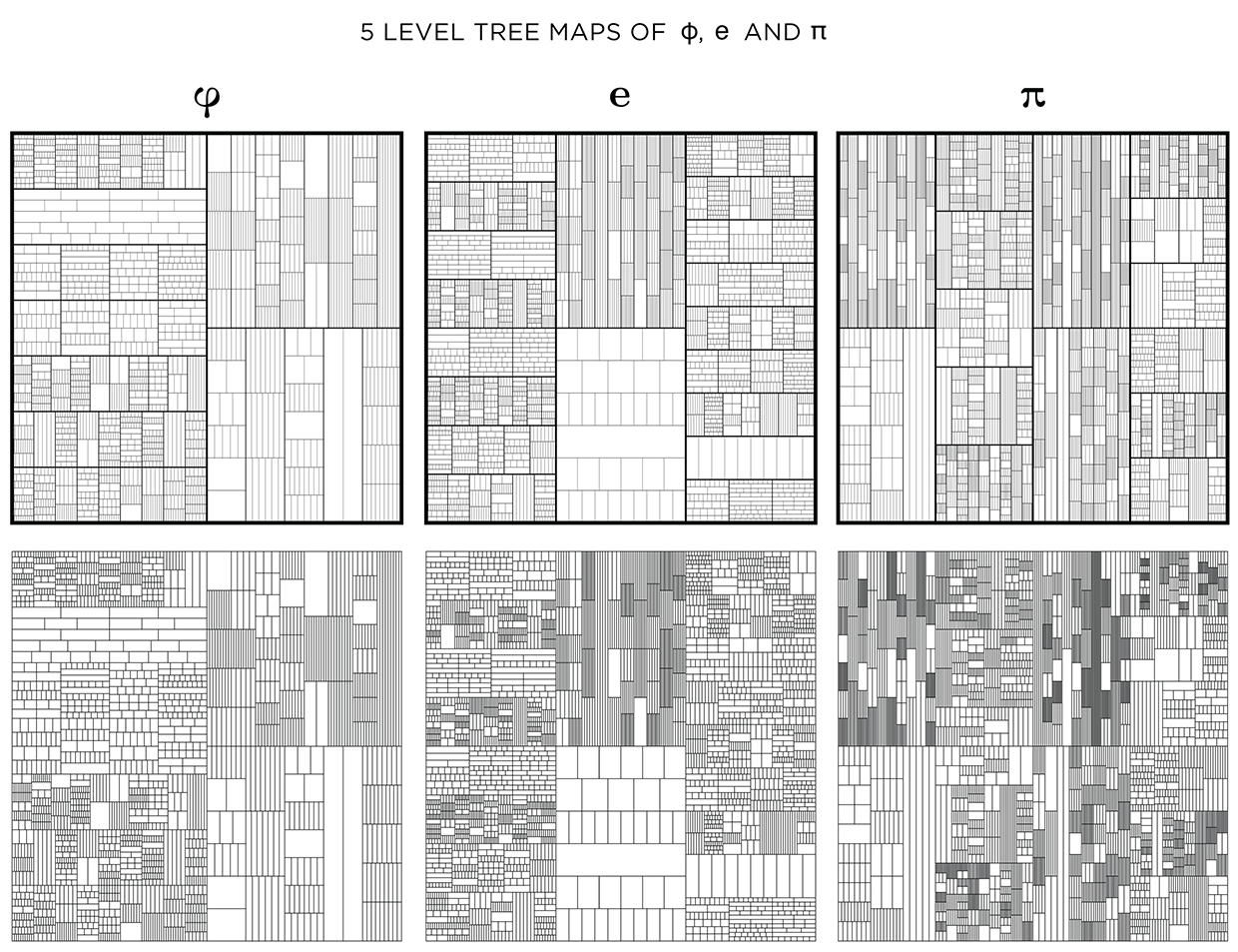
This kind of treemap can be made from any number. Below I show 6 level maps for `pi`, `phi` (Golden ratio) and `e` (base of natural logarithm).
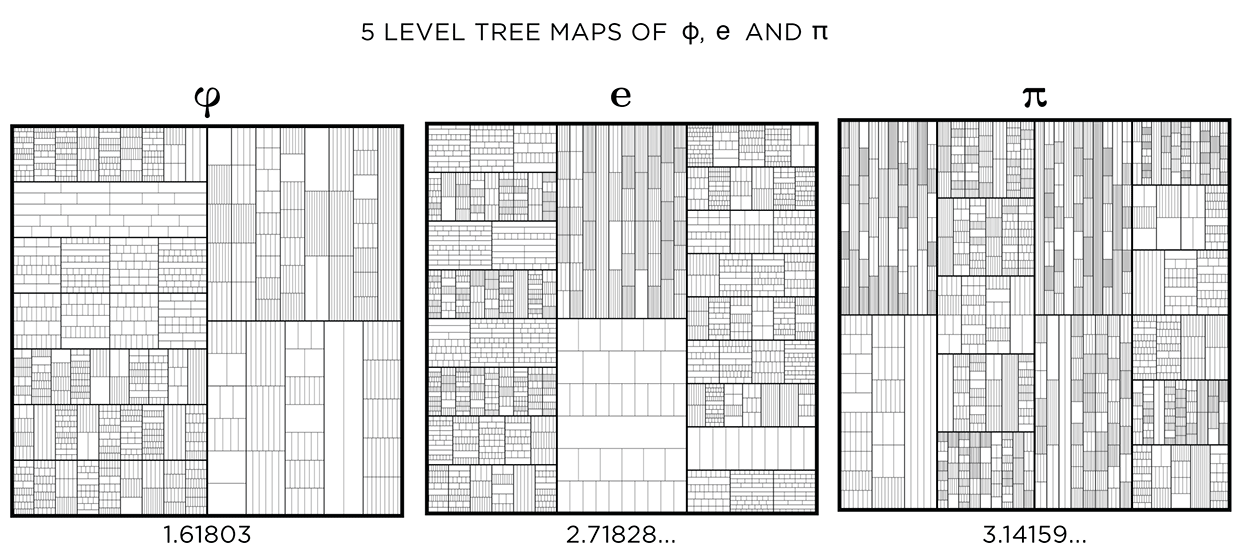
The number of digits per level, `n_i` and total digits, `N_i` in the tree map for `pi`, `phi` and `e` is shown below for levels `i = 1 .. 6`.
           PI             PHI              e
i     n_i    N_i      n_i    N_i      n_i    N_i
1       1      1        1      1        1      1
2       4      5        2      3        3      4
3      15     20        9     12       19     23
4      98    118       59     71       96    119
5     548    666      330    401      574    693
6    2962   3628     1857   2258     3162   3855
7   16616  20244    10041  12299    17541  21396
8   91225 111469
9  500861 612330
Dividing the map
In all the treemaps above, the divisions were made uniformly for each rectangle. With uniform division, the lines that divide a shape are evenly spaced. With randomized division, the placement of lines is randomized, while still ensuring that lines do not coincide.
A multiplier, such as `phi` (Golden Ratio), can be used to control the division. In this case, the first division is made at 1/`phi` (0.62/0.38 split) and the remaining rectangle (0.38) is further divided at `/`phi` (0.24/0.14 split).
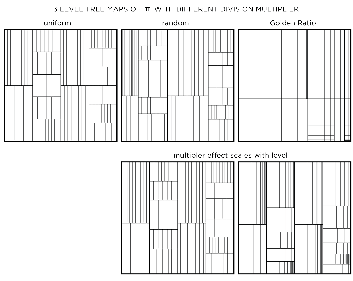
Using a non-uniform multipler is one way to embed another number in the art.
When a multiplier like `phi` is used, divisions at the top levels create very large rectangles. To attenuate this, the effect of the multiplier can be weighted by the level. Regardless of what multiplier is used, the first level is always uniformly divided. Division at subsequent levels incorporates more of the multiplier effect.
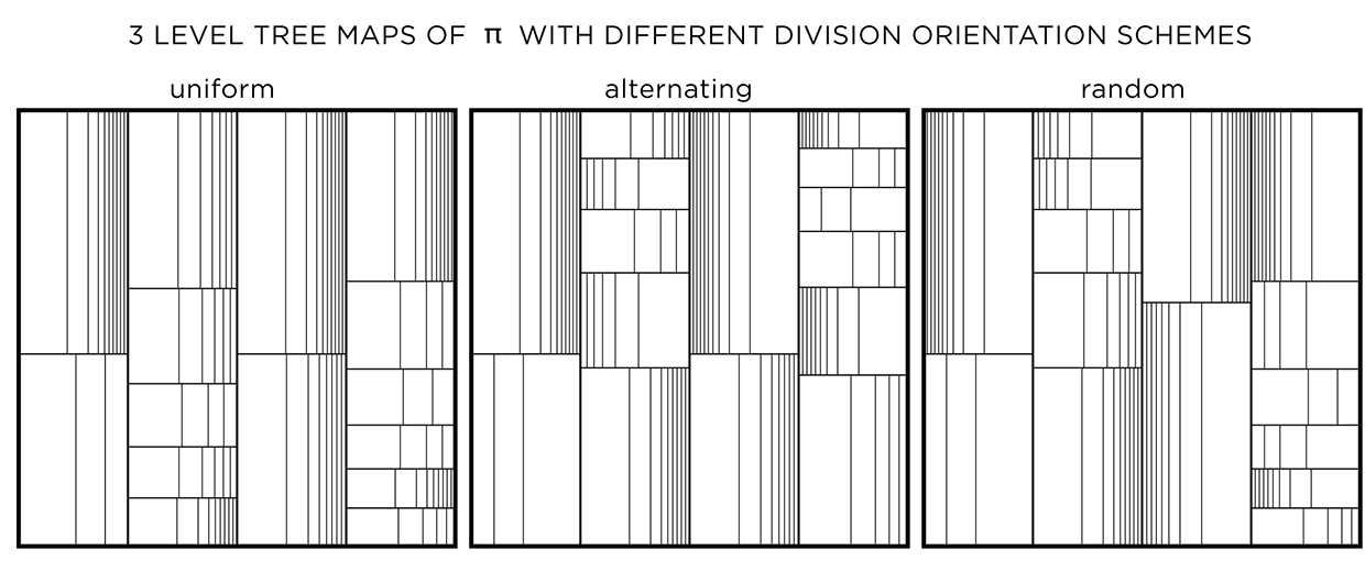
The orientation of the division can be uniform (same for a layer and alternating across layers), alternating (alternating across and within a layer) or random. This modification has an effect only if the divisions are not uniform.
Adjusting line thickness
To emphasize the layers, a different line thickness can be used. When lines are drawn progressively thinner with each layer, detail is controlled and the map has more texture.
When all lines have the same thickness, it is harder to distinguish levels.
You could see this as a challenge! Below I show the treemaps for `pi`, `phi` and `e` with and without stroke modulation.
When displayed at a low resolution (the image below is 620 pixels across), shapes at higher levels appear darker because the distance between the lines within is close to (or smaller) than a pixel. By matching the line thickness to the image resolution, you can control how dark the smallest divisions appear.

Adding color
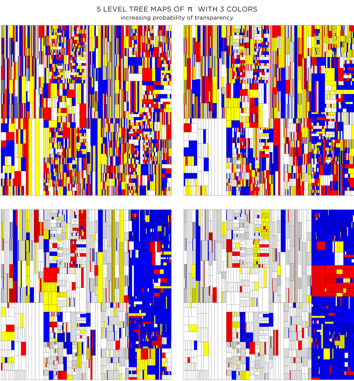
Adding color can make things better, or worse. Dropping color randomly, without respect for the level structure of the treemap, creates a mess.
We can rescue things by increasing the probability that a given rectangle will be made transparent—this will allow the color of the rectangle below to show through. Additionally, by drawing the layers in increasing order, smaller rectangles are drawn on top of bigger ones, giving a sense of recursive subdivision.
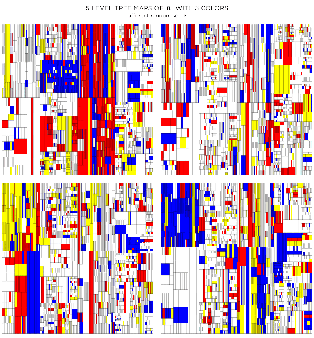
Because the color is assigned randomly, various instances of the treemap can be made. The maps below have the same proportion of colors and transparency (same as the first image in second row in the figure above) and vary only by the random seed to pick colors.
Coloring using adjacency graph
The color assignments above were random. For each shape the probability of choosing a given color (transparent, white, yellow, red, blue) was the same.
Color choice for a shape can also be influenced by the color of neighbouring shapes. To do this, we need to create a graph that captures the adjacency relationship between all the shapes at each level. Below I show the first 4 levels of the `pi` treemap and their adjacency graphs. In each graph, the node corresponds to a shape and an edge between nodes indicates that the shapes share a part of their edge. Shapes that touch only at a corner are not considered adjacent.
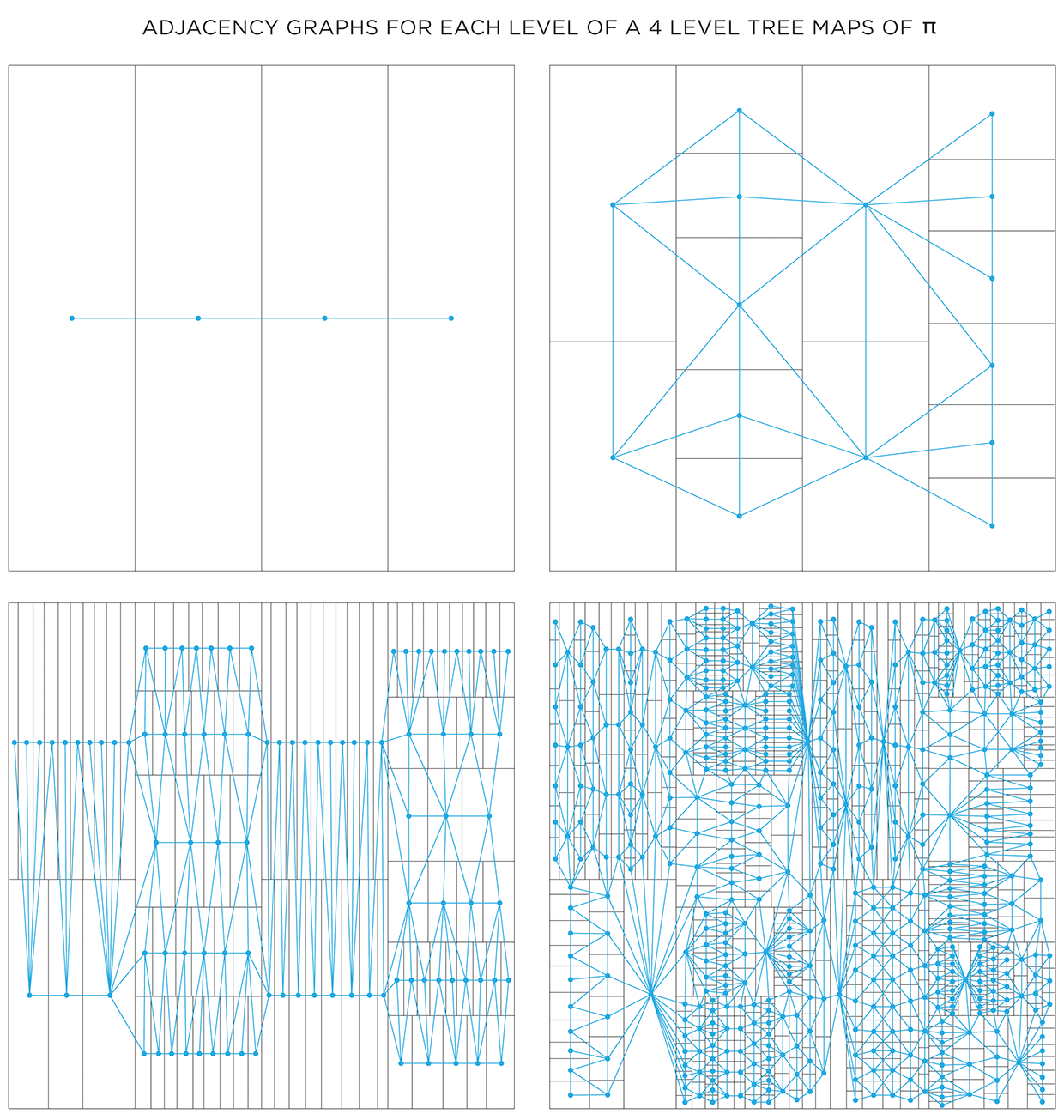
One way in which the graphs can be used is to attempt to color each layer using at most 4 colors. The 4 color theorem tells us that only 4 unique colors are required to color maps such as these in a way that no two neighbouring shapes have the same color.
It turns out that the full algorithm of coloring a map with only 4 colors is complicated, but reasonably simple options exist.. For the maps here, I used the DSATUR (maximum degree of saturation) approach.
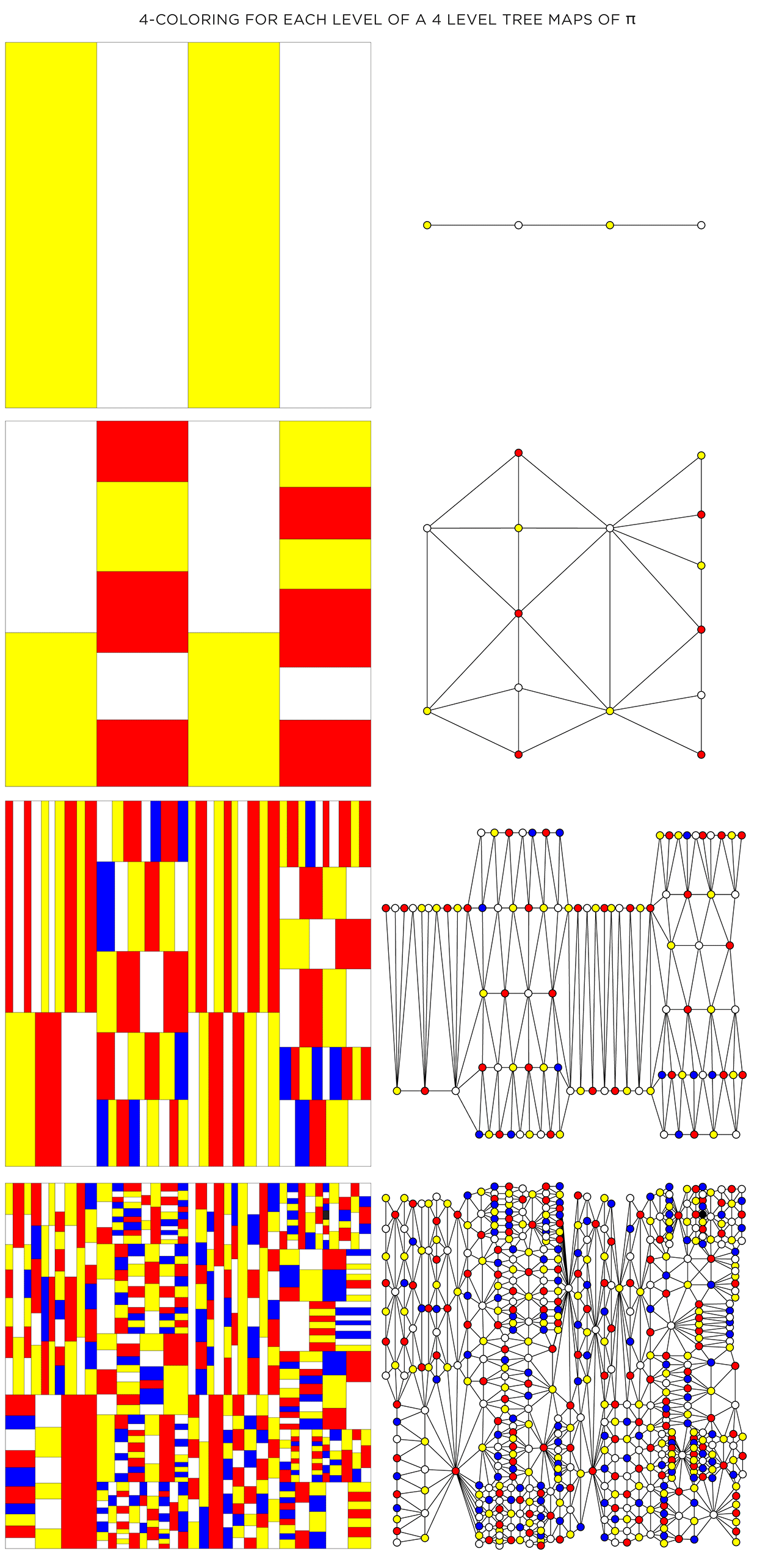
The DSATUR algorithm works well, but does not guarantee a 4-color solution. It performs no backtracking. If you look carefully, one of the rectangles in the 4th layer (top right quadrant in the graph) required a 5th color (shown black).
Nasa to send our human genome discs to the Moon
We'd like to say a ‘cosmic hello’: mathematics, culture, palaeontology, art and science, and ... human genomes.


Comparing classifier performance with baselines
All animals are equal, but some animals are more equal than others. —George Orwell
This month, we will illustrate the importance of establishing a baseline performance level.
Baselines are typically generated independently for each dataset using very simple models. Their role is to set the minimum level of acceptable performance and help with comparing relative improvements in performance of other models.

Unfortunately, baselines are often overlooked and, in the presence of a class imbalance5, must be established with care.
Megahed, F.M, Chen, Y-J., Jones-Farmer, A., Rigdon, S.E., Krzywinski, M. & Altman, N. (2024) Points of significance: Comparing classifier performance with baselines. Nat. Methods 20.
Happy 2024 π Day—
sunflowers ho!
Celebrate π Day (March 14th) and dig into the digit garden. Let's grow something.

How Analyzing Cosmic Nothing Might Explain Everything
Huge empty areas of the universe called voids could help solve the greatest mysteries in the cosmos.
My graphic accompanying How Analyzing Cosmic Nothing Might Explain Everything in the January 2024 issue of Scientific American depicts the entire Universe in a two-page spread — full of nothing.

The graphic uses the latest data from SDSS 12 and is an update to my Superclusters and Voids poster.
Michael Lemonick (editor) explains on the graphic:
“Regions of relatively empty space called cosmic voids are everywhere in the universe, and scientists believe studying their size, shape and spread across the cosmos could help them understand dark matter, dark energy and other big mysteries.
To use voids in this way, astronomers must map these regions in detail—a project that is just beginning.
Shown here are voids discovered by the Sloan Digital Sky Survey (SDSS), along with a selection of 16 previously named voids. Scientists expect voids to be evenly distributed throughout space—the lack of voids in some regions on the globe simply reflects SDSS’s sky coverage.”
voids
Sofia Contarini, Alice Pisani, Nico Hamaus, Federico Marulli Lauro Moscardini & Marco Baldi (2023) Cosmological Constraints from the BOSS DR12 Void Size Function Astrophysical Journal 953:46.
Nico Hamaus, Alice Pisani, Jin-Ah Choi, Guilhem Lavaux, Benjamin D. Wandelt & Jochen Weller (2020) Journal of Cosmology and Astroparticle Physics 2020:023.
Sloan Digital Sky Survey Data Release 12
Alan MacRobert (Sky & Telescope), Paulina Rowicka/Martin Krzywinski (revisions & Microscopium)
Hoffleit & Warren Jr. (1991) The Bright Star Catalog, 5th Revised Edition (Preliminary Version).
H0 = 67.4 km/(Mpc·s), Ωm = 0.315, Ωv = 0.685. Planck collaboration Planck 2018 results. VI. Cosmological parameters (2018).
constellation figures
stars
cosmology
Error in predictor variables
It is the mark of an educated mind to rest satisfied with the degree of precision that the nature of the subject admits and not to seek exactness where only an approximation is possible. —Aristotle
In regression, the predictors are (typically) assumed to have known values that are measured without error.
Practically, however, predictors are often measured with error. This has a profound (but predictable) effect on the estimates of relationships among variables – the so-called “error in variables” problem.

Error in measuring the predictors is often ignored. In this column, we discuss when ignoring this error is harmless and when it can lead to large bias that can leads us to miss important effects.
Altman, N. & Krzywinski, M. (2024) Points of significance: Error in predictor variables. Nat. Methods 20.
Background reading
Altman, N. & Krzywinski, M. (2015) Points of significance: Simple linear regression. Nat. Methods 12:999–1000.
Lever, J., Krzywinski, M. & Altman, N. (2016) Points of significance: Logistic regression. Nat. Methods 13:541–542 (2016).
Das, K., Krzywinski, M. & Altman, N. (2019) Points of significance: Quantile regression. Nat. Methods 16:451–452.
Convolutional neural networks
Nature uses only the longest threads to weave her patterns, so that each small piece of her fabric reveals the organization of the entire tapestry. – Richard Feynman
Following up on our Neural network primer column, this month we explore a different kind of network architecture: a convolutional network.
The convolutional network replaces the hidden layer of a fully connected network (FCN) with one or more filters (a kind of neuron that looks at the input within a narrow window).
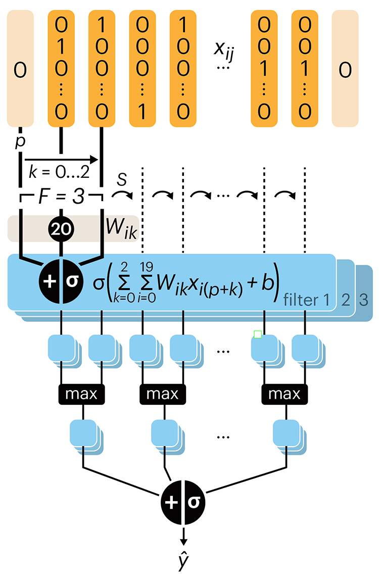
Even through convolutional networks have far fewer neurons that an FCN, they can perform substantially better for certain kinds of problems, such as sequence motif detection.
Derry, A., Krzywinski, M & Altman, N. (2023) Points of significance: Convolutional neural networks. Nature Methods 20:1269–1270.
Background reading
Derry, A., Krzywinski, M. & Altman, N. (2023) Points of significance: Neural network primer. Nature Methods 20:165–167.
Lever, J., Krzywinski, M. & Altman, N. (2016) Points of significance: Logistic regression. Nature Methods 13:541–542.