

Obesity — a Data Story
Rescuing nuanced pattterns from the clutches of a bad graphic
Here, I go through the details of the stories and their design in my poster of “BMI and Obesity Prevalence for 185 countries”.
a legend that teaches you something
As you'll see the interpretive text of the poster is itself like a mini-poster. It shows data vignettes from the poster and provides a brief explanation.
The legend doesn't simply explain what is shown. It highlights interesting observations and aims to teach you something. The aim is for you to get something out of this even if you don't look at the rest of the poster.
what is shown? how is it shown?
From the title, the poster is obviously about BMI and obesity. So, the first thing to do is define the BMI, whose equation `\textrm{BMI} = w(\textrm{kg})^2/h(\textrm{m})` can be written out in full.
Immediately after this, to place the absolute BMI values in context, I show the ranges for underweight, normal, overweight and obese categories.
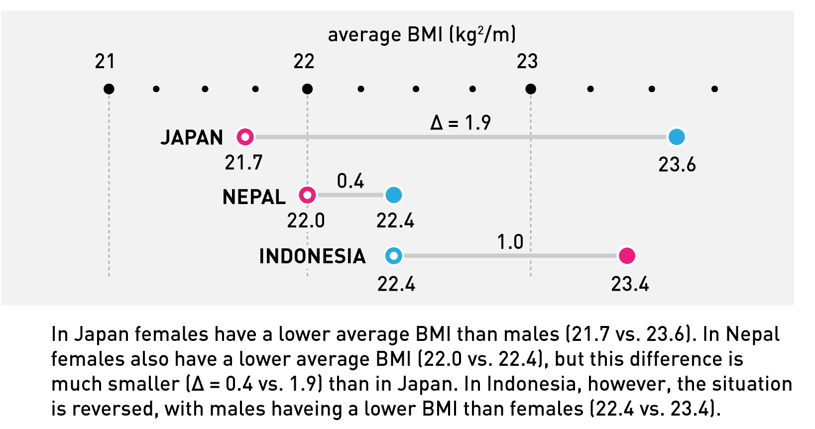
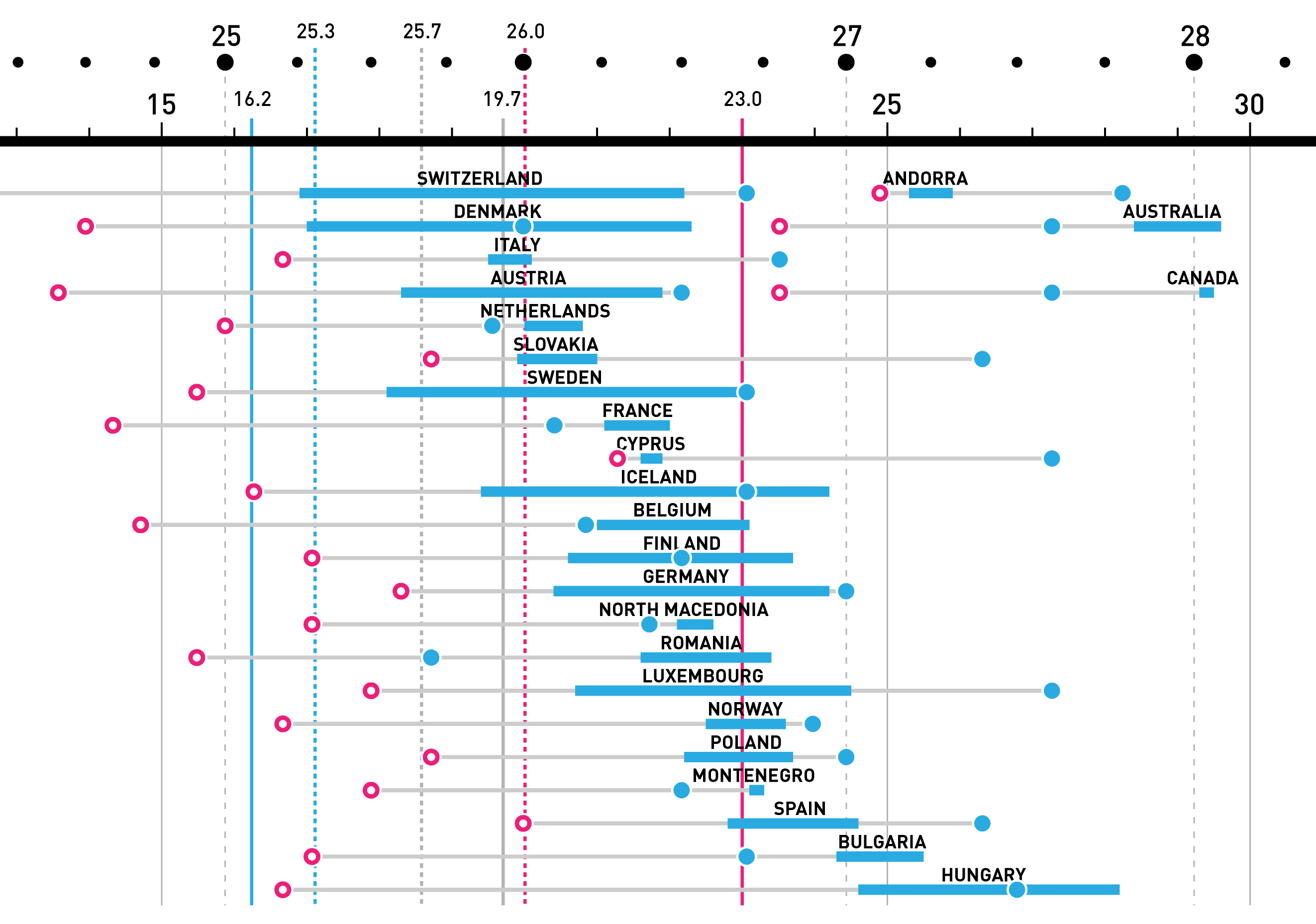
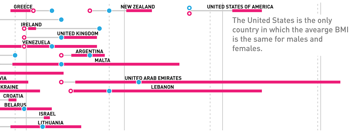
The next paragraph describes a key feature of the poster — for a given country, BMI values for males and females are shown separately. BMI is shown as a dot and colored by gender: females are encoded by magenta and males by blue (because, why not). Critically, a solid dot indicates that the BMI in that gender is higher. For example, a solid magenta dot indicates that BMI in that country is higher in females.
an example of what is being shown — BMI
Right after explaining how BMI is encoded, I show an example of three countries.
First, we look at Japan, where female BMI is lower. The vignette shows both genders' BMI values and their difference.
I then look at Nepal, which has the same trend as Japan (female BMI is lower) but this difference in Nepal is much smaller.
The last country is Indonesia, where the trend is reversed. Here, male BMI is higher.
This choice of countries is deliberate. They're reasonably recognizable and their BMI ranges are similar so the data in the legend is compact. I sensitize you to two patterns: which gender has the higher BMI and how large is the difference between genders?
Notice that the tick marks on the BMI axis are little dots and BMI is encoded by dots. This is not a coincidence.
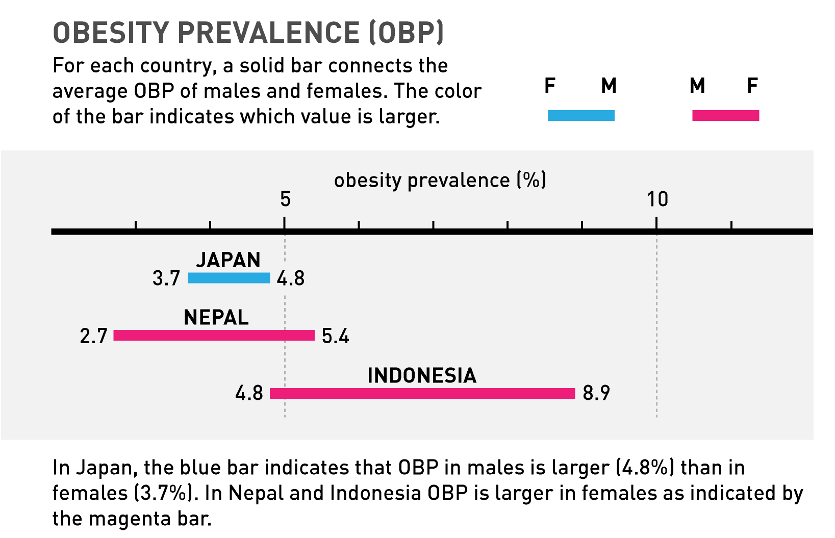
an extension to what is being shown — obesity
The poster also shows obesity statistics. This category has already been explained above (BMI ≥ 30).
Obesity is shown by a bar and the choice of color is the same as for BMI. The color of the bar shows in which gender obesity is more prevalent.
We see that in Japan the range of obesity is very small and males tend to be more obese than females. In Nepal the range is larger and in Indonesia larger still. And in both obesity prevalence in females is higher.
I introduce the OBP acronym (obesity prevalence) to keep text short. It's the only shortcut I allow myself.
Obesity is shown by a bar and the obesity axis is a bar. This is not a coincidence.
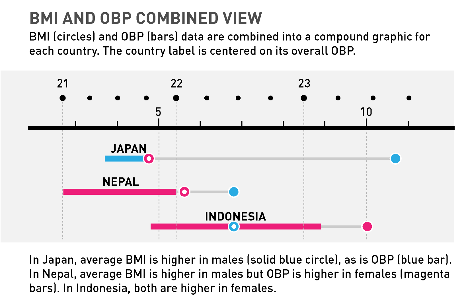
combining the BMI and obesity statistics
I now show how the BMI and obesity statistics can be combined and use the same three countries as above to do so.
I introduce the idea that countries can be categorized by the genders in which BMI and obesity is higher. For Japan this is male/male (blue dot, blue bar), for Nepal this is male/female (blue dot, magenta bar) and for Indonesia this is female/female (magenta dot, magenta bar).
Note that the BMI and OBP axes are distinct.
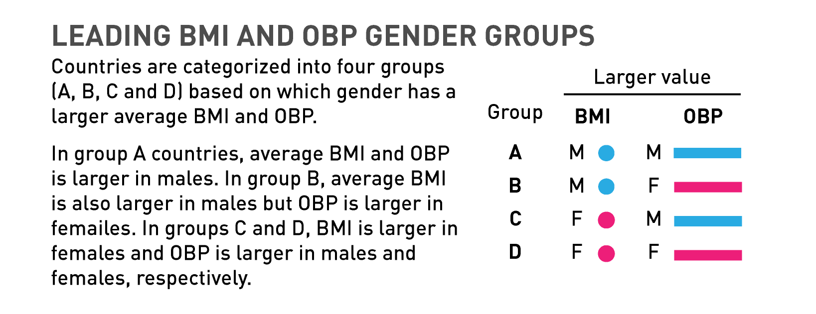
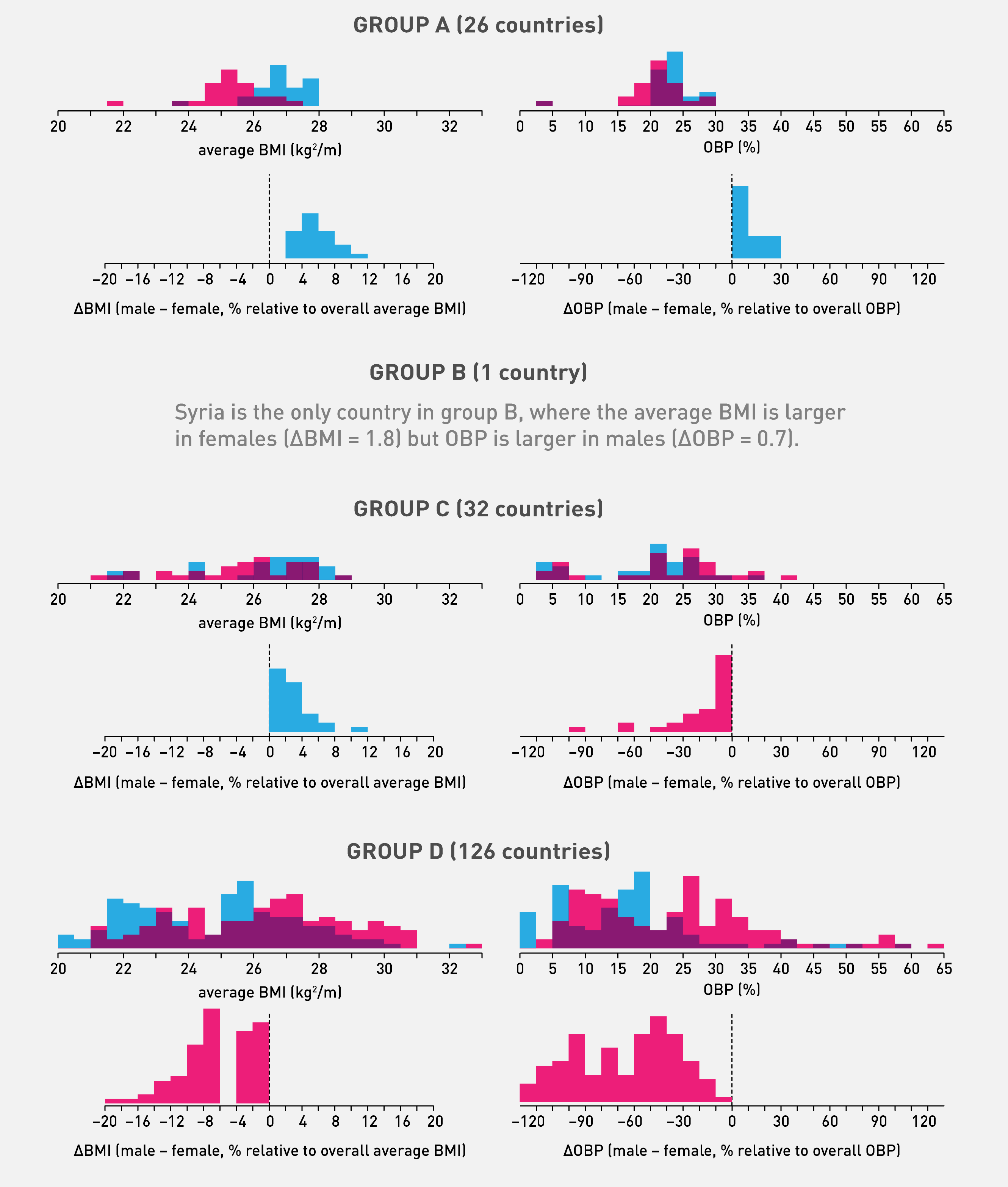
countries by leading BMI and obesity
I introduce the four groups (A, B, C, D) that correspond to which genders have a higher BMI and obesity.
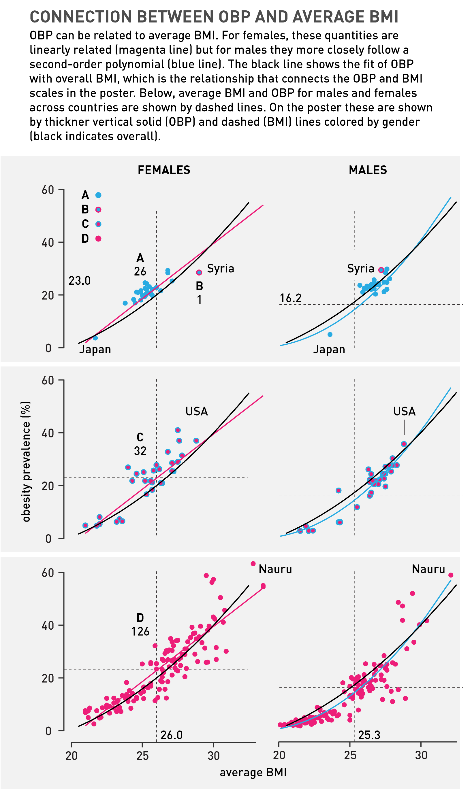
relationship between BMI and obesity
This is a pretty complicated set of plots — it shows a lot but takes you through it at a maneagable pace.
For each country group (A, B, C, D) we see the OBP plotted against BMI for males and females. The average OBP and BMI across all categories for both genders is shown by a dashed line.
I fit the trends with either a line or second-degree polynomial (this is a subjective choice).
Note that the number of countries in a group is shown next to the group letter. Group B has only one country (Syria). I point out countries that might be of interest: Japan (lowest BMI and OBP in group A), Syria (only country in group B), USA (largest BMI in group C) and Nauru (largest OBP in the entire data set).
Note that the symbols used for the countries reflect the BMI encoding. This is a little unconventional, since both BMI and OBP are being shown on these plots. I thought that keeping color here makes a stronger connection to the rest of the poster.
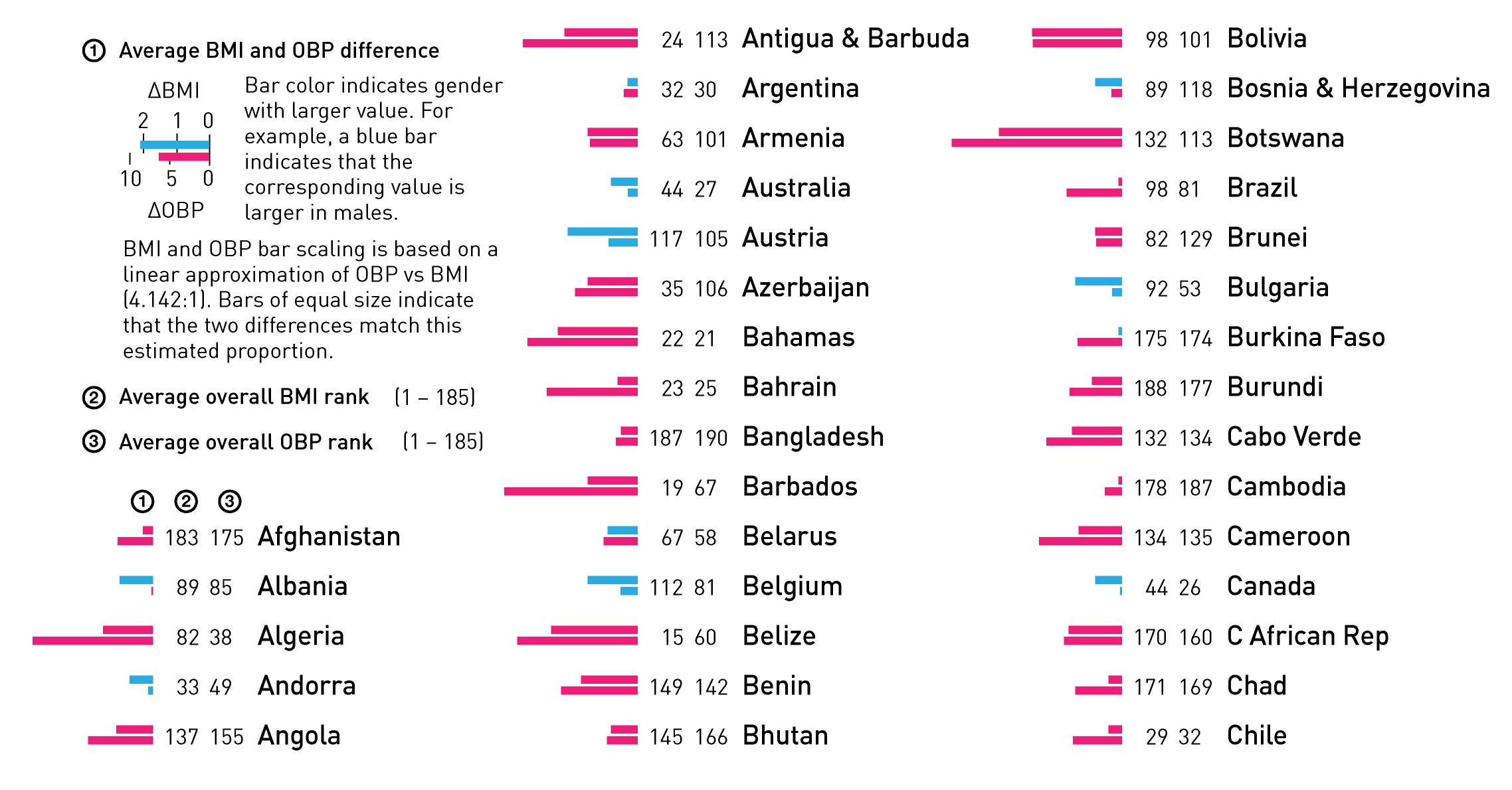
lookup table — find your country
The bottom of the poster, which is the least valuable real estate on the canvas, shows the detailed statistics and ranks for all the countries, alphabetically sorted.
I'm a big fan of showing the raw data in a way that can be easily looked up. Sometimes space doesn't allow for this but when it does, it adds another way for which outliers (more so than trends) can be spotted. But even more importantly, it's a safety net for the reader in case they get frustrated because they can't find a specific country.
BMI and OBP distributions
To fill empty parts of the poster, I provide the distributions of BMI and OBP values for the entire data set and by gender. I also show the distributions of the differences between genders for these quantities.
Right away, you can see that the differences for which female values are larger have a larger range. Both BMI and OBP distributions appear roughly bimodal.
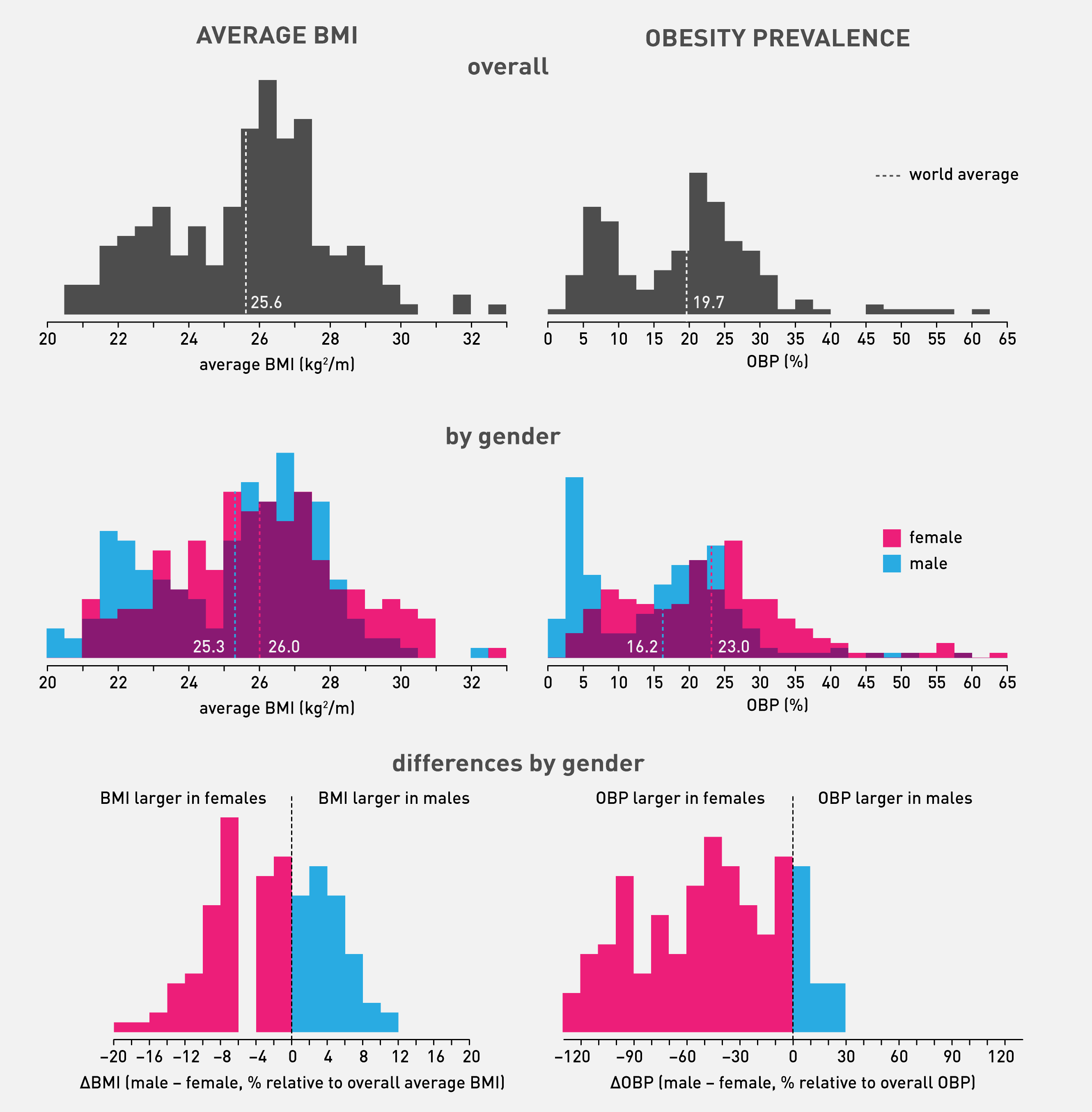
distributions by country group
Teasing the data apart a little more, here I show the distributions of values and gender differences for each country group. Compare the tails of the difference distributions for groups and quantities where male values are larger (blue) vs females (magenta). The latter have much longer tails.
For all the distribution plots I chose to keep the y-axis absolute.
averages
Overall and gender averages are shown by colored lines that drop from their respective axes.
Easter eggs
Always leave room for an anecdote.
Nasa to send our human genome discs to the Moon
We'd like to say a ‘cosmic hello’: mathematics, culture, palaeontology, art and science, and ... human genomes.


Comparing classifier performance with baselines
All animals are equal, but some animals are more equal than others. —George Orwell
This month, we will illustrate the importance of establishing a baseline performance level.
Baselines are typically generated independently for each dataset using very simple models. Their role is to set the minimum level of acceptable performance and help with comparing relative improvements in performance of other models.

Unfortunately, baselines are often overlooked and, in the presence of a class imbalance5, must be established with care.
Megahed, F.M, Chen, Y-J., Jones-Farmer, A., Rigdon, S.E., Krzywinski, M. & Altman, N. (2024) Points of significance: Comparing classifier performance with baselines. Nat. Methods 20.
Happy 2024 π Day—
sunflowers ho!
Celebrate π Day (March 14th) and dig into the digit garden. Let's grow something.

How Analyzing Cosmic Nothing Might Explain Everything
Huge empty areas of the universe called voids could help solve the greatest mysteries in the cosmos.
My graphic accompanying How Analyzing Cosmic Nothing Might Explain Everything in the January 2024 issue of Scientific American depicts the entire Universe in a two-page spread — full of nothing.

The graphic uses the latest data from SDSS 12 and is an update to my Superclusters and Voids poster.
Michael Lemonick (editor) explains on the graphic:
“Regions of relatively empty space called cosmic voids are everywhere in the universe, and scientists believe studying their size, shape and spread across the cosmos could help them understand dark matter, dark energy and other big mysteries.
To use voids in this way, astronomers must map these regions in detail—a project that is just beginning.
Shown here are voids discovered by the Sloan Digital Sky Survey (SDSS), along with a selection of 16 previously named voids. Scientists expect voids to be evenly distributed throughout space—the lack of voids in some regions on the globe simply reflects SDSS’s sky coverage.”
voids
Sofia Contarini, Alice Pisani, Nico Hamaus, Federico Marulli Lauro Moscardini & Marco Baldi (2023) Cosmological Constraints from the BOSS DR12 Void Size Function Astrophysical Journal 953:46.
Nico Hamaus, Alice Pisani, Jin-Ah Choi, Guilhem Lavaux, Benjamin D. Wandelt & Jochen Weller (2020) Journal of Cosmology and Astroparticle Physics 2020:023.
Sloan Digital Sky Survey Data Release 12
Alan MacRobert (Sky & Telescope), Paulina Rowicka/Martin Krzywinski (revisions & Microscopium)
Hoffleit & Warren Jr. (1991) The Bright Star Catalog, 5th Revised Edition (Preliminary Version).
H0 = 67.4 km/(Mpc·s), Ωm = 0.315, Ωv = 0.685. Planck collaboration Planck 2018 results. VI. Cosmological parameters (2018).
constellation figures
stars
cosmology
Error in predictor variables
It is the mark of an educated mind to rest satisfied with the degree of precision that the nature of the subject admits and not to seek exactness where only an approximation is possible. —Aristotle
In regression, the predictors are (typically) assumed to have known values that are measured without error.
Practically, however, predictors are often measured with error. This has a profound (but predictable) effect on the estimates of relationships among variables – the so-called “error in variables” problem.

Error in measuring the predictors is often ignored. In this column, we discuss when ignoring this error is harmless and when it can lead to large bias that can leads us to miss important effects.
Altman, N. & Krzywinski, M. (2024) Points of significance: Error in predictor variables. Nat. Methods 20.
Background reading
Altman, N. & Krzywinski, M. (2015) Points of significance: Simple linear regression. Nat. Methods 12:999–1000.
Lever, J., Krzywinski, M. & Altman, N. (2016) Points of significance: Logistic regression. Nat. Methods 13:541–542 (2016).
Das, K., Krzywinski, M. & Altman, N. (2019) Points of significance: Quantile regression. Nat. Methods 16:451–452.