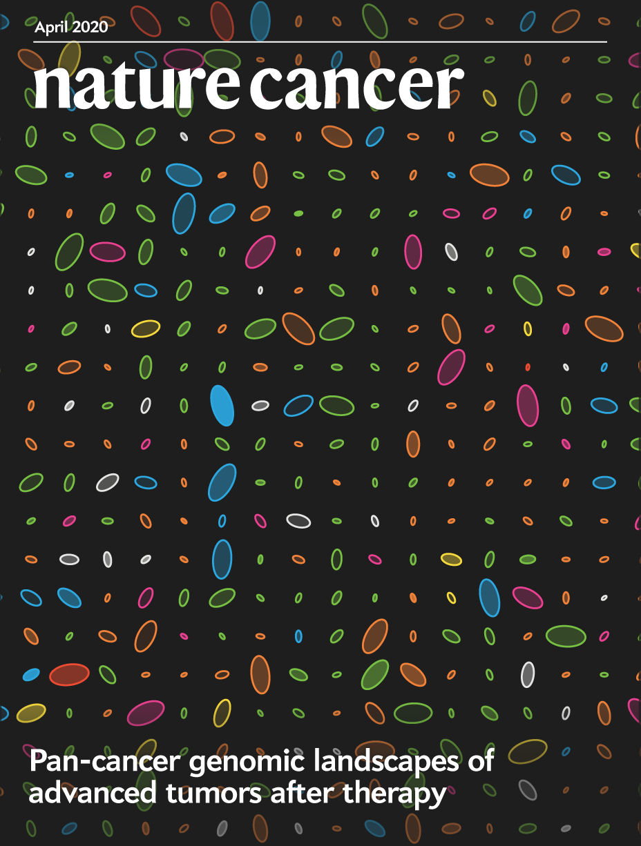
Nature Cancer Cover — April 2020 issue
Pan-cancer genomic landscapes of advanced tumors after therapy
Pleasance, E., Titmuss, E., Williamson, L. et al. (2020) Pan-cancer analysis of advanced patient tumors reveals interactions between therapy and genomic landscapes. Nat Cancer 1:452–468.
Art is science in love.
— E.F. Weisslitz
The design of the cover was inspired by Christian Stolte's DNA portraits from personal genomic data and PrintMyDNA. I've always loved Christian's style–respect the data but add playful flair. I am grateful for his allowing me to apply his approach to this design.
behind the design
respect the data, keep the eye interested
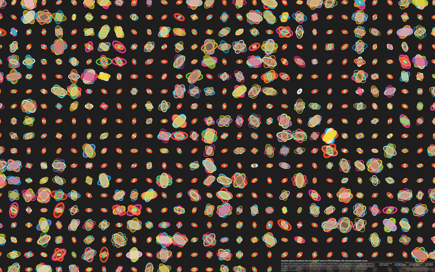
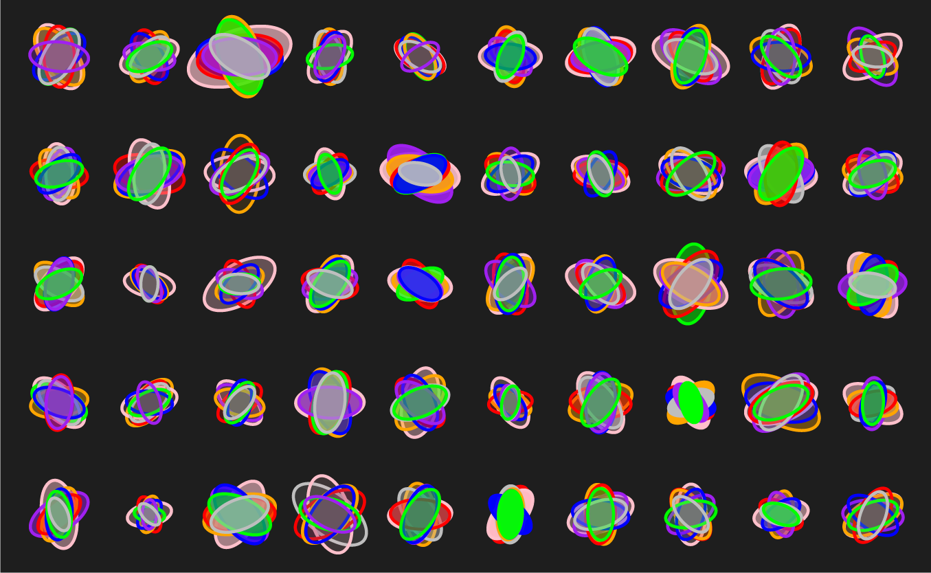
Every sample from the POG570 cohort corresponds to an individual patient and this is reflected in the design. The design is more compelling when samples are spatially distinct.
A core principle behind the design is intentionally managing and encouraging variation. If we have too much visual variation (in the extreme case, the data generation mechanism is a uniform random distribution), the eye sees nothing interesting. Although things are changing, there's nothing to lock onto. On the other hand, if we don't have enough variation, then the eye reacts with the same indifference.
To keep the eye happy (at least, our eyes), one approach is to have the shapes in a design split two or three categories. For example, the design has small ellipse systems and large ellipse systems. These are easy to spot and the eye can immediately begin to make some sense of what it sees, even though it may not yet know the reasons behind the patterns. Ideally, there should be a few cases that border on two categories, just to keep the category boundaries slightly ambiguous.
Within each category, there should be enough visual surprises that the eye wants to categorize further. Here is your opportunity to challenge it and vary things just enough so that this task isn't easy. The eye wants to group by shape and color similarity (Gestalt principles) and, to keep it challenged (but not frustrated or overwhelmed), make the first 40% of this grouping easy, the next 40% challenging and the last 20% impossible.
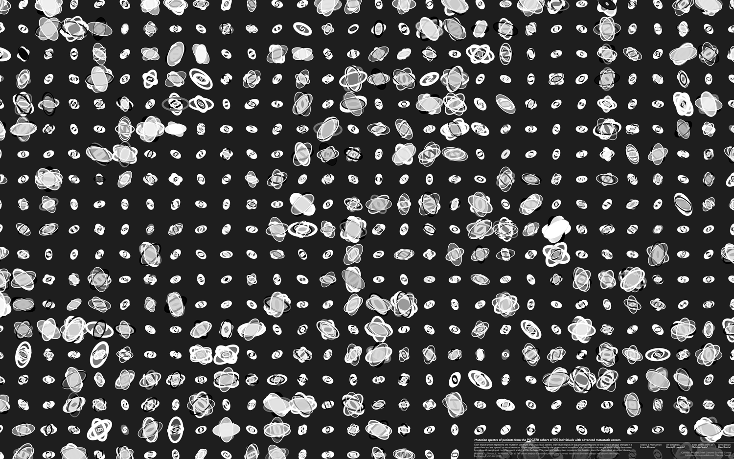
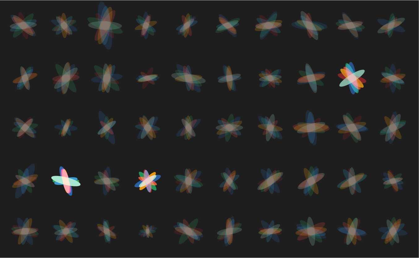
Below are three scenarios in increasing order of subjective interestingness. Too little or too much isn't as effective—find the Goldilocks zone. The "too interesting" case has ellipse properties sampled from a uniform distribution—it's always useful to see what your design looks like with random data so that you can figure out whether your data set has any kind of personality.


Practically, these considerations are retrofitted into a design once you narrow down the approach. They may not help you decide what to do but they're excellent at helping you evaluate what you've done.
And always: experiment and try not to go with your first idea.
spectrum of mutations
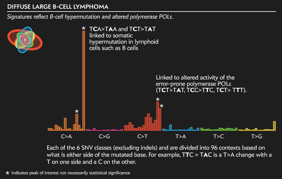
To explain the design, I'll use one of the 570 samples—a B-cell lymphoma—as an example. The method is the same for the other 569.
Using the genomic sequence of each sample, we first tabulate the number of mutations. These are classified into 7 classes: 6 kinds of single nucleotide variants (SNV: T>C, T>G, T>A, C>G, C>A, C>T) and indels (insertions or deletions). The use of the term SNV should be distinguished from SNP—typically SNP (single nucleotide polymorphism) is used to describe changes due to natural variation in the population (blue eyes, can roll your tongue, etc) but SNVs are somatic variants found in tumours.
Each sample has many other properties and a metric ton of data that describe it. We wanted to pick something that was easy to explain. For example, more categories of mutations are possible but our returns would diminish with each category.
The counts of these mutations are used to create a mutation spectrum composed of 7 ellipses. This is shown on the left of the legend.

ellipse: a mutation class
Individual ellipses represent a class of mutations. The color of the ellipse is based on its mutation class: SNVs are colored and indels are grey. This color scheme is used for the outline of the ellipse.
The median and maximum counts across the samples for each mutation class are shown below.
data %>% group_by(mutation_class)
     %>% summarise(median=median(count),max=max(count))
  class  median     max
  T.G       361   15912
  T.A       586   25997
  C.G       578   31900
  T.C       850   34438
  C.A       974   65867
  indel     422  146329
  C.T      1995  397807
The ellipse fill also uses this color but at an opacity that is a function of the number of days between the time of advanced disease diagnosis and biopsy (`\sqrt{t}` mapped onto [0,1]). Sequencing of the sample was performed shortly after the biopsy.
mutation class context
Each of the 6 SNV classes (excluding indels) and are divided into 96 contexts based on what is either side of the mutated base. For example, TTC > TAC is a T>A change with a T on one side and a C on the other.
Below is the full profile of the SNV mutations (excluding indels) for the case used in the legend above. This signature is typical of lymphoid cell hypermutation—a phenomena by which B cells produce many distinct antibodies—and of alteration in polymerase activity.
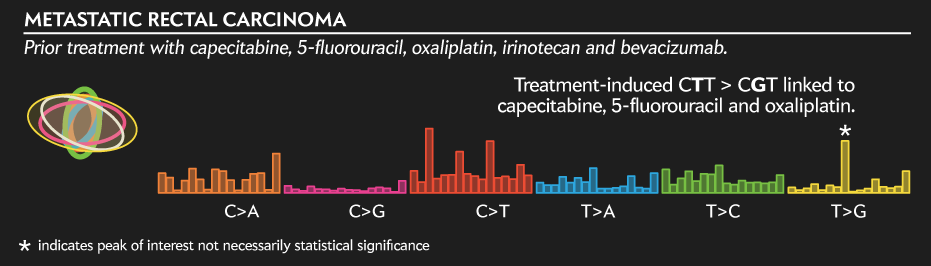
In contrast, the profile below is of a "standard" rectal carcinoma defined as "broadly colorectal" in terms of genes that are driving it. The signature itself, however, is interesting because it was induced by the treatment the patient received before being sequenced.
ellipse layers
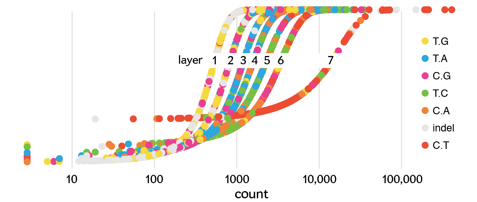
The ellipses for a sample are stacked based on the counts of mutations in their class.
The class with the most counts goes on the bottom—in our sample this is the C>A SNVs of which we have 10,422—and the class with the fewest counts goes on top—the indels of which the sample has 17.
Below are each of the 7 layers that make up the final design.


The first layer, made up of mutations with the fewest counts, is mostly T>G and C>G SNVs with a few indels. A few blue ellipses are from samples for which the class with fewest counts were the T>A SNVs.
As we go down the layers, we encounter classes with progressively more counts. In layer 2, blue ellipses(T>G SNVs) begin to appear. In layer 3, we start to see green (T>C SNVs) and orange (C>A SNVs) ellipses.
By the time we reach layer 7, where the most common mutations are, these are almost all C>T SNVs, with a few samples having indels (grey) as the most common class.
The outline on the ellipse gets thicker towards the bottom of the stack—this is a fixed progression that does not depend on the data.
The order of the layers could have been the other way: the most frequent mutations on top. And I'm sure that we could have made a go of it. As is, the least frequent mutations get an ellipse with a thin outline and these sit on ellipses with thicker outlines. This way, we're limit the ammount of a stroke that is occluded by strokes drawn above it.
ellipse size and angle
Whereas the layering tells us how the mutation classes are ranked within a sample, the size of the ellipse is related to the rank within a layer.
For a given ellipse we first find its layer. For our example sample, let's say we're looking at the layer 2 ellipse (486 C>G SNVs). We take all the mutation counts in that layer (remember, these are going to be of whatever class is the 2nd most rare in a sample) and map the 486 count onto a sigmoid curve made.
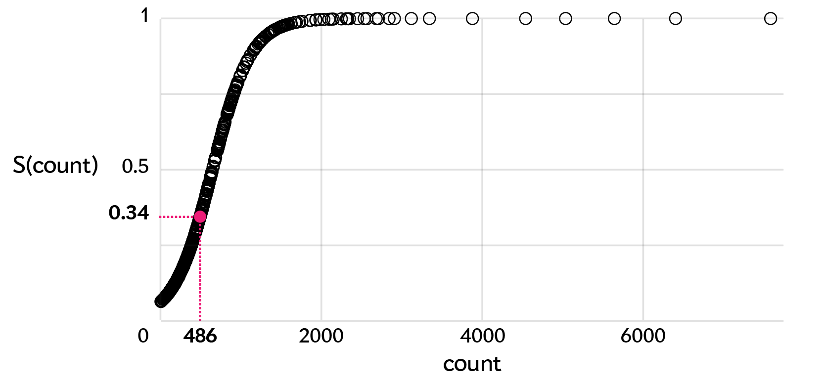
data %>% group_by(layer) %>% mutate(a = sigmoid(count,SoftMax=TRUE))
In this layer, the sample with the smallest ellipse is the one with the fewest counts in that layer and the sample with the largest ellipse is the one with the most counts (7,585). The median and maximum count values for each layer are shown below.
data %>% group_by(layer) %>% summarise(median=median(count),max=max(count))

  layer median    max
      1   284    4201
      2   398    7585
      3   562   10714
      4   704   18077
      5   870   34438
      6  1196   57499
      7  2016  397807
The sigmoid mapping defines the major axis of the ellipse (`a`) with `b=a/2` thus a fixed eccentricity of `e = \sqrt{1-b^2/a^2} = \sqrt{3}/2`. The eccentricities of all the ellipses is the same. For a given ellipse size, the count may be different. This depends on its layer's sigmoid mapping as shown below.
The angle of the ellipse is `\theta = kN/n` where `n` is the ellipse's mutation class count, `N` is the total number of mutations in a sample and `k` is a magic sauce factor.
Note that the angle is inversely proportional to the count. This was done to avoid having the ellipses in the first layer (fewest counts) all at similar angles. By making the angle proportional to `1/n` the angle variation is increased and the design looks substantially better. We played around with how things looked for various values of `k` and picked one that looked best to our eyes.
If we made the angle proportional to the relative count, `\theta = \pi n /N`, the design would look very ridig and unintersting. The images below show this—notice that all ellipses in the first layer are essentially horizontal (small angle) because their relative counts are small (median 0.05). Similarly, all the ellipses in the last layer (most counts) are closer to vertical because the median of this layer's proportional count is about 0.33.
data %>% group_by(layer) %>% summarise(median=median(count/total))

  layer  median
      1  0.0502
      2  0.0676
      3  0.0919
      4  0.115
      5  0.142
      6  0.188
      7  0.331


Notice that the ellipses have no absolute scale: every variable is scaled, either linearly, inversely or sigmoidally. I like relative scalings—once you split the data into sensible groups, relative scalings allow you to ask questions within a group.
When creating artistic data designs, explore different encodings, even if they break some rules. Always know what rules you're bending, breaking or ignoring.
This is true especially for cover designs, for which a more playful and interpretive approach is needed. There are more than enough accurate visualizations in the paper itself and a cover is usually no place for this.
Ultimately, the success of the design hinges on a combination of variation and uniformity and of symmetry and assymetry. Finding this balance is a kind of data exploration of its own.
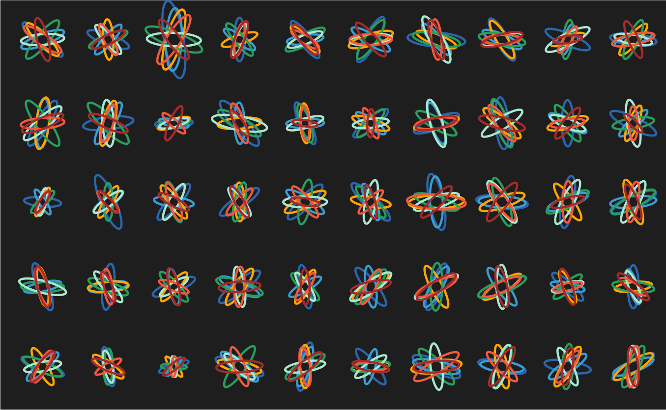
Below are some of the experiments along the way. Notice that while each of these does show variation, there's a strong sense of uniformity across the panels. There are no surprises—after the first 10 ellipse sets (or so), each additional is more of the same.
let's see some exploration

Nasa to send our human genome discs to the Moon
We'd like to say a ‘cosmic hello’: mathematics, culture, palaeontology, art and science, and ... human genomes.


Comparing classifier performance with baselines
All animals are equal, but some animals are more equal than others. —George Orwell
This month, we will illustrate the importance of establishing a baseline performance level.
Baselines are typically generated independently for each dataset using very simple models. Their role is to set the minimum level of acceptable performance and help with comparing relative improvements in performance of other models.

Unfortunately, baselines are often overlooked and, in the presence of a class imbalance5, must be established with care.
Megahed, F.M, Chen, Y-J., Jones-Farmer, A., Rigdon, S.E., Krzywinski, M. & Altman, N. (2024) Points of significance: Comparing classifier performance with baselines. Nat. Methods 20.
Happy 2024 π Day—
sunflowers ho!
Celebrate π Day (March 14th) and dig into the digit garden. Let's grow something.

How Analyzing Cosmic Nothing Might Explain Everything
Huge empty areas of the universe called voids could help solve the greatest mysteries in the cosmos.
My graphic accompanying How Analyzing Cosmic Nothing Might Explain Everything in the January 2024 issue of Scientific American depicts the entire Universe in a two-page spread — full of nothing.

The graphic uses the latest data from SDSS 12 and is an update to my Superclusters and Voids poster.
Michael Lemonick (editor) explains on the graphic:
“Regions of relatively empty space called cosmic voids are everywhere in the universe, and scientists believe studying their size, shape and spread across the cosmos could help them understand dark matter, dark energy and other big mysteries.
To use voids in this way, astronomers must map these regions in detail—a project that is just beginning.
Shown here are voids discovered by the Sloan Digital Sky Survey (SDSS), along with a selection of 16 previously named voids. Scientists expect voids to be evenly distributed throughout space—the lack of voids in some regions on the globe simply reflects SDSS’s sky coverage.”
voids
Sofia Contarini, Alice Pisani, Nico Hamaus, Federico Marulli Lauro Moscardini & Marco Baldi (2023) Cosmological Constraints from the BOSS DR12 Void Size Function Astrophysical Journal 953:46.
Nico Hamaus, Alice Pisani, Jin-Ah Choi, Guilhem Lavaux, Benjamin D. Wandelt & Jochen Weller (2020) Journal of Cosmology and Astroparticle Physics 2020:023.
Sloan Digital Sky Survey Data Release 12
Alan MacRobert (Sky & Telescope), Paulina Rowicka/Martin Krzywinski (revisions & Microscopium)
Hoffleit & Warren Jr. (1991) The Bright Star Catalog, 5th Revised Edition (Preliminary Version).
H0 = 67.4 km/(Mpc·s), Ωm = 0.315, Ωv = 0.685. Planck collaboration Planck 2018 results. VI. Cosmological parameters (2018).
constellation figures
stars
cosmology
Error in predictor variables
It is the mark of an educated mind to rest satisfied with the degree of precision that the nature of the subject admits and not to seek exactness where only an approximation is possible. —Aristotle
In regression, the predictors are (typically) assumed to have known values that are measured without error.
Practically, however, predictors are often measured with error. This has a profound (but predictable) effect on the estimates of relationships among variables – the so-called “error in variables” problem.

Error in measuring the predictors is often ignored. In this column, we discuss when ignoring this error is harmless and when it can lead to large bias that can leads us to miss important effects.
Altman, N. & Krzywinski, M. (2024) Points of significance: Error in predictor variables. Nat. Methods 20.
Background reading
Altman, N. & Krzywinski, M. (2015) Points of significance: Simple linear regression. Nat. Methods 12:999–1000.
Lever, J., Krzywinski, M. & Altman, N. (2016) Points of significance: Logistic regression. Nat. Methods 13:541–542 (2016).
Das, K., Krzywinski, M. & Altman, N. (2019) Points of significance: Quantile regression. Nat. Methods 16:451–452.