


data visualization + art
Creating the Molecular Case Studies Cover
If your photos aren’t good enough, then you’re not close enough
— Robert Capa
about the cover
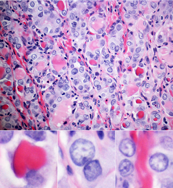
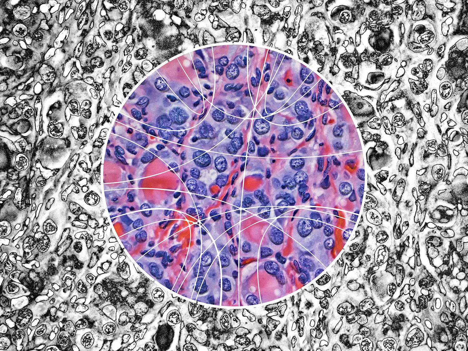
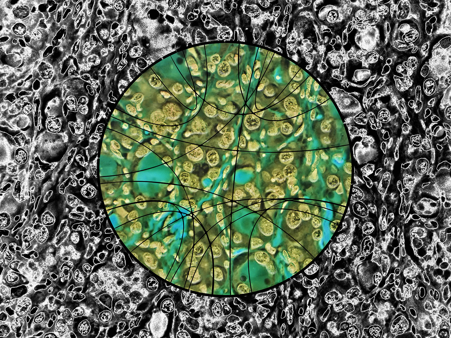
Papillary thyroid carcinoma (PTC) cells, even though malignant, are still genetically programmed to try to be thyroid follicles and may retain their follicular growth pattern, which appear as circles on cross section. Two diagnostic features of papillary thyroid carcinoma are nuclear clearing and intranuclear cytoplasmic inclusions. The black-and-white image is an artistic treatment of a PTC microscopy image (40×) from one of the Personalized Oncogenomics Program study participants at the BC Cancer Research Center. Superimposed is a Circos plot of 17 genomic fusions involving 17 chromosomes identified in the sample by whole-genome sequencing. Showing through the Circos plot is an enhanced color version of the microscopy image. The original image is from Application of genomics to identify therapeutic targets in recurrent pediatric papillary thyroid carcinoma by Ronsley et al. in the April 2018 issue.
The theme of the April issue of Molecular Case Studies is precision oncogenomics. We have three papers in the issue based on work done in our Personalized Oncogenomics Program (POG).
...this special issue provide[s] a glimpse into current cancer precision medicine efforts, reflecting only a microcosm of ... genomics in this bustling space of clinical translation.
John C. Carpten & Elaine R. Mardis
The era of precision oncogenomics
Mol. Case Stud. (2018) 4(2).
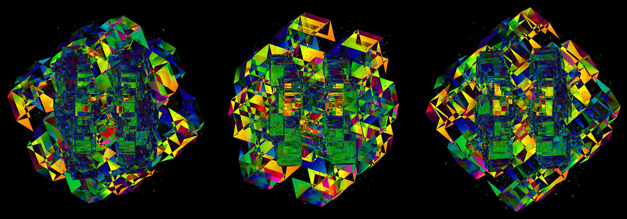
I've previously created art based on POG data—posters to celebrate the program's 5-year anniversary.
input materials
The covers of Molecular Case Studies typically show microscopy images, with some shown in a more abstract fashion. There's also the occasional Circos plot.
I've previously taken a more fine-art approach to cover design, such for those of Nature, Genome Research and Trends in Genetics. I've used microscopy images to create a cover for PNAS—the one that made biology look like astrophysics—and thought that this is kind of material I'd start with for the MCS cover.
When I look at these kind of images, I have basically no idea what I'm looking at. Sure, I know this is life at tiny scale but I am not a pathologist. This helps me greatly.
Instead, I see color, shapes, and contrast. I hunt for patterns that would make for an interesting visual, without necessarily trying to communicate any of the science behind that—the paper does a much better job at this than I ever could. It's largely a process driven by intuition and my desire to see distinct visual patterns at different length scales with some symmetry, ideally broken in a pleasing way. Vague, I know.
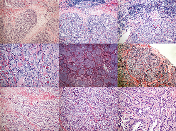
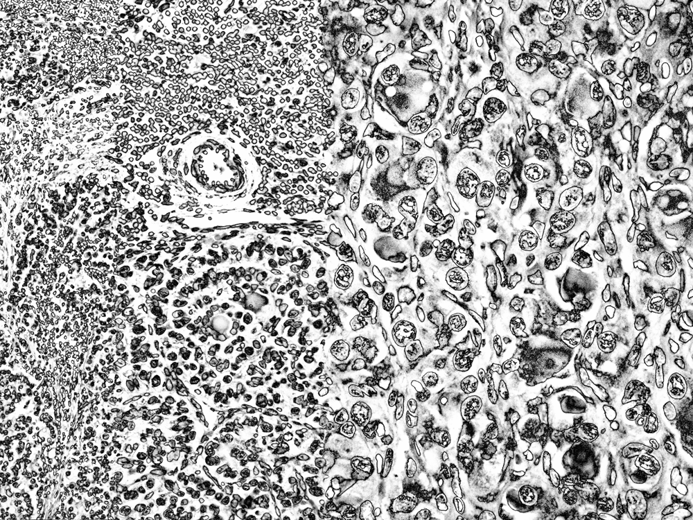
Images of different regions of the same slide, at the same magnification, can have very different levels of visual engagement (for the non-specialist). Just compare the two images below.
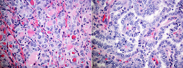
The slide on the left really caught my eye. It had the right proportion of tiny, small, medium and large things.
black and white version
The black-and-white version was obtained by solarizing the image. There are both color and black-and-white options for solarization, a method in which various tones of the image are remapped in brightness.
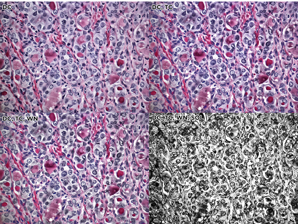
And here's the first black-and-white take.
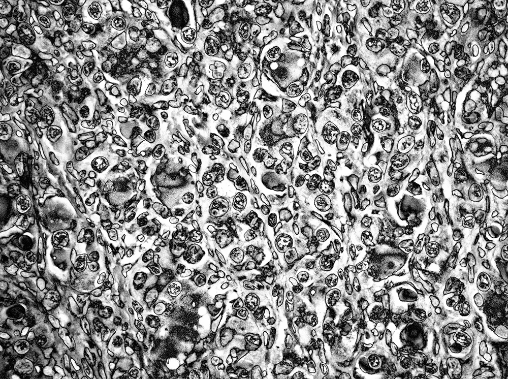
This looked good but a bit dark. I handled this by lightening the tone, differently depending on the element in the image. I also wanted to bring out more details in the internal structure of the cells. This was achieved by applying an otherwise aggressive sharpening mask.
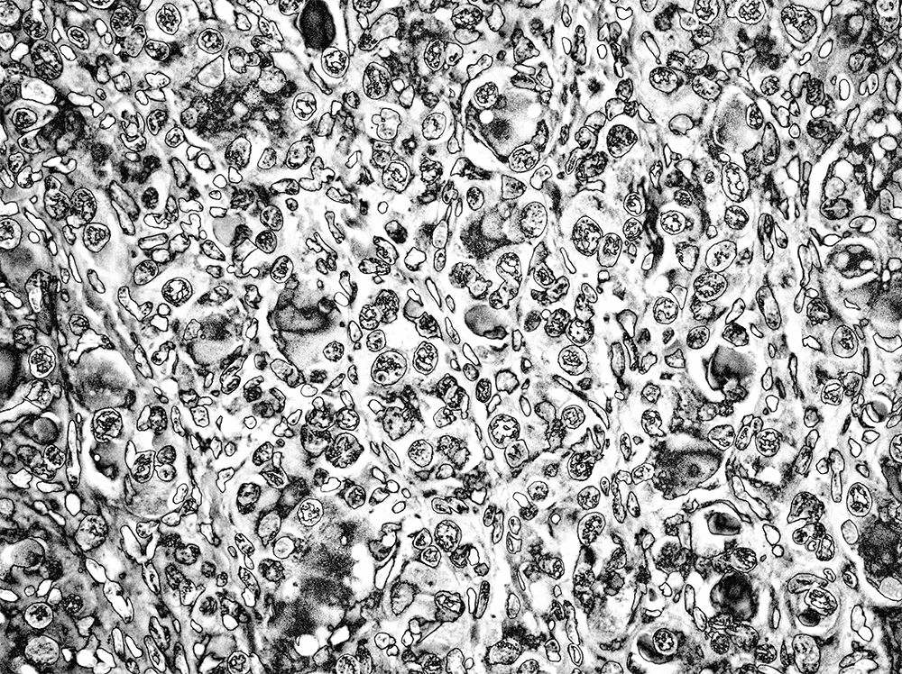
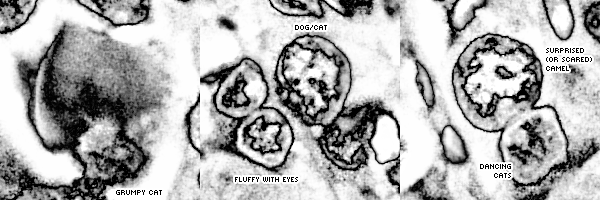
I was quite happy with this result. The combination of solarization and sharpening created a large variety of patterns inside the cells. My brain fought hard to see faces in them.
Because I had slides at different magnifications, I created a design in which three slides at 10, 20 and 40 × were composited together so that from left to right the magnification increased across the image. The effect is subtle—you can easily miss it, which is the point.
I had pretty high hopes for these black-and-white versions. Previous covers in MCS have been colorful, though, so I thought to provide a color option.
color version
For the color version, I wanted to give the colors more punch. For sure.
I also wanted to emphasize the details, like for the black-and-white image.
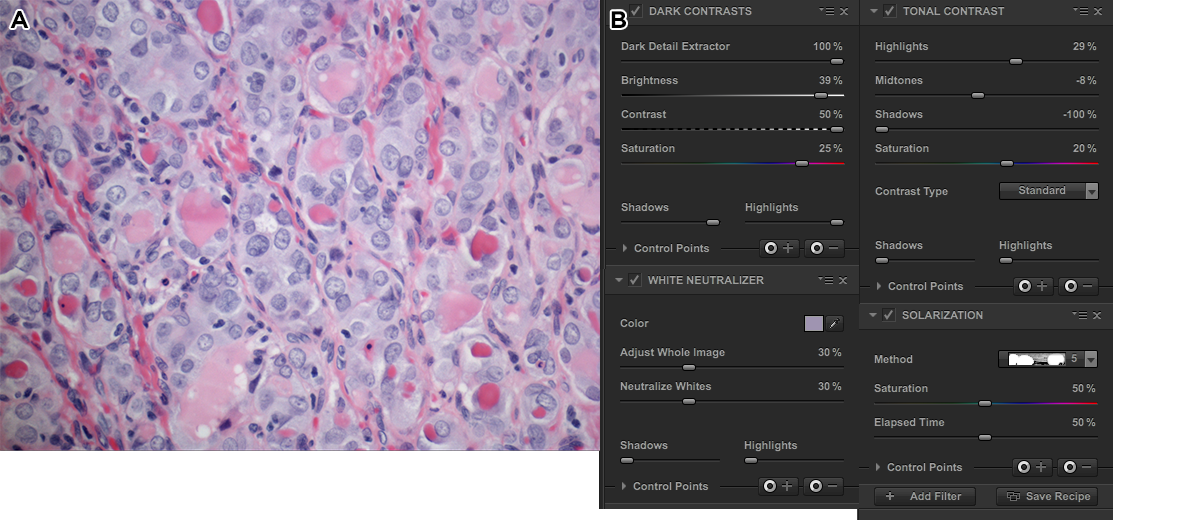
The first process step of the color slide was done using 5 Nik filters, applied in succession: dark contrast, tonal contrast, sunlight, polarization and detail extractor. The effects of the stack of these filters is shown on the original image below. The whole image is shown and in each strip the filters are stacked.
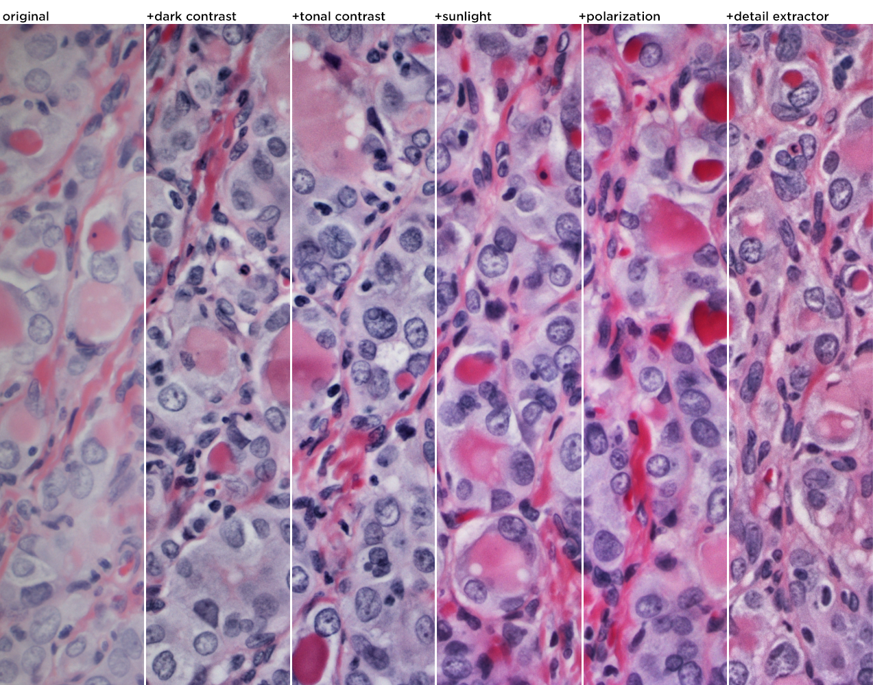
Here's the full image with the 5 Nik filters applied.
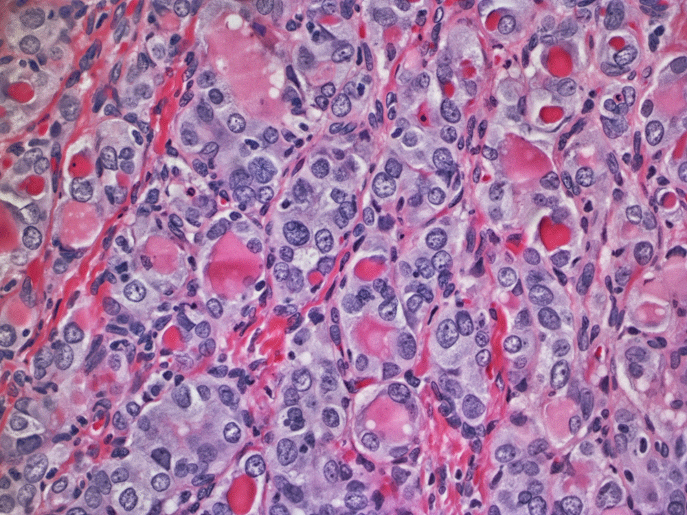
Not there yet, though. I added more sharpening (more than I've ever used before, so I felt a little weird, but got over it quickly). The colors were punched up too—I wanted more contrast between the blue and red areas and transform the reds a little into oranges.
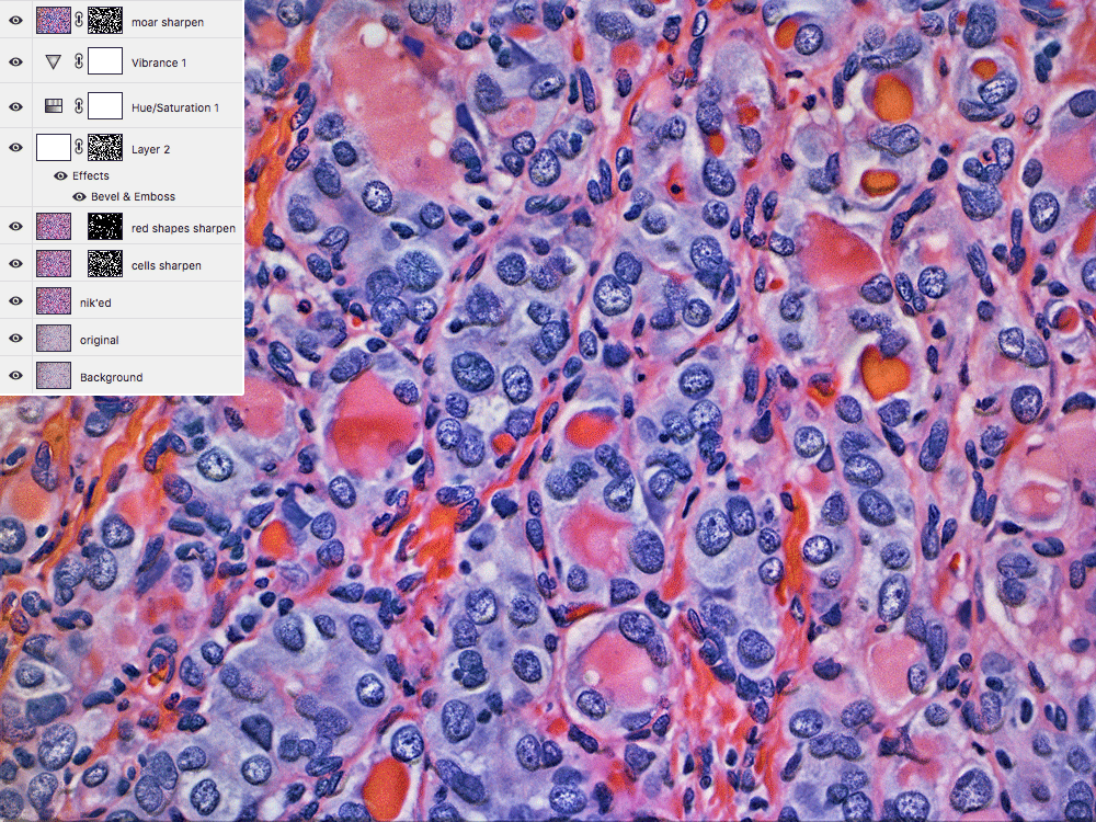
If it looks like the blue areas are popping out of the image, that's the effect of the emboss filter.
final composition
The editors asked me to encorporate a Circos image in the final design. This was tricky—I had spent a lot of time up to now fiddling with extracting patterns and textures from the images.
Something as geometrical and rational as a data graphic would alter the personality of the design. But, the goal of artistic collaboration is always to find a way, so I took some gene fusions that were found in the sample with our structural variant pipeline and created a bare-bones Circos image out of them.
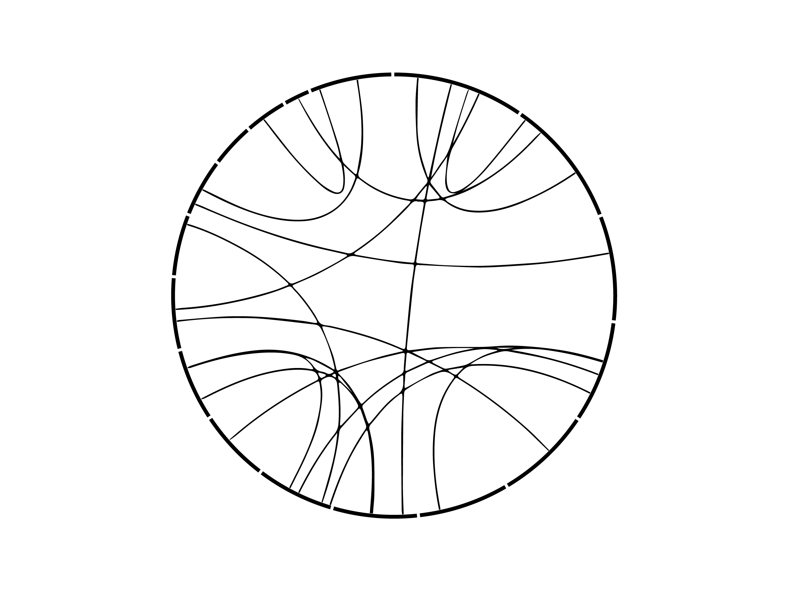
This was then superimposed on the image and emphasized by using the color design inside the circle and black-and-white design outside.
It's always fun to invert images and see what happens.
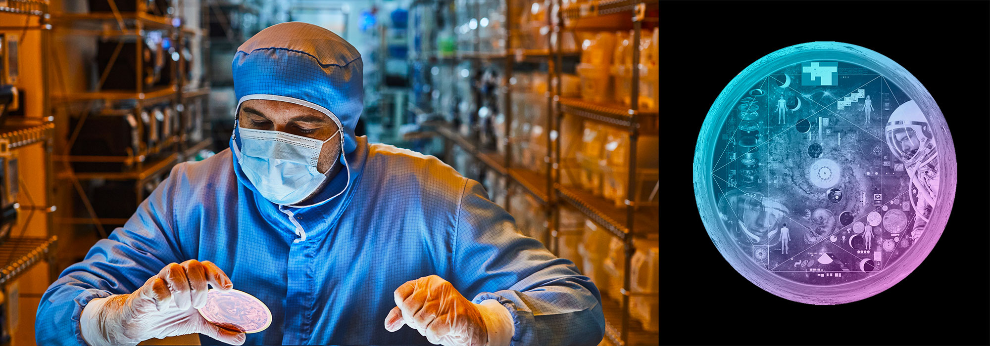
Nasa to send our human genome discs to the Moon
We'd like to say a ‘cosmic hello’: mathematics, culture, palaeontology, art and science, and ... human genomes.


Comparing classifier performance with baselines
All animals are equal, but some animals are more equal than others. —George Orwell
This month, we will illustrate the importance of establishing a baseline performance level.
Baselines are typically generated independently for each dataset using very simple models. Their role is to set the minimum level of acceptable performance and help with comparing relative improvements in performance of other models.

Unfortunately, baselines are often overlooked and, in the presence of a class imbalance5, must be established with care.
Megahed, F.M, Chen, Y-J., Jones-Farmer, A., Rigdon, S.E., Krzywinski, M. & Altman, N. (2024) Points of significance: Comparing classifier performance with baselines. Nat. Methods 20.
Happy 2024 π Day—
sunflowers ho!
Celebrate π Day (March 14th) and dig into the digit garden. Let's grow something.

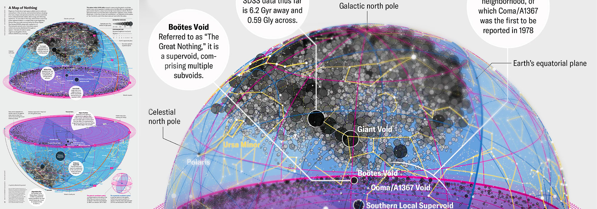
How Analyzing Cosmic Nothing Might Explain Everything
Huge empty areas of the universe called voids could help solve the greatest mysteries in the cosmos.
My graphic accompanying How Analyzing Cosmic Nothing Might Explain Everything in the January 2024 issue of Scientific American depicts the entire Universe in a two-page spread — full of nothing.

The graphic uses the latest data from SDSS 12 and is an update to my Superclusters and Voids poster.
Michael Lemonick (editor) explains on the graphic:
“Regions of relatively empty space called cosmic voids are everywhere in the universe, and scientists believe studying their size, shape and spread across the cosmos could help them understand dark matter, dark energy and other big mysteries.
To use voids in this way, astronomers must map these regions in detail—a project that is just beginning.
Shown here are voids discovered by the Sloan Digital Sky Survey (SDSS), along with a selection of 16 previously named voids. Scientists expect voids to be evenly distributed throughout space—the lack of voids in some regions on the globe simply reflects SDSS’s sky coverage.”
voids
Sofia Contarini, Alice Pisani, Nico Hamaus, Federico Marulli Lauro Moscardini & Marco Baldi (2023) Cosmological Constraints from the BOSS DR12 Void Size Function Astrophysical Journal 953:46.
Nico Hamaus, Alice Pisani, Jin-Ah Choi, Guilhem Lavaux, Benjamin D. Wandelt & Jochen Weller (2020) Journal of Cosmology and Astroparticle Physics 2020:023.
Sloan Digital Sky Survey Data Release 12
Alan MacRobert (Sky & Telescope), Paulina Rowicka/Martin Krzywinski (revisions & Microscopium)
Hoffleit & Warren Jr. (1991) The Bright Star Catalog, 5th Revised Edition (Preliminary Version).
H0 = 67.4 km/(Mpc·s), Ωm = 0.315, Ωv = 0.685. Planck collaboration Planck 2018 results. VI. Cosmological parameters (2018).
constellation figures
stars
cosmology
Error in predictor variables
It is the mark of an educated mind to rest satisfied with the degree of precision that the nature of the subject admits and not to seek exactness where only an approximation is possible. —Aristotle
In regression, the predictors are (typically) assumed to have known values that are measured without error.
Practically, however, predictors are often measured with error. This has a profound (but predictable) effect on the estimates of relationships among variables – the so-called “error in variables” problem.

Error in measuring the predictors is often ignored. In this column, we discuss when ignoring this error is harmless and when it can lead to large bias that can leads us to miss important effects.
Altman, N. & Krzywinski, M. (2024) Points of significance: Error in predictor variables. Nat. Methods 20.
Background reading
Altman, N. & Krzywinski, M. (2015) Points of significance: Simple linear regression. Nat. Methods 12:999–1000.
Lever, J., Krzywinski, M. & Altman, N. (2016) Points of significance: Logistic regression. Nat. Methods 13:541–542 (2016).
Das, K., Krzywinski, M. & Altman, N. (2019) Points of significance: Quantile regression. Nat. Methods 16:451–452.
Convolutional neural networks
Nature uses only the longest threads to weave her patterns, so that each small piece of her fabric reveals the organization of the entire tapestry. – Richard Feynman
Following up on our Neural network primer column, this month we explore a different kind of network architecture: a convolutional network.
The convolutional network replaces the hidden layer of a fully connected network (FCN) with one or more filters (a kind of neuron that looks at the input within a narrow window).
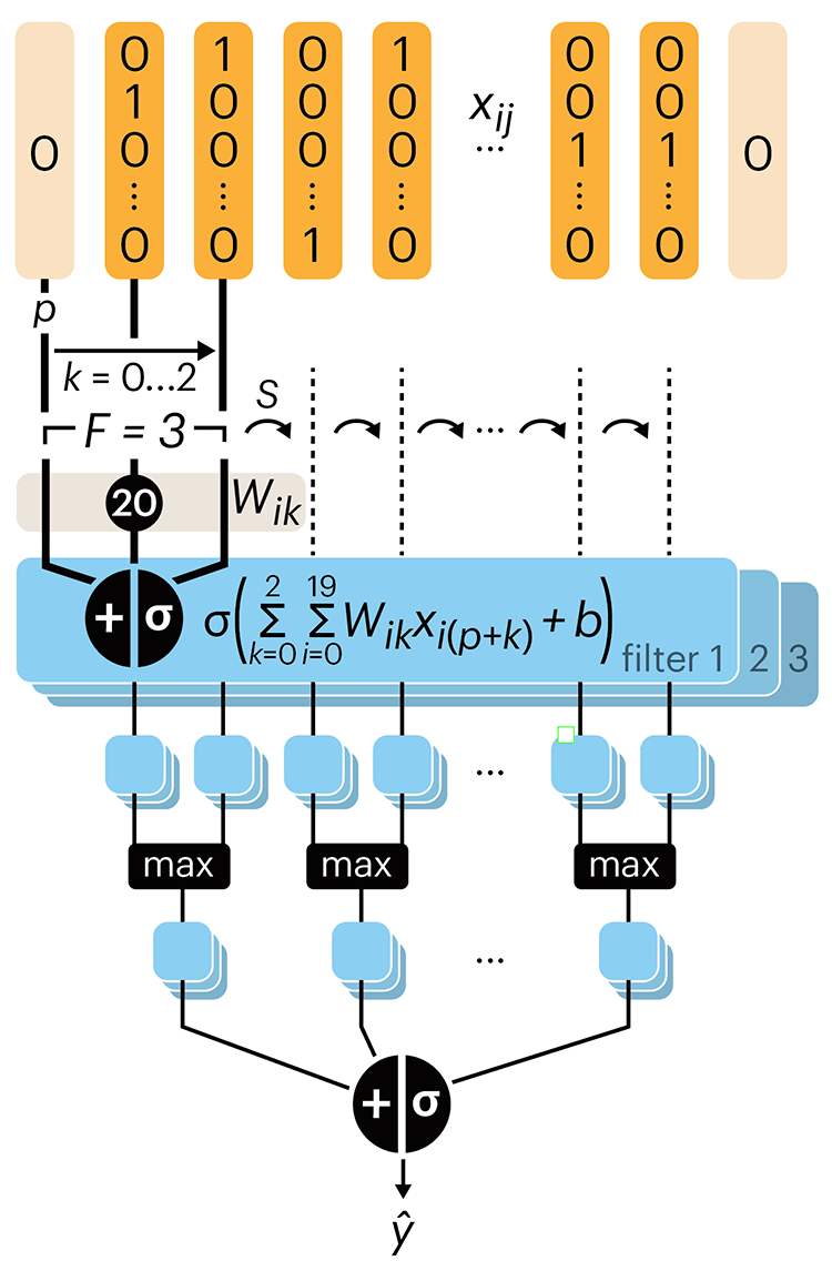
Even through convolutional networks have far fewer neurons that an FCN, they can perform substantially better for certain kinds of problems, such as sequence motif detection.
Derry, A., Krzywinski, M & Altman, N. (2023) Points of significance: Convolutional neural networks. Nature Methods 20:1269–1270.
Background reading
Derry, A., Krzywinski, M. & Altman, N. (2023) Points of significance: Neural network primer. Nature Methods 20:165–167.
Lever, J., Krzywinski, M. & Altman, N. (2016) Points of significance: Logistic regression. Nature Methods 13:541–542.