
Effective graphical abstract design for science communication
Guidelines to get you started and keep you going
The graphical abstract hospital is a place where graphical abstracts get a prescription and are sent home to convalesce on their own. Here, you will find an à la carte offering of their symptoms and corresponding cures.
MY REDESIGN PROCESS
Scientific communication must present the story clearly and concisely: honor content, maintain connections between themes and avoid undue focus on relationships that are less important or imply ones that do not exist.
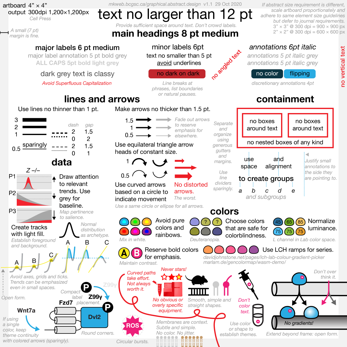
The format of the graphical abstract imposes additional challenges of designing in a small space: importance of layout and tidiness, firm typographic hierarchy, sufficient contrast for visibility of small elements and consistent level of encapsulation and detail,
Each graphical abstract redesign shown here focuses on illustrating effective ways to use color, typography, alignment, and compact data visualization. Some examples are built around a specific design theme, such as using a single color. Some go a few steps beyond what I would normally do to illustrate how a design element might be incorporated: gradients, three-dimesional effects, and small amounts of copy. Most redesigns come with supplementary examples that explore other options.
Some of these abstracts are from my workshops — I am grateful to the original authors who participated and submitted their work for redesign. Others are taken from the published literature. Either way, the redesigns critique the design and not the science.
Some of the abstracts have had some elements anonymized.
cases at a glance

This case study is a redesign of an example in Cell's graphical abstract guidelines. The original abstract is from Distinct Factors Control Histone Variant H3.3 Localization at Specific Genomic Regions.
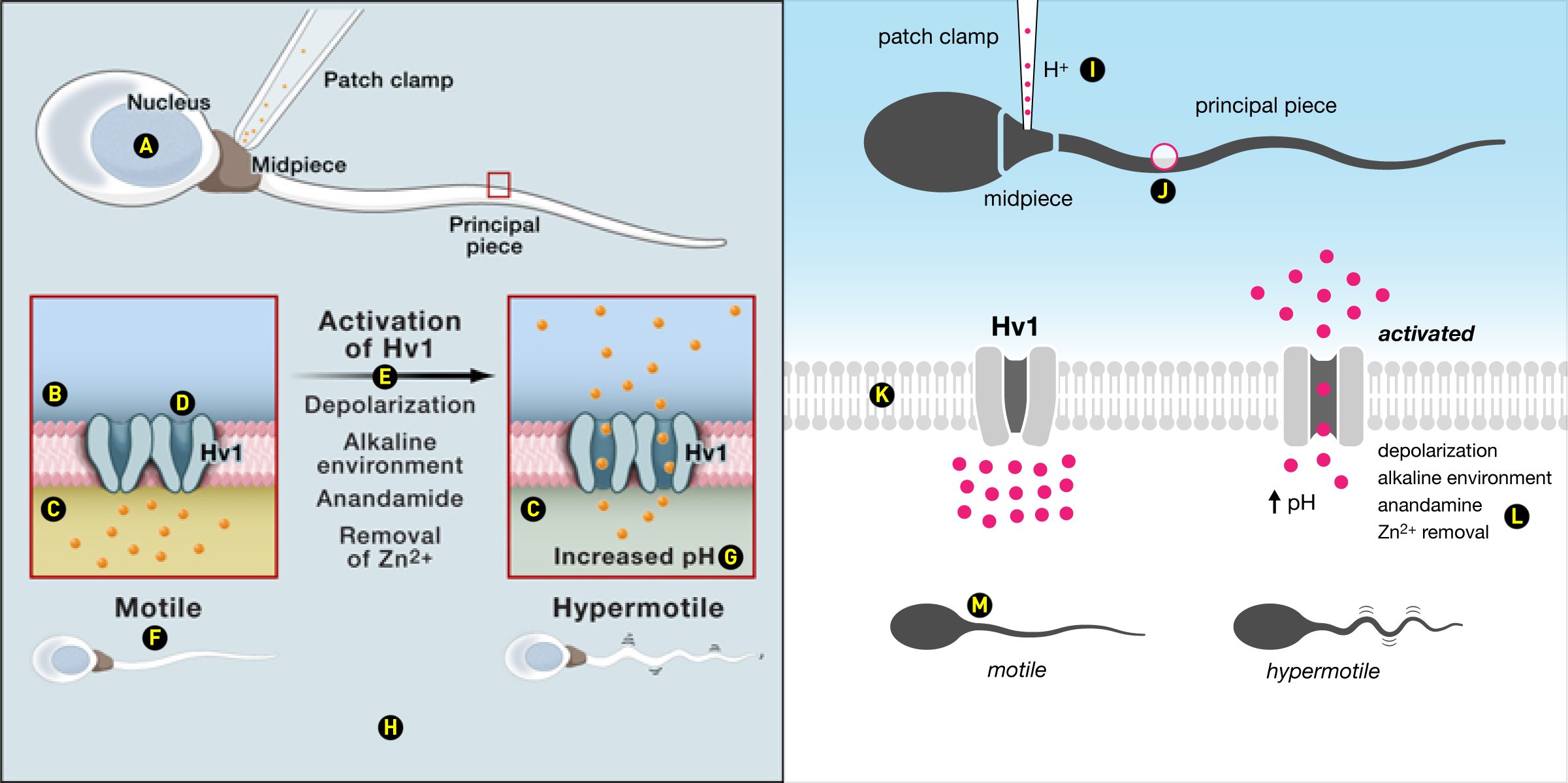
This case study is a redesign of an example in Cell's graphical abstract guidelines. The original abstract is from Acid extrusion from human spermatozoa is mediated by flagellar voltage-gated proton channel.
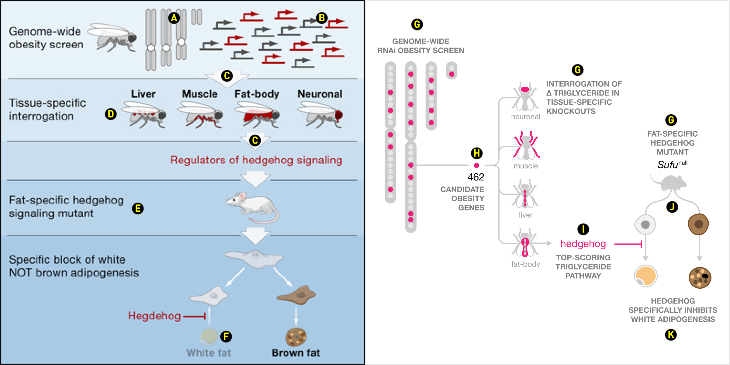
This case study is a redesign of an example in Cell's graphical abstract guidelines. The original abstract is from Drosophila genome-wide obesity screen reveals hedgehog as a determinant of brown versus white adipose cell fate.
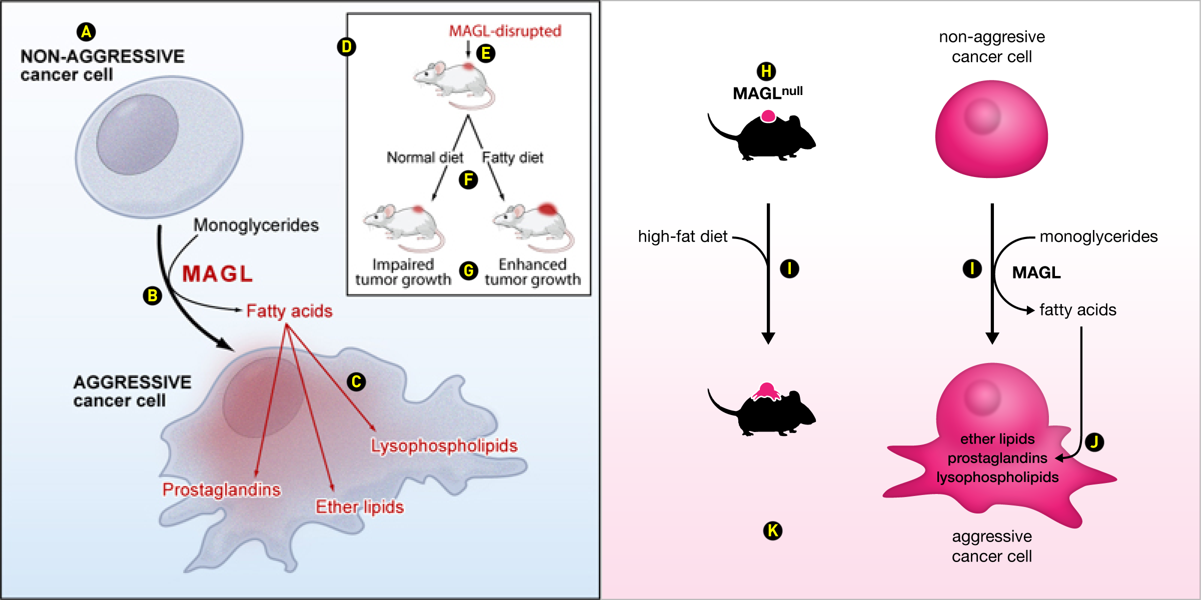
This case study is a redesign of an example in Cell's graphical abstract guidelines. The original abstract is from Monoacylglycerol lipase regulates a fatty acid network that promotes cancer pathogenesis.
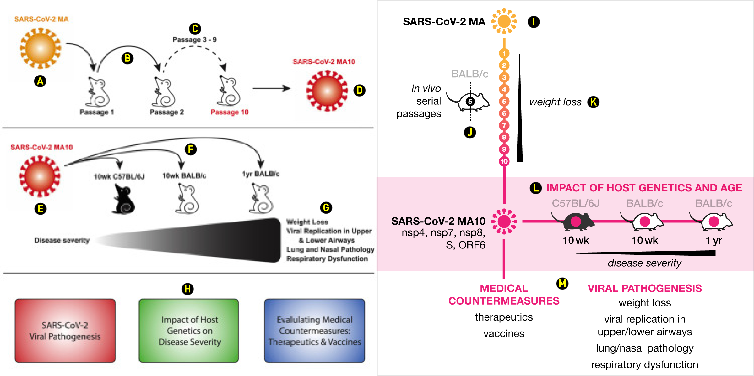
Original abstract is from A mouse-adapted SARS-CoV-2 induces acute lung injury and mortality in standard laboratory mice.
Original abstract is from Mapping neutralizing and immunodominant sites on the SARS-CoV-2 spike receptor-binding domain by structure-guided high-resolution serology.
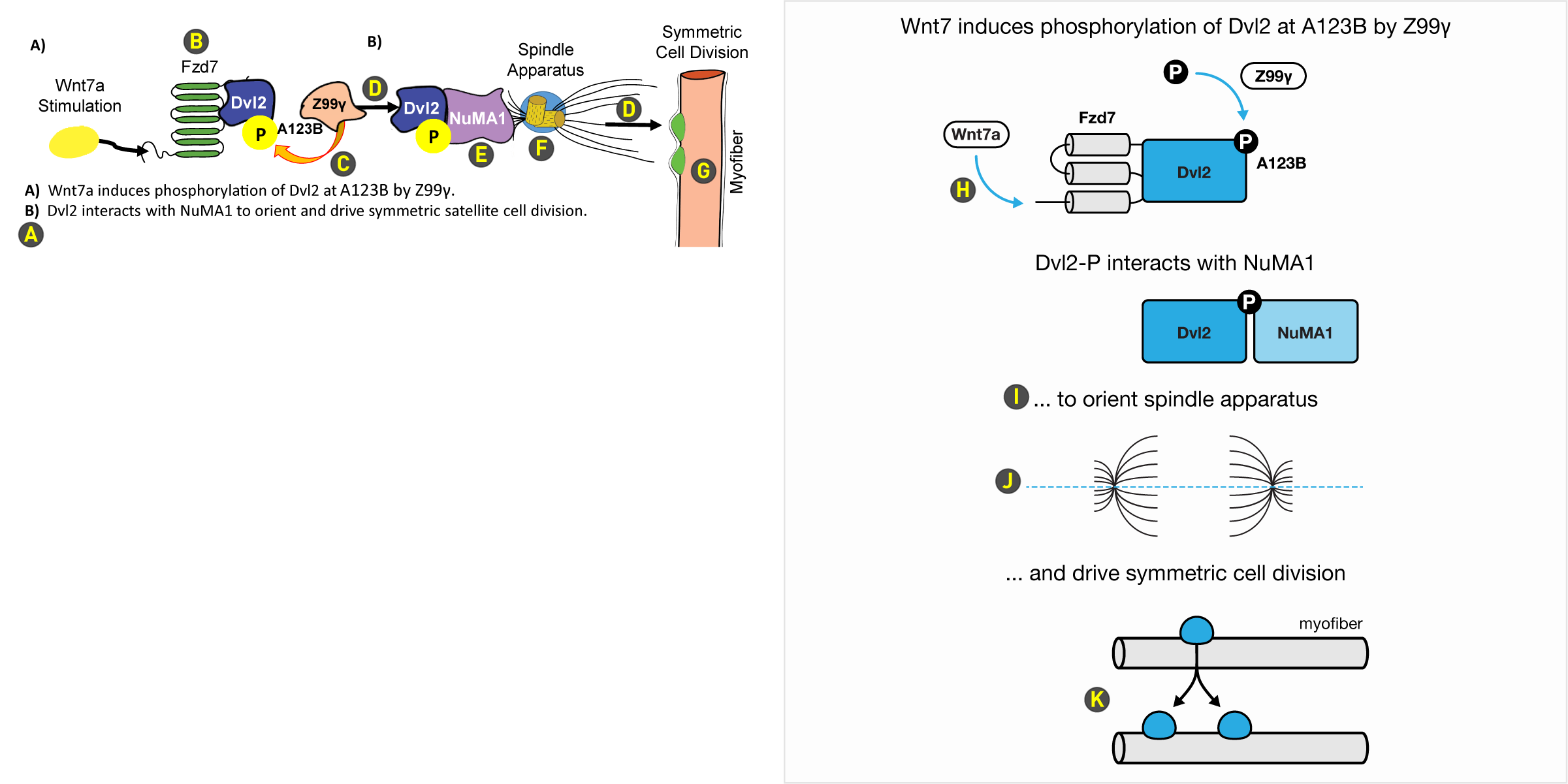
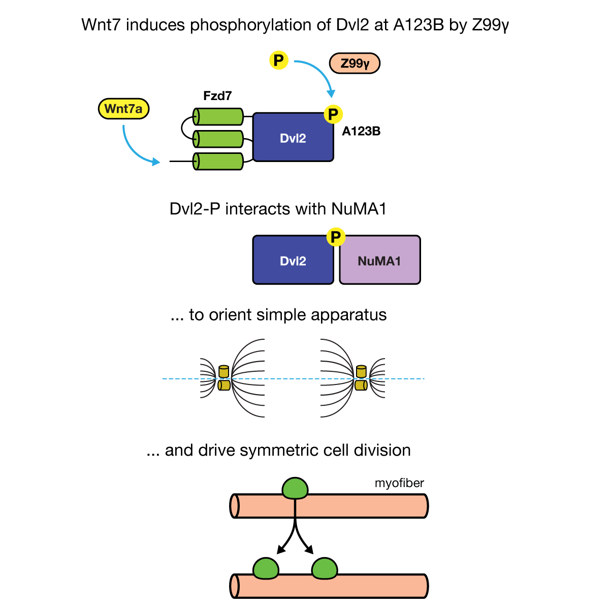
graphic abstract hospital > all cases > case 1
The original is too squished and has superfluous detail in some parts and insufficient detail in others.
Avoid full sentences. Bring labels as close to what they are labeling.
Draw the least number of elements to make your point and no more than that.
This arrow asks the eye to backtrack.
The role of the arrow between panels is ambiguous. Does it say "look here" or does it indicate that Z99γ interacts with Dvl2/NumA1 complex? This arrow is reused further on.
None of the colors communicate important information. Some colors are recycled yet mean different things (Wnt7a and phosphate is yellow). Most of the shapes are unnecessarily elaborate.
Too much detail showing aspects of the spindle apparatus. Meanwhile, the concept of "orienting" is missing.
Avoid vertical elements and vertical labels.
The redesign focuses on telling the story in an episodic way.
Blue is used to emphasize important elements. Note that there are no "look here" arrows — all arrows indicate movement.
In keeping with the original design, titles of each section explain what is happening and together form a full sentence.
The fact that the spindle apparatus is oriented is emphasized. The horizontal axis of symmetry is blue because it's an important part of the theme.
You can choose to draw a before (one cell) and after (two cells), or just the after. Note how the single cell and pair are aligned to the vertical axis (middle of Dvl2) running down the middle of the abstract.
graphic abstract hospital > all cases > case 1 > supplemental designs
Color can ruin a good design. Practise expressing concepts graphically.

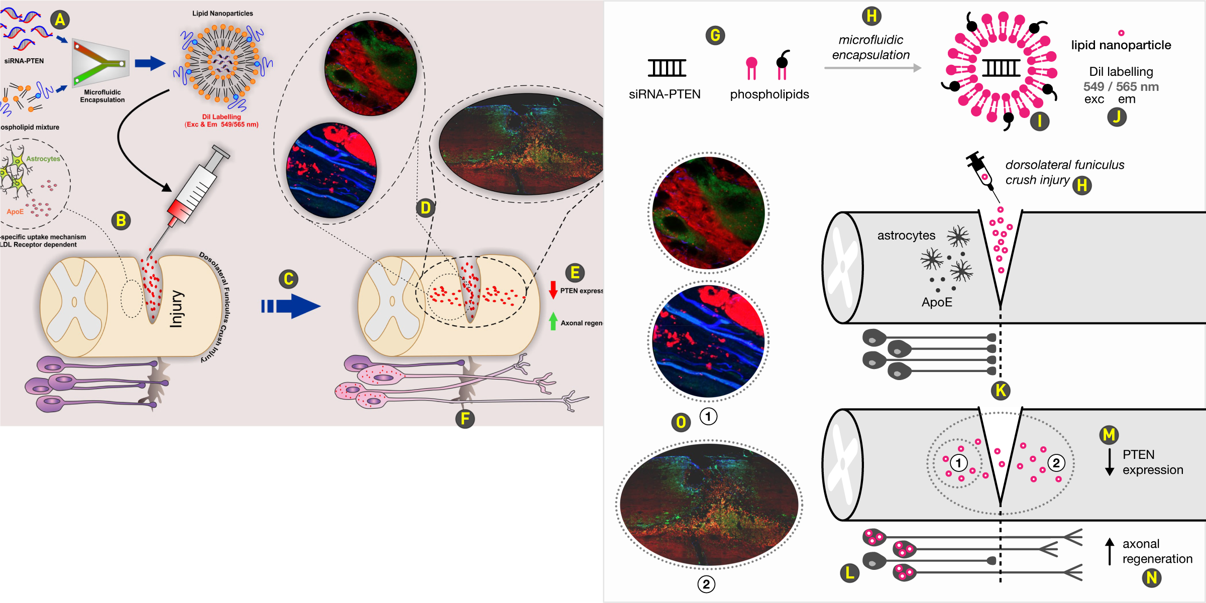
graphic abstract hospital > all cases > case 2
The extremely busy layout belies a relatively clean story. Overly embellished elements and drop shadows distract from important elements. A colored background reduces contrast and adds nothing to the design.
Don't draw more than one element when a multitude is expressly implied. The change in scale between components of the nanoparticle and the nanoparticle itself is unnecessary.
We're asked to look back up and to the left for more detail of what is happening upstream of the injury but simultaneously by a neighbouring arrow asked to look down and right. Avoid such eye traffic collisions.
Use a single arrow style throughout. Why is this arrow large, blue and with a dashed body?
Find and eliminate all sources of business, such as this maze of crop lines of various styles. None of the images are aligned to any reasonable axis.
Place labels where they belong. While both are describing what is happening inside the spinal cord, the PTEN label belongs inside while the axon label belongs closer to the neurons below.
There is no need to redraw the injury with a spiky blob, especially when the injury is originally represented by a notch.
The redesign distinguishes the preparation of the nanoparticle and then aligns key events to the vertical axis running down the middle of the nanoparticle. The magenta color saliently follows the injection, diffusion and updake of the nanoparticle.
Draw only one of each actor. It's obvious that we're not using only one of each phospholipd and that we're making more than one nanoparticle.
Don't overdraw a process. Rigid alignment and the "encapsulation" label makes it extremely clear what is happening, without having to draw any equipment associated with this step. Experimental procedures are italicized.
Draw complex structures with as little detail as possible that allows you to tell the story. Reuse symbols at the same scale as previously drawn — both siRNA and phospholipids are drawn at the same size.
Annotate away from the main eye path. Although it's relatively clear that the small circles represent the nanoparticle, placing one of them above the "lipid nanoparticle" label acts as a legend and removes all doubt.
The axis of the injury is emphasized with a dashed line. This isn't strictly necessary — alignment in the design is robust and removing this line does not introduce ambiguity.
The reason why individual neurons are drawn is to draw attention to the truncation (and regeneration) of the axons, which shows up more clearly when axons are parallel and neuron cell bodies are symmetrically arranged.
There are no other arrows in the design, so these arrows unambiguously communicate "decrease" and "increase". Never color the arrows to indicate their direction — the arrow head does this for you already.
Place labels, such as "axonal regenreation" as close to the action (e.g. where the regeneration is happening as possible). In fact, you could argue that the up arrow here is not necessary, since in the previous panel there was no regeneration.
graphic abstract hospital > all cases > case 2 > supplemental designs
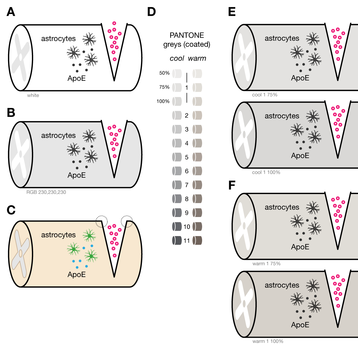
Don't take on the challenge of shading and texturing cells (or other objects) unless you're willing to spend the time and comfortable with the process. Use fill to strongly distinguish compartments (inside/outside) and explore the use of cool and warm grey palettes.
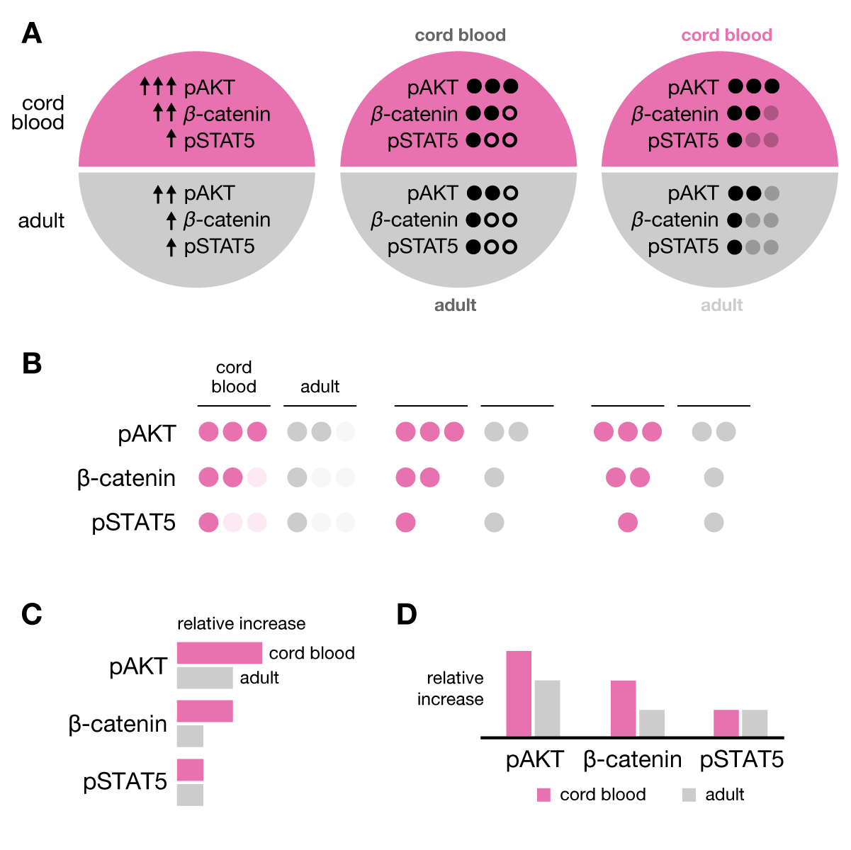
graphic abstract hospital > all cases > case 3
The original design has all the necessary components but lacks in good choice of color, alignment and spacing. Be very conservative when communicating approximate proportions — choose a scale multiplier and stick with it, unless the proportions can be quantiatively represented.
The size of this label is the same as for category (cord blood, adult) labels. But it's role is much more important — it's actually the key text in the abstract.
Avoid dark text on dark colors. The lack of contrast decreases legibility.
Avoid unnecessary capitalization and place labels consistently. Here, cord blood and adult labels are on the right of the circle, but elsewhere they are on the left of the cell phase bars.
Avoid separating elements that are to be compared. The phase labels do not belong between the bars, but before — in a tabular context, their job is that of a column header, which should come first.
It's not clear what "no division" means here, especially since there is a "division" label at the end of the bar. There's also no need for an elaborate arrow.
The redesign places the effect of stimulation first and then compares the effects of high and low stimulation. Proportions of cell phases are based on a 1.5× multiplier. In the "high" scenario, G1 of adult is 1.5× longer than in the cord blood and the length of other phases remains the same. In the "low" scenario, cord blood is 1.5× longer than cord blood in the "high" scenario. The "adult" bar here is itself 1.5× longer than the "cord blood" bar.
Don't abbreviate words (e.g. stimulation as stim) if you have the space for the full form.
All category labels "cord blood" and "adult" are right aligned to the same axis.
Splitting the circle with a white line helps to separate the two halves. Where possible, use space (white) not ink (e.g. black) to divide and distinguish.
The cell phase labels are shown only once.
The process of division is embedded in the design. If the bar represents a cell, then cell division is a split of the bar. The "division" label is not repeated.
If the low/adult bar does not end in division, draw attention to this at the beginning. The arrow is not strictly necessary, since we already expect division to be downstream of the start of the bar.
graphic abstract hospital > all cases > case 3 > supplemental designs
Two categories do not require two colors. Experiment with different ways of representing small data sets — good solutions are those that easily scale up.

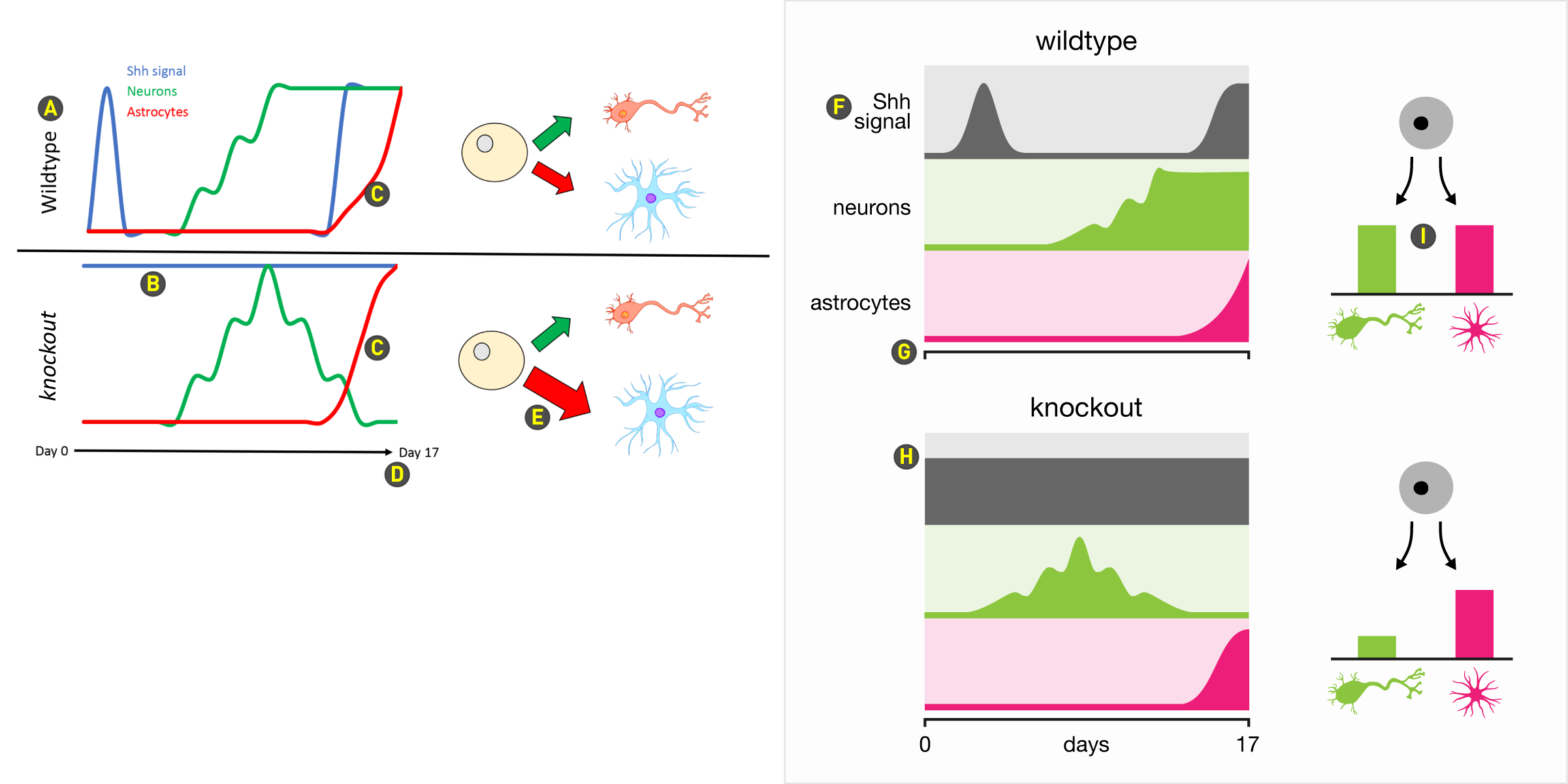
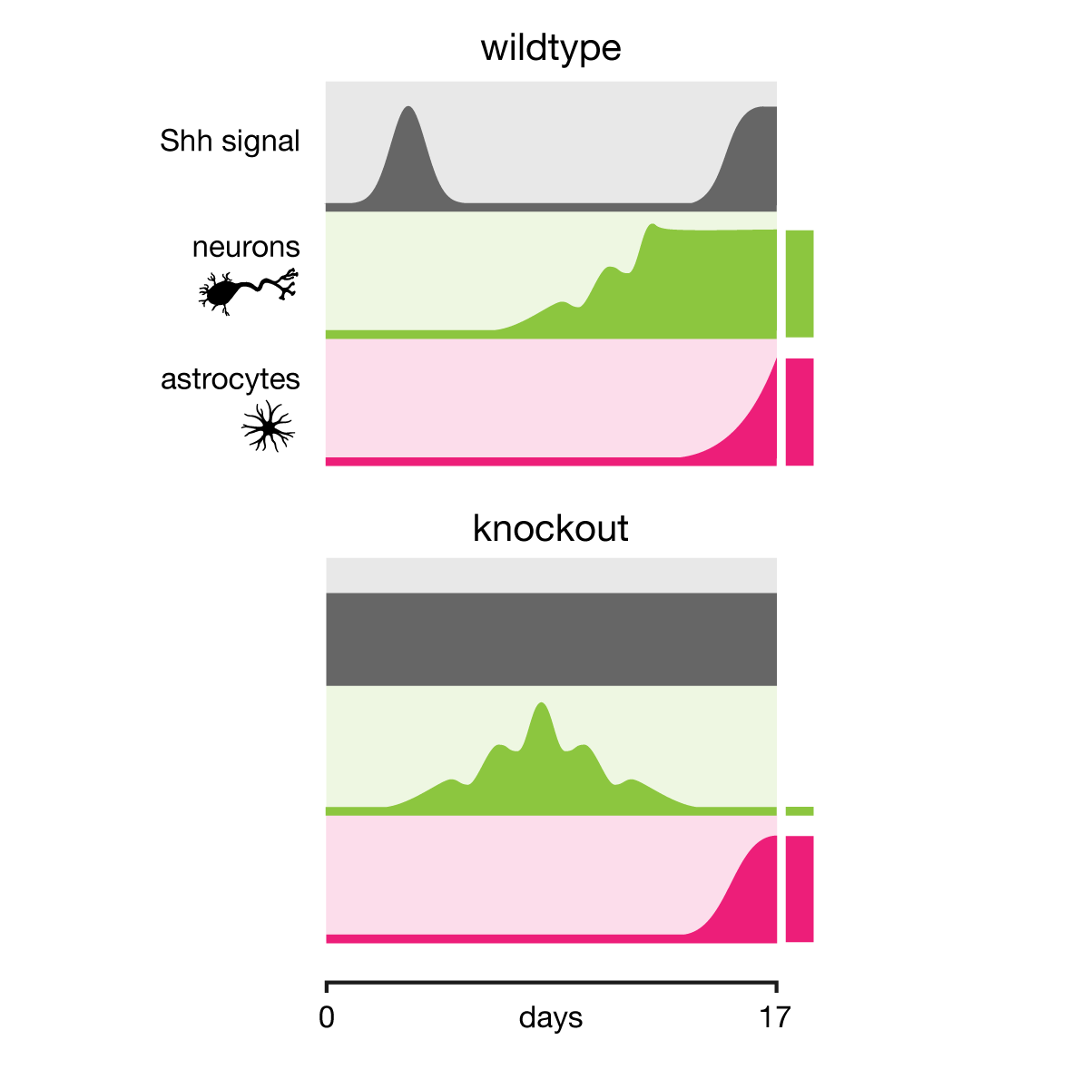
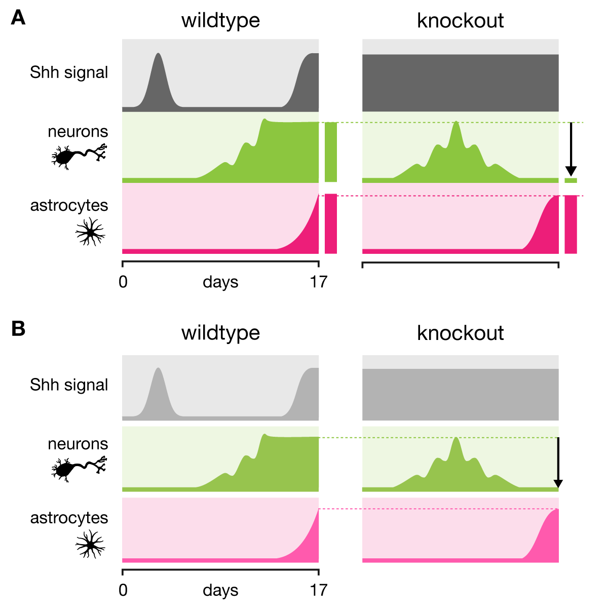
graphic abstract hospital > all cases > case 4
It's difficult to draw conclusions at a glance from the line plots because all the lines create areas of intersection that can play tricks on your eyes — it's not immediately obvious whether you're under the line or over the line. Color assignment is not colorblind-safe and then further muddled by using orange and blue for neuron and astrocyte clipart. The blue conflicts with the its use for Ssh signal and the cells do not need to be colored because they're distinguished by shape.
Avoid vertical text at all cost.
Use space to establish grouping. In this part of the plot the horizontal divider between plots, which uncannily looks like the axis below the bottom plot, runs parallel to the astrocyte plot on top (red) and the Ssh signal trace (blue) and this congestion of lines makes it hard on the eye to lock onto the baseline of each plot.
It's unclear whether the difference in how the red trace increases (power law in the wildtype and sigmoidal in the knockout) is important or unintended.
It's not necessary to repeat "day".
Never use arrow thickness to encode rate or magnitude. The arrows in this cell division representation are also ambiguous. It's more natural to interpet arrow thickness as a rate (but don't do it!) than to see it as a statement of the number of cells at the end of the timeline. Or do the arrows actually indicate a rate of differentiation on day 17?
The redesign separates each scenario into three tracks of area plots. This avoids overlapping plots and much more clearly communicates the quantity in each track because the trace has a fill.
Track labels do not need to be repeated for both scenarios.
Find a way to make your axes visible but subtle. Offset it from the data but not too far.
I've added headroom to each track to maintain visibility of the light background in the knockout Ssh signal, which is constant across time.
This part isn't necessary, but I've left it to indicate how the original can be rescued with a more quantitative representation. But I'm not crazy about it, so in the supplementary designs below I remove it.
graphic abstract hospital > all cases > case 4 > supplemental designs
Be conservative with clipart. The astrocyte shown here is one I use exclusively. The neuron clip art in the orginal is cute and reminds me of a jumping frog — are those desirable qualities? Limit the visual weight of dark greys by matching their luminance to other colors.
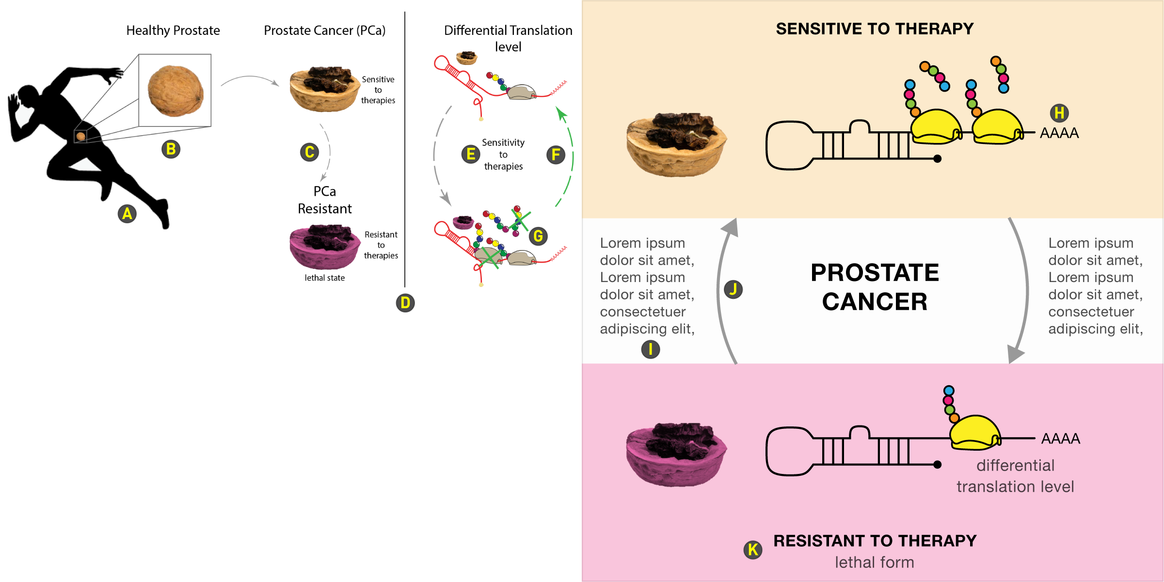
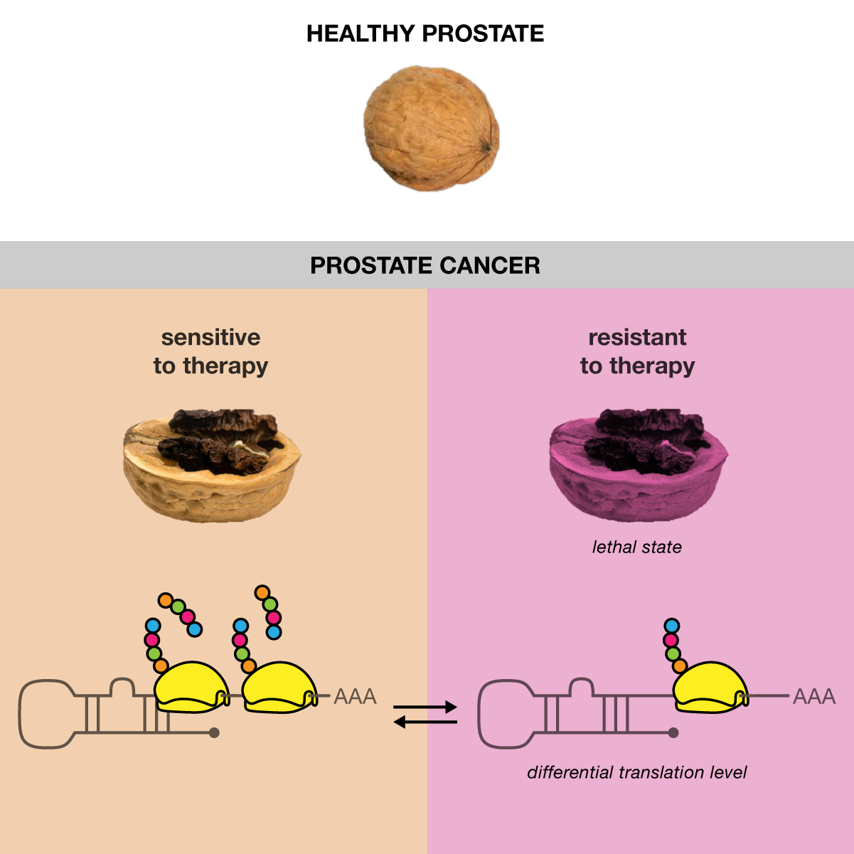
graphic abstract hospital > all cases > case 5
Some designs benefit from a top-down layout. This graphic is about a system that can transition between two scenarios. The theme of "two states that flip" should be the strongest influence on the layout. Once the molecular apparatus of one state is drawn, the other state should be represented with as much continuity as possible — align, align align!
This clipart immediately suggests that the abstract has something to do with running or exercise. The clipart is superfluous but also vexing — the eye will naturally want to try to follow the direction of motion of the runner, which takes it out of the frame.
Do we care what a healthy prostate looks like? If we do, what has this graphic told us? That it looks like a walnut. Does this help? Also, avoid elaborate zoom crop lines.
Why is this arrow dashed?
This vertical divider unnecessarily tries to separate elements that belong together. If anything, it actually should be a horizontal divider. Notice how the molecular events on the right also have a tiny prostate graphic next to them, which is so tiny that it blends into the scene as just another molecule.
Manage line breaks at ends of phrases and natural pauses. Avoid having single stop words (prepositions, conjunctions, etc) on one line.
Why is this arrow green?
Don't indicate absence of molecules by drawing them and then putting an X over them. In this case, the X is green, which isn't the most natural color to say "doesn't happen".
The redesign divides the graphic into three parts: the two scenarios and the transition between them. The graphic is about prostate cancer, so this label is placed centrally. Plenty of room remains for annotations of the transitions between scenarios. I've left the walnut prostate graphics and used their color to for background of each scenario.
How many A's are needed in a poly-A tail? I'd say 3 or 4, but not more. Always use the fewest number of elements to make your point. Always draw attention to the important parts of the graphic — this is why the ribosomes are bright yellow (black outline helps separate them from the background) and the RNA molecule is greatly simplified (and not at an angle).
Lots of room left for annotations.
Dark grey arrows do the job and are less jarring than black ones. Here I've made the arrows follow the shape of a circle to break up the rectilinear layout.
The "resistant to therapy" label is placed at the bottom to avoid having elements between the RNA diagrams, which is what we are comparing. Anytime you place something between things that are meant to be compared, you frustrate the reader (and they may not even know it).
graphic abstract hospital > all cases > case 5 > supplemental designs
Organize yourself using a tabular layout, which naturally splits the graphic into rows and columns, but make sure to indicate whether the comparison is between rows or between columns. The vertical divider in the original layout, for example, falsely suggests that we should be comparing columns, whereas the primary distinction is between rows.

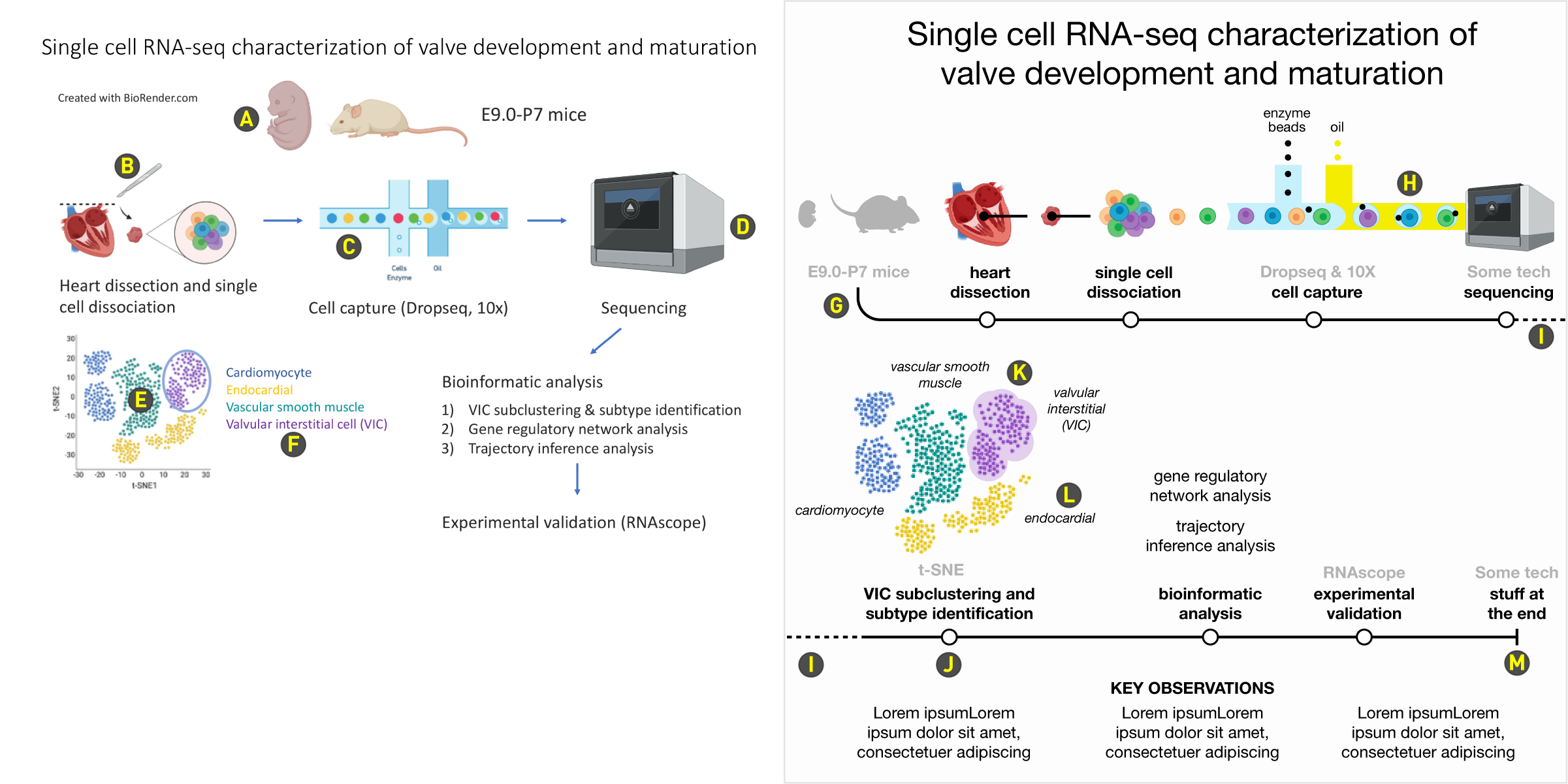
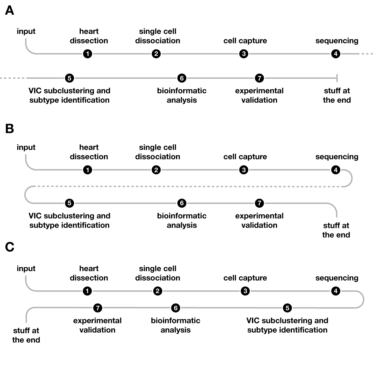
graphic abstract hospital > all cases > case 6
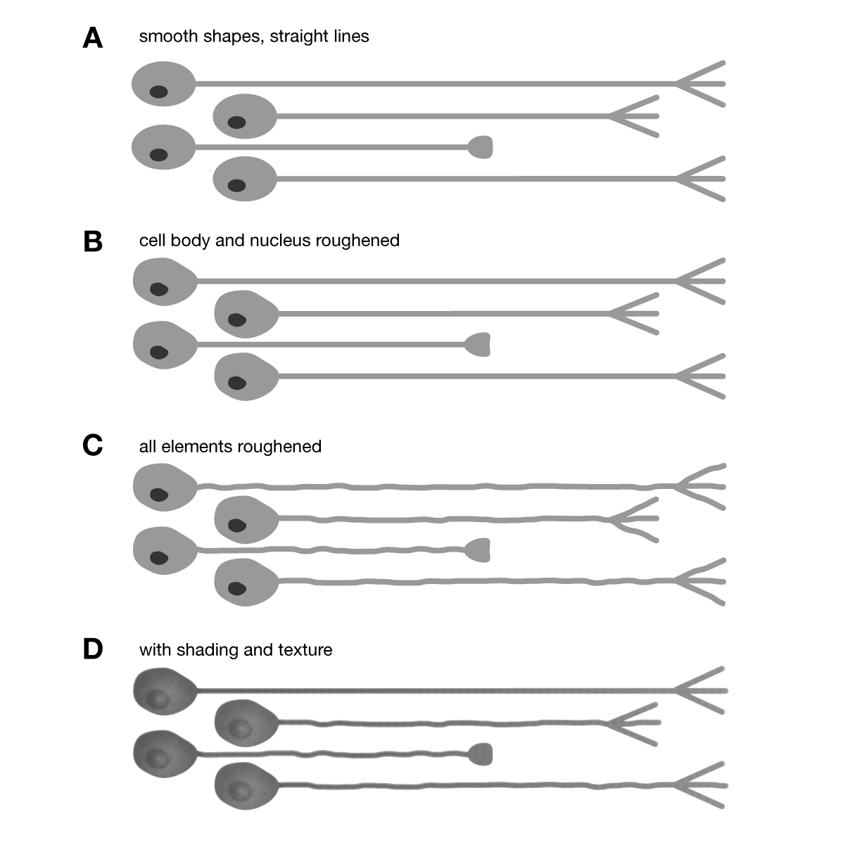
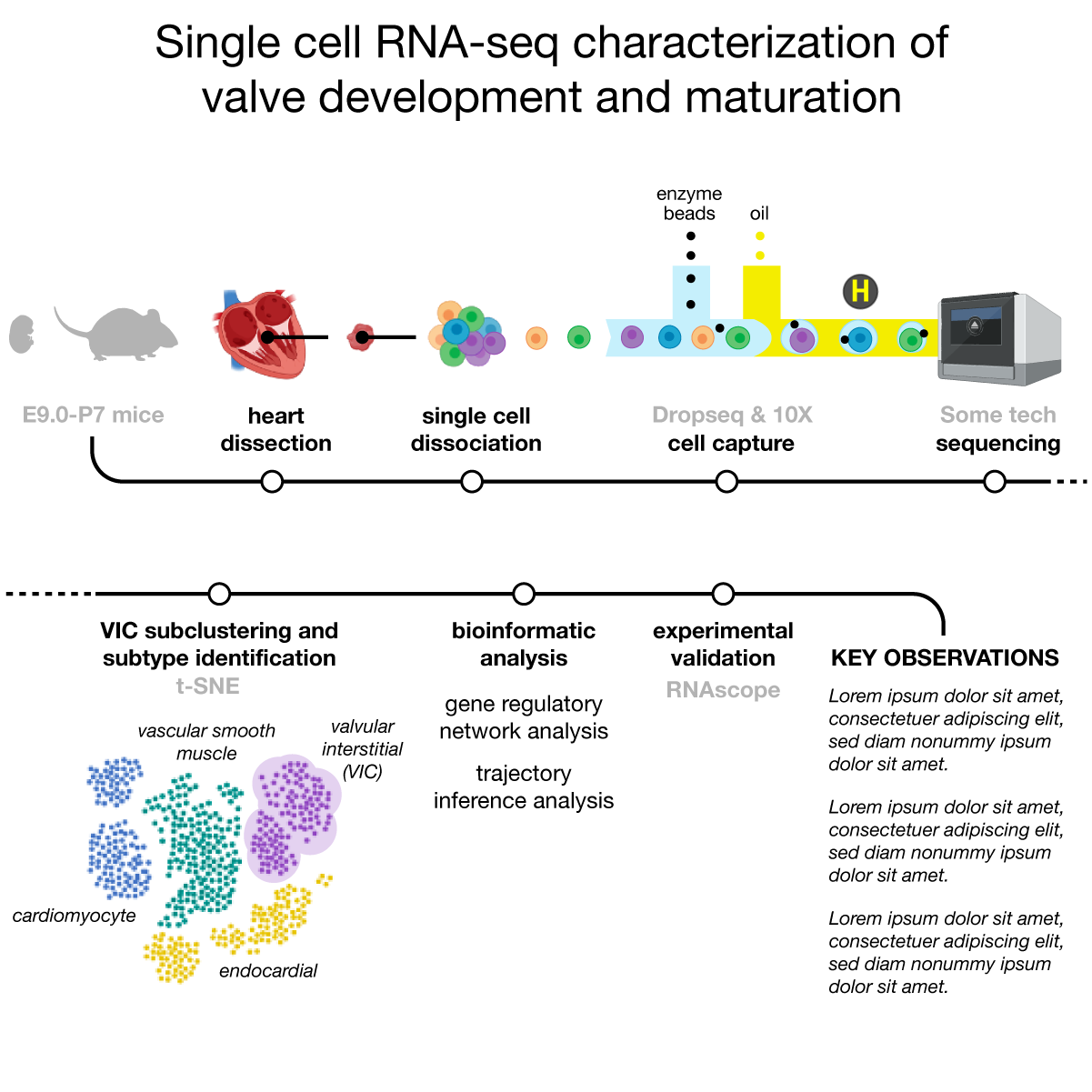
Track the movement of your eye when looking at a graphic — pay the bank $100 each time you have to backtrack or look right-to-left. The lack of alignment of step labels gives the graphic a scattered feel. The t-SNE cluster plot is actually closer to the heart dissection step than the bioinformatic analysis step. Since "space makes groups" the grouping we get isn't the one we want.
Elaborate embryo and mouse clipart is unnecessary. Also note that both face to the left, which might lead the eye to the heart dissection step, but this orientation makes an unintuitive ask: look in the top center and then move left.
The knife and dashed line here is not necessary.
The cells in the cell capture pipeline are not drawn in the same way as in the preceeding step. The pipeline is also unnecessarily long and the introduction of "enzyme beads" and "oil" from the bottom is less intuitive than from the top.
Avoid clipart of obvious equipment.
When drawing data plots, ask yourself whether you really need the axes. In this case, the point to be made is that t-SNE clustering is being applied — axes are not necessary to make this point.
Don't color text. Place it next to what it's labeling instead.
The redesign uses a metro map metaphor for the protocol.
The turn at the start of the line, completely discretionary, nicely emphasizes the concept of "start".
Continuity between steps is maintained by following the cell path from the cell cluster at "single cell dissociation" all the way into the sequencer. Note the change in color of the cell capture pipeline — yellow to intuitively indicate "oil".
A dashed line out of the frame (and into it, below) cues that the line continues.
I've placed the clustering as a separate step. This more naturally accomodates the t-SNE plot, which now has its own "station" on the line. Always be on the lookout for opportunities like this. Notice how som elabels have a lighter gray text that indicates the technology (or algorithm) applied in the step.
Don't use outlines to highlight clusters. Instead, use a light fill tracing the shape of the cluster.
Smaller italic labels indicate that these are subbordinate to all other labels.
End the protocol at its natural conclusion — confirmation of a hypothesis or key observations. Don't just dangle "experimental validation" at the end without a follow up: how many candiates were validated, what was the outcome of the validation and what did you learn?
graphic abstract hospital > all cases > case 6 > supplemental designs
When drawing protocols, try showing everything in a single straight line, either horizontal or vertical. Give text plenty of space and be on the lookout for congestion — steps should be separated by enough space to maintain the theme of a series of individual steps. Often this path will be influenced by the length of your labels and detail in illustrations but don't let text bully you around. Experiment with various eye paths and favour those that start at the top left and finish on the bottom right — avoid too many turns and upward movement.
graphic abstract hospital > all cases > case 7
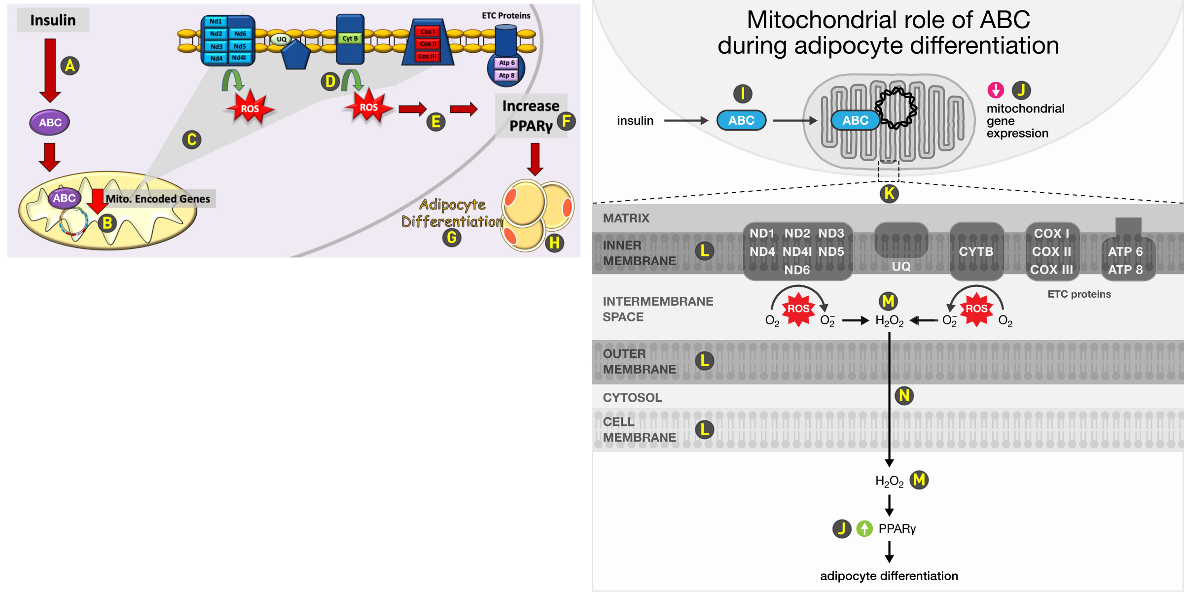
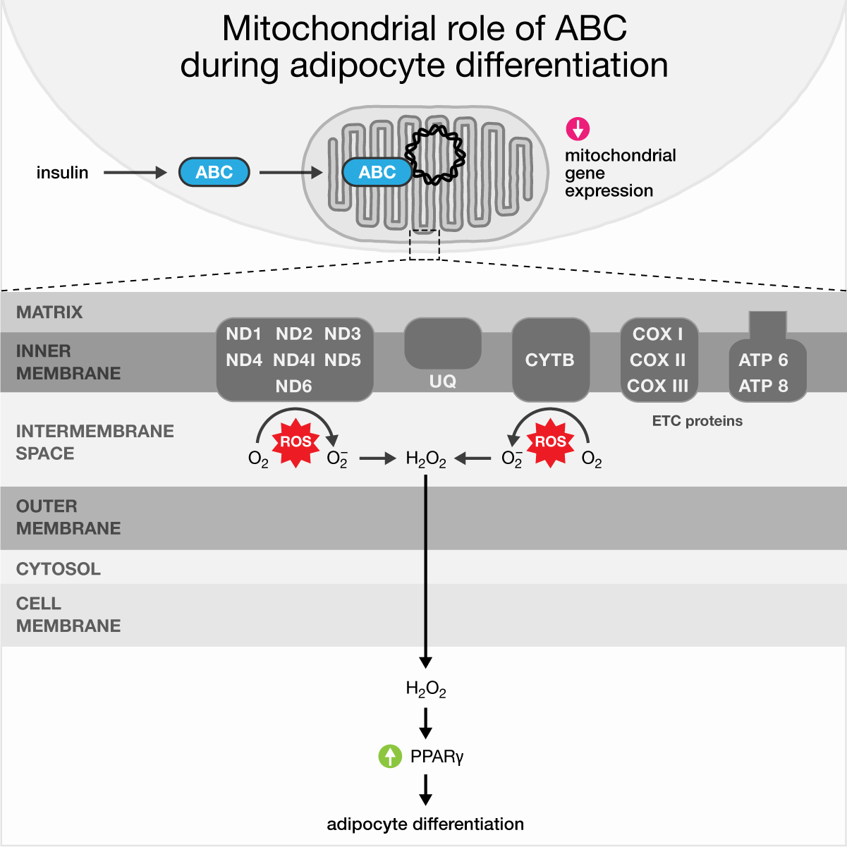
The mitochondria membrane zoom from the bottom left to the top right is unusual and crosses the full diagonal of the graphic. These should be much closer. The layout has a lot of ambiguity about which compartment we're in at any given point. Notice how the crop of the inner mitochondrial membrane is actually drawn inside the cellular compartment. Arrows mean different things: some red arrows indicate transport, one indicates a decrease and one is a "look here" arrow. The green ROS arrows are ambiguous — don't assume everyone knows what they indicate (O2 to O2– conversion). Always practise explaining because eventually you are going to have to explain something. I'm not an illustrator, so my mitochondria looks a bit like a radiator.
This red transport arrow is too heavy and too long. Look how far insulin is from ABC.
The red arrow here encodes a decrease in expression, but it's right next to a nearly identical arrow that indicates transport. Never draw the same thing to mean very different things, just as you wouldn't use three homonyms in a row (what does "set set set" mean?).
Make crop lines (or shapes) as short as possible without loss of clarity.
Explain what you mean and avoid elaborate twisting arrows.
The meaning of these red arrows is totally opaque?
Why is the increase PPARγ label on the cellular membrane? Is this accidental or purposeful?
No Comic Sans ever.
How is "differentiation" used? What is being said? That we have more white fat cells at the end or that we have more differentiation at the end (white/brown fat).
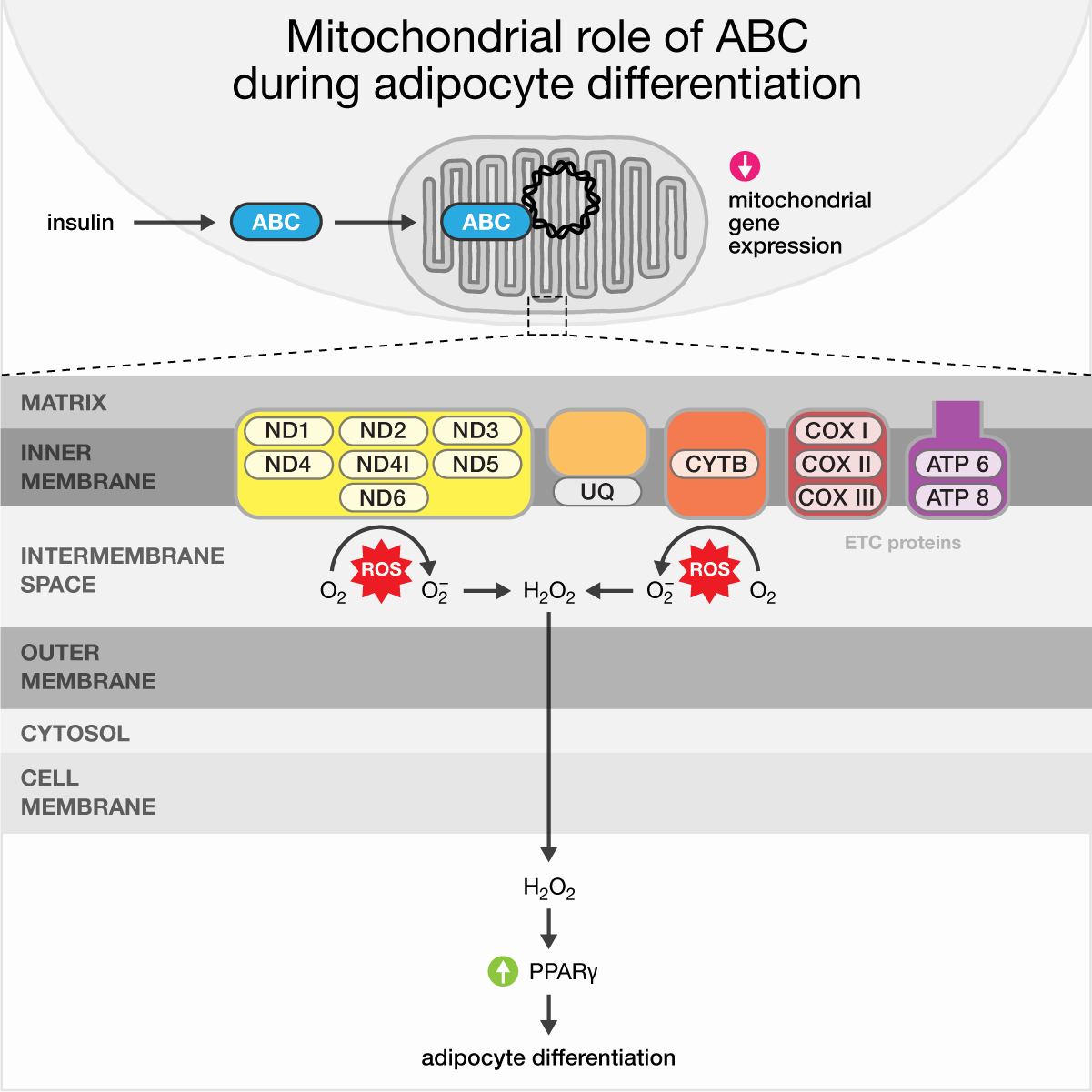
The redesign has a strong vertical axis and separates the region used to draw the cell and mitochondria from the region in which a magnified crop is shown.
Since ABC is important, using color here helps set this theme.
Because arrows are already used for transport, the arrow for decrease in expression is drawn differently. Use of color for decrease (and later, increase) is discretionary and works only if color elsewhere is tightly controlled.
Clearly indicate which area is being magnified.
Match colors of magnified areas to those introduced in the zoomed-out graphic. If multiple membranes are drawn, draw them in the same way. You're not going for realism here.
Specify which compound is being transported out of the cell. Here, I've assumed it's peroxide. Note how both ROS events point towards the middle vertical axis. Peroxide is repeated at the bottom to remind the reader what is being transported. Doing it makes each "scene" in the narrative more modular. And if you start at the bottom of the graphic and look up, you don't need to go all the way to the middle to understand what is being transported.
This arrow crosses two membranes and a compartment. It's an important part of the story and gets us out of the mitochondria through the cell and out of it.
graphic abstract hospital > all cases > case 7 > supplemental designs
Treat color as a limited and non-renewable resource — impose a color budget and don't blow it frivolously. Make use of blend modes to layer elements and colors. The lack of blend mode support in PowerPoint disqualifies it as a tool for making figures.
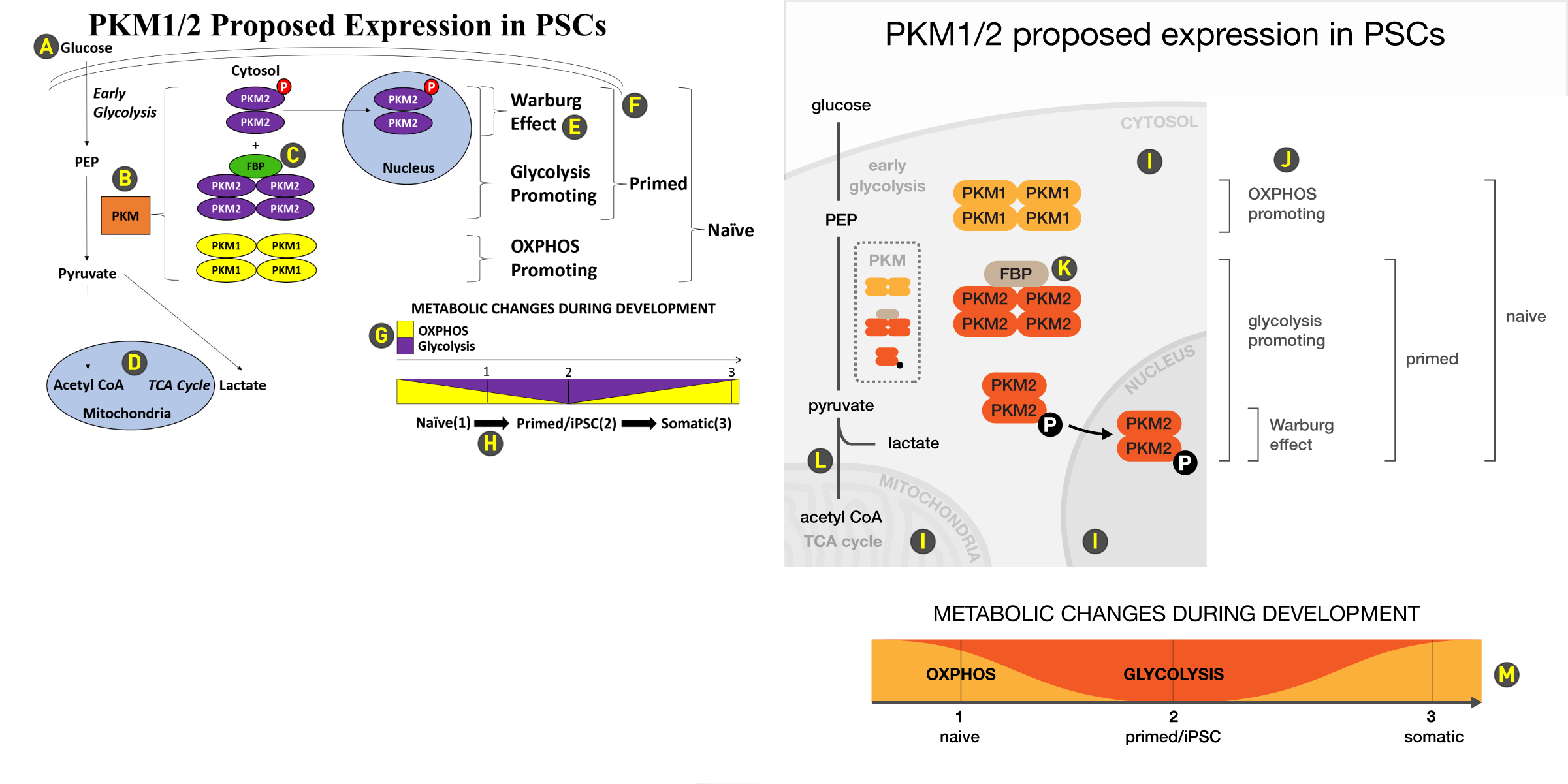
graphic abstract hospital > all cases > case 8
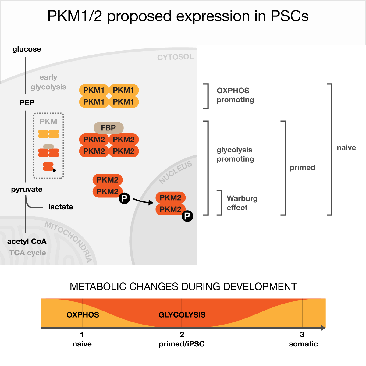
The graphic struggles to clearly communicate inside/outside of cell, mitochondria and nucleus compartments. The organization of the graphic into rows annotated by a process (Warburg effect, glycolysis, OXPHOS) ends half-way down, the mitochondria dangling off to the left and the data plot off to the right.
Glucose is uncomfortably squished between the title and membrane. Give it space to clearly announce the input to the process.
Orange is used to color the zoomed-out snapshot of the PKM compounds but none of the compounds are actually orange.
FBP gets its own color, but is it necessary?
The inside of the mitochondria and nucleus is established well but why with blue? Stick to light/dark grey for outside/inside, unless you have an excellent reason to introduce hue.
The labels are too bold for the capture brackets, which are thin and brittle. Avoid brackets to indicate a region — they're too ornate. Also notice the double use of these brackets: one is used for a zoom (PKM compounds) but others are used to delineate a region.
The membrane lines are very close to the "primed" capture bracket lines. Avoid this kind of collision and find a way to resolve it — does the membrane need to extend this far right in the graphic, or could it end at the right end of the nucleus?
Avoid legends, which is often possible when only a couple of items are being listed. Instead, incorporate the labels into the plot directly next to their elements.
These arrows mean "look here" but why so thick? And are they needed, given that they're just telling you to look down along the direction of the axis?
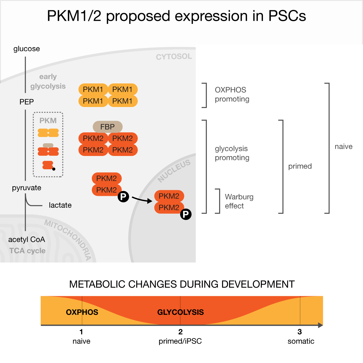
The vignette into the cell is effectively separated from other elements by using a grey fill. A gentle variation of color between PKM1 and PKM2 subtly suggests that they're related. The process is flipped to put the Warburg effect zone at the bottom, which is more natural because it leads the eye down (not up) and matches the fact that OXPHOS is the first process in the data plot.
Light compartment labels follow the shape of the membrane. This blends these labels into the background and makes them almost invisible, unless you look for them. This is the point — they're not that important so don't make them too bold.
The classification labels are offset from the molecular vignette. Brackets are used instead of braces — they're simpler and do the job.
FBP gets a soft brown color, but could just as well have been grey. Note how the zoomed-out view of the PKM complexes shows a small version of the zoomed-in view, but without labels. Doing this avoids the need for crop lines that say "this is being magnified".
Pathway lines don't always need arrows.
This plot trades in straight lines for curves. This avoids a pointy "V" at step 2, which doesn't represent how quantities change in an actual cell (all rates have continuous derivatives).
graphic abstract hospital > all cases > case 8 > supplemental designs
One of the reasons why you should be drawing on an artboard of fixed physical size (e.g. 4" × 4") is that it allows you to rationally manage line width using points as a unit. Always be thinking about the ideal size of your design if it were to be printed (aim for 4" × 4") and the visibility of all its elements.
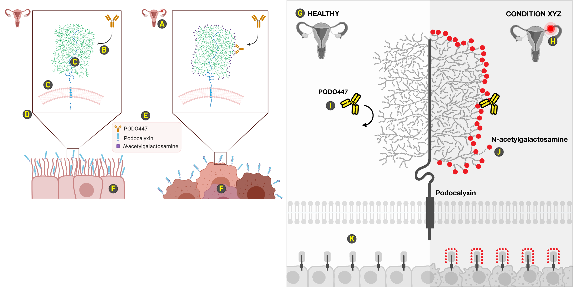
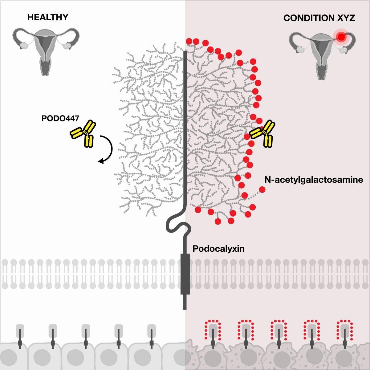
graphic abstract hospital > all cases > case 9
The space used for cells and crop lines squishes the main scene into a small space. The simplicity of the message is lost among the repetition and unnecessary variation.
The red glowing circle on the Fallopian tube is too small.
This is the wrong arrow end. It suggests inhibition, but as far as I can tell what is meant is that PODO447 does not bind.
The curvature in the podocalyxin chain isn't necessary. The scene actually seems to be tipping to the right. Similarly, the membrane doesn't need to be curved.
The design can be made without crop lines. But if such lines must be drawn, make them as light as possible without losing them.
No legends. Incorporate labels close to their elements. Legends squished into the graphic are an indication that the space is full — back up and rework the layout.
The open form (extend beyond edge) of the cells is a good choice here, but the cells are too elaborate and the small versions of the scene don't actually reflect their magnified form.
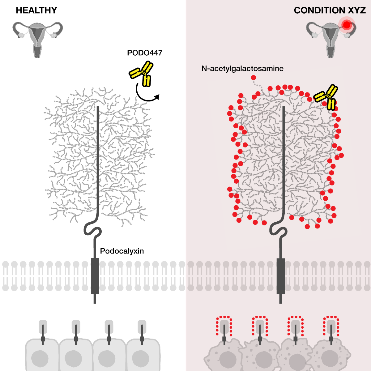
The redesign uses the podocalyxin chain, now shown straight, as the vertical axis of symmetry across which the healthy and diseased states are shown.
There's plenty of room for labeling the condition. The "healthy" label immediately cues the reader that the theme is health vs. disease.
A much larger cue to localize the scene within the reproductive system. The same red color is then used to communicate the difference between the panels.
I've made PODO447 bright yellow to make it the most salient element in the graphic. Note how the PODO447 on the left (not binding) and the one on the right (bound) are aligned horizontally. Not an accident.
One of the N-acetylgalactosamines is drawn slightly away from the others to indicate unambiguously what is being labeled. Essentially, this is a kind of legend built up from the parts of the graphic itself.
I've kept the open form for the cells but drew them more simply and with regular spacing. The cells in the disease state are slightly distressed, but only subtly. The key element here is how the miniature scene is drawn, particularly in the diseased state on the right.
graphic abstract hospital > all cases > case 9 > supplemental designs
The choice of layout can elevate or depress your message. Always favour a design that easily scales to additional detail — even if you have nothing more to show, it's clear whether the canvas is "full" — this lack of vacancy almost always indicates issues with how size and position are managed.
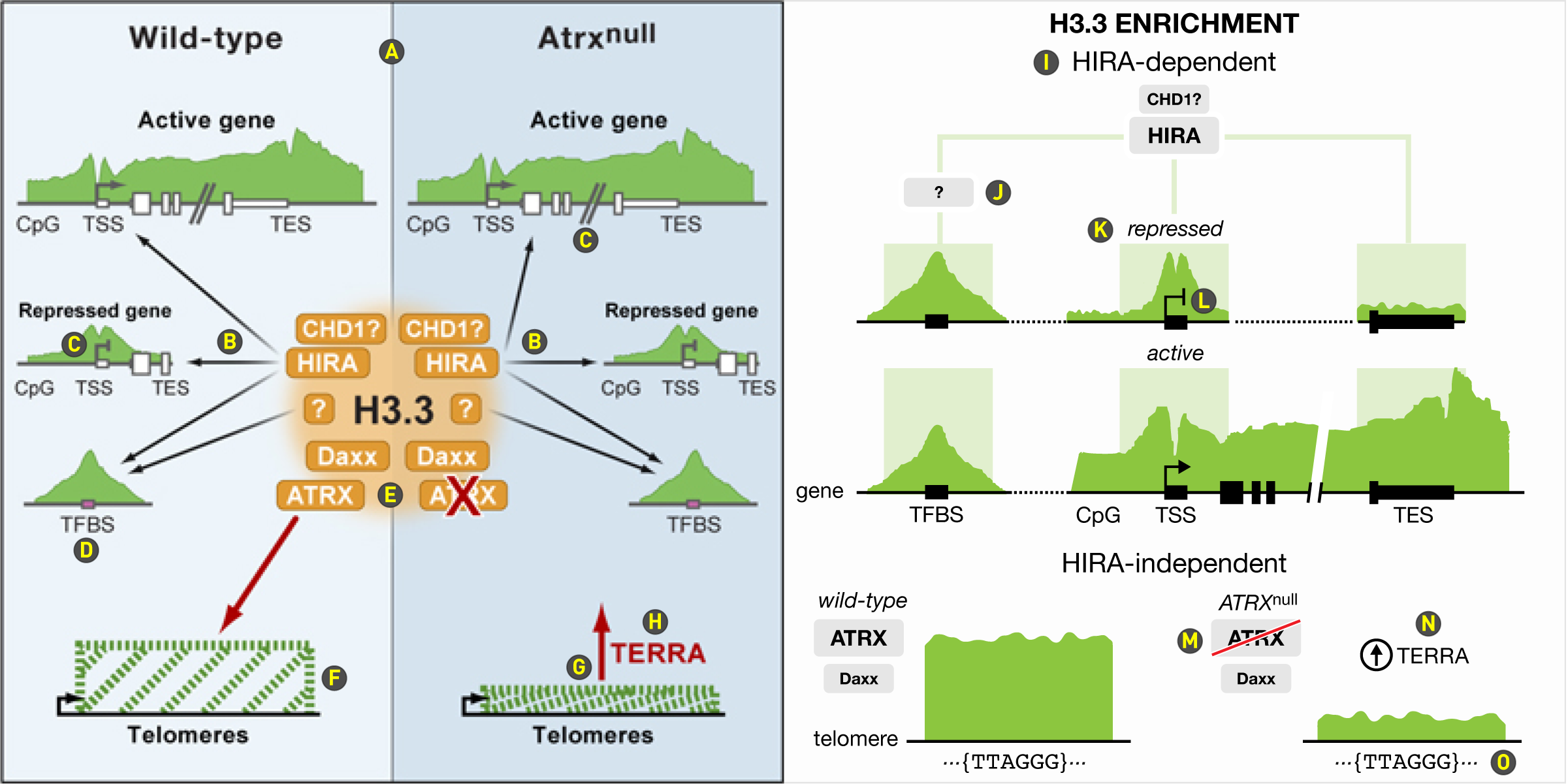
graphic abstract hospital > all cases > case 10
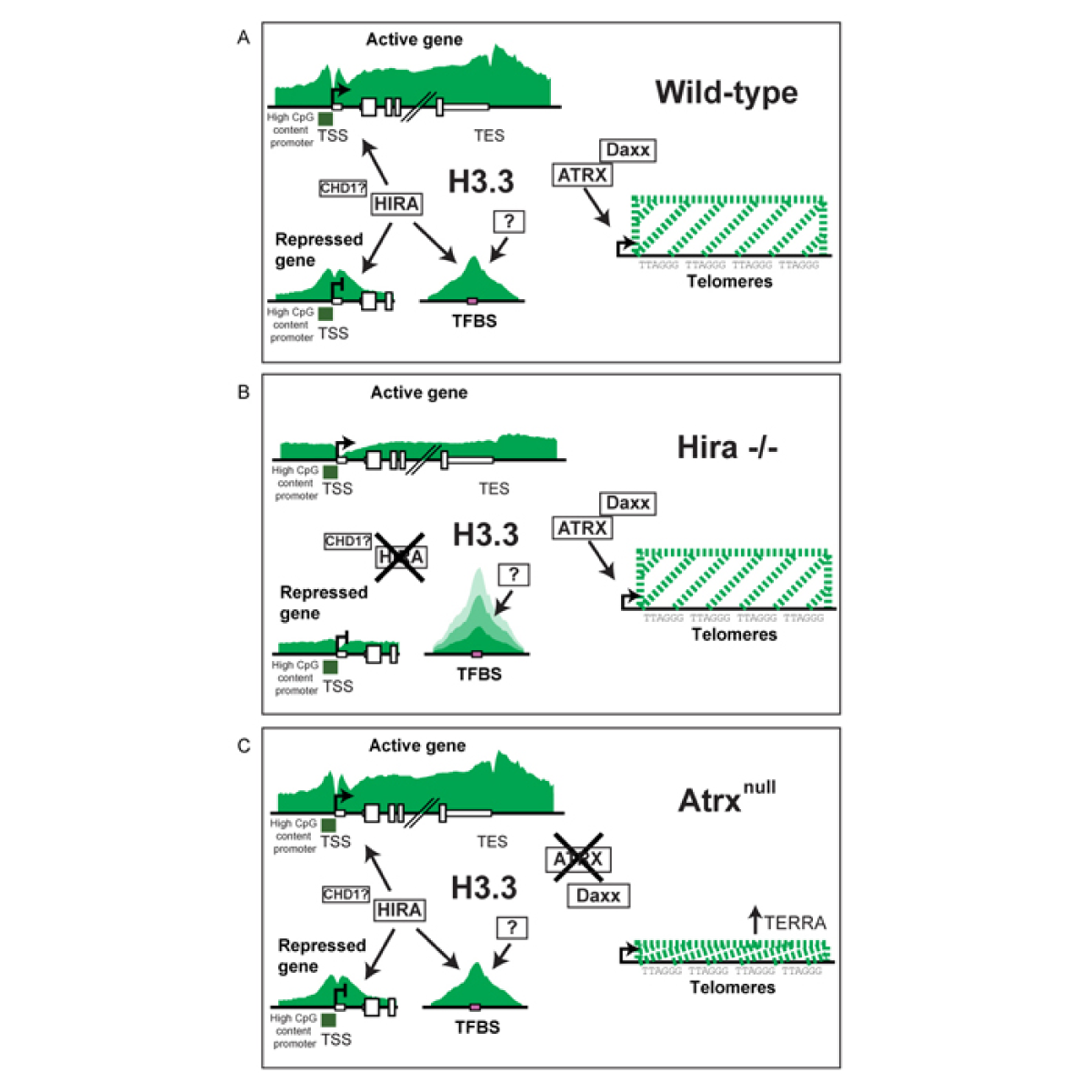
This case study is a redesign of an example in Cell's graphical abstract guidelines. The original abstract is from Distinct Factors Control Histone Variant H3.3 Localization at Specific Genomic Regions.
Cell's redesign of the original abstract takes the right step to eliminate the middle panel (Hira–/–) but doesn't go far enough in reducing redundancy. It's still very difficult to see that there are two fundamentally independent scenarios here: (1) HIRA-dependent H3.3 enchancement in genes, which is the same in wild-type and Atrxnull and (2) HIRA-independent but Atrx-dependent enhancement in telomeres. The design suffers from a mix of weak and strong graphical emphasis that does not map to pertinence, an explosion of arrows, superfluous gradients, curious use of color and mysterious textures.
The vertical split down the middle muddles the story. Top-level organization of elements is critical — a bad choice at this step cannot be rescued by great design decisions downstream.
The arrows are horrible. The arrows on the left and right are actually identical, but notice how the arrows to TSS are not symmetrical. This is due to the layout: identical positions (TSS) on identical elements (active gene) are at different distances from the middle. The arrows start weakly with a gradient — both ends of the arrow are important and should be presented with equal weight.
Do not draw tiny important elements (TSS) but large unimportant elements (axis break in active gene). There is no good reason why the TSS element is so thin (or so short, given that the diagram is an illustration and not to scale).
Why is the TFBS element purple? And is this important? We'll never know.
This gradient does not serve a functional purpose. If the meaning is "a cloud of factors that influence H3.3 enhancement" then this is implied by position. If its purpose is to draw the eye, it's unnecessary since the eye will naturally look to the center in this layout.
What are these dashed lines? The best I can guess is that the height of the rectangle indicates the amount of H3.3 enrichment, but this amount is not directly measured in the telomere in the same way as in gene regions. Is the transcription arrow in the telomere key to the story?
This red arrow is meant to indicate increased expression of TERRA. But this is the same red arrow as the "look here" arrow on the left — the same graphical element should not be recycled with a different meaning.
Both the arrow and TERRA label are so close to the green rectangle that it implies that the rectangle itself is growing and that the rectangle is actually encoding the TERRA level, which isn't the case. There are two separate things happening here: Hira-independent localization of H3.3 at telomeres and represesion of TERRA, both of which are reduced in absence of ATRX.
The redesign rearranges the elements into two scenarios: HIRA-dependent and HIRA-independent effects. The former is then broken down into effects on active and repressed genes and the latter into ATRX and ATRXnull cases. I've taken the green area plots from the original and in places adjusted their proportions to match the design. In some cases, I've made up my own. In reality, they would be formatted quantitatively.
In the original it's ambiguous what aspect of H3.3 is being illustrated, which can be resolved by explicitly including "enrichment" in the title. The "HIRA-dependent" subtitle for the first scenario sets up the top-level organization.
The H3.3 enrichment at TFBS is under the additional influence of an uncharacterized protein, which does not influence H3.3 at TSS or TES. This is somewhat clear in the original but muddled in Cell's redesign. By drawing three branches from HIRA, I can add stimulatory or inhibitory influences to each branch in a natural way.
The "represeed" and "active" genes are drawn as data tracks, on a single genomic axis (there is no reason to break the TFBS into a separate axis like in the original). Both an axis break can be indicated with a double diagonal line (but subtly!) or a dotted line. Note that in Cell's redesign the "active gene" and "repressed gene" labels have different size — while the repressed case might be less important than the active case, they're labeling the same variable (is it active? yes/no) and should have the same format.
The TSS element is large and its transcription arrow matched in size. Strictly, it's not necessary to repeat the elements on the axis of the repressed gene.
A couple of ways to indicate that ATRX has been knocked out. The "wild-type" and "ATRXnull" labels indicate the experimental condition whereas the line through ATRX indicates that the corresponding protein isn't in circulation. I prefer a single red line to an "X", because it improves the visibility of the text underneath. It's also reminiscent of road signs in Europe indicating the boundary of towns.
TERRA has been offset from the rectangle to avoid confusion.
The original design had the repeat sequence, which was removed in Cell's redesign. It's not strictly necessary but it can be easily added without interfering with other elements. In fact, it fits in nicely because it counterbalances the element labels (TSS, TSS, etc) in the gene tracks.
graphic abstract hospital > all cases > case 10 > supplemental designs
If you're drawing the same thing twice, ask yourself whether you can get away with drawing it only once. Be very careful when placing elements next to each other — proximity implies a relationship. Don't imply something that doesn't exist.
graphic abstract hospital > all cases > case 11
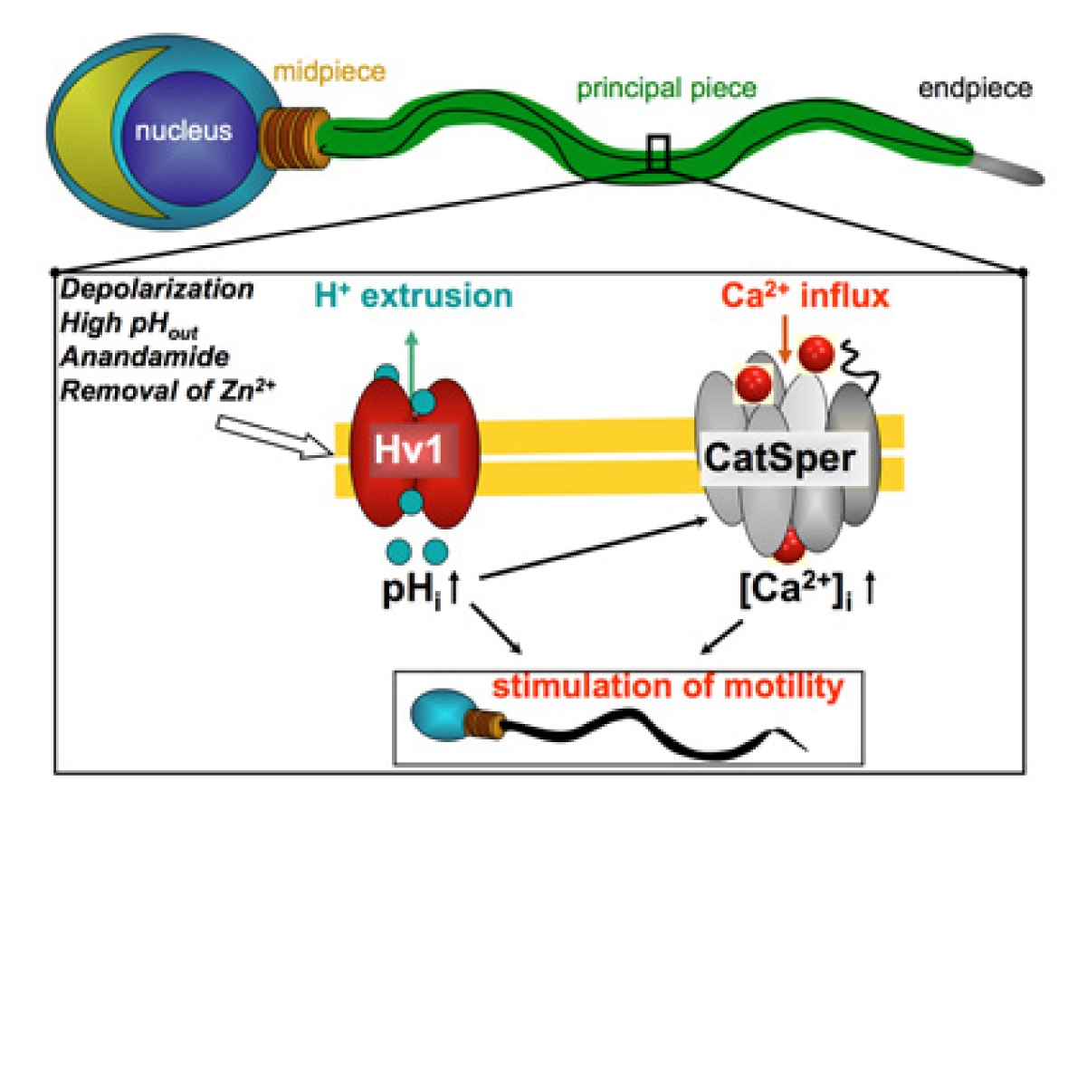
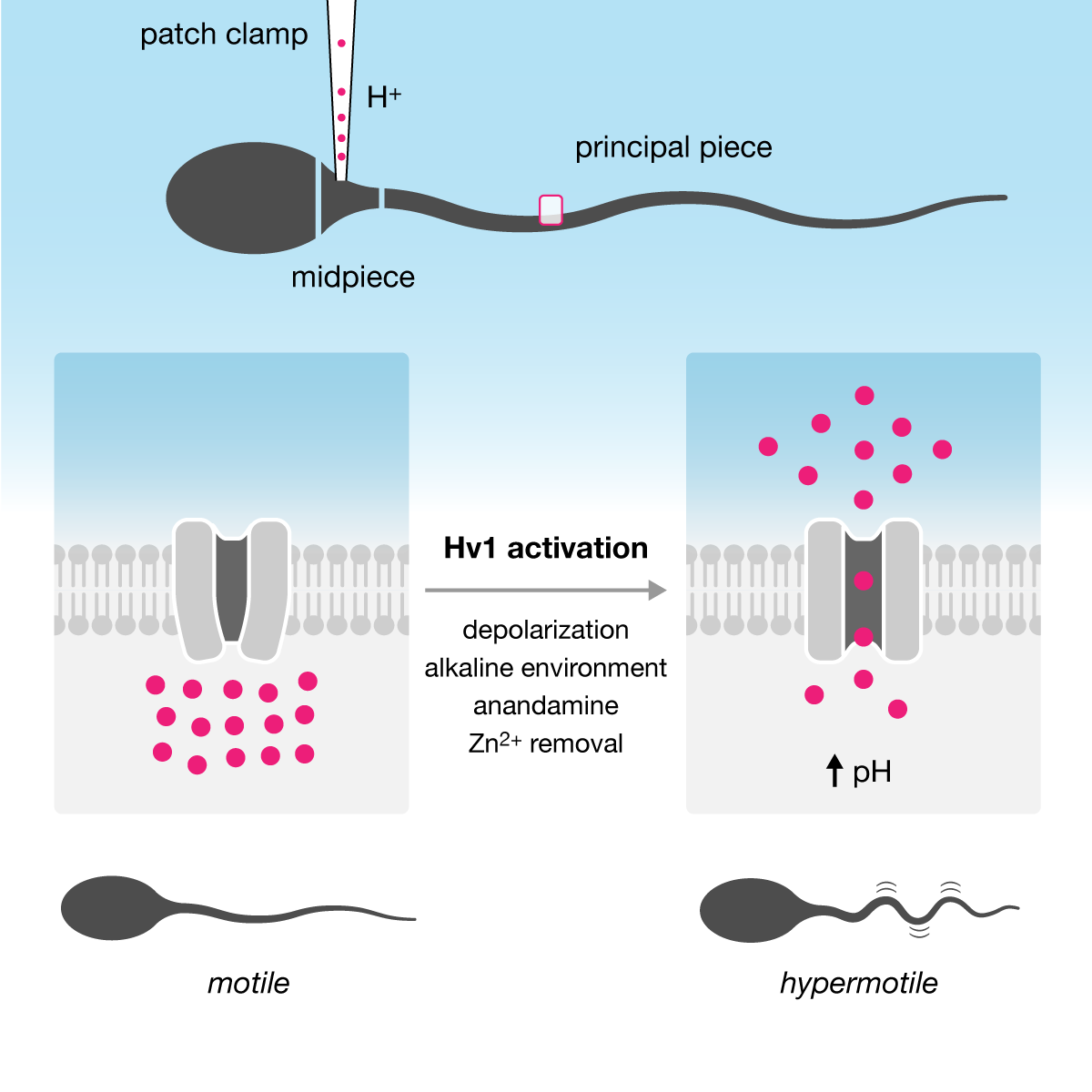
This case study is a redesign of an example in Cell's graphical abstract guidelines. The original abstract is from Acid extrusion from human spermatozoa is mediated by flagellar voltage-gated proton channel.
This is an example of how a graphic of a very simple message can wind up looking busy and full. The desaturated colors that pervade every corner of the image rob it of any contrast.
Label only what is necessary. The nucleus plays no role in the story and doesn't deserve a mention. The sperm diagram itself is too complex — its only relevant elements are the midpiece (to which the patch clamp is applied) and the extent of wiggle of the principal piece. Notice too that the angle of the sperm and shading implies a three-dimensional environment in which the principal piece is receeding into the background and placing the area of interest (red rectangle) furthest from the viewer.
The color outside the membrane in the crop is different than the color outside the principal piece in the full-scale drawing. Yes, this is a minor point but this inconsistency is neither unavoidable nor beneficial to the design.
The color inside the membrane is different in the left and right panels. Is it less orange in the right panel to indicate that the orange protons have been transported out? If so, why is the remaining color green and not light orange?
Why are two Hv1 channels drawn? Since they don't necessarily appear in pairs, drawing one (the smallest number needed to tell the story) is simpler and therefore better.
No gradient arrows.
The "motile" label describes the sperm yet it is closer to the crop rectangle. Again, this is unlikely to lead to confusion but you should nevertheless manage the distance between labels and their elements carefully, because if it's not done well in simple diagrams it will definitely not be done well when it's needed in complex diagrams.
The "increased pH" label is redundant, given that "alkaline environment" also appears in the center.
The background color is not necessary. It's almost never necessary.
My aim was to encode the theme so that it can be processed pre-attentively. I normally steer clear of gradients, but in this case I took one for the team and tried to show how a gradient might be incorporated without causing an accident. I've chosen blue at the start of the gradient at the top to indicate aqueous environment in which the sperm is swimming and then fade it close to the membrane. I've chosen not to color the inside of the membrane, which helps in offsetting the motile/hypermotile sperm illustrations away from the membrane.
What are these magenta dots? Notice how protons are labeled in the original but not in Cell's redesign. I don't think it's good to assume that we know what is being transported, given that the graphic has a "removal of Zn2+" label.
The circle indicating the crop is colored red to match the magenta-is-important theme. Also notice that the "principal piece" label is placed close to the tail and not the crop circle to avoid ambiguity in what is being labeled. In Cell's redesign the label is next to and aligned with the rectangle, which goes against Gestalt principle of spatial grouping.
I've drawn a single membrane in open form (extends beyond the frame). The membrane here provides spatial context (Hv1 is a membrane channel) and we don't need two membrane segments to say that there are two cases (inactivated and activated Hv1).
I've moved the labels off to the side, to more strongly attach them to the activated state rather than how Cell had it in the middle, associated with the process of activation. In this case, I don't think that it's necessary to have three parts in the story: inactivated, activation, activated. The first and last are enough.
I've drawn the sperm more simply than at the top (midpiece is not called out) because the purpose of the illustrations at the bottom is to emphasize the motility by the amount of wiggle in the tail. In Cell's redesign, the tail was white and had poor contrast with the background — this made the wiggle less obvious. Also, the "motile" and "hypermotile" labels are below the sperm and not between it and the membrane — this serves better to label simultaneously the state of the sperm and the entire side of the graphic.
graphic abstract hospital > all cases > case 11 > supplemental designs
graphic abstract hospital > all cases > case 12
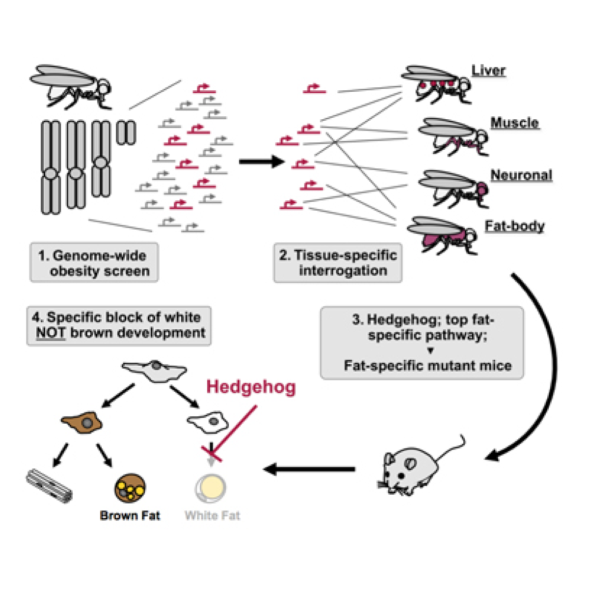
This case study is a redesign of an example in Cell's graphical abstract guidelines. The original abstract is from Drosophila genome-wide obesity screen reveals hedgehog as a determinant of brown versus white adipose cell fate.
Cell's redesign does a good job in unwinding the spiralling layout of the original but misses in maintaining contrast and emphasis through the whole story. Opportunities to provide detail are missed (e.g. the fact that triglyceride levels are measured) and the approach to alignment is too loose. Is the arrow under the fat-body fly (but not entirely centered) placed there for a reason?
It's fine to show all the ideograms for a genome, especially for one with as few chromosomes as the fly, but if you commit to drawing them, draw them in proportion to their sequenced length.
These scattered transcription symbols occupy a large amount of space and add business. They're also not necessary to communicate that the method is RNAi.
The white arrow has poor contrast with the light background. Arrows further down are smaller (why?) and aligned to a different vertical axis. This axis is close to the fat-body fly, but not perfectly centered on it. Is this just centered alignment to fit the other downstream elements or does it have something to do with the fat-body fly? It's very ambiguous.
The flies are shown in too much detail and the illustrations draw insufficient attention to the tissues of interest. The wings cover up the liver highlights, the legs are too thin to emphasize that muscle is being studied and the dark red head is not sufficiently different from the dark grey one to indicate neuronal tissue.
Committing to left-aligned scene labels results in increasing distance between the labels and the scene. In the mutant row, the mouse is longingly staring at the label. Did you notice that the flies point to the right but the mouse points to the left?
The inhibition arrow clearly communicates that white fat cell adipogenesis is inhibited. It's not necessary to then also draw the white fat cell as semi-transparent — this only reduces the visibility of an important element in the graphic without providing any new information.
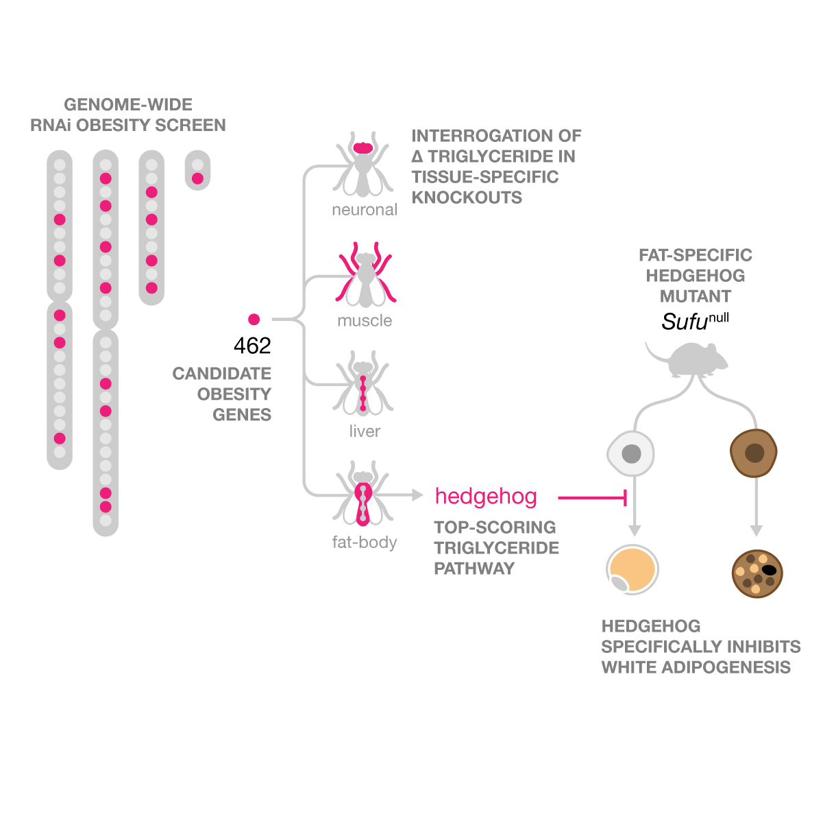
My redesign divides the story into three scenes: screen, tissue-specific knockouts and adipogenesis, with strong continuity from one scene to the next. Magenta is used to carry the theme, from the obesity candidate genes, to tissues, to the hedgehog pathway. Three key terms are included that were missed: iRNA, triglyceride and top-scoring.
The scenes are laid out in a waterfall layout for a diagonal eye path. Scene labels provide detail that is not included (or obvious from) the graphic: screen type (RNAi), variable measured (triglyceride levels), in vivo model (hedgehog mutant).
The idea of a screen is represented by locations on the ideograms with a small fraction of locations highlighted. This fraction is clearly identified as candidate obesity genes and I've added the number of these genes to communicate the scope of the screen.
The fly shapes are simple with the tissues of interest very visibly identified. The liver is not shown as a series of circles because circles have already been used to indicate genes. Instead, the liver is shown as a series of beads on a string. The output from the screen is annotated with "top-scoring" to emphasize why hedgehog was singled out.
The white and brown adipogenesis branches are oriented so that the hedgehog label is closer to the white pathway, which it inhibits. The arrows start directly at the mutant and the top-level stem cell is not shown.
If the graphic has done its job, this label is not strictly necessary. However, it nicely bookends the end of the story, providing a sense of symmetry with the label that starts the story.
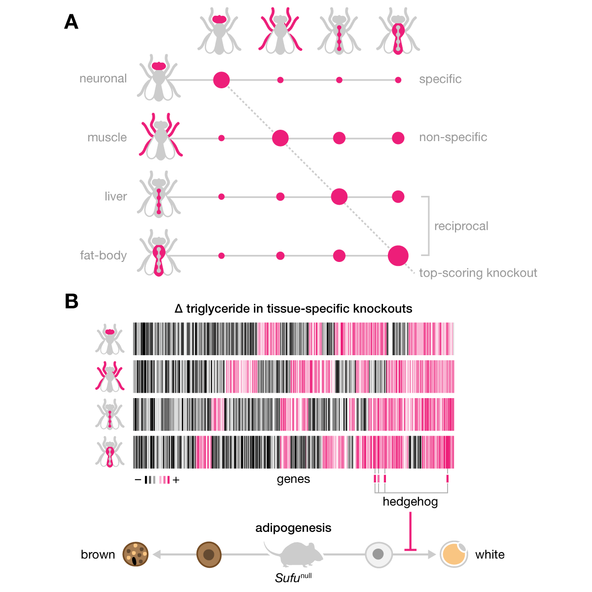
graphic abstract hospital > all cases > case 12 > supplemental designs
If one figure in the paper tells the bulk of the story (in this case, Figure 2), consider adding its elements to the graphical abstract. Don't show everything in gory detail, but hint at the data structure and analysis. Place data graphics in deference to how the story is organized — don't let a plot force you into bad decisions.
graphic abstract hospital > all cases > case 13
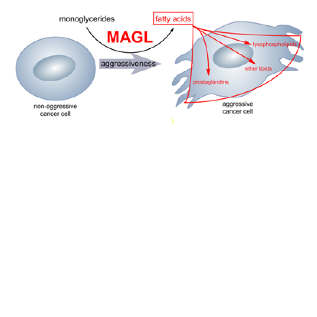
This case study is a redesign of an example in Cell's graphical abstract guidelines. The original abstract is from Monoacylglycerol lipase regulates a fatty acid network that promotes cancer pathogenesis.
This is the one Cell redesign that I think does a poorer job at organizing the material than the original. Always distinguish layout from the design of individual elements — they can vary in effectiveness and quality. A reasonably good layout (left-to-right in the original) can to some extent rescue bad design (boxes and mismanaged text in the original) and indicate the archetype of the story. A bad layout muddles things from the beginning and leaves the reader to untangle the mess — no matter how nicely individual elements are drawn.
Don't mix caps and lower case. There's very little benefit to capitalize "non-aggressive" and "aggressive" — the main cue for these categories should be shapes and colors.
There is no need for this arrow to be curved and different in thickness from the MAGL arrow, which is also curved, but at a different angle. Curved arrows are more dynamic than straight arrows and therefore useful to indicate movement or transport — "look here" or "this happens next" arrows should be straight so that, when needed, curved arrows can be used effectively.
These red arrows cross the cell to reach to the text labels on its other side. Why not rearrange the text to shorten these arrows? What is meant by the different locations of each of the labels in the cell? That they're in different pathways? This spatial scattering is not needed.
Cell added the mice to provide context to the cell graphic. This is a good idea but context doesn't always have to be shown in a crop box and with a totally different graphical style. Instead, find a way to match how the context is displayed as close to the way the main story is displayed.
The "MAGL-disrupted" text does not need to be red.
The diet labels aren't centered to anything (other than horizontally to themselves).
These two labels are redundant. It's enough to say "enhanced tumor growth" because the other state is implied by the graphic. I would argue that these labels are actually not necessary if the graphic does a good job in communicating this visually.
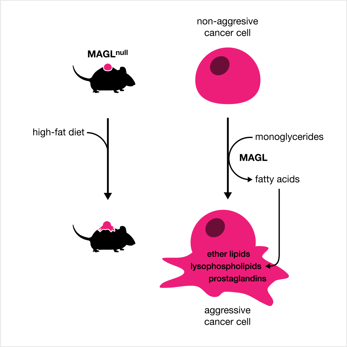
My redesign is built around a symmetric representation of the mouse context and cell context. I normally don't use gradients or any kind of three-dimensional styling but in this case I try to show how these elements can be used to strengthen the story. Magenta is just a better red.
A simple mouse with a simple tumor shape, which is reused to show the tumor cell in greater detail. Find ways to recycle shapes like this to provide continuity and limit redundant labeling.
Both reaction arrows are identical and symmetry of substrates (high-fat diet, monoglycerides) is enforced. This helps show that the process on the left is of the same kind as the process on the right and, like recycling the cell shape, recycling arrows and pathway shapes reduces clutter.
The arrow into the cell is very carefully placed to avoid unnecessary overlap with the tentacles of the cell. In fact, the tentacles have been moved around so that the internal labels fit and so that this arrow has a natural entry into the cell.
The very faint magenta gradient indicates progression from non-aggresive (top, white) to aggressive (bottom, magenta). This is about as strong a gradient as I would use.
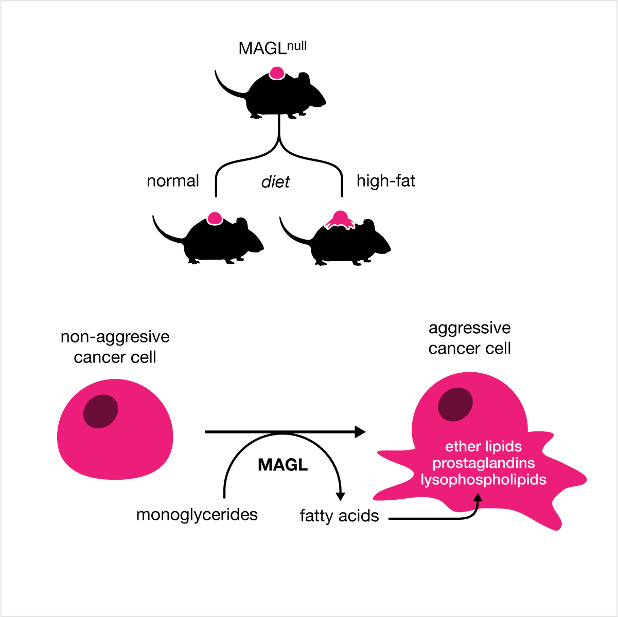
graphic abstract hospital > all cases > case 13 > supplemental designs
I would never call myself an illustrator — but I'm a very good "layout technician". Therefore, I try to avoid drawing elaborate elements such as cells with gorgeous gradients, shading, texture and all those floaty elements inside that remind you that there's an entire world inside that membrane. In this case study, though, I tried my hand at this kind of visual finesse — I welcome your criticism of these attempts. I also show how similarity between processes can be emphasized by showing them symmetrically — either through alignment or, as in this case, reusing the same elements.

graphic abstract hospital > all cases > case 14
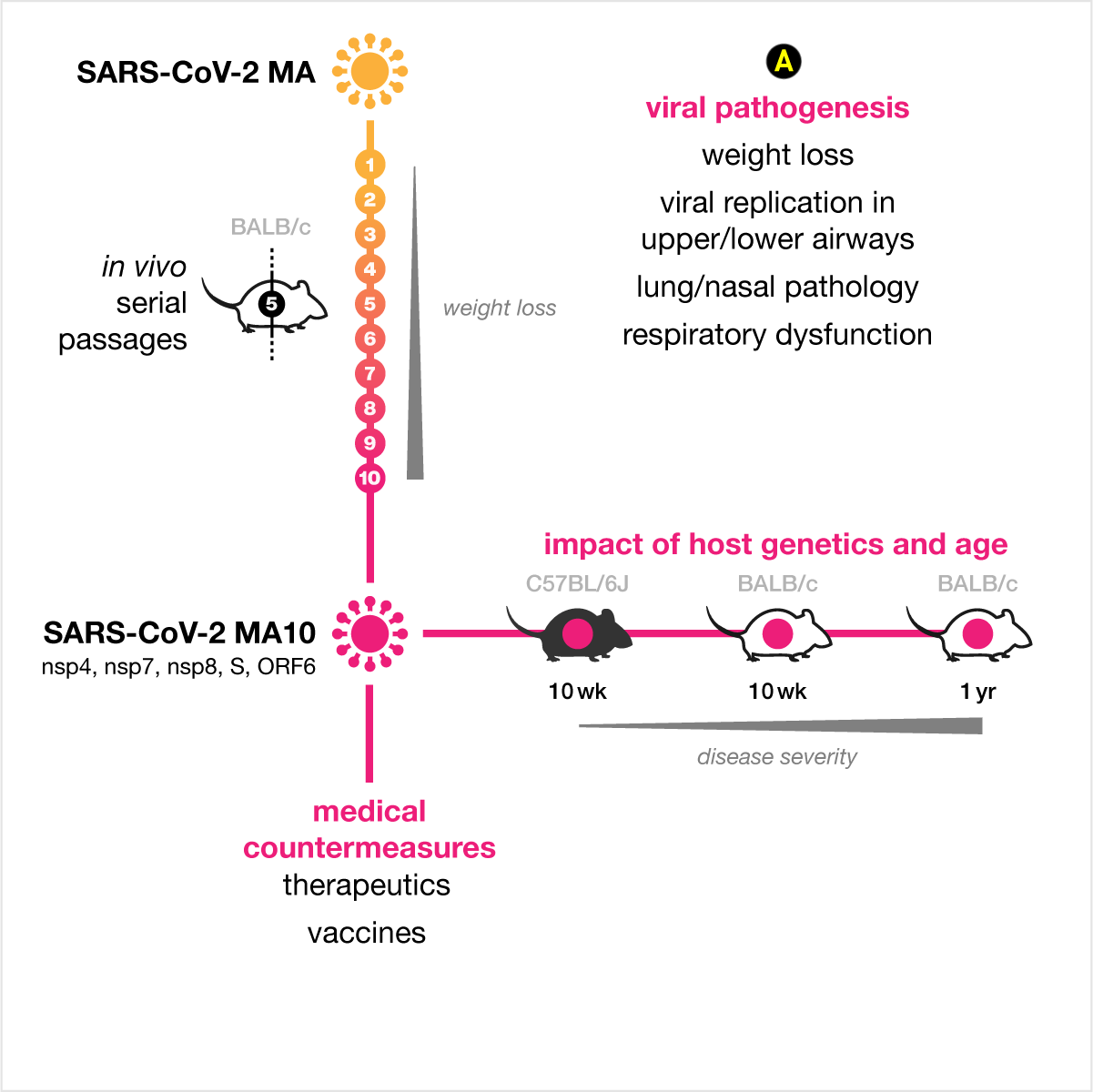
Original abstract is from A mouse-adapted SARS-CoV-2 induces acute lung injury and mortality in standard laboratory mice.
The abstract splits the message into three parts (passage, infection, key points) but this division unnecessarily separates elements (e.g. MA10) and relationships (e.g. "impact of host genetics on disease severity" is implied in the middle panel by the "disease severity" gradient). Scale and detail of objects is inconsistent: a very elaborate virus is much more salient than the mice, which are dainty and cute with a curly tail that traps the eye (to me, they look like they're reaching out for more virus with their hands). The disease severity gradient gives the graphic a very strong center of mass — the eye is drawn back to it, no matter how hard you try to look elsewhere.
The virus clipart is too large and does not benefit from a gradient. If anything, the gradient should be dark, not light, in the center to more firmly attach the graphic to its location.
Arrows do not need to be curved. Notice how the arrow to the first mouse is curved but the arrow from the last mouse is straight.
A dashed arrow here does not clearly encode "more passages". Dashed lines should be reserved for cutoffs or explicit dividers to aid in comparison of neighbouring elements and whenever a line needs to be made fainter but without use of lighter tone.
The MA10 virus should be horizontally aligned with the MA virus.
The middle panel picks up where the first panel left off. If the two panels could be somehow joined, there would be no reason to repeat the MA10 clipart.
These arrows are far too elaborate and because each has a different length, they imply that the 1yr BALB/c mouse is somehow "further" from the MA10 virus. The arrow length says "the MA10 virus has a longer distance to travel to each mouse" but this is obviously not the case for this experiment. Avoid graphically communicating something that is not true and, importantly, that makes another encoding impossible: arrow length can not be used to imply distance in the graphical abstract or (ideally) anywhere else in the paper.
The text is too small and appears squished between the gradient and edge of the graphic. It's also much weaker than the gradient, which makes the juxtaposition of these two elements unnatural.
If possible, key observations or points raised should be incorporated into the narrative. Try to incorporate labels and longer text as close to where they belong in the story, rather than relegating them to a legend (or a laundry list).
The redesign attempts to integrate the three panels of the original into a cohesive whole, including the key observations. The serial passages and infection with MA10 are shown as two orthogonal axes, which allows for consently formatted annotation for each process (e.g. weight loss, disease severity). This layout supports adding additional information, such as which mice were used for the passages and mutated genes observed in MA10.
A simplified virus with a visual weight that neither cowers nor dominates.
An inline explanation of the in vivo serial passage process. Rather than showing 10 mice, I show 10 circles for each passage, with the legend zooming in on passage 5 to show the mouse and vertical line to imply continuity with adjacent passages. I've added the strain of the mice used for passages — the mouse is an outline because this is an albino strain (compared to the black C57BL/6J strain).
I've added this (see Figure 1 in the paper) to show how having a strong axis for the passages allows for the overlay of data.
The key observation that host genetics and age has an impact on disease severity is folded into the graphic as a title. Notice that "... on disease severity" is not needed in the title, because there is a disease severity bar below the mice.
The other two key observations are placed at the bottom, where they were before, but now more clearly aligned with the most closely related element: the countermeasures are against MA10 (thus aligned with it) and pathogenesis is immediately under the "disease severity" bar.
graphic abstract hospital > all cases > case 14 > supplemental designs
After your design, experiment with removing colors to see which ones are necessary and which are superfluous. If your layout is good, highlights along strong axes or divisions formed by space may not be necessary. Always try to find a way to add data or annotations in a natural way to the graphic (e.g. along an axis corresponding to an important quantity, such as time or disease progression), even if you don't plan to include this data in the graphical abstract. A good graphical abstract is an excellent starting point for a talk (by you or by someone talking about your work) or an introductory figure in a review paper.

graphic abstract hospital > all cases > case 15
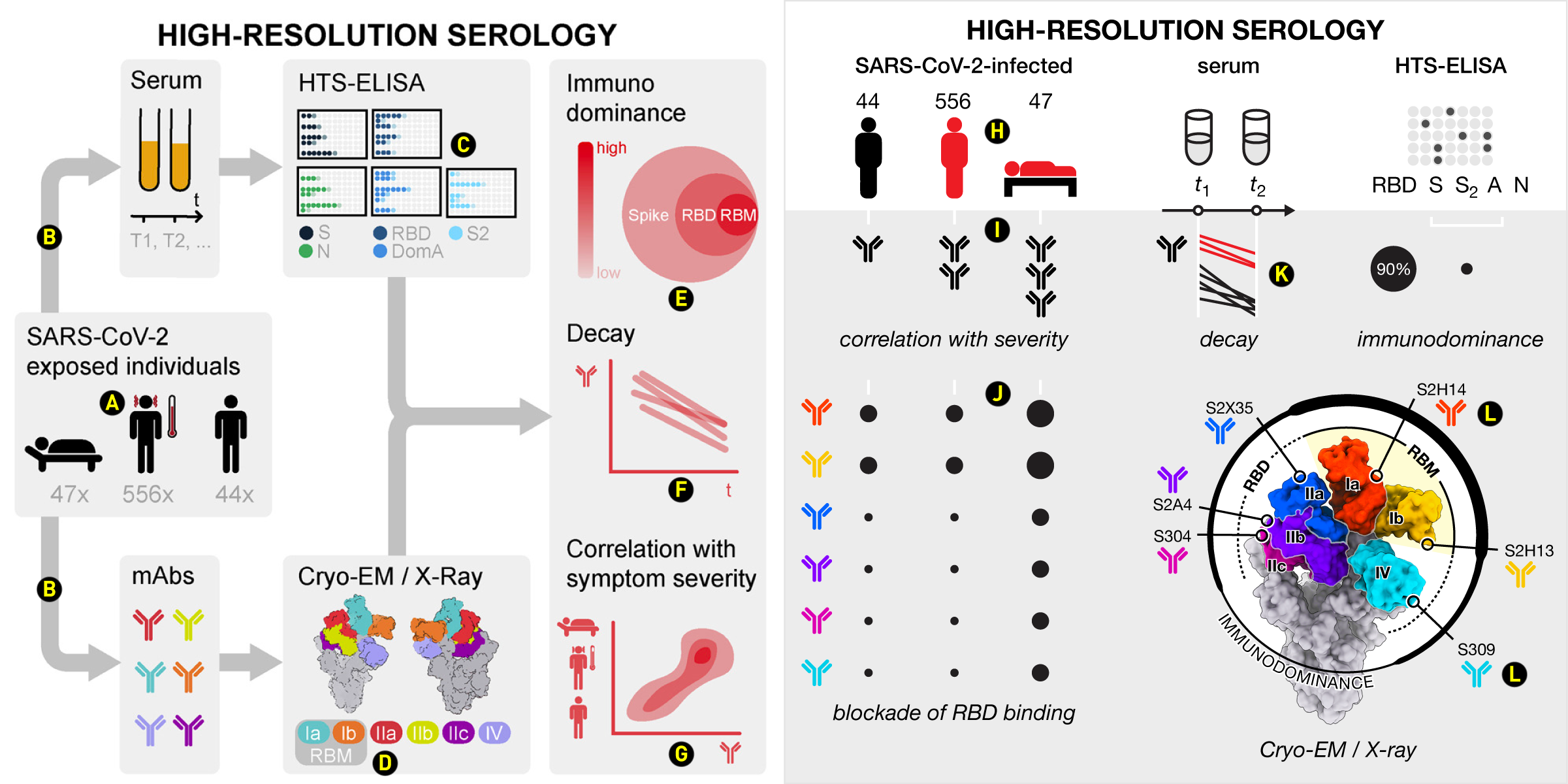
Original abstract is from Mapping neutralizing and immunodominant sites on the SARS-CoV-2 spike receptor-binding domain by structure-guided high-resolution serology.
This abstract means well — it has a flow and a story to tell. Unfortunately, the flow is a little wonky and the story, as shown, is a little misleading. If you follow the northbound grey arrow from the SARS-CoV-2 individuals, you'd conclude that serum was extracted from each individual at two (or more) time points. And you'd be right. Naturally, then, you'd conclude that monoclonal antibodies (mAbs) were also extracted from each individual. And you'd be wrong. Each of the mAbs were isolated independently from a variety of sources. The Venn diagram is also very weird because it tries to communicate two things simultaneously: (a) the structural hierarchy (a nested relationship) of the spike protein, which contains the receptor binding domain (RBD), which, in turn, contains the receptor binding motif (RBM), and (b) the degree to which each is immunodominant (not a nested relationship). There's too much reliance on legends and illustrations that are either too detailed (contour plots for symptom severity) or insufficiently detailed (decay plot).
The symptom icons are inconsistent. The asymptomatic individual is suitably shown. If we accept the symptomatic individual with the thermometer and blood squirting from the ears (headache?), then the hospitalized person, who is lying down, certainly suffers from these two symptoms (and likely more). The × suffix for subject counts is unnecessary.
These two identical arrows mean completely different things. The one pointing to serum means "extracted from each individual". The one pointing to mAbs means "individuals infected with SARS-CoV-2 have one or more of these mAbs, each of which was isolated from various sources".
Showing five plates and a legend is a very busy way to signal what was done. Notice that the colors are actually irrelevant — what is to be learned from the patterns on each plate for each of the sites tested. The labels in the legend are also too faint, whereas the outlines of the plates themselves are too prominent.
This is a pretty structure but unfortunately shrunk by the legend and the image of the back of the protein (on the right). Labels should be brought close to the structure. Color selection misses an opportunity to group Ia and Ib sites.
This is a frustrating Venn diagram because it obfuscates the simple the message of the paper that RBD is 90% immunodominant. The size of the circles seems to be arbitrarily chosen to allow sufficient room for labels.
This plot misses the opportunity to connect the sampling times t1 and t2 of the serum collection to (a) calculating the decay and (b) the fact that symptomatic individuals have more antibodies.
This plot unnecessarily repeats the person icons. Their order on this plot, which is what you expect if y-axis is severity, contradicts the order of the icons in the "exposed individuals" panel, where it would have been more sensible to put the asymptomatic person first and have "severity" go from left to right.
It took me a long time to converge on a redesign that I was happy with. This was primarily because the issues with the abstract are relatively subtle and distributed across all the panels. The flow of the abstract, which proceeds along the arrows from "data source" (individuals) to "data collection methods" (HTS-ELISA, Cryo-EM/X-Ray) to "analysis and conclusions" (immunodominance, decay, correlation with severity) is a reasonable one but it gets in the way of connecting concepts across panels (e.g. severity, antibodies).
The hospitalized icon has the same head and torso of the others, but slightly shorter legs to keep the icon compact. Red is universally understood to be the color of disease and, generally, any kind of undesirable outcome.
The left side of the abstract is a table, with the columns corresponding to disease severity. This is reinforced by little white notches.
These data weren't in the original abstracts, but I thought they might be useful to show because they speak to immunodominance. Individual mAbs are rows, which nicely create a table with the disease severity columns.
The decay traces reuse the serum time collection axis. The white axes repeat the motif used elsewhere to cue the eye. Importantly, red lines (antibodies from symptomatic/hospitalized individuals) are higher on the y-axis indicating more abundance.
The protein structure is aligned in such a way as to align the red and cyan mAbs icons at the end of the callout lines align with the corresponding icons in the "blockade of RBD binding" table. The structure is a relatively busy graphic and in the supplemental designs I show other ways in which it can be presented.
graphic abstract hospital > all cases > case 15 > supplemental designs
Showing three-dimensional rendered structures clearly in small spaces, like a graphical abstract or small figure panel, requires careful control of contrast to avoid loosing the perception of depth. Contrast can be adjusted in Photoshop using the indispensable curves tool and individual colors can tuned with the hue/saturation tool. Doing this may require that you create masks for sites of interest. I've done this here — each colored site was isolated and sits in its own layer.


Nasa to send our human genome discs to the Moon
We'd like to say a ‘cosmic hello’: mathematics, culture, palaeontology, art and science, and ... human genomes.


Comparing classifier performance with baselines
All animals are equal, but some animals are more equal than others. —George Orwell
This month, we will illustrate the importance of establishing a baseline performance level.
Baselines are typically generated independently for each dataset using very simple models. Their role is to set the minimum level of acceptable performance and help with comparing relative improvements in performance of other models.

Unfortunately, baselines are often overlooked and, in the presence of a class imbalance5, must be established with care.
Megahed, F.M, Chen, Y-J., Jones-Farmer, A., Rigdon, S.E., Krzywinski, M. & Altman, N. (2024) Points of significance: Comparing classifier performance with baselines. Nat. Methods 20.
Happy 2024 π Day—
sunflowers ho!
Celebrate π Day (March 14th) and dig into the digit garden. Let's grow something.

How Analyzing Cosmic Nothing Might Explain Everything
Huge empty areas of the universe called voids could help solve the greatest mysteries in the cosmos.
My graphic accompanying How Analyzing Cosmic Nothing Might Explain Everything in the January 2024 issue of Scientific American depicts the entire Universe in a two-page spread — full of nothing.

The graphic uses the latest data from SDSS 12 and is an update to my Superclusters and Voids poster.
Michael Lemonick (editor) explains on the graphic:
“Regions of relatively empty space called cosmic voids are everywhere in the universe, and scientists believe studying their size, shape and spread across the cosmos could help them understand dark matter, dark energy and other big mysteries.
To use voids in this way, astronomers must map these regions in detail—a project that is just beginning.
Shown here are voids discovered by the Sloan Digital Sky Survey (SDSS), along with a selection of 16 previously named voids. Scientists expect voids to be evenly distributed throughout space—the lack of voids in some regions on the globe simply reflects SDSS’s sky coverage.”
voids
Sofia Contarini, Alice Pisani, Nico Hamaus, Federico Marulli Lauro Moscardini & Marco Baldi (2023) Cosmological Constraints from the BOSS DR12 Void Size Function Astrophysical Journal 953:46.
Nico Hamaus, Alice Pisani, Jin-Ah Choi, Guilhem Lavaux, Benjamin D. Wandelt & Jochen Weller (2020) Journal of Cosmology and Astroparticle Physics 2020:023.
Sloan Digital Sky Survey Data Release 12
Alan MacRobert (Sky & Telescope), Paulina Rowicka/Martin Krzywinski (revisions & Microscopium)
Hoffleit & Warren Jr. (1991) The Bright Star Catalog, 5th Revised Edition (Preliminary Version).
H0 = 67.4 km/(Mpc·s), Ωm = 0.315, Ωv = 0.685. Planck collaboration Planck 2018 results. VI. Cosmological parameters (2018).
constellation figures
stars
cosmology
Error in predictor variables
It is the mark of an educated mind to rest satisfied with the degree of precision that the nature of the subject admits and not to seek exactness where only an approximation is possible. —Aristotle
In regression, the predictors are (typically) assumed to have known values that are measured without error.
Practically, however, predictors are often measured with error. This has a profound (but predictable) effect on the estimates of relationships among variables – the so-called “error in variables” problem.

Error in measuring the predictors is often ignored. In this column, we discuss when ignoring this error is harmless and when it can lead to large bias that can leads us to miss important effects.
Altman, N. & Krzywinski, M. (2024) Points of significance: Error in predictor variables. Nat. Methods 20.
Background reading
Altman, N. & Krzywinski, M. (2015) Points of significance: Simple linear regression. Nat. Methods 12:999–1000.
Lever, J., Krzywinski, M. & Altman, N. (2016) Points of significance: Logistic regression. Nat. Methods 13:541–542 (2016).
Das, K., Krzywinski, M. & Altman, N. (2019) Points of significance: Quantile regression. Nat. Methods 16:451–452.