

Effective graphical abstract design for science communication
Guidelines to get you started and keep you going
GRAPHICAL ABSTRACT DESIGN GUIDELINES
The graphical abstract guidelines build on my design guidelines for posters. Because their focus is on telling the essence of a story in a small space, I see them as much less negotiable than guidelines for posters, where the large canvas allows for more options.
See how the guidelines can be applied to graphical abstracts in the wild by visiting the graphical abstract hospital.
The Graphical abstract mindset
The purpose of the graphical abstract is to quickly present the key findings of a paper in a way that closely matches the narrative of the paper. The graphical abstract should place all central terms in context and emphasize key relationships.
A graphical abstract is Figure 0.
Everything you learn about the design of graphical abstracts applies to the design of figures.
Everything you learn about the design of figures applies to the design of posters.
Identifying what to put in the graphical abstract cannot be answered by design alone. Design can help place and shape what you have chosen, but it cannot tell you what to chose — that's up to the science.
Graphical abstracts are typically small square bitmaps. Though individual journal requirements vary, this constraint on the size of the canvas places tremendous limits on the design and imposes more strict requirements than when designing for a larger space.
The graphical abstract is a tiny space that offers no quarter. A bad design decision cannot be mitigated by a good design decision downstream. There is no room for "style".
The graphical abstract is a visual elevator pitch. There is no room for visual garnish or embelishment of any kind.
The function of a graphical abstract comes from its form, which cues the nature of relationships in its story.
Many abstracts struggle to fit the path of the story into a small space. Individual scenes meander down the image, often snaking, as elements struggle for space and attention. Make it easy for the eye and guide it along simple paths.
The graphical abstract should never be designed with attracting the eye as the first priority. Rather, it's your first opportunity for engaging the reader's pre-attentive processing and to lay out a map of the story. Every part of the abstract should correspond to the beginning of important story arcs in the paper.
Strict control of color.
No gradients. There, I said it.
No elaborate three-dimensional representations. While well-drawn ones can be attractive, many distract the eye with too much detail and draw attention away from the story path.
Your paper is a mansion and the graphical abstract is a studio apartment — you cannot bring all the furniture. Too often, "style" is that credenza you've been lugging around everywhere. It's time to let it go.
Most graphical abstracts have poor top-level organization. In many, the wrong things are grouped and categories, such as experimental conditions, are not clearly demarcated. Opportunities for maintaining continuity between scenes of the story are often missed.
Understand and practise good Gestalt grouping principles. In a small space, color will group more powerfully than position and much more powerfully than shape.
Organize content in a way that reflects spatial or semantic hierarchy by making use of Gestalt figure-ground principles. These are very helpful in reinforcing inside vs. outside (e.g. cytosol vs. nucleus).
Tables are dead. Long live the table.
Typical graphical tropes, such as those used in figures and presentations, have no place in graphical abstracts. Everything must be distilled down to its core essence — this part is hard and requires that you pay attention to how graphical elements relate in shape and position and whether these relationships are unambiguous and speak to your story with specificity.
Many abstracts do not balance visual weight: they have too much detail in shapes and symbols and have too much variation in text size and line thickness.
In most abstracts, key aspects of the story are lost among too much variation due to loose design.
For every pair of things on the abstract, ask yourself: (1) can their graphical relationship be improved to better match their actual relationship? (2) does their graphical relationship imply something that isn't important or true? (3) am I repeating myself?
Are things of equal importance drawn with equal emphasis? How many different sizes of type are being used?
The abstract's grid layout should present a strong tabular feel. Can you draw a horizontal or vertical line across the abstract to divide its elements along thematic or categorical boundaries?
Stick to straight paths for the eye: left-to-right, top-to-bottom, or top-left to bottom-right. Avoid requiring the reader to backtrack or turn sharply.
Align ruthlessly. In a small space even tiny misalignments become obvious and a barrier to assessing relationship between elements.
Encapsulate your story in a strong and obvious grid layout (1×2, 2×2, ...) and maintain symmetry in margins, padding and spacing between elements.
Use open form (elements extending beyond the image) to imply that the scene is a vignette of a larger scene or more complex process.
Color
The success of a graphical abstrat rests on how well it is organized and how well it represents important relationships. Color can be used to maintain a theme (e.g. health vs disease) but this effect is diluted by other colors.
Do not create too many color groups. Instead, group using space and shape.
Avoid strongly coloring elements that are drawn for context or are of secondary importance.
Avoid background color, which generally reduces contrast. If you cannot overcome your desire for a background gradient, make it as subtle as possible.
Typography
Well-chosen type placement and size goes a long way in alleviating tightness of a small space.
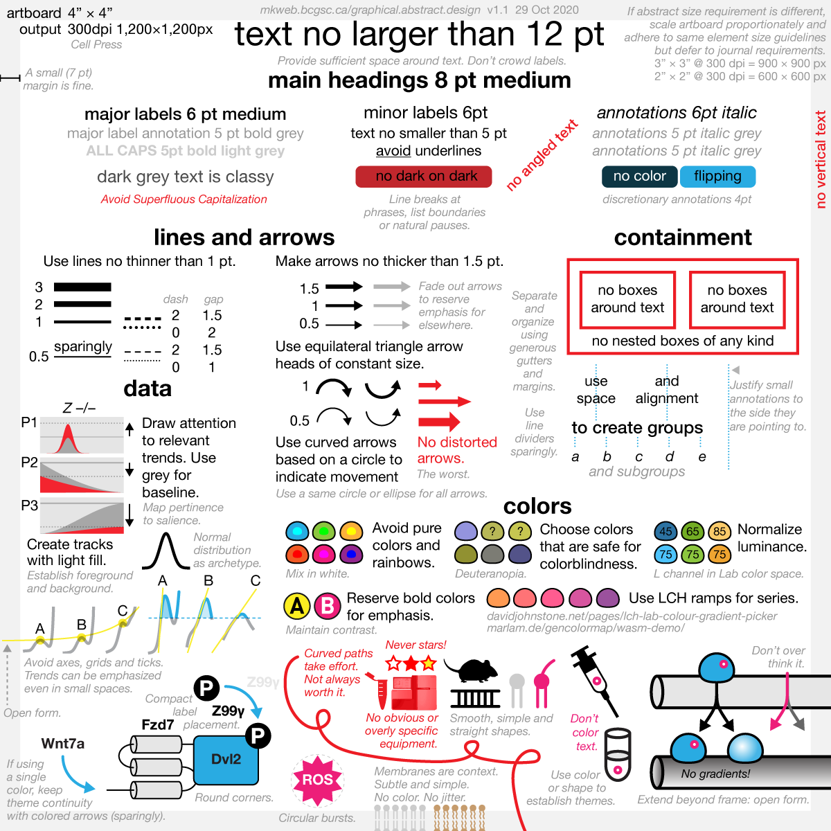
Have a modest type size ladder with no more than 3 sizes — for example, 4, 6, 8 pt.
Generally, do not apply color to text unless you're cuing the continuation of a theme. But do so carefully.
Use light and dark grey for text to indicate a hiearchy of importance.
On a large canvas, there is room for a fully type hierarchy (bold, small caps, italics, etc). In a small space, there isn't. Always evaluate the legibility of text on the final bitmap.
Do not outline or add styling to text, such as drop shadows or glow.
Apply bold and italics gently and do not combine them — too much variation in type will overwhelm the space.
Small italic labels make for great annotations.
Technical Considerations
Although the graphical abstract itself may never be printed, it's extremely helpful to design it to a specific physical size. You'll be able to standardize your design process for graphical abstracts, figures and posters.
Design on a 4" × 4" artboard and export at 300 dpi. Scale artboard size, not output resolution, to match journal requirements.
Use point units for sizing text in the range 6–10 pt. Limit yourself to Arial or one of the Helveticas. Avoid angled or vertical text.
Draw lines no thinner than 0.5 pt. Standardize line and arrow length and angle.
Nasa to send our human genome discs to the Moon
We'd like to say a ‘cosmic hello’: mathematics, culture, palaeontology, art and science, and ... human genomes.


Comparing classifier performance with baselines
All animals are equal, but some animals are more equal than others. —George Orwell
This month, we will illustrate the importance of establishing a baseline performance level.
Baselines are typically generated independently for each dataset using very simple models. Their role is to set the minimum level of acceptable performance and help with comparing relative improvements in performance of other models.

Unfortunately, baselines are often overlooked and, in the presence of a class imbalance5, must be established with care.
Megahed, F.M, Chen, Y-J., Jones-Farmer, A., Rigdon, S.E., Krzywinski, M. & Altman, N. (2024) Points of significance: Comparing classifier performance with baselines. Nat. Methods 20.
Happy 2024 π Day—
sunflowers ho!
Celebrate π Day (March 14th) and dig into the digit garden. Let's grow something.

How Analyzing Cosmic Nothing Might Explain Everything
Huge empty areas of the universe called voids could help solve the greatest mysteries in the cosmos.
My graphic accompanying How Analyzing Cosmic Nothing Might Explain Everything in the January 2024 issue of Scientific American depicts the entire Universe in a two-page spread — full of nothing.

The graphic uses the latest data from SDSS 12 and is an update to my Superclusters and Voids poster.
Michael Lemonick (editor) explains on the graphic:
“Regions of relatively empty space called cosmic voids are everywhere in the universe, and scientists believe studying their size, shape and spread across the cosmos could help them understand dark matter, dark energy and other big mysteries.
To use voids in this way, astronomers must map these regions in detail—a project that is just beginning.
Shown here are voids discovered by the Sloan Digital Sky Survey (SDSS), along with a selection of 16 previously named voids. Scientists expect voids to be evenly distributed throughout space—the lack of voids in some regions on the globe simply reflects SDSS’s sky coverage.”
voids
Sofia Contarini, Alice Pisani, Nico Hamaus, Federico Marulli Lauro Moscardini & Marco Baldi (2023) Cosmological Constraints from the BOSS DR12 Void Size Function Astrophysical Journal 953:46.
Nico Hamaus, Alice Pisani, Jin-Ah Choi, Guilhem Lavaux, Benjamin D. Wandelt & Jochen Weller (2020) Journal of Cosmology and Astroparticle Physics 2020:023.
Sloan Digital Sky Survey Data Release 12
Alan MacRobert (Sky & Telescope), Paulina Rowicka/Martin Krzywinski (revisions & Microscopium)
Hoffleit & Warren Jr. (1991) The Bright Star Catalog, 5th Revised Edition (Preliminary Version).
H0 = 67.4 km/(Mpc·s), Ωm = 0.315, Ωv = 0.685. Planck collaboration Planck 2018 results. VI. Cosmological parameters (2018).
constellation figures
stars
cosmology
Error in predictor variables
It is the mark of an educated mind to rest satisfied with the degree of precision that the nature of the subject admits and not to seek exactness where only an approximation is possible. —Aristotle
In regression, the predictors are (typically) assumed to have known values that are measured without error.
Practically, however, predictors are often measured with error. This has a profound (but predictable) effect on the estimates of relationships among variables – the so-called “error in variables” problem.

Error in measuring the predictors is often ignored. In this column, we discuss when ignoring this error is harmless and when it can lead to large bias that can leads us to miss important effects.
Altman, N. & Krzywinski, M. (2024) Points of significance: Error in predictor variables. Nat. Methods 20.
Background reading
Altman, N. & Krzywinski, M. (2015) Points of significance: Simple linear regression. Nat. Methods 12:999–1000.
Lever, J., Krzywinski, M. & Altman, N. (2016) Points of significance: Logistic regression. Nat. Methods 13:541–542 (2016).
Das, K., Krzywinski, M. & Altman, N. (2019) Points of significance: Quantile regression. Nat. Methods 16:451–452.