Essentials of Data Visualization — 8-part miniseries
Thinking about drawing data and communicating science
This video series focuses on relevant and practical concepts in scientific data visualization. My aim is to make you think more clearly about visual presentation and to make you a better communicator. Each video is about 15 minutes long and comes with a slide deck of the images used in the video, exercise and suggested solutions.
Each video in the series presents fundamental ideas and is designed to provide constraints and guidance to your thoughts about communicating your data. The purpose of scientific data visualization is not merely to inform but also to answer and generate hypotheses.
Whatever your communication medium, you should always have consistency (good!), redundancy (bad!) and an appropriate mapping between relevant and salience in mind (tricky!). Once these are satisfied, look to flow and density of material to achieve clarity (elusive!).
I present these essential topics using biological data as examples. But if you're not a biologist, don't worry. Instead, think about the data structure rather than meaning and you'll be fine.
Download all course materials.
1. Data Encoding

Make it easy to answer relevant questions.
When you think of data visualization, the first ideas that come to mind are a scatter plot, or a bar char, a box plot or a network diagram. These are all data encodings—methods that relate data values to the positions, sizes and shapes of the lines or symbols that appear on the screen or in a figure. There are many data encodings—which do you choose?
watch | PDF slides
2. Shapes and Symbols

Intuitively encode role and relevance.
Shapes and glyphs are really important. They make up the heart of a lot of data plots. Your default should be the circle. If you need different shapes, try to map the classes as intuitively as possible onto the shapes. Use less prominent symbols for data that are less relevant (such as reference data included for context).
watch | PDF slides
3. Color

Use it for emphasis and visual separation.
Color is one of the most exciting ways in which you can completely screw over your visualization. What can start off as a great diagram can be absolutely ruined by a lack of color judgment. When using color, ask yourself—do I need it? Try to work around it using grey tones from Brewer palettes. If you succeed, you’re in a perfect place to use spot color, sparingly, for emphasis.
watch | PDF slides
4. Uncertainty

Don't make errors in error bars.
Knowing the limits of your knowledge is very important. In biology, it’s important to be able to sample the extent of biological variation. And so being able to show this and other forms of variation in measurements or any computed values in visualizations is very important—it addresses reproducibility and your capacity to make statistical inference. Often this is done with error bars. Ironically, there’s a lot of error associated with the use of and interpretation of error bars.
watch | PDF slides
5. Design

Organize and clarify.
Design plays a large role in data visualization. Think of design as choreography for the page. In our context it’s not merely driven by aesthetic, but function. Although there’s always room for aesthetic—gently applied—and I really encourage you to find your own and continue to refine it. But always remember, be understood before being articulate. Be legible before being attractive! Your goal here isn’t to make inroads on the global stage of aesthetic studies. Become a good visual explainer. It’s harder … and more worth doing.
watch | PDF slides
6. Nothing

No data, no ink.
Data-to-ink ratio, taken to the extreme: if there is no data to show, no ink should be used. The idea of “no data to show” may correspond to a variety of scenarios. There may be sincerely no data to show—no values were collected. Or, there are no significant changes to see. Where possible, you should use empty space to indicate lack of data or lack of change in data. You should never be distracted by something that isn’t relevant and empty space is not distracting—it really just provides contrast to adjacent elements, which presumably correspond to actual data or actionable data.
watch | PDF slides
7. Labels

Respect type and use it to establish hierarchy.
Open up a journal or your favourite text book. Find a figure. There’s probably some labels in there. Maybe it’s a multi-panel figure and the labels are the titles. Maybe there are some callouts that tell you what the parts are. If it’s a plot there are probably axis labels and tick labels and maybe a legend with some labels. There’s usually several informational layers in the image, each with their own labels. These labels should reflect that these layers are different. They should also reflect the relative importance of these layers.
watch | PDF slides
8. Process

Creating a visualization for Scientific American Graphic Science: from start to finish.
Let’s now look at the process of designing a visualization from scratch—from the encoding all the way to design. This was a graphic I did for the June 2015 issue of Scientific American. It appeared on the Graphic Science page.
watch | PDF slides
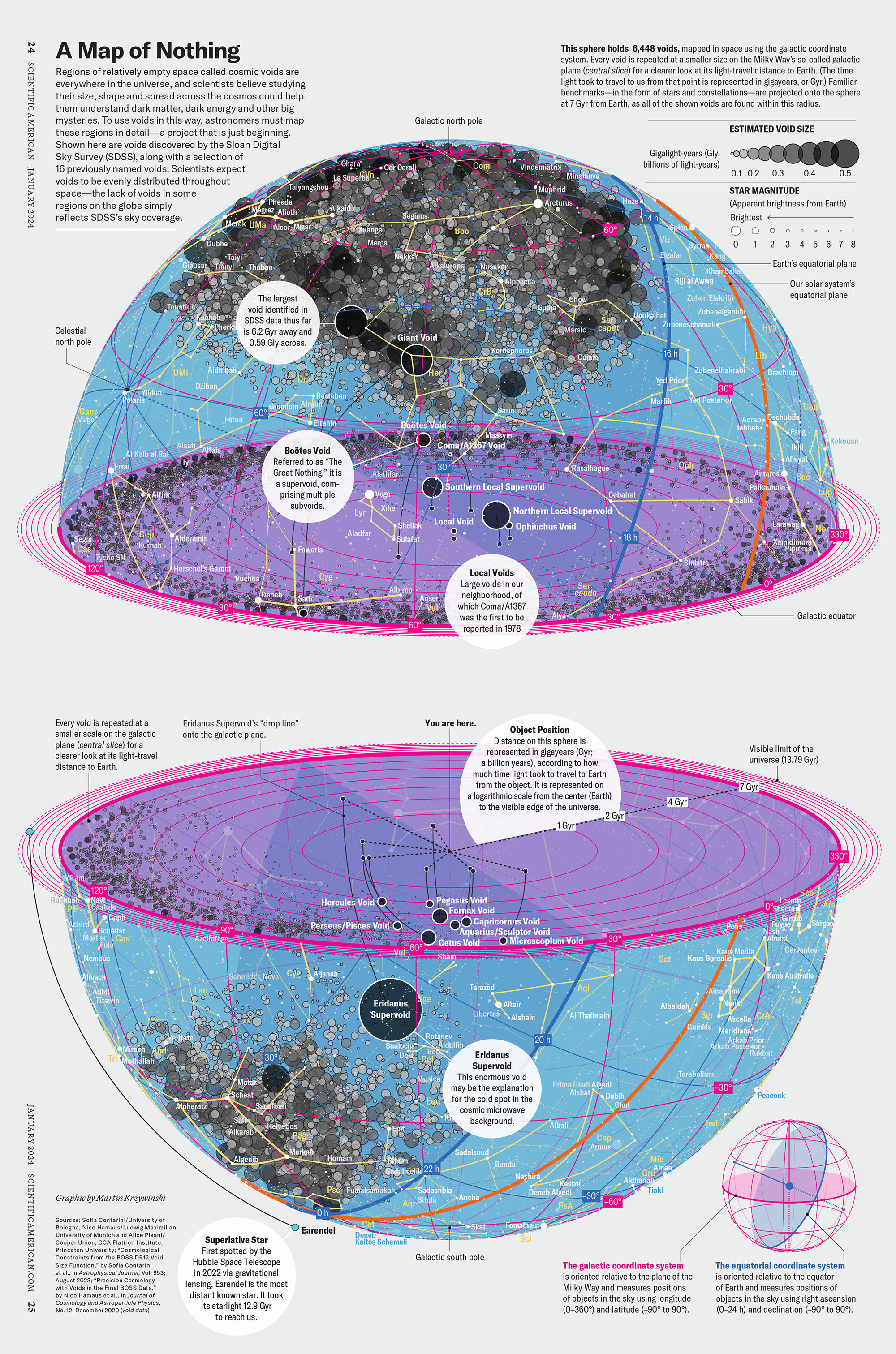
Nasa to send our human genome discs to the Moon
We'd like to say a ‘cosmic hello’: mathematics, culture, palaeontology, art and science, and ... human genomes.


Comparing classifier performance with baselines
All animals are equal, but some animals are more equal than others. —George Orwell
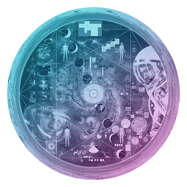
This month, we will illustrate the importance of establishing a baseline performance level.
Baselines are typically generated independently for each dataset using very simple models. Their role is to set the minimum level of acceptable performance and help with comparing relative improvements in performance of other models.
Unfortunately, baselines are often overlooked and, in the presence of a class imbalance5, must be established with care.
Megahed, F.M, Chen, Y-J., Jones-Farmer, A., Rigdon, S.E., Krzywinski, M. & Altman, N. (2024) Points of significance: Comparing classifier performance with baselines. Nat. Methods 20.
Happy 2024 π Day—
sunflowers ho!
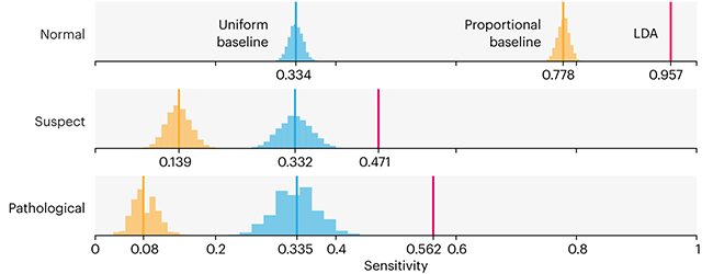
Celebrate π Day (March 14th) and dig into the digit garden. Let's grow something.
How Analyzing Cosmic Nothing Might Explain Everything
Huge empty areas of the universe called voids could help solve the greatest mysteries in the cosmos.
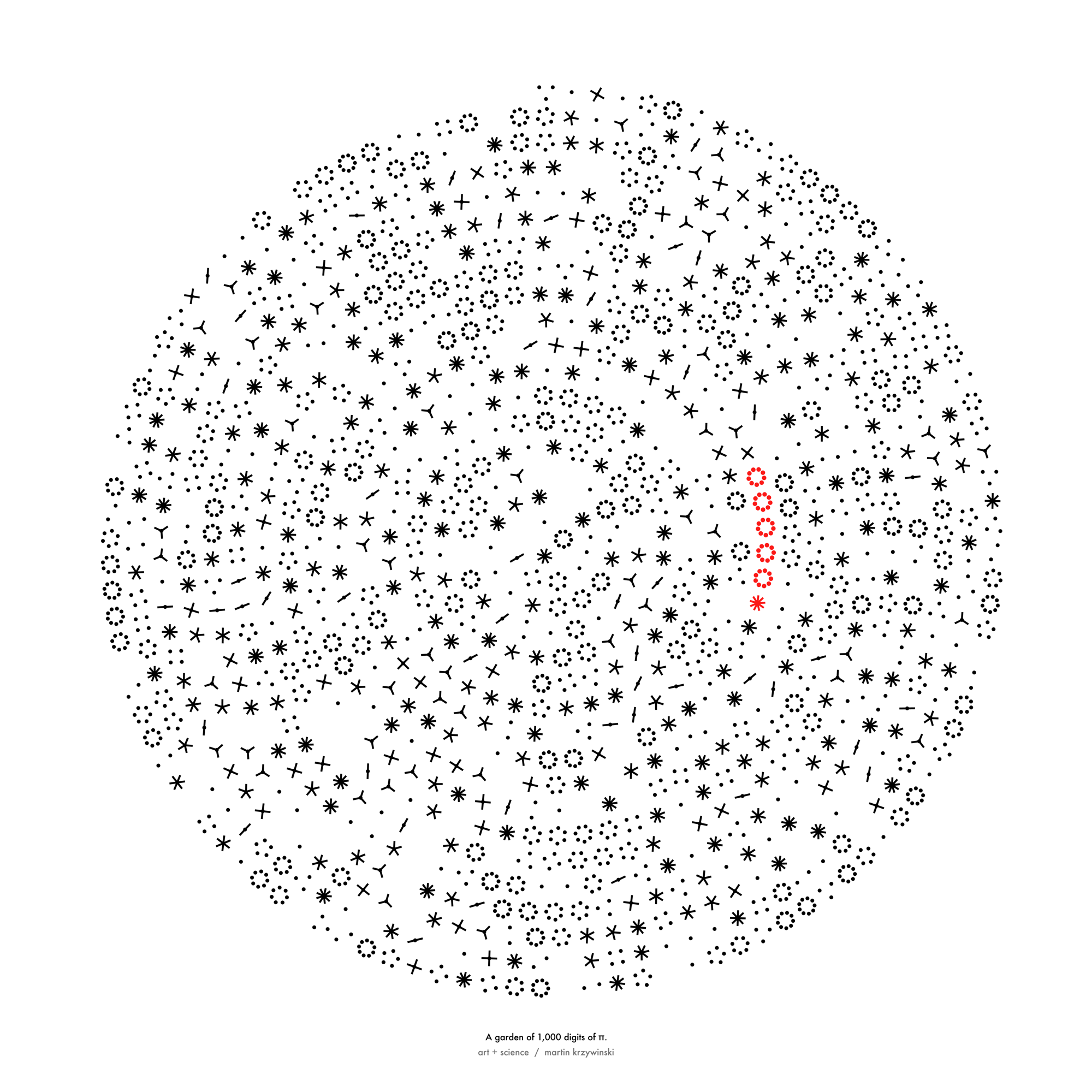
My graphic accompanying How Analyzing Cosmic Nothing Might Explain Everything in the January 2024 issue of Scientific American depicts the entire Universe in a two-page spread — full of nothing.
The graphic uses the latest data from SDSS 12 and is an update to my Superclusters and Voids poster.
Michael Lemonick (editor) explains on the graphic:
“Regions of relatively empty space called cosmic voids are everywhere in the universe, and scientists believe studying their size, shape and spread across the cosmos could help them understand dark matter, dark energy and other big mysteries.
To use voids in this way, astronomers must map these regions in detail—a project that is just beginning.
Shown here are voids discovered by the Sloan Digital Sky Survey (SDSS), along with a selection of 16 previously named voids. Scientists expect voids to be evenly distributed throughout space—the lack of voids in some regions on the globe simply reflects SDSS’s sky coverage.”
voids
Sofia Contarini, Alice Pisani, Nico Hamaus, Federico Marulli Lauro Moscardini & Marco Baldi (2023) Cosmological Constraints from the BOSS DR12 Void Size Function Astrophysical Journal 953:46.
Nico Hamaus, Alice Pisani, Jin-Ah Choi, Guilhem Lavaux, Benjamin D. Wandelt & Jochen Weller (2020) Journal of Cosmology and Astroparticle Physics 2020:023.
Sloan Digital Sky Survey Data Release 12
Alan MacRobert (Sky & Telescope), Paulina Rowicka/Martin Krzywinski (revisions & Microscopium)
Hoffleit & Warren Jr. (1991) The Bright Star Catalog, 5th Revised Edition (Preliminary Version).
H0 = 67.4 km/(Mpc·s), Ωm = 0.315, Ωv = 0.685. Planck collaboration Planck 2018 results. VI. Cosmological parameters (2018).
constellation figures
stars
cosmology
Error in predictor variables
It is the mark of an educated mind to rest satisfied with the degree of precision that the nature of the subject admits and not to seek exactness where only an approximation is possible. —Aristotle
In regression, the predictors are (typically) assumed to have known values that are measured without error.
Practically, however, predictors are often measured with error. This has a profound (but predictable) effect on the estimates of relationships among variables – the so-called “error in variables” problem.
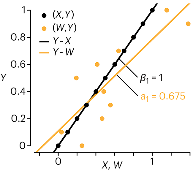
Error in measuring the predictors is often ignored. In this column, we discuss when ignoring this error is harmless and when it can lead to large bias that can leads us to miss important effects.
Altman, N. & Krzywinski, M. (2024) Points of significance: Error in predictor variables. Nat. Methods 20.
Background reading
Altman, N. & Krzywinski, M. (2015) Points of significance: Simple linear regression. Nat. Methods 12:999–1000.
Lever, J., Krzywinski, M. & Altman, N. (2016) Points of significance: Logistic regression. Nat. Methods 13:541–542 (2016).
Das, K., Krzywinski, M. & Altman, N. (2019) Points of significance: Quantile regression. Nat. Methods 16:451–452.


