Designing for Color blindness
Color choices and transformations for deuteranopia and other afflictions
Here, I help you understand color blindness and describe a process by which you can make good color choices when designing for accessibility.
The opposite of color blindness is seeing all the colors and I can help you find 1,000 (or more) maximally distinct colors.
You can also delve into the mathematics behind the color blindness simulations and learn about copunctal points (the invisible color!) and lines of confusion.
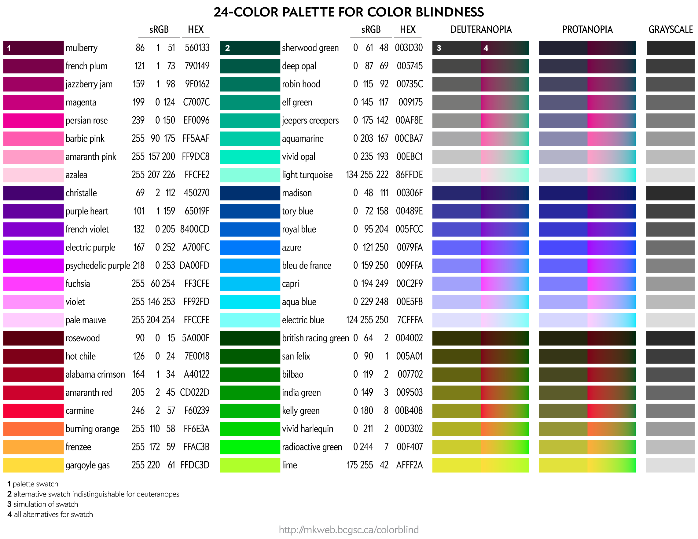
Color palettes for color blindness
contents
In this section, I cover how to make good color choices when considering audiences with color blindness.
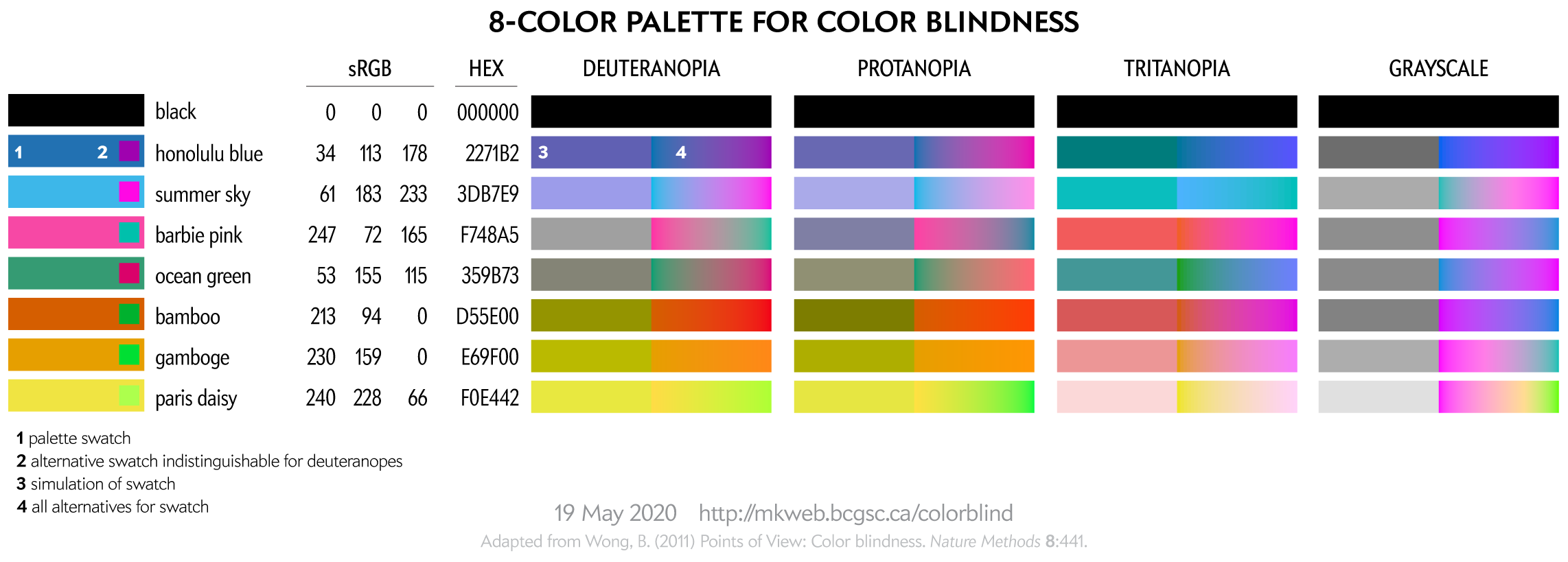
With the exception of the 8-color palette, all palettes have been created using a process (read below) that tries to maintain perceptual luminance uniformity in color-blind space.
This 8-color palette is adapted from Nature Method's Points of View: Color blindness by Bang Wong. Note that in that original source the RGB values listed in the table did not exactly correspond to the RGB swatches—probably an RGB vs CMYK conversion mixup.
This palette is suitable for categorical color encoding—the colors do not, as a whole, have a natural order and none is substantially more salient than another.
You can download these colors as plain text list of HEX and RGB values.
For more tips about designing with color blindness in mind, see Color Universal Design (CUD) — How to make figures and presentations that are friendly to people with color blindess.
To people with color blindness, some colors appear the same. This equivalence can be used to identify colors that are distinct to those with normal as well as to those with color blindness.
For a given RGB color we can simulate how it would appear to someone with color blindess and identify groups of RGB colors that appear indistinguishable in color blindness.
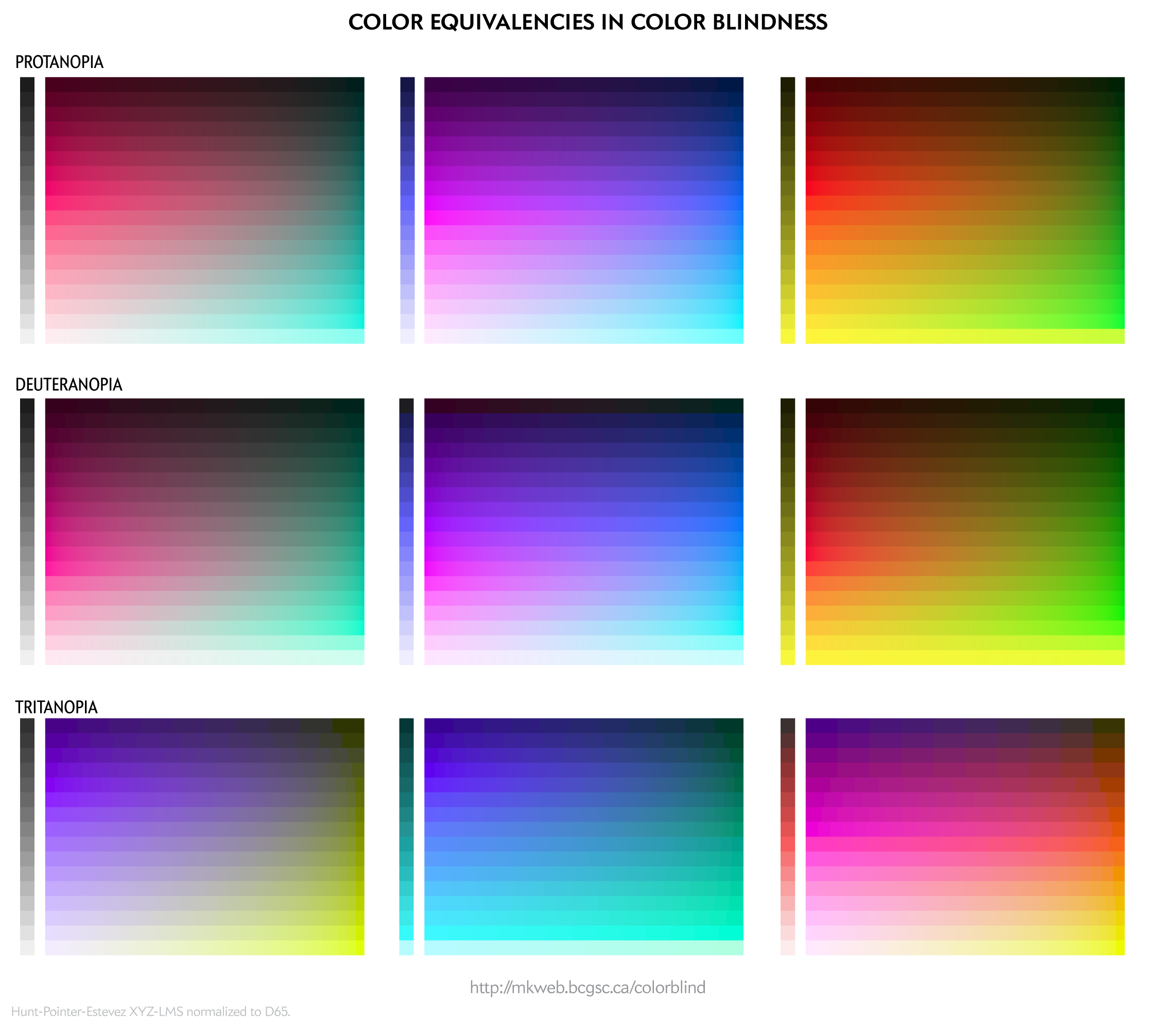
These equivalencies can be used to construct color palettes—lists of colors that are distinguishable to deuteranopes and those with normal vision.
Since deuteranopia is the most common, this is the condition that I use for color selection.
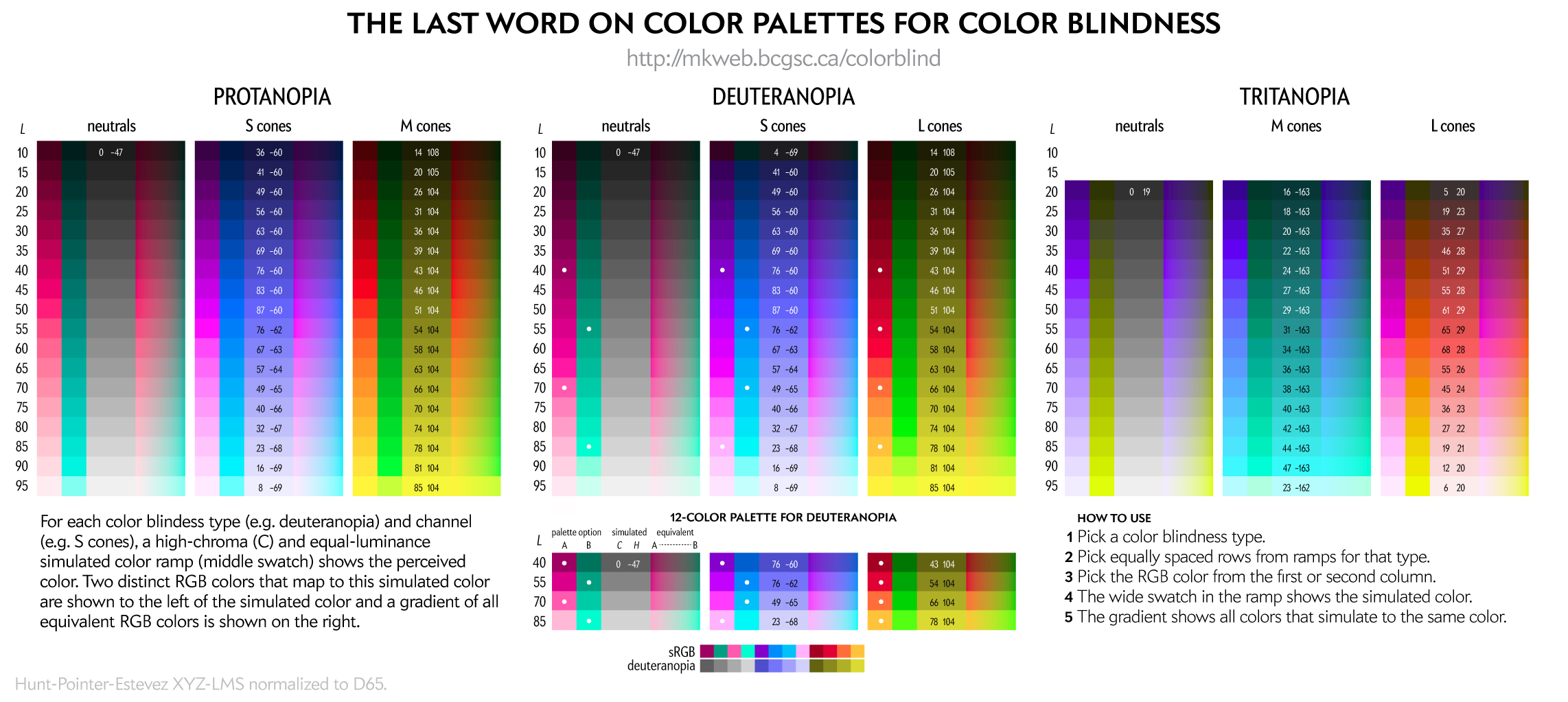
The exact luminance (perceived brightness) of the simulated color varies depending on the color blindness algorithm. Each row in the squares above should look identical using any color blindness simulation (e.g. Color Oracle, Photoshop, etc) but brightness of the rows may be slightly different than shown here.
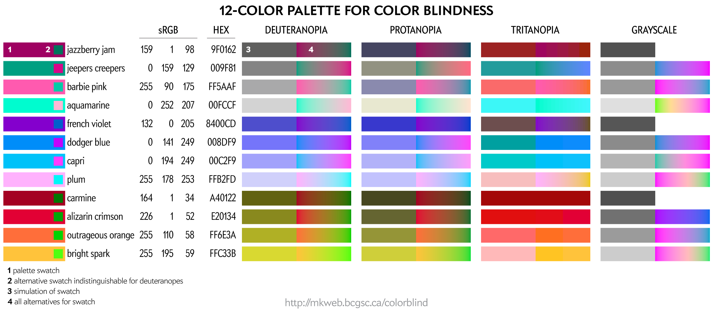
This palette maps four colors onto each of the two color dimensions in deuteranopes and four onto greyscale. This palette is very useful for designing transit and subway maps.
Color names are playful selections from my list of 10,000 color names.
You can download these colors as plain text list of HEX and RGB values.
You can download these colors as plain text list of HEX and RGB values.
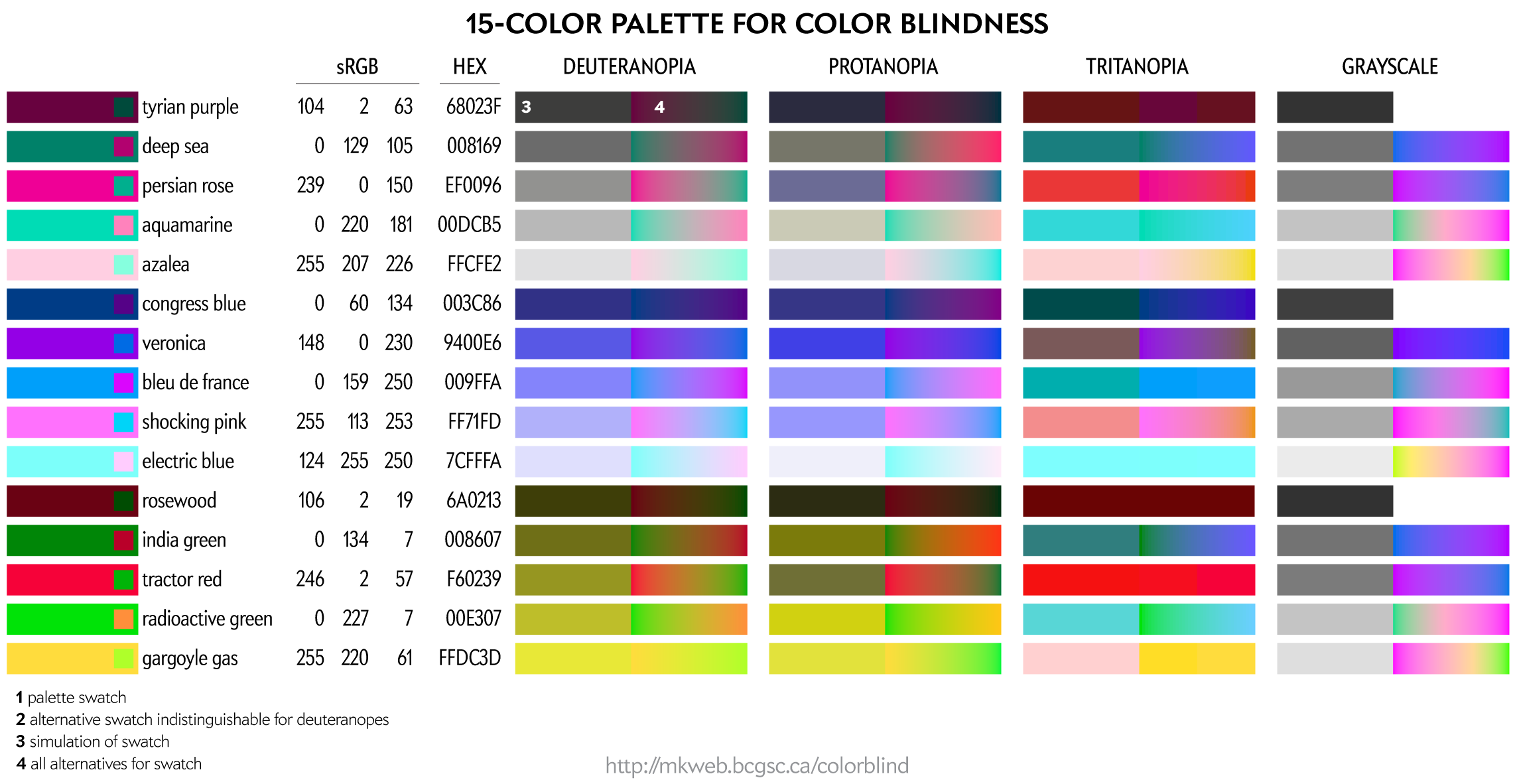
Even more color choices for color blindess, including colors that map onto greys. For these, I don't have RGB/HEX values handy.
You can download these colors as plain text list of HEX and RGB values.
You can create your own color palettes using the figure below.
For a given color blindness type (e.g. deuteranopia) and channel (e.g. blue), the rows represent reasonably uniform steps in LCH luminance of the simulated color and a rich (high chroma) simulation at that luminance.
Nasa to send our human genome discs to the Moon
We'd like to say a ‘cosmic hello’: mathematics, culture, palaeontology, art and science, and ... human genomes.


Comparing classifier performance with baselines
All animals are equal, but some animals are more equal than others. —George Orwell
This month, we will illustrate the importance of establishing a baseline performance level.
Baselines are typically generated independently for each dataset using very simple models. Their role is to set the minimum level of acceptable performance and help with comparing relative improvements in performance of other models.

Unfortunately, baselines are often overlooked and, in the presence of a class imbalance5, must be established with care.
Megahed, F.M, Chen, Y-J., Jones-Farmer, A., Rigdon, S.E., Krzywinski, M. & Altman, N. (2024) Points of significance: Comparing classifier performance with baselines. Nat. Methods 20.
Happy 2024 π Day—
sunflowers ho!
Celebrate π Day (March 14th) and dig into the digit garden. Let's grow something.

How Analyzing Cosmic Nothing Might Explain Everything
Huge empty areas of the universe called voids could help solve the greatest mysteries in the cosmos.
My graphic accompanying How Analyzing Cosmic Nothing Might Explain Everything in the January 2024 issue of Scientific American depicts the entire Universe in a two-page spread — full of nothing.

The graphic uses the latest data from SDSS 12 and is an update to my Superclusters and Voids poster.
Michael Lemonick (editor) explains on the graphic:
“Regions of relatively empty space called cosmic voids are everywhere in the universe, and scientists believe studying their size, shape and spread across the cosmos could help them understand dark matter, dark energy and other big mysteries.
To use voids in this way, astronomers must map these regions in detail—a project that is just beginning.
Shown here are voids discovered by the Sloan Digital Sky Survey (SDSS), along with a selection of 16 previously named voids. Scientists expect voids to be evenly distributed throughout space—the lack of voids in some regions on the globe simply reflects SDSS’s sky coverage.”
voids
Sofia Contarini, Alice Pisani, Nico Hamaus, Federico Marulli Lauro Moscardini & Marco Baldi (2023) Cosmological Constraints from the BOSS DR12 Void Size Function Astrophysical Journal 953:46.
Nico Hamaus, Alice Pisani, Jin-Ah Choi, Guilhem Lavaux, Benjamin D. Wandelt & Jochen Weller (2020) Journal of Cosmology and Astroparticle Physics 2020:023.
Sloan Digital Sky Survey Data Release 12
Alan MacRobert (Sky & Telescope), Paulina Rowicka/Martin Krzywinski (revisions & Microscopium)
Hoffleit & Warren Jr. (1991) The Bright Star Catalog, 5th Revised Edition (Preliminary Version).
H0 = 67.4 km/(Mpc·s), Ωm = 0.315, Ωv = 0.685. Planck collaboration Planck 2018 results. VI. Cosmological parameters (2018).
constellation figures
stars
cosmology
Error in predictor variables
It is the mark of an educated mind to rest satisfied with the degree of precision that the nature of the subject admits and not to seek exactness where only an approximation is possible. —Aristotle
In regression, the predictors are (typically) assumed to have known values that are measured without error.
Practically, however, predictors are often measured with error. This has a profound (but predictable) effect on the estimates of relationships among variables – the so-called “error in variables” problem.

Error in measuring the predictors is often ignored. In this column, we discuss when ignoring this error is harmless and when it can lead to large bias that can leads us to miss important effects.
Altman, N. & Krzywinski, M. (2024) Points of significance: Error in predictor variables. Nat. Methods 20.
Background reading
Altman, N. & Krzywinski, M. (2015) Points of significance: Simple linear regression. Nat. Methods 12:999–1000.
Lever, J., Krzywinski, M. & Altman, N. (2016) Points of significance: Logistic regression. Nat. Methods 13:541–542 (2016).
Das, K., Krzywinski, M. & Altman, N. (2019) Points of significance: Quantile regression. Nat. Methods 16:451–452.